Archive for the ‘Uncategorized’ Category
Wednesday, November 6th, 2019
Schrank’s Discourse Ranges Widely but inevitably Comes Back to “Connoisseurship”
Harris Schrank
Q: Please tell us a bit about yourself. How long have you been in the print business? How did you happen to become a fine-art-print dealer?
A: I became a print dealer about 10 years ago, after collecting prints for many years (and after a long run as a practicing sociologist and then a shorter stint as a corporate bureaucrat).
Q: Is there a “standard route” into print dealing-art history degree, apprenticeship in an established business, own shop-or do dealers tend to come from varied background and access routes. Does it run in families?
A: There’s no standard route. People from all sorts of backgrounds get caught up in prints – I know one dealer who was a cardiologist and another a pediatrician, any number of lawyers and accountants, a music critic, graphic designer, daughters and sons of dealers. Here and there one finds someone who actually studied art, worked at a gallery, and then became an independent dealer. One would think that would be the conventional route, but it’s not that common.
Q: Judging from the excellent brief guides you have published on ebay, your discourse centers around “connoisseurship.” It sems to be about print erudition. Is that a fair assertion? What, from your point of view, are the joys and benefits of knowing a lot about prints, both for collectors and dealers?
A: The more prints you see and study, the more you appreciate. In the contemporary field images and impressions from a single edition tend to be quite alike, in fact that’s a usual objective of the printer making an edition. But historically the printmaker – who often was also the artist – was not so concerned with creating a uniform edition as creating different variations upon the same theme. So the artist would change the print through various states, or use different inking and papers, thereby getting different results. Rembrandt approached printmaking in this way, as later did hundreds of artists such as Pissarro and Degas, Whistler and even Picasso. So it’s a good idea to know a lot about how these artists worked when examining their prints. And even among the artists who tended to make prints in just a few states, and worked toward a definitive state, connoisseurship is needed to determine which impressions they printed personally, which are earliest or best reflect the intent of the artist.
Q: How does one go about acquiring enough print erudition to be a knowledgeable collector? How much is enough?
A: The basic task is to see lots of examples of the same image. In a good print room like those at the Metropolitan Museum or the National Gallery it’s possible to see a number of Durer engravings of Adam and Eve, or Rembrandt’s Three Crosses, for example, and see how different they can be in quality, printing approach, inking, paper, etc. Once you’ve seen a number of impressions of a print you can start to make judgements about a print’s quality.
Q: In your experience, roughly what percentage of print collectors take it upon themselves to learn about prints in a serious way? How many of them succeed in becoming true print connoisseurs. Or do most of them leave the question of print connoisseurship to their dealers?
A: In my experience most print collectors are rather serious, and I’d regard quite a number as connoisseurs, but perhaps this is a characteristic of the “pre-contemporary” print field. Many collectors are fussy about condition, but obsessing about condition shouldn’t be confused with connoisseurship. Connoisseurship involves making distinctions among various impressions of the same print, knowing about print techniques, papers, the art historical context, etc. Collectors are wise to work with knowledgeable dealers who can help them locate and select prints, but if they “delegate” too many matters of connoisseurship they’re missing lots of the fun of collecting.
Q: How many of your clients “keep coming back for more?” Aside from the obvious monetary question, is it a great satisfaction for a dealer to nurture a client from rank beginner to serious collector?
A: I enjoy working with anyone interested in prints, regardless of their level of sophistication. The learning process is mutual, for often beginners ask good questions which lead me into areas I hadn’t considered. Of course I enjoy working with experienced collectors as well, and get some special satisfaction from finding something they haven’t seen, or locating a print they’ve been looking for or that fits well into their collection.
Q: Is it possible to construct a profile of the typical print collector. Or are there several profiles? What do they look like?
A: There are lots of types. Some focus on aesthetic issues, some on periods or art movements; some on a particular artist. Some are condition freaks, some want just lifetime impressions or just signed impressions; others search for pictures of certain things like skulls or boats or early New York scenes. Some people just seem to look for bargains, but they tend to have mediocre collections.
Q: Has your quest for connoisseurship taken you abroad? Is firsthand knowledge from, say, Europe, China or Japan necessary to take the connoisseuer to the next level?
A: It’s fun to see where an artist worked. I’ve been to Rembrandt’s House in Amsterdam, and James Ensor’s in Ostend, Belgium. And it’s great to see scenes such as the canals and bridges of Venice that were the subjects of Whistler etchings. But to me the real excitement is just seeing great impressions of great prints, and many of these (the ones I don’t own!) can be found in museums or collections nearby.
Q: This brings us to the question of specialization. Presumably it’s impossible to be a connoisseur of everything. How important is specialization? I noticed that two of your mini guides are devoted to Rembrandt and Goya. Are these two artists your specialties?
A: I love Goya and Rembrandt, and am somewhat conversant with them, but would not say they’re a specialty. I find I focus on artists for whom printmaking itself was a specialty, including for example Drer, Jacques Callot, Van Ostade among the old masters, Camille Pissarro and Jacques Villon among European impressionists and modernists, and among Americans, John Sloan and Reginald Marsh and of course James Whistler. Some dealers and collectors prefer to focus on a single artist, but I find that confining.
Q: What is the role and the importance of auction houses? To what extent has their credbility been eroded by the scandals of recent years. Are auction prices true indicators of the value of fine-art prints?
A: Auction houses are important to the print world, but they can be risky places to buy or sell prints. They sometimes get good prints, especially from estates, but also get problematic prints – the prints dealers and individuals either can’t sell or don’t want to be associated with when they’re sold. Collectors without the resources, time or knowledge to make good judgments among auction offerings are easy prey for the houses. And these days the houses are charging quite a bit – often on both ends – to sell things, so collectors need to be wary of paying too much for so-so quality items.
As for the usefulness of auction prices: the huge variability of prints and their auction prices severely limits the value of auction prices as indicators of value. So over-reliance on such records is a bad idea – high prices are too often the result of buyers caught up in an irrational bidding war, and low prices a reflection of low quality offerings. I find that these days – in the old master area especially – many of the finer or rarer impressions don’t reach the auction houses, but are sold privately.
Q: While we’re on the subject of value, where would you place fine-art prints as investments, say on a scale between General Motors and gold.
A: I’ve heard people say that these days prints are more blue chip than the traditional blue chips. I also sense that the market for older prints may be more stable than the contemporary market. Lots more might be said about all this but in general I’d encourage people to buy prints because they love them, not as an investment.
Q: On the subject of certificates of authenticity, you have been quoted as saying: “These have been thoroughly discredited in recent years; an inflated-sounding claim of a C of A is often a sign that there is a problem in the wings.” Would you care to elaborate on that affirmation a bit? We’ve been telling artists for years that the C of A is the way to go. Are there different criteria in this matter for contemporary prints and old masters? Isn’t a Fine Print Description just a more elaborate C of A? Isn’t it just as easy to falsify an FPD as a C of A?
A: An FPD is my own invention; it’s just a full description of the print which I sign and date. I suppose it is a C of A without the pretension of the C of A designation. Every week or so I hear from collectors who’ve overpaid for a print, or bought a print that’s not really what it’s supposed to be, and they’re typically armed with an “official” C of A which is nothing more than a phony marketing device. These C of A’s are no substitute for a buyer doing some homework, or buying from a reputable dealer.
Q: With so many con artists afoot these days at every level of the food chain, what possibility do print collectors have to protect themselves from fraud? How should they go about it?
A: Of course the best way to protect themselves is to develop some knowledge about prints, and the prints they’re purchasing. I would also encourage collectors to buy from dealers who are members of the International Fine Print Dealers Association (IFPDA). These dealers have gone through a serious vetting process. The IFPDA website (www.printdealers.com) lists the members, and is also a good source of print knowledge, definitions, etc.
Q: In Internet print sales the question of establishing a seller’s honesty and inspiring a buyer’s confidence, is even trickier. You sell prints over the Web. How do you deal with these issues? What percentage of your sales are via Internet?
A: I rarely buy on the Web and would not generally recommend it. I buy prints in person, and recommend that as the best method. I do sell prints via the Web, and anything I sell I’ll purchase back within a reasonable amount of time, so I basically sell prints on approval (as will any reputable dealer). I enjoy presenting prints on eBay (I started with Sothebys.com, which morphed into eBay before it went under), and have met many experts and specialists through that route, but today such sales are less than 5% of my total. I enjoy eBay as a discipline (I show lots of pictures of each print, and create a rather full descriptive entry for each print), and in practice use it more for advertising than sales. I also have a number of print guides displayed on eBay.
Q: You place a great deal of emphasis on the importance of the catalogue raisonne in determining the authenticity of prints, and you are not alone in this respect. Most catalogues raisonnes, if I’m not mistaken, are compiled by art historians after the artists in question have died. Wouldn’t it make more sense for the artist herself, or her agent, to create the catalogue as they go along? Wouldn’t that information tend to be much more reliable? Having said that, should we encourage serious contemporary printmakers to start preparing their own catalogues raisonees?
A: I suppose you’re right that artists should keep good records, but I imagine many artists would probably see that as a distraction (I don’t like keeping records myself, and I’m no artist). Many artists have in fact kept extensive records, and these help the compilers of catalogues. For example Albrecht Durer kept an extensive diary in which he details who he gave prints to; and artists such as Camille Pissarro, Reginald Marsh, and Martin Lewis kept detailed notes about their printmaking efforts which helped cataloguers. But many artists are notorious for getting print states, dates and the number of impressions printed wrong (Pissarro and Marsh are good examples), so good cataloguers have to examine everything from scratch whether the artist has kept notes or not.
Q: Many readers of this interview will be fine-art print professionals, print studio people, master printmakers… They are ultimately the ones who advise many of today’s printmakers on questions of editions, signing, best practices and print permanence. From the point of view of a print dealer, what comments or advice would you share with them?
A: I’m no expert on contemporary printmaking, but might mention that I’ve been very impressed with the contemporary prints that have been shown at the International Fine Print Center NY (IFPCNY) New Prints shows (there have been about 25 of these exhibits over the past decade). Perhaps those not familiar with this non-profit Print Center and its programs and exhibits might be interested in looking into them. (Disclosure – I’m on the Board of the IFPCNY.)
Q: Regarding editions, would you like to give your views on this issue? For example, why the disparity in the sizes of editions between Europe and the USA?
A: I didn’t know about this difference. Let’s go on to the next question!
Q: What about editioning inkjet reproductions of paintings, so-called “signed and numbered limited-edition giclee prints?” What do you make of that phenomenon? Or do we just put it down to H.L. Mencken’s immortal remark: “Nobody ever went broke…?”
A: When it comes to buying art people often justify their irrational or even inane behaviour by saying they buy “what they like,” as if that excuses their mistakes. And in the case of prints, where there’s often another example of the print that’s earlier, or better (or just genuine), and less expensive to boot, it’s infuriating to see people blithely enriching con artists. So I guess old Mencken had a point. But education sources, such as your site, should help people make better choices, so there’s always hope.
Thank you, Harris, for your kindness in sharing your connoiseurship with us.
Contact Harris Schrank:
Phone: 212 662 1234
Posted in Uncategorized |
Tuesday, January 31st, 2017
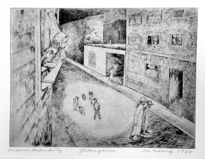
Lea Grundig-Langer (1906-1977), Judengasse in Berlin (Jewish Quarter in Berlin), 1934, signed and dated in pencil lower right, titled lower center, cycle name (Unterm Hakenkreuz) lower left). In excellent condition, printed on a heavy cream wove paper, the full sheet, 9 3/4 x 12 7/8 inches, the sheet 16 1/2 x 21.
Provenance: Galerie St. Etienne, New York, NY.
A fine fresh impression, printed with carefully drawn plate tone.
Lea Langer was born in Dresden in 1906 where her family was part of the Jewish community. She studied at the city’s Decorative Arts and Crafts Academy before progressing, in 1924, to the prestigious Saxon Art Academy: here she was admitted into the Masterclass of Otto Gussmann where fellow participants included Otto Griebel, Wilhelm Lachnit und Hans Grundig. At the Academy she also got to know Otto Dix, whom she would come to regard as one of the most influential of her mentors.
She remained at The Academy till 1926, when she left the Jewish Community, joined the Communist party, and shortly thereafter married Hans Grundig. Her work was banned by the Nazis, who put her in prison for a short time; she later emigrated to Palestine, then back to Europe and eventually East Germany, where she was active politically while teaching and practicing her art.
Posted in Uncategorized |
Wednesday, June 29th, 2016
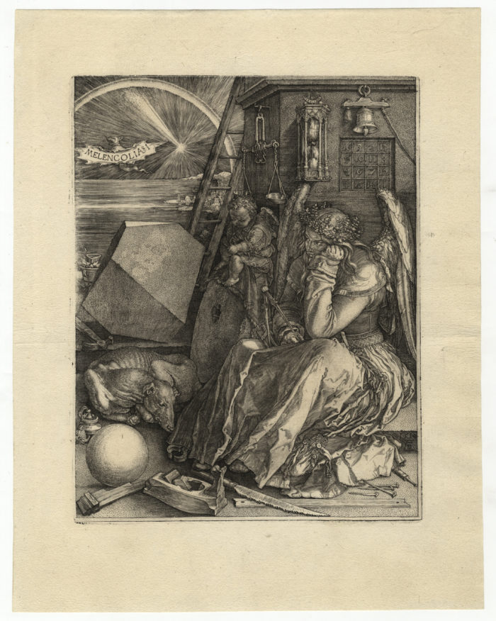
Albrecht Dürer
1471 – Nuremberg – 1528
Melencolia I 1514
engraving; 239 x 187 mm (9 3/8 x 7 5/16 inches), with wide margins
Bartsch 74, Meder 75 state IIb (of IIf); Schoch/Mende/Scherbaum 71
Watermark: small jug (Meder 158)
A very fine impression, in excellent condition.
provenance:
library of the Magdalenenkirche, later university library, Wrocław (formerly Breslau) (Lugt 2371b)
C.G. Boerner, Neue Lagerliste 6, Düsseldorf 1952, no. 38
private collection, Germany
Among the dozens of interpretations of the elements of Melancholia are these insights – in his essay on Melencolia – by the eminent art historian Erwin Panofsky:
“Dürer’s Melencholia is neither a miser nor a mental case but a thinking being in perplexity, her face overcast by a deep shadow, made more impressive by the startling white of the eyes. The wreath on her head is woven of water-ranunculus and watercress, both plants of a watery nature, to counteract the bad effects of “dryness” associated wth the melancholy humor. The mature and learned Melencholia typifies Theoretical Insight which thinks but cannot act. The ignorant infant, making meaningless scrawls on his slate and almost conveying blindness, typifies Practical Skill which acts but cannot think.”
Posted in Uncategorized |
Monday, May 2nd, 2016
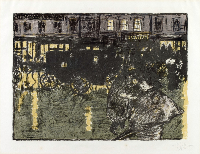
Pierre Bonnard
1867 Fontenay-aux-Roses – Le Cannet 1947
Rue, le soir, sous la pluie – Rainy Street at Evening 1895–99
lithograph printed in five colors on thin wove paper; 255 x 350 mm (10 1/8 x 14 inches)
signed and numbered in pencil at lower right no 95
Roger-Marx 66; Bouvet 68; Johnson 10.10
provenance
Emile Laffon, Paris (Lugt 877a)
This print is from Bonnard’s album Quelques Aspects de la vie de Paris, published by Ambroise Vollard and printed by Auguste Clot in an edition of 100. Although the date given on the cover is 1895, Johnson concludes that since the whole set was not exhibited until 1899 and a sketch for one of the plates (Place, le soir, Bouvet 64) is dated 1899, the album was not completed and published until 1899.
Posted in Uncategorized |
Friday, April 8th, 2016
Posted in Uncategorized |
Tuesday, March 29th, 2016
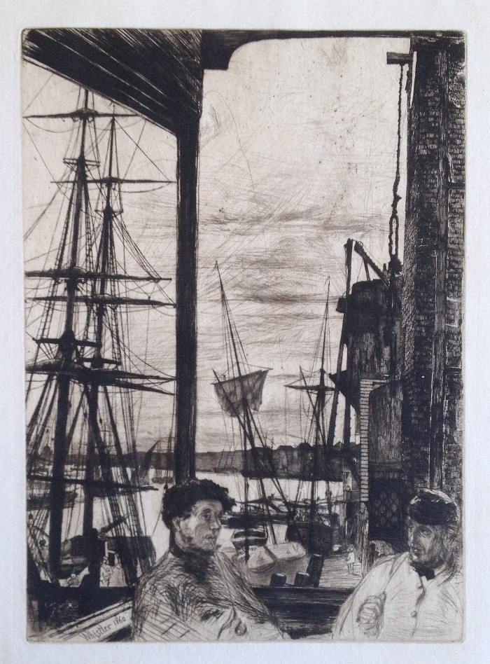
James McNeill Whistler (1834-1903), Rotherhithe, etching and drypoint, 1860 [signed and dated in the plate lower left]. Reference: Kennedy 66, third state (of 3), Glasgow 70, sixth state (of 6). Published, in the definitive state, as part of the Thames Set. In very good condition, with margins, 10 7/8 x 7 7/8, the sheet 13 x 9 7/8 inches.
A fine impression, printed in brownish/black ink on a cream laid paper with the watermark KF.
Rotherhithe is the area opposite Wapping on the banks of the Thames. The site of the image is the Angel, an inn in Bermondsey, very near Rotherhithe. Although Tower Bridge dominates the view up-river from the narrow balcony, in the distance St Paul’s Cathedral is visible beyond the bend of the river.
Rotherhithe is one of Whistler’s most iconic early images; it was exhibited at the Royal Academy in 1862, and then was titled Wapping in its later 1871 publication as part of the Thames Set (a series of 16 etchings). The copper plate is in the Freer Gallery of Art.
Posted in Uncategorized |
Friday, November 27th, 2015

Martin Lewis – Shadow Dance
We can offer a large collection of over 100 Martin Lewis prints and drawings, to be sold “en bloc.” The collection includes all the iconic and best known prints as well as many great rarities, a number of drawings, and a sampling of canceled plates. Inquiries are welcome; by e mail at hschrank@nyc.rr.com, or by phone at 212 662 1234.
To view the collection please tap this link: VIEW PDF
Posted in Uncategorized |
Monday, November 23rd, 2015
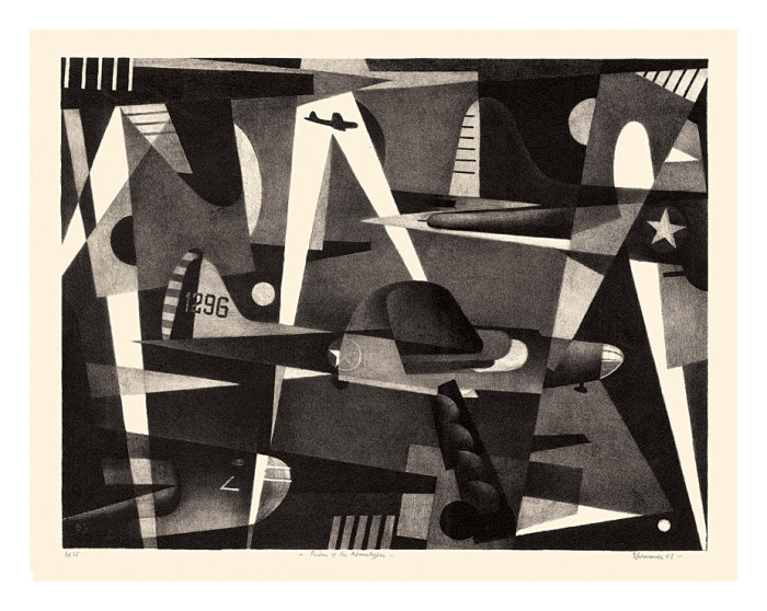
Benton Spruance (1904-1967
Riders of the Apocalypse––– 1943, Lithograph.
Fine and Looney 222. Edition 35. Signed, dated, titled and annotated Ed 35 in pencil. Initialed in the stone, lower left.
Image size 12 11/16 x 16 3/8 inches (322 x 416 mm); sheet size 15 5/8 x 19 1/4 inches (397 x 489 mm).
A superb impression, on off-white wove paper, with full margins (1 1/4 to 1 5/8 inches); in excellent condition. Printed by Cuno.
Exhibited and Reproduced: The American Scene: Prints from Hopper to Pollock, Stephen Coppel, The British Museum, 2008, catalog p. 205.
Collections: British Museum; Free Library of Philadelphia; National Gallery of Art, Washington; Philadelphia Museum of Art.
Posted in Uncategorized |
Friday, November 13th, 2015
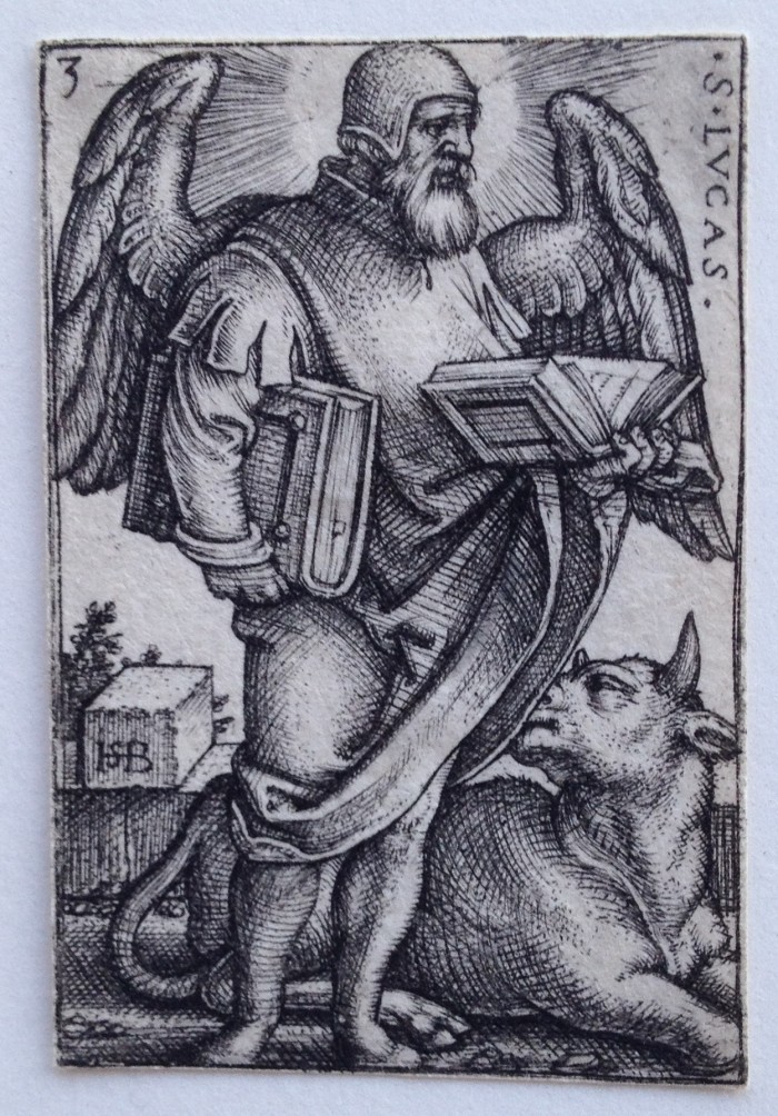
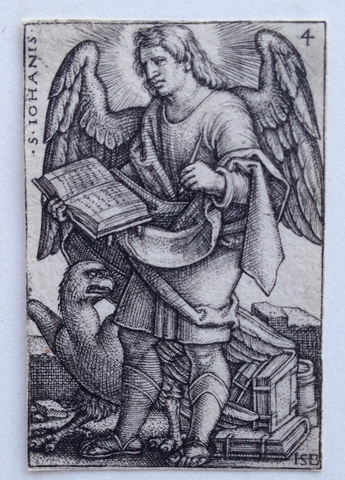
Hans Sebald Beham (1500-1550), Four Evangelists, engravings (4), 1541 [initialed, titled and numbered in the plates]. References: Bartsch 55-58, Pauli, Hollstein 57-60; 57 and 58 3rd state, 59 and 60 fifth state (of 5), In excellent condition, each plate trimmed along or just outside of the borderline, 1 3/4 x 1 1/4 inches.
Fine rich impressions.
Sebald Beham was born in Nuremberg in 1500. In 1525 he and his brother Barthold, together with Georg Pencz, were thrown out of Nuremberg following an investigation into their agnosticism, but they returned the next year. Sebald continued to get into trouble: he was expelled again for publishing an essay on the proportions of the horse which was taken from Durer’s unpublished Art of Measurement.
Note: photos of St. Mark and St. Matthew available on request.
Posted in Uncategorized |
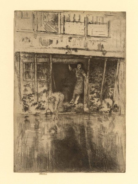
Sunday, October 25th, 2015

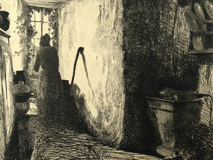
James Whistler – The Doorway
James Whistler (1834-1903), The Doorway, drypoint, etching and roulette, 1879-80, signed with the butterfly on the tab and inscribed “imp”. Reference: Kennedy 188, seventh state (of 7); Glasgow 193, twenty (of 20). From the First Venice Set. In very good condition, trimmed by the artist around the plate mark except for the tab, printed on a simile Japon paper, 11 1/2 x 8 inches.
Provenance:
P. & D. Colnaghi & Co., London (their stock number in pencil on verso C. 335)
A very fine impression, printed in brown ink.
The passageway at the center of the architectural framing device is still partly open and a window allows some light to come in from behind into the darkened interior of the Pallazzo Gussoni on the Rio de la Fava. The rhythm of the windows, further accentuated by the changing of the orientation of the ironwork, makes the ornate architecture the manifest subject of this print.
This is Whistler print is most dramatically and fully conceived after a number of earlier states. The girl at the center of the composition, in the doorway, was re-worked progressively in the early states, but probably never completely resolved to the satisfaction of the artist, as suggested by his completely burnishing out the figure in Glasgow’s 17th state. He then re-drew the figure entirely, in drypoint, making her a bit smaller, with her features now rather clear and holding a thin cloth (as in the earliest states) in the water. In previous states Whistler left the area below the doorway relatively clear of etching or drypoint, allowing a space for plate tone and various wiping effects. In this late state he drew in dense networks of overlapping drypoint lines to dramatize the shadows of the doorway and the motions of the water on the canal; this technique presages the use of drypoint in the Amsterdam plates (see, for example, Pierrot, K. 407). The dramatic movement of the water thus contrasts with the stillness of the architecture, making this one of Whistler’s most engaging and fully realized compositions.

The Doorway – Detail
Posted in Uncategorized |
Friday, October 9th, 2015
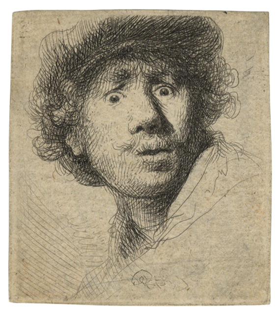
Rembrandt Harmensz. van Rijn 1606 Leiden – Amsterdam 1669
Self-Portrait in a Cap, wide-eyed and open-mouthed 1630
etching and drypoint; 51 x 45 mm (2 x 1 3⁄4 inches)
Bartsch 320, White/Boon only state; Hind 32; The New Hollstein 69 second (final) state
provenance
Charles Delanglade, Marseille (Lugt 660)
A very good impression of this rare and much sought-after little print; in good condition with the platemark visible all round.
This is one of Rembrandt’s early self-portraits from his Leiden years between 1628 and 1631. More specifically, it is one of a small group of etchings dating to 1630 in which he used his own image to experiment with various facial expressions that might serve as models for his work and that of his pupils. In these tiny prints, many little bigger than postage stamps, the artist’s features undergo many transformations as he explores a range of expressions. In this case, he wears a beret and his eyes, mouth, and the contours of his face are rounded in apparent wonder or surprise. Three other etchings of this date show the artist frowning (Bartsch 10); open-mouthed (Bartsch 13); and laughing (Bartsch 316). The inventiveness and variety of Rembrandt’s self-portraits (as well as his obsession with making them) far exceeded that of his Dutch contemporaries. Indeed, Clifford Ackley observes that “these quirky, personal etched self-portraits are without clear precedent in the history of self-portraiture, particularly in printmaking”.
Posted in Uncategorized |
Saturday, October 3rd, 2015
 Francisco Goya (1746-1828), Picador Caught by a Bull, lithographic crayon and scraper, 1825. Harris 284, Delteil 287, from the edition of 100 [signed Goya in the plate lower left], printed by Gaulon, Bordeaux, from the set The Bulls of Bordeaux. In exceptionally fine condition, the matrix flawless, slight light stain, the full sheet (remains of prior hinging edges verso); 12 1/4 x 16 1/4, the sheet 15 1/2 x 20 1/8 inches.
A fine rich, black impression, printed on a cream wove paper.
Provenance: H.J. Thomas (Lugt 1378); estate of Albert Gordon. Lugt writes of Thomas: “Monsieur Henri Thomas ne fait pas l’uvre de tel ou tel matre, son but est que ses cartons offrent, en preuves exceptionnelles, un ensemble de ce que l’art de la gravure a produit de plus remarquable toutes les poques et dans toutes coles.
Goya was perhaps the first major artist to make use of the lithographic technique, in 1819 at the age of 73. His earliest experiments were with transfer lithography, using pen on transfer paper, but his “mature” work, after 1824, was done directly on the lithographic stone. He initially made five Bordeaux lithographic bulls, but discarded one of the lithographs after having taken a proof and, apparently, been dissatisfied with it.
In late 1825 Goya wrote to his friend Joaquin Ferrer, who was living in Paris at the time, sending an impression of the first of the Bulls (Corrida de novillos) and asking him if this and the other three bullfighting lithographs could be sold in Paris. Ferrer wrote that another edition of the Caprichos would have greater appeal. Goya responded “I understand and accept what you tell me about the prints of bulls but I rather had in mind that they should be seen by art connoisseurs who abound in that great court [Paris} and the great number of people who have seen them, not counting Spaniards, thought it would be easy [to sell them].” So Goya’s Bulls of Bordeaux did not appeal to the French taste of the period.
Goya wrote Ferrer that “I’ve no more sight, no hand, nor pen nor inkwell, I lack everything – all I’ve got left is will.” But with the creation of the Bulls of Bordeaux, Goya had produced one of the great monuments of printmaking.

Detail
Posted in Uncategorized |
Friday, September 18th, 2015
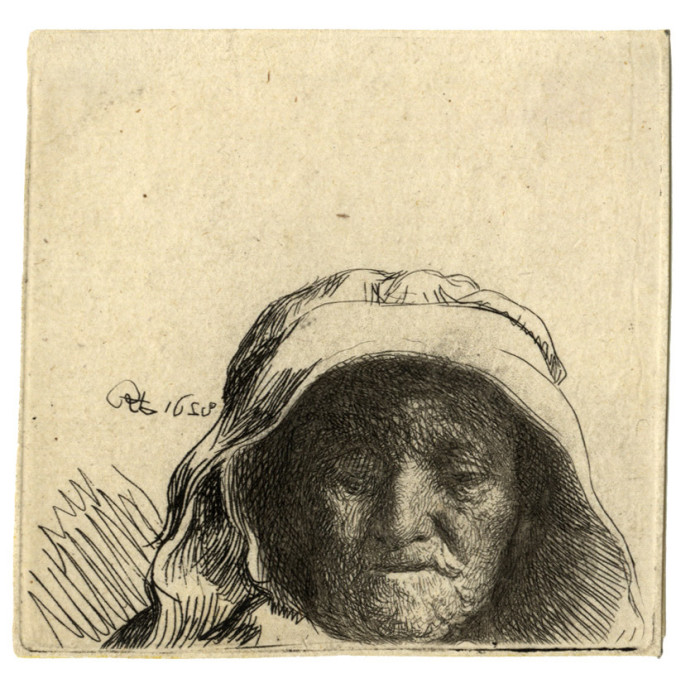
Rembrandt Harmensz. van Rijn
1606 Leiden – Amsterdam 1669
The Artist’s Mother: Head Only, Full Face 1628
etching; 63 x 66 mm (2 1/2 x 2 5/8 inches)
Bartsch 352, White/Boon second (final) state; Hind 2; The New Hollstein 6 second (final) state
This rare little plate is one of the earliest to be generally accepted as the work of Rembrandt. It is still experimental; the artist has not managed to get the tonal balance in the biting of the two states correct. The face, which was etched first and was never bitten deeply, is considerably paler than the hood, which was added later.
Further, the unusual composition makes the print look almost like a fragment; the head of the woman is oddly anchored slightly to the lower right of the image and points to Rembrandt’s early tendency to begin drawing with his etching needle without having a clear idea of the size or position of the intended image. In this case, although the first state (of which a unique impression survives in Amsterdam) shows that the artist used black chalk to develop a version that would have included part of the figure’s upper body, in the end, the artist cut away more than an inch of the plate just below her chin, reinforcing the idiosyncrasy of the portrait. Another print that Rembrandt made of his mother in etching and drypoint the same year (Bartsch 354) and in etching and engraving in ca. 1631 (Bartsch 343) demonstrate his rapid progress in a range of printmaking techniques.
Rembrandt’s mother provided a readily available female counterpoint to his own self-portraits. But his choice of her as subject matter also reflects a growing market at this time for images of old people, their time-worn faces providing a contrast to the long-established taste for comely young women. This aesthetic interest might also relate to the contemporary “picturesque” taste for such dilapidated old structures as ruins and humble farmhouses as well as peasants and beggars. The popularity of these motifs, frequently addressed by Rembrandt himself, might be explained in some cases by their familiarity, as well as by their freedom from complex or morally burdensome religious, historical, or literary themes.
Posted in Uncategorized |
Thursday, September 17th, 2015
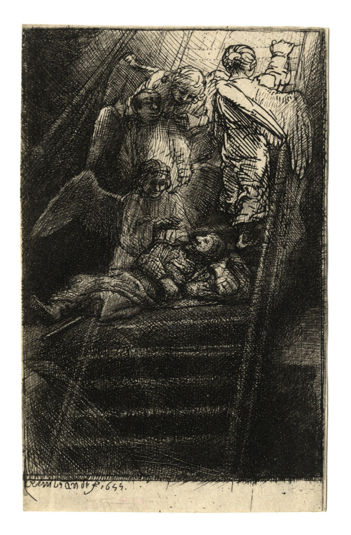
Rembrandt Harmensz. van Rijn
1606 Leiden – Amsterdam 1669
Jacob’s Ladder, an illustration to Piedra gloriosa 1655etching and engraving with drypoint; 115 x 70 mm (4 1/2 x 2 13/16 inches)
Bartsch 36B, White/Boon third (final) state; Hind 284; The New Hollstein 288b third state (of four)
provenance
Heneage Finch, 5th Earl of Aylesford, London and Packington Hall, Warwickshire (Lugt 58)
John Heywood Hawkings, London and Bignor Park, Sussex (Lugt 3022)
Walter Francis, 5th Duke of Buccleuch, London and Dalkeith, Scotland (Lugt 402)
Kennedy Galleries, New York (their stock no. in pencil on verso a12846)
John William Bender, Kansas City (Lugt 1555b)
A very fine, rich impression with deep burr, with the lower sides of the stepladder burnished in, and the whole dense lower area printed effectively with the utmost care; before the plate was reworked in drypoint.
Jacob’s Dream is one of four etchings that Rembrandt composed on one plate, intended to be cut into four for use by the publisher as illustrations to a book by his friend, the rabbi, scholar, publisher, and diplomat Menasseh ben Israel (1604–1657). (The other images show The Statue of Nebuchadnezzar Overthrown; David and Goliath [B.36C]; and Daniel’s Vision [Bartsch 36A, C, and D respectively].) This work, written in Spanish and titled Piedra gloriosa de la estatua de Nebuchadnesar, was published in Amsterdam in 1655. It is a mystical tract in which a series of episodes from the Book of Daniel are seen to presage the coming of the Messiah. It also incorporates appeals for greater tolerance of the Jewish population. As Jan Piet Filedt Kok put it: “The Jews of the 17th century were obsessed with the coming of the Messiah, which they looked forward to in the expectation that it would put an end to the misery and suffering of the Jewish people. In a time of persecutions in Portugal, Spain and Poland this was not to be wondered at”.
Jacob’s Dream shows the sleeping patriarch, his head resting on a stone, as he dreams of a ladder upon which angels ascend and descend to and from heaven. It was the only one of the four subjects in the illustrations that Rembrandt had treated previously. Menasseh understood the work to be an allegory of the fall of the enemies of Israel, writing in the text that “you will see how three angels descend a staircase … and another who is at the top and ascending, representing the fall of the three preceding monarchies and the escalation in which we experience the last” (quoted in Michael Zell, Reframing Rembrandt: Jews and the Christian image in Seventeenth-Century Amsterdam, Berkeley/Los Angeles/London 2002, p. 74).
The book with Rembrandt’s etchings survives in only five known copies. Other editions exist but these contain often crude engravings after Rembrandt’s original designs, sometimes with significant adjustments to the images. Current scholarship suggests that these are the work of the Jewish artist Salom Italia, who had made an engraved portrait of Menasseh in 1642. Rembrandt’s choice of etching and drypoint for book illustration, although reinforced by engraving, was somewhat unusual since they tend to deteriorate much more rapidly than engraving or woodcut, both of which are thus better suited to producing enough impressions for a book edition. It seems most likely, therefore, that Rembrandt’s etchings were replaced for practical reasons. In the first instance, however, Menasseh did entrust this politically and religiously complex project to Rembrandt, who was neither Jewish nor a professional illustrator. Furthermore, Rembrandt’s illustration of the text “reflects an exceptional degree of cooperation. The alterations Rembrandt agreed to make, even if they involved compromising his aesthetic convictions, attest to an uncharacteristic willingness to revise his work to accommodate Menasseh’s directions … Menasseh, moreover, always under financial pressures, which were particularly acute during this period, could hardly have afforded to pay the fee Rembrandt could command” (ibid., pp. 84f.).
Given that a number of surviving individual impressions, like this one, exist outside the book, and that Rembrandt experimented with some of them on a range of different supports, including vellum and Japanese gampi paper, it seems clear that he used this commission to create highly idiosyncratic prints that could stand on their own. All of these prints, with their rich plate tone and selective wiping, are not accidental trial proofs but were clearly pulled by Rembrandt to satisfy the requirements of a highly sophisticated group of collectors. This is ultimately the reason for their survival, even though they count among the rarest and most sought-after of the master’s prints.
Posted in Uncategorized |
Thursday, August 27th, 2015
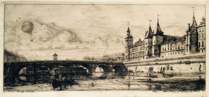
Charles Meryon (1821-1868), Le Pont au Change, 1854, etching. Reference: Delteil/Wright 34 fifth state (of twelve), Schneiderman 40, fifth state (of 12) [with the signature, date and address in the plate in the margin below]. On old very fine and thin laid paper with a “Contribution Directes” watermark. In very good condition, with margins 6 1/8 x 13 1/8, the sheet 7 1/8 x 13 3/4 inches.
Provenance: J.H. Wrenn (with his stamp verso, Lugt 1475), and then by descent.
P. & D. Colnaghi & Co., London (their stock no. in pencil on the verso C27108)
Kennedy Galleries, New York (their stock no. in pencil on the verso a35112)
A extremely fine, richly printed atmospheric impression, in a brownish/black ink, printed personally by the artist, with a veil of plate tone, wiped selectively in places such as the wall and faces of the buildings at the right.
From a point of view at water level we can see the Pompe de Notre Dame (the old water pump) beyond the bridge, and the Palais de Justice and Tour de Horloge on the Isle de la Cite at the right. In the water a man, presumably drowning, reaches toward a boat, but those in the boat are turned in the other direction, looking toward the balloon marked Speranza (hope) in the sky. On the bridge a hearse and a parade of mourners walk toward the left, as a group of soldiers at the far left marches toward them.
Meryon made a few changes in the figures and clouds in the next state (the 6th), and removed the balloon in the seventh state; then, in 1859-60 he famously added a flock of huge birds to the sky – this was variously interpreted as the result of the influence of Poe (The Raven), or as evidence of Meryon’s continuing mental instability after his stay at the institution Clarenton; and of course there were other possibilities. Indeed, the meanings of the print in this earlier state – the ironies of the conjunction of the balloon Speranza, the drowning man and those turning away from him, and the funereal procession, for example – have been the subject of much speculation as well.
It is however indisputable that Le Pont au Change, particularly in this early state, is one of the most dramatic and beautiful of Meryon’s compositions, and a great icon of mid-19th Century printmaking.
Posted in Uncategorized |
Sunday, August 16th, 2015
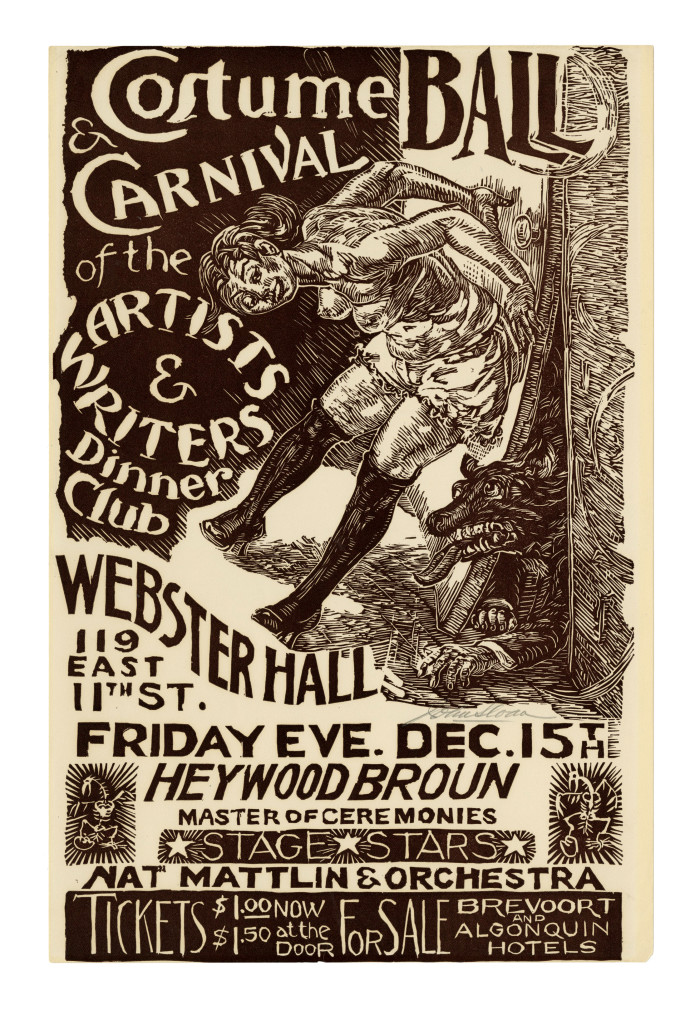
John Sloan (1871-1951)
Costume Ball & Carnival of the Artists & Writers Dinner Club – 1933, Linocut.
Morse 277. No edition, printing unknown but assumed very small. Signed in pencil lower right, beneath the wolf’s hand-like paw.
Image size 19 x 12 inches (483 x 305 mm); sheet size 19 x 12 1/2 inches (483 x 318 mm).
A fine impression, in dark brown ink, on the full sheet of heavy, cream wove paper. A reinforced crease in the top left corner; a minor nick in the bottom center sheet edge and a small loss in the bottom right sheet corner; slight yellowing to the sheet edges left and right, not affecting the image. otherwise in very good condition. The image printed to the sheet edges top and bottom, with small margins left and right; the sheet size (19 x 12 1/2 inches) is consistent with impressions in the collections of Library of Congress and Metropolitan Museum of Art. Very scarce; we find no record of this print appearing on the art market.
The poster copy reads: “Costume Ball & Carnival of the Artists and Writers Dinner Club . Webster Hall . 119 E 11th St. Friday Eve. Dec. 15. Heywood Broun . Master of Ceremonies . Stage Stars . Nat Mattlin & Orchestra . Tickets $1.00 now $1.50 at the door . For Sale . Breevort and Algonquin Hotels.”
Sloan’s poster advertises a decadent costume ball sponsored by the Artists & Writers Dinner Club, a group that provided regular dinners to needy people in the arts during the Depression. Since its founding in 1886, Webster Hall on the Lower East Side had become an established venue for social events, meetings, lectures, and dances, but soon became best known as a meeting place for left-wing political activist groups of all kinds. By the 1930s, it was nominated “the Devils’ Playhouse,” notorious for decadent parties and carnivals arranged by progressive groups like the editors of The Masses and the Liberal Club. Parties were inspired by the costume balls of Paris and given names like “Pagan Romps” and “Art Model Frolicks;” by then it had also become one of the places that homosexuals could openly hold their own celebrations and events. The burlesque figure dominating the image, with bared breasts, bloomers, and stockings merely hints at the decadence and debauchery that awaits the ball’s attendees.
Webster Hall has in fact continued its storied history to the present day as a venue for numerous recordings, concerts, and events. In 2008 the building was officially designated a New York City landmark, recognized for its significant role in the cultural development of New York City’s Greenwich Village.
Posted in Uncategorized |
Friday, July 31st, 2015
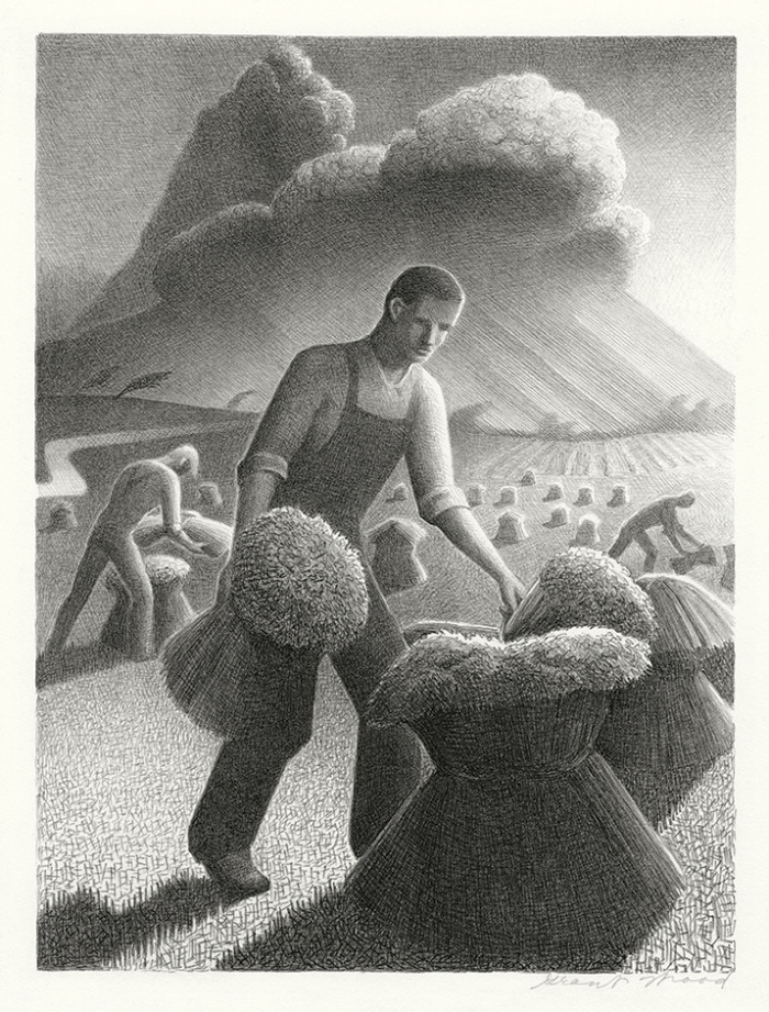
Grant Wood (1891-1942), Approaching Storm––– 1940, Lithograph.
Cole 16. Edition 250. Signed in pencil.
Image size 8 7/8 x 11 7/8 inches (225 x 302 mm); sheet size 10 3/4 x 14 1/4 inches (273 x 362 mm).
A superb, well-inked impression, on off-white wove paper, with margins (7/8 to 1 1/4 inches), in excellent condition.
The artist’s last print, published by Associated American Artists, 1940.
Reproduced: American Master Prints from the Betty and Douglas Duffy Collection, The Trust for Museum Exhibitions, Washington, D.C., 1987.
Collections: Albrecht-Kempler Museum of Art, Akron Art Museum, Art Complex Museum, Carnegie Museum of Art, Cedar Rapids Museum of Art, Cleveland Museum of Art, Des Moines Art Center, Detroit Institute of Arts Museum, Fine Arts Museums of San Francisco, Metropolitan Art Museum, Museum of Fine Arts Boston, New Britian Museum of American Art, Phoenix Art Museum, Rhode Island School of Design, Saint Louis Art Museum, Spencer Museum of Art, Springfield Museum of Art, Sterling and Francine Clark Art Institute, University of Iowa Museum of Art Digital Collection, Whitney Museum of American Art.
Posted in Uncategorized |
Friday, July 24th, 2015
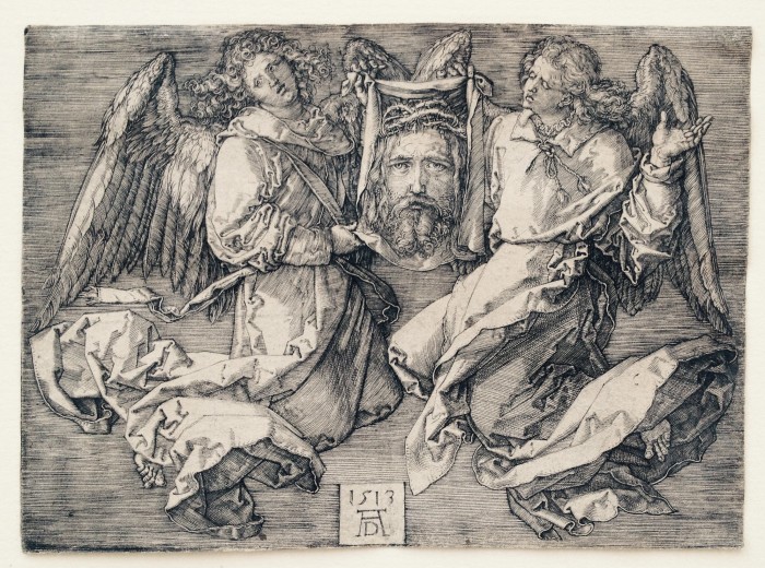
Albrecht Durer (1471-1528), Sudarium Held by Two Angels, engraving, 1513 [with the monogram and date on a tablet]. References: Bartsch 25, Meder 26, Strauss 69. In very good condition, trimmed on the platemark all around (a fold(s) visible verso, some slight thin spots verso). On a laid paper without visible watermark (Meder indicates no watermark on Meder a-c impressions). 4 x 5 l1/2 inches.
Provenance:
NATIONALMUSEUM , Cabinet des Estampes, Stockholm (with their “doublett” stamp verso, Lugt 1935). The Nationalmuseum (Stockholm) had a substantial collection of Durer prints; duplicate examples were sold in auctions in Stockholm in 1903 and 1904.
A very good Meder b/c impression, with the scratch in the drapery at the left still visible; but before the scratch from the elbow to the drapery at the right.
ON RESERVE
Posted in Uncategorized |
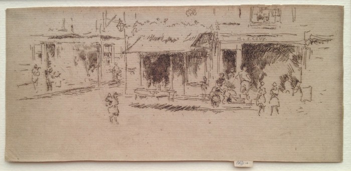
Tuesday, July 21st, 2015

James Whistler (1834-1903), J.H. Woods’ Fruit Shop, Chelsea, etching and drypoint, 1887-88. Signed with the butterfly on the tab and annotated “imp,” also titled by the artist in pencil verso. References: Kennedy 265 first state (of 2), Glasgow 327 first state (of 4). Trimmed by the artist around the plate mark except for the tab, in excellent condition. Printed in dark brown ink on laid paper, 3 3/4 x 5 1/8 inches.
A fine impression of this great rarity; the print was never published: Glasgow accounts for only a few impressions, and none of the first state (known only through an illustration in Kennedy).
Provenance:
J. H. WRENN (1841-1911), agent de change, Chicago. Estampes. (his stamp, on each of the two hinges verso, Lugt 1475.
This is before the second state in which short fine drypoint lines are added on the lower part of the window-panes at left along with more shading around the woman in the centre. In the third state much new etched shading is added around the woman in the centre. In Glasgow’s fourth state the shading and the figure were removed; no impression is known of this state, but the state is inferred from the cancelled plate.
According to Glasgow “Joseph Henry Wood had a greengrocer’s shop at 1 Park Walk (off the Fulham Road), Chelsea, London in 1887. By 1888 he was at 391 Fulham Road.” This is one of a number of Chelsea shop fronts etched by Whistler.
Posted in Uncategorized |
Friday, July 17th, 2015
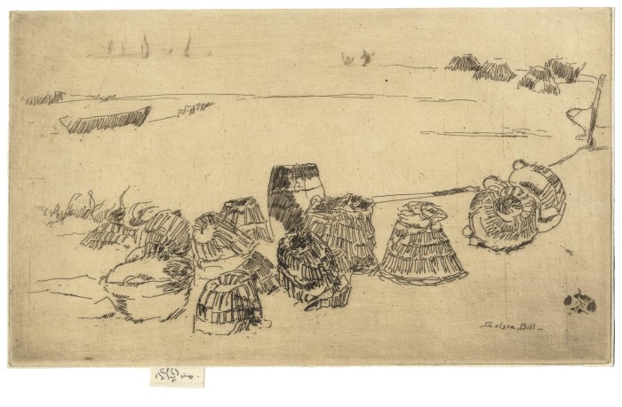
James Whistler (1834-1903), Lobster Pots – Selsea Bill, etching and drypoint, 1880-1, signed with the butterfly on the tab and inscribed “imp.” [also signed with the butterfly in the plate, and titled Selsea Bill, lower right]. Reference: Kennedy 235, Glasgow 241, fourth state (of 4). From the Twenty-Six Etchings (the Second Venice Set). In excellent condition, printed on a laid paper with a partial Strasbourg Lily watermark. 4 3/4 x 8 inches.
Provenance:
Bernard Buchanan MacGeorge (his stamp verso, Lugt 394
Henry Harper Benedict (his stamp verso, Lugt 1298)
Charles C. Cunningham (his stamp verso, Lugt 4684)
A very fine impression, printed in a brown ink with plate tone over all; wiped selectively so that the foreground is a shade darker.
The plate was first exhibited at The Fine Art Society in London in 1883. In 1886 it was published as part of A Set of Twenty-Six Etchings, the so-called “Second Venice Set,” by Messrs. Dowdeswell and Thibaudeau.
The etched inscription at lower right locates the scene in Selsea Bill, a small town on the south coast of England where Whistler was visiting Charles Augustus Howell. There is a wistfulness in this slight composition, suggesting that the print was made right after Whistler’s return from his first trip to Venice. However, as Robert Getscher aptly remarks, “even the Venetian subjects are never this inconsequential”. To our modern eyes, however, this makes the print all the more intriguing. Lobster-Pots is one of Whistler’s freest linear exercises: clusters of parallel stripes countered by aureoles of radiant hatching. Walter Sickert would soon afterwards move similarly close to pure abstraction in some of his beach-related etchings like Scheveningen, Bathing Machines of 1887 (Bromberg 95) and, especially, the small Scheveningen, Wind-Chairs and Shadows of the same year (Bromberg 91).
Posted in Uncategorized |
Monday, July 13th, 2015
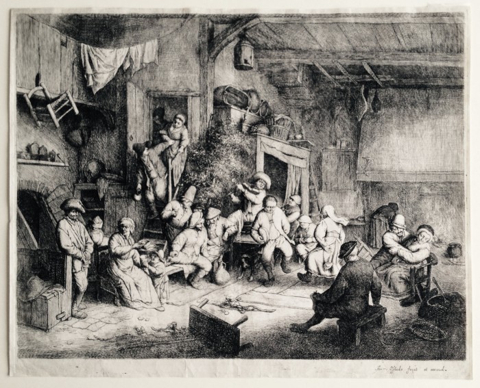
Adriaen Van Ostade (1610-1685), The Dance in the Inn, etching, c. 1652-54). Reference: Hollstein 49, Godefroy 49, sixth state (of 9). In very good condition (possible strengthening or repair upper edge, slight rippling or handing folds), with small margins, larger at bottom, 25.7 x 32.2 cm.
Provenance:
A. J. Lamme (1812-1900), Rotterdam (Lugt 138, stamp verso). Lamme was a painter, who founded the Musee Boymans in 1849 and stayed as founding director to 1870. The sale of his collection was held in Amsterdam in 1901; the collection was described by Lugt as “beaucoup d’estampes de l’ecole hollandaise..”
Watermark: Foolscap with seven pointed collar; Godefry’s watermark number 22. Godefry notes “toutes les epreuves sur lesquelles il figure sont de qualite honorable and imprimee avec soin” (all the proofs with this mark are fine and printed with care); he dates the mark as used in the period 1680-85, the latter part of Van Ostade’s life.
A fine, lifetime impression, noted by Godefry as rare in this state.
The eminent Ostade collector and scholar S. William Pelletier (who owned one fine impression of the Dance, also a sixth state), noted that this “print, the largest executed by Ostade and in many ways the most carefully executed of his entire graphic production, led Rouir to call it the artist’s “Hundred Guilder Piece”, a reference to Rembrandt’s most famous etching” (which was completed a few years earlier). The Dance is Ostade’s most complex print, and therefore has led scholars to various interpretations of the activities. For example Slatkes believed this print to be a wedding celebration. Stone-Ferrier suggested the leafy tree and branch on the floor are signs of an indoor May Day festival celebrating the transition from winter to spring. Whatever the interpretation, the composition is extraordinary.
This print is sold.
Posted in Uncategorized |
Thursday, June 11th, 2015
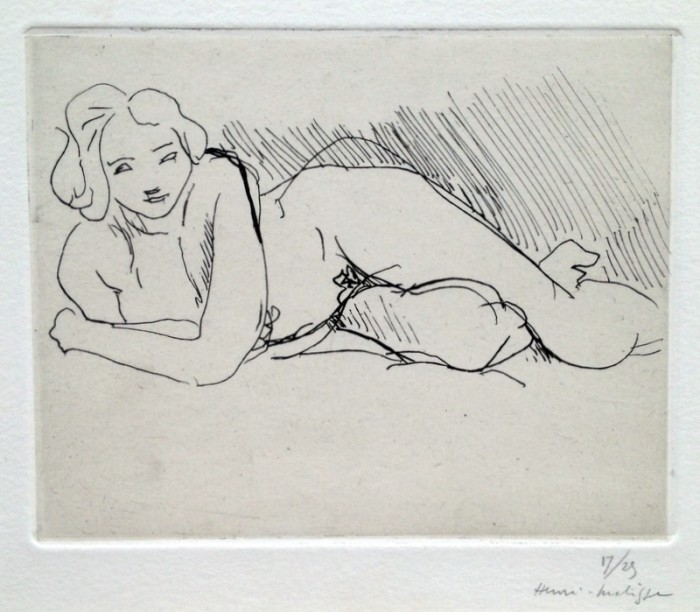
Henri Matisse (1869-1954), Nu Couché 1929, etching in black on grey/tan Chine-collé on heavy cream wove with deckle edges all around, signed and numbered (17/25) in pencil lower right. Reference: Duthuit 194, only state, from the edition of 25. In very good condition, the full sheet (slight soiling toward edges, remains of prior hinging verso), 5 x 6, the sheet 11 1/8 x 14 5/8 inches.
Provenance:
Christie’s London, July 3, 2001. (Old Master, Modern, and Contemporary Prints)
A fine warm impression of this small-editioned print, not seen on the print auction market since 2001.
In his small edition etchings and drypoints Matisse displayed a mastery of draftsmanship unmatched in modernist printmaking. Nu Couché is a splendid example of Matisse’s genius.
Posted in Uncategorized |
Monday, June 1st, 2015
James Whistler (1834-1903), Pierrot, 1889, etching, printed in brown on fine laid paper; trimmed to the platemark by the artist, signed with the butterfly and inscribed imp on the tab, also signed with the butterfly and inscribed verso [also with the butterfly in the plate, upper left]; Kennedy 407, fourth state (of five); Glasgow 450, sixth state (of eight) (cf. Margaret F. MacDonald, Grischka Petri, Meg Hausberg, and Joanna Meacock, James McNeill Whistler: The Etchings, a catalogue raisonné, University of Glasgow, 2011); Lochnan 408, 9 x 6 1/4 inches. Pierrot was never published, although it was clearly intended to be part of a (never published) Amsterdam Set. In very good condition.
Provenance:
James L. Claghorn (with [faint] stamp verso, Lugt 555c)
Also signed on the verso in pencil with the butterfly and inscribed “selected for [unclear but probably “Wunderlich”; several impressions were sent to Wunderlich, Whistler’s US dealer]
Also with initials RGO (?) in pencil, lower left verso (not identified in Lugt)
A very fine, evenly balanced impression, printing with subtle plate tone. Printed in a brownish/black ink on an ivory laid paper.
This state is before the small patches of shading were added below the windows to the left of the main doorway.
Apparently Whistler regarded Pierrot as his favorite among the Amsterdam plates. In a letter to Whistler Howard Mansfield, the famed collector, wrote: “The impression you showed me of “Pierrot” is so fine…that I feel that I must have it. The fact that it is your favorite among the Amsterdam plates makes me wish to possess it in its greatest beauty.”
The scene shows dyers on the Oudezijds Achterburgwal in Amsterdam. Although titled Pierrot or The Pierrot, and this character from the 17th Century Italian Commedia Dell’arte was experiencing a revival of interest in the late 1800’s, there is nothing apparent in the composition to suggest the fictional character; the figures depicted are workers, the main one simply a young boy wearing an apron, the other a woman rinsing a cloth in the canal.
As in the other Amsterdam views, the dark, tonal areas are no longer created purely by selective wiping – although there is much such wiping evident in the print – but by the extraordinarily dense networks of overlapping lines.
Posted in Uncategorized |
Friday, May 29th, 2015
James Whistler (1834-1903), St. James Place, Houndsditch, 1887, etching and drypoint, signed with the butterfly on the tab and inscribed “imp”. [also with the butterfly in the plate, upper center] In very good condition, trimmed on the platemark except for the tab by the artist. References: Kennedy 290 (only state); Glasgow 255, second state (of 2). 82 x 178 mm, 3 3/16 x 6 7/8 inches.
Provenance:
R.M. Light and Co., Santa Barbara, California
Dr. H. Malcolm Hardy, Shawnee Mission, Kansas (not in Lugt)
A fine impression of this great rarity, with two tiny penciled circles verso (indicating that Whistler thought a this was a particularly distinctive impression).
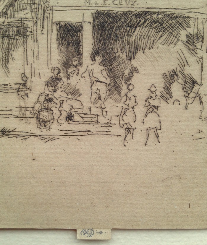
Of greatest rarity. Margaret MacDonald’s Glasgow catalogue accounts for merely eight known impressions, all of them in museum collections (to which our impression has to be added). The print is first recorded as sold by the artist in November 1887. The same year, it was exhibited at the Royal Society of British Artists during Whistler’s brief presidency. As Glasgow notes, Whistler “must have thought highly of it, and sent it to an international exhibition in Brussels in the following year.” The print was nevertheless never properly published since a “Houndsditch Set” that was planned by the artist remained unfinished. This ultimately accounts for the print’s rarity.
During 1887–88, Whistler worked on a series of etchings of the East End of London. This is one of several prints in which he depicts some of the many small businesses then operating in Houndsditch, one of the Jewish quarters. His image of a busy street scene with modest shops, including that of M. and E. Levy (a fruit shop run by the brothers Moss and Eleazor Levy), was made at a significant moment in London’s Jewish history. From 1881–84 a new influx of Eastern European Jews had arrived in the city in the wake of a wave of pogroms after the assassination of Tsar Alexander II (for which they had been scapegoated). The new immigrants, typically desperately poor, settled in the East End in areas like Houndsditch, Whitechapel, and Spitalfields where there were already existing Jewish populations, and began to work in tailoring, cabinetmaking, shoemaking, and other crafts and trades. Around the corner from St. James’s Place was the grand synagogue in Duke’s Place, built in 1692, which had long been the principal place of worship for the city’s well-to-do Ashkenazi Jews by the time Whistler made this print. (It was destroyed in a German air raid in 1942).
Posted in Uncategorized |
Thursday, May 21st, 2015
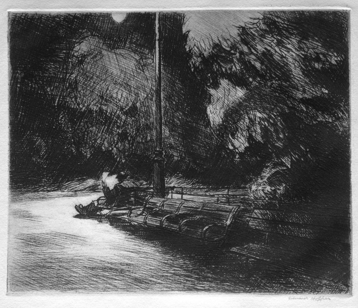
Edward Hopper (1882-1967), Night in the Park, etching, drypoint, burnishing, 1921, signed in pencil lower right and titled and priced ($30.) in pencil by the artist lower left corner recto. References: Zigrosser 20, Levin (plate 80), only state. In good condition, slight mat toning well outside of the plate mark. 6 3/4 x 8 1/4, the sheet 11 1/2 x 15 inches.
Provenance: Whitney Studio Galleries, 10 West 8th Street, New York (with their label; later becoming the Whitney Museum)
Hirschl and Adler, New York (with label)
A fine black rich impression, with plate tone carefully wiped on the sidewalk and in front of the man, and on the lamp at the top; and with a fine layer of plate tone left in the night sky.
Generally described only as an etching, Night in the Park has a substantial amount of drypoint work as well, particularly evident in the pathway, the sky, and throughout the foliage. And too, there is much evidence of burnishing, again evident in the pathway. Some of Hopper’s most complex prints are known to have been created through a series of successive states or progress proofs; Night in the Park, although among his most complex prints, is known in only one state.
Hopper’s debt to Rembrandt, particularly the scenic etchings and drypoints such as his Three Trees, is obvious in Night in the Park.
Note: on reserve
Posted in Uncategorized |
Wednesday, May 13th, 2015
Martin Lewis
1881 Castlemaine, Victoria, Australia – New York 1962
American Nocturne 1937
lithograph on wove paper; 250 x 365 mm (9 7/8 x 14 3/8 inches)
signed by the artist in pencil at lower right
McCarron 125 only state
provenance
Armin Landeck (artist and friend of Lewis)
Paul McCarron, New York
A fine impression of this great rarity, printed on a cream-colored wove paper; in very good condition with full margins.
McCarron notes that there were 17 recorded impressions of American Nocturne. In his label for this print (appended to the mat) McCarron notes that according to Lewis’s notebook only 8–14 impressions were made.
Lewis was born in Australia but immigrated to the United States in 1900, where he took on work as a commercial illustrator in New York. In 1915, he began to make etchings (and indeed, trained Edward Hopper in the technique). After a period in Japan between 1920 and 1921, Lewis returned to New York and began to produce drypoints inspired by Japanese ukiyo-e prints. From 1928 he began to make drypoints of New York City at different times of day and under different weather conditions. Kennedy Galleries offered him a solo show in 1929 and went on to publish 17 new prints by the artist over the next two years, a successful run that was only ended by the Depression; in 1932 Lewis retreated to Sandy Hook, Connecticut.
American Nocturne was made a year after Lewis’s return to New York but nonetheless suggests a kind of nostalgia for the small-town life he had left behind. There is ultimately nothing really charming about the image, however. Indeed, the shadowy black-and-white scene, with its row of identical rooftops and the man leaning into the window of the luxurious car suggesting a slightly sinister narrative, evokes the highly stylized effects of the American film noirs of this period.
Posted in Uncategorized |
Monday, May 11th, 2015
James McNeill Whistler (1834-1903), Sketch After Cecil Lawson’s “Swan and Iris,” etching and drypoint, 1882. Reference: Glasgow 247, Kennedy 241. Glasgow’s 5th state (of 6). In very good condition, with the sewing holes at the right, printed on an antique laid paper with a Strasbourg Lily watermark. 5 1/4 x 3 1/4, the sheet 7 x 4 1/2 inches.
A very fine impression of this relatively rarely encountered sketch, printed in a grey/black ink with substantial burr from the drypoint work, and with a layering of plate tone.
Cecil Lawson (1851-1882) was a painter, the husband of an elder sister of Whistler’s eventual wife Beatrice. The etching is after an unfinished Lawson painting; it was used in the memoir of Lawson published by the Fine Art Society, in 1883.
This is fifth state (of 6), before the several diagonal lines and one short, almost horizontal line are added to the lower edge of the dark shading on the left side of the arch, and extend into the bevel on that edge. This impression is particularly fine insofar as the upper left arch, and the sails of the boats at the top, are darkened with a fine layer of plate tone, accentuating the burr of the drypoint.
This is not signed in the plate, although the iris itself is reminiscent of a variation of Whistler’s butterfly.
Posted in Uncategorized |
Friday, November 28th, 2014
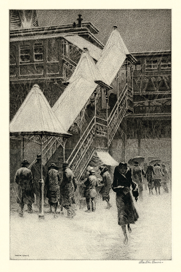
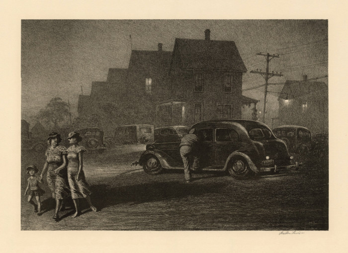
Martin Lewis ((1881-1962)
Snow on the “El”- – 1931, Drypoint and Sand Ground
McCarron 95. Edition 49 (including 5 trial proofs). Signed in pencil. Signed in the plate, lower left.
Image size 14 x 9 inches (356 x 229 mm); sheet size 17 11/16 x 12 9/16 inches (449 x 319 mm).
An exceptionally fine, richly inked impression, with velvety burr throughout, on cream laid paper, with full margins (1 3/4 to 2 inches), in excellent condition.
The location depicted is Twenty-third Street and Sixth Avenue, New York City. By the mid-20th century, a coalition of commercial establishments and building owners along Sixth Avenue campaigned to have the El removed. The El was closed on December 4, 1938 and came down in stages, beginning in Greenwich Village in 1938–39; the 6th Avenue Subway replaced it a couple of years later.
Collections: Addison Gallery of American Art, British Museum, Brooklyn Museum, Colby College Museum of Art, Detroit Institute of Arts, Herbert F. Johnson Museum of Art (Cornell University).
Posted in Uncategorized |
Sunday, October 19th, 2014
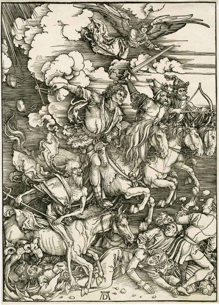
Albrecht Dürer
1471 – Nuremberg – 1528
The Four Horsemen ca. 1497–98
plate 5 from The Apocalypse
woodcut on laid paper; 395 x 279 mm (15 1/2 x 11 inches)
Bartsch 64; Meder 167 Latin edition of 1511; Schoch/Mende/Scherbaum 115
provenance
Paul Davidsohn, Berlin (Lugt 654, his stamp verso)
his sale, C.G. Boerner, Leipzig, sale 129, May 3–8, 1920, lot 1533.
A very good and evenly printing impression; in very good condition showing the borderline all round.
Illustrating the Revelation of St. John the Evangelist, chapter 6 verses 1–8, this composition counts among Dürer’s most famous images. As an icon of German Renaissance art it ranks at the same level as Dürer’s engravings of Adam and Eve and his three Meisterstiche of 1513–14.
Paul Davidsohn, born in Danzig in 1839, moved to Scotland in 1858 and then to London in 1862 where he was a merchant for 20 years, later moving to Berlin. Renowned for his Old Master print collection and connoisseurship, in his later years he also gained fame as a financier of the Silent Film era; e.g., he financed the early films of Hans Lubitsch. The sale of his collection at CG Boerner (which in that period held auctions) was the first great print sale after WWI.
Posted in Uncategorized |
Tuesday, October 14th, 2014

Rembrandt, Harmenz Van Rijn (1606-1669), Christ Preaching (La Petite Tombe), etching, burin and drypoint, c. 1657. References: Bartsch, Hollstein 67, Hind 256, only state; Nowell Usticke’s first state (early) of three, New Hollstein 298, first state (of 2). In excellent condition, with small margins all around, printed on a thin laid paper, 6 1/8 x 8 1/8 inches.
A fine balanced “black sleeve” impression, with strong burr on the drypoint, especially on the sleeve and garment of the man at the left, the garment of Christ, the arch, the wall and column upper right, beard of the man upper left, etc.
Provenance: Gerd Rosen, Berlin, sale 23 (1954), lot 1986
Dr. Otto Schäfer, Schweinfurt (with his stamp verso, not in Lugt) his sale, Sotheby’s New York, May 13, 1993, lot 21
Exhibits (and Publications):
Radierungen von Rembrandt in Ingelheim am Rhein, exhibition Ingelheim 1964, cat. no. 13
Kunst und Können. Drei Graphische Techniken und ihre Meister aus der Sammlung Otto Schäfer, exhibition Martin von Wagner Museum der Universität Würzburg / Städtische Sammlungen Schweinfurt, 1985-86, p. 240, cat. no. R-25, p. 241 ill.
In this print Rembrandt revisits the theme of his magnum opus, the so-called Hundred Guilder Print of ca. 1648 (Bartsch 74). This smaller, condensed version is one of the artist’s most balanced compositions. It has a classical serenity that has led scholars to point to the influence of Raphael’s Vatican fresco of Parnassus. Martin Royalton-Kisch notes that in 1652 Rembrandt sketched a version of Raphael’s work, well-known at the time through reproductive prints, in the album amicorum of his friend Jan Six. After establishing the overall scheme with a straightforward combination of horizontal and vertical elements, the artist enriched the details and atmospheric effects by going over the etched plate with a drypoint needle, thereby creating a lively “dialogue between clean etched lines and velvety drypoint lines fringed with rich burr” (Clifford Ackley, see reference below).
The Petite Tombe has traditionally been dated to ca. 1652. Based on his watermark research Erik Hinterding now proposes an execution date of ca. 1657 (cf. The New Hollstein: Rembrandt. Text, vol. 2, p. 270). Its somewhat confusing title was introduced by Gersaint in 1751 and later mis- understood as making reference to the “little tomb” on which Christ supposedly stands. In fact, this title refers back to Clement de Jonghe’s inventory where it is listed as “Latombisch plaatjen” (La Tombe’s little plate), a reference to Nicholas La Tombe who might have commissioned the work. Members of the La Tombe family are noted in documents relating to Rembrandt dating to between 1650 and 1658.
The early impressions of La Petite Tombe are sometimes referred to as “black sleeve” impressions because of the burr on the sleeve of the man standing left front, which creates a black effect; in later impressions this area whitens. In such impressions there is also burr on the beard of the man in the top left corner, and on Christ’s garments.
Rembrandt printed impressions of La Petite Tombe on both European papers (as in our example) and Japan papers. The latter, which tend to be less absorbent, produce washlike patches of tone where the drypoint burr would otherwise be absorbed by the paper, and the resulting look is painterly, soft and fluid. The European paper impressions have a clearly defined, structural, architectural look. This impression is particularly well balanced, adding to the sense of calm reflectiveness among the listeners (as well as the child playing in the foreground).
literature:
Erik Hinterding, Ger Luijten, and Martin Royalton-Kisch (eds.), Rembrandt the Printmaker, exhibition catalogue, Rijksprentenkabinet, Amsterdam/British Museum, London, 2000–01, no. 68 Clifford S. Ackley et al. (eds.), Rembrandt’s Journey: Painter, Draftsman, Etcher, exhibition catalogue, Museum of Fine Arts, Boston/Art Institute of Chicago, 2003–04, nos. 136f.
Posted in Uncategorized |
Tuesday, October 14th, 2014
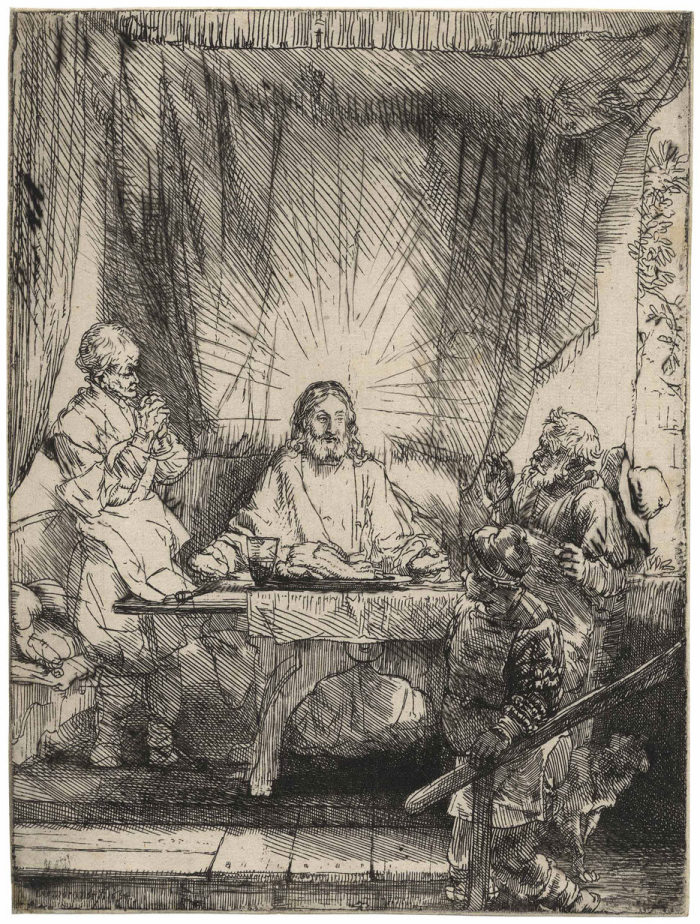
Rembrandt Harmensz. van Rijn 1606 Leiden – Amsterdam 1669
Christ at Emmaus: the larger plate 1654 etching and drypoint; 213 x 161 mm (8 3⁄8 x 6 5/16 inches)
Bartsch 87, White/Boon second state (of three); Hind 282; New Hollstein 283 second state (of five)
provenance
August Artaria, Vienna (Lugt 33);
his sale, Artaria & Co., Vienna, May 6–13, 1896, lot 534, described as: superbe épreuve avec beaucoup de barbes. Rare.
Julius Rosenberg, Copenhagen (Lugt 1519 and 1520);
his sale, C.G. Boerner, Leipzig, May 1–2, 1901, lot 178, described as: prachtvoller Abdruck des zweiten Zustandes, mit starkem Grat … Aus Sammlung Artaria.
Dr. Julius Elischer von Thurzóbánya, Budapest (Lugt 824)
P. & D. Colnaghi & Co., London (their stock no. in pencil on the verso C. 12793)
Percival Duxbury (1872–1945), Bredbury, Cheshire (acquired from the above in 1936)
Lilian Honor Lewis (by descent; d. 2013)
In this “larger plate” Rembrandt revisits a subject he first etched in 1634. The lively scene in the earlier print (Bartsch 88) looks like a vignette from everyday life while 20 years later the image is imbued with a monumental solemnity. Artists traditionally depict this scene showing Christ at the moment when he is breaking the bread. Rembrandt chooses the next instant, when the true identity of the traveler is revealed to the two disciples who had encountered him on their way to Emmaus (Luke 24:13–31). The translucency of the lightly etched composition fits the spiritual content at the core of the biblical story, emphasizing the ethereal figure of Christ shortly before he “vanished out of their sight.”
Christ at Emmaus belongs to a group of four vertical plates depicting scenes from the Life of Christ that are often understood as parts of a projected Passion series; the other three are The Presentation in the Temple: in the Dark Manner (Bartsch 50); The Descent from the Cross by Torch- light (Bartsch 83); and The Entombment (Bartsch 86). Christ at Emmaus and The Descent from the Cross are the only ones dated in the plate, both 1654. The solemn Presentation and the somber Descent from the Cross are both densely wrought dark compositions; the Entombment makes the transition between light and dark from the first to the second state whereas the present plate remains “lightly etched,” with only minimal, albeit effective, drypoint work added in the second state (New Hollstein’s states three through five no longer originate with Rembrandt). It is worth speculating that a fifth plate, Christ Appearing to the Apostles (Bartsch 89), this one a horizontal composition but with precisely the same measurements, dated 1656, and also known only as a “lightly etched” print, might also have been part of such a late Passion cycle.
In the purely etched first state, the head and halo of Christ appear as if they have not actually been finished—even if the survival of at least 25 impressions, according to New Hollstein, proves that Rembrandt did pull a small edition. In this, the second state, he added a lot of work, all of it in drypoint. There are more rays in the halo, and, most importantly, the face of Christ has now been completed. However, the burr on the drypoint strokes wore away quickly. The patches of burr showing in our impression along the slanted lines of the curtain and on the hat of the man on the right most effectively indicate that this is a very early pull—representing the artist’s full realization of this mature composition.
Posted in Uncategorized |
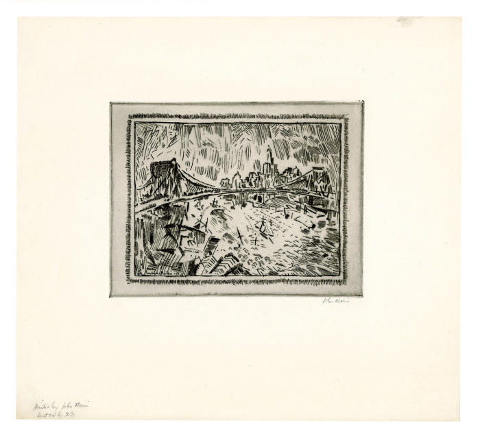
Monday, October 13th, 2014
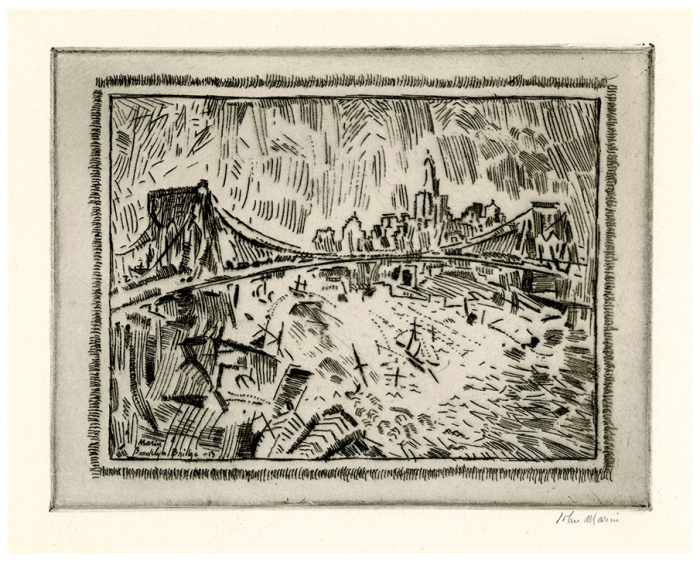
John Marin (1870-1953), Brooklyn Bridge and Lower New York, etching and drypoint, 1913, signed in pencil bottom right and inscribed in pencil by the artist “Printed by John Marin/sent out by 291” lower left margin. Reference: Zigrosser 106, second state (of two). Published by Alfred Steiglitz, 291 Fifth Avenue, New York. The full sheet, in very good condition, 6 7/8 x 8 7/8, the sheet 14 3/16 x 15 5/8 inches.
A very fine impression of this great rarity, printed with a veil of plate tone carefully wiped to lighten the center of the composition.
The composition was completed in the first state, known in only a few impressions; in the second state Marin added drypoint accents to the structures below the bridge, the boats in the river, the sky, and to the bridge as well.
Provenance:
Agnes and Eugene Meyer, Mount Kisco, NY; and then by descent to the family
Zigrosser called for an edition of 25 prints on Whatman paper plus a large edition after steel-facing on Van Gelder for the New Republic set in 1924. But he was mistaken in identifying this print as used in the New Republic set; Brooklyn Bridge Swaying No. 6 (Z 112) was initially used for that set but substituted after a few impressions by Downtown the El (Z 134). It is also not clear that the edition of 25 is accurate, for Zigrosser knew of only about a half dozen impressions, in major museums, and the print is virtually never seen on the market.
Brooklyn Bridge and Lower New York is among the earliest, if not the earliest, of the cubist-influenced prints Marin made after working for several years in a Whistlerian/realist idiom. When shown at Steiglitz’s 291 Gallery in 1913 Marin wrote some notes of explanation, including this statement: “I see great forces at work; great movements….In life all things come under the magnetic influence of other things; the bigger assert themselves strongly, the smaller ones not so much, but still they assert themselves, and though hidden they strive to be seen and in so doing change their bent and direction….While these powers are at work pushing, pulling, sideways, downwards, upwards, I can hear the sound of their strife and there is great music being played….And so I try to express graphically what a great city is doing.”
Marin’s modernist prints, done in the same year as the 1913 Armory Show, represent a new direction in American art.
Posted in Uncategorized |
Friday, October 10th, 2014
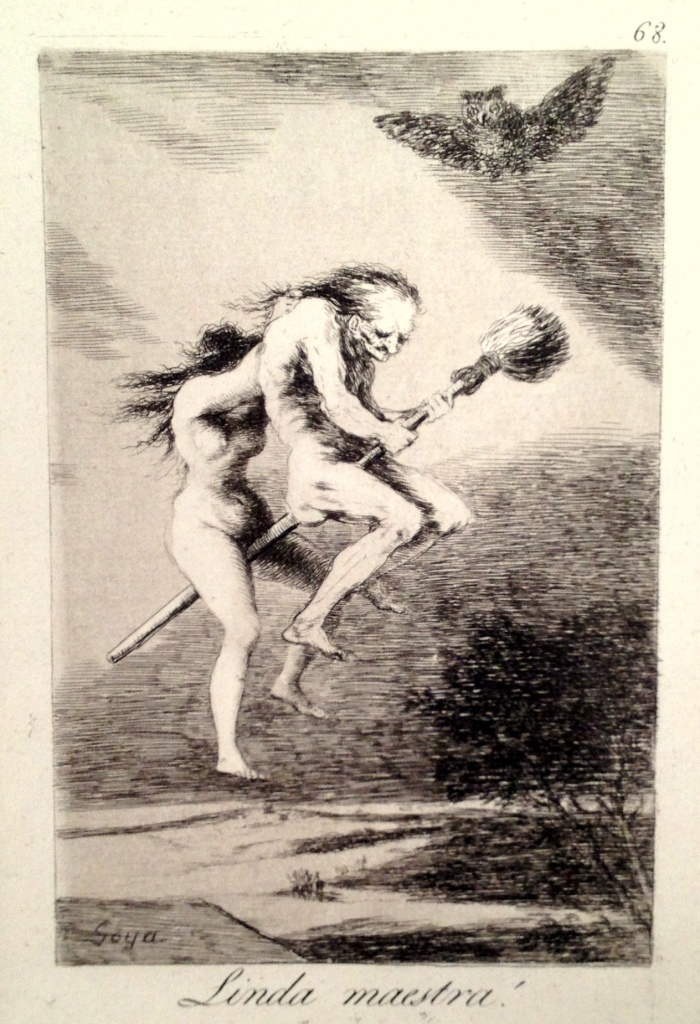
FRANCISCO JOSE de GOYA y LUCIENTES (1746 – 1828)
LINDA MAESTRA (Pretty Teacher) 1799 Delteil 105; Harris 103)
Etching, burnished aquatint and drypoint, Plate 68 from the first edition of “Los Caprichos”. In good condition, the full sheet, 8 ¼ x 5 7/8, the sheet 11 3/4 x 8 3/8 inches.
A very good impression, with the fine grain aquatint contrating slightly with the highlights on the head and shoulder of the old witch, down the right side of the second witch.
Harris notes that in the later (posthumous) editions the aquatint wears down gradually until the plate prints as a pure etching with a slight general stain.
Goya’s commentary: The broom is one of the most necessary implements for witches; for besides being great sweepers, as the stories tell, they may be able to change the broom into a fast mule and go with it where the Devil cannot reach them.
Posted in Uncategorized |
Thursday, October 9th, 2014
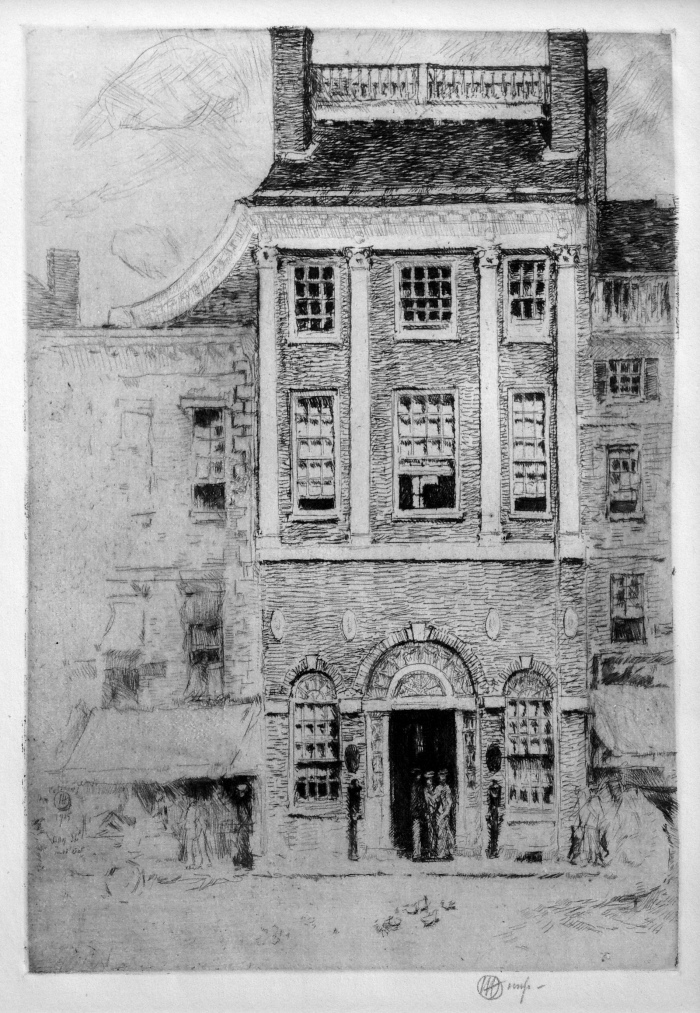
Childe Hassam (1859-1935), The Athenaeum, Portsmouth, etching and drypoint, 1915, signed in pencil with the cypher lower right and inscribed “imp”, also titled in pencil lower left toward the sheet edge. [also signed, titled and dated in the plate, with “Dot”, center left] Printed on an antique Bible paper. Reference: Cortissoz/Clayton 14. In very good condition, with full margins, with the usual drying tack holes Hassam employed when printing personally, 8 1/2 x 6 inches, the sheet 11 7/8 x 9 1/4d inches.
A fine impression of this great rarity, with selectively wiped plate tone highlighting the upper windows of the building, with rich burr from the drypoint work at the left and right sides of the composition.
Cortissoz notes: “Done from nature in Miss Dorothy Whitcomb’s car.”
“The facade of the masterpiece by Charles Bullfinch….This is one of the three buildings by Bullfinch in this beautiful old American Town.” (Cortissoz)
Hassam loved to use old Bible paper for printing when possible; here the verses (from Psalms, CVIII and CIX) are on the left side of the sheet and the rest of the sheet was reserved for commentary.
This is a relatively early etching for Hassam, although he was not young when he created it – he began printmaking in earnest in mid-career, well after he had achieved renown as America’s great impressionist master.
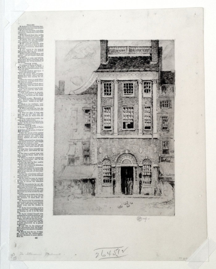
Hassam – The Athenaeum, Portsmouth, the full sheet
Posted in Uncategorized |
Tuesday, August 26th, 2014
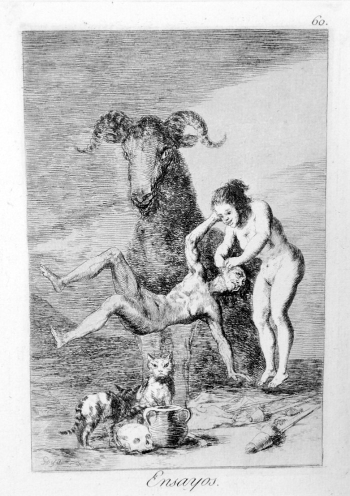
Francisco Goya (1746-1828), Ensayos (Trials), etching, aquatint and burin, 1799. Plate 60 of the Caprichos, First Edition. Harris 95, Delteil 97. In very good condition (with the binding holes showing at left), printed in sepia on a soft but strong laid paper, 8 1/16 x 6 1/2, he full sheet, 12 1/16 x 8 3/4 inches.
A fine impression.
Harris notes that the fine grain aquatint in one pale tone contrasts with the highlights on the central figure’s chest, the cat and the skull in the foreground, and with the highlights on the ‘teacher,’ particularly in the early impressions where the aquatint forms a line across her stomach. In this impression these aquatint highlights are quite prominent, as is the line across the teacher’s stomach.
Goya’s commentary: “Little by little she is making progress. She is already making her first steps and in time she will know as much as her teacher. ” The drawing in pen and sepia ink has a legend elucidating this note: “Trial of novice witches on their first flight and they set to work with fear.”
Posted in Uncategorized |
Thursday, August 14th, 2014
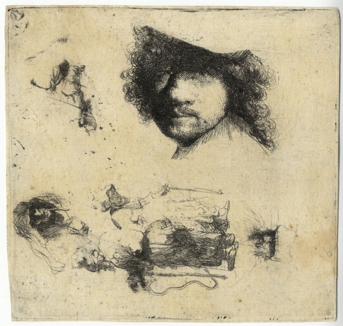
Rembrandt Harmensz. van Rijn (1606-1669), Sheet of Studies: Head of the Artist, a Beggar Couple, Heads of an Old Man and Old Woman, etc., etching, 1632. References: Bartsch, Hollstein 363, New Hollstein 115, Hind 90. In good condition (apart from traces of a diagonal fold, minor staining). Second state (of 2), 4 x 4 1/8 inches.
A fine early impression of this rare print.
Provenance:
ex Coll. Viscount Downe (?, with stamp verso, cf. Lugt 719a);
Helmut H. Rumbler (Frankfurt-am-Main, stock number 33004 verso)
C.G. Boerner (New York, Dusseldorf, stock number 28987 / RZ verso)
Gerardo Rueda (Spain, 1926-1996); Rueda was a painter and sculptor well known for his art collection as well as his own work.
Nowell-Eusticke rates its rarity RR+ (“a very scarce sheet of 1632”).
In addition to the large self portrait the sheet portrays a beggar couple, an old man, an old woman, and other elements. Such sheets, both in drawings and a number of etchings, belong to the tradition of “model books.”
Posted in Uncategorized |
Wednesday, August 13th, 2014
Rembrandt Harmensz. van Rijn
1606 Leiden – Amsterdam 1669
Jan Lutma, Goldsmith 1656
etching, engraving, and drypoint on thin chine; 196 x 150 mm
Bartsch 276, White/Boon 276 first state (of three); Hind 290; New Hollstein 293 first state (of five)
provenance
John Malcolm, Poltalloch, Argyleshire, Scotland and London (cf. Lugt 1489)
British Museum, London, acquired from the above in 1895 (cf. for the museum’s stamps designated to the Malcolm collection Lugt 1780–81; all the above according to the annotated Colnaghi label on the old backing of the frame)
P. & D. Colnaghi & Co., London (their stock no. in pencil on the verso C.21644)
Percival Duxbury (1872–1945), Bredbury, Cheshire (acquired from the above in 1936)
Lilian Honor Lewis (by descent; d. 2013)
New Hollstein lists three other impressions on Chinese paper.
Jan Lutma (c. 1584-1669) was a master gold and silversmith; he holds an object with a turned stem (possibly a candlestick) in his right hand, and on the table at his left is a drinking bowl.
Rembrandt used a fine needle to draw the portrait and furniture; then enriched the plate through hatching and drypoint. In this impression one can observe substantial drypoint burr, particularly in Lutma’s coat. In the second state Rembrandt added a window in the room (with a signature and date in the upper left pane), and shadows on the wall.
Posted in Uncategorized |
Wednesday, August 13th, 2014
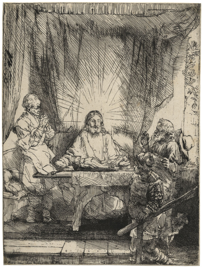
Rembrandt Harmensz. van Rijn
1606 Leiden – Amsterdam 1669
Christ at Emmaus: the larger plate 1654
etching and drypoint;
Bartsch 87, White/Boon second state (of three); Hind 282; The New Hollstein 283 second state (of five)
provenance
August Artaria, Vienna (Lugt 33);
his sale, Artaria & Co., Vienna, May 6–13, 1896, lot 534, described as superbe épreuve avec beaucoup de barbes. Rare.
Julius Rosenberg, Copenhagen (Lugt 1519 and 1520);
his sale, C.G. Boerner, Leipzig, May 1–2, 1901, lot 178, described as prachtvoller Abdruck des zweiten Zustandes, mit starkem Grat. … Aus Sammlung Artaria.
Dr. Julius Elischer von Thurzóbánya, Budapest (Lugt 824)
P. & D. Colnaghi & Co., London (their stock no. in pencil on the verso C. 12793)
Percival Duxbury (1872–1945), Bredbury, Cheshire (acquired from the above in 1936)
Lilian Honor Lewis (by descent; d. 2013)
An extraordinarily fine very early impression, with substantial burr from the drypoint work added in this state. Subsequent states are posthumous.
Posted in Uncategorized |
Monday, July 28th, 2014
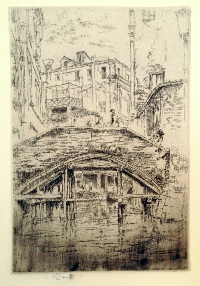 James McNeill Whistler (1834-1903), Ponte del Piovan, 1879-1880, etching and drypoint, signed on the tab with the butterfly and inscribed “imp.” [also signed with the butterfly in the plate, toward the right on the bridge] References: Kennedy 209, Glasgow 220, fifth state (of 6).It was published (in the fifth and sixth states) by Messrs Dowdeswell and Thibaudeau with A Set of Twenty-six Etchings (the Second Venice Set) in 1886. This is the impression cited and illustrated in Kennedy as the fourth state example; and noted as in the collection of W. Dowdeswell.
In very good condition, trimmed around the plate mark except for the tab by the artist. Printed in a dark brown ink on a laid paper. With a tiny W and a “0” verso, possibly by Whistler; also annotated “second state” verso in pencil, 8 7/8 x 6 inches.
Provenance: letters SMS in pencil verso (not in Lugt).
Walter Dowdeswell (1858-1929), as listed by Kennedy (cf. Lugt 799). Dowdeswell was a London art dealer, and also a collector of Whistler’s work.
watermark: partial crowned shield with fleur-de-lis (cf. Spink/Stratis/Tedeschi, watermark nos. 284f.)
An extremely fine impression, with intense plate tone toward the bottom of the sheet, and with much burr on the drypoint work added for this state.
This impression was surely printed early in or before the edition, for prints from the edition typically show much wear in the drypoint work (so much so that Kennedy thought the worn impressions constituted a new state).
According to Glasgow, the Ponte del Piovan, Venice, Italy, “has been rebuilt several times, but the view is still remarkably unchanged. The etching was drawn from a gondola, looking north down the Rio de Ca’ Widmann to the Ponte del Piovan detto del Volto, with the Palazzo Widmann beyond. This view, drawn accurately on the copper plate, is reversed, as usual, in the print.
Although Glasgow notes that approximately 44 impressions of Ponte del Piovan were published for the Second Venice Set edition, the print has appeared only rarely on the market in the last 25 years.
Posted in Uncategorized |
Saturday, May 17th, 2014
James Abbott McNeill Whistler (1834 Lowell, Massachusetts – London 1903), Nocturne: Palaces 1879–80, etching and drypoint printed in dark brown on off-white laid paper; 298 x 201 mm (11 3/4 x 7 7/8 inches), trimmed by the artist just outside the platemark all round; signed in pencil with the butterfly and inscribed imp on the tab; Kennedy 202 before first state (of eight); Glasgow 200 intermediary state between the first and the second (of twelve)
watermark: crowned shield with hunting horn and pendant letters wp
provenance
Frederick Keppel & Co., New York (their stock no. in pencil on the verso a10068)
Mrs. John D. Rockefeller
Mr. and Mrs. John D. Rockefeller III
Dr. and Mrs. James W. Nelson
Linda Papaharis, New York
Samuel Josefowitz, Pully, Switzerland (acquired in 1988)
A superb impression with carefully modulated tonal wiping; with substantial burr from the drypoint work especially towards the top and bottom of the composition, in impeccable condition.
Before the row of small vertical strokes in the water immediately below the wall of the left palace, to the left of the patch indicating the doorway’s reflection. Those strokes are already visible in Kennedy’s first state but not yet in the second state described in the Glasgow catalogue. However, Glasgow’s second state does show a vertical band of short horizontal lines along the left edge of the shadow cast on the water by the bridge. These horizontal strokes are clearly missing in our impression, making it therefore an intermediary state between Glasgow’s first and second states.
The unique first state in the Freer Gallery of Art in Washington, D.C. is annotated by the artist “1st state 1st proof”; while the composition is basically finished, it lacks any of the tonal wiping characteristic for this print and was never trimmed to the platemark. Apart from this unique “proof,” the present sheet can therefore be considered as the earliest known impression pulled from the “finished” plate. We believe this is the only recorded impression of this new “second” state.
Each impression of Nocturne: Palaces is different from the others, in effect a monotype, expressing different times of night or day, temperatures, effects of light. Margaret MacDonald in her classic Palaces in the Night: Whistler in Venice amplifies: “Nocturne: Palaces was a daring plate: difficult to print, relying heavily on the quality of the ephemeral drypoint lines…in the best impressions it is the inking of the plate that coordinates and unifies the widely dispersed lines of shading. The linear pattern of marks is unusual and the inking makes each print unique.”
Posted in Uncategorized |
Thursday, May 15th, 2014
James Whistler (1834-1903), The Embroidered Curtain 1889, etching and drypoint, printed in brown on laid paper; 240 x 159 mm (9 1/2 x 6 1/4 inches), trimmed on the platemark all round; signed in pencil with the butterfly and inscribed imp on the tab [also signed with the butterfly upper left], Kennedy 410 first state (of seven); Glasgow 451 first state (of ten)
watermark: Pro Patria
provenance
Robert Rice, his mark (not in Lugt) on verso of backing sheet
David Tunick, Inc., New York (his code in pencil on verso of backing sheet DT …)
Gordon Cooke Ltd., London
Samuel Josefowitz, Pully, Switzerland (acquired in 1989)
Literature
Sixty-Five Prints by James McNeill Whistler, sale catalogue, David Tunick, Inc., New York 1975 (Catalogue Number 7), no. 43
A very fine, shimmering impression of this great rarity; only a few other first state impressions are recorded, one at the Metropolitan Museum of Art in New York, another at the Art Institute of Chicago.
Posted in Uncategorized |
Thursday, May 8th, 2014
Dusart – The Village Festival
Cornelis Dusart (1660-17040), The Village Festival, etching, 1685 [signed in the plate lower left “Corn. duSart fe/1685]. References: Bartsch 16, Hollstein 16, second state (of 3). In very good condition, 10 x 13 1/8 inches.
Ex. Collection Charles Ryscamp
A fine impression of this lively, complex composition.
In this monumental portrayal Dusart creates a deep perspective, with very dark figures in the foreground, most of the action in the middle distance, and in the farthest distance a church steeple, distinct only in early impressions such as ours. The inn’s banner identifies it as the “Gulde Schenk Kan” (Golden Tankard).
Dusart was a favored pupil of Adriaen van Ostade, and apparently inherited much of the contents of Ostade’s studio, for the inventory of his estate contained many drawings by Adriaen and his brother Isaak. As is evident by The Village Festival, Dusart was influenced by the Ostades, as well as other Dutch masters such as Jan Steen.
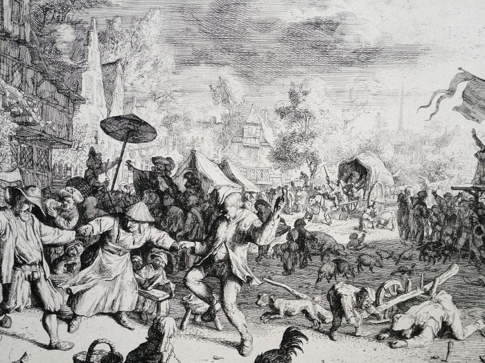
detail
Posted in Uncategorized |
Saturday, April 26th, 2014
Martin Lewis (1881-1962), Shadow Dance – – 1930, Drypoint and Sand Ground.
McCarron 88. Edition 109 (including at least 7 trial proofs). Signed in pencil. [Signed in the plate, lower right].
Image size 9 7/16 x 10 7/8 inches (240 x 276 mm); sheet size 13 1/8 x 14 7/8 inches (333 x 378 mm).
A superb, rich impression, on cream laid paper, with full margins (1 3/4 to 2 inches); in pristine condition.
One of Lewis’s great Precisionist works, and an icon of American printmaking, as well as a wonderful New York image. McCarron notes that initially Lewis named this Shadow Dance, Sunset, but then shortened the title. In a note found on another impression it is mentioned that the man on the left is Lewis himself. The setting is Park Avenue at 34th Street, Manhattan.
Posted in Uncategorized |
Friday, February 28th, 2014
Whistler – The Little Nude, Reading
James Whistler (1830-1903), The Little Nude Model, Reading, lithograph, 1889-90; [signed with the butterfly in the stone]. Reference: Spink 33, Way 29, only state. Printed by Goulding, January 1904, on a medium weight ivory laid paper with the watermark OWP & AOL, Spink watermark #219. In generally good condition (irregular mat staining outside of the image, a small paper loss left edge) on a large sheet, 10 1/4 x 7 3/4, the sheet 14 3/4 x 10 1/4 inches.
Provenance:
Colnaghi, London (with their stock number C4540 lower right recto)
Unidentified collector (circular stamp lower left verso, not found in Lugt)
Kennedy Gallery (with stock number A97479 verso)
Initials in pencil DK and HNO verso (not in Lugt, possible stock refererences)
A good impression of this popular image. Little Nude Model, Reading sold better than any other lithograph in Whistler’s 1895-6 exhibition at the Fine Art Society, and only one impression remained in his estate in 1903.
A total of 28 impressions of The Little Nude Model, Reading were made by Way, and just after Whistler’s death an edition of 55 were printed by Goulding.
Posted in Uncategorized |
Monday, November 25th, 2013
We are pleased to offer an extraordinary group of George Bellows lithographs, from a private collection, representing all major areas of Bellows’s printed oeuvre, including iconic boxing images, examples of prints from the War Series, New York scenes, vignettes of American life, and portraits of the artist and his family and friends. A listing of these lithographs is shown below (some may not be available as this offering continues). These are being sold individually. Inquiries are welcome, via phone or e mail.
The Life Class, First Stone
Mother and Children (“June Again”)
Artists Judging Works of Art
Business Men’s Class (Business Men’s Class, Y.M.C.A.) Preliminaries (Preliminaries to the Big Bout)
The Life Class, Second Stone (The Model, Life Class)
Shower-bath
Dance in a Madhouse
Tennis (Tennis Tournament)
The Tournament (Tennis at Newport)
Sunday 1897 (Sunday, Going to Church)
In the Subway
The Hold Up, first state
Counted Out, Second Stone
Introductions
Introducing Georges Carpentier
The Black Hat (Emma in a Black Hat)
Married Couple
Billy Sunday
Between Rounds, Small, Second Stone
Business Men’s Bath
The Dead-Line (The Strikers)
Punchinello in the House of Death
The Irish Fair
The Return to Life
The Garden of Growth
The Crowd, second state
Farewell to Utopia
The Drunk, first stone
The Drunk, second stone
The Actress (Lady of 1860, The Actress)
Wedding
Dempsey and Firpo
Dempsey Through the Ropes
Anne in a Black Hat
Jean in a Black Hat, first state
Portrait of Mrs. Herb Roth
Drawing: Nude Study, Boy on a Raft
Posted in Uncategorized |
Tuesday, November 19th, 2013
Howard Cook (1901-1980), Chrysler Building (Chrysler Building in Construction) – –1930, Wood Engraving.
Duffy 122. Edition 75, only 50 printed. 1931, signed in pencil.
Image size 10 1/16 x 6 11/16 inches (256 x 170 mm); sheet size 11 7/8 x 9 inches (302 x 229 mm).
A superb, black impression, on thin cream wove Japan paper, in excellent condition.
By the early 1930s, Cook’s prints of New York, especially its skyscrapers and bridges, were widely known and often reproduced in such magazines as Harpers and The Atlantic Monthly. The first solo exhibition of his prints was held in 1929 at the Weyhe Gallery in New York.
While Cook’s lithographs of New York were made in collaboration with the printer George Miller, he insisted on printing his woodcuts and etchings himself. Cook lived in New Mexico for much of his life, and only took up residence in New York for varying periods between 1930 and 1938; nonetheless, he remains most renowned for the prints he produced of what he described as “the endearing serrated skyline of the most exciting modern city in the world”.
Here Cook shows the Chrysler Building before the addition of its famous art deco “crown.” For a brief period after it was finished and before the completion of the Empire State Building in 1931, it was the tallest building in the world. Cook’s perspective of the illuminated building, seen from below, enhances a sense of its looming monumentality; this is further reinforced by the dark geometric forms of the smaller surrounding buildings.
Posted in Uncategorized |
Monday, November 18th, 2013
Peggy Bacon (1895-1987), The Swiss Restaurant, 1918, etching and drypoint, signed, titled and annotated “For Sandy” in pencil. Reference: Janet Flint 17, only state, no edition known. In very good condition, with margins, 5 7/8 x 7 7/8, the sheet 8 3/8 x 9 3/4 inches.
A fine rich impression with substantial burr from the drypoint work.
The Swiss Restaurant was a favorite eating place for students of the Art Students League, near Carnegie Hall. The inscription “For Sandy” refers to Bacon’s son, Alexander Brook.
Peggy Bacon was born in Ridgefield, Connecticut. She studied at the Art Students League with John Sloan, Kenneth Hayes Miller, and George Bellows. Bacon is known to many audiences, for she created paintings and prints, wrote poetry and novels, and illustrated over 60 children’s books. Print lovers know her best for her splendid drypoint compositions, including early modernist works, and her satirical portrayals of both rural and New York life.
Posted in Uncategorized |
Friday, September 27th, 2013
Posted in Uncategorized |
Wednesday, September 11th, 2013

Reginald Marsh (1898-1954), Smokehounds, 1934, Etching
Sasowsky 158. Edition 13. Signed in pencil. [Initialed and dated in the plate, lower right.]
Image size 11 7/8 x 8 13/16 inches (300 x 224 mm); sheet size 14 1/4 x 10 3/4 inches (362 x 273 mm).
A fine, crisp impression, on BFK Rives off-white wove paper, with full margins (7/8 to 1 3/8 inch). A repaired tear (3/8 inch) in the bottom left sheet edge, well away from the image, otherwise in excellent condition. Printed by the artist. Very scarce.
Marsh made a single trial proof of each of the eight states prior the definitive ninth state, but the design was complete in the first state. He successively added small changes in the successive states after the first; in the ninth he added shading lines in the lower left part of the girder at the left, and some additional shading to the left of the man standing at the far left. In his notes he mentioned that two of the prints among the thirteen he printed in the ninth state were “defective”, so the actual number of prints in the “edition” was surely fewer than 13 (and of course Marsh’s estimates of estate size were frequently off; he typically noted that the number of impressions in the final state was more than it actually was).
A painting by the artist of the same subject is in the permanent collection of the Corcoran Gallery of Art, Washington, DC.; a drawing of the subject is in the Fogg Art Museum at Harvard. The title refers to the Bowery dwellers’ intoxication from cheap alcohol, popularly called “smoke.”
Posted in Uncategorized |
Thursday, September 5th, 2013
Albrecht Dürer (1471 – Nuremberg – 1528), The Adoration of the Magi 1511, woodcut; 295 x 221 mm, Bartsch.3; Meder 208 b (of i); Schoch, Mende and Scherbaum 225
watermark: bull’s head and flower and initials JZ (Meder 70)
provenance
Graf Yorck von Wartenburg, Klein-Oels, Silesia (Lugt 2669);
his sale, C.G. Boerner, Leipzig, May 2-3, 1932, lot 382; 750 Marks to Guiot
Gabriel Cognacq, Paris (Lugt 538d);
his sale, M. Rousseau, Drouot, Paris, May 21, 1952, lot 105; 34,000 francs
P. & D. Colnaghi & Co., London (stock no. 28704)
Richard Zinser, Forest Hills, NY
thence by descent
N.G. Stogdon, cat. VIII: German and Netherlandish Woodcuts of the Fifteenth and Sixteenth Centuries, 1991-92, no. 34
The print was made the same year Dürer published another version on this subject in the cycle of the Life of the Virgin (Meder 199; this latter print was actually executed earlier in ca. 1501-03). The 1511 version is slightly larger than the blocks in the series and it was clearly intended as a separate single-leaf print. Therefore, it presents an excellent opportunity to observe the remarkable artistic development between the two treatments of the same subject: Dürer brings a greater clarity and monumentality to the individual forms as well as to the whole composition. Ultimately, he redefines the traditional devotional image within a new artistic form.
Meder’s states (a) and (b) differ only in the watermark; Dürer seemed to have used paper with a high crown watermark (Meder 20) for part of his earliest edition of this print and even his state (a) already shows first traces of a fine vertical crack in the block at top and bottom; as described by Meder under (a), this crack is hardly noticeable in the present impression.
A very fine impression; the borderline visible all round; glue marks stemming from an old album mount visible only on the verso, otherwise in excellent condition.
Posted in Uncategorized |
Tuesday, August 20th, 2013
Jacques Lipschitz (1891-1973), Lutteurs (Fighters), etching, aquatint, burin, c. 1940, signed in pencil lower right and numbered 8/33 lower left, from the presumed edition of 33. In very good condition, with margins (slight soiling in margins) printed on a cream wove paper. 13 3/4 x 9 15/16, the sheet 18 1/2 x 13 inches.
A fine, strongly printed impression, in black ink on medium weight ivory/cream laid paper.
An impression of this print in the collection of the University of Virginia Museum of Art, from the T. Catesby Jones Collection, is titled: The Road to Exile.
Lipschitz has worked this plate in sculptural terms: the etched lines are bitten deeply, the engraved lines are cut vigorously, and the aquatint is drawn in effective contrasts against a deep black background, so that the printmaking itself heightens the drama of the composition.
Lipschitz, born in Druskeniki, Polish Lithuania, began his art studies at Vilna but went to Paris in 1909 to study at the famed Academy Julian, and then at the Ecole des Beaux-Arts. He focused on sculpture; was influenced by Archipenko, African sculpture, and of course Cubism; became a close friend of Juan Gris and an admirer of Rodin. While in Paris he explored printmaking at Stanley William Hayter’s Atelier 17. (Hayter, a British painter-printmaker, had established a workshop in Paris in 1927 where he taught classes in etching and engraving to artists interesting in printmaking, and provided facilities for established artists such as Picasso, Ernst, Calder, Chagall, Giacometti, as well as Lipschitz. In 1940 he moved the workshop to New York.) In 1941, after Hitler’s army occupied France Lipschitz escaped to the United States, where after a short time he resumed his connection with Hayter, completing his very few intaglio prints (probably only about 7 in all) which were rich and inventive studies and variations in Cubist volume, mostly related to the theme of the Minotaur, a subject he also explored in his sculpture.
Posted in Uncategorized |
Thursday, August 8th, 2013
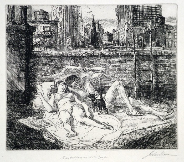
John Sloan (1871-1951), Sunbathers on the Roof, etching, 1941, signed and titled in pencil, from the edition of 175 published by the American College of Print Collectors, in good condition (old hinging top edge verso, a scratch verso not showing through). Reference: Morse 307. 6 x 7, the sheet 8 1/2 x 10 1/2 inches.
A fine clear impression, printed on an ivory laid paper, with full margins with deckle edges.
Sloan wrote of this print: “In the spring as the rays grow warmer, the tenement roofs in New York begin to come to life. More washes are hung out – gay colored underthings flap in the breezes, and on Saturdays and Sundays girls and men in bathing togs stretch themselves on newspapers, blankets or sheets in the sun, turning over at intervals like hotcakes.”
Posted in Uncategorized |
Tuesday, August 6th, 2013
Edouard Manet
1832 – Paris – 1883
Les Courses a Longchamps– The Races at Longchamps 1864
lithograph on chine appliqué;
chine: 404 x 517 mm (15 7/8 x 20 5/16 inches)
Moreau-Nélaton 85; Guérin 72; Wilson-Bareau (1977) 66; Wilson-Bareau (1978) 76; Fisher 56; Harris 41 second state (of three)
provenance
Robert M. Light & Co., Inc., Boston
Carolyn and George Rowland, Boston (acquired in 1972)
Paul Sachs in his Modern Prints and Drawings asks: “Why is this scribble, done in fever heat, important enough to reproduce? Because an impression of a shifting scene has rarely, if ever, been better rendered in black and white; because the excitement of the race track is made so vivid that we want to shout and bet on the winner; because the significance of movement is stressed; and finally because there is present in the skillful rendering of the agitated scene a quality that is of importance in a work of art: complete consistency of treatment.
Posted in Uncategorized |
Tuesday, August 6th, 2013
Ellison Hoover (1888-1955), Midnight Manhattan, lithograph, c. 1930, signed in pencil lower right. From the edition of 50. In very good condition, with full margins, 10 7/8 x 8 5/8, the sheet 13 x 11 inches.
A fine impression of Hoover’s most iconic image, printed on a cream wove paper.
An atmospheric, and possibly slightly romanticized vision of mid-town Manhattan, with the Chrysler Building clearly recognizable toward the left, and the Empire State Building at the right.
Posted in Uncategorized |
Friday, August 2nd, 2013
Armin Landeck (1905-1984), Manhattan Vista, drypoint, 1934, signed and dated in pencil lower right and inscribed “Ed 100” lower right. Reference: Kraeft 47, only state, stated edition of 100. In very good condition, with full margins, 10 1/8 x 8 7/8, the sheet 13 7/8 x 12 1/4 inches.
A fine impression, printed on a cream wove paper.
Landeck wrote of this print: “Detail [lower left] from my lithograph, View of New York [K. 37, 1932).
Posted in Uncategorized |
Thursday, August 1st, 2013
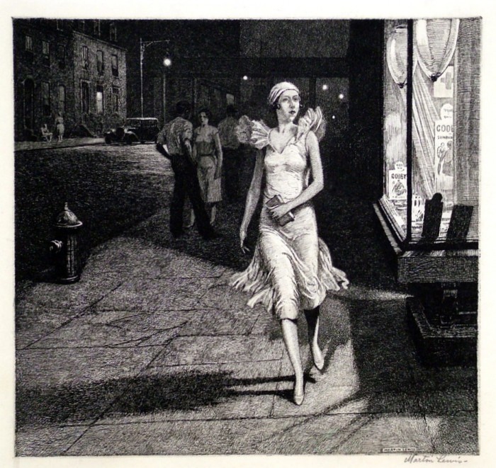
Martin Lewis (1881-1962) Night in New York, drypoint, 1932, signed in pencil lower right [also signed in the plate in a rectangle lower right]. Reference: McCarron 102, from the edition of 125 (another 10 impressions were reserved for the artist). In very good condition, with full margins, 8 3/8 x 8 7/8, the sheet 13 1/8 x 11 5/8 inches.
A presentation print of the Chicago Society of Etchers, with their blindstamp lower left. The edition was printed by Charles S. White.
A fine impression, printed in black ink on cream laid paper.
New York was a central subject matter for Lewis; in Night in New York he depicts a typical New York young women – perhaps not distractingly attractive, but that was never a concern of Lewis’s – and by focusing on a single figure captures both the excitement, and the loneliness, of the city.
Posted in Uncategorized |
Monday, July 29th, 2013
Louis Lozowick (1892-1973), New York, lithograph, c. 1925, signed and dated 1923 in pencil. Reference: Flint 6. In excellent condition, the full sheet with deckle edges, printed on a cream wove BFK Rives paper (with the watermark initials BFK); 11 3/8 x 8 15/16, the sheet 15 3/4 x 11 1/4 inches. Margins: left 1 3/8, bottom 2 1/8, right 1, top 2 3/8 inches. One of approximately 15 known impressions.
A fine fresh impression of this great rarity.
Flint (1982) lists an impression in the National Museum of American Art (Smithsonian) but lists no other institutions holding this print; an impression was given to the British Museum in 1993 (and it served as the cover print for the catalog of their major exhibition The American Scene, The British Museum Press, 2008).
“New York” is a cubist/futurist vision of the city Lozowick conceptualized while in Europe during the period from 1920-24. “New York” is a composite of recollected views – the Brooklyn Bridge is at the lower left; much was recalled, according to Lozowick, from trips on the elevated line on West 109th Street made when attending the National Academy of Art during the years 1912-15; the buildings and the elevated subway cars at the right are treated in what Lozowick called a “futurist technique.”
British Museum curator Stephen Coppel, in The American Scene catalog, calls “New York” “Lozowick’s most important print,” expressing his “utopian vision of New York as the ultimate symbol of the modern American city.”
Lozowick was of course influential in developing the American School of Precisionism, even while he was in Europe in the early ’20’s, and then later when he returned to the U.S. In his essay on the Americanization of Art, written in the late ’20’s, he famously noted that the “artist who confronts his task with original vision and accomplished craftsmanship, will note with exactitude the articulation, solidity and weight of advancing and receding masses, will define with precision the space around objects and between them; he will organize line, plane and volume into a well knit design…and weave organically into every composition an all pervading rhythm and equilibrium.”
Posted in Uncategorized |
Monday, June 24th, 2013
James McNeill Whistler (1834-1903), The Large Pool (Wapping, The Pool), etching and drypoint, 1879, signed with the butterfly on the tab, [also signed with the butterfly in the plate, lower left]. References: Kennedy 174, Glasgow 180, Glasgow’s eighth state (of 8), In excellent condition, trimmed by the artist on the plate mark except for the tab, 7 1/2 x 11 inches.
Provenance:
Edward James
Robert Light & Co., Boston, then to Carolyn Crossett Rowland in April, 1988.
Printed in dark brownish/black ink on cream/ivory laid paper with the Arms of Amsterdam watermark.
A very fine impression of this extremely rare print, signed in pencil with the early large shaded butterfly (butterfly of 1879). This print was not published; the Whistler Etchings Project at Glasgow has identified 13 impressions.
The Large Pool shows the Pool of London at Wapping, the scene of several prints of the Thames done some twenty years earlier. In composition it anticipates the etchings Whistler was about to do in Venice.
According to the Glasgow catalogue Whistler apparently had a high regard for this plate, as evidenced by the care he took with selection of papers and printing of various states, and by correspondence regarding the plate; and he may have hoped it would help him avert bankruptcy. But it did not (and indeed he gave one impression to James Waddell, the accountant involved in the bankruptcy proceedings); in the end no edition of the print was made.
Posted in Uncategorized |
Friday, June 21st, 2013
Charles Meryon (1821-1868), Tourelle Rue de Tixeranderie, etching, 1852. References: Schneiderman 24, 2-3rd state (of 5); Delteil 29, 2-3rd state (of 5). In very good condition, printed in browish/black ink on a bluish laid paper. In very good condition, with full margins, 9 5/8 x 5 1/8, the sheet 12 5/8 x 8 inches.
Provenance:
Knoedler (with their stock number K5360 verso0
Kennedy Galleries (with their stock number a 48762 verso)
Émile Galichon (1829-1875), Paris (Lugt 856; cf. also Lugt 1058f, which mentions his posthumous 1875 sale of Meryon.), his sale, Paris (expert Clément), May 10-14, 1875
A fine fresh impression.
In the Schneiderman’s fourth state (and Delteil’s IV and V) the inscription was added below. This impression corresponds to Schneiderman’s illustration of State 2, but “random scratches in the sky and on the walls of the house” are not apparent, and it also seems the small gaps described as filled in in State 3 are indeed filled in.
This house stood at the corner of the rue de Coq; it was demolished in 1851, so Meryon made preparatory drawings of the house just in time (Meryon was trying to capture Parisian scenes and structures that were vulnerable to the destructive forces of modernization). The street was mentioned in Notre-Dame de Paris as among the most interesting in the city.
Posted in Uncategorized |
Friday, June 21st, 2013
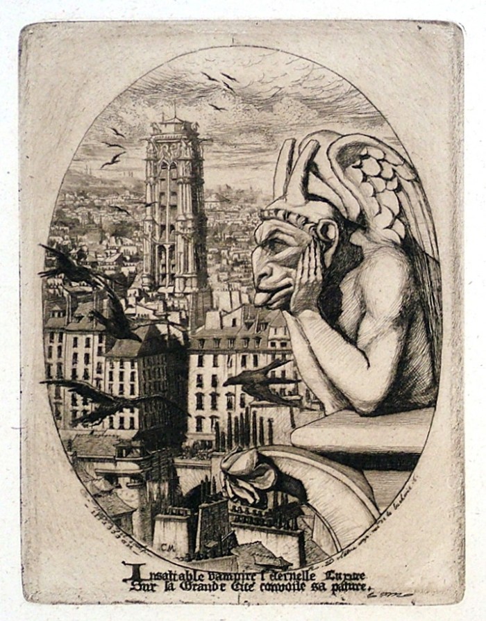
Charles Meryon (1821-1868), Le Styrge (The Vampire), etching, 1853. References: Schneiderman 27, fifth state (of 10); Delteil 23, fourth state (of 8). In very good condition, with full margins, printed on a blue/green laid paper, 6 5/8 x 5, the sheet 11 x 8 5/8 inches.
Provenance:
Knoedler, New York (with their stock number K 2341)
Colnaghi, London (with their stock number c 3114)
C. W. Dowdeswell (stamp verso, Lugt 690)
A fine rich impression, with plate tone. In the next state the inscription at the bottom is removed, the plate shows signs of wear and the printing is typically less rich, with little or no tone. In this state the print was printed by the artist himself (cf. James D. Burke, Charles Meryon, Prints and Drawings, p. 33-9)
The Stryge is one of the stone gargoyles leaning on a parapet of the upper balcony of a tower of the Notre-Dame in Paris. In a letter to his father Meryon wrote: “This monster which I have represented does exist, and is in no way a figment of imagination. I thought I saw in this figure the personification of Luxuria; it is this thought which inspired me to compose the two verses at the bottom of the print…” The verse, in translation: “Insatiable vampire,/Eternal Luxuria/ Coveting the Great City/ As its feeding place.”
Posted in Uncategorized |
Friday, June 21st, 2013
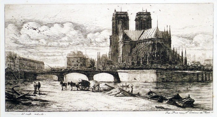
Charles Meryon (1821-1868), L’Abside de Notre Dame de Paris, etching with engraving and drypoint, 1854. References: Schneiderman 45, fourth state (of 9), Delteil 38, fourth state (of 8). In good condition, with thin area top edge, with full margins, 6 1/2 x 11 5/8, the sheet 10 5/8 x 17 inches.
Provenance:
Knoedler (with their stock number K 3025)
A very good impression, printed in dark brownish/black ink on an ivory laid paper with the HUDELIST watermark (characteristic of impressions of L’Abside in this state), printed personally by the artist.
The eminent art critic Phillipe Burty wrote of L’Abside: “The view of Notre-Dame…is a magisterial sight. The church of Notre Dame seems to have exerted a great attraction on the dreamy spirit of the artist. It has dictated to a poet [Victor Hugo] one of the beautiful books of our generation; it has inspired in Meryon his most beautiful plate.”
Posted in Uncategorized |
Tuesday, June 18th, 2013
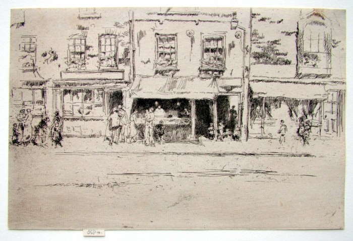
James McNeill Whistler (1834-1903), Fish Shop, Chelsea, etching and drypoint, 1886, signed with the butterfly on the tab and inscribed imp [also signed with the butterfly in the plate upper left]. References: Kennedy 264, Glasgow 267, first state (of 2). In very good condition (slight staining upper right, trimmed by the artist on the plate mark all around except for the tab. Printed on an ivory laid paper with plate tone, 5 3/8 x 8 1/2 inches.
A limited edition of 50 impressions of Fish Shop, Chelsea was printed in 1886 for the benefit of the Society of British Artists; these were impressions of the first state. Our impression was thus probably from that edition, although Whistler is known to have reserved about 5 impressions for himself.
A fine impression.
Provenance: Colnaghi, London (with their stock number c10570 verso).
In the relatively rare second state Whistler added drypoint lines to the woman behind the counter of the fish shop.
The etching shows Maunder’s Fish Shop among a row of shops in Chelsea. The Glasgow catalogue notes: “Mrs Elizabeth Maunder’s fish-shop was at 72 Cheyne Walk, Chelsea, London. 9 The building was demolished in 1892… Whistler later lived in the house that replaced it, which was built by the architect C. R. Ashbee. The building was destroyed in World War 2. The same row of houses appears in Whistler’s oil painting Street in Old Chelsea painted in the early 1880s, where the fish-shop, with its light plastered walls and steep pitched roof, is just to left of centre.”
Posted in Uncategorized |
Monday, June 17th, 2013
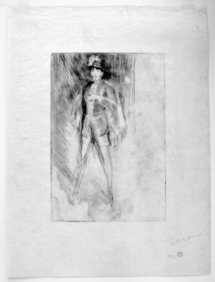
James Abbott McNeill Whistler (1834 Lowell, Massachusetts – London 1903), Irving as Philip of Spain, No. 2 1876/77, drypoint and etching on tissue-thin Chine;
plate: 224 x 152 mm (8 13/16 x 6 inches)
sheet: 364 x 272 mm (14 5/16 x 10 11/16 inches)
inscribed by Whistler in pencil at lower right: very rare_ / printed by the “Maud”_
Kennedy 171, third state (of four); Glasgow 159 third state (of six)
provenance
Howard Mansfield, New York (Lugt 1342)
Harris G. Whittemore, Naugatuck, Connecticut (Lugt 1384a)
private Collection
Notes:
A rare print before cancellation. Glasgow notes that 22 impressions have been accounted for; however, the great majority of these are from the cancelled plate.
Maud Franklin was of course Whistler’s model and mistress; she was an artist, and, as indicated here, apparently did some printing for Whistler. It is interesting that several of the pre-cancellation proofs shown in the Glasgow catalog show very irregular wiping patterns, perhaps characteristic of an inexperienced printer (i.e., Maud). Our impression too has been wiped irregularly, especially towards the right side and around Irving’s legs. But selective wiping is evident; the figure has been wiped rather cleanly highlighting it against a background of plate tone.
The Glasgow catalog notes that this print “is closely related to Whistler’s oil painting, Arrangement in Black, No. 3: Sir Henry Irving as Philip II of Spain [y187], painted in 1876. Another version of the same drypoint is Irving as Philip of Spain, No. 1 [G 158]. Henry Irving (1838-1905) was an actor, the subject of many portraits and paintings.
Detail – Whistler’s inscription; Mansfield and Whittmore marks showing through
Posted in Uncategorized |
Monday, June 17th, 2013
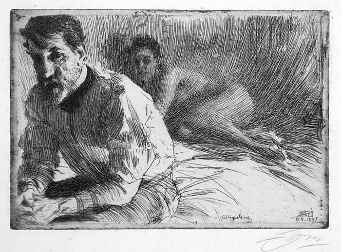
Anders Zorn (1860-1920), Augustus Saint Gaudens II (Saint Gaudens and his Model), etching, 1897, signed in pencil lower right [also titled, initialed, dated in the plate]. References: Asplund 114, only state; Hjert and Hjert 74, Schubert-Soldern 85. In very good condition (upper margin edge as if taken from a notebook), with margins, 5 1/2 x 7 7/8, the sheet 8 x 12 1/2 inches.
A fine impression of this rather rare print, printed in dark brownish/black ink with plate tone on an ivory laid paper with the watermark Pro Patria with initials J L & Z.
This portrait of Saint Gaudens (1848-1907) shows the artist with his seductively posed model who is surely Davida Johnson Clark, the beautiful young model by whom he had a child.
Posted in Uncategorized |
Wednesday, June 5th, 2013
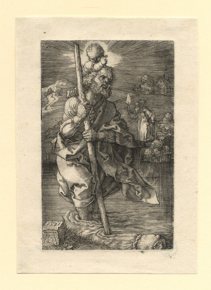 Albrecht Durer (1471 – Nuremberg – 1528)
Saint Christopher facing right 1521
engraving; 119 x 74 mm (4 11/16 x 2 15/16 inches)
Bartsch 52; Meder 52 a (of d); Schoch/Mende/Scherbaum 94
provenance
Wilhelm August Ackermann, Lübeck and Dresden (Lugt 791);
his sale, Rudolph Weigel, Leipzig, March 29ff., 1853, lot 138, described as
Kostbarster Druck und mit 11 Lin. breitem Rande.; sold for 7 Thaler 15 to
Gabriel von Cronstern III, Nehmten (cf. Stogdon, p. 357);
their sale (“a German Family of Title”, part 2), Christie’s, London, June 18, 1992, lot 56
Robert M. Light & Co., Inc., Santa Barbara
Carolyn and George Rowland, Boston
A superb impression in impeccable condition, with generous margins all round.
The silvery tones of this impression are characteristic of Dürer’s prints of the 1520s. In the engravings as well as the woodcuts (such as The Last Supper, 1523) made during this late part of his career, the artist began to replace the often dramatic black-and-white contrasts of his earlier prints with a wide range of subtle gradations of gray.
p
Posted in Uncategorized |
Thursday, May 16th, 2013
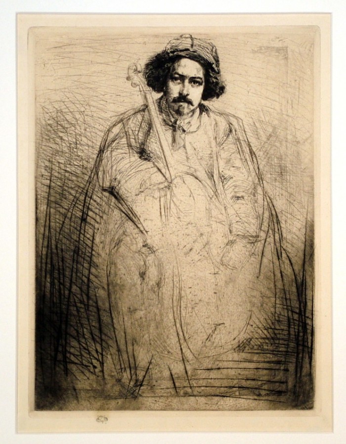
Whistler – Becquet
James McNeill Whistler (1834-1903), Becquet, 1859, etching, printed in dark brown on ivory wove paper. Signed in pencil with the butterfly lower margin, and signed with the butterfly and inscribed by the artist “Very fine proof” and with the tiny circle device (the artist’s marking of a fine proof) verso. In very good condition, remains of prior hinging verso. References: Glasgow 62, sixth state (of 6), Kennedy 52, fourth state (of four); Lochnan 55, included in the Thames Set, 10 x 7 5/8, the sheet 11 3/4 x 9 1/4 inches.
Provenance
Howard Mansfield (Lugt 1342, two stamps verso)
Harris Whitmore (Lugt 1384a, stamp verso)
E.R. Martin, New York (pencil initials verso, not in Lugt)
Charles C. Cunningham, Jr., Boston (not in Lugt, stamp verso)
R.M. Light and Co., Boston
acquired: Carolyn Crossett Rowland, from above, 1980
Kennedy Galleries (with their stock number verso, a27047)
A very fine, rich impression; given its exceptional quality probably printed apart from the Thames Edition.
Another impression in this state signed and with the artist’s inscription as here is in the Freer Gallery, Washington, D.C.; the signature on the Freer impression is estimated by Glasgow to be of 1890.
Whistler titled the plate The Fiddler when he published it as part of the Thames Set in 1871. It is one of the two non-Thames subjects included in the set (the other is The Forge, Kennedy 68). The print shows the French sculptor and musician Just Becquet (1829–1907), a friend of the artist who, according to Joseph Pennell’s Whistler Journal, lived in his studio among “disorder and his cello” (quoted after Lochnan, p. 104).
The plate on which the portrait was drawn had previously been used for an oblong view of West Point which a friend of Whistler brought to him for his opinion; stacked muskets and other paraphernalia can still be seen toward the lower edge of this print.
Verso: Cunningham stamp; Whistler butterfly and inscriptions
Posted in Uncategorized |
Tuesday, May 14th, 2013

James McNeill Whistler (1834-1903), Becquet, 1859, etching, printed in black on very thin Japan paper (the sheet has various condition problems and is laid down on wove paper). References: Glasgow 62, fourth state (of 6; this impression is pictured in the Glasgow catalogue for the fourth state), Kennedy 52, second state (of four); Lochnan 55, 9 ¾ x 7 ½, the sheet 10 ½ x 8 inches.
Provenance
Knoedler & Co., New York (their stock no. in pencil on the verso MK31679)
An early impression of this print. This proof precedes those published in the Thames Set (the first printing of this Set was in the fifth state, a later printing in the 1870’s in the sixth state. In states after the fourth the foul biting at the bottom of the plate was cleaned.
Whistler titled the plate The Fiddler when he published it as part of the Thames Set in 1871. It is one of the two non-Thames subjects included in the set (the other is The Forge, Kennedy 68). The print shows the French sculptor and musician Just Becquet
(1829–1907), a friend of the artist who, according to Joseph Pennell’s Whistler Journal, lived in his studio among “disorder and his cello” (quoted after Lochnan, p. 104).
“The plate on which the portrait was drawn had previously been used for an oblong view of West Point which a friend of Whistler
brought to him for his opinion; stacked muskets can still be seen at the lower right corner of this print”.
$3500
Posted in Uncategorized |
Thursday, May 2nd, 2013
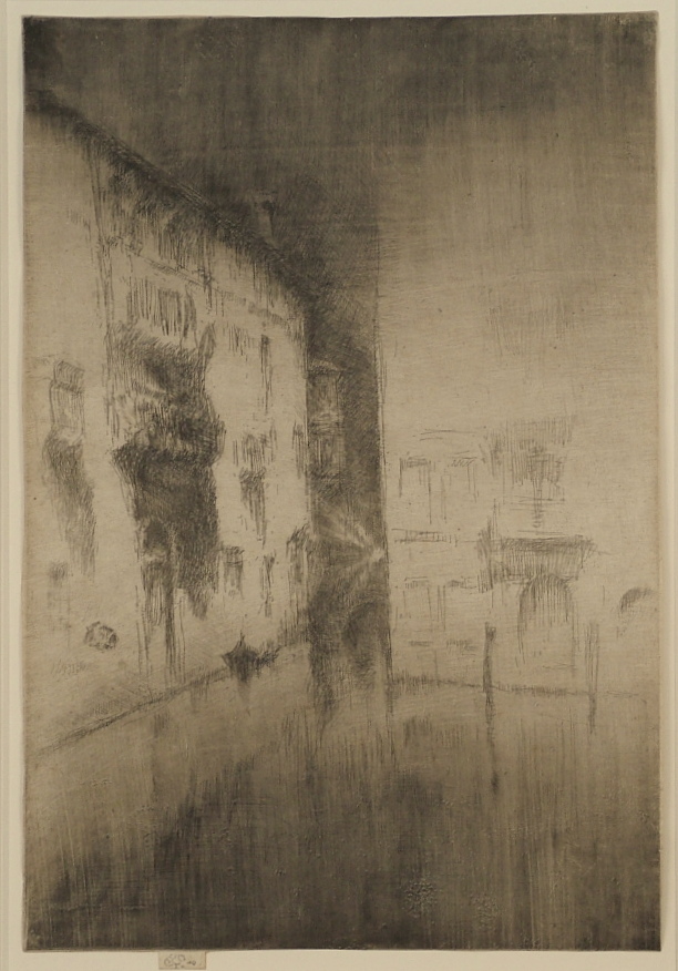
James Whistler (1834-1903), Nocturne: Palaces, etching and drypoint with plate tone, 1879-80, signed with the butterfly on the tab and inscribed “imp.” Also with a second butterfly in pencil verso, and the artist’s tiny circle device (signifying a selected proof). Reference: Glasgow 200, twelfth state (of 12), Kennedy 202, ninth state (of 9). From the Twenty-Six Etchings, the Second Venice Set. In very good condition (scattered light foxing verso, not visible recto), on laid paper (trimmed by the artist to the platemark except for the tab), 11 3/4 x 7 7/8 inches.
Watermark: Coat of Arms of Amsterdam
Provenance:
Kennedy Galleries (with their stock number a53836 verso
Ch. E. Ellingwood (Lugt 822, verso)
A superb, luminous impression, printed in brown ink, carefully wiped to darken the water in the canal in the foreground and the sky toward the top.
It is rather unusual for Whistler to sign his prints verso (as well as recto); this is sometimes considered evidence of a selected proof, as is his adding of one or more tiny circles. Of course Whistler was a practiced marketer, so such added markings are not always indicative of anything; and in any case they are quite unnecessary as proof of the quality of this impression.
In this state, in the words of the Glasgow catalogue, “considerable shading is added to the left side of the image, most notably: on the sky between the left and centre palaces and the wall of the right palace; under the eaves of the left palace; on the balcony, shadow and doorway of the left palace; on the centre palace, seen behind the bridge; around the beams eminating from the lamp; on the bridge, the shadow beneath it and its reflection; and on the reflection of the gondola.” These additions heighten the features of the palaces, the bridge, and the lamplight, which were losing focus in prior states.
Each impression of Nocturne: Palaces is different from the others, in effect a monotype, expressing different times of night or day, temperatures, effects of light. The lamp lighting the composition from within (a device borrowed from Rembrandt and also used in his Street at Saverne of 1858) is in this impression quite visible; in other impressions it is pale and nearly lost. This impression is in some ways comparable to an impression (also of the last state) at the Metropolitan Museum of Art in New York (pictured in Katherine A. Lochnan’s book The Etchings of James McNeill Whistler) although of course there are still substantial differences in the wiping of the plate tone. Indeed, differences in states for this print can be slight, while differences in the wiping of the plate from one impression to another are vast.
Margaret MacDonald in her classic Palaces in the Night: Whistler in Venice amplifies: “Nocturne: Palaces was a daring plate: difficult to print, relying heavily on the quality of the ephemeral drypoint lines…in the best impressions it is the inking of the plate that coordinates and unifies the widely dispersed lines of shading. The linear pattern of marks is unusual and the inking makes each print unique.”
Posted in Uncategorized |
Wednesday, May 1st, 2013
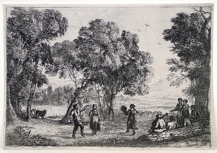
Claude – The Country Dance, Small Plate
Claude Gellee, called Le Lorrain (1600-1682), The Country Dance, Small Plate, etching, c. 1637. Reference: Manocci 19, fourth state B (of seven). In very good condition, trimmed on or outside of the platemark, 5 3/8 x 7 3/4 inches.
Watermark: Pascal Lamb (Manocci watermark no. 19)
A fine lifetime impression, printed with a subtle layering of plate tone.
The first state of The Country Dance, with three goats in the foreground left, is known in only one impression (in the British Museum). The second state, with the goats burnished out, is also unique (collection: Oxford). In the third state, lines in the sky were burnished out, and in the fourth state (A) the plate corners have been rounded; in the fourth state (B) a long broken scratch runs through the highest of the three birds. In the fifth state, after our impression, the plate was entirely re-worked – a village has replaced the forest scene at the left, foliage in the lower left corner was reduced. The sixth and seventh states are posthumous.
Claude made his etchings as original works, with preparatory drawings; the preparatory drawing for The Country Dance is incised for transfer (at the Ashmolean Museum, Oxford). The theme of a country dance was used by Claude throughout his life, appearing in the closely related etching La Danse Villageoise (M. 20), and also in several drawings and paintings.
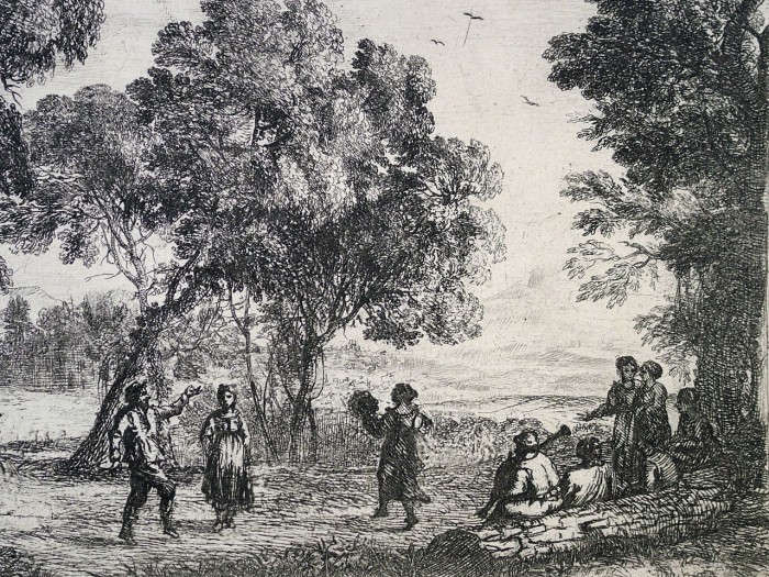
Claude, The Country Dance – detail
Posted in Uncategorized |
Thursday, April 25th, 2013
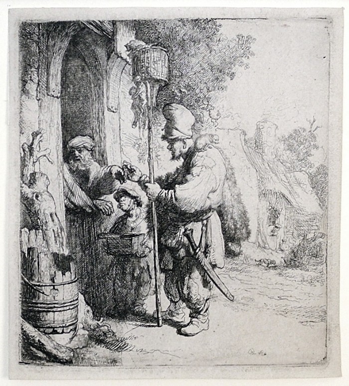
Rembrandt – The Rat Catcher
Rembrandt Harmensz. van Rijn
1606 Leiden – Amsterdam 1669
The Rat Catcher 1632
etching; 140 x 125 mm (5 1/2 x 4 7/8 inches)
Bartsch 121, White/Boon third (final) state (of three); Hind 97
watermark
double-headed eagle (Hinterding, vol. 2, p. 109, variant A.a.b, vol. 3, p. 177 ill.)
provenance
P. & D. Colnaghi & Co., London (their stock nos. in pencil on verso C 14174 and C 30912)
private collection; sale, Sotheby’s, London, March 19, 2013, lot 52
A fine, early impression of this rare print; in excellent condition with small margins all round.
The first state of this print (before the shading to the right of the box of rat poison the boy is holding) is known in only two impressions; the second state (with the shading on the box but before additional shading in the foliage over the rat killer’s head) is known in one impression (Rothschild Collection, Paris). The plate is not in existence.
The watermark in this impression is known to Hinterding only in the unique second-state impression in the Rothschild collection in the Louvre; this confirms that this is indeed an early pull from the plate in its final state.
Rembrandt’s Rat Catcher is composed of elements he used earlier, e.g., the pedlar himself was after the Man with Hands Behind His Back (Bartsch 135) of 1631; and the man in the house resembles bearded characters in Rembrandt paintings of the period. The lightly etched landscape and farmhouse in the distance create a sense of depth, and represent a rather rare appearance of landscape for Rembrandt in the 1630s.
The rat catcher was frequently depicted by artists before Rembrandt, and even more frequently after Rembrandt’s version, including many copies clearly derived from Rembrandt’s composition.
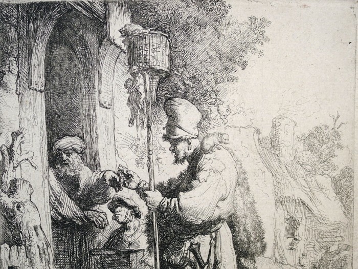
Rembrandt – The Rat Catcher – detail
Posted in Uncategorized |
Wednesday, April 24th, 2013
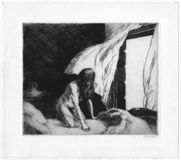
Edward Hopper
1882 Nyack – New York 1967
Evening Wind 1921
etching on wove paper; 6 7/8 x 8 1/4 inches (sheet: 9 1/2 x 10 5/8 inches)
signed in pencil at lower right Edward Hopper; annotated by the artist on verso:
etching $35 / “The Evening Wind” / Edward Hopper /3 Wash. Square / New York
Levin 77; Zigrosser 9
provenance
private collection
Notes:
In a footnote to Zigrosser’s The Etchings of Edward Hopper he refers to Evening Wind as having seven states; this is corroborated by the Philadelphia Museum web site which shows their seven states of The Evening Wind (Zigrosser was curator of prints at Philadelphia). These may be progress proofs, one to a state; we have not encountered other proof states of the print, and know of no definitive documentation of the states of Hopper prints. In all likelihood, then, our impression is of the definitive state. The drawing for the print is at the Whitney Museum of American Art.
Gail Levin, in her Edward Hopper: The Complete Prints, writes that his later etchings were often carefully worked out in preliminary drawings, and notes “The evolution of Evening Wind to etching from preparatory drawing has meant a sharper focus on the nude woman in the foreground through elimination of the distracting definition of background details…” (p. 12). The basic composition from the drawing, and through the states, however, was unchanged.
Posted in Uncategorized |
Wednesday, April 17th, 2013
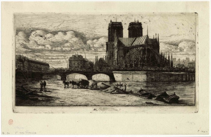
Charles Meryon
1821 – Paris – 1868
L’Abside de Notre-Dame – The Apse of Notre-Dame, Paris 1854
etching with engraving and drypoint on thin laid paper; 163 x 300 mm (6 7/16 x 11 3/4 inches)
annotated in pencil at lower left “B. 50 [!] 1e non termine”
Burty 52; Delteil 38 third state (of eight); Schneiderman 45 third state (of nine)
watermark
CONTRIBUTIONS DIRECTES
provenance
Émile Galichon (1829-1875), Paris (Lugt 856; cf. also Lugt 1058f, which mentions his posthumous 1875 sale of Meryon.)
his sale, Paris (expert Clément), May 10-14, 1875
Phillipe Burty (1830-1890), Paris (Lugt 413; cf. the entry Lugt 2071 which mentions the sales of Burty’s collection)
his sale, Sotheby’s, London, April 27ff., 1876
possibly Francis Seymour Haden, London and Arlesford (cf. Lugt 1227 et al.; not stamped but annotated in pencil verso “Haden”)
Lugt refers to the sale (April 27 ff., Paris) of Burty’s first state impression of L’Abside; this is incorrect since the first state is unique (it is in the National Gallery, with an extensive provenance not including Burty); quite certainly Lugt is referring to our impression (which is also incorrectly noted as a first state in pencil on the recto, lower left). (Lugt: Dans cette vente figurait son œuvre exceptionnel de Meryon, 217 pièces en états variés, dont nous citons : L’Abside de Notre-Dame, 1r ét. £ 17….)
Phillipe Burty was an eminent art critic and collector; he was among the first to recognize the genius of Meryon, and wrote the first catalogue raisonne of his work.
Burty wrote of L’Abside: “The view of Notre-Dame…is a magisterial sight. The church of Notre Dame seems to have exerted a great attraction on the dreamy spirit of the artist. It has dictated to a poet [Victor Hugo] one of the beautiful books of our generation; it has inspired in Meryon his most beautiful plate.”
Posted in Uncategorized |
Tuesday, April 2nd, 2013
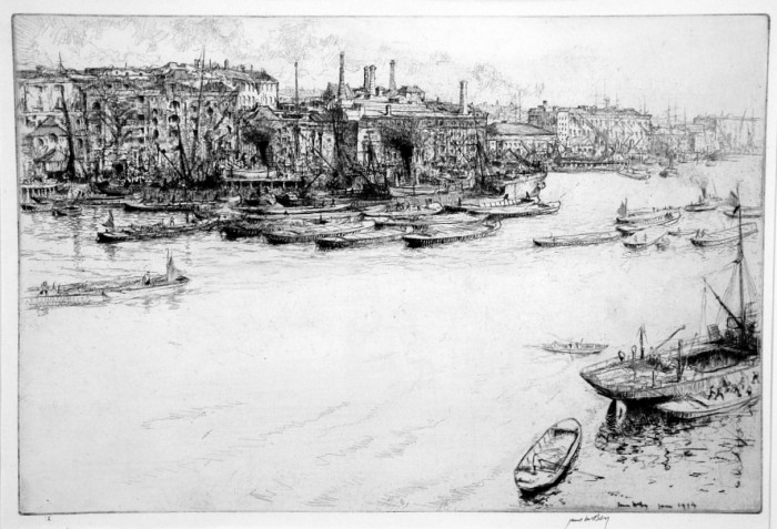
James McBey, The Pool, 1914
James McBey (1883-1959), The Pool, etching and drypoint, 1914, signed in pen lower right and numbered (I) lower left margin. Reference: Hardie 150. [also signed and dated June 1914 in the plate lower right]. From the edition of 50 (plus proofs). In very good condition, with margins, printed on laid white paper, 9 1/2 x 14 1/8, the sheet 11 1/8 x 15 5/8 inches.
Provenance: Harris Whittemore (Lugt 1384a, with his stamp lower left recto]
A fine impression, with much burr from the drypoint work.
McBey made about nine states of one impression each in the evolution of The Pool; most changes were minor, and the last few were touches of drypoint on and under some of the barges, and on some of the people; he also burnished marks in the water in his later proof impressions. This impression is numbered I, from the edition of fifty.
This is the Pool of London, from a warehouse near the south end of the Tower Bridge, looking toward warehouses and wharves on the north bank. It is not the Thames of Whistler, calm, unruffled, but a river of bustling activity.
Martin Hardie wrote, comparing The Pool to McBey’s The Lion Brewery, “Both have made record prices for the artist’s work in the saleroom….Decorative, attractive, masterly though [The Lion Brewery] it be, I cannot allow, for a moment that it has the vital significance and atmosphere of The Pool. In this latter plate you find, stronger and intensified, the feeling of life and movement that began with the Moroccan Set; and movement is a very subtle thing to capture in a network of etched lines.”
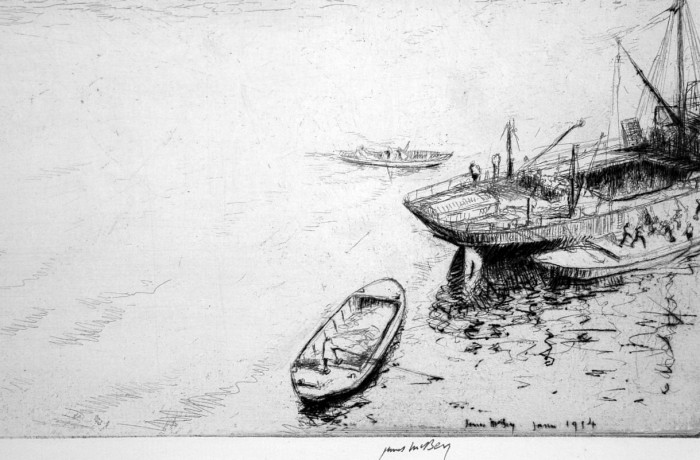
McBey – The Pool, detail
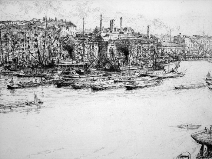
McBey, The Pool, detail
Posted in Uncategorized |
Thursday, March 28th, 2013
Giovanni Battista Piranesi (1720-1778), Piramide di Caio Costio Vicino alla Porta S. Paolo (Pyramid of Gaius Cestius near Porta S. Paolo), etching, 1745, signature lower left. Amidei, 1745. Focillon 110, Wilton-Ely 54. From the First Edition of Varie Veduti di Roma Anticha e Moderna. In very good condition, with wide margins, marginal soiling and slight fraying left edge well outside of image, ink number upper right outside of plate mark.
A fine fresh impression; monumental in scope although in a small-scale format (5 x 7 inches). With margins (sheet is 8 7/8 x 13 inches).
The first edition is before the numbers (Tom II. pag 19) upper left and the number upper right (72) as pictured in Wilton-Ely (his illustration is from the Venuti edition of this plate, published in 1763).
The small views of Rome of the Varie Vedute, made at the outset of Piranesi’s career, were not re-issued in later editions of his collected works, since the plates were sold directly to publishers by Piranesi. They were used to illustrate guidebooks to Rome until the mid-1760’s.
Posted in Uncategorized |
Thursday, March 28th, 2013
Giovanni Battista Piranesi (1720-1778), Veduta dell Interno del Pantheon (Interior View of the Pantheon), etching, 1756. First Edition, from the series Le Antichita Romane, Bouchard e Gravier 1756. References: Focillon 172, Wilton-Ely 307. In excellent condition, 5 1/2 x 10 1/2, the sheet 10 1/2 x 15 5/8 inches.
A fine impression, printed on a cream laid paper (with the watermark double circle with fleur de lys and initials CB, Robison’s watermarki 33, as found in presentation volumes of the Vedute).
Piranesi developed the plates of the Antichita Romane (Roman Antiquities) after eight years of careful study and excavation. His aim, as with all his archaeological publications, was both to record the vanishing past, and to inspire designers to emulate these past achievements.
Posted in Uncategorized |
Thursday, March 28th, 2013
Giovanni Battista Piranesi (1720-1778), etching, Veduta Interna Del Pronao del Pantheon, 1756, First Edition, from the series Le Antichita Romane, Bouchard e Gravier 1756. Reference: Focillon 171, Wilton-Ely 306. In very good condition, with full margins, 5 1/4 x 8, the sheet 8 3/4 x 12 3/4 inches.
A fine delicately printed impression printed on medium cream laid paper.
An interior view of the porch of the Pantheon.
Piranesi developed the plates of the Antichita Romane (Roman Antiquities) after eight years of careful study and excavation. His aim, as with all his archaeological publications, was both to record the vanishing past, and to inspire designers to emulate these past achievements.
Posted in Uncategorized |
Friday, March 1st, 2013
Whistler – La Vieille aux Loques
James Whistler (1834-1903), La Vieille aux Loques, etching and drypoint, 1858. [signed in the plate with the reverse s], 8 1/8 x 5 3/4 inches. Kennedy 21 first state (of three); Glasgow 27 second state (of 4). In very good condition. Watermark: foolscap
Provenance:
Jules Gerbeau, Paris (Lugt 1166);
his sale, Strölin, Paris, May 25–27, 1908 (Lugt mentions a “belle série” of Whistler prints in this sale)
Kennedy Galleries, New York (their stock no. in pencil on verso a45616)
Howard Mansfield, New York (Lugt 1342)
Harris G. Whittemore, Naugatuck, Connecticut (Lugt 1384a)
A fine, rich impression of this early proof, before various shading and hatching lines and the name and address of the printer Delatre are added (in the Kennedy second state, Glasgow third state) for publication in the French Set.
La Vieille aux Loques is exceedingly rare in this state, i.e., prior to publication. The Glasgow census indicates no early proofs among major Whistler collections (e.g., Chicago, Baltimore, British Museum, Bibliotheque Nationale, Colby, Boston MFA, Fogg, Freer, Hunterian, Cleveland, MMA ), with the exception of the NYPL Avery Collection (second state, cited by Kennedy), and the Library of Congress (first state, not known to Kennedy). The print is not rare in the third or fourth states.
La Vieille aux Loques was published in the later third state in Douze eaux-fortes d’après Nature (Twelve Etchings from Nature, the ‘French Set’) in 1858.
The composition, probably etched in Paris, is of course related to his other doorway or interior etchings such as The Rag Pickers, La Marchande de Moutarde, and The Kitchen, and, as Lochnan has pointed out, relates to a tradition in Dutch art of compositions framed by doorways, and later paintings by Francois Bonvin (1817-1887), Charles Jacque (1813-1894), and Jean Baptiste Millet (1831-1906).
La Vieille aux Loques – verso
Posted in Uncategorized |
Friday, March 1st, 2013
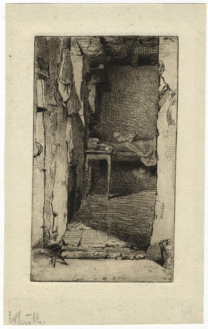
Whistler Rag Pickers, third state (of 5)
James A.M. Whistler (1834-1903), The Rag Gatherers (Rag Pickers, Quartier Mouffetard, Paris); etching, 1858. 6 3 1/2 inches, in very good condition.
Kennedy 23 third state (of five) – this impression mentioned; Glasgow third state (of 5) – this impression mentioned.
signed in pencil at lower left corner of the sheet Whistler [also signed, with the reverse s, in the plate]
Printed in dark brownish/black on a cream laid paper; watermark: letters LVG pendant to a coat of arms (probably with Strasbourg lily)
Provenance:
Kennedy Galleries, New York (their stock no. in pencil on verso a37141)
Howard Mansfield, New York (Lugt 1342)
Harris G. Whittemore, Naugatuck, Connecticut (Lugt 1384a)
Together with an impression of Kennedy’s fifth (and final) state (see illustration below); Watermark: Three balls with peak of a foolscap (?)
In the first four states of Rag Pickers only shading and detailed changes are made to the print; in the fifth state a radical change is introduced: two figures are added, a girl sitting up in bed and a boy standing near her. Lochnan suggested that Rag Pickers, Quartier Mouffetard, Paris was etched on Whistler’s return from the Rhineland in 1858, that is, after 7 October, and that the figures were added when Ralph Thomas Sr. (1803-1862), was encouraging Whistler to print his etchings in preparation for his first show of etchings in London (cf Glasgow). Most impressions known are of the final state; impressions of the third or earlier states are relatively rare. The final state was probably printed in 1861, although many impressions of the final state may be later.
This was etched in Paris, in the Mouffetard district of the Latin Quarter. The composition is of course related to his other doorway or interior etchings such as La Vielle aux Loques, La Marchande de Moutarde, and The Kitchen, and, as Lochnan has pointed out, relates to a tradition in Dutch art of compositions framed by doorways, and later paintings by Francois Bonvin (1817-1887), Charles Jacque (1813-1894), and Jean Baptiste Millet (1831-1906).
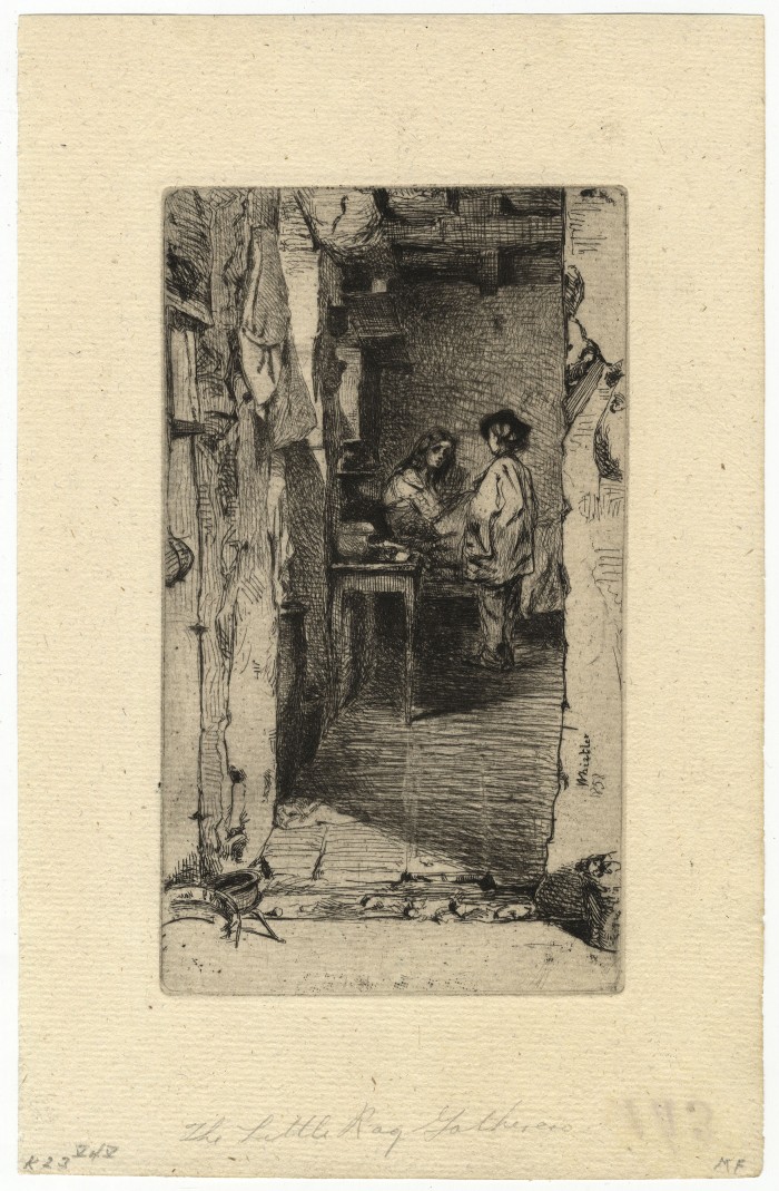
Whistler, Rag Pickers, 5th state
Whistler – Rag Pickers, third state, verso
Posted in Uncategorized |
Thursday, February 21st, 2013
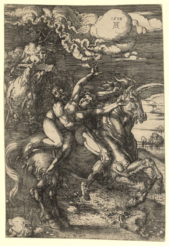
Albrecht Dürer
1471 – Nuremberg – 1528
Die Entführung auf dem Einhorn – Abduction on a Unicorn 1516
etching; 310 x 212 mm (12 1/4 x 8 5/16 inches)
Bartsch 72; Meder 67; Schoch/Mende/Scherbaum
watermark
anchor in circle (Meder 171)
provenance:
Gilhofer & Ranschburg, Lucerne
Carl and Rose Hirschler, geb. Dreyfus, Haarlem (Lugt 633a), acquired in January 1938;
thence by descent
exhibition:
B.L.D. Ihle/J.C. Ebbinge Wubben, Prentkunst van Martin Schongauer, Albrecht Dürer, Israhel van Meckenem. Uit eene particuliere verzameling, exhibition catalogue, Museum Boijmans, Rotterdam, 1955, p. 34, no. 55
A fine impression before any rust spots; in excellent condition; trimmed within the platemark, with the borderline visible all round as well as the four rounded corners of the plate.
Posted in Uncategorized |
Thursday, February 21st, 2013
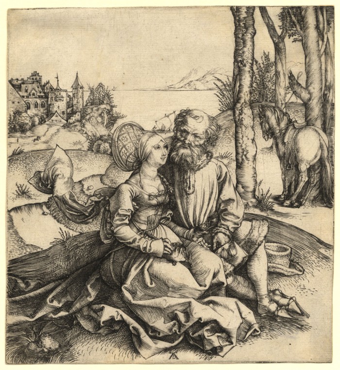
Albrecht Dürer
1471 – Nuremberg – 1528
Der Liebesantrag – The Ill-Assorted Couple ca. 1495–96
engraving; 150 x 137 mm (5 7/8 x 5 7/16 inches)
Bartsch 93; Meder 77 I.b-c (of III); Schoch/Mende/Scherbaum
provenance
Gilhofer & Ranschburg, Lucerne
Carl and Rose Hirschler, geb. Dreyfus, Haarlem (Lugt 633a), acquired in August 1924;
thence by descent
exhibition
B.L.D. Ihle/J.C. Ebbinge Wubben, Prentkunst van Martin Schongauer, Albrecht Dürer, Israhel van Meckenem. Uit eene particuliere verzameling, exhibition catalogue,Museum Boijmans, Rotterdam, 1955, p. 17, no. 22
A very good impression, showing the vertical scratch in front of the horse but not the one above the head of the man; in excellent condition with the platemark visible all round.
Posted in Uncategorized |
Thursday, February 21st, 2013
Félix Buhot
1847 Valogne – Paris 1898
Le Peintre de marine –The Seascape Painter, c. 1879
etching on laid paper; 129 x 207 mm (5 1/8 x 8 2/8 inches)
with the artist’s stamp (Lugt 977) in the lower margin of the plate below the image
Bourcard/Goodfriend 146 third state (of four)
provenance
possibly Henrietta Buhot (there are two pencil inscriptions on the recto and verso: coll. HB)
private collection, France;
its sale, Paul Renaud, Paris, October 25, 1985, lot 55 (a detail of this print illustrated on the cover of the catalogue; the impressions in this collection of prints by Buhot were all stamped on the verso with a triangular blue stamp with the letters fb; not in Lugt)
A superb, rich impressions of this rare print; on a pristinely preserved sheet with wide margins (deckled edges at right and below).
Posted in Uncategorized |
Tuesday, February 5th, 2013
Martin Lewis (1881-1962), Glow of the City– – 1929, Drypoint
McCarron 77. Edition 110, including 4 trial proofs. Signed in pencil. Annotated Trial Proof No 2 in pencil and numbered 2 at the bottom right sheet edge.Signed in the plate, lower right.
Image size 13 3/4 x 9 7/8 inches (350 x 251 mm); sheet size 17 5/8 x 12 7/8 inches (448 x 327 mm).
A superb, richly inked, luminous impression, in dark brown ink, on cream wove paper, with full margins (1 3/4 to 1 7/8 inches).
Lewis, here at the height of his technical virtuosity, has created a beautifully nuanced image, at once dramatic and intimate. Awarded the Print Club of Philadelphia’s Charles M. Lea Prize in 1930, many consider this to be the artist’s most important work.
“The dark steeple beyond the tenements rose from a church that once stood at the Manahattan entrance of the Queens-Midtown Tunnel. The Art Deco skyscraper in the distance with illuminated upper floors, is the 1929 Chanin Building, designed by Slaon and Robertson, which stands at the corner of Forty-second Street and Lexington Avenue…The Chanin building had a very dramatic impact on the New York City skyline because it did not yet compete with taller neighbors like the Chrysler Building, completed in 1930.” –McCarron
Collections: ACM, AIC, AMP, BMNY, BPL, CAM, CU, DIA, LC, MAC, MMA, MOMA, NAM, NGA, NMAA, OC, PMA, SU, YU.
Posted in Uncategorized |
Tuesday, January 15th, 2013
Francisco Jose de Goya (1746-1828), Mala Noche, etching and burnished aquatint, 1799,Plate 36 from the First Edition of Los Caprichos. Harris 71, Delteil 73. [titled and numbered 36 in upper right, in the plate] On soft strong laid paper, printed in warm sepia. In very good condition. With full margins, 7 1/2 x 5 1/4, the sheet 12 1/4 x 8 1/8 inches.
A fine early impression, with the highlights on the figures contrasting brilliantly with the aquatint, a characteristic of the earliest impressions of this plate.
Goya’s commentary: Gadabout girls who don’t want to stay home, risk exposing themselves to these hardships.
Posted in Uncategorized |
Tuesday, January 15th, 2013

Goya – Tantalo
Francisco Jose de Goya (1746-1828), Tantalo, etching and burnished aquatint, 1799, Plate 9 from the First Edition of Los Caprichos; Harris 44, Delteil 46, with the title lower margin, no. 9 upper right, on laid paper in light sepia ink. In good condition apart from scattered foxing recot, a thin spot near lower right margin edge far from image, 205 x 150 mm.
A fine balanced impression, the the two subtle aquatint tones printing quite effectively (in the later printings the stronger aquatint weakens considerably, at which point the contrasts – here quite clear – are lost).
Goya’s commentary: If he were a better lover and less of a bore, she would revive.
Posted in Uncategorized |
Thursday, January 10th, 2013

Roland Clark (1874-1957), Old Squaws, c. 1930, drypoint, signed in pencil lower right, numbered (72) lower left, and titled lower center toward margin edge; from the edition of 75. In good condition, with margins (moderate light staining, remains of prior hinging upper corners), 2 3/4 x 7, the sheet 6 1/8 x 10 inches.
A fine impression of this iconic Clark composition.
Roland Clark’s grandson, Roland B. Clark, M.D., provides this biographical sketch of the artist on a website devoted to Clark’s art: “Roland Clark was born in New Rochelle, New York in 1874. He graduated from the William Kellogg School in New York City, then pursued his formal art training studying drawing and painting at the Art Students League. In the early 1920’s he began to create the etchings that were to bring him national and international acclaim. His contemporaries held him in such high regard that he was asked to create the U.S. Federal duck stamp design in 1938.
In addition to his legendary etchings he created numerous renowned oil paintings, watercolors, and aquatints. He was also a prolific writer of sporting articles, short stories, and poems. Stray Shots was his first autobiographical collection of stories and essays, published in 1931, and illustrated with thirteen original etchings. It has become one of the most valued sporting books of all time. Stray Shots was followed by the beautifully illustrated Gunner’s Dawn in 1937, and Pot Luck in 1945.”
Posted in Uncategorized |
Thursday, January 10th, 2013

Bror Julius Olsson NORDFELDT (American 1878 – 1955)
The Wave, Moonrise; 1906
Donovan 19. Color woodcut on thin cream laid paper.
Signed and dated in pencil, also inscribed with the number 24, upper left. In very good condition.
9 1/4 x 11 1/4 inches.
A fine impression of this rare woodcut. Nordfeldt’s numbering system appears to be related to the total number of prints he made, not the number of impressions made of each print.
Bror Julius Olsson Nordfeldt was born in Sweden, moving at the age of 14 with his family to the United States, settling in Chicago. In 1896 he began studies at the Art Institute of Chicago while working as a typesetter on the Swedish newspaper, “Hemlandet”. At the Art Institute, he studied with Frederick Richardson and John H. Vanderpool. Nordfeldt traveled to Paris in 1900 to study at the Académie Julian and in 1901 he studied woodblock printing in Oxford, England with F. Morley Fletcher. He returned to Sweden to live and work in Jonstorp, a village on the Western coast. After 1903 Nordfeldt lived in Chicago, then in Paris, San Francisco during WWI (where he supervised the camouflaging of merchant ships!), then Santa Fe and a host of other U.S. locations ending up in scenic Lambertville, New Jersey where he died in 1955. The Wave, Moonrise, was created in one of the most fertile periods of Nordfeldt’s career, when under the strong influence of both modernism and Japonisme.
Posted in Uncategorized |
Wednesday, January 9th, 2013

Owen Selwyn (?), Blair Hall, Princeton, etching with plate tone, c. 1925, signed in pencil lower right. Printed in brownish/black ink on cream laid paper, in good condition (slight light staining), with margins, 8 7/8 x 6 7/8, the sheet 12 3/8 x 10 3/4 inches.
A fine impression, a well crafted etching in the British Etching Revival tradition, by an unknown (to me!) artist.
Posted in Uncategorized |
Wednesday, December 5th, 2012

Gustave Baumann – Three Pines
Gustave BAUMANN American (1881 – 1971), Three Pines, 1925, color woodcut, signed, titled and dated 56; with the artists hand in heart stamp. Printed on cream laid paper with a tree (?) watermark, from the edition of 50 printed in 1956. In very good condition, with full margins; 11 x 9 1/2, the sheet 17 x 14 inches.
A fine impression, the colors vivid and fresh.
This is a view of Estes Park, Colorado.
Posted in Uncategorized |
Friday, November 30th, 2012
 Rembrandt Harmensz. Van Rijn (1606-1669), The Baptism of the Eunuch, etching and drypoint, 1641 (signed and dated in the plate). References: Bartsch 98, Hind 182, second state (of 2); Nowell-Usticke’s second state (e) (of 4). In good condition, trimmed on the platemark all around, 6 11/16 x 8 3/8 inches (170 x 213 mm).
A fine, clear and early impression of this lightly etched plate.
On laid paper with a Foolscap With Seven-Pointed Collar, Hinterding’s C-a-a watermark (page 256, Rembrandt as an Etcher, Catalogue of Watermarks, volume 3, page 256). Hinterding identifies a number of Rembrandt lifetime impressions with this watermark including The Omval (B. 209 ii(2),National Gallery of Art); The Blindness of Tobit (B. 42i(2) Metropolitan Museum of Art); and also a number of impressions with closely related watermarks (cf. Hinterding, op. cit., volume II, p. 140 et. seq.).
The lifetime or early dating of this impression is further substantiated since it is before the appearance of the sharp diagonal scratch to the right of the head of the standing man, said by Nowell-Eusticke, to be introduced in the Basan impressions. But Nicholas Stogdon, describing a “near-contemporary” impression of this print notes “According to Nowell-Usticke the sharp diagonal scratch to the right of St. Philip’s head first appears in the P.G Basan edition; this can hardly be the case as it is already present in this near-contemporary impression (the papermaker is recorded as active in the 1680’s).” (Indeed, we have found this scratch on virtually all the impressions of this print to have appeared on the market in recent years.)
The story of the baptism of the eunuch is from Acts 8:26-39. While walking along the road from Jerusalem to Gaza, St. Philip is compelled by the spirit of God to accompany the passing entourage of the Treasurer of Ethiopia, a eunuch serving under Candace, Queen of Ethiopia. Philip joins them and preaches to the official and his servants, and when they come to a small body of water the eunuch asks Philip to baptize him.
Posted in Uncategorized |
Tuesday, November 27th, 2012

Francisco Goya (1746-1828), Alla Va Eso (There It Goes), etching, drypoint and aquatint, 1799, plate 66 from Los Caprichos, First Edition (of 12). References: Delteil 103, Harris 101. In very good condition, with margins, 8 1/8 x 6 1/2, the sheet 10 3/4 x 7 7/8 inches.
A very good impression. Printed in a warm sepia ink on fine quality, soft but strong laid paper.
This is printed with a fine grain aquatint, in one pale tone. The lighter areas such as the legs and stomach, arms and face of the figure in front, and the face of the cat, stand in contrast to the slightly darker aquatint elsewhere. These contrasting areas of tone are lost in the later impressions.
In the drawing for this print Goya wrote: “Dream. A witch instructress giving a first flying lesson to her pupil” and below wrote “Witches practicing”. Goya’s commentary on this: “There goes a witch, riding on the little crippled devil. This poor devil, of whom everyone makes fun, is not without his uses at times.”
Posted in Uncategorized |
Monday, November 19th, 2012
")
Lozowick – Under the Bridge
Louis Lozowick (1892-1973), Under the Bridge, lithograph, 1930, Flint 75, edition 20 (10 additional impressions 1972), signed, numbered, titled and numbered 15 in pencil. A fine, rich impression from the first edition (the 1930 edition, before the 1972 edition), with full margins (11/16 to 1 5/8 inches), on cream wove paper, in excellent condition. Printed by George C. Miller. Plate cancelled. Collection: NMAA
An iconic precisionist image.
Image size 14 x 8 inches (356 x 203 mm), sheet size 15 3/4 x 11 1/4 inches (400 x 286 mm)
Posted in Uncategorized |
Thursday, November 15th, 2012
")
Camille Pissarro – Effet de Pluie, 1879, second state (of 6)
Camille Pissarro
1830 St. Thomas – Éragny-sur-Epte 1903
Effet de Pluie – Effects of Rain 1879
pure aquatint on gray Japanese paper; 160 x 215 mm (6 1/4 x 8 1/2 inches)
inscribed in pencil below imprimé par Degas pour Pisarro (sic) 1er etat
Delteil 24 second state (of six)
comparative literature
Barbara Stern Shapiro, Camille Pissarro. The Impressionist Printmaker, exhibition catalogue, Museum of Fine Arts, Boston 1973, nos. 15–17 (states ii, iv, and vi); second, fourth, and sixth state); Nicole Minder, Degas & Pissarro: alchimie d’un rencontre, exhibition catalogue, Cabinet Cantonal des Estampes, Musée Jenisch, Vevey/Musée du Québec/The Israel Museum, Jerusalem 1998–99, Vevey 1998, cat. nos. 38–39 (states iii and iv).
There are some corrections to the list of known impressions recorded in the reprint of Delteil: We are able to trace two impressions of the first state (Bremen and formerly with C.G. Boerner [Neue Lagerliste 123, 2007, no. 37], now Minneapolis, but not Oxford); there is a second state in the Ashmolean Museum, Oxford, part of the Orovida Pissarro collection, printed on grayish paper, and another in the Yale University Art Gallery; to these, this impression, previously unrecorded, has to be added; there are two impressions of the third state (private collection in Switzerland and Frankfurt); two impressions of the fourth are in private collections (Switzerland and New York), the latter like ours annotated imprimé par Degas, as well as in Oxford and Philadelphia; there is one impression of the fifth state in Berlin.
Inspired by Degas and in anticipation of the new print journal Le jour et la nuit, Pissarro took up printmaking with a new enthusiasm in 1879. Like Degas and Cassatt, he experimented widely. The heavy, card-like wove paper of this early working proof matches the paper used by Degas for prints made at the same time. In the first two states Pissarro is laying the sort of liquid aquatint ground that Bracquemond had encouraged Degas to try, fully avoiding any use of drypoint or etching as a guide (the marks on the plate are either from polishing or accidents). The artist did not begin to articulate the composition with delicate drypoint lines before the third state; by the final state, etching and vernis mou (soft-ground), a metal brush and emery paper have all been employed in creating the composition.
This is a quintessential Impressionist print in an early stage of creation.
Posted in Uncategorized |
Wednesday, November 14th, 2012
")
Mary Cassatt – The Lamp
MARY STEVENSON CASSATT (1844–1926)
The Lamp, 1890–91
Drypoint, soft-ground etching, and aquatint, printed in colors, inked à la poupée, on laid paper, 12 9/16 x 9 15/16 in.
Signed and inscribed (at lower center): [artist’s monogram stamp]; (at lower right): Imprimee par l’artiste et M. Leroy / Mary Cassatt / (25 épreuves); (in a different hand, at lower right margin): La Femme a l’Eventail, sous la lampe). Edition of 25. Fourth and final state
RECORDED: cf. Adelyn Dohme Breeskin, Mary Cassatt: A Catalogue Raisonné of the Graphic Work (1979), pp. 22, 62–63 no. 144, 141 illus. in color // cf. Nancy Mowll Mathews and Barbara Stern Shapiro, Mary Cassatt: The Color Prints, exhib. cat. (Williamstown, Massachusetts: Williams College Museum of Art, 1989–90), pp. 111–15 no. 6 illus. in color
A dedicated printmaker, Mary Cassatt produced more than two hundred aquatints, etchings, drypoints, and lithographs over a period of thirty years. The Lamp is part of a series of ten color prints that she executed, with the help of M. LeRoy, a professional printer, in 1890-91. Although Cassatt frequently based prints on her earlier paintings and pastels, the ten color prints are remarkable not only for their original compositions but also for their appropriation of Japanese printmaking styles. The making of these prints was extremely labor intensive, as it relied on a combination of a number of printmaking techniques, including drypoint, etching, and aquatint. In her catalogue raisonné of Cassatt’s graphic work, Adelyn Breeskin notes: These prints were her next great triumph and one which would give her claim to fame if they were her sole accomplishment. They are indeed her most original contribution, adding a new chapter to the history of the graphic arts and, as color prints, have never since been surpassed (Breeskin, op. cit., p. 21). Moreover, Breeskin notes that this suite of prints was especially novel not only because of their japonisme, but because she gave the models themselves Japanese features. Furthermore:
In The Lamp (no. 144), the table and its ornaments are more Oriental than European. Such details are not copied. They are not even borrowed directly. They are the result of such thorough study and understanding that they are absorbed into the artist’s feeling and thought and thereby become a part of her own expression (Breeskin, op. cit., p. 22).
Though The Lamp and the other color prints Cassatt executed concurrently were revolutionary in Western art, they failed to receive correspondingly strong critical acclaim. These prints were shown, along with works by her friend Camille Pissarro, in 1891 at Durand-Ruel in Paris, and again at Durand-Ruel’s New York gallery later that year. Neither show was successful, as very few of the prints were sold. Despite these setbacks, Cassatt remained encouraged by the support of a few friends, critics, and collectors. Cassatt produced several additional color prints of advanced technique over the next few years. Today, they are considered among the finest prints in American art, a fitting tribute to Cassatt’s radical approach and determination.
Of the ten color prints Cassatt showed at the Durand-Ruel galleries, The Lamp is perhaps the one that most reveals Cassatt’s debt to Japanese prints. According to Nancy Mowll Mathews and Barbara Stern Shapiro, “this interpretation of a woman ‘at home’ is unique and may reflect the common Japanese device of showing a woman’s neck from behind, highlighting this oriental symbol of beauty” (op. cit., p. 111). The Lamp also demonstrates Cassatt’s growing mastery of the aquatint technique. The evolution of the print’s composition is slight, with only a few minor changes from the first to the fourth and final state (ibid., pp. 112-13 figs. 6-I, 6-II, 6-III, and 6-IV illus. in color). Earlier prints in her series of color aquatints required as many as seventeen states for the artist to be satisfied. In The Lamp, Cassatt, having settled on the composition early on, was able to embark on a remarkable exploration of color printing, in which she used the aquatint technique on all three plates used to make the final print. By the final state, of which the present print is an example, Cassatt had carefully reworked each color region to avoid overlap and maximize the crispness of line. The result is one of most dynamic and colorful of her series of prints, a true masterpiece in American printmaking.
Posted in Uncategorized |
Monday, October 15th, 2012

Jacques Lipschitz (1891-1973), Leda and the Swan, 1947, etching, three states. Reference: Bibliotheque Nationale Inventaire du Fonds Francais, p. 358. In very good condition.
Fine strong impressions of three progressive states, including the final state.
The last state of this etching was created in an edition of 50 for loose insertion in the édition de tête copies of the book Lipschitz, a monograph on the sculpture of Jacques Lipchitz from 1911 to 1945 with a prefatory essay by Maurice Raynal (Paris. Editions Jeanne Bucher. 1947. Folio. pp. 18. Monochrome frontispiece reproducing Modigliani’s portrait of Lipchitz and his wife (‘Portrait de Jacques Lipchitz et sa Femme’) and 71 monochrome plates (‘similigravure’) of sculptures by Lipchitz after photographs by Marc Vaux and Colten)
Posted in Uncategorized |
Thursday, October 4th, 2012

Henri Matisse (1869-1954), Nu, Époque du Chapeau Jaune, 1929, etching in black on grey/tan Chine-collé on heavy cream wove with deckle edges all around, signed, titled and numbered in pencil lower right [also signed and inscribed in the plate lower right]. Reference: Duthuit 220, only state. In excellent condition, 9 7/8 x 5, the sheet 14 3/4 x 11 1/8 inches.
A fine warm impresssion.
In his small edition etchings and drypoints Matisse displayed a mastery of draftsmanship unmatched in modernist printmaking. Nu, Époque du Chapeau Jaune is a splendid example of Matisse’s genius.
Posted in Uncategorized |
Tuesday, October 2nd, 2012

Matisse – Etudes
Henri Matisse (1869-1954), Etudes, 1932, etching in black on grey/tan Chine-collé on heavy cream wove, signed and titled in pencil lower right. Reference: Duthuit Books p. 33 (Studies for Matisse’s illustration designs for Stéphane Mallarmé’s Poésies). In very good condition, the full sheet, 9 1/2 x 5 1/2, the sheet 14 1/4 x 11 3/4 inches.
A fine impression of this rare page of studies. The sheet consists of a half-dozen nudes in various degrees of definition, and two portraits at the lower left, one a face, the other a woman in a hat and dress with a fan (in the final book the woman with the fan is featured alone in a similar posture, but in reverse).
Poetry was an important source of inspiration for Matisse, and for years he maintained the practice of reading poetry early each day before he raised a paint brush, pencil or etching needle. In his lifetime he produced a number of illustrated books which were known as “livre d’artiste” (artist’s book); Poésies, of 1932, with mythologically inspired images based on texts by Stéphane Mallarmé, was his first such venture.
Posted in Uncategorized |
Tuesday, October 2nd, 2012
")
Francisco Goya – That’s Tough – Proof
Francisco José de Goya y Lucientes (1746 Fuendetodos – Bordeaux 1828), Fuerte cosa es! – That’s tough! ca. 1808–1814, etching, burnished aquatint, and drypoint on laid paper; 155 x 203 mm (6 1/16 x 8 inches), Harris 151.I.3 (of III.7)
watermark: Serra
provenance
Infante Don Sebastian de Borbón y Braganza
Georges Provôt, Paris;
his sale, Hôtel Drouot, April 10, 1935, lot 60
private collection, Germany
Proof impression for plate 31 of Los Desastres de la Guerra, with the earlier number 32 in the lower left corner, before additional drypoint work and border lines.
No impression of state I.1 (before the aquatint) is known and only one impression (Paris, Bibliothèque nationale) of state I.2 (before any numbers). Harris list lists eight impressions of state I.3, including this one.
Goya’s Desastres was conceived in three phases. One group depicts scenes from the famine that raged in Madrid in the winter of 1811–12 as a result of the French occupation. Another group was created between 1820 and 1823, a late addition to the set and mainly consisting of more allegorical scenes. The two prints presented here belong to the earliest and largest group of prints, etched between 1808 and 1814. These images present the most direct reflection of the effects and cruelties of the war with France.
The grim-looking mamelouck fighter is about to return his saber to its sheath. One of his fellow French soldiers tugs at the boots of one of the two corpses hanging from the tree on the right. Behind him another soldier is apparently attacking a woman. Goya’s title here can only be cynical.
Posted in Uncategorized |
Monday, October 1st, 2012
")
Francisco José de Goya y Lucientes (1746 Fuendetodos – Bordeaux 1828), No se puede saber por qué – One can’t tell why ca. 1808–1814, etching, burnished aquatint, drypoint, and burin on laid paper; 155 x 203 mm (6 1/8 x 8 inches), Harris 155.I.2 (of III.7)
provenance
Infante Don Sebastian de Borbón y Braganza
Georges Provôt, Paris; his sale, Hôtel Drouot, April 10, 1935, lot 64
Tomás Harris, London (not in Lugt)
private collection, Germany
A fine, rich proof impression for plate 35 of Los Desastres de la Guerra, before numbers, letters, and before additional drypoint and burin work.
No impression of state I.1 (before the aquatint) is known nor are any proof impressions with numbers (Harris’ hypothetical state I.3) known. Harris lists nine impressions of state I.2, including this one. This is a lifetime impression; the edition was published posthumously.
No less than eight convicts are about to be garroted. Each man clutches a crucifix—a sign that they have already made their last confession. Their crime—ownership of a weapon— is announced on placards hanging around their necks, alongside the weapons themselves. Many Spanish citizens were executed this way. Their crimes were not only murder and armed robbery; suspicion of espionage for the insurgents or any other support for them was sufficient to subject the accused to this cruel fate.
An impression from the First Edition is shown below, for comparison purposes (this impression is also available)

Posted in Uncategorized |
Tuesday, September 4th, 2012

Durer - Christ in Limbo
Albrecht Durer (1471-1528), Christ in Limbo (Harrowing of Hell), woodcut, 1510, Bartsch 14, an impression just after the 1511 edition of The Large Passion, 15 5/8 x 11 ¼ inches, on old laid paper with a Crest of Augsburg related watermark (cf. Meder 180, Briquet 2110, dated c. 1486-1583; also similar to Augsburg arms, Meder 177). In excellent condition, with borders all around, usual horizontal printer’s crease across center.
An exceptionally well printed impression of this iconic image.
The legend can be found in the Apocryphal text, the Gospel of Nicodemus. After his Resurrection Jesus descended into Hell and led the just, the patriarchs, the prophets of the Old Testament and Adam and Eve, into the light. Later a clarity was introduced that all of them were not in Hell, but in the bordering region, Limbo (from the Latin word limbus, a hem); it was taught that because they lived and died before the Christ’s self-sacrifice for peoples redemption, they were put in the lower place until such time when Jesus could liberate them. The story was later retold in the Golden Legend.
The Christ in Limbo may be the first (of four) of Durer’s woodcuts executed in 1510 to complete the Large Passion series. The earlier 7 prints of the series were made in 1497-1499, and were printed as single sheets up to 1511 when an edition of the series was printed. This helps account for the particularly strong impression of the present print; the block was not nearly as worn by the 1511 printing as the earlier blocks were, and so subsequent printings of these newer blocks are stronger than those for the earlier blocks. The later blocks also tended to represent a more sophisticated approach to woodcutting, and were made by more skilled woodcutters.
Posted in Uncategorized |
Friday, August 17th, 2012

Lyonel Feininger (1871-1956, Süssenborn (also Dorfkirche also Little Church), c. 1926, Woodcut. Prasse W253. One of only several proofs on Japan. Signed in pencil, lower left. Numbered 2401 (the artist’s inventory number), estate stamped and numbered W 420 in pencil, in the bottom right sheet corner.
Image size 5 3/8 x 5 3/4 inches (137 x 146 mm); sheet size 8 x 9 1/2 inches (203 x 241 mm).
A fine, black impression, on tissue-thin cream laid Japan, with full margins (1 1/8 to 2 inches), in excellent condition. One of only a few signed proofs before the published editions: 50 on Mino copy paper, of which 44 are unsigned; No. 10 of portfolio, 10 Holzschnitte von Lyonel Feininger (c.1926).
Süssenborn is a village near Weimar in Thuringia, central Germany.
Collections: Dresden, Middletown
Posted in Uncategorized |
Wednesday, August 1st, 2012
")
Veneziano – Procession of Silenus
Agostino dei Musi (called Veneziano) (active 1514–1536), The Procession of Silenus (after Raphael) ca. 1520–25 , engraving; 189 x 259 mm. Reference:
Bartsch, vol. 14, p. 192, no. 240. In excellent condition, laid at the reverse edges to an album sheet (Chatsworth), slight staining.
watermark
anchor in circle (similar to Briquet 495)
provenance
Dukes of Devonshire, Chatsworth;
their sale, Christie’s, London, December 5, 1985, lot 69
A suberb impression.
The figures of Silenus and his attendants are somewhat related to a Roman Sarcophagus at Woburn Abbey (formerly at the Villa Aldobrandi Frascati). This or a similar sarcophagus probably provided the source for the lost Raphael drawing on which this engraving is based.
Posted in Uncategorized |
Tuesday, July 31st, 2012
")
Bonasone – Adoration of the Shepherds
Giulio Bonasone (c. 1510 – Bologna – after 1576), The Adoration of the Shepherds (after Giulio Romano) ca. 1550–60, engraving; 271 x 431 mm. (10 9/16 x 16 15/16 inches). Reference:
Bartsch vol. 15, p. 118, no. 38; Massari 122; The Illustrated Bartsch, vol. 28, p. 242, no. 38
provenance
Sir Peter Lely (Lugt 2092)
Dukes of Devonshire, Chatsworth;
their sale, Christies, London 5th December 1985, lot 80
private collection, Germany; private collection, Chicago
C.G. Boerner, Neue Lagerliste 115, Düsseldorf/New York 2001, no. 17
There is a related drawing in the Gabinetto Nazionale delle Stampe, Rome, which has been variously attributed to Raphael, Perino and more recently to Giulio Romano. The design was also used by Agostino Veneziano for his Adoration of the Shepherds (Bartsch 17).
An extraordinarily fine early impression, with plate tone; vertical wiping lines distinct.
In excellent condition, trimmed along the plate mark and tipped down onto an album sheet at the corners (on the original album sheet from Chatsworth).
Posted in Uncategorized |
Wednesday, July 25th, 2012

Whistler - Rotherhithe (cancelled)
James Whistler (1834-1903), An Album Containing Fifty Cancelled Etchings and Drypoints ca. 1879
An unusual album of fifty cancelled etchings and drypoints, many known only in cancelled impressions, printed on laid paper, in a contemporary half-leather binding with gilded tooled spine, measuring 15 1/4 x 11 inches. Inscribed in pencil on the verso of the marbled front fly-leaf Whistler / 50 Cancelled etchings and extensively annotated in pencil throughout.
Whistler declared bankruptcy in May 1879 and was allowed by the receiver to destroy his unfinished work and deface his copperplates prior to the auction of his property in September of that year, just before he left for Venice. About one hundred of these plates were purchased at the auction by The Fine Art Society which then published a small edition (probably no more than twenty copies) of fifty-seven of the cancelled prints; this is titled Fifty-Seven Defaced Etchings and Drypoints by J.A. McNeil [sic] Whistler.
The present album includes forty-eight of the prints published in The Fine Art Society’s edition and two prints not in that volume. Many impressions are annotated with titles, references to the Wedmore catalogue, or other notes. It includes a number of hitherto unknown impressions, or prints very rare in pre-cancelled impressions; most are also rare in cancelled impressions.
These impressions are quite fine; it is probable that they served as proof impressions for other albums of cancelled etchings published during this period. The prints are generally in excellent condition; the drypoints typically have substantial burr. Printed on ivory laid paper with the watermarks Van Gelder and crowned shield with fleur-de-lis and letters vgj; all with wide margins (sheets vary in size).
The prints included are:
- F.R. Leyland’s Mother, 1874–75, Kennedy 103
- Lady in an Arm-Chair, 1861, K. 79, known only after cancellation
- August Delâtre, Printer; 1858–59, K. 26
- A Man Reading, 1873–77, K. 137, known only after cancellation
- Astruc, A Literary Man, 1859, K. 53
- Greenwich Pensioner, 1859, K. 34
- Fumette’s Bent Head, 1859, K. 57
- A Wharf, 1859, K. 48
- Arthur Haden, 1859, K. 61
- Portrait of Whistler, 1859, K. 54, signed in pencil
- Mr. Mann, 1860, K. 63
- Rotherhithe, 1860, K. 66, not included in The Fine Art Society’s set
- Axenfeld, 1860, K. 64
- Riault, the Engraver, 1860, K. 65
- The Open Book, 1861, K. 84, known only after cancellation
- Jo, 1861, K. 77
- Landscape with a Fisherman, 1861, K. 83, known only after cancellation
- F.R. Leyland, K. 102, 1874–75, only a few impressions before cancellation
- Encamping, 1861, K. 82, very rare before cancellation
- Battersea Reach, 1863, K. 90, known only after cancellation
- The Toilet, 1863, K. 93, known only after cancellation
- Sketch of Heads, 1875, K. 104, very rare before cancellation
- Steamboat Fleet, 1875–77, K. 156, very rare before cancellation
- Irving as Philip of Spain, No. 2, 1876–77, K. 171
- Elinor Leyland, 1874, K. 109
- A Girl with Large Eyes, 1875, K. 131
- A Lady at a Window, 1875–77, K. 138, very rare before cancellation
- The Silk Dress, 1875, K. 107, only a few impressions known before cancellation
- Lady Standing, not found in Kennedy, but found in The Fine Art Society’s set
- Nude Figure Posing, 1874–75, K. 127, known only after cancellation
- Under Old Battersea Bridge, 1876–78, K. 176
- A Child on a Couch, No. 1, K.124, known only after cancellation
- Shipping at Liverpool, 1867, K. 94, very rare before cancellation
- The Little Velvet Dress, 1873, K. 106
- The Beach, 1875–78, K. 116
- Agnes, 1875–78, K. 134
- Swinburne, 1873–77, K. 136
- The Piano, 1875–77, K. 141
- The Scotch Widow, 1875–76, K. 142
- Speke Shore, 1875, K. 144
- Shipbuilder’s Yard, 1875, K. 146
- London Bridge, 1877, K. 153
- Sketch of Ships, 1859, K. 151, only one impression known before cancellation
- The Troubled Thames, K. 152
- A Sketch from Billingsgate, 1876–77, K. 168
- The Thames toward Erith, 1877, K. 165
- Lindsey Houses, 1876–77, K. 166
- From Pickle-Herring Stairs, 1876–77, K. 167
- Nude Girl Standing, 1873–78, K. 128, known only ae
- Irving as Philip of Spain, No. 1, K. 170, not included in The Fine Art Society’s set, very rare prior to or after cancellation.

Posted in Uncategorized |
Thursday, July 19th, 2012
-001")
Marie Laurencin – La Romance
Marie Laurencin (1883-1956), La Romance. 1912, etching, signed, numbered (12/25) and dated in pencil, also inscribed by the artist with three lines of an Apollinaire manuscript, in very good condition with full margins, 197 x 250 mm, 9 7/8 x 8 3/4, the sheet 16 1/2 x 12 1/2 inches. Reference: Marchesseau 22, from the edition of 25 proofs.
A fine fresh impression, with plate tone, printed on cream laid paper; a rare early Laurencin proof.
During the early years of the 20th century, Laurencin was an important figure in the Parisian avant-garde, a friend of Georges Braque and a member of the circle of Picasso. She became romantically involved with Picasso’s friend, the poet Guillaume Apollinaire, and has often been identified as his muse.
Posted in Uncategorized |
Tuesday, May 22nd, 2012

Childe Hassam – Marie at the Window
Childe Hassam (1859-1935), Marie at the Window, etching and drypoint, 1923. Signed with the cypher and inscribed “imp” in pencil [also with initials and date in the plate, lower right]. Cortissoz/Clayton 230, only state. In very good condition, the matrix immaculate (evidence of toning verso, platemark reinforced upper left verso), printed on a cream wove paper, 10 7/8 x 7, the sheet 13 1/4 x 9 1/2 inches.
A fine impression of this great rarity.
Made from the model in the artist’s New York apartment. In 1923, the year Marie at the Window was etched, Hassam was already world-renowned, known as America’s great impressionist painter and etcher (his career as an etcher began in earnest relatively late, about eight years earlier).
Marie at the Window is one of several Hassam compositions done in the tradition of Japonisme, showing an interior of patterned surfaces and a single contemplative woman, generally lost in contemplation. This theme was a favorite of turn-of-the-century “Quietists” such as Thomas Wilmer Dewing, his close friend J. Alden Weir, and of course Marie Cassatt.
Posted in Uncategorized |
Monday, May 21st, 2012

G e r a l d – K .– G e e r l i n g s – –1 8 9 7 – 1 9 9 8
Up and Going– 1931, Etching and Aquatint.
Czestochowski 22. Edition 40. Signed and titled in pencil.
Image size 11 15/16 x 7 3/8 inches (303 x 187 mm); sheet size 16 7/8 x 11 1/8 inches (429 x 283 mm).
A superb, atmospheric impression, in dark sepia ink, on pale green laid paper, with full margins ( 1 13/16 to 2 3/8 inches), in excellent condition.
Over half of the edition of this iconic print is known to be in major public institutions; impressions are thus rarely found on the print market. Collections include: AIA, AIC, BM, BPL, CH, GC, GKG, IMA, LACM, MHC, MM, MMA, MPL, NYPL, PMA, PRIN, UI, UPAA, UW, UWM, VA.
Up and Going contrasts straightforward precisionist structures – the buildings at the right – with ominous symbolist-like imagery – the rising clouds of smoke; it thus seems to depict both the optimism of early 20th Century America and the concerns and forebodings of the Great Depression era.
Gerald Geerlings studied architecture after service in WWI, and became an architect in New York, working with several firms including York and Sawyer, and then on his own. He also studied printmaking in his early years as an architect, at the Royal College of Art in London. He made prints during two periods: from 1926-33, and again after 1975. His later work, in lithography typically with hand colored pastel, is quite beautiful, but his earlier striking citiscapes, now rare, are perhaps most highly sought after by today’s collectors.
Posted in Uncategorized |
Monday, May 7th, 2012

Goya – Ya Van Desplumados
Francisco Goya (1746-1828), Ya van Desplumados (There They Go Plucked, i.e., Fleeced), etching, burnished aquatint and drypoint, 1799. Reference: Harris 55, Delteil 57; plate 20 from Los Caprichos, The First Edition (of 12). In good condition, with margins (soiling in margins, remains of binding holes at left; 8 1/2 x 6, the sheet 12 x 7 7/8 inches.
A very good impression, printed in sepia on soft but strong laid paper, as specified by Harris for the First Edition impressions. Printed in two shades of aquatint, one very pale, the other darker. This can be seen perhaps most vividly at the bottom of the composition; also compare the wings of the bird at top to the background. The drypoint touches on the faces of the two “bird-men” at the lower left are quite clear, as are the flecks on the right leg of the bird-man at the right.
After the impressions of the First Edition (about 300) the Caprichos was printed posthumously in 11 additional editions, none of which are comparable in quality to the lifetime impressions.
Goya’s commentary on this print: If they have already been plucked, get them out: there will be others coming along. (Perhaps a version of P.T. Barnum’s “There’s a sucker born every minute.”)
Posted in Uncategorized |
Tuesday, May 1st, 2012

Rembrandt Van Rijn (1606-1669), Sheet of Studies: Head of the Artist, A Beggar Couple, etching, c. 1632, etching. References: Bartsch 363, Hollstein (White and Boon) 363, second state (of 2); Usticke’s first state (early) (of 4); Bjorklund 32-1In generally good condition, with small margins, 4 x 4 1/4 inches, with a partial Arms of Amsterdam watermark watermark (Ash/Fletcher 1).
Provenance: Oval stamp (not identified in Lugt); Initials in ink (W [Wilson?]; D) also not identified in Lugt.
A fine crisp impression, very rare particularly in an impression of this quality; the plate for this print is not known to have existed after Rembrandt’s death.
Posted in Uncategorized |
Tuesday, May 1st, 2012

Martin Lewis – Derricks at Night
Martin Lewis (1882-1962), Derricks at Night, drypoint, 1927. McCarron 62, second state (of 2), intended edition 100, 104 printed. Signed in pencil; also signed in the plate, lower right. In excellent condition (evidence of prior hinging upper corners,
Image size 7 7/8 x 11 7/8 inches, sheet size 11 1/4 x 15 /7/8 inches.
Provenance: Estate of Delores D. DiPaola; also with the Kennedy stock number verso.
A superb, atmospheric impression in warm black ink, with rich burr, on cream laid paper.
Illustrated in Contemporary American Etching, American Art Dealers Association, New York, 1930.
Derricks at Night is one of the few Lewis prints having more than one state; the composition was substantially set in the first state but small adjustments in many areas were made for a second state (e.g., “wooden slat below globe of lamp defined; bracket holding streetlight strengthened”, etc.).
Derricks at night is one of Lewis’s great Precisionist works, seemingly also demonstrating a cubist sensibility.
Posted in Uncategorized |
Saturday, April 7th, 2012

Martin Lewis – Rainy Day, Queens
Martin Lewis (1881-1962), Rainy Day, Queens, drypoint, 1931, signed in pencil lower right [also signed in the plate lower right]. Reference: McCarron 94, only state, from the edition of about 70. In very good condition (the slightest toning upper margin edge), the full sheet, 10 5/8 x 11 7/8, the sheet 14 1/4 x 15 1/2 inches.
Provenance:
ex Collection: Delores D. DiPaola
Kennedy Galleries (with their stock data in pencil, recto and verso)
A fine rich impression of this iconic image, printed in black ink on an ivory wove paper.
Lewis described this location as “Skillman Ave. Queens”; it is probably at the intersection of Skillman Avenue and 49th Street.
Martin Lewis was interested in Japanese art early in his career, and in 1920 visited Japan, where he stayed for nearly two years. Rainy Day, Queens owes much to this influence: the careful placement of compositional elements, for example, and the atmospheric effects of rain, frequently found in Japanese prints and in Lewis’s Japan-based prints (e.g., Fishing Boats in the Rain, M. 41, and Showers on the Bay, M. 46).
Posted in Uncategorized |
Thursday, March 22nd, 2012

Whistler – Nocturne Furnace
James A.M. Whistler (1834-1903), Nocturne: Furnaces, etching and drypoint, 1879-80, signed with the butterfly on the tab and inscribed “imp”. References: Kennedy 213, Glasgow 208, eleventh state (of 12), published in the Second Venice Set. In generally good condition (repaired thin spots upper right and a tiny spot lower right), trimmed by the artist on the platemark except for the tab, 6 5/8 x 9 1/8 inches.
A fine impression, printed in a dark brown/black ink on ivory laid paper. This impression has been meticulously wiped by the artist, generally from the center outward thus illuminating the central furnace and figure; the wiping lines lend a luminous quality to the impression. The entire right quadrant is left rather dark, as is the area surrounding the furnace, and the areas below the furnace and to the upper left are lighter and shadowy.
In this impression the man within the furnace area holding the tool is clearly illuminated, and we can still see the wooden ceiling of the furnace room. A gondola is in the canal at the left, with a shadow on the water; also shadows from the wall fall on the canal. The figure in the window at the upper left is also rather clearly detailed. The myriad of etching and drypoint lines, together with the heavy layering of plate tone, give the composition a somber atmospheric quality.
$12,000
Posted in Uncategorized |
Monday, March 5th, 2012

Francis Seymour Haden (16 September 1818 – 1 June 1910), Shere Mill Pond, No. II, etching and drypoint, 1860, signed in pencil lower right. Reference: Schneiderman 37, sixth state(of 9). Published in Etudes a L’eau-forte. In adequate condition (repaired hole in sky upper left), the full sheet, 7 x 13 1/8, the sheet 8 1/8 x 13 3/4 inches.
A very good impression, with much burr from the drypoint work, on laid paper.
Shere Mill Pond was considered one of the early high marks of the British Etching Revival movement. Malcolm Salaman wrote of this print in 1923:
"But it was in 1860...that the Shere Mill Pond was done, that plate which, with its tenderly expressive charm
of a still pool reflecting all its sheltering greenery under the calmest of summer skies, and scarcely disturbed even by the
sudden flutter of a water-fowl, Hamerton was tempted to describe as "with the single exception of one plate by Claude (Le Bouvier),
the finest etching of a landscape subject that has ever been executed in the world "—praise that I agree with Wedmore in
regarding as extravagant."

(We might agree today that although this praise is indeed extravagant, Shere Mill Pond, No. II does have lasting charm.)
Posted in Uncategorized |
Tuesday, February 14th, 2012

Martin Lewis - Showers on the Bay
Martin Lewis (1881-1962), Showers on the Bay, 1925, drypoint and sand ground, signed lower right [also signed in the plate lower right]. Reference: McCarron 46, second state (of 2). One of 23 recorded impressions, including a trial proof. In excellent condition, the full sheet, 7 7/8 x 11 3/4 inches.
Provenance: Estate of Lucile Deming Lewis (pencil inscription verso). Lucile Deming, a social worker who had come from Wisconsin to New York in 1914, met Lewis shortly after his return to the city in 1922. Their first home was on Staten Island, then they rented a house in Greenwich Village, and in 1924 Lucile purchased the house next door at 111 Bedford Street; their son Martin Deming Lewis was born later that year.
A fine impression, printed in brown ink on cream laid paper.
Posted in Uncategorized |
Wednesday, January 11th, 2012

Beham - Pacientia
Hans Sebald Beham (1500-1550), Pacienta (Patience), engraving, 1540 [signed, dated, titled, and inscribed in the plate]. Reference: Bartsch 138, Pauli 141. In good condition, trimmed on or just inside the platemark, 4 1/8 x 2 13/16 inches.
Printed on laid paper with a partial Crest of Nuremberg, Small watermark (Meder watermark 210, Briquet 917); this watermark is found on a German drawing 1643 and Durer prints circa mid 16th Century.
Provenance: ex Collection Delores D. Di Paola (not in Lugt)
A fine impression of this interesting composition: Patience protects a lamb while a rather unattractive creature next to her seemingly contemplates the possibility that Patience will tire of this exercise, and let the lamb loose. But Patience being who she is, Creature will probably have a long wait.

Posted in Uncategorized |
Monday, January 9th, 2012

James Ensor (1860-1949), Lady Godiva, etching and drypoint, 1933, signed in pencil lower right and numbered (9/15) lower left margin. References: Croquez 130, Taevernier 130, Elesh 137, third state (of3). In good condition, on the full sheet with very wide margins (soft folds in margins, a repaired nick at right edge, 5 x 3 1/2, the sheet 12 3/4 x 11 inches.
A fine delicately printed impression, with burr on the drypoint especially on Lady Godiva and her horse’s hair. Printed on a Holland laid paper.
There are two paintings related to this print, one done before the print (collection of Mrs. Harry C. Sandhouse, New York, Tricot 559, 1927), and another after (Tricot 728, 1937, location unknown).
According to the legend (as related in Wikipedia),Lady Godiva was an 11th century Anglo-Saxon who “took pity on the people of Coventry, who were suffering grievously under her husband’s oppressive taxation. Lady Godiva appealed again and again to her husband, who obstinately refused to remit the tolls. At last, weary of her entreaties, he said he would grant her request if she would strip naked and ride through the streets of the town. Lady Godiva took him at his word and, after issuing a proclamation that all persons should stay indoors and shut their windows, she rode through the town, clothed only in her long hair. Just one person in the town, a tailor ever afterwards known as Peeping Tom, disobeyed her proclamation in one of the most famous instances of voyeurism. In the story, Tom bores a hole in his shutters so that he might see Godiva pass, and is struck blind. In the end, Godiva’s husband keeps his word and abolishes the onerous taxes.
In Ensor’s version, there are a number of Peeping Toms in the town, some with rather large noses and indeed, the figure peering through the shutters at the lower right might well be an elephant. The town resembles Ostend; indeed it appears to be the view of Boulevard Van Iseghem from Ensor’s studio.
$4400
Posted in Uncategorized |
Monday, January 2nd, 2012

James Whistler (1834-1903), Longshoremen, etching and drypoint, 1859 [signed and dated in the plate]. References: Glasgow 52, fourth state (of 4), Kennedy 45. In excellent condition, with margins, 5 15/16 x 8 3/4, the sheet 8 1/16 x 11 1/16 inches.
A very fine impression, an early impression of this state, printed in a dark brownish/black ink on an ivory thin laid Japan paper. In the later impressions the curling drypoint lines on the left arm of the man at the left tend to fade; in this impression they are clear. Later impressions tend to be cleanly wiped; in this impression a veil of plate tone has been left on the plate overall, with extra tone remaining toward the left of the plate
Longshoremen is a relatively common print, but can be properly appreciated only in very fine impressions such as this example.
$3200
Posted in Uncategorized |
Monday, December 19th, 2011

Honore Daumier (1808-1879), LA MANOEUVRE A BORD, lithograph, 1843, plate 9 from the series LES CANOTIERS PARISIENS, published in Le Charivari, and also in the album Album Les Canotiers Parisiens . Reference: Daumier Register 1031, third state (of 3). A sur blanc impression. In good condition, 9 3/4 x 10 1/2, the sheet 10 1/4 x 13 1/2.
A fine strong impression, with good contrasts.
In the mid-1800’s boating on the Seine was a favorite weekend pre-occupation for Parisiens, including many who were ill-suited to the challenges of riverboating. Here’s the translation from the Daumier Register:
Original Text:
LA MANOEUVRE A BORD.
(Le Capitaine hurlant dans son porte-voix.) – Gabier, voici un grain qui se prépare . . . . carguez toutes les voiles! . . . .
– C’est bon . . c’est bon! . . est-ce que tu ne pourrais pas me dire ça tout tranquillement, au lieu de me fourrer ton grand diable d’instrument dans l’oreille! . . . . ça mà rendu si sourd que je n’en vois plus clair! . . . . .
Translation:
A BOAT-MANOEUVRE.
– The Captain yelling in his trumpet:
Gabier! There is a squall building up, get ready!….. Clew up all the sails!… That’s good:…. very good!
– Why didn’t you say that to me calmly instead of poking this huge instrument into my ear! Now I am so deaf, I can’t see clearly anymore!…
Posted in Uncategorized |
Monday, December 5th, 2011

James Whistler (1834-1903), The Beggars, etching and drypoint, 1879-80, signed with the butterfly on the tab and inscribed “imp”. Reference: Glasgow 190, eighth state (of 17), Kennedy 194, fourth state (of 9), from the First Venice Set. In excellent condition, trimmed by the artist to the plate mark except for the tab, 12 x 8 1/8 inches.
Provenance: Kennedy Galleries, NY, with their stock number verso (a 6953).
A very fine impression, printed on laid Japan, with substantial plate tone especially towards the edges of the composition.
In this rather early impression Whistler has burnished the butterfly from the upper left (and one can still see some evidence of this work), and moved the lantern from the far left toward the middle of the composition. But he has yet to do much additional shading and figuration work on the man with the wide-brimmed hat in the passageway.
$19,000

Posted in Uncategorized |
Wednesday, November 16th, 2011

Adriaen Van Ostade - The Family
Adriaen Van Ostade (1610-1685), The Family, etching and drypoint, c. 1647. References: Godefry 46, third state (of 7). In excellent condition, trimmed on or to the borderline at the top and sides, a bit more space below, on old laid paper without watermark, 6 15/16 x 6 1/16 inches.
Provenance: Jiles Boon (1916-2009); E.V. Rouir, Belgium (Lugt 2156a, with his stamp verso)
A very fine impression of this rare early state (Godefry designates the third states as RR, “très rare.”)
In the third state Van Ostade has re-worked the border lines with a burin, but the lower right corner of the cleaver suspended on the wall over the coffeepot, to the right of where the man is standing, has yet to be completed; this is also before the vertical crosshatching on the floor in the lower left corner, which is done in the still-rare fourth state.
The Family is one of Van Ostade’s masterpieces, called by Hamerton perhaps his most perfect etching, and by Wedmore among the “chefs d’oeuvre” of the art of etching. The composition is one of his most successful, with the focus on the family (taking up only about a quarter of the space), each of the family members is occupied – the father cutting bread, the mother feeding an infant, the younger boy holding a soup bowl and the older one playing with the dog – a splendid, positive picture of 17th Century Dutch peasant life.
Posted in Uncategorized |
Thursday, November 10th, 2011

Zorn – Omnibus
Anders Zorn ((1860-1920), Omnibus, etching, 1892, signed in pencil lower right. Reference: Delteil 71, Asplund 72, Hjert/Hjert 183, second state (of 3). One of only a few impressions of the second state, edition 75. In excellent condition, the full sheet, 10 3/4 x 7 3/4, the sheet 17 1/4 x 12 3/8 inches.
A fine striking impression of this early rare state, before the several lines added to the left of the face of the woman at the upper left.
Zorn’s composition of people on the omnibus is a variation on a theme popularized by many artists, including Mary Cassatt’s color drypoint Interior of a Tramway done a short time earlier (1891); Zorn varies the composition by taking a diagonal stance, and cropping the figure in the foreground; he uses the radical patterning of etching strokes to portray movement and light. He also portrays himself, in the top hat in the upper left.
$11,000
Posted in Uncategorized |
Tuesday, October 25th, 2011

James Whistler (1834-1903), The Two Ships, etching and drypoint, 1875, signed with the butterfly in pencil. Reference: Glasgow 143, fifth state (of 5), Kennedy 148, third state (of 3). In good condition (pale light staining, minor repairs at upper and lower edges); the full sheet, on a 17th C. laid paper with the watermark initials WK. 8 x 5 1/16, the sheet 12 3/8 x 7 3/4 inches.
Provenance: B.B. MacGeorge (Lugt 394). Lugt notes: “Les estampes de Whistler, que MacGeorge possédait aussi en très belles épreuves, furent acquises en 1902 par H. Wunderlich & Co. (Kennedy & Co) de New-York.” Bertrand Buchanan MacGeorge was a Glasgow merchant and noted print collector.
A fine rich impression of this great rarity, with much burr in the drypoint work. This appears to be a very early proof of the fifth state, much richer than the fifth state impression at the National Gallery (Washington). In the fifth state additional shading lines are added to the small boat at the left, the two larger boats, and another warehouse is added behind the one at the far right (in addition to a few other smaller changes.)
A few proofs were made of the early states; then the Dowdeswell firm is said to have published an edition of 30 impressions in 1880, while Whistler was in Venice working on the Venice etchings. The rarity of impressions suggests that the entire edition was not printed.
$25,000

The Two Ships - detail
Posted in Uncategorized |
Friday, October 21st, 2011

James Whistler (1834-1903), The Garden, etching and drypoint, 1879-80, signed with the butterfly on the tab and inscribed imp; also inscribed ox verso, on early 18th Century laid paper with the watermark Arms of Amsterdam. References: Kennedy 210, sixth state (of 8). Glasgow 194, probably 8th state (of 15), before the figure of the woman at the right in the doorway turns toward her right (cf. Margaret F. MacDonald, Grischka Petri, Meg Hausberg, and Joanna Meacock, James McNeill Whistler: The Etchings, a catalogue raisonné, University of Glasgow, 2011)
From the Second Venice Set, edition of 30 plus 12 individual proofs of selected prints, including The Garden. In very good condition, trimmed by the artist on the platemark except for the butterfly tab. 12 x 9 7/8 inches.
Provenance: Kennedy Gallery, New York, with their stock number verso (A6410)
A superb impression in dark brown/sepia ink, carefully wiped to darken the canal in the foreground and to highlight the doorway.
This magical composition depicts a doorway and canal in Venice, but the precise location of this doorway remains unknown.
Posted in Uncategorized |
Monday, October 17th, 2011

Reginald Marsh (1898-1954), Box at the Metropolitan, etching and engraving, 1934, signed in pencil lower right, and numbered 22 (erased, lower left). Reference: Sasowsky 143, fifth state (of 5). In very good condition (a few minor stains verso, slight skinning where prior hinging verso), with margins, 10 x 8, the sheet 11 ¾ x 8 7/8 inches.
A fine impression, printed on a heavy cream wove paper.
In 1936 Marsh made another Opera Box engraving (S. 162, known as Opera Box), a smaller print but with the same format, and also showing six people. The inhabitants of the box have changed, however, except for the woman center bottom and man center top (one can understand his favoring these two as models). Both Opera Boxes were made at the height of the Great Depression; one suspects, judging from the expressions of the participants that Marsh was making a bit of a statement about the wealthy types who would be able to dress up formally and attend the opera during the period.
Posted in Uncategorized |
Thursday, September 8th, 2011
John Skippe (1742-1811), St. John holding a Chalice, c. 1780, chiaroscuro woodcut print after Parmigiano. Four color blocks: light green, light brown, medium brown, dark brown. 282 x 154 mm. Signed in the block, with extensive annotations. Nagler, 17. Le Blanc, 17. Kennedy, 191. In very good condition, tipped to a backing sheet at several places, 10 7/8 x 6 inches.
A fine impression, with the colors registering clearly.
Provenance: Mr. and Mrs. Percy Simmons;
Exhibited: Beyond Black and White, Chiaroscuro Prints from Indiana Collections, 1989-90; Indiana Museum of Art.
Skippe was a “gentleman antiquarian” who traveled widely, collecting drawings which he later used as the basis for his chiaroscuro woodcuts. His intent was to replicate the Italian manner of Ugo da Carpi, and perhaps even encourage a re-birth of chiaroscuro woodcut printing. His prints were a great success, but the re-birth of the medium was not forthcoming. Skippe was not focused on the commercial possibilities of the medium, sharing his prints only with appreciative connoisseurs and colleagues. He created a number of folios of prints; the number is unknown but they are rare, and were of varying sizes. In the United States there are two folios at the Yale Center for British Art (one of 31 prints, the other containing 20); another folio of 42 is at the Cincinnati Museum of Art, and finally a folio of 28 is at the University of Chicago.
Posted in Uncategorized |
Monday, August 15th, 2011

John Marin (1870-1953), Old House, Rue Saint Romain, Rouen, etching, 1909. Signed in pencil lower right, titled in pencil lower left [also signed and dated in the plate lower right, and titled lower left]. Reference: Zigrosser 92, only state, from the edition of about 12 prints. In excellent condition, on a cream wove paper with margins (slight ink scuffing lower right margin away from matrix), 8 1/4 x 6 1/4, the sheet 10 1/2 x 8 1/2 inches.
A fine impression of this rarity, printed in black ink with a veil of plate tone toward the edges, and wiped to illuminate the highly differentiated patterns of windows and doors of the house.
Old House, a rare print, was not known to E.M. Benson who created the pioneering catalogue of Marin’s prints for the artist’s exhibition at the Museum of Modern Art in 1936, and thus it did not appear in the Benson catalogue. The reproduction of the print in the Zigrosser catalogue is from the collection of Patricia M. Walker, who is cited in Zigrosser as one of the sources outside of the Philadelphia Museum of Art (which has the nearly complete set – the Master Set – of the Marin prints) which he borrowed from in order to create the exhibit which accompanied his catalogue raisonne of the prints. Zigrosser did a census of 28 museum and 3 private Marin print collections for his catalogue, and he names the collections holding each print; with respect to Old House he names only the Walker Collection, indicating that Old House was not found outside of that collection in his rather comprehensive census. His estimate of an edition of 12 prints is probably just a good guess, which he uses elsewhere with respect to rarer items, but there does not appear to be any strong evidence of this (for example, as was usual, the print is not numbered); hence the real number could well have been lower or higher than 12.
In this period Marin’s etchings were rather closely related in composition and technique to Whistler’s; Old House, Rue Saint Romain is reminiscent of late period Whistler etchings such as Palaces, Brussels (1887, Kennedy 361), and The Embroidered Curtain (1889, Kennedy 410).
Posted in Uncategorized |
Tuesday, July 26th, 2011

Six American Etchings: The New Republic Portfolio 1924
The complete set of six etchings, as issued in 1924, containing Marin’s rare Brooklyn Bridge No. 6 (Swaying), which appeared in only a few sets before being substituted by Marin’s Downtown the El (Zigrosser 134).
The set includes:
Peggy Bacon (1895–1987), The Promenade Deck, 1920 (Flint 47), 6 x 8 3/8 inches
Ernest Haskell (1876–1925), The Sentinels of North Creek, ca. 1923, 5 x 7 7/8 inches
Edward Hopper (1882–1967), Night Shadows, 1921 (Levin 82) 7 x 8 3/8 inches
John Marin (1870–1953), Brooklyn Bridge No. 6 (Swaying), 1913 (Zigrosser 112) 10 ¾ x 8 ¾ inches
Hayes Miller (1876–1952), Play, 1919, 4 7/8 x 5 7/8 inches
John Sloan (1871–1951), Bandit’s Cave, 1920 (Morse 195), 7 x 5 inches
An exceeding rare and fine set, surely one of the earliest issued (since it contains the rare Marin print). Hopper’s Night Shadows is extraordinarily black and rich; each of the other impressions including Marin’s Brooklyn Bridge No. 6 (Swaying) is unusually fine.
This set has unusual historical importance: it includes prints exemplifying both traditional approaches to American printmaking, including those by Haskell, Miller, Bacon, and Sloan, as well as examples of important early American Modernist printmaking: Hopper’s Night Shadows and Marin’s Brooklyn Bridge No. 6 (Swaying).
In 1924 The New Republic offered readers a set of six original signed etchings along with the purchase of a subscription to the magazine. The original offering, in an advertisement in the Saturday Review of Literature (December 6, 1924, p. 350), reads in part:
SIX ETCHINGS
Incomparable as Christmas Gifts
Originals – Not Reproductions: Each Proof Printed by Peter J. Platt, on Handmade Van Gelder Paper – Signed by the Artist, and Offered At Incredibly Small Cost with a Subscription to The New Republic ‘The Ablest of America’s Weeklies’ …“The difficulty with this offer is not to explain, but to refrain…Yet overstatement is almost difficult in face of the facts—the foremost of which (alone simply sufficient to testify to the quality of these etchings) is the names of the six artists themselves.” A subscription form was then appended, offering readers a year’s subscription to the New Republic, with the set, for $8 (or two years for $12; the New Republic alone was $5 a year).
The edition size is not known. In a letter to John Sloan dated January 14, 1925, Robert Hallowell, secretary of the New Republic, writes, referring to set,“These went very well up until the end of last year. Since then, however, the orders have dropped off so considerably that I think there is considerable doubt that we will ever dispose of as many as a thousand sets. Up to date the total is between five and six hundred.” (Morse, 1969, p. 221).
Marin’s Brooklyn Bridge print was planned for inclusion in the set, but after a few were printed, it was replaced by Marin’s Downtown the El. (The original cover specified the Brooklyn Bridge, but in subsequent covers this was crossed out in ink and replaced by the words “Downtown Manhattan.”) Zigrosser, Marin’s cataloguer, suggested that perhaps the plate had broken. This is unlikely since the printer, Peter Platt (1859–1934), was America’s most distinguished artists’ printer of the period, worked alone, and it was unlikely that he would have broken a copperplate. A more likely explanation is that Downtown the El is about the same size as the other prints in the set, whereas the Brooklyn Bridge print is much larger; a plate of the same size would facilitate the printing of a large issue. Each of the plates was purchased by the New Republic, and the paper’s records for 1924–5, and probably also the plates, have been lost or destroyed.
Today, complete sets of the New Republic are rare, and those containing Marin’s Brooklyn Bridge are rarer still – indeed, they are virtually unknown to the market. Zigrosser had not encountered a set, and in his catalogue raisonne of Marin prints he guessed – incorrectly – which Marin print was initially included in it. Years later, in a correction (published in The Print Collector’s Newsletter, 1970, Vol. 1, No. 4), he noted that he had located only one institution which owned a complete set New Republic set (The New York Public Library; today the impression cannot be located), and that set included Downtown the El, not the Brooklyn Bridge. We have been unable to locate any museum or institution with a complete set (with either Marin!).
Each of the artists represented in the portfolio was important. At the time of the publication of the set, John Sloan was one of the best-known artists in America, a member of the Ashcan School, a painter represented in great museums throughout the country, and a major printmaker as well. Hayes Miller was known not only as an artist but also as a teacher whose students included the artists of New York’s Fourteenth Street School, including Peggy Bacon, an early Modernist who became a leading book illustrator (and was the youngest artist to produce a piece for this set). Ernest Haskell was already prominent in the United States and in Paris, noted as an etcher and student of Whistler. By 1924 Edward Hopper was beginning to earn recognition as one of America’s great young artistic talents; and John Marin had already been widely recognized for his role in creating some of the first American Modernist paintings and prints after the Armory Show in 1913.
This set, a great rarity in near-pristine condition and containing the original group of etchings, represents an important landmark in American printmaking.
Posted in Uncategorized |
Monday, July 25th, 2011

Rembrandt Harmensz. van Rijn (1606-1669), The Sleeping Herdsman, 1643-44, etching and engraving, Bartsch, Hollstein 189, Hind 207, only state. In excellent condition, with small margins all around, 4 1/8 x 2 1/4, the sheet 4 5/16 x 2 1\2 inches.
Provenance:
Kennedy Galleries (with their stock number, a66794, verso)
Albertina, Vienna (with their duplicate stamp verso, Lugt 5g)
A very good/fine impression, crisply printed with the lines on the forehead of the boy distinct and burr discernible on the shading near the right border to the right of the sleeping shepherd.
Nowell-Eusticke noted that this is a “rare little plate” (RR+); the plate is not in existence and posthumous impressions are not known.
This was one of a small number of prints, each rare and probably just for limited distribution to his friends, Rembrandt made of salacious subjects (including The Flute Player, A Man Making Water, A Woman Making Water, The Monk in the Cornfield). Here a young couple engage in sexual play while an old shepherd just to their left covers his eye and (perhaps!) sleeps; a cow looks on.

Rembrandt Sleeping Shepherd - Detail
Posted in Uncategorized |
Friday, July 22nd, 2011
 Benton Spruance (1904-1967), Subway Shift; The Second Front , 1943, Lithograph.
Fine and Looney 223. Edition: 30; signed, titled and annotated Ed 30 in pencil. Initialed in the stone, lower right.
Image size 10 3/16 x 16 1/4 inches (368 x 486 mm); sheet size 15 1/4 x 23 1/8 inches (387 x 587 mm).
A fine, rich impression, on cream wove paper with a Signature watermark, with full margins, in excellent condition. Printed by Cuno.
Subway Shift has of course been reproduced widely, including recently in The American Scene: Prints from Hopper to Pollock, Stephen Coppel, The British Museum, 2008, reproduced p. 205. In this publication Coppel points out that Spruance made Subway Shift as part of a “government-sponsored Artists for Victory initiative inspired by artists all over America to take up the patriotic call,” and that Subway Shift portrayed “civilians who have signed up for the home front as politically engaged citizens” (p. 30).
But my colleague Keith Sheridan points out that a close reading of the print shows its meaning to be quite different from a simple-minded “patriotic call.” Indeed, Spruance was a socially conscious and thoughtful artist who surely had reservations about war as an instrument of policy, and probably also wondered about the unswerving allegiance of average citizens to the cause, . Focusing on the print itself, Sheridan points out that six of the subway riders are wearing pins, which might have expressed patriotic positions, but in fact are pictures of themselves! And instead of reading “politically engaging” newspapers or journals, one is reading a Dick Tracey comic book, another a True Romances magazine. So the members of this Second Front would appear to be engaged far more with themselves and their frivolous pursuits than with serious matters of the War.
Posted in Uncategorized |
Friday, July 1st, 2011

Otto Goetze (1868-1931), “Vor dem Spiegel“ – Portrait of a young woman, sitting in front of a mirror, c. 1900, etching and softground etching, signed in pencil lower right [also signed in the plate lower left]. In generally good condition, with margins, time staining and browning toward outer edges, printed in black on a cream/ivory Van Gelder laid paper, with their watermark; 8 1/2 x 6 1/4, the sheet 11 1/2 z 9 1/4 inches.
A good impression of this rarely encountered print.
Otto Goetze was a well-known painter and etcher in Berlin at the turn of the 20th Century. He studied at Leipzig and Munich Academies. After 1908 he focused entirely on etchings.
Posted in Uncategorized |
Monday, June 27th, 2011

Emil Orlik (1870-1932), Würfler – Gambler, etching, 1897, signed in pencil lower right. Reference: Söhn 52803-6, published in the art periodical PAN Vol.3, October 1897. In good condition, with margins (browning toward margin edges), 2 3 1/4, the sheet 3 x 4 1/4 inches.
A fine impression of this rarely encountered tiny gem, printed on laid paper, with plate tone. This print was later published in Pan, Vol. 3, October 1897.
Allan Wolman, in his indispensable website on Orlik (www.orlikprints.com), writes of the context of Orlik’s career at this early transitional stage:
In 1896 Orlik returned to Munich to work with his fellow pupil and life-long friend Bernhard Pankok on their first essays in the making of colour woodcut prints. They had seen examples of Japanese woodcut prints and were fascinated by them. He began contributing illustrations to the journal Jugend. By 1897 Orlik was such an accomplished print-maker that four of his small etchings were chosen for publication in the prestigious art magazine PAN. Also illustrated in PAN was a reproduction of his first poster ‘Die Weber’, designed for the play of the same name produced by Gerhart Hauptmann. Hauptmann was so impressed by the poster that he invited Orlik to Berlin to visit his studio and this was the first stepping stone to Orlik’s involvement in the theatre.

Detail
Posted in Uncategorized |
Monday, June 27th, 2011

Max Weber (1881-1961), Mother Love (Madonna and Child), woodcut in colors, 1920, signed in pencil lower right margin. Reference: Rubenstein 35, no edition stated. The matrix in good condition, with wide margins (stains in margins, remains of prior hinging visible recto, loss upper left). 4 13/16 x 2 1/8, the sheet 8 3/4 x 5 5/8 inches.
A very good impression of this great rarity, with vivid colors, printed on a tan/cream Japan paper.
Weber did not make his small color woodcuts in editions, and he changed the colors from one impression to another; thus each print is a variation on a monotype.
Posted in Uncategorized |
Thursday, June 16th, 2011

James McNeill Whistler (1834-1903), Glass-Furnace, Murano, drypoint with plate tone and burnishing, 1879-80, signed with the butterfly on the tab and annotated “imp”, also signed in cursive in pencil verso, also titled by the artist (“Furnace Murano”) and signed with the butterfly on the mat underneath the print, also numbered No. 1 twice on the mat). Also with a dealers inventory number D (possibly Dowdeswell?)1213 in pencil verso. Reference: Kennedy 217, first state (of 4). In excellent condition, trimmed by the artist just outside of the platemark and around the tab. Printed in brown ink on laid paper with a Strasbourg Lily pendant 4 watermark.
A fine, crisp impression of this great rarity, with much burr on the drypoint work, and carefully wiped plate tone.
This impression is before the slanting lines to the right of the door or window below at the left, and also at the right of the second window above, and before the definition of the head of the man opposite to the one seated; also before the lengthening of the lines above his shoulder. This first state impression is stronger than the other known first state impressions (at the Metropolitan Museum in New York and the Library of Congress, both unsigned), so it may be the first proof printed (thus perhaps accounting for the notation No. 1 on the original mat).
Although Glass-Furnace, Murano was made in Venice at the same time as Whistler made the prints for his published Venice sets, he did not publish Glass-Furnace, Murano; hence it is rare – only about half a dozen impressions are known.

Whistler - butterfly and title on mat

Whistler - signature on verso
Posted in Uncategorized |
Wednesday, June 15th, 2011

Norbert Goeneutte (1854-1894), Henri Guérard Consultant un Carton des Estampes (Le Dos d’Artiste), etching and drypoint, 1876. [signed N. Goeneutte lower right and Norbert along a diagonal lower left, in the plate] Reference: Duvivier 82, 1/2. Edition size small, but unknown. Printed by Delâtre on laid paper. 6 1/4 x 4 1/4, the sheet 8 1/4 x 5 1/4 inches.
A fine impression of the first state (roulette work was added in the second state), printed in brownish/black ink.
The model is Goeneutte’s friend and fellow-Impressionist, Henri Guérard (1846-1897), in his studio at 4, Avenue Frochot. Published by Paris à l’eau-forte, of which Guérard was at this time the art editor, under the title Le dos d’un artiste. Printed by Delâtre on laid paper.
Posted in Uncategorized |
Wednesday, June 15th, 2011

Arnold Houbraken (1660-1719), Portrait of Jacques Molaert (1649-1727), mezzotint, c. 1710, engraved by Nicolas Verkolje (1673-1746). Reference: Charles Le Blanc 5, first or second state (of three). [With the letters A. Houbraken, Inv. lower left, and N. Verkolje fecit lower right in the plate]. In good condition (very slight staining verso), trimmed on the plate mark and then backed along the edges. 10 1/4 x 7 5/8, the sheet 11 5/8 x 8 5/8 inches.
A very good proof impression, before the inscription letters, which are handwritten in this proof in a brown ink in a blank square.
Le Blanc notes that the first state was before letters, the second state had an inscription of 4 lines, and the third state an inscription with 6 lines. In this proof the area for the inscription is left blank, and an inscription of 6 lines is written in; thus this could be an impression of the first state or, possibly the second state (with the inscription covered to stay blank with the lines later written in).
Houbraken was a painter and author, best known today for his massive Schouburgh, a compilation of 500 biographies of seventeenth-century Dutch “Golden Age” painters.
Nicolas Verkoljie was a painter and engraver, a student of his father Jan, also an expert mezzotinter.

detail
Posted in Uncategorized |
Tuesday, June 7th, 2011

Sir David Young Cameron (1865-1945), Winchester Cathedral, etching and drypoint, 1925, signed in pencil lower right [also signed in the plate lower left]. Reference: Rinder 471, fourth state (of 4), from the edition of 65. In good condition (slight scuffing lower right, right margin irregular since paper was apparently taken from a book, a stain bottom margin away from image, remains of prior hinging verso), 16 1/8 x 10 3/4, the sheet 18 1/4 x 11 3/8 inches.
A fine rich impression printed on old laid paper.
Winchester Cathedral is one of the largest in Europe, famous for having been saved from collapse in the early 20th Century, as the burial place of Jane Austen, and as the subject of a popular song in 1966.

Detail
Posted in Uncategorized |
Tuesday, June 7th, 2011

Bror Julius Olsson NORDFELDT (American 1878 – 1955)
The Wave, Moonrise; 1906
Donovan 19. Color woodcut on thin cream laid paper.
Signed and dated in pencil, also inscribed with the number 249, upper left. In very good condition.
9 1/4 x 11 1/4 inches.
A fine impression of this rare woodcut. Nordfeldt’s numbering system appears to be related to the total number of prints he made; impressions of The Wave, Moonrise are quite rare, and indeed we have not encountered them on the market in recent decades.
Bror Julius Olsson Nordfeldt was born in Sweden, moving at the age of 14 with his family to the United States, settling in Chicago. In 1896 he began studies at the Art Institute of Chicago while working as a typesetter on the Swedish newspaper, “Hemlandet”. At the Art Institute, he studied with Frederick Richardson and John H. Vanderpool. Nordfeldt traveled to Paris in 1900 to study at the Académie Julian and in 1901 he studied woodblock printing in Oxford, England with F. Morley Fletcher. He returned to Sweden to live and work in Jonstorp, a village on the Western coast. After 1903 Nordfeldt lived in Chicago, then in Paris, San Francisco during WWI (where he supervised the camouflaging of merchant ships!), then Santa Fe and a host of other U.S. locations ending up in scenic Lambertville, New Jersey where he died in 1955. The Wave, Moonrise, was created in one of the most fertile periods of Nordfeldt’s career, when under the strong influence of both modernism and Japonisme.
Posted in Uncategorized |
Tuesday, May 17th, 2011

Bror Julius Olsson NORDFELDT (American 1878 – 1955)
The Long Wave, 1903
Donovan 3. Color woodcut on laid paper.
Signed and dated in pencil.
7 7/16 x 14 11/16 in.; 18.89 x 37.31 cm.
Bror Julius Olsson Nordfeldt was born in Sweden, moving at the age of 14 with his family to the United States, settling in Chicago. In 1896 he began studies at the Art Institute of Chicago while working as a typesetter on the Swedish newspaper, “Hemlandet”. At the Art Institute, he studied with Frederick Richardson and John H. Vanderpool. Nordfeldt traveled to Paris in 1900 to study at the Académie Julian and in 1901 he studied woodblock printing in Oxford, England with F. Morley Fletcher. He returned to Sweden to live and work in Jonstorp, a village on the Western coast. The Long Wave would appear to be from this period. After 1903 Nordfeldt lived in Chicago, then in Paris, San Francisco during WWI (where he supervised the camouflaging of merchant ships!), then Santa Fe and a host of other U.S. locations ending up in scenic Lambertville, New Jersey where he died in 1955.
Posted in Uncategorized |
Monday, April 11th, 2011

Bresslern-Roth - Geese
Norbertine Bresslern-Roth (1891-1978), [Geese], c. 1928, color linocut, signed in pencil lower right, annotated “handruck” (hand printed) in pencil lower left. In very good condition, with margins, printed in colors on a thin hand made Japan cream laid paper, 8 1/4 x 10 1/8, the sheet 10 1/8 x 11 5/8 inches.
Provenance: Estate of Sylvan Cole
A fine fresh impression of this rarely encountered linocut, printed from successive blocks
Norbertine Bresslern-Roth was an animal and portrait miniature painter as well as a graphic designer. From 1901 to 1910 she studied under Alfred Schrötter at the School of Arts in Graz. She continued her studies from 1911 to 1916 at the Vienna Academy of Fine Arts under Ferdinand Schmutzer. The artist then attended Hans Hajek’s school for animal painting.
In 1916 Bresslern-Roth returned to Graz where she worked mainly as an animal painter: along with Carl Fahringer and Heinrich Ludwig Jungnickel she is one of the most important Austrian animal painters. Brangwyn even pronounced her the greatest animal painter of her time.
In 1928 Bresslern-Roth went on a study trip to North Africa, which, in addition to her studies at various zoological gardens, had a great impact on her extremely varied works. Apart from her dramatic animal paintings she also painted decorative, stylised figure compositions such as “Dancing Women” or “Bird Hunter”. Bresslern-Roth became famous for her colourful linocuts and gobelin designs. (Bio taken from artistarchive.com)

Detail
Posted in Uncategorized |
Monday, April 4th, 2011

Boutet - Woman with Bellows
Henri Boutet (1851-1919), [Femme, Woman with Bellows] , c. 1890, drypoint, signed and numbered (N. 9) in pencil lower right and with the artist’s red stamp (Lugt 1295a) [also signed in the plate]. In good condition, with wide/full margins (brown at edges), 7 1/2 x 5, the sheet 12 1/4 x 8 3/4.
A fine impression, with substantial burr from the drypoint work.
Boutet was one of the most talented of the Belle Epoque artists. He made a number of small drypoint portraits of women in tiny editions, or women in various Japonisme related postures. These prints, carefully printed, wiped and signed, are rather rarely encountered today, although reproductions of Boutet’s work are quite common. He became popular as an illustrator for magazines such as the Paris-Croquis and Le Courrier Francais, and later founded publications including La Revue Artistique. He was well known at the turn of the century as “le Petit maître au corset” – the small master of the corset.

Detail
Posted in Uncategorized |
Thursday, March 31st, 2011

Vico - Trophy with a Breast Plate Leaning Toward the Left
Enea Vico (1523-1567) engraving, Trophy With a Breas Plate Leaning Toward the Left, 1550, Bartsch 444, with the name of the publisher Ant[onio] Lafreri at bottom, first state (of 2) before numbers. Good condition, with small margins all around, archival matting, 10 x 7 inches.
A fine, fresh impression. A single stack of weird beasts, arms, armor, and shields.
On laid paper with a Ladder in a Circle watermark.
Provenance: Furstich Waldburg Wolfegg’sches Kupferstichkabinett (Lugt 2542).
The fine impressions of Vico’s Trophy series, such as this example, are of astonishing clarity and brilliance. This sort of showmanship was until recently discounted as lacking in original draughtsmanship or inventiveness, but recent work (as exemplified in the British Museum exhibit The Print in Italy, 1550-1620), is reawakening enthusiasm for Italian prints of this period.
In the December 2002 issue of The Print Quarterly Rosemary Mulcahy writes that “Enea Vico da Parma was the outstanding printmaker of his generation.” She goes on to quote Vasari, who devoted a substantial entry to Vico in his Lives: “many others have engaged in copper engraving, but have not attained such perfection.”
Vico made a range of prints, including archaeological excursions and designs such as this one, and also statues, gems, vases, and some portraits.
Posted in Uncategorized |
Thursday, March 31st, 2011

Enea Vico - Trophies Including a Helmeted Woman
Enea Vico (1523-1567) engraving, Trophies Including a Helmeted Woman, 1550, Bartsch 442, with the name of the publisher Ant[onio] Lafreri at bottom, first state (of 2) before numbers. Very good condition, with small margins all around, archival matting, 10 x 6 7/8 inches.
A fine, fresh impression, the trophies in two parallel piles, the right side featuring ferocious birds, or at least winged creatures, as well as the helmeted woman; the left side has a pile of armor, weird animal and human faces, shields, and a bit of weaponry as well.
Provenance: Furstich Waldburg Wolfegg’sches Kupferstichkabinett (Lugt 2542).
The fine impressions of Vico’s Trophy series, such as this example, are of astonishing clarity and brilliance. This sort of showmanship was until recently discounted as lacking in original draughtsmanship or inventiveness, but recent work (as exemplified in the British Museum exhibit The Print in Italy, 1550-1620), is reawakening enthusiasm for Italian prints of this period.
In the December 2002 issue of The Print Quarterly Rosemary Mulcahy writes that “Enea Vico da Parma was the outstanding printmaker of his generation.” She goes on to quote Vasari, who devoted a substantial entry to Vico in his Lives: “many others have engaged in copper engraving, but have not attained such perfection.”
Vico made a range of prints, including archaeological excursions and designs such as this one, and also statues, gems, vases, and some portraits.
Posted in Uncategorized |
Thursday, March 24th, 2011

James Goetz (1915-1946) , Rhea, etching and engraving, 1946, signed in pencil lower right, from the Primordials Portfolio, in an edition of only 30. In very good condition, printed on Murillo paper (heavy buff wove paper). Printed at Atelier 17. The full sheet, 8 7/8 x 4 7/8, the sheet 12 7/8 x 9 3/8 inches.
A very fine, intricately engraved and printed impression.
S.W.Hayter, the famed printmaker and founder of Atelier 17, said of Goetz: “James Goetz was young. He was an artist who became a soldier; I understand a good one… An officer in the 5th Armored Division, he was wounded in action at Alencon. We who worked beside him in the atelier feel that his absence must have been regretted by his men as deeply as it is by us. He returned after convalescence to his preoccupations of before the war. The engraving medium in which, as these prints show, he found an instrument of great power, served him to state the problem of existence…But for the senseless accident which put an end to his work in June 1946 he might perhaps have found a solution in life.”
Goetz wrote of this subject: “Through the ages Kronos and Rhea produce the gods Hera, Aides, Poseidon and Zeus. Kronos, who creates only to destroy, swallows all his children at birth – but Zeus – for whom Rhea substitutes a stone. Zeus forces his father to disgorge the others and he becomes the sire of all gods and men who follow.”
A close reading of this complex abstraction yields some sense of Goetz’s meaning, and leads to a myriad of other thoughts, feelings and observations as well.
Posted in Uncategorized |
Thursday, March 24th, 2011

Adriaen van de Velde (1636 – Amsterdam – 1672 – Amsterdam), Two Cows and a Sheep, etching, c. 1657-9. Reference: Hollstein 4. In good condition, on old laid paper, a soft horizontal fold, trimmed on the borderline and window mounted, 4 1/4 x 5 1/8 inches.
A very good impression.
Adriaen van de Velde, the son of Willem van de Velde the 1st, was apparently not interested in pursuing marine paintings which were the specialty of his brother and father, and so was sent to Haarlem to learn landscape painting. And he did indeed specialize in landscapes, particularly pastures and cattle. Although his teacher was Jan Wisjnants, his work reflects the subject matter of Paulus Potter and Karel Dujardin. But his style is his own.
Posted in Uncategorized |
Thursday, March 24th, 2011

John Marin (1870-1953), Downtown, The El, etching, 1921, signed in pencil lower left (also signed and dated in the plate). Reference: Zigrosser 134, only state. Published initially by Alfred Stieglitz and then included as part of the Folio of American Etchings by the magazine The New Republic in 1924, in an edition of unknown size but probably above 500. In very good condition, the full sheet, on Van Gelder wove paper, 6 3/4 x 8 3/4, the sheet 11 x 13 3/4 inches.
Provenance: Hirschl and Adler Galleries, Inc., New York, New York.
A fine bright impression.
Initially the New Republic Set, sometimes known as Six American Etchings, contained Marin’s Brooklyn Bridge No. 6 (Swaying) (Zigrosser 112). But after a small number of sets were completed, Downtown the El was substituted for Zigrosser 112 (and so the number of Downtown The Els in the set would have been a bit fewer than the others in the set). Zigrosser, who apparently had not seen a complete set at the time he created the catalogue raisonne, conjectured that the substitution might have been because the original plate was damaged. But since the printer, Peter Platt, was the most renowned artist’s printer of his time, and worked alone, it is unlikely that he would have damaged the plate; a more likely possibility is that he switched to a print that was more comparable in size to the others in the set (The Brooklyn Bridge print was much larger), and Downtown The El is about the same size as the others (the other prints were Peggy Bacon: The Promenade Deck; Ernest Haskell: The Sentinels of North Creek; Edward Hopper: Night Shadows; Hayes Miller: Play; and John Sloan: Bandit’s Cave).
Downtown The El is one of Marin’s early – and influential – modernist prints, made after his style changed from the British Etchers/Whistlerian idiom. It has also been called Park Row, and Downtown New York. The El is no longer there, but the building in the center, the Woolworth Building, still stands.
Posted in John Marin, Uncategorized |
Tuesday, March 22nd, 2011

Joseph Hirsch (1910-1981), Lunch Hour, 1942, lithograph, signed in pencil. Published by Associated American Artists, in good condition (some time staining) with full margins, on a cream wove paper, 9 x 11 3/4, the sheet 11 x 13 7/8 inches.
A very good impression, still in its original Associated American Artists mat (which, surprisingly, does not appear to be acid-free).
Hirsch was a traditionalist, a social realist painter and printmaker, who won numerous prizes and awards over the course of a long career. His work did not tend to break new ground, but if he were producing these paintings and prints today one wonders whether this sort of work would be revered as leading edge post-modernism. The AAA label, reproduced below, shows the wide ranging acclaim he had achieved by age 32.

The Associated American Artists Label for Hirsch’s Lunch Hour
Posted in Uncategorized |
Monday, March 21st, 2011

Rembrandt Harmensz. van Rijn (1606-1669), The Death of the Virgin, etching and drypoint, 1639 [signed and dated in the plate]. References: Bartsch, Hollstein 99, Hind 161, second state (of 3). In very good condition (a couple of small fox marks, unobtrusive printer’s creases lower right), printed on sturdy ivory/tan laid paper with a Strasbourg Lily watermark (see discussion below), trimmed just outside of the platemark top and sides, outside of the borderline bottom, 15 5/8 x 12 1/4 inches.
A fine lifetime impression, with traces of drypoint burr on the figures and clothing of figures at the left; also on the chair bottom right, and in numerous places elsewhere.
In the second state Rembrandt added drypoint work on the chair lower right, in the third state he darkened the foreground bedpost with additional drypoint.
Provenance: Kennedy Galleries, NY (with their inventory number verso); unidentified collector (initial N, not in Lugt). Also writing verso in pencil (title, catalogue numbers, the annotation “extremely fine.”)
A Strasbourg Lily watermark is common to the first state and second state impressions of Death of the Virgin (cf. Erik Hinterding, Rembrandt as an Etcher, Catalogue of Watermarks, vol. 2, p. 276; also see Ash and Fletcher, Watermarks in Rembrandt Prints, p. 196); the variation closest to our impression is probably Hinterding’s Strasbourg Lily C.b.a. (cf. Hinterding vol. 2, p. 203) which is found in the second state impression at PCS (Private Collection, Switzerland). Other examples of the second state with this watermark or a close variant (cf. Hinterding p. 276) can be found at the Rijkisprentenkabinet, Amsterdam; the British Museum; The Library of Congress; and the Philadelphia Museum of Art. Hinterding indicates that Rembrandt used paper with this watermark during the period 1633-1641.
In this very large depiction of the death of the Virgin, a story not recounted in the Bible but widely known since the Middle Ages through an account in the Golden Legend, Rembrandt focuses on the movement and expressions of the mourners surrounding the covered bed. A doctor takes Mary’s pulse, while the bald-headed apostle Peter comforts her; a priest stands at the left and a shorter figure (kneeling?) holds a tall pole (much as a kneeling server in Durer’s woodcut of the same subject holds a crucifix and a priest stands to the left). A man sitting in the foreground reads a huge bible. The figures are dressed in vaguely oriental garb, to locate the scene in the ancient Middle East. Above the bed in the clouds an angel appears, surrounded by putti. Rembrandt uses a vast range of techniques in the print, sketching some figures and the clouds lightly, and drawing some figures and structures in great detail and with substantial shading and cross-hatching.

Detail
Posted in Uncategorized |
Thursday, February 24th, 2011

Somm - Printing Shop
Henry Somm (1844-1907), The Printing Shop, etching and drypoint, c. 1880, not signed [signed in plate], in good condition, trimmed on the plate mark, 1 7/8 x 3 1/8 inches.
Provenance: Initials RWX verso, in pencil (not in Lugt)
A fine impression of this tiny but figure-filled image.
In this print shop a woman appears to be spreading acid over a plate in a pan; tiny figures abound including a devilish character looking at prints lower left, a tiny figure presiding over the acid bath, and three other figures in a cloud just above a torrent of prints falling earthward.
Henry Somm, whose original name was Francois-Clement Sommier, was a well-known impressionist illustrator and artist, a friend of Buhot, and of course much influenced by Japonisme.

Detail

Detail
Posted in Uncategorized |
Thursday, February 10th, 2011

Winslow Homer – Fly Fishing, Saranac Lake
Winslow Homer (1836-1910), Fly Fishing, Saranac Lake, etching, aquatint and burnishing, 1889, signed lower left and numbered lower right (39) in pencil [also signed in the plate lower left “Winslow Homer Sc 1889 Copyright”]. Reference: Goodrich 104. Edition unknown but quite possibly intended 100; highest numbered impression known is 62. Printed on a simile japan paper, in very good condition (slightest toning; small fox mark in image); the full sheet, 17 3/8 x 22 1/5, the sheet 19 7/8 x 28 inches.
A very fine, rich impression of this print, perhaps the most highly sought after of the Homer etchings.
Fly Fishing, Saranac Lake is the only composition which the artist created exclusively as a print, not after one of his paintings; it is also probably his last etching.
Lifetime impressions of Fly Fishing, Saranac Lake are rarely seen on the market or encountered by collectors, but posthumous impressions of this print do appear from time to time, so it may be instructive to discuss the rather vast differences between the lifetime and posthumous impressions.
The printing of Homer’s lifetime impressions was handled by George W.H. Ritchie who at first also attempted, with limited success, to sell the prints; later the print dealer C. Klackner handled the sales. Around 1900 the five plates in Ritchie’s possession were put in storage and no more prints were made from them until about 1940, when Charles S. White, who had bought the business from Ritchie, began to make posthumous prints. The plates were bought by Williams Ivins, Curator of Prints at the Met in 1941, and are still at the Met; Ivins then had White make additional plates under his supervision.
Our impression compares favorably with the Met’s, which has some light tone, but the printing of their signed impression is very similar to ours. The Met impression, acquired in 1924, is printed on the same paper as ours, a relatively light simile japan; the Met also has a posthumous (unsigned) impression printed on a sturdier japan paper, as well as the plate.
The signed prints are printed with rich plate tone in the figure and central areas, and the plate tone has been selectively wiped in other areas, resulting in a strong contrast between the central figures and the surrounding areas. The posthumous impression has much plate tone overall but no differentiation between the central area and the rest of the print. Thus, the central figure is printed rather dryly in the posthumous printing relative to the lifetime impressions. This is consistent with Goodrich’s discussion of the lifetime and posthumous printings (p. 19, Lloyd Goodrich, The Graphic Art of Winslow Homer; he inexplicably prefers the flat later printing, referring to the earlier printing as “romantic”!).
There are many other differences as well. For example, the white area to the right of the fish was apparently burnished by Homer, to eliminate a number of lines and hazy shading; in the lifetime impressions the effect is a clear white as intended, but in the posthumous impression the use of heavy plate tone picked up some of these lines and hazy shading, thus defeating the desired burnished effect.
The top right corner of the posthumous impression shows some blotching and spotting resulting from the corrosion of the plate; this area is evident on the plate itself. The lifetime impressions, made prior to this corrosion, show no such effects.
Posted in Uncategorized |
Wednesday, February 2nd, 2011

James Whistler (1834-1903), The “Adam and Eve” Old Chelsea, etching and drypoint, 1878 [with the butterfly initial in the plate, in the sky left]. References: Glasgow 182, third state (of 3), Kennedy 175, third state (of 3). In very good condition, printed on a thin laid paper with full margins, 7 x 11 15/16 x 8 3/4 x 13 7/8 inches.
A fine impression, with touches of burr from the drypoint work especially on the boats and sails at the left, the crumbling porch of the Adam and Eve, and elsewhere. Many impressions in the edition were not printed with the detailing clear; this impression displays the details vividly (perhaps in some part thanks to the very thin paper used for this impression).
The “Adam and Eve” was etched in 1878, and published by Hogarth and Son, London, 1879.
Provenance: letters VAT and G in pencil verso (not in Lugt)
Whistler here depicts the Chelsea bank of the Thames, at low tide. The Adam and Eve was a tavern (one can read the words “Wine and Spirit Estab” just under the sign of the tavern in the etching), demolished in 1872. According to Katharine Lochnan (The Etchings of James McNeill Whistler) the etching was based on a photograph by James Hedderly. The etching is a close (but reversed) reconstruction of the photo (see figure 215, Lochnan).
Lochnan argues that in the “Adam and Eve” Whistler is not focused so much on the physical structure of the composition as on feelings of light and atmosphere, and on oriental principles of balance and placement; thus this print was important as a prelude to the Venice set rather than a replication of the perspective of the 1859 Thames etchings.

Detail

Detail
Posted in Uncategorized |
Wednesday, January 26th, 2011

Aristide Maillol (1861-1944), Juno, lithograph in sanguine, signed in pencil with the cipher lower right and numbered (7/25) lower left. Reference: Guerin 274 III, from the Maitres et Petits Maitres d”Aujourd’hui, published by the Galerie des Peintres Gravures, 1925, edition of 125. Printed on cream laid paper. In very good condition, with full margins, 8 1/2 x 11 1/4, the sheet 12 1/2 x 19 3/8 inches.
With the blindstamp of the Galerie des Peintres Gravures lower right (Lugt 1057b).
Provenance: collection of Dr. and Mrs. Freddy and Regina T. Homburger, purchased directly from the artist. The Homburgers were distinguished collectors of modern art. This print was exhibited in the exhibition of the Homberger collection, a traveling exhibit whose locations included the Fogg Museum at Harvard, the Ringling Museum in Florida, the University of Maine, and the Philadelphia Museum of Art (several labels appended to back of mat).
A fine impression of this iconic Maillol figure.
Junon is French for Juno, the Roman version of the Greek God Hera.
Posted in Uncategorized |
Wednesday, January 12th, 2011
 Felicien Rops (1833-1898), LA PRESSE, CARTE D’ADRESSE DE L’IMPRIMERIE F. NYS, etching. Exsteen 589, Amiel 139. In excellent condition, the full sheet with deckle edges (remains of prior hinging verso), printed on a heavy cream wove paper. 3 3/8 x 4 5/8, the sheet 5 3/4 x 8 7/8 inches.
A fine impression of this rarely encountered etching.
La Presse is unusual in the Rops oeuvre insofar as the subject matter is entirely innocent (although the antics of the various cherubim are subject to various interpretations!). This Carte d’Adresse was used by F. Nys, who was Rops printer at times; it suggests that Nys was a teacher of printmaking as well as a printer.

Detail

Detail
Posted in Uncategorized |
Tuesday, January 11th, 2011

Pierre Gatier (1878-1948), La Toilette (also known as Le Rimmel or L’elegante a sa Toilette), 1911, preliminary drawing in pencil, ink and watercolor for the etching and aquatint, signed in color lower right and and inscribed “aquarelle dessin pour L’Eegantes de Monmartre”. The reference for the print is Felix Gatier 81, from the series L’Elegantes de Montmarte, 1911″ (4 plates), as edited by George Petit, and published in a suite of 100. In very good condition (some handling folds toward the outer edges), on a light simile Japan wove paper, the full sheet with wide margins, 8 5/8 x 12 1/2, the sheet 14 x 21 5/8 inches.
The drawing outlines the complete composition of the final etching and aquatint, but focuses the coloration on the central figure; the rest of the composition is delineated in both pencil and ink. The size of the drawing is about the same as the print. The woman in the drawing has a softer expression, less stern than in the print; her stockings are black, her undergarment white with pink trim, and unlike the print, she wears a white headband.
In Le Rimmel (eyeliner) Gatier captures the spirit of the Belle Epoque, and demonstrates his facility with aquatint, and the method of using three color plates which apparently fascinated him – he wrote a treatise on the method, which is re-printed in the recently published catalogue raisonne of his prints.
Le Rimmel is the second plate of a series of four, showing a women of Montmarte waking, dressing (Le Rimmel), shopping, and then going out on the town. This is – in our view – the most interesting depiction in the series.
The drawing and print are sold as a pair.
$3200 the pair

The Print – see separate entry
Posted in Uncategorized |
Tuesday, January 11th, 2011

Pierre Gatier (1878-1948), La Toilette (also known as Le Rimmel or L’elegante a sa Toilette), 1911, etching and aquatint, signed and inscribed “Recherche de couleurs”. [also signed and dated in the plate]. Reference: Felix Gatier 81, from the series L’Elegantes de Montmarte, 1911″ (4 plates), as edited by George Petit, and published in a suite of 100. In very good condition, on a heavy cream wove paper, the full sheet with deckle edges, 8 5/8 x 12 1/2, the sheet 13 7/8 x 19 5/8 inches.
A fine fresh impression of this colorful Fin de Siecle aquatint, printed in three colors.
In Le Rimmel (eyeliner) Gatier captures the spirit of the Belle Epoque, and demonstrates his facility with aquatint, and the method of using three color plates which apparently fascinated him -he wrote a treatise on the method, which is re-printed in the recently published catalogue raisonne of his prints.
Le Rimmel is the second plate of a series of four, showing a women of Montmarte waking, dressing (Le Rimmel), shopping, and then going out on the town. This is – in our view – the most interesting depiction in the series.
This will be sold together with the preparatory drawing (see listing above); $3200 the pair.
Posted in Uncategorized |
Thursday, December 16th, 2010

Reginald Marsh (1898-1954), Skyline from Pier 10 Brooklyn, 1931, etching, Sasowsky 129, fourth state (of 4). There were 18 impressions of the final state printed by Marsh; 11 postumous (1956); 100 Whitney, 1971. In excellent condition; with the usual fingerprints and stray spots of ink in the margins and paper trimmed a bit unevenly as characterizes the impressions printed personally by Marsh. Signed and annotated # 7 in pencil. Signed and dated in the plate, lower right.
Image size 6 3/8 x 11 7/8 inches (162 x 222 mm); sheet size 8 1/8 x 13 5/8 inches (206 x 346 mm).
A superb, richly inked impression, on cream laid paper, with full margins (5/8 to 1 1/8 inches).
One of only 18 lifetime impressions. In the artist’s original mat; an exhibition label on the mat back: XXII ND BIENNIAL INTERNATIONAL ART EXHIBITION – VENICE 1940. The label rubber-stamped and dated 10 MAG 40 XVIII (10 May 40). According to the label this impression was apparently sold or offered for sale at this exhibition by the Society of American Etchers; the price at the time was $40.

Label on original mat for Venice Biennial sale, 1940
Posted in Uncategorized |
Monday, November 22nd, 2010

James McNeill Whistler (1834-1903), Rotherhithe, etching and drypoint, 1860 [signed and dated in the plate lower left]. Reference: Kennedy 66, third state (of 3). Published, in the third state, as part of the Thames Set. In very good condition, with margins, 10 7/8 x 7 7/8, the sheet 15 1/16 x 10 1/4 inches.
A fine impression, printed in black on a cream laid paper.
Rotherhithe is the area opposite Wapping on the banks of the Thames. The site of the image is the Angel, an inn in Bermondsey, very near Rotherhithe. Although Tower Bridge dominates the view up-river from the narrow balcony, in the distance St Paul’s Cathedral is visible beyond the bend of the river.
Rotherhithe is one of Whistler’s most iconic early images; it was exhibited at the Royal Academy in 1862, and then was titled Wapping in its later 1871 publication as part of the Thames Set (a series of 16 etchings). The copper plate is in the Freer Gallery of Art.

Detail
Posted in Uncategorized |
Tuesday, November 2nd, 2010

Theodore Roussel (1847-1926), Penelope, A Doorway, Chelsea; etching, 1888-89, signed and inscribed “imp” in pencil in the tab [also signed in the plate upper left]. Reference: Hausberg 23, only state, from the edition of about 30. In very good condition, trimmed by the artist on the platemark all around except for the tab. Printed in black ink on cream laid paper, 4 1/4 x 2 11/16 inches. Plate later cancelled.
A fine impression with a light veil of plate tone.
The title refers to Ulysses’ wife Penelope, who passed the time weaving while waiting for her husband to return.
The composition is remindful of the many Whistler compositions in which figures are placed in doorways, alleyways, or otherwise framed; Roussel was of course a Whistler accolyte, and arguably his most talented follower; he met Whistler at about the time he created this etching.

Detail
Posted in Uncategorized |
Tuesday, November 2nd, 2010

Louis Lozowick (1892-1973), Tel and Tel (T&T), lithograph, 1952, signed and numbered (9/15) in pencil. Flint 235, from the edition of about15-20. in excellent condition, image size 13 x 8 3/8 inches (330 x 213 mm); sheet size 16 1/8 x 12 1/8 inches (410 x 308 mm).
Provenance: Keith Sheridan Fine Prints
A fine impression, on cream wove paper, with full margins (1 1/2 to 2 inches), in excellent condition.
In this superb composition Lozowick demonstrates his interest in cubism, abstraction, and precisionism simultaneously.
Posted in Uncategorized |
Friday, October 29th, 2010

James McNeill Whistler (1834-1903), Rotherhithe, etching and drypoint, 1860 [signed and dated in the plate lower left]. Reference: Glasgow 60, first/second state (of 6), Kennedy 66, first state (of 3). Published, in the last state, as part of the Thames Set. In very good condition, trimmed about 1/8″ outside of the platemark, printed in black on a cream laid paper. 10 3/4 x 7 3/4 inches.
Provenance: Unknown collector, initials in ink verso, not found in Lugt.
A fine impression, before the completion of the hull of the boat lower foreground, and before much drypoint work in various places including the shirt of the man on the right, before the re-working of the lines on the face and shirt of the man at the left, and before strengthening of various areas generally in the bottom part of the composition.
Rare in this early state. The Glasgow first state is said to be without the dots in the sky upper right, but these are faintly visible in the first state example pictured; otherwise their first state is the same as their second state.
Rotherhithe is the area opposite Wapping on the banks of the Thames. The site of the image is the Angel, an inn in Bermondsey, very near Rotherhithe. Although Tower Bridge dominates the view up-river from the narrow balcony, in the distance St Paul’s Cathedral is visible beyond the bend of the river.
Rotherhithe is one of Whistler’s most iconic early images; it was exhibited at the Royal Academy in 1862, and then was titled Wapping in its later 1871 publication as part of the Thames Set (a series of 16 etchings). The copper plate is in the Freer Gallery of Art.

Detail
Posted in Uncategorized |
Wednesday, October 6th, 2010

Wenzel Hollar (1607-1677), Young Woman with a Cap with a Feather, etching, 1647, after Holbein. Reference: Pennington 1550, first state (of 2) [annotation in the plate: HHolbein inv, WHollar fec: A.A. Bierling excud: 1647]. In very good condition, trimmed just outside of the platemark all around, on an old laid paper, hinged (with glue?) at the top, partial unidentified watermark, 5 1/4 x 3 5/8 inches.
A fine impression.
Pennington notes that A.B. Chamberlain in his Hans Holbein the Younger, 1913, says that no original for this print is known, and that it appears in J.M. M’Creery’s Collection of 1816.
Pennington notes that in the second state of this print a number 8 is added to the bottom right corner.
This print will be sold with a later impression on wove paper which, curiously, also does not have the 8 in the bottom right corner; it is conceivable that this too is a first state and that the added “8” was posthumous; more likely it was burnished out of this example. The second impression is interesting insofar as it shows the wear not found in the fine lifetime impression.
Posted in Uncategorized |
Monday, October 4th, 2010

James Ensor (1860-1949), The Gamblers (Les Jouers), etching and drypoint, 1895, signed, titled and dated, also signed verso, in pencil [also signed in the plate lower left]. References: Elesh 94, Delteil 92, Taevernier 93, only state. In excellent condition, printed on a simile Japan wove paper, the full sheet, 4 9/16 x 6 1/4, the sheet 9 1/4 x 11 1/2 inches.
A fine impression, with burr from the drypoint work particularly evident on the hand of the player at the right and visible elsewhere; with some plate tone overall, a bit stronger upper left and right.
Ensor was familiar with gambling from his exposure to the world of casinos in his seaside home of Ostend (and indeed had exhibited at the Kursaal d’Ostende in 1882-83). The eminent Ensor scholar Patrick Florizoone has pointed out the ambivalent attitude of the law toward gambling in Belgium toward the latter years of the 19th Century, and also noted that a well-known Ostend politician (Montangie) was made destitute in April 1892 as a result of a gambling scandal. Since Les Jouers is based on a drawing made in 1883, it is plausible that this is what Ensor had in mind when depicting the losing gambler at the center of this composition.

Detail
Posted in Uncategorized |
Friday, October 1st, 2010

Hans Bol (1534-1593), engraving, 1570, engraved by Pieter van der Heyden. From the set of the Four Seasons. Reference: Hollstein 202 (first state of 2), Lebeer 78. Condition problematic: several thin spots, repaired areas, brown spot in image, other flaws, trimmed around the borderline, 9 x 11 1/4 inches.
Watermark: Gothic P
A very good impression.
When he died Pieter Bruegel the Elder had completed 2 drawings for the set of the Four Seasons; one was executed in 1565, another in 1568, undertaken by Hieronymus Cock. The publisher entrusted completion of the set to Hans Bol.
Bol’s design is closely linked to a Bruegel drawing of 1558 which was also published as an engraving by Cock: Ice Skating before the Gate of Saint George. Bol follows Breugel’s depiction of large-scale human figures as well as showing the ice and snow of the winter season. This design was one of the early prototypes of the later very popular genre of winter scenes done by Dutch artists; indeed Pieter Bruegel the Younger probably used this as a model for his 1616 series of paintings of the same subject matter, now in Bucharest.

Detail
Posted in Uncategorized |
Thursday, September 9th, 2010

Two Carnival Fools
Pieter Breughel (1525-1569), Suite of Two Scenes of Carnival Fools, 1642, engraved by Hendrick Hondius (c. 1579-1649). References: Bastelaer 225-226; Lebeer 94-95. Two very fine impressions of these rarely encountered prints, each on old laid paper:
– Two Carnival Fools (Bastelaer 225) [signed at lower left P.B. inv. Hh fecit 1642. Cum priv.], second state (of 2), with margins, in very good condition (with a line above the plate mark at the top, possible tear and expert paper replacement upper left outside the borderline, 5 x 6 1/4, the sheet 5 1/2 x 6 3/4 inches. With the B.6 lower left margin as noted by Lebeer for state 2.
– Three Carnival Fools Playing with Sceptres (Bastelaer 226) [signed at the lower left Pet. Breug. inv. Hhondius fecit; in the center C: privil, dated 1642 at the top, on the wall. Also in state B the number 19 lower left]. In very good condition but trimmed above the lower margin below but outside of the borderline. Possibly first state since before the number 19 as shown in Bastelaer, but possibly after the addition of the A.6 at the (now removed) lower blank margin; otherwise second state (of 2). 4 7/8 x 6 3/8 inches.
Provenance: Sotheby’s London sale of Old Master Prints, December 4, 2003. We know of only one other appearance of a set at auction in the past 20 years (Christie’s London, June 28. 1990).
Lebeer listed this set as “estampes complementaires”, prints after drawings not necessarily intended by Breughel to be engraved; he also questioned whether these prints of carnival fools were by Breughel but did not list them as rejected.
on reserve

Three Carnival Fools Playing with Sceptres
Posted in Uncategorized |
Tuesday, September 7th, 2010

After Master of the Die (1525-1560), Three Putti Playing with an Ostrich, an anonymous reverse copy of the Master of the Die engraving after the design of Giovanni da Udine), c. 1534, cf. Bartsch 33. In very good condition, trimmed on or just inside of or outside of the borderline, 8 1/4 x 11 inches.
A very good impression.
This is a reverse copy after one of four prints based on a set of four tapestries designed by Udine and commissioned by the Pope. The four finished tapistries, known as Playing Putti, hung in the Sala di Constantino in the Vatican. Finished in 1521, they represent dreams of a Golden Age under the pontificate of Leo X.
The Playing Putti engravings were made by the Master of the Die, an unidentified member of the studio of the famed Marcantonio Raimondi in Rome. This workshop specialized in making prints in collaboration with Raphael. The engravings were sufficiently important to have been copied, in this case not with any fraudulent intent (after all, the copy is in reverse) but simply because the compositions proved so popular.

Detail
Posted in Uncategorized |
Tuesday, September 7th, 2010

Master of the Die (c.1525-1560), Two Putti Mocking a Monkey, after Raphael (but more probably after Giovanni da Udine), c. 1534, engraving. Reference: Bartsch 34, second state (of 2) [signed with the die lower right, with the letters Rapha.VR.In. lower center, Ant lower right, and the publisher’s name Lafreri Formis lower right]. In very good condition, with a tiny repaired tear lower margin, on old laid paper with an indeterminate figure in a circle watermark, 8 1/2 x 11 1/8, the sheet 9 5/8 x 12 1/4 inches.
Provenance:
ex. Coll: Francis Leventritt
Kennedy Galleries (with their stock number a62622 verso
ex Coll: unidentified collector with initials in ink WSG (not in Lugt)
This is one of four prints after the set of four tapestries commissioned by the Pope. The four finished tapistries, known as Playing Putti, hung in the Sala di Constantino in the Vatican. Finished in 1521, they represent dreams of a Golden Age under the pontificate of Leo X.
The Master of the Die, identifiable by the small die with the initials at the lower right of his engravings, has been identified as one of several members of the studio of the famed Marcantonio Raimondi in Rome. This workshop specialized in making prints in collaboration with Raphael.

Detail
Posted in Uncategorized |
Wednesday, August 25th, 2010

Jonas Suyderhoef (1610-1690), La Rixe (The Brawl), after Adriaen Van Ostade (1610-1685), engraving, c. 1660. [with the lettering A. Ostaden pinxit at the bottom left; J. Suyderhoef sculpsit bottom center; and Clemendt de Jonghe excudit bottom right]. Reference: Wussin 127, third state (of 5). In adequate condition but laid down on card, upper right tip repaired, a spot of paint upper left, moderate age toning, trimmed outside of plate mark, 17 3/8 x 14 5/8 inches.
A good impression of this large engraving, in the state before the de Jonghe address was taken off and the address of F. de Wit added. In the fifth state the plate passed into the hands of Basan, who removed the de Wit address.
Suyderhoef created this engraving after van Ostade’s painting in the Pinacotheque in Munich.
The brawl is lively: two peasants threaten each other with knives; a dog cowers below the table at the center; an elderly man moves to pick up a weapon at the right.

Detail
Posted in Uncategorized |
Monday, August 23rd, 2010
 David Teniers the Younger (1610-1690), Les Jouers de Boules (The Bowlers), etching, c 1660. Reference: Dutuit 38, first state (of 2). With a number of condition issues: tear through upper left corner and lower right corner restored, foxing, inked in on repaired corners, some rubbed spots, spots of red on man at right. With narrow or thread margins most of the way around, 5 3/4 x 10 inches, 146 x 254 mm.
Provenance: Sotheby’s Park Bernet New York, auction of old master prints November 3 1983, lot 462.
A fair impression, on paper with a 17th C. watermark of a fleur de lys in crowned shield.
Teniers was of course a major 17th Century Dutch painter (not to be confused with his rather less notable father, DT senior). But most of the prints found with his name are made by others after his paintings. Les Jouers is considered to have been made by the artist himself.

Detail

Detail
Posted in Uncategorized |
Friday, August 20th, 2010

Jacques Villon (1875-1963), Yvonne D. de face (Yvonne Duchamp, Full-Face), 1913, drypoint, signed in pencil lower right, and inscribed “ep d’artiste avant ebarbage”. Reference: Ginestet and Pouillon E 281, a proof impression before steelfacing (first state, of 2, see below), in very good condition, on Arches wove paper,21 1/2 x 16 1/4, the sheet 25 1/8 by 23 3/8 inches.
A very fine rare proof impression of this cubist landmark, with the substantial drypoint burr before the drypoint was burnished and the plate was steelfaced.
This is one of the few proofs of Yvonne D. de Face that Villon created before burnishing the drypoint, adding his signature in the plate itself, and steelfacing it. Another such impression is in the Philadelphia Museum of Art. There is also an impression (at the Bibliotheque Nationale in Paris) in which the bottom third of the print has yet to be completed.
After burnishing of the drypoint, addition of the signature and steelfacing an edition of 28 impressions was printed. The prints from the edition, though of course still spectacular, lack the richness and depth of the proof impressions.
Innis Howe Shoemaker (Jacques Villon and his Cubist Prints) points out that of Villon’s three monumental drypoint portraits of his sister Yvonne from 1913 the present work is the one in which he used the most radical application of pyramidal construction, which was ultimately derived from his reading of Leonardo da Vinci’s Trattoro della pittura. Here the figure and ground merge into each other; the separations are created by sets of parallel lines going in different directions, so the segments appear as volumetric planes. Shoemaker notes: “In this respect Yvonne de Face surpasses the other two portraits of Yvonne, for Villon has employed a purely graphic technique not only to achieve a clearer integration of figure and space but also to express the idea of Cubist simultaneity: ‘the concurrent and coexisting plurality of points of view organized into a plastic whole'”
Yvonne was the sister of Jacques Villon and the other two Duchamp brothers Marcel Duchamp and the sculptor Raymond Duchamp-Villon (Jacques and Raymond changed their names).
Posted in Uncategorized |
Tuesday, August 3rd, 2010

James Abbott McNeill Whistler (1834-1903), The Kitchen, etching, 1858, a proof from the Twelve Etchings, signed in pencil by the artist lower right. Reference: Kennedy 24, second state (of 3). Glasgow 16, second state (of 3). (Glasgow notes that since they have not located any impressions of Kennedy’s described, but not seen, first state, that state might not exist.) From a 1858 printing; there was a later edition of 50 impressions printed in a third state, signed with the butterfly (the pencil butterfly dates from 1879/81). Printed in dark brown ink, chine appliqué on wove. In generally good condition, with very wide margins, the matrix excellent; the backing sheet with some rubbing lower margin, faded foxing on backing sheet, folded along the far sides toward the edges, and with extensive annotation (see below). 9 x 6 1/4, the sheet 17 x 12 3/16 inches.
An extremely fine early impression, probably a proof before the early printings of the Twelve Etchings in 1858.
The following annotation is found on the sheet, lower margin: “This proof is pronounced by M. Thibaudeau to be ‘perhaps the finest that the plate has yielded.’ (Alphonse Wyatt Thibaudeau (1840-1892) was a well-known art critic and connoisseur and, late in his career, an art dealer; he was, with Messrs Dowdeswell, publisher of Whistler’s Second Venice Set in 1886.)
Other annotations:
Lower left: “W. 19.” (The Way catalogue number)
Lower center in ink: The number “15” inside a circle
Lower center: “1st etat” (which it may be, see note above)
Lower right: “62.00”
Lower center/right, above inscription: “167.”
Verso LL of the printed image written in pencil: “WHxr” (not located in Lugt, perhaps a dealer’s notation)
The wove backing sheet is larger than ordinarily found for the early, 1858, impressions of The Kitchen, but the dimensions do correspond to those of the impression at the Hunterian Art Gallery (Glasgow).
The Kitchen was drawn during Whistler’s etching tour of the Rhineland between 14 August and 7 October 1858.
It was published in Douze eaux-fortes d’après Nature (the ‘French Set’) in 1858, and by the Fine Art Society in 1885 in an edition of 50.
$13,500
Posted in Uncategorized |
Tuesday, July 27th, 2010

James Abbott McNeill Whistler (1834-1903), Upright Venice, 1880, etching, signed with the butterfly on the tab, and inscribed “imp” [also signed with the butterfly in the plate]. Kennedy 205, second state (of 4); one of the Second Venice Set. In flawless condition, trimmed just outside of the platemark by the artist, with the tab for the butterfly, 10 x 7 inches.
A very fine impression, printed in brown ink on lightweight laid paper, printed by the artist and wiped with plate tone overall, and a very subtle layering of additional tone on the wharf in the foreground.
After 42 impressions were printed the plate was cancelled and turned over to the Dowdeswells on January 17 1887; the plate is now in the Art Institute of Chicago.
The first state of Upright Venice included only the top part of the composition; the bottom part was added about 6 months later in the second state. The third and fourth state changes were minor, just additions to the shadows of the gondola at the bottom. Although the composition works splendidly from an aesthetic perspective, it actually depicts two very different views of Venice: at the top the view of the city at a distance with sky above and water below, and at the bottom a closer view of waterfront activity.
Posted in Uncategorized |
Friday, July 23rd, 2010

Goya – Bien Tirada Esta
Francisco Goya (1746-1828), Bien Tirada Esta (It is nicely stretched), etching, burnished aquatint and burin, 1799. Reference: Harris 52, Delteil 54; plate 17 from Los Caprichos, The First Edition (of 12). In very good condition, with margins; 8 1/2 x 6 1/8, the sheet 12 1/2 x 7 3/8 inches.
A fine impression, printed in sepia on soft but strong laid paper, as specified by Harris for the First Edition impressions. Printed in two shades of aquatint, which vary only slightly (in the later impressions the aquatint shades contrast more as the paler aquatint wears faster). The burin work at the bottom of the old lady’s skirt is visible but not overly pronounced (as is the case in the later impressions). The aquatint contrasts brilliantly with the highlights of the figures, as it should.
After the impressions of the First Edition (about 300) the Caprichos was printed posthumously in 11 additional editions, none of which are comparable in quality to the lifetime impressions.
Goya’s commentary on this print: “Oh! The bawdy old woman is no fool! She knows quite well what is wanted, and that the stockings must fit tightly.” Pierre Gassier’s French translation of this commentary (taken from the Biblioteca Nacional, Madrid translation of Goya’s commentary) played on the French word “bas” meaning stocking or low), i.e., “A prostitute pulls on her stocking (bas) to make her legs more attractive, but there’s really no place lower (plus bas) that she can fall.” Whatever the wording, the general meaning is fairly clear, as is the visual contrast between the two women.
Posted in Uncategorized |
Thursday, July 22nd, 2010

Henri Matisse (1869-1954), Danseuse Couchée (Dancer Reclining), lithograph, 1926-7, signed in pencil and numbered (17/130) lower right. Reference: Duthuit-Matisse, Matisse L’Oeuvre Grave 487. In generally good condition (evidence of prior hinge and other stains verso, unobtrusive dot or two recto), the full sheet with deckle edges, 10 7/8 x 18, the sheet 13 x 19 3/4 inches. Printed on a pale cream wove Arches paper. From Dix Danseuses, issued by Galerie d’Art Contemporain, Paris, 1927, from the edition of 130, total printing 166.
A very good impression of this iconic Matisse image.
This is one of the several images of ballet dancers that Matisse drew with the lithographic crayon in the mid 1920’s. He seemed to enjoy lithography because of the texture and richness of the medium, which would complement the sculptural qualities of the drawings he was creating at that period. In Danseuse Couchée he makes particular use of the medium in the focus on the dancer’s ballet dress – the contrasting design patterns on the bodice and skirt take on a particularly atmospheric quality in lithography.
Posted in Uncategorized |
Wednesday, July 21st, 2010

George Bellows (1882-1925), Sunday 1897 (Sunday, Going to Church), lithograph, 1921, signed in pencil lower right [also initials in the plate]. Mason 73, only state, edition 54. In very good condition, printed on chine (with the slight creasing at margin edges, tiny nicks characteristic of this very thin paper). The full sheet with wide margins, 12 1/8 x 14 7/8, the sheet 14 x 17 7/8 inches.
A fine impression.
This is a view of Bellows as a teenager center, his father to his left saluting passersby, his mother at the right, and some others all crowded into the family buggy on the way to church; the time is 1897 and the place is Bellows’ native Columbus, Ohio. This is Bellows’ only lithographic portrait of his father, who died in 1913, one of only a few portrayals of his midwestern roots; another is Sixteen East Gay Street, a neighborhood scene, and he also created a humorous composition of fraternity life in Initiation in the Frat, both 1921 lithographs.

Detail: Bellows in the center, his father at the left.
Posted in Uncategorized |
Thursday, July 15th, 2010

Francisco Goya (1746-1828), Que Sacrificio! (What a Sacrifice!), etching, burnished aquatint and drypoint, 1799. Reference: Harris 49, Plate 14 from the First Edition of Los Caprichos (of 12); edition of about 300. In very good condition (slight thinning spots inherent in paper verso, hints of light foxing esp. verso). The full sheet with full margins, 7 7/8 x 6, the sheet 12 5/8 x 8 1/2 inches.
A fine impression, printed in sepia on a hand made, soft but strong laid paper.
In this impression one can distinguish the aquatint, which was applied in only one pale tone, from white of the paper in the old man’s head and shoulders, and the head of the girl. In the later impressions (including of course the posthumous impressions of the succeeding eleven editions) these contrasts are lost.
Goya’s commentary: “That’s how things are! The fiance is not very attractive, but he is rich, and at the cost of the freedom of an unhappy girl, the security of a hungry family is acquired. It is the way of the world.”
Posted in Uncategorized |
Thursday, July 15th, 2010

Charles Meryon (1821-1868), La Pompe Notre Dame, etching and drypoint, 1852. References: Schneiderman 26, seventh state (of 10); Wright 15, sixth (of 9). In very good condition, with margins, 6 3/4 x 10, the sheet 7 5/8 x 10 1/2 inches.
A fine impression, printed in a dark brown ink on greenish laid verdatre paper; this state is prior to the edition printed for L’Artiste.
Provenance: Ministère de l’Intérieur, Paris, with its blindstamp lower right (cf. Lugt 1816d). Jules Niel (cf. Lugt 1944), librarian at the Ministry of the Interior was one of the first collectors of Meryon prints, and was instrumental in having the Ministry purchase sets of the Eaux-fortes sur Paris. These sets were printed on a greenish laid paper, and consisted of fine early impressions of the Paris prints.
Also: Colnaghi (with their stock number recto).
The Notre Dame pumphouse was built around 1670 and was slated for elimination by the mid-1850’s; Baron Haussmann’s plans called for finding alternative sources of water beyond the Seine. But it was not demolished until 1858, giving Meryon time to draw and etch it. The view is from water level, and tends to exaggerate the towers of Notre Dame a bit (Meryon favored their inclusion in many of his prints, and in this case they really could be seen from the vantage point of his drawing).
Posted in Uncategorized |
Wednesday, July 14th, 2010

Adriaen Van Ostade (1610-1665), The Peasant Settling His Debt, etching, c 1646. Godefroy 42, Hollstein 42, Godefroy’s eighth state (of 12). In very good condition, with small/thread margins all around. 4 5/32 x 3 15/32; the sheet 4 1/4 x 3 17/32 inches.
Provenance: Rev. J Burleigh James, Knowbury Park, England (Lugt 1425), sale: London, April 23-30, 1877 [Sotheby’s]; Paul Davidsohn, Grunewald-Berlin (Lugt 654), sale: Leipzig, November 22-26, 1920 [C.G. Boerner]; Paul M. Robinow, Hamburg (Lugt 2237b), sale: Bern, November 7, 1946 [Gutekunst and Klipstein]; Dr. William Pelletier (not yet in Lugt), bought at Craddock & Barnard, London. November 6, 1969.
A fine impression. Pelletier described this impression (in the catalogue Adriaen Van Ostade, Etchings of Peasant Life in Holland’s Golden Age), in this way: “A flawless impression in black ink on ivory, laid paper, printed with tone and inky plate edges. In this state, there are new strokes in the shadow below the chimney,and the line above the woman’s belt is strengthened and forked. Godefroy described this state as ‘tres rare’. ” (Indeed, this is the earliest state of this print that Pelletier, who had a very comprehensive Van Ostade collection, owned. ) After state 8 the plate is re-worked and gives heavy, dull impressions; the posthumous Picart edition was taken from state 10.
The Peasant Settling His Debt is famed as a small gem, an etching which successfully addresses the difficult problem of portraying daylight suffused through a window.

Detail
Posted in Uncategorized |
Wednesday, July 14th, 2010

Camille Pissarro (1830-1903), Prarie de Bazincourt, drypoint and aquatint, 1888, signed, titled, and inscribed “4e etat def no. 6”. Reference: Delteil 79, fourth state (of 4). In very good condition (with the drying holes and associated nicks all around at margin edges, slight mat toning), the full sheet, 3 1/4 x 4 5/8, the sheet 7 x 8 3/4 inches.
A fine impression, delicately printed in a sepia/brown ink on cream laid paper.
Lifetime impressions of Prarie de Bazincourt are rare; only one proof of the first state is known (in which there were only 2 cows, and before aquatint); only one of the second state (with aquatint and 2 cows added); 2 or 3 of the third state (with the aquatint reduced); and 8 to 10 impressions of the fourth state, with a few lines added next to the willow tree at the right, and other lines on the ground toward the left. (There was an edition of 18, stamped and numbered, printed posthumously; these of course are mere ghosts of the lifetime impressions.)
In 1884 Pissarro moved his family to Eragny, a small village about 80 Km northwest of Paris. From the back of his house he had a fine view across a meadow to the neighboring village of Bazincourt – this is that view. He may have worked on this etching plate outdoors, from a point in the field outside of the house; a painting (Vue of Bazincourt) in the Brooklyn Museum done the next year, in 1889, shows the same view but with a larger field.
Posted in Uncategorized |
Wednesday, July 14th, 2010
Felix Buhot (1847-1898), Westminster Bridge, etching and drypoint, signed in pencil and inscribed as first state by the artist (1re etat), first state (of 6)(Bourcard/Goodfriend 156). On Japan paper. In very good condition, some very pale foxmarks, pale mat staining, with small margins, 11 5/8 x 15 3/4 inches, the sheet 12 3/4 x 16 3/4 inches.
A very fine impression of this very rare early state (still without any indication of the locomotive in the bottom left remarque, near the tunnel). In this early impression, created before the plate started to show wear, the etching and drypoint lines are quite vivid and delicate.
Provenance: Sold to present owner at Christie’s New York Sale 11/20/89.

Westminster Bridge is one of Buhot’s great masterpieces, created about 12 years after he began printmaking. No one (save, perhaps Degas) used such a range of complex printing techniques as Buhot.
In this first state impression of Westminster Bridge one can see both the finished design, and the beginnings of sketches – particularly in the remarques outside of the central borderline – which were to become further defined in the later states. For example, the outlines of the wooden staircase leading to the Thames are evident at the right. At the top, buildings of Parliament along the Thames are clear, as is the coupole of St. Paul’s; a ship is sketched in at the left. In the main body of the work the carriages are drawn in a rich drypoint with substantial burr, as are the buildings and Big Ben; several people walking near the foreground are only sketched in lightly at this stage.
Posted in Uncategorized |
Wednesday, July 14th, 2010

Felix Buhot (1847-1898), Westminster Bridge (or Westminster Clock Tower), c. 1882, etching, drypoint, roulette, burnishing; with the Buhot red monogram stamp (Lugt 977) bottom margin. Reference: Bourcard/Goodfriend 156, Bourcard’s 5th or 6th state (of 6); Goodfriend’s 6th or 7th state (of 8). In very good condition, slight signs of light toning or prior hinging, the full sheet with full margins; 11 1/8 x 15 5/8, the sheet 14 1/4 x 19 1/4 inches.
Provenance:
Collection of Mr. and Mrs. Edward Flower
Collection of Alfred Barrion (with his stamp lower right corner recto, Lugt 76). G. Alfred Barrion (1842-1903) was a noted collector, of whose collection Bourcard wrote: “Ici toutes les épreuves sont de qualité absolument exceptionnelle, chose rare à rencontrer en province.”
A fine impression, printed in brownish/black ink on a greenish laid paper with a Fleur-de-Lys watermark.
This is of course one of Buhot’s great tour de force works, an extremely complex rendering of the entrance to the Westminster Bridge, with the view of the Westminster Clocktower in the distance. Surrounding the central composition are a walkway over the Thames at the right; a view of the Thames, St. Paul and various ships at night in full moon at the top; a dome and a man in silhouette carrying a torch, sketched in lightly at the left; and people walking toward a train station, an owl carrying a lantern, at the bottom margin. But the central composition, with a myriad of people and carriages (with their backs toward the viewer) remains the strong focus of the composition, one of Buhot’s most successful. In this impression the plate has been wiped only lightly, leaving a layering of plate tone.

Detail
Posted in Uncategorized |
Tuesday, July 13th, 2010

Martin Lewis (1881-1962), Veterans, 1935, Crayon Lithograph with Tushe. McCarron 113. Edition 8. Signed in pencil. Initialed in the stone, lower right. Inscribed For Elizabeth, in the bottom left margin.
Image size 9 13/16 x 13 7/16 inches (249 x 341 mm); sheet size 13 3/4 x 17 1/2 inches (349 x 445 mm).
A fine impression, on cream wove paper, with wide margins (1 7/8 to 2 1/4 inches), in excellent condition.
Veterans is rare; McCarron was aware of only 8 impressions printed, including a trial proof, which were delivered to Kennedy Galleries in 1935. In 1959 Lewis noted, in a letter to his daughter in law Patricia Lewis in response to a woman’s asking for an impression: “If by chance I should find another print among those I have I will let you know. But I have no record of one and I do know that I had not printed more than one or two, at most many years ago and more than likely only one.” Veterans was Lewis’s first known lithograph.
This impression is inscribed to Elizabeth; most probably this is Elizabeth Ray Lewis, a well known (at the time) Washington D.C. artist.
Collections: CU, DIA, NYPL.
Posted in Uncategorized |
Tuesday, July 13th, 2010
 Lyonel Feininger (1871-1956), Dreimastiges Schiff mit Stern (Three-Masted Ship with Star), woodcut, c. 1928, Prasse W263, no edition made, only state. Signed in pencil and numbered 2806 (the artist’s inventory number) in the artist’s hand, beneath the signature. Signed with the artist’s emblem in pencil, bottom left sheet corner [also estate stamped and numbered W 823 in pencil, in the lower right sheet corner[.
Image size 2 3/8 x 2 1/2 inches (60 x 64 mm); sheet size 5 3/8 x 6 1/2 inches (143 x 165 mm).
A fine, black impression of this very rare woodcut, on oatmeal-tan carbon-copy paper, with full margins (1 to 2 inches). The paper lightly sun-bleached within the original mat opening; otherwise in excellent condition.
This is one of only four known proofs.
Collection: Pasadena
Posted in Uncategorized |
Tuesday, July 13th, 2010

Lyonel Feininger (1871-1956), Angler und Schiffe (Anglers and Ships), woodcut, 1916, Prasse W135, second state (of 2), edition 30 (1941), one of only several proofs before the published edition. Signed and dated in pencil. Signed with the artist’s emblem in pencil, bottom left sheet corner.
Image size 3 1/4 x 4 1/2 inches (83 x 114 mm); sheet size 5 1/2 x 8 1/2 inches (140 x 216 mm).
A fine, black rare proof impression, on oatmeal-tan carbon-copy paper, with full margins (3/4 to 2 1/4 inches). The paper lightly sun-bleached within the original mat opening; a small loss in the top right sheet corner well away from the image (see illustration); otherwise in excellent condition.
Only one proof is known of a first state impression, on carbon-copy paper; the composition was not changed for the second state but the block was cleaned of “excess wood” (which had created a messy dotted effect) according to Prasse.
Estate stamped and numbered W 701 in pencil, in the lower right sheet corner. Published edition: No.8 of the porfolio, Ten Woodcuts by Lyonel Feininger, 1941. Used as a letterhead.
Collections: Cincinnati CiPL; Cleveland CMA (II, 1941 edition); New York MOMA (II, 1941 edition); Philadelphia PAFA (II, 1941 edition).
Posted in Uncategorized |
Tuesday, June 29th, 2010

Reginald Marsh (1898-1954), Frozen Custard, etching, 1939, signed in pencil lower right margin [also signed and dated in the plate lower right]. Reference: Sasowsky 183, second state (of 2). From the total printing of 18 in this state (there were 2 first state proofs). In excellent condition, with margins (some rippling in bottom margin, printed by the artist and trimmed by him slightly irregularly (as was his custom), printed on cream laid paper, 7 1/8 x 9 7/8, the sheet 8 3/4 x 11 3/4 inches.
A fine fresh and crisp impression.
A painting with the same design but quite different details is in the Benton Collection.
The composition of Frozen Custard is curious. With the exception of a woman buying a custard from the man in glasses toward the left, the crowd within and surrounding the custard stand all appear to be looking toward the viewer, perhaps the artist or a photographer, or some spectacle on the Coney Island boardwalk. A child in front points to something, further suggesting that the crowd is looking at something other than the artist or a photographer. The composition is similar to Rembrandt’s Ecce Homo, except for the absence of a central figure, but this is made up for by the two woman in the booth holding frozen custards aloft, as if they were objects of worship.

Detail

Detail
Posted in Uncategorized |
Wednesday, May 26th, 2010

Martin Lewis (1881-1962), Spring Night, Greenwich Village– – 1930, Drypoint and Sand Ground.
McCarron 85. Edition 92. Signed in pencil. Titled in the artist’s hand, in pencil, in the bottom left sheet corner, recto. Signed in the plate, lower right.
Image size 9 7/8 x 12 3/8 inches (251 x 315 mm); sheet size 13 3/8 x 16 inches (340 x 406 mm).
A superb, richly inked, atmospheric impression, with overall velvety burr, on cream wove paper; full margins (1 3/4 to 1 7/8 inches). Glue remains from the original hinges on the top sheet edge; otherwise in excellent condition.
At the time Lewis made Spring Night, Greenwich Village he lived at 111 Bedford Street (which may be the street depicted in the print), in the Village, and was immersed in the intellectual and artistic life of the neighborhood. His exhibit at Kennedy Galleries in 1929 had been a great success, and he discontinued the commercial art work he had been doing. But of course the Great Depression changed everything; Lewis and his wife gave up their house in the Village and moved to Sandy Hook, Connecticut. He set up a short-lived printmaking school in the Village in 1934 (with Armin Landeck and the printmaker George Miller), and moved back to the Village in 1936.
Posted in Uncategorized |
Friday, May 14th, 2010

John Sloan (1871-1951), Arch Conspirators, etching, 1917. Morse 183, second state (of 2). Edition 100 (and in this rare instance, that’s how many impressions of the edition were printed). Signed, titled and annotated 100 proofs in pencil. [Signed and dated in the plate, lower left]. In excellent condition. Image size 4 1/4 x 5 7/8 inches (108 x 149 mm); sheet size 8 1/8 x 10 7/8 inches (206 x 276 mm).
A fine, rich impression, on cream wove paper, with full margins (1 5/8 to 2 5/8 inches); Printed by Ernest Roth.
“A mid-winter party on the roof of Washington Square Arch. Among those present: Marcel Duchamp, Charles Ellis (actor), John Sloan, and Gertrude Drick (poet), instigator of the affair. A document was drawn up to establish the secession of Greenwich Village from the United States…. The door of the Arch stairway has since been kept locked.” Another article about the incident, “Arch Conspirators” by Margaret Christie (New York Tribune, Dec. 30, 1923), tells essentially the same story. It quotes Sloan at length in the author’s words and reproduces the 1st state of this etching. –Morse, p. 209
$3000
Posted in Uncategorized |
Wednesday, May 12th, 2010

Pieter Breughel the Elder (1525-1569), Temperance, engraving, c. 1560, engraved by Philips Galle, one of the Seven Virtues. References: Hollstein 138, Bastelaer 138, LeBeer 133, New Hollstein 315, first state (of 2), before the correction in the text changing the last i of the word “tenacitati” to an “e”. [Inscribed Bruegel lower right, and with the word “Temperantia on the hem of the woman’s dress, in the plate] In very good condition, a tiny rust mark upper left, trimmed at the plate mark and outside of the borderline all around, 8 3/4 x 11 3/8 inches.
A fine impression, printed in an olive/black ink on old laid paper.
Breughel’s pen and ink drawing for Temperance is in the Museum Boijmans Van Beuningen, Rotterdam.
The translation of the Latin text: “We must look to it that, in the devotion to sensual pleasures, we do not become wasteful and luxuriant, but also that we do not, because of miserly greed, live in filth an ignorance.”
In contrast to the extreme behaviors found in some of Breughel’s compositions, everyone’s activities here are quite measured, and in fact many of them are literally measuring things: men measure the height of a pillar as well as the size of the earth and the distance between stars. In the lower right rather adult looking students study the alphabet, and an orchestra and chorus play diligently at the left. Temperantia herself seems to be holding various measuring devices while balancing a clock on her head.

Detail

Detail

Detail
Posted in Uncategorized |
Wednesday, May 12th, 2010

Auguste Brouet (1872-1941), L’Antiquaire (The Antiquarian), etching and drypoint, c. 1905, signed in pencil lower right and numbered lower left. Reference: Geffroy/Boutitie 69, first state (of 2); G/B 68, second state (of 3). In very good condition, with margins (a deckle edge on the bottom), 3 7/16 x 5 5/16, the sheet 4 1/2 x 8 1/2 inches.
A fine impression, printed on a cream laid paper.
In the initial state our antiquarian is shown inside a shop, with various antiques hanging outside the shop. In this state the plate is reduced a bit – a print container is added just outside of the entryway, and the antiques hanging at the left are burnished out. The antiquarian has changed his profession; he now focuses on prints. In the third state the plate is reduced again, and in the blank space the name and address of a publisher, Frederick Gregoire, is added.
The catalogue raisonne for Brouet listed the first state separately, as G/B 68; G/B 69, which is shown as having two states, is actually the second and third states of G/B 68.
Brouet was a highly regarded etcher at beginning of the 19th Century and thereafter; he studied with Gustave Moreau and Auguste Delatre in his early years, and later worked with Degas and Whistler. But of course it’s clear that Rembrandt etchings were central to his aesthetic approach.

Detail
Posted in Uncategorized |
Monday, May 10th, 2010

Camille Pissarro (1830-1903), Effet de Pluie (Rain Effect), 1879, etching and aquatint, signed in pencil lower right and inscribed 3e etat – no 3, and titled lower left margins. Reference: Delteil 24, sixth state (of 6). In very good condition, printed on an old cream laid paper (partial initials watermark), the full sheet, 6 3/8 x 8 3/8, the sheet 9 1/2 x 12 5/8 inches.
A very fine impression, printed with a light veil of plate tone in a brownish/black ink.
Effet de Pluie in the first state evidences only shadowy, murky shapes in aquatint only; as Pissarro worked on the plate he added lines in drypoint, converting these inchoate shapes into a haystack, trees, two peasants, and a field, thus establishing the interaction between areas of light and dark. He added the oblique lines indicating rain in the fifth state, and in the sixth state added the white rain lines against the dark aquatint of the peasants.
Effet de Pluie represents a high point of impressionist printmaking, a culmination of Pissarro’s collaboration with Degas in creating various new effects through inventive techniques.
Only 8-10 proofs are known of the sixth state, and about the same number in total of the prior states.

Detail
Posted in Uncategorized |
Tuesday, May 4th, 2010
James Whistler (1834-1903), Nocturne: Palaces, etching and drypoint with plate tone, 1879-80, signed with the butterfly on the tab and inscribed “imp.” Reference: Glasgow 200, Kennedy 202, seventh state (of 9). From the Twenty-Six Etchings or the Second Venice Set. In very good condition, on laid paper (trimmed by the artist to the platemark except for the tab), 11 3/4 x 7 7/8 inches.
A very fine atmospheric impression, printed in brown ink, carefully wiped to darken the water in the canal in the foreground and the sky toward the top.
In this state a row of fine lines above the roof at the left and along the border of the house and canal at the left have been burnished, thus enhancing the contrast between the roof and sky, and house and canal; the butterfly has yet to be added to the plate.
Each impression of Nocturne: Palaces is different from the others, in effect a monotype, expressing different times of night or day, temperatures, effects of light. The lamp lighting the composition from within (a device borrowed from Rembrandt and also used in his Street at Saverne of 1858) is in this impression barely visible; in other impressions it is very bright. This impression is in some ways comparable to an impression (also of the seventh state) at the Art Gallery of Ontario used as both the front and back cover illustrations for Katherine A. Lochnan’s book The Etchings of James McNeill Whistler, although of course there are still substantial differences in the wiping of the plate tone. Indeed, differences in states for this print are slight, while differences in the wiping of the plate from one impression to another are vast.
Margaret MacDonald in her classic Palaces in the Night: Whistler in Venice amplifies: “Nocturne: Palaces was a daring plate: difficult to print, relying heavily on the quality of the ephemeral drypoint lines…in the best impressions it is the inking of the plate that coordinates and unifies the widely dispersed lines of shading. The linear pattern of marks is unusual and the inking makes each print unique.”
POR
Posted in Uncategorized |
Tuesday, May 4th, 2010

James McBey (1883-1959), Night in Ely Cathedral, etching and drypoint, 1915, signed in pen lower right and numbered lower left margins (XXXIII). Reference: Hardie 161, eighth state (of 8), from the edition of 76. In very good condition, with margins (cut irregularly at left edge), on a laid paper, 11 5/8 x 8, the sheet 13 1/4 x 9 7/8 inches.
A fine impression.
The composition of Night in Ely Cathedral appears to have been substantially completed in the first state, but McBey made successive alterations with burnishing, drypoint work, sharpening and clarifying certain elements such as the figure of the sacristan at the left, and the light from the gas jet.
Hardie describes the composition thus: The west porch of Ely Cathedral from the nave. The upper part and the whole of the west window are in deep shadow. A gas jet burns at the bottom of the pillars to the left. A sacristan, wearing a scull cap, is in the front.
Malcolm Salaman wrote that after completing the etching Isle of Ely ” McBey yielded to an entirely new and mystic inspiration, and compassed one of his most beautiful and spiritual efforts, Night in Ely Cathedral. The solemn mystery of the ancient fane by night, with the ages haunting its shadows, seems to have appealed the the depths of McBey’s nature, so that he brought his magic gifts of expression with reverend emotion to the interpretation, just as the religious builders devoted their work on the sacred edifice long, long ago. This masterly plate, with its wonder of peace, was McBey’s last before he was sent to France on war service at the beginning of 1916. “
Posted in Uncategorized |
Monday, May 3rd, 2010

Jacques Villon (1875-1963), Les Vingt Ans Fier (The Wild Twenty Years), etching and drypoint, 1931, signed in pencil lower right and annotated “e p d’artiste 10/0 (also signed in the plate). Ginestet and Pouillon 337, third state (of 3), a proof impression outside of the edition of 50. In very good condition, slight discoloration at bottom and top margin edges, printed with full margins on a cream BFK Rives wove paper, with deckle edges, 5 7/8 x 8 3/8, the sheet 9 7/8 x 12 7/8 inches.
A fine impression.
Les Vingt Ans Fier is based on lines from a poem by Francis Vielé-Griffin (published in a volume called La Partenza, 1899), in which the author takes leave of his youth, muses on his past, moves through a period of despair and hints of future joys.
Posted in Uncategorized |
Friday, April 30th, 2010

Jacques Villon (1875-1963), Fillette Assise Dans un Tub, etching and drypoint, 1908, signed in pencil lower right and inscribed “essai” lower left margin. Reference: Ginestet and Pouillon E 231, before the edition of 35. In excellent condition, printed in black on a heavy cream wove paper, 9 1/2 x 8, the sheet 12 3/4 x 9 7/8 inches.
A fine impression, before Villon’s name and date in the plate lower right (and thus a first state of 2). In the final state Villon darkened the etching and drypoint work in addition to adding his name and date. This impression is a more delicately rendered version of the subject, printed with a veil of plate tone.
This is from the Minne series, a group of prints made by Villon in 1907-8, portraying the young daughter of a friend in various poses. Minne’s real name was Renee, and she achieved a sort of fame four years later when Villon made his landmark cubist prints of her. In this modernist/expressionist portrait Villon explores the enigmatic character of a young girl, a subject which held much fascination for him at this early stage in his career. Villon made two other etchings of Minne in a tub, in 1907 – these were somewhat sketchier and tentative; it is also interesting that we can see that Minne has grown a bit since those earlier efforts.
Posted in Uncategorized |
Monday, March 29th, 2010

Max Pechstein (1881-1955), Sitzander Akt (Nude Sitting), woodcut, 1918, signed in pencil lower right. Kruger H 207. In excellent condition, printed on a heavy tan wove paper with wide margins, 14 1/8 x 9 1/4, the sheet 16 1/4 x 21 1/4 inches.
A superb impression of this masterful woodcut, with strong contrasts.
Pechstein, one of the foremost German Expressionists, joined Der Brücke in 1906, and became the president of the Neue Secession in 1910. He traveled to Palau in the South Seas in 1914, but at the outbreak of WWI was interned in Japan, finding his way back to Germany only to be drafted and sent to the Western Front in 1916. He was released shortly thereafter after a nervous collapse in 1917.
Sitzander Akt, made just after Pechstein’s involvement in the War, reflects Pechstein’s long interest in “primitive” art and peoples, and may even have been made with sculpture tools he had brought back from Palau. The palm frond in the background, and the carved stool on which the nude sits – and of course the nude herself – indicate a tropical setting. Pechstein responded positively to the end of the war and the advent of the Weimar Republic – perhaps Sizander Akt is an expression, however ultimately futile, of hope in Germany’s future.

Detail
Posted in Uncategorized |
Tuesday, March 23rd, 2010

Max Weber (1881-1961), Mother Love (Madonna and Child), color woodcut, Rubenstein 35, edition small, 1926. Signed in pencil. Annotated #3 in pencil, in the bottom left sheet corner.
Image size 4 7/8 x 2 1/8 inches (124 x 54 mm); sheet size 9 3/8 x 6 3/4 inches (238 x 171 mm)
A fine impression with good color, on tissue thin cream laid Japan, with full margins (2 to 2 1/2 inches). A repaired tear in the lower right sheet edge well away from the image, otherwise in excellent condition. Attached to the original Downtown Gallery backing board with their date stamp verso FEB 6 1929.
Posted in Uncategorized |
Friday, March 12th, 2010

James Ensor (1860-1949), Roman Victory, etching and drypoint, 1889, signed, dated and titled in pencil, countersigned in pencil verso [also signed in the plate]. References: Delteil 78, Croquez 78, Taevernier 78, Elesh 78, second state (of 2). In good condition (remains of prior hinging bottom margin recto, slight mat toning not affecting image), with margins, 6 11/16 x 9 1/16, the sheet 10 3/4 x 12 3/4 inches.
A fine impression, printed in black ink on a cream wove paper, with plate tone.
In the second state Ensor added a crowd of viewers and marchers lower left in drypoint, populated the fields in the background with a myriad of tiny marchers (including a troop on horseback and four tiny elephants), and finished the stormy sky.
The tiny windmill at the extreme right border indicates that this scene depicts Julius Caesar’s invasion and victory over Gaul in 57 B.C. Many late 19th Century artists were captivated by ancient Roman or Greek historical events; Ensor was not one of them – he regarded this obsession with disdain – and Roman Victory is one of his very rare explorations in this realm.
$4750

Detail

Detail
Posted in Uncategorized |
Thursday, March 11th, 2010

James Ensor (1860-1949), Ostend Fisherman, etching and drypoint, 1900, signed in pencil, dated lower right, titled lower left, countersigned and titled verso [also signed in the plate, and with the word Ostend]. References: Elesh 123, Taevernier 118, Delteil 118. First state (of 2). In good condition (slight toning, prior hinging verso, slight rubbing top verso, including a lovely fingerprint lower right margin edge), with full margins, 5 5/8 x 4, the sheet 10 1/4 x 9 1/4 inches.
A fine impression of this great rarity (we do not know of other impressions on the market). Printed in black on a cream/tan simile Japon paper. The impressions pictured in Elesh, Delteil, etc., are of the second state.
This first state print is delicately printed; the composition is complete but in the second state the print is reworked rather heavily to produce a darker image.
Ensor was interested in the fishermen of Ostende from an early age. This etching is surely based on a charcoal drawing Ensor made in the early 1880’s; another version was also made by his friend Willy Finch (Tournai, Musee des Beaux Arts). This etching shows a fisherman posing in Ensor’s studio, far from the natural environment which would have been the subject for most other artists. The style is of course close to that of many of Rembrandt’s etching portraits which Ensor studied and copied in his early years.
$3500
Posted in Uncategorized |
Wednesday, March 3rd, 2010

Francisco Goya (1746-1828) , Todos Caeran (All Will Fall), etching and burnished aquatint, 1799. Reference: Harris 54, Delteil 56. Plate 19 from the First Edition (of 12); the first edition size was approximately 300. The matrix in excellent condition, defects outside image (with the binding holes left, reinforced plate mark, repaired tears around edges, fold top corner).The full sheet, 8 1/2 x 5 3/4, the sheet 11 3/4 x 8 inches.
A fine impression, printed in sepia ink on a fine quality, soft but strong laid paper. In this impression the fine grain aquatint contrasts vividly with the highlights on the bird woman standing in the tree, the upper part of the praying woman at the left, and the sky behind the figures at the right, as indicated by Harris as characteristics of the fine impressions of the First Edition; in the subsequent (posthumous) editions the aquatint softens and breaks up, and the fine burnishing effects in the bird upper left disappear.
This plate refers to the bird hunting practice common in Goya’s time, but still employed in recent times, of setting up a wired bird anti-decoy or frightener in a tree which hunters could get to flap its wings. Smaller birds would fly below it, and would dive and scatter when the decoy fluttered. These smaller birds would then be caught in netting or twigs set up by the hunters.
In Goya’s print the bird at the top of the tree is a decoy, and is attracted by other birds. Commentators have noted this bird’s resemblance to the Dutchess of Alba, and the bird just behind it to Goya’s own self portrait (now in the Met in NY). An early text (the Ayala text) notes “soldiers, commoners, and monks, fly around a lady who is half-hen; they all fall, and the women hold them down by the wings, make them throw up and pull out their guts.” This is what’s happening at the bottom of the composition: two women (identified as prostitutes) work on a captured male bird – the bird is already plucked by one while the other pushes a rod into the bird’s anus; an older woman at the left prays. This illustrates the common fate of all those deluded by love: all must fall.
Goya’s commentary on this print: “And those who are about to fall will not take warning from the example of those who have fallen! But nothing can be done about it: all will fall.”

Detail

Detail
Posted in Uncategorized |
Friday, February 26th, 2010

L'Arrivee du Poisson (Arrival of the Fishes), L. 706
Jean-Emile Laboureur (1877-1943), Quatre Images Bretonnes, album of 4 woodcuts, 1912-14, signed on the justification page and numbered 18. Reference: Sylvain Laboureur 681, 695, 698, 706; second states (of 2), from the edition of 130 on Arches paper (there were an additional 10 issued on Japan, and L. 681, 695, and 698 were also issued in editions of 35-40 prior to the album). Including: the Title Page; justification page, index page, and the four woodcuts. In generally good condition, a nick on the cover edge, browning toward paper edges. The full sheets, printed in black on a wove Arches paper, the full sheets 22 1/4 x 19 1/2 inches.
Very good impressions of these early cubist works.
The album includes these woodcuts: Les Matelots (L. 681), 1912, 13 3/4 x 13 3/4 inches; Le Calvaire Breton (L. 695), 1913, 14 1/2 x 11 5/8 inches; La Rentree au Port (L. 698), 1913, 9 3/4 x 14 inches; L’Arrivee du Poisson (L. 706), 1914, 11 5/8 x 11 5/8 inches.
These works were done in the years 1912-1914, and so were separated chronologically in the Loyer catalogue of Laboureur’s graphic work; they were regrouped as a set for the Sylvain Laboureur catalogue.
The album is of substantial interest insofar as it documents a turning point in the influence of cubism on Laboureur’s work: in the earlier works (L. 681, 695) one sees the modernist imagery which Laboureur had begun to employ by this time, and in the only slightly later works (L. 698 of 1913 and L. 706 of 1914) one can see the blossoming of Laboureur’s personalized cubism. Indeed, La Rentree au Port, shown at the Salon d’Automne in 1913, was widely commented on by contemporary critics as influenced by cubism, while retaining the personal idiosyncracies that Laboureur was known for; the last woodcut (L. 706) is also a quite successful interpretation of cubism, again very different in means and manner from the first two cuts.
$850 the set of 4

Le Calvaire Breton (L. 693)

La Rentree au Port (L. 698)

Les Matelots Ivres (The Drunken Sailors) (L. 681)
Posted in Uncategorized |
Monday, February 8th, 2010

Léopold Survage (Moscow 1879 – 1968 Paris, Notre Champ D’Action Est Limite – 1946, wood engraving, signed and dated lower right [also initialed LS in the block, lower right], numbered lower left, on cream wove paper with a ram’s head watermark, with wide margins, 7 1/2 x 6, the sheet 11 x 8 3/4 inches. In excellent condition.With the blindstamp LE LIVRE ET SES AMIS lower right sheet. From the presumed edition of 100.
A fine clear impression.
This remarkable work, influenced by cubism and futurism, is ablaze with imagery which is, perhaps, exemplifying the title of the piece – Notre Champ D’Action Est Limite (Our Field of Action is Limited) – which is actually carved into the block at the left.
Survage was influenced by many figures in the European Modernist movement, from Cezanne to Picasso; starting in Russia, and then moving to Paris (where he studied with Matisse, later roomed with Modigliani). He moved on to become a famed muralist, painter, set designer, and film maker.

Detail
Posted in Uncategorized |
Monday, February 8th, 2010
Léopold Survage (Moscow 1879 – 1968 Paris, Notre Champ D’Action Est Limite – 1946, wood engraving, signed and dated lower right [also initialed LS in the block, lower right], numbered lower left, on cream wove paper with a ram’s head watermark, with wide margins, 7 1/2 x 6, the sheet 11 x 8 3/4 inches. In excellent condition.With the blindstamp LE LIVRE ET SES AMIS lower right sheet. From the presumed edition of 100.
A fine clear impression.
This remarkable work, influenced by cubism and futurism, is ablaze with imagery which is, perhaps, exemplifying the title of the piece – Notre Champ D’Action Est Limite (Our Field of Action is Limited) – which is actually carved into the block at the left.
Survage was influenced by many figures in the European Modernist movement, from Cezanne to Picasso; starting in Russia, and then moving to Paris (where he studied with Matisse, later roomed with Modigliani). He moved on to become a famed muralist, painter, set designer, and film maker.
Detail
Posted in Uncategorized |
Thursday, January 28th, 2010

Camille Pissarro (1830-1903), Rue de Géricault à Rouen, lithograph, 1896, signed in blue pencil lower right margin, titled center, and inscribed “Ep defi No 11” left [also signed in the plate in reverse]. Reference: Delteil 173, only state, from the group of about 21 impressions, a few of which were not signed. There were no posthumous impressions, and the cancelled plate is in the Bibliotheque Nationale. In good condition apart from spots of staining or foxing in margins, with margins, 7 1/4 x 5 1/2, the sheet 12 7/8 x 9 3/4 inches.
A fine impression, printed on green-Ingres paper affixed to a white wove.
Pissarro also made an etching of this section of Rue de Géricault (Delteil 120); the view is generally similar to the lithograph but is perhaps more realistic, less atmospheric than the lithographic version.
Posted in Uncategorized |
Thursday, January 28th, 2010
 Jacques Callot (1592-1635), La Petite Passion (The Small Passion), etchings, 1694, the complete set of 12. References: Lieure 537-548, Meaume 19-33. First states (of two and three), L. 542 second state (of 3). In generally good condition, on old laid paper, with narrow margins or trimmed on the platemark, slight thin spots, occasional soiling, prior hinging verso, L. 547 tiny loss lower right edge. 3 1/4 x 2 3/8 inches.
A very fine crisp early set, all before numbers, all first states except L542 (the first state of which is exceedingly rare).
Provenance: Sotheby’s New York, Sale of Old Master Prints, 11/14/81
Lieure quotes Mariette saying that “these twelve small prints are among the most beautiful things that Callot drew after returning from Italy.” Bouchot, who referred to this series as remarkable, wrote that “one could hardly believe that in the space of seven centimeters high and five wide the artist had been able to develop his conception so completely, while missing nothing.”
These compositions are unframed by borders; Callot frames the action by architectural or natural devices, giving the central figures strength through a heightened line, and giving the composition depth by depicting figures and buildings in a lighter context behind the action. Astonishingly, each of these compositions would “work” superbly in a much larger format.

The Flagellation

The Presentation to the People

The Crown of Thorns
Posted in Uncategorized |
Thursday, January 7th, 2010

Clifford Isaac Addams (1876-1942), Soho Alley, etching and drypoint, 1912, signed in pencil lower right and annotated “imp A” lower left [initialed A in the plate lower right and dated 1912 lower left]. In excellent condition, printed on cream wove paper with the partial watermark GM, with margins, 4 7/8 x 13, the sheet 9 x 16 3/8 inches.
A fine impression.
Addams was born in Woodbury New Jersey, near Philadelphia, and attended Drexel Institute there, won a Philadelphia Academy Cresson Traveling Scholarship, and entered Whistler’s Academy in Paris in 1899. There Whistler introduced Addams to his wife-to-be, Inez Bate; they were married in 1900, and lived in London – where he created Soho Alley – from 1905 until 1914.
In the early 1900’s London’s Soho district housed working class Italian immigrants; this series of shops is similar to many of the Whistler shop-front prints such as T.A. Nash’s Fruit Shop. The horizontal format is comparable to many Whistler prints (such as Long Venice) and pastels as well. The density of the etching work may be compared to the inking of Whistler’s Amsterdam prints.
Soho Alley was exhibited and discussed in the famous exhibit (at the Boston MFA and the Philadelphia MA) and catalogue The Stamp of Whistler.

Detail

Detail
Posted in Uncategorized |
Tuesday, December 29th, 2009

Guitar Player
Jacques Callot (1592-1635), Three Gobbis, etchings, 1616. References: Lieure 416, 420, 426, second states (of 2, and thus probably posthumous, but no less whimsical for that), three from the set of 20. In generally good condition, trimmed just outside of the platemark (420 on the platemark at bottom; 420 with slight staining; each with remains of prior hinging verso), app. 2 1/2 x 3 1/2 inches.
Provenance: unidentified collector (tiny oval chop mark at bottom of each; letters not discernible)
Very good impressions of these comical figures.
The three figures (with loose translations) are:
Lieure 416: L’homme au gros dos orne d’une rangee de boutons (man with large back, ornamented with a range of buttons)
Lieure 420: Le jouer de luth (the lute player)
Lieure 426: Le cancal jouant de la guitar (the knock-kneed guitar player)
Note: These prints are not for sale.

The Lute Player

L’homme au gros dos
Posted in Uncategorized |
Thursday, December 24th, 2009

Reginald Marsh (1898-1954), Erie R.R. Yards, etching, 1929, signed in pencil lower right and numbered lower left. Reference: Sasowsky 87, fifth state (of 6). In very good condition, printed on a cream laid paper, with margins, 9 x 12, the sheet 10 1/2 x 13 1/4 inches.
A brilliant black impression of this great rarity.
Two impressions were printed in this state.
On the size of Marsh’s lifetime editions, his famous quote explains the situation: “Since I do practically all my own printing, I do not limit the edition. The buyer limits the edition – he rarely buys, I rarely print.” Marsh also occasionally numbered his prints with large edition sizes, often suggesting an edition of 50, as in this impression (numbered 8/50). But it appears from the writing on the number that this was an afterthought, and that the number 8 corresponds to the original numbering. Sasowsky notes that Marsh printed impressions 10 through 17 of the final state, 8 and 9 of the penultimate state (this impression would be the 8), and numbers 1 through 7 in earlier states. Some of these had the number /50 added. Whatever the number printed, this print is quite rare; in fact we know of no other impressions to appear on the print market in the past 25 years.
A Marsh lithograph with the same title (Sasowsky 18) but a completely different composition was published 1928. The composition of the etching is similar to that of Eries R.R. Locos Watering (S. 155) and to a painting Locomotive Watering in the collection of Mrs. Reginald Marsh; there is also a related drawing in the Fogg Art Museum.

Detail
Posted in Uncategorized |
Tuesday, December 22nd, 2009

Arthur B. Davies (1862-1928), Ecstasy (alternate title: Leda), 1916, drypoint, signed in pencil lower right. Reference: Price 165, Czestochowski 30, third state (of 3). Edition size unknown but small. In very good condition, the full sheet, printed on a thin ivory wove paper, 2 3/4 x 4, the sheet 9 1/2 x 7 1/2 inches, archival mounting.
A very fine impression of this rare drypoint, printed in black ink with the drypoint burr extraordinarily rich.
One of the earliest of Davies’ modernistic experiments, created at a time when Davies was generally regarded as the preeminent American artist of his generation. After the Armory Show of 1913, Davies experimented with various modernist and cubist perspectives; Ecstacy is one of the earliest and most successful of these explorations.
Marsden Hartley said of Davies: Often you have the sensation of looking through a Renaissance window upon a Greek world – a world of Platonic verities in calm relation with each other.
Posted in Uncategorized |
Tuesday, December 22nd, 2009

Rembrandt Harmensz. van Rijn (1606-1669), The Cavalry Fight, etching, ca. 1632. Reference: Bartsch 117 [unsigned, undated], second state (of 2), in good condition, 4 3/16 x 3 1/4 inches.
Provenance: ex. Coll Earl of Aylesford, London and Packington (Lugt 58). One of the most distinguished Rembrandt collections.
A fine clear impression of this very rare little plate. (The plate is not known to have survived Rembrandt.)
Posted in Uncategorized |
Tuesday, December 22nd, 2009

Mary Cassatt (1844-1926), Afternoon Promenade, soft ground etching and preliminary transfer drawing, ca. 1881. Reference: Breeskin 33, second (final) state. Printed on laid paper, watermark ARCHES. Also the transfer drawing for Afternoon Promenade, pencil on thin wove paper. The etching 11 x 8 1/2, the drawing on paper 12 1/2 x 16 inches.
Provenance for the etching: Edgar Degas, Paris (Lugt 657)
Provenance for drawing and etching: Robert Hartshorne, New York (Lugt 2215b), thence by descent
The drawing is mentioned by Breeskin under no. 33.

Drawing - recto

Drawing - verso
Posted in Uncategorized |
Monday, December 21st, 2009

Arthur B. Davies (1862-1928), Fresia (aka Portrait), drypoint on zinc, 1916-17, signed in pencil lower margin. Reference: Czestochowski 37, only state, edition unspecified, total printing unknown but small. In good condition apart from a small hole to the left of the signature, slight paper rippling. 3 1/2 x 2 1/4, the sheet 7 x 4 1/8 inches.
A fine impression, printed on a very thin laid paper.
Posted in Uncategorized |
Sunday, December 20th, 2009

Arthur B. Davies (1862-1928), Greek Robe, soft-ground etching and aquatint, 1918-19, signed in pencil lower right. Reference: Czestochowski 62, fourth state (of 4), total printing unknown but small. An impression on cream/yellow wove paper, with light staining, some soft creases, soiling in margins, with margins cut irregularly and with thin areas verso, 11 7/8 x 7 15/16, the sheet 14 3/4 x 10 inches.
A good impression of this rarely encountered print, with the aquatint shading and differentiation apparently stronger than that pictured in Czestochowski for this state.
Posted in Uncategorized |
Thursday, December 17th, 2009
 –
–
Lyonel Feininger (1871-1956) Waldkirche, 2, 1920, Woodcut.
Prasse 220. Edition proofs only; 2nd state (of 3). Signed in pencil, lower left. Numbered 2028 (the artist’s inventory number) in the artist’s hand, in the bottom center margin.
Image size 5 11/16 x 4 1/2 inches (144 x 114 mm); sheet size 9 3/4 x 6 5/8 inches (248 x 168 mm).
A fine, black impression, on tissue-thin cream laid Japan, with full margins (7/8 to 2 1/2 inches), in excellent condition. A rare 2nd state proof; Prasse cites only one known proof in this state, on oatmeal-tan carbon-copy paper.
No. 10 of portfolio, Zwölf Holzschnitte von Lyonel Feininger, 1921.
Collections: Cambridge BRM; Darmstadt BA, Hlm; Hamburg; Kaiserslautern; Krefeld; Philadelphia PMA; Sarbrücken.
$5500
Posted in Uncategorized |
Thursday, December 17th, 2009

Cornelius Schut (1597-1655), Madonna and Child, etching, c. 1650, [signed lower left in the plate]. Reference: Hollstein 35. In very good condition, trimmed just outside of the borderline (but possibly on or inside the platemark) all around, on laid paper, 5 1/2 x 5 1/4 inches.
Provenance: ex Collection Thomas Graff (Lugt 1092a, with his stamp verso)
A very good impression.
Schut, born in Antwerp, is closely associated with his teacher Rubens. Discussing the Rubens school Arthur Hind wrote (in his History of Engraving and Etching) that “works of a similar type [to Rubens], combining breadth of style with a light and open manner of etching, are best represented in Rubens’s pupil Cornelius Schut.”
Posted in Uncategorized |
Wednesday, December 16th, 2009

Air
Crispin de Passe (1565-1637), The Four Elements, the set of four engravings after drawings by Maarten de Vos (1532-1603), c. 1600. References: Francken 1130-1133; Hollstein 524-7. Three impressions with an Eagle watermark, one with a Cross of Lorraine. In generally good condition (Aqua with margins, with slight discoloration, traces of a vertical fold; Terra trimmed just inside the platemark, a small repaired slit lower right; Aer with thread margins; Ignis with narrow margins, a central stain, small printer’s crease, tip of lower left corner made up. Approximately 8 x 8 1/4 inches.
Provenance: Claude-Augustin Mariette, 1687 (Lugt 1786, inscribed on Aqua)
Sold at Christie’s New York, 5/8/83, to current owner.
Very good impressions of these delightful images.
Maarten de Vos was a leading Antwerp painter and draftsman who adopted a mannerist idiom after traveling to Italy; Crispin de Passe was a talented engraver whose career was greatly assisted by his marriage to Magdalena de Bock, a niece (by marriage) of the prolific painter and designer Martin de Vos—the great majority of de Passe’s early prints follow designs by de Vos. For a most readable work on the de Passe family print lovers are encouraged to read Ilja Veldman’s Crispijn de Passe and his Progeny.

Fire

Water

Earth

Detail, from Fire
Posted in Uncategorized |
Wednesday, December 16th, 2009

Ira Moskowitz (1912-1985), Dusk-Zimapan, 1940, lithograph, signed in pencil lower right, titled lower left, from the (presumed) edition of about 25. Reference: Czestochowski 70. In good condition, with margins, on a cream wove paper, 8 3/8 x 11 6\7/16, the sheet 9 3/4 x 12 1/2 inches.
A fine impression.
Ira Moskowitz was born in Poland in 1912, a descendant of a long rabbinical line. The family moved to Prague in 1914, and then in 1927 to New York City, where Ira studied with Jerome Myers and Henry Wickey at the Art Student’s League. In 1939, Moskowitz made his first trip to Mexico, and stayed for six months – he probably created Dusk-Zimapan at this time. In 1943 he received a Guggenheim Fellowship and moved to New Mexico, where he remained for seven years drawing the Indians and becoming an active member of the Taos-Sante Fe artists group which included John Sloan, a Moskowitz admirer.

Detail
Posted in Uncategorized |
Tuesday, December 15th, 2009

José Clemente Orozco (November 23, 1883 – September 7, 1949), La Loca, etching and aquatint, 1944, signed in pencil lower right and numbered (77/100) lower left. Reference: Hopkins 38, from the edition of 100. In excellent condition, with margins, 10 1/2 x 6 3/4, the sheet 11 5/8 x 9 inches.
A fine impression, printed in black on a cream laid paper.
Provenance: collection of Dr. and Mrs. Freddy and Regina T. Homburger, purchased directly from the artist. The Homburgers were distinguished collectors of modern art.
This impression exhibited: Fogg Art Museum, Harvard University; Ringling Museum, Maine State Museum.
Orozco is of course well known today as one of the great Mexican muralists (along with Diego Rivera andDavid Alfaro Siqueiros, and others). He was also a superb engraver and etcher, as demonstrated in this wonderful portrait.

- Detail
Posted in Uncategorized |
Friday, December 11th, 2009

Samuel William Reynolds (1773-1835), The Falconer, after James Northcote (1746-1831), mezzotint with stipple, roulette and drypoint, 1797. References: Whitman 414, second state of 3; Le Blanc 99. A proof before the inscription space was cleared of the open mezzotint ground (cleared in state 2a). In generally good condition apart from light foxing, toning verso and in the margins, on old laid paper, with margins, 19 ¾ x 13 15/16, the sheet 14 5/8 x 20 5/8 inches.
A fine rich impression of this important mezzotint, in an early proof impression.
The sitter in this portrait was the artist’s brother Samuel Northcote, Junior. The mezzotint is probably based on the painting in the collection of Lord Kinnaird, which was painted in 1796.
State 1 is before the inscription at the bottom margin; state 2 has the lettering but is before the margin is cleaned. The lettering reads: “James Northcote RA pinxt Sam W. Reynolds sculpt. The Falconer London Published March 1 1797 by IR Smith King St. Covent Garden”. In very small letters above the title “Mr Sam’ Northcote of Plymouth”.
The combined skills of the painter Northcote and the brilliant mezzotinter Samuel Reynolds created some of the finest mezzotints of the period; The Falconer is one of the most important of these prints.

Detail, showing inscription space before ground is cleared

Detail
Posted in Uncategorized |
Wednesday, December 9th, 2009

John Skippe (1742-1811), A Group of Monks and a Woman (after Rubens ?), chiaroscuro woodcut, c. 1783. [with the inscription upper right: PP Rubens inv Joan:Skippe scul]. References: Le Blanc III 529, 13. On laid paper with a watermark Sitting Woman with Shield and Pitchfork (cf. Churchill 231, 234). In good condition, trimmed on or into the borderline, not laid down, some nicks on edges; 15 x 9 1/4 inches.
A fine impression, printed in four blocks (light and medium greyish green, light and dark brown).
Provenance: ex Collection Mr. and Mrs. Percy Simmons; also with the collector’s mark RE in a circle verso (not located in Lugt).
Exhibited: Beyond Black and White: Chiaroscuro Prints from Indiana Collections, Indiana University Art Museum (1989); Indianapolis Museum of Art (1990). Number 56 in the catalogue of the exhibition.
Skippe’s attribution to a drawing by Rubens in his own collection should be amended; the drawing is apparently based on the Rubens painting The Marriage of St. Catherine, with Many Saints, and focuses on a group of figures in the right lower corner of the painting.
Skippe was a “gentleman antiquarian” who traveled widely, collecting drawings which he later used as the basis for his chiaroscuro woodcuts. His intent was to replicate the Italian manner of Ugo da Carpi, and perhaps even encourage a re-birth of chiaroscuro woodcut printing. His prints were a success technically and aesthetically, but the re-birth of the medium was not forthcoming. Skippe was not focused on the commercial possibilities of the medium, sharing his prints only with appreciative connoisseurs and colleagues. He created a number of folios of prints; the number is unknown but they are rare, and were of varying sizes. In the United States there are two folios at the Yale Center for British Art (one of 31 prints, the other containing 20); another folio of 42 is at the Cincinnati Museum of Art, and finally a folio of 28 is at the University of Chicago. The small number of prints distributed by Skippe, and his avoidance of any commercial publication, have resulted in a paucity of Skippe prints appearing on the market; and today they are rarely seen or even known except by specialists or connoisseurs.
Posted in Uncategorized |
Tuesday, December 8th, 2009

John Skippe (1742-1811), A Naked Man Carried on the Shoulders of Two Others, after Guercino (?), chiaroscuro woodcut, 1781. [upper left: L.C./JS/1781]. In good condition, trimmed just at or within the printed borderline, affixed to a laid folio sheet, on laid paper, 10 x 5 3/4 inches.
A fine impression, printed in four blocks (olive green, light green, brown, dark brown).
Naked Man bears a dedication on a separate sheet below the print to James Edwards. Edwards was a bookseller and bibliographer whose family firm sold many valuable libraries, including the library of the famed chiaroscuro printmaker Antonio Maria Zanetti (1680-1757).
Provenance: ex Collection Mr. and Mrs. Percy Simmons.
Exhibited: Beyond Black and White: Chiaroscuro Prints from Indiana Collections, Indiana University Art Museum (1989); Indianapolis Museum of Art (1990). Number 51 in the catalogue of the exhibition.
Naked Man is attributed by Skippe to a drawing by Guercino in his collection, but he also includes the initials (upper left) L.C., which presumably is a reference to Ludovico Carracci, who Skippe may have thought originated the composition. The meaning of the composition itself is not clear; it is certainly a complex aesthetic study, reminiscent of Michaelangelo’s nudes on the ceiling of the Sistine Chapel.
Skippe was a “gentleman antiquarian” who traveled widely, collecting drawings which he later used as the basis for his chiaroscuro woodcuts. His intent was to replicate the Italian manner of Ugo da Carpi, and perhaps even encourage a re-birth of chiaroscuro woodcut printing. His prints were a great success, but the re-birth of the medium was not forthcoming. Skippe was not focused on the commercial possibilities of the medium, sharing his prints only with appreciative connoisseurs and colleagues. He created a number of folios of prints; the number is unknown but they are rare, and were of varying sizes. In the United States there are two folios at the Yale Center for British Art (one of 31 prints, the other containing 20); another folio of 42 is at the Cincinnati Museum of Art, and finally a folio of 28 is at the University of Chicago.
Posted in Uncategorized |
Tuesday, December 8th, 2009

John Skippe (1742-1811), St. Sebastian and St. Roch before the Virgin and Child (after Titian), chiaroscuro woodcut, c. 1783. [inscribed Titianus lower center, initials in box lower right in the plate]. In good condition, trimmed just at or within the printed borderline, not affixed to a folio sheet, on laid paper, 6 x 4 1/4 inches.
A fine impression, printed in three blocks (tan, greenish grey, dark brown).
Provenance: ex Collection Mr. and Mrs. Percy Simmons, also with the collector’s mark RE in a circle verso (not located in Lugt).
Exhibited: Beyond Black and White: Chiaroscuro Prints from Indiana Collections, Indiana University Art Museum (1989); Indianapolis Museum of Art (1990). Number 53 in the catalogue of the exhibition.
Skippe was often inaccurate when attributing the drawings in his collection to great artists; in this case the attribution to Titian has been re-assigned by Popham to the famed Dominico Campagnola, a sixteenth century Venetian painter influenced by Titian. The drawing was in reverse of Skippe’s print.
This is one of the few Skippe chiaroscuro prints to employ a key block.
Skippe was a “gentleman antiquarian” who traveled widely, collecting drawings which he later used as the basis for his chiaroscuro woodcuts. His intent was to replicate the Italian manner of Ugo da Carpi, and perhaps even encourage a re-birth of chiaroscuro woodcut printing. His prints were a great success, but the re-birth of the medium was not forthcoming. Skippe was not focused on the commercial possibilities of the medium, sharing his prints only with appreciative connoisseurs and colleagues. He created a number of folios of prints; the number is unknown but they are rare, and were of varying sizes. In the United States there are two folios at the Yale Center for British Art (one of 31 prints, the other containing 20); another folio of 42 is at the Cincinnati Museum of Art, and finally a folio of 28 is at the University of Chicago.
Posted in Uncategorized |
Tuesday, December 8th, 2009

John Skippe (1742-1811), The Three Angels Before the Kneeling Abraham (after Titian), chiaroscuro woodcut, c. 1783. References: Nagler XVI 476,2; Le Blanc III 529, 2. [inscribed lower right “Titian in. JS. scl.”]. In good condition, trimmed just at or within the printed borderline, mounted to old watermarked laid album paper. 7 7 1/6 x 7 7/16 inches.
A fine impression, printed in four blocks (light brown, brown, grayish green, dark brown).
Provenance: ex Collection Mr. and Mrs. Percy Simmons
Exhibited: Beyond Black and White: Chiaroscuro Prints from Indiana Collections, Indiana University Art Museum (1989); Indianapolis Museum of Art (1990). Number 54 in the catalogue of the exhibition.
Skippe was rather liberal in attributing the drawings in his collection to great artists; in this case the attribution to Titian has been re-assigned by Popham to “seventeenth century Italian school.” The drawing was in reverse of Skippe’s print.
Skippe was a “gentleman antiquarian” who traveled widely, collecting drawings which he later used as the basis for his chiaroscuro woodcuts. His intent was to replicate the Italian manner of Ugo da Carpi, and perhaps even encourage a re-birth of chiaroscuro woodcut printing. His prints were a great success, but the re-birth of the medium was not forthcoming. Skippe was not focused on the commercial possibilities of the medium, sharing his prints only with appreciative connoisseurs and colleagues. He created a number of folios of prints; the number is unknown but they are rare, and were of varying sizes. In the United States there are two folios at the Yale Center for British Art (one of 31 prints, the other containing 20); another folio of 42 is at the Cincinnati Museum of Art, and finally a folio of 28 is at the University of Chicago.
Posted in Uncategorized |
Monday, December 7th, 2009

Thomas Hart Benton (1889-1975), Discussion, 1969, Lithograph.
Fath 82. Edition 250. Signed in pencil. Signed in the stone, lower left.
Image size 9 7/8 x 12 inches (251 x 305 mm); sheet size 12 7/8 x 17 7/8 inches (327 x 454 mm).
A fine, rich impression, on cream wove paper, with full margins (1 1/4 to 3 1/8 inches); hinge glue stains on the top sheet edge, recto, well away from the image; otherwise in excellent condition.
Published by Associated American Artists.
“In the summer of 1937 Life magazine hired me to report, with drawings, on the famous ’sit down’ strikes occurring in the Detroit area at the time. Some newspaper reporters had written of these strikes as if they were the beginnings of revolution. I found neither Talk about or desire for revolution only an itch for more money. The drawing from which this litho was made represents a discussion between a union recruiter and a negro worker. The Union boss sits in the background looking on.” -THB
Posted in Uncategorized |
Tuesday, December 1st, 2009

Alphonse Legros (1837-1921), The Wall of the Presbytery (Le Mur du Presbytere), c. 1890, etching and drypoint, signed in pencil lower right. In good condition, printed on a cream laid paper (probably a journal or bookkeeping paper), very slight toning, remains of prior hinging verso. 5 3/8 x 7 1/4, the sheet 7 3/4 x 9.
A fine impression with substantial burr from the drypoint work.
This etching is closely aligned with a number of Rembrandt’s smaller landscapes; in particular the tower and dense wooded areas in front of it and at the left attest to Legros’s love of the work of the master.

Detail
Posted in Uncategorized |
Sunday, November 29th, 2009

Mathias Hornung after Callot’s Man Playing Grill as Violin (Lieure 423)
Months of the Year, a set of 12 prints derived in large part from Jacques Callot’s Les Gobbi (cf. Lieure 407-426, dated 1616). Published and possibly engraved by Paul Fürst (1608-1666), Nurnberg. [with the publisher/artist’s name P.Fürst Excu in the plate, and the name of each character]. Each print glued to a card just at the corners, with margins, glue and other stains coming through, other defects, 2 x 2 1/2 inches, the sheets 2 3/8 x 3 1/4 inches
A fascinating set, combining the humorous characterizations of Callot and following the German tradition of personifying the months of the year.
Each print is named after a month, i.e., the first is Fabianus Ienner (Fabianus January), then Mathias Hornung (Mathias February), Gregorius Mertz (March), Marcus April (April), up to Simion Weinman (October), Martius Wintermon (November) and Nicolaus Christmon (December). This follows an old tradition in German printmaking. For example, Hans Sebald Beham’s Peasant Festival or The Twelve Months, 1546 (Bartsch 154-163) follows the identical naming practice.
Paul Fürst was a publisher, print dealer, and possibly an artist as well. He is perhaps best know for his image of Doktor von Schnabel von Rom, a man dressed in a hawk costume, which apparently 17th Century doctors used when visiting patients to ward off the Plague. He published a few prints by Hollar; he was a contemporary of Hollar, but not Callot, although the Gobbi set would have been rather freshly known to Fürst since it would presumably have been made only a couple of decades before this set.
In creating the set the Gobbi imagery was followed loosely (and in reverse); in some cases the artist took imagery from a couple of the Gobbi plates to arrive at the desired composition. For example, Simon Weinman has the gross stomach of Callot’s “Man With Large Stomach” (Lieure 415), but holds a cup in the air in line with Callot’s Le Buveur (Lieure 411) (Weinman is of course a wine-man as well as Mr. October). Some of the images do not appear derived from Callot in any way except in spirit. But Nicolaus Christmon is clearly derived from Callot’s Man with a Falling Belly (Lieure 417), Philipus May from Callot’s Violin Player (Lieure 418), and Mathias Hornung from Callot’s Man Playing a Grill as a Violin (Lieure 423). Note: This set is not for sale.


Posted in Uncategorized |
Monday, November 23rd, 2009

Israel Silvestre (1621-1691), View of the Palace and Gardens of Cardinal Ludovisi, etching, c. 1660 [with the title and address of Henriet in the margin below]. Printed on a cream laid paper, with a bunch of grapes watermark, in good condition, trimmed just outside or inside of the plate mark and outside of the borderline, 4 5/8 x 9 3/4 inches.
Silvestre was the nephew of the print dealer and publisher Israel Henriet, who often used the name Israel alone when listing himself as a publisher (as in this example). Henriet took his nephew in as an orphan, and Silvestre went on to become a leading etcher in the late 17th Century. Henriet was a friend of Jacque Callot, published much of his work, and in 1661 at his death left the plates to his nephew Silvestre (whose aesthetic debt to Callot is evident in plates such as this view.
The Villa Ludovisi in Rome was built in the 17th century by Domenichino for the Cardinal Ludovico Ludovisi; the gardens, some of which are shown in this view, were made even more opulent and magnificent years later by the designer Andre Le Notre, the architect of the gardens of Versailles.

Detail
Posted in Uncategorized |
Monday, November 23rd, 2009

Israel Silvestre (1621-1691), Veduta di Campo Vaccina, Vieu du Campe Vaccine, etching, c. 1660, from the series of Veduta, plate 8 [with the titles, name of Israel and the publisher Mariette in the plate]. In generally good condition, with margins, 5 1/4 x 10 1/8, the sheet 5 1/2 x 10 5/8 inches. Watermark: dagger with shield.
A very good impression, printed on a cream laid paper.
Israel Silvestre was a nephew of the print dealer Israel Henriet, who was a friend Jacques Callot. Henriet took Silvestre in as an orphan at an early age. Silvestre became a prolific etcher, making many view of France and Italy; later in his career he inherited his uncle’s plates, including many of the works of Callot and Stefano Della Bella. As is evident from this etching, he was strongly influenced by the work of these artists.
During the 17th and 18th Century the Roman Forum, the area between the Capitoline Hill and the Colosseum, was called the “Campo Vaccino” or cow field, for the Forum had been largely buried for many years in this area; in this etching we can still see cattle wandering over the middle ground; the Colosseum is visible in the background.

Detail
Posted in Uncategorized |
Thursday, November 19th, 2009

James McNeill Whistler (1834-1903), The Bead-Stringers, etching, 1879-80, signed on the tab with the butterfly and inscribed “imp”. Reference: Kennedy 198, eighth state (of 8). In excellent condition, trimmed on the platemark by the artist all around except for the tab, printed on laid paper. From the “Set of Twenty-Six Etchings”, the Second Venice Set. From the edition of 30 (an additional 12 were planned for certain titles including The Bead-Stringers. 9 x 6 inches.
A very fine impression, with a subtle plate tone overall, selectively wiped so that the bottom of the plate is slightly darker.
The Bead-Stringers is one of only two subjects from Whistler’s Venice stay for which a drawing exists; the view is that of the Calle de le Mende, Dorsoduro, which opens through the sottoportico, onto the Fondamenta Ospedaleto.
Posted in Uncategorized |
Thursday, November 19th, 2009

James McNeill Whistler (1834-1903), The Velvet Dress, drypoint, 1873, printed in black ink on japan paper, signed with the butterfly on the tab [also signed with the butterfly in the plate]. Kennedy 105, fourth state (of 5). Trimmed on the plate mark by the artist, 9 1/8 x 6 1/8 inches.
A fine delicately printed impression of this rare print, known in only about two dozen impressions, only two of which are signed in pencil.This is one of the first prints in which Whistler used the butterfly monogram.
Whistler made three drypoints of Mrs. Francis Leyland; The Velvet Dress is the most successful of these. Susan Grace Galassi devotes a chapter to Francis Leyland in the catalogue of the exhibit Whistler, Women and Fashion, shown at the Frick Collection in 2003. Apparently after Mrs. Leyland saw a model in a velvet dress she told Whistler she wanted to be painted in a similar dress, and perhaps to appease her Whistler made this beautiful spare drypoint of Mrs. Leyland standing in profile, in a full gown.
In this fourth state impression Whistler has straightened Mrs. Leyland’s hair a bit, added some background lines; in a fifth state (we know of only one example, in the Smithsonian Freer collection) he strenghthened the drypoint substantially.
Posted in Uncategorized |
Thursday, November 12th, 2009

Emil Orlik (1870-1932), Gambler, etching, 1897, signed in pencil lower right margin. Reference: Söhn 52803-6. The matrix in good condition; mat burning well outside of plate mark. 2 x 3 1/4 inches.
A fine impression of this rarely encountered tiny gem, printed on laid paper, with plate tone. This print was later published in Pan, Vol. 3, October 1897.
Allan Wolman, in his indispensable website on Orlik (www.orlikprints.com), writes of the context of Orlik’s career at this early stage:
In 1896 Orlik returned to Munich to work with his fellow pupil and life-long friend Bernhard Pankok on their first essays in the making of colour woodcut prints. They had seen examples of Japanese woodcut prints and were fascinated by them. He began contributing illustrations to the journal Jugend. By 1897 Orlik was such an accomplished print-maker that four of his small etchings were chosen for publication in the prestigious art magazine PAN. Also illustrated in PAN was a reproduction of his first poster ‘Die Weber’, designed for the play of the same name produced by Gerhart Hauptmann. Hauptmann was so impressed by the poster that he invited Orlik to Berlin to visit his studio and this was the first stepping stone to Orlik’s involvement in the theatre.
Posted in Uncategorized |
Thursday, November 12th, 2009

Giovanni Battista Piranesi (1720-1778), The Forum of Nerva; With the Two Half-Buried Corinthian Columns, etching, 1770, from the Views of Rome [with the title on stone lower left: Veduta degli Avanzi del Foro di Nerva, signed lower right: C. Piranesi f.]. References: Hind 95, Focillon 750, Wilton Ely 228. The first state (of 4), before numbers. In excellent condition, with the usual centerfold and full margins, 18 3/4 x 28, the sheet 21 x 30 3/4 inches.
A fine fresh impression.
Watermark: Fleur de Lys in a Double Circle (Robison’s watermark 34, Hind’s watermark 3).
This lifetime impression is of course relatively rare; for example both Hind and Wilton-Ely illustrate the print with a second state impression.

Detail

Detail
Posted in Uncategorized |
Thursday, November 12th, 2009

Final State
Auguste Lepère (1849-1918), LA MUSIQUE ET LA POESIE SECOURANT LES ARTISTES, chiaroscuro woodcut, a set of 5 including 4 proofs (two color blocks, two proofs before letters and initials, and the final proof), each signed in pencil. Reference: Texier-Bernier 517. In good condition, each attached at corners to a backing card; the proofs each on chine volant, the final proof on wove. 7 1/2 x 5 1/4, each with margins 1-2 inches, matted on a single presentation mat.
A superb set of proofs demonstrating Lepere’s working method. Includes two color blocks, and two trial proofs before the initial in the block and the letters below. Each proof and the final impression is signed; one proof before letters is inscribed “essai”, another before letters is numbered, and the final proof is also numbered.

Proof before letters, numbered
Although the two trial proofs before letters are similar to the final state in several respects, the final state colors are a bit more vivid, and, most notably, in the final state Lepere has more clearly defined the buildings and particularly the figures.

Proof before letters inscribed "essai"

Orange Block

Yellow Block
Posted in Uncategorized |
Wednesday, November 11th, 2009
 Jean-Emile Laboureur (1877-1943), Petite Images de la Guerre Sur le Front Britannique, Portfolio of 9 engravings, 1916, with the signature in pencil on the justification sheet, and numbered (95), from the total edition of 120; there were also about 30 proofs of earlier states and 15 in this state not in the edition. Reference: Laboureur 144-152, fourth state (of 4). In good condition, the cover of the portfolio worn but the prints and inside sheets in very good condition. The portfolio includes a title page which reads in part: “Neuf gravures au burin de J.-E. Laboureur precedees d’une Lettre sur les spectacles de la Guerre, de Roger Allard. A Paris, de ‘imprimerie d’A. Vernant, 6 rue Emile Dubois.” Each print is about 7 x 5 1/2 inches, on a sheet 11 x 8 3/4. Each impression is printed on a double sheet, which, when folded, is 11 x 8 3/4 inches.
Fine impressions, in excellent condition.
For the show The Cubist Print, 1981, Burr Wallen wrote: “The plates represent evolved versions of the artist’s slender, elongated figures with long necks and stylized poses in the matter of Parmigianino. It is possible that Laboureur may have been inspired by Winslow Homer’s Campaign Sketches, a portfolio of lithographs published in Boston in 1863 that take a similarly casual approach to camp life during the Civil War. One cannot fail to be impressed by the consummate precision of his fine engraved lines,possibly executed with the help of a magnifying glass. A rich variety of hatching and cross-hatching grw from the artist’s study of old master engravings…” It seems too that Laboureur was influenced by the Mannerist old master engravings he studied in the years before the Great War; here he melds Mannerist and Cubist idioms to create his own modernist aesthetic.
We show only four of the set of 9 engravings, but of course pictures of all the prints are available on request.


Posted in Uncategorized |
Wednesday, November 11th, 2009

Auguste Lepère (1849-1918), Sur la Seine, vue prise de la frégate du Pont Royal, wood engraving, 1879, signed in pencil [also initialed in the plate lower left]. Reference: Lotz-Brissonneau 270. In very good condition apart from some printing scratches, full margins, 8 3/4 x 5 7/8, the sheet 18 1/4 x 12 1/4 inches.
A fine clear impression, printed on a cream simile-japon paper.
Provenance: Phillips Gallery, sold October 27, 1981, to the current owner.
Auguste Lepère was the undisputed leader in the creative revival of wood engraving in Europe in the second half of the nineteenth century. Beginning his art studies as a teenager, he had by the mid 1870s clearly emerged as one of the most renowned printmakers of his time. In both etching and wood engraving, he became known as the prime delineator of daily life. Sur la Seine represents a tour-de-force example of the wood-engraver’s art.

Detail
Posted in Uncategorized |
Wednesday, November 11th, 2009

Emil Orlik (1870-1932), The Courtisan, or Mädchen aus Niingata, 1902, etching, roulette, and aquatint, signed and dated in pencil lower right. Reference: Kuwabara R-6, plate 11 of the portfolio “Aus Japan”. In good condition apart from a number of thin spots and tears in the margins not affecting the matrix; 7 3/4 x 5 1/4, the sheet 10 3/4 x 7 1/4 inches.
A fine fresh impression, printed on cream laid paper; one of the most beautiful of Orlik’s Japan subjects.
An extremely rare print, made just after Orlik’s first major voyage to the Far East.

Detail
Posted in Uncategorized |
Monday, November 2nd, 2009

James Ensor (1860-1949), Les Peches Capitaux Domines Par La Mort (The Deadly Sins Dominated by Death), etching, 1904, signed and dated in pencil lower right, titled in pencil lower left [also signed in the plate lower right]. References: Delteil 126, Croquez 126, Taevernier 126, Elesh 131, only state. In excellent condition, printed on a simile japon paper, with full margins, 3 5/8 x 5 1/2, the sheet 9 3/8 x 11 5/8 inches.
A fine early impression, as indicated by the quality of the printing as well as the early Ensor signature.
The seven sins are represented by carnival figures: Pride as a soldier at the left, then Avarice holding a bag of money, Anger as a women furious at the man representing Lust, then Gluttony eating a sausage, Envy menacing a knife, and finally Sloth falling asleep while a snail creeps up his nightgown.

Detail
Posted in Uncategorized |
Friday, October 30th, 2009

Adolphe Beaufrere (1876-1960), [Mountain and Sea], soft ground etching, c. 1910, signed in pencil lower right margin and with the artist’s red stamp lower right. Not in Morane. In very good condition, printed on a cream/tan card, with small (1/4″) margins all around, 105 x 149 mm, 4 1/4 x 5 7/8 inches.
Provenance: acquired directly from Jean-Noel Beaufrere, the artist’s son.
A fine impression of this most unusual modernist image, printed with plate tone.
This is an exceedingly rare proof impression, quite possibly unique.

Detail, showing estate stamp and signature
Posted in Uncategorized |
Friday, October 30th, 2009

Adolphe Beaufrere (1876-1960), La Vache Noire, Le Pouldu (The Black Cow. Le Pouldu), soft ground etching, 1910, unsigned. Reference: Morane 10-23, only state. In very good condition, trimmed about 1/8-1/4 inch outside of the platemark, 7 x 8 1/8 inches.
Printed in black on a laid paper, with the watermark Original Hindostan Mill, with the letters and crest.
Provenance: acquired directly from Jean-Noel Beaufrere, the artist’s son.
A fine proof impression of this very rare composition. Morane notes that only 1 or 2 proofs of Le Vache Noire was pulled.
It appears that at this time Beaufrere was experimenting with a variation on a soft ground etching technique, perhap just brushing or dabbing acid on the plate, and then printing the plate.
Beaufrere was among the many artists who worked on the French Le Pouldu coast, others included Gauguin, Emile Bernard, and Paul Seurisier.

Detail
Posted in Uncategorized |
Wednesday, October 28th, 2009

Mary Cassatt (1844-1926), The Manicure, drypoint, circa 1908, signed in pencil lower left. Reference: Breeskin 199, first state (of 2).In very good condition, printed on laid paper with margins, 8 3/8 x 6, the sheet 12 3/4 x 9 inches.
Provenance: Robert Hartshorne, New York (with his stamp verso, Lugt 2215b).
A fine delicately printed impression, printed in a dark brownish/black ink, with touches of burr from the drypoint work in many places, and a very subtle veil of plate tone.
Robert Hartshorne collected fine examples of work by artists such as Degas, Cezanne, Matisse, and Picasso, and was known for his particularly distinguished collection of Cassatt prints.
Although Manicure is frequently seen in the later second state restrike impressions, first state impressions are exceedingly rare.

Detail

Detail
Posted in Uncategorized |
Tuesday, October 27th, 2009

Adolphe Appian (1819-1898), Barque de Pecheurs (also known as Barques de Cabotage Cotes d’Italie), etching, 1874, printed with title below and with the inscription Appian Sc. lower left. References: Curtis and Proute 40, Jennings 35, G. and A. Burton 37, second or third state (of 3). In excellent condition, printed on a cream laid paper, 5 3/4 x 8 3/4, the sheet 8 x 11 1/2 inches.
A fine impression, printed with a subtle veil of plate tone, wiped selectively so that the central sail is bright; printed in a dark brownish/black ink.
In the fine Burton catalogue it is noted that:
“The painting of this title was exhibited at the 1872 Paris Salon, and the print was exhibited there three years later. It is another rare composition arranged around a central element…with the white sail as the static focus of the picture.”

detail
Posted in Uncategorized |
Sunday, October 25th, 2009

Albrecht Durer (1471-1528), Christ Taking Leave of His Mother (Der Abschied Christi von seiner Mutter), a proof impression before the edition of 1511, woodcut on laid paper, from the Small Woodcut Passion. References: Bartsch 21, Meder 132, Schoch/Mende/Scherbaum 193. In excellent condition, 5 x 3 3/4 inches (128 x 98 mm).
Provenance:
Stefan Jamesy, Vienna and New York (Lugt 1529 d)
Watermark: Bull’s Head (Meder 70)
A fine fresh proof impression (before the edition of 1511)
Posted in Uncategorized |
Saturday, October 24th, 2009
 Gerald Leslie Brockhurst (1891-1978), Una (Portrait of a Creole Lady), etching, 1929, signed in pencil lower right [also signed in reverse in the plate lower left]. Reference: Fletcher 65, tenth state (of 10), from the edition of 111. In very good condition, the slightest marginal toning, printed on a cream wove paper with full margins, 8 5/8 x 6 1/4, the sheet 15 3/8 x 10 1/2 inches, archival matting.
A very fine impression, delicately printed in brownish/black ink.
Provenance: Kennedy Galleries, with their stock number (A53211) lower right.
A painting in the Metropolitan Museum of Art in New York by Brockhurst is related to this etching; the model is the same woman.
Gerald Leslie Brockhurst was one of the outstanding British artists of the early 20th Century, hugely popular in the ’20’s and early ’30’s. Today he is still renowned for his poignant images of young women and girls and several portraits of contemporaries (Rushbury, McBey); to print lovers portraits such as this example show him at his best: as a master etcher, and superb draftsman.
Posted in Uncategorized |
Friday, October 23rd, 2009

Henri Matisse (1869-1954), Le Grand Nu, lithograph, 1906, signed and numbered (23/50) in pencil lower right. Reference: Duthuit-Garnaud 403, only state, from the edition of 50. Printed by August Clot, Paris. In excellent condition, the full sheet, 11 1/8 x 9 7/8, the sheet 17 11/16 x 13 3/4 inches, archival matting.
A fine rich impression, printed in black on a soft light China paper.
Le Grand Nu is Matisse’s first lithograph, drawn directly on the stone; it is a landmark print both in his career as an artist and printmaker, and in the history of modernist printmaking.
By 1906 Matisse had been involved in Fauvist art for a couple of years, and Le Grand Nu is often regarded as a Fauvist print (and so it is, at least chronologically). But as many commentators have observed, it also has strong cubist elements, although Braque and Picasso were to embark on their cubist work some time after Le Grand Nu. But perhaps the cubism of Le Grand Nu is really a reflection of the importance of Cezanne to Matisse – Cezanne’s ability to abstract form, to reduce objects to their simplest forms – his cones, cylinders, spheres. At about the time he created Le Grand Nu Matisse defined his aesthetic aims:
“What I am after is expression…Expression to my way of thinking does not consist of the passion mirrored upon a human face or betrayed by a violent gesture. The whole arrangement of my picture is expressive. The place occupied by figures or objects, the empty space around them, the proportions, everything plays a part….every part will be visible and will play the role conferred upon it…All that is not useful in the picture is detrimental. A work of art must be harmonious in its entirety; for superfluous details would, it the mind of the beholder, encroach upon the essential elements. “

detail
Posted in Uncategorized |
Thursday, October 22nd, 2009

Giovanni Battista Piranesi (1720-1778), etching, 1748 [signed in the plate lower left, and titled]. References: Wilton-Ely 87, Focillon 90. First Edition. From Varie Veduti de Roma Anticha e Moderna. In very good condition, stray spots of oil mostly on verso not affecting image, a written number in margin upper right, 4 3/4 x 7 3/4, the sheet 8 3/4 x 12 3/4 inches.
A fine early lifetime example from this series of small plates made early in Piranesi’s career. Printed in black on a firm cream laid paper.
The plates of the Views of Ancient and Modern Rome were made at the outset of Piranesi’s career. Impressions from the First Edition are rare; in fact any impressions from the set are quite rare, largely because Piranesi sold the plates, and they were not included in the many frequently re-issued editions of Piranesi’s collected works.
The Villa Ludovisi in Rome was built in the 17th century by Domenichino for the Cardinal Ludovico Ludovisi; the magnificent gardens were designed by Andre Le Notre, the architect of the gardens of Versailles.
The plate below by Israel Silvestre (1621-1691), an eminent 17th Century etcher, shows the Ludovisi Palace about 75 years earlier, before the construction of the gardens and elaborate entrance area and fountain. (This etching will be sold as an interesting companion piece to the Piranesi impression).

Detail

View of Villa Ludovisi circa 1770 by Israel Silvestre (1621-1691)
Posted in Uncategorized |
Wednesday, October 21st, 2009

William Zorach (1887-1966), Pegasus, 1921, linocut, signed in pencil lower right. In very good condition, on thin cream laid paper with margins, 4 1/2 x 4 7/8, the sheet 8 x 7 1/2 inches, archival mounting.
A fine clear black impression.
Provenance: Heald Collection.
Pegasus is of course the winged horse of Greek mythology; among other stories, the young warrior Bellerophon rode Pegasus when he went off to slay the monster Chimaera, and after this success he rode Pegasus as he successfully destroyed a series of monsters. Pegasus is also the name of a constellation in the Northern Hemisphere.
Efram Burk, in his brilliant article on Zorach’s prints in the Print Quarterly (The Prints of William Zorach, December, 2002) conjectures that the rider in Zorach’s Pegasus might have represented a girl Zorach met while hiking in 1920; Zorach wrote that he had seen her riding, and he wrote her letters over a period of a decade.
Zorach studied modernist art in Paris in the years 1909-11, and was introduced to it as well through Marguerite Thompson, who met Matisse, Picasso, Zadkine, etc. in Paris at that time; Marguerite met Zorach in 1911 and they married in 1912. Pegasus, one of his more abstract compositions, was created in Provincetown, in 1921.
Posted in Uncategorized |
Tuesday, October 20th, 2009

John R. Barclay (1884-1962), The Proof, drypoint, c. 1920, signed in pencil lower left and numbered (no. 9) lower right 9also with the stamp number 3551 . In very good condition, on a laid paper (with the partial watermark Gelder), with margins, 7 7/8 x 7 7/8, the sheet 14 3/8 x 9 7/8 inches, archival matting.
A fine impression of this rarely encountered image, printed in a dark brownish/black ink with substantial drypoint burr, and with a subtle layering of plate tone at the right and bottom of the composition, the left area and the face of the man wiped more thoroughly.
Barclay was a member of the Edinburgh Group, a group of Scottish painters who exhibited together in 1912 and 1913, and then after the war in 1919, 1920 and 1921. Other members of the group included Eric Robertson (1887-1941), William Oliphant Hutchison (1889-1970), and Mary Newbery (1892-1985).
This impressionistic composition of a man holding an etching proof may be a self portrait of the artist, and the print itself bears evidence of its being a working proof, i.e., it is printed toward the top of the sheet, and has a number of faint fingerprints or ink marks at the edges of the sheet.
Posted in Uncategorized |
Thursday, October 15th, 2009

Gerard Edelinck (1649-1707), Philippe, Duc d’Anjou, after de Troy, engraving, c. 1698. Reference: Randall Coll. 736. In very good condition (remains of prior hinging verso), with margins, 15 1/4 x 11 1/2, the sheet 16 5/8 x 12 7/8 inches, archival matting.
Provenance: ex Collection Gottfried Eissler (Lugt Supplement 805b, with his stamp verso)
A fine impression.
Philippe, Duc d’Anjou (1683-1746) is pictured just before he was named King Philippe V of Spain in 1700. Philippe was born at Versailles, the second son of Louis, le Grand Dauphin and Duchess Maria Anna of Bavaria. At his birth he was named Duke d’Anjou, which he would be known as until he became the king of Spain.
Edelinck is of course well known as one of the great 17th Century masters of portraiture, and the burin. Francoise de Troy (1645-1730), who painted this portrait, was a renowned painter and engraver, a director of the Royal Academie of Painting and Sculpture, and a member of an eminent family of artists.

Detail
Posted in Uncategorized |
Thursday, October 15th, 2009
Gerard Edelinck (1649-1707), Philippe, Duc d’Anjou, after de Troy, engraving, c. 1698. Reference: Randall Coll. 736. In very good condition (remains of prior hinging verso), with margins, 15 1/4 x 11 1/2, the sheet 16 5/8 x 12 7/8 inches, archival matting.
Provenance: ex Collection Gottfried Eissler (Lugt Supplement 805b, with his stamp verso)
A fine impression.
Philippe, Duc d’Anjou (1683-1746) is pictured just before he was named King Philippe V of Spain in 1700. Philippe was born at Versailles, the second son of Louis, le Grand Dauphin and Duchess Maria Anna of Bavaria. At his birth he was named Duke d’Anjou, which he would be known as until he became the king of Spain.
Edelinck is of course well known as one of the great 17th Century masters of portraiture, and the burin. Francoise de Troy (1645-1730), who painted this portrait, was a renowned painter and engraver, a director of the Royal Academie of Painting and Sculpture, and a member of an eminent family of artists.
Detail
Posted in Uncategorized |
Monday, October 12th, 2009

Adriaen Van Ostade, The Singers, circa 1668, etching. References: Godefry, Hollstein 19. The fifth state (of seven). In very good condition. [with the inscription on the plate [A. v. oftade fecit et excud.]. With margins, 9 7/16 x 7 17/32, the sheet 9 17/32 x 7 19/32 inches. On old laid paper.
Provenance: Craddock and Barnard, London, acquired on December 8, 1967 by Dr. S. W. Pelletier (with his stamp verso, Lugt 4193). Dr. Pelletier was known for his fine collection of Van Ostade etchings (as well as superb examples of etchings by Rembrandt, Van Dyke, Meryon, and others).
A fine impression in black ink on ivory laid paper, with superb contrasts.
In this state the three vertical lines above the jug are crossed by three diagonal strokes, also appearing in the margin, before the scratch on the nose of the standing man). Dr. Pelletier notes that Godefry is not correct in stating that state V is a Picart (and thus possibly posthumous) printing; and that the Picart is of state VI (cf. Adriaen Van Ostade, Etcher of Peasant Life in Holland’s Golden Age, pp. 109-110. This impression is illustrated in this volume, p. 106).
Further data on this and other Van Ostade prints, in the exhibition catalog for the 1998 exhibition at the Rembrandthuis, Everyday Life in Holland’s Golden Age: The Complete Etchings of Adriaen van Ostade, sheds additional light on the dating of this impression. Laurentius points out, based on watermark evidence, that there were posthumous printings of Van Ostade prints in the period 1685-1700, probably by Gole, and indeed, that Picart may not have printed/published a posthumous edition at all. In the initial essay in the catalogue Pelletier revises his ’94 opinion that this impression is definitely lifetime in light of Laurentius’s conclusion that the print in this state is found in the posthumous editions. Pelletier notes, however, that “In some cases impressions of a Picart-Gole state are still in the condition left by Van Ostade. My own studies indicate that the following fifteen etchings, in the states corresponding to those in the Picart-Gole edition, do not contain the characteristic fine, close, parallel strokes, and therefore probably exist in lifetime impressions: B. 1,2,5,6,8,10,13,16,19,20,24,27,33,40, and 41.” He then gives examples of Mariette-dated prints that were in lifetime states but the same states in the posthumous edition(s). (Slatkes also notes that whomever produced the early posthumous edition re-worked only those plates which were especially worn.) Laurentius points out that a number of the etchings examined did not have watermarks. Watermark evidence would shed light on the lifetime status of this impression but unfortunately, without the watermark evidence, we can not conclude with certainty that this is not (or is) a lifetime impression (and we can not find a watermark on this impression, nor could Pelletier).
The Singers is one of Van Ostade’s most important and impressive works. It shows four singers, three of whom are highlighted by the candlelight held by the man at the left; a fourth man is in the shadows upper left, and other shapes, suggesting figures, lurk in the background as well.
The Singers probably depicts members of a rhetorical group; these groups were common in The Netherlands during the late 15th and 16th centuries (there were two in Haarlem at the time, and many local artists such as Frans Hals and Esaias van de Velde, were members). Their members presented public readings, plays, and sponsored literary competitions. Jan Steen created well-known paintings of such a group (at Worcester and Philadelphia), probably after Van Ostade’s conception. Van Ostade as well made several drawings and a watercolor on the subject, and probably at least one painting (now lost). The triangular shape at the bottom of the etching is surely the upper half of a “blazon” or coat of arms that these rhetorical groups used to identify themselves.

Detail
Posted in Uncategorized |
Monday, October 12th, 2009
 Etienne Delaune (1519-1583) Grotesques Sur Fond Noir, engravings, circa 1560, the set of 6 plates of Grotesques Sur Fond Noir (Oval Compositions of Divinities and Fables). Reference: Robert-Dumesnil 371-376. Very good condition, tiny crease upper left margin (R-D 373); parts of collector’s stamps on several at margins; trimmed well outside of oval borders, archival mat. Sizes: two prints are larger size (R-D 375-6 2 7/8 x 2 1/4 inches), the rest smaller (R-D 371-4 2 1/4 x 2 1/2 inches). Archival mounting.
Fine impressions of these rarities.
Provenance: unidentified collector’s stamps (not in Lugt) recto
The greatest achievement of the early 16th C. French School of engraving was in ornamental and architectural prints, and Delaune, trained as a goldsmith, was the pre-eminent master and leader of this school. In this set we see depictions of Apollo, Mars and Hercules, as well as women with palms, women sitting, and a sacrificial altar; each in great detail in a gloriously ornamental context.


Posted in Uncategorized |
Monday, October 12th, 2009

Adriaen Van Ostade, The Singers, circa 1668, etching. References: Godefry, Hollstein 19. The fourth state (of seven). In very good condition. With the inscription on the plate [A. v. oftade fecit et excud.]. With margins, 9 7/16 x 7 15/32, the sheet 9 3/4 x 7 3/4 inches. On old laid paper with the Fleur de Lys in Crowned Shield watermark, a variant of the several comparable watermarks cited by Godefry as characteristic of the early impressions.
Provenance: J. Danser Nyman, sale Amsterdam, March 19, 1798, to Hendriks [Knoedler Gallery, New York (Lugt 2007)]; Martin Carlsson, Stockholm; George Bjorklund, Stockholm, acquired from him on August 18, 1966 by Dr. S. W. Pelletier (with his stamp [twice] verso). Inscribed in graphite by J. Danser Nyman verso, also by another unidentified collector [OE] in violet ink verso. (This is the earliest state impression of this print collected by the eminent Van Ostade collector Dr. S. W. Pelletier.)
A fine richly printed impression in black ink with plate tone, with superb contrasts – a fine example of Van Ostade’s use of chiaroscuro – on ivory laid paper. This state shows Van Ostade’s signature bottom right, and the three very tiny vertical strokes across the border above the jug at the top, before the further shading above.
It is of course only in the early, lifetime impressions that Van Ostade etchings can be fully appreciated. Additional printings were made posthumously; this is the fourth state; the Picart (posthumous) edition was made in the sixth state (not the fifth, as noted by Godefry). Godefry described impressions of this state as “rare.”
The Singers is one of Van Ostade’s most important and impressive works. It shows four singers, three of whom are highlighted by the candlelight held by the man at the left; a fourth man is in the shadows upper left, and other shapes, suggesting figures, lurk in the background as well.
The Singers probably depicts members of a rhetorical group; these groups were common in The Netherlands during the late 15th and 16th centuries (there were two in Haarlem at the time, and many local artists such as Frans Hals and Esaias van de Velde, were members). Their members presented public readings, plays, and sponsored literary competitions. Jan Steen created well-known paintings of such a group (at Worcester and Philadelphia), probably after Van Ostade’s conception. Van Ostade as well made several drawings and a watercolor on the subject, and probably at least one painting (now lost). The triangular shape at the bottom of the etching is surely the upper half of a “blazon” or coat of arms that these rhetorical groups used to identify themselves.
Posted in Uncategorized |
Tuesday, October 6th, 2009

Adriaen Van Ostade (1610-1685), Bust of a Peasant (or, A Female Peasant Laughing), etching, 1647 (see discussion below). Reference: Godefroy 2, third state (of 5). In very good condition, with small margins outside of the platemark, 1 1/4 x 1 1/4 inches.
A fine strong impression, before the artist’s initials were added and the borderline was strengthened with a burin.
Godefroy indicates that impressions from this state were included in the later Picart edition, but there is evidence that impressions of this state were also taken before the Picart edition; this impression appears sufficiently fine to suggest that it is a lifetime impression.
Godefroy dates this to 1636, but subsequent authorities have concluded that this work is far too mature to date that early, and suggest a later date (Schnackenburg 1647-52; Slatkes 1650-52).
This was probably meant as a companion piece or pendant to Godefroy 1, Bust of a Laughing Peasant.
Posted in Uncategorized |
Tuesday, October 6th, 2009

Francisco Goya (1746-1828), Hilan Delgado, (They Spin Finely), etching, aquatint, drypoint and burin, 1799. References: Harris 79, Delteil 81. Plate 44 from Los Caprichos, First Edition (of 12), edition of approximately 300. In very good condition, with wide margins, 8 1/4 x 6, the sheet 11 5/8 x 8 inches.
A fine impression, printed in sepia ink, on a fine quality, soft but strong laid paper. The two layers of aquatint contrast effectively with the highlights on the spinner. The drypoint lines on the threads held by the spinner, and the gravure lines on her neck, can be seen clearly in this impression (along with touches of burr).
Goya’s commentary: They spin finely and the devil himself will not be able to undo the warp which they contrive.

Detail
Posted in Uncategorized |
Tuesday, October 6th, 2009

Francisco Goya (1746-1828), Se Repulen (They Spruce Themselves Up), etching, burnished aquatint and burin, 1799. References: Harris 86, Delteil 88. Plate 51, Los Caprichos, First Edition (of 12), edition size was approximately 300. In very good condition, with wide margins. Printed on fine quality, soft but strong laid paper, 8 3/8 x 6, the sheet 12 x 8 inches.
A fine impression, printed in sepia ink, with the 2 layers of aquatint contrasting well between each other and the white sky. The burnishing on the figures and the cloud to the right creates an effective half-tone. (These subtleties are lost in the later, posthumous, impressions from the eleven subsequent editions of Los Caprichos.)
This is one of the series of portrayals of witches in the Caprichos. Goya’s commentary: This business of having long nails is so pernicious that it is forbidden even in Witchcraft.

Detail
Posted in Uncategorized |
Tuesday, October 6th, 2009

Wenzel Hollar (1607-1677), The Mineral Spring, etching, c. 1645. Reference: Pennington 1238, fourth state (of 4). In generally adequate condition, trimmed on or just into the borderline, tiny nick lower margin edge, repair (?) upper right, hinging slightly showing through. 4 5/8 x 7 5/8. Watermark: Crown with initials MM.
A good/fair impression, showing wear at the extreme left.
This interesting composition shows a sunken stone basin with steps; water is running from two pipes in a decorated wall. People are seated in the basin and under the trees, and a man with two pitchers walks toward the well.
Pennington notes that various locations have been identified for the Mineral Spring.
The publisher, Paul Furst (1608-1666) died about a decade before Hollar.

Detail
Posted in Uncategorized |
Wednesday, September 30th, 2009

State 14
Henry Somm (1844-1907), Japonisme, drypoint, c. 1881. Four proofs, in states 2 (with pencil additions), 7, 14, and an intermediate state between 7 and 14 with pencil drawing, states 2, 7 and 14 signed and annotated as to their states. Each impression in good condition, with margins, 9 1/2 x 12 1/2 inches.
State 2: A fine impression on wove, with a figure drawn in to the left of the woman, with extensive penciling below the woman’s face and elsewhere in preparation for later states, signed and annotated “2 epreuves”.
State 7: A fine rich impression on cream wove, still with the figure to the left of the woman, but with two figures added in the lower foreground – a woman in a stylish dress and a devilish figure to her left, signed and annotated “7eme etch” and 2 epr”.
Intermediate working proof: A fine rich impression on cream laid paper, with the man at the right fully drawn as in state 7 above, but with the figure to the left of the woman and the two foreground figures burnished out, with extensive penciling in the unprinted areas.
State 14: A fine rich impression on cream wove, with the man on the right now holding a lantern with a detailed picture on it, standing on folders and in front of a house, signed and annotated 14 etat, 2 epreuves.
Henry Somm, whose original name was Francois-Clement Sommier, was a well-known impressionist illustrator and artist, a friend of Buhot, and of course much influenced by Japonisme.

State 2, with extensive pencil additions

State 7, with new figures in the foreground

Working Proof between states 7 and 14, with extensive penciling.
Posted in Uncategorized |
Wednesday, September 23rd, 2009

Ursula Fookes (1906-1991), Dancers, two linocuts, c. 1930, each signed in pencil, one impression also numbered (9/50). Only state. In very good condition, one impression trimmed to the image (with a fold or crease across the matrix), the other with about a half inch margin (two tiny loses in the lower margin).
Fine fresh impressions of these great rarities. Each printed on a very thin Japanese mulberry paper. Printed in green, sea green, red, brown, blue.
These prints are mirror images of each other. We initially thought these were from separate linocut plates, but after much examination realized that since the paper is so thin Ms. Fookes was able to turn one impression over, sign it on the verso side, and achieve a slightly (almost indiscernible) different, muted, effect (in addition to an entirely different direction).
Ursula Fookes was a member of the Grosvenor School, the early 20th Century British movement associated with Sybil Andrews, Claude Flight, and Cyril Power. Her linocuts were made in small editions, and only recently, as the work of Andrew et al has become sought after, has it been brought to the light of the marketplace. We have not encountered other impressions of this print.
Because of the unusual method Fookes employed to create these two impressions, they will be sold as a pair.

Posted in Uncategorized |
Wednesday, September 23rd, 2009

Hans Sebald Beham (1500-1550), Ornament with Two Genii Riding on Two Chimeras, engraving, 1544 [with initials and date in the plate]. References: Bartsch 236, Hollstein 241, Pauli 241, third state (of 4, but see note below). In very good condition, trimmed on the borderline, slight thinning bottom verso, 1 1/4 x 4 inches.
A superb impression; impressions of this quality are of the greatest rarity in today’s print market.
The state progression of this print is subtle, e.g., the second state is identified as one hatching on the shank of the genius on the left, the third as “with a third diagonal hatching on some parts of the background”, and the fourth as a fourth vertical hatching between the body of the left genius and the back of the chimera. We have had difficulty assessing the state but believe this is an early impression based on it’s extraordinary quality.
Beham was one of the Northern Renaissance Little Masters, so called because of their eminence in producing small-scale engravings such as Ornament with Two Genii Riding on Two Chimeras. Beham was born in Nuremberg in 1500, and may have trained under Durer, though his training is no more certain than that of his younger brother Barthel. He made his first engraving in 1518, and later became known for producing woodcuts, as well as engravings.
This is one of the tiny prints Beham which no doubt served as the basis for decoration of objects during the Northern Renaissance, objects such as clocks, locks, cups, ceramics, stained glass windows, boxes, cabinets, swords, etc.
Posted in Uncategorized |
Tuesday, September 22nd, 2009

Hans Sebald Beham (1500-1550), Hercules and Cerberus, engraving, 1545. Bartsch 100, Pauli 104, Hollstein 67, second state (of 3) [with initials, date and title in the plate]. In very good condition, trimmed on the platemark but outside of the borderline, 2 1/4 x 3 inches.
Provenance: I.H. von Hefner, Alteneck (Lugt 1254, his stamp on verso)
A fine impression.
This shows the last of Hercules’s labors: pulling Cerberus out of the underworld. To do this he got Pluto to bring the monstrous dog into the light of day, but on the condition that Hercules would not use his weapons to drag Cerberus – and so his weapons can be seen on the ground.
The buildings burning in the background are borrowed from a Caraglio print of the same subject; Beham borrowed heavily from Italian sources for his Labors, and in fact his entire series appears to have been based on Caraglio’s series.
Posted in Uncategorized |
Tuesday, September 22nd, 2009

Hans Sebald Beham (1500-1550), A Mask Held by Two Genii (First State) 1544, engraving, Bartsch 228, Pauli, Hollstein 232, first state (of 2), [initialed and dated in the plate], in excellent condition, trimmed on the platemark but outside of the borderline, archival mounting. 1 15/16 x 2 7/8 inches.
A brilliant impression of the rare first state.
In the second state lines were added to the right hand of the geni at the left; in this first state impression these lines have yet to be added (see detail below).
Provenance: Unidentified collector EW (with initials in graphite verso, not located in Lugt).
Beham was one of the Northern Renaissance Little Masters, so called because of their eminence in producing small-scale engravings such as A Mask Held by Two Genii. Beham was born in Nuremberg in 1500, and may have trained under Durer, though his training is no more certain than that of his younger brother Barthel. He made his first engraving in 1518, and later became known for producing woodcuts, as well as engravings.
A Mask Held by two Genii is one of the better known small prints made by Beham which has (apparently) served as the basis for decoration of objects during the Northern Renaissance, objects such as clocks, locks, cups, ceramics, stained glass windows, boxes, cabinets, swords, etc.

Detail
Posted in Uncategorized |
Tuesday, September 22nd, 2009

Henri Matisse (1869-1954), Jeune Femme Enserrant son Genou Gauche (Young Woman Holding her Left Knee), drypoint, 1929, signed in pencil lower right margin and numbered (24/25). Reference: Duthuit 144, only state. From the edition of 25 (there was also one artist’s proof). In good condition (unobtrusive creasing upper right), printed on chine applique on a strong Arches wove paper, the full sheet, 4 7/8 x 6 1/8, the sheet 11 x 12 3/8 inches.
A fine impression.
In his small etchings and drypoints Matisse displayed a mastery of draftsmanship unmatched in modernist printmaking. Jeune Femme Enserrant is a splendid example of Matisse’s genius.
Posted in Uncategorized |
Sunday, September 20th, 2009

Hans Sebald Beham (1500-1550), A Mask Held by Two Genii, 1544, engraving, Bartsch 228, Pauli, Hollstein 232, second state of two,[initialed and dated in the plate], in very good condition, trimmed on or possibly just into the platemark but outside of the borderline (on the borderline at left), some ink drawing verso not visible recto, archival mounting. 1 15/16 x 2 7/8 inches.
A fine black evenly printed and clear impression. In this second state lines have been added to the right hand of the genius at the left.
Provenance: Dr. Karl Herweg, with his stamp verso (Lugt 3974).
Beham was one of the Northern Renaissance Little Masters, so called because of their eminence in producing small-scale engravings such as A Mask Held by Two Genii. Beham was born in Nuremberg in 1500, and may have trained under Durer, though his training is no more certain than that of his younger brother Barthel. He made his first engraving in 1518, and later became known for producing woodcuts, as well as engravings.
A Mask Held by two Genii is one of the better known small prints made by Beham which has (apparently) served as the basis for decoration of objects during the Northern Renaissance, objects such as clocks, locks, cups, ceramics, stained glass windows, boxes, cabinets, swords, etc.
Posted in Uncategorized |
Saturday, September 12th, 2009

Reginald Marsh (1898-1954), Steeplechase, etching and engraving, 1932, signed in pencil lower right and numbered (13) lower left. Reference: Sasowsky 138, Tenth state (of 10). Edition of about 25. Very good condition, a touch of light tone, printed on a cream wove paper, with margins, 7 7/8 x 10 7/8, the sheet 9 1/16 x 12 inches, window matting.
A superb black impression.
This is one of Marsh’s iconic Coney Island images, a couple – a girl and a sailor – at the center of the composition, and two girls at either end. The sense of movement is palpable.
Posthumous impressions were made for the Whitney benefit edition, but of course these are merely a ghostly reminder of the richness and sweep of the lifetime impressions, which in this case was printed by Marsh personally (he printed impressions 6 through 19).
A painting was made of this subject, called George Tilyou’s Steeplechase, which is now at the Smithsonian American Art Museum.
Steeplechase Park was one of the most famous amusement parks in the industry’s history. The park opened in 1897 and its feature attraction was the Steeplechase Ride, a horse race which wound around the Pavilion of Fun. The park closed in 1964.
Posted in Uncategorized |
Thursday, September 10th, 2009

Charles Meryon (1821-1868), Le Pont au Change, 1854, etching. Reference: Schneiderman 40, fifth state (of 12). On old laid paper with a Crowned Shield watermark. In very good condition, with full margins, 6 1/8 x 13 1/8, the sheet 11 1/2 x 17 1/4 inches.
A brilliant, rich impression, printed in dark brown ink.
Provenance: Dr. William Pelletier, with his stamp on verso.
From a point of view at water level we can see the Pompe de Notre Dame (the old water pump) beyond the bridge, and the Palais de Justice and Tour de Horloge on the Isle de la Cite at the right. In the water a man, presumably drowning, reaches toward a boat, but those in the boat are turned in the other direction, looking toward the balloon marked Speranza (hope) in the sky. On the bridge a hearse and a parade of mourners walk toward the left, as a group of soldiers at the far left marches toward them.
Meryon made a few changes in the figures and clouds in the next state (the 6th), and removed the balloon in the seventh state; then, in 1859-60 he famously added a flock of huge birds to the sky – this was variously interpreted as the result of the influence of Poe (The Raven), as evidence of Meryon’s mental instability after his stay at the institution Clarenton; and of course there were other possibilities. Indeed, the meanings of the print in its earlier states – the ironies of the conjunction of the balloon Speranza, the drowning man and those turning away from him, and the funereal procession, for example – has been the subject of much speculation as well.
It is however indisputable that in this early state, Le Pont au Change is one of the most dramatic and beautiful of Meryon’s compositions.
Posted in Uncategorized |
Thursday, September 3rd, 2009

Emil Orlik (1870-1932), Old Arab Man, etching with platetone, c. 1912-16, signed in pencil and annotated (or dated) 16. In very good condition, printed on cream laid paper, 3 3/4 x 2 1/8, the sheet 5 3/4 x 3 7/8 inches.
A fine clear impression.
The invaluable Emil Orlik website (www.orlik.com) dates this print to about 1912; they note that “In 1912 he made his next important journey abroad, visiting North Africa, Ceylon, China, Korea and Japan, returning via Siberia.”
Orlik demonstrates his familiarity with the old masters, especially Rembrandt, in this tiny print – he had carefully studied and copied the old masters as a student, working at the Munich Pinakothech in the early 1890’s.
Posted in Uncategorized |
Wednesday, September 2nd, 2009

Alphonse Legros (1837-1921), A Wayfairer, etching and drypoint, c. 1890, signed in pencil lower right [also signed in the plate lower right]. Reference: Bliss 265. In good condition, with margins (some dealer stock numbers in margins, slight soiling), printed on a cream laid paper, 5 1/2 x 10 5/8, the sheet 9 x 12 7/8 inches, archival mounting.
Provenance:
Frank E. Bliss (stamp [variation] lower right recto, Lugt 265. Bliss was the author of the a catalogue raisonne for the artist)
C.J. Knowles (1840-1900), London, oval stamp with initials CJK (Lugt 576). Knowles was an active art collector, a close friend of Legros, as well as other artists such as Strang and Rodin.
A fine impression.
The British Museum entitles their impression Un Vagabond Passant dans une Ruelle.

Detail
Posted in Uncategorized |
Wednesday, September 2nd, 2009

Barbara Latham (1896-1988), Bear Family, 1937, wood engraving, unsigned [signed and dated in the block]. Published by American Artists Group. In excellent condition, on an ivory wove paper, the full sheet with full margins, 10 x 8, the sheet 13 x 18 inches. Window matting, with archival board, unattached mylar hinging.
A fine impression of this charming image.
The American Artists Group was formed in 1934, during the Great Depression, with the express purpose of providing unsigned inexpensive prints which were to be widely distributed. AAG published prints by Ganso, Spruance, Meissner, Ruzicka and Lankes, among many other noted artists. Although the prices of these prints was minimal, sales were sluggish in that economy and editions were not sold out; most printings were under 200 and many under 100. Today, these prints are prized and highly valued by discerning print collectors.
Barbara Latham studied art in New England and New York, and started her career as a commercial artist. She later moved to Taos, New Mexico, married artist Howard Cook, and became famous in her own right for her paintings and prints depicting people and animals of the Southwest.
Posted in Uncategorized |
Tuesday, September 1st, 2009

Honore Daumier (1808-1879), The Fireworks (Le Feu D’Artifice), lithograph, 1840. Reference: Daumier Register 656, second state (of three). Published initially in this state in Actualities as number 14 in this series; then later in state 3 in La Charivari. A sur blanc impression, in very good condition, printed on a cream wove paper, 11 5/8 x 8, the sheet 13 3/4 x 10 inches, archival mounting.
A fine fresh impression of this night scene, with dark charcoal blacks contrasting with the light of the woman lower left and the father.
This sur blanc impression has no lettering verso; it is from the rare collector’s limited edition, made at the time of the publication of the lithograph in newsprint for collectors who wanted the Daumier lithographic composition on a heavier paper than the newsprint, and without the interference of the newsprint in the image.
Taken unabashedly from the invaluable Daumier Register, here’s a translation:
Original Text:
LE FEU D’ARTIFICE.
Un Père est un traiteau donné par la nature.
Translation:
AT THE FIREWORKS DISPLAY.
A father is a draft horse, provided by nature.
$250

Detail
Posted in Uncategorized |
Monday, August 31st, 2009

Honore Daumier (1808-1879), Les Envies de Madame, lithograph, c. 1839-42, plate 32 from the series Moeurs Conjugales. Reference: Daumier Register 655, second state (of 3). In good condition, sur blanc, 12 x 8 1/2, the sheet 13 1/2 x 10 1/2.
A fine impression with the blacks particularly strong and fresh.
This is a sur blanc impression, produced especially for collectors in a limited edition; the paper is a cream wove, and there is no newprint verso as found in the journal impressions.
This print was first published in the journal La Caricature, then later it was selected for publication in La Charivari.
Here is a translation, taken from the Daumier Register:
Original Text:
LES ENVIES DE MADAME.
– Oscar je veux manger du melon ! va m’acheter du melon !
– Mais il est une heure du matin, et nous sommes en Janvier !
– N’importe, Oscar, je veux du melon à tout prix, ou je vais te mordre.
Translation:
THE WHIMS OF A WIFE.
– Oscar, I want to eat a melon! Go and buy a melon for me!
– But it is one o’clock in the morning and we are in January!
– Doesn’t matter, I want a melon at any cost, or else I bite you!
$250

Detail
Posted in Uncategorized |
Monday, August 24th, 2009

Edward Landon (1911-1984), In the Beginning, serigraph, 1953, signed in pencil lower, titled lower left, and numbered (7/25) center. Reference: Ryan 102, only state, from the edition of 25. In good condition (no signs of prior matting or framing), with margins (soft folds in margins away from image), 12 x 18, the sheet 15 x 21 1/2 inches.
A very good impression, printed in colors on a cream wove paper.
During his travels from about 1950 Landon devoted himself to the study of pre-Christian Scandinavia art, filling his notebooks with studies of Viking ships, runes, sculpture and design. The forms in In the Beginning are direct descendants of prehistoric Celtic petroglyphs.
Posted in Uncategorized |
Monday, August 24th, 2009

Edward Landon (1911-1984), Time Silhouette, serigraph, 1969, signed in pencil lower right, inscribed “Edition 30” lower center, and titled lower left. Reference: Ryan 201, only state, edition of 30. In excellent condition (no sign of prior matting or framing), the full sheet with margins (some trivial soft folds near edges), 18 x 9, the sheet 13 1/4 inches.
A fine rich impression. This is the cover print for the Ryan catalogue raisonne of the Landon prints.
Late in his complicated and often difficult life and career Landon often focused very intently on a few well-chosen forms, leaving aside the complex imagery and references of earlier years. Among these career-culminating images, Time Silhouette is one of his most successful.
Posted in Uncategorized |
Monday, August 24th, 2009

Edward Landon (1911-1984), Disputation, serigraph, 1949, signed in ink lower right and titled in pencil lower left. Reference: Mary Ryan 59, only state, from the edition of 35. Pictured in Ryan on page 18. In good condition (soft folds at bottom edge not near image); the full sheet, 21 1/2 x 25 1/2, the sheet 25 1/2 x 14 7/8 inches.
A very good impression, printed in colors on a cream wove paper.
Disputation exemplifies Landon’s involvement with abstraction, and with Surrealism – with its concerns with irrationality, absurdity and unconsciousness. Here, figures appear to be in conflict but they seem to arise from the same place, so the conflict portrayed may be psychological, internal.
Posted in Uncategorized |
Monday, August 24th, 2009
 Honore Daumier (1808-1879), Un Dernier Toast, lithograph, 1843. Reference: Daumier Register 1040, third state (of 4). With letters [signature in the stone]. From the Album Les Canotiers Parisiens, Plate number 18. With text this print appeared in the journal Le Charivari; it was also issued sur blanc (see below) by Pannier and Aubert. In good condition, slight staining outside of image lower left, 11 1/2 x 8, the sheet 13 7/8 x 10 1/2 inches.
A fine clear impression.
This is a sur blanc impression, printed in a small contemporaneous edition for collectors (probably 100-150 impressions only). This form of the print was and generally is preferred over the newprint impressions for a number of reasons – the paper is better quality, one doesn’t see newsprint through the image because there’s no newsprint verso (that’s why they call it sur blanc), and of course it’s just rarer than the newsprint editions – and for all these reasons the sur blancs do have the drawback of being more costly than the newprint versions (although the price difference is minimal given the other differences).
I unabashedly quote the invaluable Daumier Register for a translation:
Original Text:
UN DERNIER TOAST.
Messieurs, ne retournons pas à bord sans porter un dernier toast en l’honneur de deux des objets qui contribuent le plus à charmer notre existence… buvons aux dames et au veau froid…….
Translation:
A LAST TOAST!
Gentlemen, let’s not go back on board without a final toast in honour of the two things which, most of all, bring charm to our lives… let’s drink to the ladies and cold veal!
$325

Detail
Posted in Uncategorized |
Friday, August 21st, 2009

Charles Turzak (1899-1986), Methodist Temple, Chicago, c. 1930, woodcut, signed, titled and numbered (16/50), from the edition of 50. Reference: Turzak 22. In very good condition, with margins on a very thin hand made Japan paper, 8 1/2 x 13 1/4, the sheet 16 x 11 1/4 inches; archival mounting.
A fine bright impression. Printed on a cream/tan paper in a black ink.
Turzak noted in his catalogues that this print was cut on bass wood, and that this was the “view from my studio window – 6th floor.”
Turzak was a painter, printmaker, illustrator and designer. While a high school senior he won a national cartoon contest sponsored by Purina Mills. With the (relative) notoriety and riches he achieved through the contest he was able to get into (and pay for) the Art Institute of Chicago in 1920. After graduating in 1924 Turzak stayed in Chicago as a free-lance and commercial artist.
He gained a measure of serious fame during the Depression, participating in various federal arts programs; his modernist versions of Chicago sights created during those years are particularly valued today.
After the Depression he made more commercial art, then in his later years worked again as a painter and printmaker. His art is represented in the collections of the Library of Congress, Yale University Art Gallery, The Art Institute of Chicago, Northwestern University’s Mary and Leigh Block Gallery, the Illinois State Historical Library, and other public collections.

Detail
Posted in Uncategorized |
Monday, August 17th, 2009

Lester George Hornby (1882-1956), Market Day on Blvd. Edouard Quinet, Paris, c. 1910, etching, signed in pencil lower right and numbered (8/30) lower left [also signed and titled in the plate lower left. In excellent condition, with small margins (trimmed just outside of the plate mark top and sides, a bit more space below), 6 x 8 7/8, the sheet 6 3/8 x 9 3/8 inches.
Provenance: Kennedy Galleries, New York (with their label intact)
A fine impression, printed in a dark brown ink on thick laid paper, with a strong layering of plate tone wiped slightly more towards the middle of the composition to highlight the donkeys and the activity underneath the central market tents.
Hornby moved from Massachusetts to Paris in 1906, and made that his home base for several years while he traveled throughout Europe.
The critic Rowland Thomas wrote in 1910 “Hornby is beyond doubt a master etcher with such power of eye and hand as our generation has hardly known before. Not since Whistler posed with the Universe on his needle point has anyone scratched on solid metal lines of such electrifying, such insolently simple conciseness as these- a new old Paris leaps transfigured and revealed for those who will glory in her.”
Hornby often numbered prints in terms of his hoped for sales rather than in terms of the actual number of impressions printed; hence this print, rarely encountered, may in fact have been issued in less than 30 impressions.
Posted in Uncategorized |
Friday, August 14th, 2009

Muirhead Bone (1876-1953), On the Stocks, lithograph, 1917, signed in pencil lower right [also signed in the stone], in very good condition (remains of hinging verso), printed on a handmade cream wove paper, 13 7/8 x 18, the sheet 15 1/4 x 21.
Provenance: Kennedy Galleries, New York, with their mat and annotations.
A very good impression.
Bone started his printmaking career in lithography, eventually achieving renown as a leader of the British Etching movement through his work in etching and drypoint. On the Stocks suggests that lithography, rather than drypoint, would seem to be just the right medium to capture the rough grit and smoke of shipbuilding, and the mammoth size of the effort – but Bone created most such compositions in drypoint.
In On the Stocks a large merchant ship is being built under a shed to shelter a hive of workmen beneath the weather. The many little railways seen in the foreground bring the material from the shops to the stocks. This is one of a group of lithographs of the Western Front (a reproduction of which is included in a book called the Western Front, Doubleday, New York, 1917, with drawings by Bone, documenting the World War I effort); it was also included (as number 2) in a set of 6 lithographs entitled Building Ships.

Detail
Posted in Uncategorized |
Thursday, August 13th, 2009

Jacques Callot (1592-1635), Les Fantaisies, etchings, 12 from the set of 14, 1635. Reference: Lieure 1372-5, 1377-84, first states (of 2); the frontispiece second state (of 2). In excellent condition (the Lieure numbers had been written on each, now erased), with small/thread margins, printed on laid paper, each c. 2 9/16 x 3 3/8 inches.
Fine early impressions of these tiny figures, three to a sheet. These first state impressions are each before the numbers which were added to the lower right.
According to Lieure, in each of these prints Callot depicts the “dames, les seigneurs et les cavaliers du regne de Louis XIII.” They are drawn in a line, with all the grace and character of the figures that Watteau would paint a half-century later.


Posted in Uncategorized |
Wednesday, August 12th, 2009
 Grace Hartigan (1922-2008), Untitled (from Salute), 1961, color serigraph, edition not stated, unsigned, numbered 23 in pencil verso.
Image size 17 x 14 1/2 inches (432 x 368 mm); sheet size 17 1/2 to 14 1/2 inches (445 x 368 mm).
A fine, painterly impression, with fresh colors, on the full sheet of off-white wove paper; with top and bottom margins (1/16 to 1/2 inch) and the image extending to left and right sheet edges; in excellent condition.
Created for the Tiber Press four-volume set of poetry by Kenneth Koch, John Ashbery, Frank O’Hara, and James Schuyler, illustrated with original silkscreen prints by Alfred Leslie, Joan Mitchell, Michael Goldberg, and Grace Hartigan. The four volumes are entitled Permanently, Odes, Salute, and The Poems. Printed by Floriano Vecchi.
Posted in Uncategorized |
Wednesday, August 12th, 2009

Felix Vallotton (1865-1925) woodcut The Piano Player, 1896, signed in blue crayon, numbered 35, from the edition of about 100. Plate IV of Instruments de Musique. Reference: Vallotton and Goerg 174. In good condition apart from an unobtrusive printing crease at right, occasional pale staining in margin, with full margins, conservation matted, 9 x 7 1/8 inches, the sheet 12 7/8 x 10.
Provenance: Sold at Christie’s New York, May 3, 1999.
A fresh, clearly printed impression of this striking composition, printed on cream wove paper.
Vallotton was the Fin de Siecle master of the modernist woodcut, using just a few lines to create a readable and delightful image. Nowhere is this ability more evident than in The Piano.
The pianist portrayed is Raoul Pugno, a well-known turn of the century musician.
Posted in Uncategorized |
Saturday, August 8th, 2009

Michael Augustin Power O’Malley (1870-1946), Cat in Doorway, c. 1930, etching and drypoint, on pinkish/tan wove paper with the watermark with the Van Gelder Zonen Holland watermark, with condition issues: slight creasing in the image, creasing, handling folds and soiling in the margins, rippling in the matrix associated with printing, staining verso, browning toward margin edges, the full sheet with full margins, deckle edges. 9 7/8 x 8, the sheet 18 3/4 x 12 1/4 inches, not matted.
A very good impression of this modernist, stark image.
Provenance:
Ex Collection: Albert M. Bender Collection
San Francisco Museum of Art (with its label verso)
Christie’s New York, 2008
Power O’Malley was born in Waterford, Ireland in 1870, studied at the National Academy of Design with Robert Henri and Walter Shirlaw, and between 1913 and 1919 painted covers for Life (magazine). He was active in Los Angeles in 1926-29 and, after a decade in Ireland, again in 1938. He died in New York on 3 July 1946.
Posted in Uncategorized |
Friday, August 7th, 2009

Adolphe Beaufrere (1876-1960), Fermes et Marais, Port-Louis, 1908, etching, signed in pencil lower right [also initialed and dated in the plate lower right]. References: Morane 08-03, Laran 36. Printed on a thin wove Japan paper, in brown/olive ink. In very good condition, with margins, 7 7/8 x 11 3/4, the sheet 8 1/2 x 12 1/4 inches.
Provenance: acquired directly from Jean-Noel Beaufrere, the artist’s son.
A fine impression, with a light veil of plate tone, carefully wiped more cleanly in the field and middle sky; the foreground, especially the foreground right, is dark.
Morane notes that the intended edition was 40, there were 3 proofs of a first state and 5 of a second.
Beaufrere was born at Quimperle, in Brittany, and though he traveled widely he re-connected with this area throughout his life. As a teenager he decided that he wanted to become an artist and he traveled to Paris where, shortly after his arrival, he encountered the eminent Gustave Moreau, who took him on as a student. Moreau encouraged him to study old master prints, especially the prints of Rembrandt and Durer, which were available in the Cabinet des Estampes in Paris – this was to be critical in his development. He was also influenced by the stirrings of modernism in Paris at the time, as well as the Japanese woodcut tradition and the French frenzy with Japonisme.
Beaufrere began printmaking near the end of his formal training; he made a number of woodcuts, but soon focused more on etching and engraving, as well as painting (curiously, one of his printmaking teachers at that time was the Canadian etcher Donald Shaw MacLaughlan; Fermes and Marais appears to evidence a MacLaughlan influence). He began showing his prints, with some success, but after his marriage in 1905 his new wife convinced him to move out of Paris and back to Brittany, a move having a mixed effect on his career – contacts with other artists became fewer, but he did maintain gallery relationships, and the French countryside and it’s inhabitants would provide a continuing source of inspiration – as illustrated in Fermes et Marais, Port-Louis.

Posted in Uncategorized |
Thursday, August 6th, 2009

Francisco de Goya Y Lucientes (1746-1828), La Tauromaquia, the complete set of 33 etchings with aquatint, drypoint and engraving, 1814-16. First Edition, with the explanatory text page, impressions printed in sepia ink on laid paper, one with watermark SERRA, nine with watermark MORATO. References: Delteil 224-256, Harris 204-236, 247 x 353mm, the sheets approx. 298 x 411 mm. Published in Madrid by the artist, with wide margins, in very good condition, some plates with unobtrusive printing creases, with black cloth-covered binding with artist’s name in gilt.
Fine impressions of this great rarity.
Provenance:
M. Murillo (19th C.), bookseller, Madrid (not in Lugt, with his label inside back cover)
Archibald Philip Primrose, 5th Earl of Rosebery (1847-1929), The Durdans, Epsom, Surrey (not in Lugt, his stamp on the front fly-leaf)
Philip Hofer (1898-1984), Curator, Houghton Library, Harvard University (not in Lugt, with his book plate inside front cover)
Much has been written about Goya’s intent in creating the Tauromaquia set (of course including many articles and books by Philip Hofer, a prior owner of this set). Goya was nearing 70 as he began the plates, and to a certain degree he recalls his youth in them – growing up he knew or at least had seen many of the great bullfighters, and later claimed to have done some bullfighting himself. He began the set with portraits of contempory bullfighting, and the great moments he personally recalled, but then added historical figures as well, going back to medieval times, and 16th Century figures, so the set became a sort of review – although certainly not an accurate history – of bullfighting through the years. Goya is unconcerned with the historical validity of the costuming or even the setting, and as he redid certain plates and worked from his original drawings, he simplified the compositions radically, so that only the most essential shapes and characters appear. Many commentators have identified the plates of the Tauromaquia set as forerunners of impressionism, and expressionism, which they surely are; we would also suggest their evolution also evokes the modernist temper of abstraction, for in these plates one can see Goya re-ordering a finite number of shapes in different ways, in each instance revealing a new and fascinating aesthetic form.
The First Edition of La Tauromaquia was published in very small numbers, both as a set and as single plates; the initial edition is thought to have been much smaller than that of the Caprichos (which was about 300). Long after Goya’s death the Calcographia produced additional editions, starting with a small one in 1855 (on wove), a Third in 1876 (on laid), up to a Seventh in 1937. The plates of La Tauromaquia deteriorated substantially after the First Edition, so it is only be viewing the prints of the lifetime First Edition that one can fully appreciate the splendid technical and aesthetic achievement that Goya’s Tauromaquia represents.
Posted in Uncategorized |
Wednesday, August 5th, 2009

George Bellows (1882-1925), Legs of the Sea, lithograph, 1921, signed in pencil lower right, signed by the printer Bolton Brown and annotated “imp” (impressit) lower left [also initialed in the plate]. Reference: Mason 85, only state, edition of 53. In very good condition, with margins (hinging at upper corners showing through slightly), 8 1/2 x 11 1/4, the sheet 9 3/4 x 12 1/8 inches.
Provenance: H.V. Allison and Company, 11 East 57th Street, New York; with their label on mat verso.
A fine fresh impression.
Legs of the Sea depicts Third Beach in Newport, Rhode Island; Bellows and his family summered for two seasons in Rhode Island, where he made a number of sketches which were re-worked into paintings and four lithographs: another bathing lithograph (Bathing Beach, Mason 86), and his two tennis lithographs (Mason 71 and 72).
Two related drawings for Legs of the Sea are in the Wiggin Collection, Boston Public Library.

Detail
Posted in Uncategorized |
Tuesday, August 4th, 2009

Childe Hassam (1859-1935), The Old Mulford House, etching, 1926. Signed by the artist with his monogram in pencil, together with the annotation “imp.” Titled The Old Mumford House in the artist’s hand, bottom left sheet edge. [Also signed and dated in the plate lower right] Reference: Wofsy 264. Edition not known but very rare.
On cream wove paper with full margins. In very good condition, with the artist’s tack holes (used for drying) at the sheet edges, repaired tear and reinforced crease bottom left corner away from image. 8 3/8 x 10 7/8 inches (213 x 276 mm); the sheet 12 1/2 x 16 1/4 inches (318 x 413 mm).
A fine impression of this rarely encountered American Impressionist print – an atmospheric impression of an Easthampton landmark, with the play of shadows across the house working effectively as seen in the best impressions of Hassam’s work.
The “imp” after Hassams monogram stands for the Latin imprimivit, a notation indicating that this was printed personally by the artist.
Hassam is of course one of America’s pre-eminent Impressionist artists, celebrated on a large stage most recently with a show devoted to his work at the Metropolitan Museum of Art in New York.
Posted in Uncategorized |
Tuesday, August 4th, 2009

Louis Lozowick (1892-1973), Queensboro Bridge , 1930, Lithograph.Flint 61. Edition 50. Signed, titled and dated in pencil.
Image size 13 1/2” x 7 5/8” (342 x 193 mm); sheet size 15 7/8” x 10 3/4” (403 x 272 mm).
A fine, rich impression, on Rives BFK cream wove paper, with full margins ( 7/8 to 1 5/8 inches), in excellent condition.
Lozowick attended Kiev Art School from the age of 12 to 14, at which point he emigrated to the US. In New York he studied for three years at the National Academy of Design, then attended Ohio State, worked as a lithographer, and traveled extensively in Europe and Russia between 1919 and 1924. With this exposure to cubism and Russian modernism, combined with his talent as a draughtsman, he was able to help adapt cubism/modernism to America, creating an exciting new idiom called Precisionism.
By 1930, when Queensboro Bridge was made, Lozowick had already spent several years making superb Precisionist lithographs, proving that this printmaking method was ideal for the movement. But the public was not convinced, and he reverted in the later ’30s to more conventional, easily accessible compositions. Of course with hindsight it’s clear (and has been for about the last 30 years!) that this Precisionist work was the high point of Lozowick’s career, and of American art of the period.
Posted in Uncategorized |
Tuesday, August 4th, 2009

John Sloan (1871-1951), Night Windows (also referred to by Sloan as Roof and Windows, and Man on Roof), etching, 1910, signed, titled and annotated 100 proofs in pencil [also signed and dated in the plate lower left]. Reference:Morse 152, state 5 (of 5). Edition 100 (110 printed). In very good condition (minor toning in the margins well away from image), 5 1/8 x 6 3/4 inches (130 x 171 mm); sheet size 9 5/8 x 12 1/2 inches (232 x 318 mm).
A fine, rich impression, on cream wove paper, with full margins (2 1/4 to 2 7/8 inches).
The tack holes near the margin edges of this impression indicate that it was printed by Peter Platt, one of Sloan’s favorite printers; Platt impressions are coveted by Sloan collectors since they are invariably masterfully printed – fine, rich, and black.
Years later Sloan wrote of Night Windows: “While his faithful wife is doing the wash downstairs my neighbor casts a roving eye across the areaway. A commonplace or even vulgar incident may produce a work of art.”
Exhibited in the Armory Show, New York, February 1913.
Posted in Uncategorized |
Sunday, August 2nd, 2009

Leo Meissner (1895-1977), Sea Gulls, wood engraving, 1936, not signed [signed and dated in the plate lower left]. Published by American Artists Group. In very good condition, on an ivory wove paper, the full sheet with full margins, 8 x 10, the sheet 13 x 18, still in the original AAG mat with the printed statement by the artist verso.
A fine impression of this dramatic image.
Although Meissner worked in several media he was a leading master of the difficult technique of wood engraving (using engraving tools to create an image on the polished hard end of the timber). Sea Gulls likely represents the birds hovering over the craggy Maine coast where he generally summered.
The American Artists Group was formed in 1934, during the Great Depression, with the express purpose of providing unsigned inexpensive prints which were to be widely distributed. AAG published prints by Ganso, Spruance, Meissner, Ruzicka, Chaffetz and Lankes, among many other noted artists. Although the prices of these prints was minimal, sales were still sluggish in that difficult economy; most printings were in editions of under 200 and many under 100. Today, these prints are highly valued by discerning print collectors.
Posted in Uncategorized |
Sunday, August 2nd, 2009

Boris Margo (1902-1995), [Abstract Composition], 1969, etching, aquatint and embossing [cellocut method] signed and dated in pencil lower right margin; initialed AP lower left. In pristine condition, on BFK RIVES cream wove paper, with their watermark, the full sheet, 8 7/8 x 12 7/8, the sheet 13 x 19 3/4 inches. Archival mounting (mylar unattached hinging between acid free boards, glassine cover).
A fine atmospheric impression.
Here Margo creates a powerful image, using a rather more direct composition than in many of his works, and working with only black and white, and a range of intermediate greys.
This impression was made shortly after completion of the important catalogue raisonne of Margo’s print work (Gelb and Schmeckebier, Boris Margo Graphic Work, 1932-1968). However we believe this work was done using the cellocut method, a printmaking technique which Margo invented. Margo had been making prints of cut plywood, but one day found a piece of celluloid on the ground, and began using it as a printing matrix. It is subject to solvents, and so there were various ways in which the celluloid could be worked upon: by dripping a solvent onto it, by brushing or drawing on it with the solvent.
Best known as a painter of surrealist imagery, Boris Margo was born in Wolotschisk, Ukraine, in Russia. In 1919 he enrolled at the Polytechnik of Art at Odessa, and in 1924 received a grant to study at the Futemas (Workshop for the Art of the Future) in Moscow. A second grant enabled him to study the work of the old masters in the Hermitage Museum in Leningrad and to attend Pavel Filonov’s Analytical School of Art in 1927. In 1928 Margo received a certificate from the Polytechnik and immigrated to Montreal, where he worked as a muralist for a year. Moving to New York City in 1930, he studied at the Roerich Museum and two years later began teaching there.
Margo appeared in a show called “The Ideographic Process” at the famed Betty Parsons Gallery in 1947, along with Hans Hoffman, Rothko, Ad Reinhardt, and a year later had his own one man show with Betty Parsons. Later important shows were held at the Brooklyn Museum, the Tweed Gallery at the University of Minnesota, Duluth, and the Michael Rosenfeld Gallery in New York in 1993.
Posted in Uncategorized |
Sunday, August 2nd, 2009

Nicholas LeSueur (French 1691 – 1764), Emperor Henry IV at the Feet of Pope Gregory VII, chiaroscuro woodcut, circa 1730, from two blocks (olive brown, tan), and etching, from a drawing by Frederick Zucarri, in the Cabinet Crozat [with the names of the artist, title, cabinet in the block]
On heavy laid paper with a Shield watermark, with very wide margins, on a mottled laid paper, in very good condition, 17 1/2 x 8 1/2, the sheet 20 3/4 by 14 inches.
A fine, fresh impression of this striking composition.
From the Cabinet Crozat series – a folio of works, by LeSueur and others, of chiaroscuro woodcuts after famous drawings and paintings in France (sponsored by Pierre Crozat). Shortly after his initial involvement in this project (about 1725), he became the chief wood engraver for the series, and was one of the champions of the chiaroscuro woodcut technique during the 18th Century.
The outline of the drawing was initially done in etching, and then the color tones were successively added using the woodcut blocks. This accounts for the strong detailing ordinarily not possible using a pure chiaroscuro woodcut technique.
This impression was exhibited in the show Beyond Black and White: Chiaroscuro Prints from Indiana Collections, at the Indianapolis Museum of Art and the Indiana University Art Museum, 1989-90, catalogue number 39.

Detail
Posted in Uncategorized |
Friday, July 31st, 2009

Erich Heckel (1883-1970), In der Muschelstube II (In the Oyster Bar), also known as Gent (Ghent), lithograph, 1916, signed in pencil lower left [also signed in the plate lower left and titled Gent lower right]. From the publication Der Bildermann [The pictureman], Vol.I, No.4, 1916 Edition: 137: 12 on Japan for the deluxe edition of Der Bildermann 1916; 75 on cream wove, and 50 on wove as published by Paul Cassirer Berlin, 1920. Reference: Dube 229 I/B (of II), from the edition of 75. In good condition, with slight soft folds in margins, with full margins, 11 x 8, the sheet 13 1/4 x 12 inches.
A fine impression, printed in black on cream/ivory wove paper.
Heckel was classified as unfit for service during World War I, but volunteered to work in an ambulance unit stationed in Roeselaar and Ostend, each quite near Ghent (title of this lithograph). The unit was staffed mostly by artists, who were allowed time to work on their art.
Posted in Uncategorized |
Friday, July 31st, 2009

James Ensor (1860-1949), Les Diables Dzitts et Hihahox Conduisant le Christ aux Enfers (The Devils Dzitts and Hihahox Leading Christ to Hell), etching and drypoint, 1895, signed and dated in pencil lower right, titled lower left, also countersigned on verso [also signed and dated in the plate]. References: Delteil 88, Croquez 90, Taevernier 90, Elesh 90, only state. Printed on strong tan/ivory wove Japan paper. In excellent condition, with full margins, 6 5/16 x 8 7/8, the sheet 9 1/4 x 11 3/4 inches.
A fine impression of this enigmatic – and emblematic – Ensor composition.
According to apocryphal texts after his death Christ descended into Limbo to bring redemption to the first sinners, Adam and Eve. In 1886 Ensor made a drawing of this event, and later made this etching, both with the same curious title. Many years later he explained in a letter to Max Gevers in May 1936 that the title, including the names of the devils, was purely imaginary.
In the etching Christ is led to Satan, who sits at the top of the stairs at the upper left; the two Devils leading Christ are armed and ugly. Fanciful characters and insects crawl along the bottom foreground, and at the lower right is a menacing group of horned and lobster-like creatures – some with faces reminiscent of the masks then available in his mother’s Ostende souvenir shop, still on display there today.
Another fine impression of this print, printed in brown ink, is included in the major Ensor exhibit at the Museum of Modern Art, New York.

Detail
Posted in Uncategorized |
Thursday, July 30th, 2009

Jacques Villon (1873-1963), Une Grand Mere, drypoint, 1943, signed in pencil lower right, inscribed “epreuve d’essai” lower left, and inscribed “a Arnold Newman” center. Reference: Ginestet and Pouillon 475, only state; a trial proof impression before the edition of 45. In very good condition, with margins (slight soiling in margins and verso, slightest mat tone), on laid paper, 9 3/8 x 7, the sheet 12 5/8 x 9 7/8 inches, matted.
A fine impression of this rarely encountered image.
Villon’s cubist prints are among his most interesting and sought after. Here he demonstrates his use of the drypoint technique to interweave various gradations of black against a background of straight drypoint or engraved lines.
This impression is inscribed to the late Arnold Newman, a world-famous photographer; Newman was friendly with a number of artists who, as in this instance, provided him with examples of their work.
Une Grand-Mere has been exhibited at various museums in the United States including the Museum of Modern Art (1953) and the Boston Museum of Fine Arts (1964), and was also shown widely in Europe – Athens, Paris, Oslo, Lisbon, etc.
The portrait is of Mme. Merlin, the mother of Mme. Andre Mare; Villon also made a painting of this woman.
Posted in Uncategorized |
Thursday, July 30th, 2009

Jacques Villon, Minne Sitting (Minne Assise a Terre), drypoint, 1907, signed in pencil. Reference: Ginestet and Pouillon 196. In very good condition, on hand made cream laid paper, the full sheet with deckle edges, 9 1/2 x 6 3/4, the sheet 11 x 8 1/2 inches, archival mounting.
A very fine artist’s proof impression of this delightful subject (who was the subject of a number of etchings Villon made at about this time), with carefully wiped plate tone creating a halo-like ground surrounding Minne.
G&P call for an edition of approximately 50; however, we have not seen other impressions of this print on the market, nor was it included in Lucien Goldschmidt’s major Villon print sale of 1970 (A Collection of Graphic Work 1896-1913 in Rare or Unique Impressions); we thus believe this print to be quite uncommon in any state, and this proof impression of the utmost rarity.
This is from the Minne series, a group of prints made by Villon in 1907, portraying the young daughter of a friend in various poses. Minne’s real name was Renee, and she achieved a sort of fame four years later when Villon made his landmark cubist prints of her. In this modernist/expressionist portrait Villon explores the enigmatic character of a young girl, a subject which held much fascination for him at this early stage in his career.
Posted in Uncategorized |
Tuesday, July 28th, 2009

James McNeill Whistler (1834-1903), The Lime-Burner, 1859, etching and drypoint, printed in black ink on very thin Japan paper with margins
Kennedy 46, second (final) state; Lochnan 49. With small margins, 10 x 7, the sheet 10 1/2 x 7 1/2 inches.
A very fine rich impression.
The print was exhibited at the Royal Academy in London in 1860 under the title W. Jones, lime-burner, Thames Street. Forming the visual center of an early example of Whistler’s frame-within-a-frame compositions, the figure of Mr. Jones, although small, is nevertheless treated very much like a portrait and the name explicitly given by Whistler in the title for the Royal Academy would confirm this. The lime-burner looks straight out at the viewer while the artist’s complex perspectival devices draw us back into the depth of the image; here a passage opens a small view onto the river and even beyond to the other bank of the Thames.
Published as part of the Thames Set in 1871.
Posted in Uncategorized |
Tuesday, July 28th, 2009
 James McNeill Whistler (1834-1903), The Lime-Burner, 1859, etching and dryoint, printed in brown on laid paper, with wide margins
Kennedy 46, first state (of two), Lochnan 49; 9 7/8 x 6 3/4, the sheet 14 5/8 x 10 5/8 inches. Watermark: Hudelist
provenance:
Edgar Degas, Paris (Lugt 657)
P. & D. Colnaghi & Co., London (their stock no. in pencil in lower margin C.13502)
A fine impression of the rare first state. This impresssion was exhibited widely in the traveling exhibit of etchings and other works from the Degas collection.
The print was exhibited at the Royal Academy in London in 1860 under the title W. Jones, lime-burner, Thames Street. Forming the visual center of an early example of Whistler’s frame-within-a-frame compositions, the figure of Mr. Jones, although small, is nevertheless treated very much like a portrait and the name explicitly given by Whistler in the title for the Royal Academy would confirm this. The lime-burner looks straight out at the viewer while the artist’s complex perspectival devices draw us back into the depth of the image; here a passage opens a small view onto the river and even beyond to the other bank of the Thames.
The Degas provenance of this print is highly intriguing. Katharine Lochnan (Etchings of James Whistler) quotes a letter from Mary Cassatt to Joseph Pennell in which she writes that “long ago M. Degas told me he had once written a very urgent letter to Whistler asking him to join a group of painters who were intending to exhibit together, the same group afterwards nicknamed impressionists, but Whistler never replied to the letter” (Lochnan, p. 223). (For an interesting discussion of the relationship of Whistler and Degas see: Betsy G. Fryberger, Whistler: Themes & Variations, 1978.)
Posted in Uncategorized |
Tuesday, July 28th, 2009
")
James McNeill Whistler (1834-1903), Seymour Standing Under a Tree, 1859, etching and drypoint on fine laid paper; inscribed in pencil by Seymour Haden in lower margin “1st pr from plate”. References: Glasgow 30, second state (of three); Kennedy 31, second state (of three); Lochnan 35. On laid paper, watermark:
Hunting Horn in Shield, 5 ¼ x 3 7/8, the sheet 7 1/8 x 5 5/8 inches
Provenance:
Kennedy Galleries, New York (their stock number in pencil on verso a37155)
Ethel Gardner; a gift in memory of her husband George Peabody Gardner (nephew and heir of Isabella Stewart Gardner)
to Bishop Laurence of the Archdiocese of Boston
George S. van Houten, Waalre, Netherlands
The young boy leaning against a tree, possibly in Greenwich Park near London, with his partial reflection visible on the surface of
the water in the foreground, is Francis Seymour Jr. (born 1850), the older son of Whistler’s half-sister Deborah Delano, known
as Dasha (1825–1908), and her husband Francis Seymour Haden (1818–1910). The couple had another son, Arthur Charles
(born 1852) and a daughter, Anne Harriet, known as Annie (born 1848), both of whom were portrayed by their uncle in some
of his earliest etchings (Kennedy 9 and 10).
Posted in Uncategorized |
Tuesday, July 28th, 2009

Mortimer Menpes (1855-1938), Dresden, Old Market Square, etching and drypoint, c. 1908, signed by the artist in pencil lower right and annotated “imp” indicating that he personally printed this impression; on a fine antique laid paper. The full sheet, in very good condition, with deckle edges all around (some slight printer’s ink fingerprints and some fox marks in margins), 5 7/8 x 7 7/8, the sheet 10 x 16 inches, archival matting with window mat, acid free non adhesive mylar hinging.
This was first exhibited by Menpes at the Fine Art Society, London, 1908, no 14 and entitled “Dresden, Old Market Square.”
Reference: National Museum of Australia Accession Number 84.1328.
A fine impression, printed in a dark brownish/black ink, with a subtle veil of plate tone overall.
Menpes was of course the great Australian printmaker and printer, known for his close relationship to Whistler – as a student and colleague in printmaking – but also famed in his own right as one of the towering figures of the British Etchers movement.
Posted in Uncategorized |
Monday, July 27th, 2009

Camille Pissarro (1830-1903), Vue de Rouen (Cours-la-Reine), etching, soft ground etching, drypoint, maniere grise, 1884, signed in pencil lower right “C Pissarro”, numbered (No. 3) lower left, inscribed “Epreuve d’artiste” lower left, and titled “Vue de Rouen au Cours la reine” lower left. Reference: Delteil 50, state 3 (of 3). One of the dozen or so artist proofs of the third state (there was no edition, and only 1 proof of the first state and 4 of the second), and one of the five artist’s proofs that were numbered. In excellent condition with full margins, printed on a tan/buff colored hand made Dutch laid paper with the watermark Van Gelder. 5 7/8 x 7 7/8, the sheet 11 x 14 1/4 inches
A fine impression, printed in brown ink, with a veil of plate tone overall.
Pissarro did not like professional printing of his etchings, and so he printed most of his plates himself (working at this time with Degas, who also apparently printed many Pissarro proofs). The concept was not to produce a large edition of prints similar in appearance (only about 5 of Pissarro’s prints were in fact editioned during his lifetime); printmaking for Pissarro was a way of experimenting, achieving variations in light, mood, sensibility, with each proof. He did not intend to earn much money through printmaking (and he never did). In 1883 Pissarro was painting at Rouen, and returned to Paris with a number of sketches and full of recollections, which he used in developing the Rouen prints, which were probably completed in early 1884; Pissarro did not yet have a printing press of his own, so he used printing facilities in Paris. These are among his most engaging prints, and Vue de Rouen (Cours-la-Reine) is among the most successful of this group.
Posted in Uncategorized |
Monday, July 27th, 2009

Sir Frank Short (1857-1945), The Lifting Cloud, mezzotint, 1901, signed in pencil lower right. Reference: Hardie 118. In good condition, slight light toning, remains of prior hinging verso, with margins, on an ivory wove paper, 6 x 9, the sheet 8 x 11 1/4 inches, archival matting with un-attached mylar hinging and acid free window mat.
A fine atmospheric impression.
Hardie describes the print in dramatic terms: Heavy clouds cast a shadow over an angry sea, with breakers showing flashes of white; the clouds lift to the right, where a labouring ship is seen; in the foreground a large boulder and a half-submerged anchor. Short based the print on a color sketch he made on Whitby Scaur.
Short was one of the most productive and eminent of the British Etchers; an artist whose influence as a teacher was profound, and who in addition to promoting the art of printmaking in general, revived the techniques of aquatint and mezzotint. The Lifting Cloud demonstrates his total mastery of the difficult and laborious mezzotint technique.
Posted in Uncategorized |
Friday, July 17th, 2009

Rembrandt Harmensz. van Rijn (1606-1669), Christ and the Woman of Samaria, 1657, etching, drypoint and burnishing, signed in the plate and dated (1658). References: White-Boon 70, Bartsch, Rovinski, Seidlitz 70; third state (of 3); Nowell Usticke 3e (of 5). Printed on a heavy ivory/tan gampi laminate Japan paper, in excellent condition, with margins, 4 7/8 x 6 3/16, the sheet 5 5/8 x 6 7/8 inches.
Provenance:
Collections of Carlos Gaa (cf. Lugt 538a), and the Kopping collection (according to sales records of C.G. Boerner, as described in sales in 1926 and 1929)
Richard Gutekunst, Stuttgart, London and Bern, 1870-1961 (Lugt 2213/a; stamp verso). The Gutekunst Collection was renowned for the quality of each and every one of its Rembrandt impressions.
A fine impression, with substantial burr on the well and the vines lower left, the faces of Christ and the woman, Christ’s hand, and elsewhere. In the third state Rembrandt burnished a number of areas including the upper right above Christ’s head, and the area between Christ and the woman; in this impression the burnishing marks are quite evident. There is a light veil of plate tone overall.
From about 1647 Rembrandt often favored for printmaking the heavy Japan paper available in Amsterdam through the Dutch East India Company; he used this very rare and expensive paper on many of his finest impressions, including this example.
In this state Rembrandt has darkened the lower left area of the composition and the well significantly with drypoint, added some definition to the stones of the well, lightened the area between Christ and the woman and the section above Christ’s head. In this impression the blackening of the lower left quadrant is particularly dramatic.
The woman of Samaria was amazed that Christ, a Jew, would speak to her as Jews traditionally stood quite apart from the Samaritans. He explains that “whomever drinketh of the water that I shall give him shall never thirst.” The woman was interested. Christ suggested she go and bring her husband, but she said she has no husband. Christ intuits that in fact she had five husbands, and that the present one is no true husband. The woman, impressed by this insight, declares that Christ must be a prophet. Christ’s disciples, who had gone into town to get some food, return (as seen at the right) and are amazed to find Christ involved in discussion with this woman. Christ proceeds to Galilee, noting that although this woman – from another land – was able to understand him, “a prophet hath no honour in his own country.”
Posted in Uncategorized |
Wednesday, July 15th, 2009

Anders Zorn (1860-1920), The Waltz, etching, 1891, signed in pencil lower right margin [also signed and dated in the plate lower left]. Reference: Hjert and Hjert 178, Asplund 54, third state (of three), from the edition of 40. In excellent condition, on an ivory/tan Japan paper, with full margins, 13 5/8 x 8 13/16, the sheet 16 x 11 1/8 inches.
A fine fresh impression of one of Zorn’s best known images.
An oil painting of this subject was bought by Mr. George Vanderbilt at the World’s Columbian Exposition in 1893; the painting, together with a watercolor study, are now in the Vanderbilt collection in Biltmore House, Asheville, North Carolina.
In the original draft of this composition the artist Louis Sparre was dancing in the foreground with Zorn’s model Marta Petrini, but in the final version Zorn substituted himself for Sparre. The woman of the couple at the right is Emma Zorn. The setting is a ball given by the Zorns in their Paris studio on the Boulevard de Clichy.
The use of light, the composition, and movement created by the linear patterning make this one of Zorn’s most successful compositions.
$13,500
Posted in Uncategorized |
Wednesday, July 15th, 2009
 Israhel van Meckenam (c.1440/5-1503), Children’s Bath (Das Kinderbad), engraving, c. 1480. Lehrs, Band IX, 478III – Hollstein III. In excellent condition, with small/thread margins all around, 4 1/4 x 5 3/4 inches, 11 x 13 cm.
Provenance:
Karl Ferdinand Friedrich von Nagler, Bayern and Berlin, 1770-1846 (Lugt 2529, stamp verso)
Kupferstichkabinett der Koniglichen Sammlung, Berlin (Lugt 1606, stamp verso)
Richard Fisher, Hill Top, Midhurst, 1809-1890 (Lugt 2204, stamp verso)
Adalbert Freiherr von Lanna, Prague, 1836-1909 (Lugt 2773, stamp verso); then sold at the auction of H.G. Gutekunst in Stuttgart, May 11, 1909, and described there as “Ausgezeichneter Abdruck von schonster Erhaltung und mit Randchen. Ausserst selten.”
Ritter Rudolf von Gutmann (Lugt 2770)
Albert Blum, Short Hills New Jersey and Zurich (Lugt 79/b, stamp verso).
A superb impression; an impression of this condition and quality is of the greatest rarity.
One of Israhel van Meckenem’s specialties was scenes of everyday life, including engravings of couples engaged in various activities. He often engraved an elaborate banderole around the figures, not including any printed material on the banderole but perhaps suggesting the observer supply some witty inscription inspired by the composition. Although it is a larger print than the couples subjects, and the composition more complex, Das Kinderbad appears to be created in this spirit, inviting the viewer to write a proverb or witticism in the blank banderole at the top.
Posted in Uncategorized |
Wednesday, July 15th, 2009
Israhel van Meckenam (c.1440/5-1503), Children’s Bath (Das Kinderbad), engraving, c. 1480. Lehrs, Band IX, 478III – Hollstein III. In excellent condition, with small/thread margins all around, 4 1/4 x 5 3/4 inches, 11 x 13 cm.
Provenance:
Karl Ferdinand Friedrich von Nagler, Bayern and Berlin, 1770-1846 (Lugt 2529, stamp verso)
Kupferstichkabinett der Koniglichen Sammlung, Berlin (Lugt 1606, stamp verso)
Richard Fisher, Hill Top, Midhurst, 1809-1890 (Lugt 2204, stamp verso)
Adalbert Freiherr von Lanna, Prague, 1836-1909 (Lugt 2773, stamp verso); then sold at the auction of H.G. Gutekunst in Stuttgart, May 11, 1909, and described there as “Ausgezeichneter Abdruck von schonster Erhaltung und mit Randchen. Ausserst selten.”
Ritter Rudolf von Gutmann (Lugt 2770)
Albert Blum, Short Hills New Jersey and Zurich (Lugt 79/b, stamp verso).
A superb impression; an impression of this condition and quality is of the greatest rarity.
One of Israhel van Meckenem’s specialties was scenes of everyday life, including engravings of couples engaged in various activities. He often engraved an elaborate banderole around the figures, not including any printed material on the banderole but perhaps suggesting the observer supply some witty inscription inspired by the composition. Although it is a larger print than the couples subjects, and the composition more complex, Das Kinderbad appears to be created in this spirit, inviting the viewer to write a proverb or witticism in the blank banderole at the top.
Posted in Uncategorized |
Sunday, July 12th, 2009

Adriaen Von Ostade (1610-1685) etching, circa 1647(Godefry 41, Bartsch 41), 6th state (of 8). [signed in the plate] In very good condition, with (small) margins all around, archival matting. 118 x 116 mm (4 5/8 x 4 1/2 inches)
A fine, bright and clear impression, with traces of inky plate edges and wiping scratches still printing outside of the image.
The Pig Killers is the first of Ostade’s complex compositions, made when he was in his late 30’s. It portrays the entire farm family in this celebratory ritual: the head of the family oversees the operation (at the left), the farmhand kneels on the just slaughtered pig while the farmer’s wife collects the blood in a ladle; the eldest son holds a candle lighting up the scene while two other children – perhaps understandably – are less focused on what’s going on.
Night scenes such as this were popular with Van Ostade and his contemporaries (most notably, Rembrandt). Van Ostade’s work at this time sometimes resembles that of Rembrandt, although Van Ostade’s teacher was Frans Hals, and Van Ostade worked and lived in Haarlem his whole life (but of course Rembrandt’s etchings were known to him, and the tradition of night scenes in 17th Century Dutch etching precedes both Van Ostade and Rembrandt).
Posted in Uncategorized |
Sunday, July 12th, 2009

Israhel van Meckenem (1445-1503), St. Stephen, engraving, circa 1480-1490. Reference: Lehrs IX 382, Bartsch 93. First state of two. [with initials below in the plate] On old laid paper with a Hand and Flower watermark (Lehrs watermark 10), edges made up a few mm. within borderline, skinned and reinforced in places on verso from removal of old backing, with a few associated repaired breaks, most noticeably on right arm of the saint, and another into top of palm frond in his left hand, some stains.
A fine impression of this great rarity (we know of no other impressions in North America). In a brown/black ink, unusually strong in the printing of the lower part of the vestments and on the ground.
Provenance: ex coll S. Paelinck (sepia ink inscription on verso, “V Pael, No 103”, see Lugt 257)
Ducs d”Arenberg (Lugt 567)
Dr. Albert M. Blum (stamp on mat), his sale Sothebys New York, 2/88
This impression is cited by Lehrs in his register of sales (auction Paelinck, Brussels, 1860 first state, 60 francs to the Duke of Arenberg) and classified as a * impression (no *** impressions are cited). Lehrs knew of 40 impressions only.
Israhel van Meckenem, trained as a goldsmith, was one of the earliest, and most prolific Renaissance printmakers. He is notorious for copying the work and reworking the plates of other engravers (including Master ES) and well-known also for creating the first double portrait – of himself and his wife.the printing process. His original engravings show scenes from everyday life, recording contemporary dress and manners with honesty and humour; but of course he also made religious prints, and in fact made prints of anything that would sell; he was well-attuned to the market.
St. Stephen was the first Christian martyr – according to the Acts of the Apostles he was taken outside of the city and stoned to death. Generally depicted as a young and beardless man, with the stones, he’s invoked by headache sufferers; the association is with the pain of the stoning.
Posted in Uncategorized |
Friday, July 10th, 2009

Rembrandt Harmensz. Van Rijn (Leiden 1606-1669 Amsterdam), Self Portrait in a Cloak with a Falling Collar: Bust, 1630-31, etching, [signed RHL and dated 1630 which was altered to 1631 in the plate]. References: Bartsch 15, White/Boon, Hollstein 15; fifth state (of six; see note below). In very good condition, with a 1/4 inch thread margin all around. 2 1/2 x 2 1/8, the sheet 2 5/8 x 2 3/16 inches.
Provenance:
George Hibbert, London (Lugt 2849)
William Esdaile, London (Lugt 2617)
Otto Gerstenberg, Berlin (Lugt 2785; with the “Montag number” M. 180 on the verso, cf. Lugt 1840c)
David Tunick Inc., New York (ca. 1983)
Private collection, USA.
A fine crisp impression of this exceedingly rare print. Nowell-Eusticke rates its rarity as RRRR (“Practically unobtainable, greatest rarity”)
In a note in the Print Quarterly (Vol. 1, no. 2, June 1984, p. 124) Linda Papaharis described an impression of Self-Portrait in a Cloak in the Morgan Library as a sixth state; this impression has a broad area of additional shading to the left center edge of the plate above the shading at the lower left. She noted that this Morgan Library impression was apparently known to Rembrandt expert Arthur Hind for there is a pencil notation indicating this on the mount, but that the Morgan had catalogued the impression as an undescribed state; hence although earlier cataloguers traditionally account for five states of this print we catalogue this impression as a fifth state (of 6).
Posted in Uncategorized |
Tuesday, July 7th, 2009

Camille Pissarro (1830-1903), Femme Cuellant des Choux (Woman Picking Cabbage), etching, 1888. Signed, titled and inscribed by the artist (lower right: “Imp. par C.P.”; lower left: “3’etat No. 2, femme cueillant des choux/cuivre”). Reference: Delteil 77, third state (of 7). In very good condition, with wide margins (barely discernible mat stain in margins), 3 15/16 x 2 1/2, the sheet 9 1/4 x 6 inches.
A fine, delicately printed impression of this rare print, printed in a light brownish/red ink, with a subtle layer of plate tone overall, on a laid paper.
Eight impressions of this state were pulled (by Pissarro himself), each annotated 3rd etat and numbered. There were only one or two impressions pulled in each of the prior or subsequent states. After this, the third state, Pissarro darkened the composition considerably. (There were also 24 impressions pulled posthumously.)
The cabbages toward the bottom of this impression appear to be printed twice, on a greyish ground, and then defined with careful etching lines (see detail below). Here Pissarro has used the technique he and Degas developed when working together in the early 1880’s, which has been called “maniere grise” (gray manner). According to Pissarro scholar Barbara S. Shapiro (Camille Pissarro, The Impressionist Printmaker), “a pencil-shaped emery stone rubbed on the plate simulated very fine-grained aquatint that reads as a gray tonality.” The technique gives the impression that the artist has either created the print with two plates, or perhaps worked over the paper somehow with a pencil or wash by hand before pulling the impression. But although the plate has in fact been worked over carefully using different techniques, the print is made in a single pull through the press. Pissarro (and Degas) wanted to produce various printmaking effects through the print process itself, not by inking the plate by hand (a la Whistler).
As Shapiro notes: “The prints of these brief years are triumphs of printmaking, characterized by shimmering surfaces that show varying degrees of light. Yet the unusual and seemingly spontaneous effects were the result of complex procedures.”

Detail
Posted in Uncategorized |
Tuesday, July 7th, 2009

Theophile Alexandre Steinlen (1859-1923), Dan le Rue, lithograph, 1911, signed in pencil [also signed in the plate). Reference: Crauzat 295, titled by him as Dan la Rue or also Femme Seule. In the only state, printed on a chine colle, on a heavy cream wove paper. In good condition, with full margins (9 3/4 x 6 1/8, the sheet 15 x 11 inches), archival matting.
Published “hors texte” in the volume La Misere Sociale de la Femme,” a compilation of essays by writers from the 16th to the 20th Century, in 1911, in Paris, by Dewambez.
A very good impression of this rarely encountered image.
Theophile Alexandre Steinlen began his career as an illustrator for several Paris journals (Le Chat Noir, Gil Blas), and was attracted to printmaking presumably because he was such an excellent draughtsman. His lithographic work, such as Dan la Rue, was of course informed by the marvelous draughtsmanship of his fellow-countryman and predecessor Honore Daumier, and in this example we see also the strong influence of impressionism.
Although he is famed publicly for his studies of cats, and his fin de siecle posters, his work throughout his career was marked by strong social consciousness. Early on, he created images of French life – prostitutes and pimps, construction workers and miners, ragpickers and soldiers, and, in this example, a young woman with an umbrella, alone in the wind-blown streets, probably coming home from work.
Posted in Uncategorized |
Monday, July 6th, 2009

Prescott Chaplin (1896-1968), Purse Sienners, color woodcut, signed in pencil lower right and titled lower left margins; on a heavy brown wove paper, with margins, in very good condition, 11 5/8 x 6 7/8, the sheet 14 x 9 1/4, archival mounting.
A fine impression of this splendid image; one of Chaplin’s great woodcuts. The colors appear to have been applied by hand, perhaps using the guidance of a stencil.
Prescott Chaplin was a California artist noted for his woodcuts, and especially esteemed for his work in color. His modernist aesthetic, perhaps best known through his many works on Mexican subjects, works particularly well in this harbor scene, which shows the reflections of light on the water.
Posted in Uncategorized |
Monday, July 6th, 2009

Francisco Goya (1746-1828), Los Moros Hacen Otho Capeo en Plaza con Su Albornoz (The Moors made another pass at the bull with their cape). Etching, burnished aquatint and drypoint. 1815-1816. Plate 6 from Tauromaquia. Reference: Harris 209, Delteil 229. First Edition (of 7). In very good condition, on laid paper with full margins, 310 x 440 mm (exactly the sheet size specified by Harris of the First Edition), 9 1/4 x 13 7/8, the sheet 12 1/4 x 17 1/2 inches, archival mounting.
A fine clear impression, printed in sepia ink As noted by Harris: This edition is the only one in which the full qualities of the plates can be appreciated. The impressions are extremely fine and are all clean-wiped. (Only the First Edition impressions are lifetime).
Goya etched the Moorish bullfighters wearing their traditional Marmeluke uniforms; he also thought that hey introduced the notion of enticing the bull with a cape (or albornoz).
Posted in Uncategorized |
Thursday, July 2nd, 2009

Marguerite Zorach, Temptation, etching and drypoint, signed, dated (1909) and inscribed “Paris” in pencil, lower right. In good condition, on a cream laid paper with margins (7 3/4 x 5, sheet 9 3/4 x 7 inches).
A fine impression, with a veil of plate tone, carefully wiped to create dark passages (e.g., to the left of the trees, against the wall).
Marguerite Zorach ( 1887-1968) had enrolled at Stanford, but was invited to Paris by her aunt. On the day of her arrival, in November 1908, she visited the Salon Automne, and so was exposed to the French Fauves. Soon thereafter she met Gertrude Stein, talked with Picasso, and was befriended by Zadkine (and eventually met, and married, William Zorach). In the very rare and early etching (we have not seen another impression on the market) The Temptation we get a feel for the swirl of artistic movements which may have affected Marguerite soon after her arrival in Paris. Though she was later influenced by cubism and expressionism, here the dominant themes appear to be Symbolism and its counterpart in the applied arts, Art Nouveau. So this very unusual etching and drypoint represents a pivotal moment in the history of America’s – and an American’s – adoption of modernism. At the time Marguerite Zorach made this print (1909) she was not yet married to William Zorach (they met in Paris in 1911 and married in 1912); she was still Marguerite Thompson. The print was no doubt signed and dated (for the time the print was made) after she was married to Zorach, and she used her married name when signing it.
Posted in Uncategorized |
Thursday, July 2nd, 2009
 Childe Hassam (1859-1935), Fifth Avenue, Noon, 1916, etching, signed with the artist’s monogram in pencil, and inscribed “imp” [also signed and dated in the plate]. Reference: Cortissoz 77. Edition c. 20, 2nd state of two. In excellent condition, with full margins (the artist’s drying tack holes at the sheet edge), 9 15/16 x 7 3/16 inches (252 x 183 mm); sheet size 12 5/8 x 9 3/4 inches (321 x 248 mm).
A fine, crisp impression, on cream wove paper
Hassam printed this impression personally.
A view from a window at Fifth Avenue, New York, looking north from 34th Street, etched from life.
Collections: Achenbach Foundation for Graphic Arts, Cleveland Museum of Art, Corcoran Museum of Art, Metropolitan Museum of Art. Exhibited: Museum of Fine Arts Boston, 1922; Carnegie Institute, Pittsburgh, 1916, 1922. Cover illustration for 94 Prints by Childe Hassam, Joseph Czestochowski, 1980.
Posted in Uncategorized |
Wednesday, July 1st, 2009

Honore Daumier (1808-1879), Desperate Fisherman (or, There is No Accounting for Taste), lithograph, 1840 [with letters in the plate]. Reference: Daumier Register 817. A sur blanc impression, on cream wove paper, issued apart from the newsprint publication in Charivari (also issued in the Album Comique in 1842). In very good condition, with margins, 11 3/4 x 8, the sheet 13 3/8 x 10 1/4 inches, archival window matting.
A fine fresh impression of this classic fishing scene.
The sur blanc impressions were published in quite limited editions for collectors (typically 100 or so impressions), in this case prior to the wider publication of the lithograph. Collectors generally preferred the sur blancs because the paper was better grade, there was no newsprint to show through and, the printing quality was generally quite fine.
Here, from the invaluable online Daumier Register, is a translation of the lettering, as well as a comment on the translation:
Original Text:
LE PÊCHEUR ACHARNÉ
ou
il ne faut pas disputer les gouts.
Translation:
THE DESPERATE FISHERMAN
or
“There is no accounting for tastes”.
There is a play on words in the text of this print. “des goûts” means “of tastes”. It is pronounced in the same was as the word “d’égout”, meaning “sewage”.
Posted in Uncategorized |
Wednesday, July 1st, 2009

Theodore Roussel (1847-1926), Low Tide Fowey (First Plate), etching, 1911, signed on the tab and inscribed imp (Latin for impressit)[also signed in the plate lower left]; Reference: Hausberg 100, third state (of 3). In excellent condition (remains of prior hinging verso), trimmed by the artist on the platemark with a tab left for the signature and annotation, on a laid paper, 3 1/2 x 5 inches, archival matting.
A fine delicately printed impression of this rare print. Roussel printed only 15 in this state, 8 in the second state and 1 in the first.
Apparently this delicate plate wore out quickly, so Roussel made another version (Hausberg 101) which was then steel-faced (although no edition was made of this version).
Roussel was an admirer, and one of the more talented students of Whistler, and, like Whistler, he printed his etchings personally, then trimmed them at the plate mark and left his signature on a tab.
The subject dates from Roussel’s visit to Fowey, Cornwall during the summer of 1911.
Posted in Uncategorized |
Wednesday, July 1st, 2009
")
James Whistler (1834-1903), Price’s Candle Works, drypoint on laid Japan paper, circa 1875. Trimmed on the platemark by the artist. With an early butterfly signature and inscribed imp in pencil on the tab. Kennedy 154, an intermediate state between states III and IIIa, before drypoint addition to the topsail but with additions to main sail; Glasgow (Margaret F. MacDonald, Grischka Petri, Meg Hausberg, and Joanna Meacock, James McNeill Whistler: The Etchings, a catalogue raisonné, University of Glasgow, 2011) 166, twelfth state (of 13). Lochnan 155. h: 8.9 x w: 8.9 in / h: 22.6 x w: 22.6 cm
Provenance:
Kennedy Galleries, New York (their stock no. in pencil on verso a65820)
Tracy Dows, New York (Lugt 2427)
Charles C. Cunningham, Jr., Boston (not in Lugt)
The Fine Art Society, London
George S. van Houten, Waalre, Netherlands
A fine impression, printed with subtle and even plate tone and burr on the drypoint. This is the impression illustrated in the Glasgow catalogue for the twelfth state.
Kennedy initially listed four states and then added two additional states; one should therefore properly count six states, this one being an intermediate one between (new) states four and five. But Glasgow (see reference above) describes 13 states; this would appear to be a very early impression of the twelfth state.
This print is an example of the effect that Whistler could achieve with the contrasts of night and illumination, making, as Wedmore remarked, “the chimney of a brewery or a candle works […] not less beautiful than […] King’s College Chapel”.
on reserve
Posted in Uncategorized |
Wednesday, July 1st, 2009
James Whistler (1834-1903), Price’s Candle Works, drypoint on laid Japan paper, circa 1875. Trimmed on the platemark by the artist. With an early butterfly signature and inscribed imp in pencil on the tab. Kennedy 154, an intermediate state between states III and IIIa, before drypoint addition to the topsail but with additions to main sail; Lochnan 155. h: 8.9 x w: 8.9 in / h: 22.6 x w: 22.6 cm
Provenance:
Kennedy Galleries, New York (their stock no. in pencil on verso a65820)
Tracy Dows, New York (Lugt 2427)
Charles C. Cunningham, Jr., Boston (not in Lugt)
The Fine Art Society, London
George S. van Houten, Waalre, Netherlands
A fine impression, printed with subtle and even plate tone and burr on the drypoint.
Kennedy initially listed four states and then added two additional states; one should therefore properly count six states, this one being an intermediate one between (new) states four and five.
This print is an example of the effect that Whistler could achieve with the contrasts of night and illumination, making, as Wedmore remarked, “the chimney of a brewery or a candle works […] not less beautiful than […] King’s College Chapel”.
Posted in Uncategorized |
Wednesday, July 1st, 2009

James McNeill Whistler (1834-1903), The Palaces, 1879-80, etching on laid paper; trimmed on the platemark by the artist, signed with the butterfly and inscribed imp on the tab. Reference: Kennedy 187, third (final) state; Lochnan 184.
Provenance: P. & D. Colnaghi & Co., London (their stock no. in pencil verso C.13455)
Kennedy Galleries, New York (their stock no., partially erased, in pencil verso a 66798)
Thérèse Lowndes Noble, New York (Lugt 1953 but not stamped; according to a note on the mat of the previous owner)
private collection, USA (acquired 1979–80)
A fine impression.
The print shows on the verso three tiny circles in pencil, a sign that has often been interpreted as Whistler’s method of marking a choice impression. However, as Ruth Fine has pointed out, “no document […] has been located which verifies this. […] If these annotations were a Whistlerian designation of quality, they were probably one more aspect of the artist’s public relations campaign, allowing certain buyers to think they were getting something extraordinary”.
The Palaces is Whistler’s largest etching, depicting the Sagredo and Pesaro palaces at Santa Sofia. Both of them “are Gothic, a period Whistler otherwise largely avoided in Venice”. Compositionally one may position it at an interesting transition point. In most of the other architectural views from the First Venice Set Whistler continues to use his characteristic framing devices, usually with some kind of passageway that pulls the viewer into the image (see e.g. The Lime-Burner above). Here one is confronted with the large facade of the palace, set parallel to the picture plane. The door is shaded with dense lines and does not allow any view through into a deeper layer of space. If one were to cut out the palace alone without the surrounding sky and water, the composition would already closely resemble the later Venice and Amsterdam facades. Steps and The Embroidered Curtain show this artistic development in the present catalogue at its most accomplished level.
Published as part of the First Venice Set in 1881.
Posted in Uncategorized |
Tuesday, June 30th, 2009

Francisco Goya (1746-1828), etching, lavis, burin and burnisher, 1810, Plate 20 from the Disasters of War. Harris 140 I/2 (of III/7). A working proof before letters and numbers [with signature and date lower left]. 6 1/8 x 9, the sheet 7 5/8 x 9 15/16 inches.
Provenance: Infante Don Sebastian de Borbon y Branganza; George Prevot (This is the proof referred to in Harris as Lima Private Coll. (ex Provot). Sold by Prevot in Paris, April 10, 1935, Hotel Drouot, in the sale of Prevot’s Goya collection, catalog number 49. );Private Swiss Collection
An extraordinarily fine proof impression.
One first state impression is known, and about nine other second state proofs have been accounted for; eight are in major institutions (Boston MFA, Madrid BN, New York MMA, Paris BN and BAA, Berlin KK).
In this state there was extensive etched re-working of the original design and filling in of the unworked areas in the right foreground; with the false biting burnished on the figures, with lavis which fails to print in some of the very clean wiped impressions. Although relatively clean wiped, lavis bordering can be seen quite clearly on this impression. No proof is known with the earlier 8 only, or with nos. 8 and 20.
The print quality is extraordinary, particularly when compared to that of the edition (the First Edition was printed posthumously, in 1863; six additional editions followed).

Detail
Posted in Uncategorized |
Tuesday, June 30th, 2009

Marguerite Zorach (1887-1968), Two Female Nudes (also known as The Dancers), c. 1915-20, lineolum cut, signed in pencil lower right margin. One of a small number of proofs; there was no edition. In excellent condition, on a very thin cream Japan paper, with margins, 8 1/4 x 6 1/2, the sheet 12 x 10 1/2 inches. Archival mounting with window mat.
A fine impression of this very rarely encountered American modernist/cubist print.
Provenance: The Heald Collection, with its mat.
The Zorachs (William and Marguerite), who met in Paris, spent several summers in Provincetown (1915, 1916, 1921, 1922), and it is surely there that Marguerite created this cubist composition, which bears some resemblance to other linoleum cuts she created there, including A New England Family, and Provincetown Players (indeed the two women portrayed here may have been Provincetown Players).
The linoleum cut technique was well suited to Zorach’s approach to printmaking at the time; she could carve the image herself, and print it herself by hand.
Zorach was focused on the artmaking, not marketing or distribution of prints, so she did not edition them, number them, sign them all, or keep careful records of the number of prints produced. This has had a mixed effect on Zorach’s reputation as a printmaker – some of her prints are little known and rarely seen – but today her prints are increasingly sought after by knowledgeable collectors.
Posted in Uncategorized |
Tuesday, June 30th, 2009

Francisco Goya (1746-1828), Who Will Bell the Cat (Quien se Pondra El Cascabel at Gato?); also Animal Folly (Disparate de Bestia), etching, c. 1820, burnished aquatint and drypoint. Reference: Harris 268, Delteil 222. In excellent condition, the full sheet, on fine laid paper, 9 1/2 x 13 3/4, the sheet 12 x 17 1/4, archival window mat.
Published by L’Art with the title “Otras Leyes Por el Pueblo and below “(Autres loie pour le peuple)” [other laws for the people] with “Goya inv. et sc.” and “L’Art” to the left and “Fcois Lienard, Imp Paris” to the right. One of the four additional plates prepared for the Proverbios Series but unpublished until the late nineteenth century (1877). (There were initially 18 prints in the set, which was first published in 1864.) One working proof of Quien se Pondra is known, then some posthumous trial proofs before letters prior to the edition.
Provenance: ex Collection Frederick Garnet Rice (Lugt Supplement 1042a), his stamp verso.
A fine impression, with the aquatint contrasts clear, and the drypoint scratches vivid as well.
Harris notes that the “elephant is copied from a pen and ink drawing which represents two elephants and their keeper. There are etched traces of the second elephant in the rocks above the Moors.” In this impression these etched traces are quite clear.
The generally accepted interpretation of this print is that the elephant, representing the people, is being seduced into accepting laws which would sap its strength and put it at the mercy of the ruling class. The fable of the mice who held a meeting to discuss what to do with the cat (they decided to bell it, but then had to decide who would take on the task) was in an anthology that was almost surely known to Goya. In the composition one of the cowering Moors holds a book (laws?) while another holds out a bell harness in the direction of the massive animal.

Posted in Uncategorized |
Tuesday, June 30th, 2009

Francisco de Goya (1746-1828), Bien te se está – It serves you right, etching with aquatint with touches of burin; on laid paper, circa 1808-1814, Harris 126 I.3 (of III.7). 14.1 x 20.4 cm; the sheet 20.8 x 29.7
A working proof impression for plate 6 of Los Desastres de la Guerra , with the earlier number 26 in the lower left corner, but before the additional burin work in the two known I.4 working proofs (Paris Gil and the Cean Bermudez Album impressions).
Harris lists one impression of state I.1 (Berlin) and one of state I.2 (Boston). Of the present state I.3, six impression are known, including this one that was formerly in the collection Georges Provôt in Paris
Provenance: Infante Don Sebastian de Borbón y Braganza
Georges Provôt, Paris
his sale, Hôtel Drouot, April 10, 1935, lot 37
private collection, Switzerland
Working (lifetime) proofs of the Disasters prints are of course of the utmost rarity; no edition was made during Goya’s lifetime – the First Edition of Los Desastres de la Guerra was published posthumously, in 1863, and seven editions were made in all.
Posted in Uncategorized |
Tuesday, June 30th, 2009

Edgar Chahine (1874-1947), drypoint, Le Ciacolone (Les Bavardes), Venise, 1922, signed, titled and numbered (74/100) in pencil. Reference: Tabanelli 348, third state of three, from the edition of 100. On a green laid paper with a letters watermark. With small margins, 12 1/2 x 8 1/2 (the sheet 13 1/2 x 10). In generally good condition apart from nicks and remains of old hinging right margin edge; fold at lower right; the image surface excellent, archival mounting.
A fine atmospheric impression, printed in brownish/black ink on an old green laid paper, with a veil of plate tone but carefully wiped to create areas of light (e.g., the blouse of the woman at left), and with ink left on the plate to create areas of shadow (e.g., lower left). The very heavy burr from the drypoint work gives the print a satiny glow.
Les Bavardes was created at a propitious moment in Chahine’s career – he had recently married Julia Gaumet, had left Paris and traveled through France and down to Venice. At the height of his artistic powers (and about to receive much recognition back in Paris), his Venice portraits of this time are quite different from his earlier Belle Epoque work – he portrayed women with children, little known Venetian alleys and courtyards, and, as in this example, older Venetian women talking in the streets.
Posted in Uncategorized |
Tuesday, June 30th, 2009

Sir David Young Cameron (1865-1945), Old St. Etienne, etching and drypoint, 1907, signed in pencil lower right. Reference: Rinder 400. In very good condition, on old cream wove paper, with small margins (remains of prior hinging verso), 16 7/8 x 9, the sheet 19 1/2 x 9 1/2 inches. Archival storage with window mat.
Provenance: estate of Elizabeth Hutton Tupson, Lady Cameron.
A fine impression, printed in a dark brown ink with a veil of plate tone.
Cameron was, of course, one of the greatest of the British Etchers, and Old St. Etienne is one of the finest of his several church-front portraits.
In 1929 Cameron’s work sold at record prices for British prints; his The Five Sisters, York Minster sold for $3200 in August 1929, perhaps a higher price than any British print even to this day. Cameron’s star fell with the Depression. Robin Garton, always an insightful observer, noted in the early 1990’s that Cameron was “an artist of quite remarkable qualities and it would be hard to find a more worthwhile artist who is more out of fashion.” Today there are stirrings of interest in artists whose reputations have withstood the fashions of recent art movements, and Cameron’s time may be – again – at hand. In any case, this is a splendid print.
Posted in Uncategorized |
Tuesday, June 30th, 2009

Fiske Boyd (1895-1975), Interior, woodcut, 1936, unsigned. Published by the American Artists Group. In very good condition, on ivory wove paper, the full sheet, 6 x 10 1/4, the sheet 13 x 18 inches. In the original mat as issued (the mat has some soiling and a tear, not affecting the print).
A very good impression.
The American Artists Group was formed in 1934, during the Great Depression, with the express purpose of providing unsigned inexpensive prints which were to be widely distributed. AAG published prints by Ganso, Spruance, Meissner, and Lankes, among many other noted artists. Although the prices of these prints was minimal, collectors were saving what money they had, and so the editions were not sold out; most printings were under 200 and many under 100. Ironically, today, these prints are considered rare collector’s items.
Boyd seems to have become more modernist over time; in the picture depicted in this woodcut one can see a vision of the sort of prints he was to make a bit later in his career. Even here, he uses the medium of the woodcut to carve out a flat, modernist composition, in a sense ahead of his time for an American artist.
Posted in Uncategorized |
Tuesday, June 30th, 2009

Fiske Boyd (1895-1975) woodcut Concept, 1951, signed in pencil [also initialed and dated in the block], from the edition of 100 published by the Society of American Etchers-Engravers and Woodcutters, NY.
A fine impression, in very good condition, with wide margins, on a heavy cream wove paper, 12 x 9 inches (the sheet 17 1/4 x 14 1/4), archival mounting.
This is a modernist view of the East River Drive (also known as Franklin Delano Roosevelt Drive), New York City. (The tall building is the UN Building, etc.) One of Boyd’s most famous images, this print is frequently chosen by museum curators to represent the post War modernist woodcut in America (and it is featured in the collection of many museums such as the Smithsonian Museum of American Art or the San Francisco Museum of Art).
Fiske Boyd printed each of his woodcuts by hand, “by hand rubbing with the back of a spoon.” He said that “Even though it is relatively labourious and takes too long the way I do it, I come back to it time and time again….the very tediousness of the labor involved makes possible – nay unavoidable – the working out of a pictorial design with a kind of deliberateness that gives a peculiar control over certain aspects of the work.”
Posted in Uncategorized |
Tuesday, June 30th, 2009

HERMAN ARMOUR WEBSTER (1878-1970), Monte Caprino, Rome, etching, c. 1925, signed in pencil lower right. In excellent condition, with full margins and deckle edges, 5 3/8 x 7, the sheet 9 1/4 x 11 1/4 inches, archival matting.
A fine strong impression, printed in black ink on cream laid paper.
Born in New York and educated at Yale, Webster discovered Paris and its artistic ferment in 1900, moved there in 1904 to study at the Académie Julian with J.-P. Laurens and the etcher Eugène Béjot, and also was inspired by the etchings of Whistler and Meryon. Webster travelled extensively in Europe, and made numerous etchings of Paris and other European cities; he became widely distinguished as a painter-etcher both in Europe and the U.S.
During the middle ages the Campidoglio, one of the Seven Hills of Rome, was simply known as “Monte Caprino” where goats grazed among the ruins. In the 16C Michelangelo redesigned the square to accommodate the position of a pre-existent palace, the Palazzo dei Conservatori. On its foot there is the imposing Piazza Venezia, one of the biggest and most central squares of the city.
Posted in Uncategorized |
Tuesday, June 30th, 2009

Henri Boutet (1851-1919), Au Theatre a Paris, drypoint, 1884, signed in pencil and inscribed 1 etat (1st state). Reference: Henri Beraldi, Les Gravures du XIX Siecle, Vol. 2, p. 176. In excellent condition, printed on wove paper with full margins, 9 1/4 x 5 1/2, the sheet 13 1/4 x 8 1/2 inches, archival matting.
With the red Boutet stamp (Lugt Supp. 1295a).
A fine rich impression, with much burr from the drypoint work, a light plate tone wiped selectively, e.g., the ribbon is whiter than the background. Boutet apparently used a tiny roulette tool to create the effects of gray shading in the spaces surrounding the model.
This is a proof impression; before the addition of letters at the bottom margin.
Boutet was one of the most talented of the Belle Epoque artists. He made a number of small drypoint portraits of women in tiny editions (20 or so), of which this example is a first state proof. These prints, carefully printed, wiped and signed, are rarely encountered today, although reproductions of Boutet’s work are quite common. He became popular as an illustrator for magazines such as the Paris-Croquis and Le Courrier Francais, and later founded publications including La Revue Artistique. He was well known at the turn of the century as “le Petit maître au corset” – the small master of the corset.
Posted in Uncategorized |
Tuesday, June 30th, 2009

Georges Braque (1882-1963), Femme Assise (Seated Woman), etching, 1934, signed in pencil lower right and numbered (12/50) lower left. Reference: Vallier 24, only state. From the edition of 50 published by Maeght, Paris, in 1953 (only a few trial proofs were printed in 1934). Printed by Visat, Paris. In very good condition apart from pale light and mat stain, on Arches wove paper, the full sheet with deckle edges, 9 1/2 x 7 1/8, the sheet 17 3/4 x 12 1/2 inches. Archival mounting with window mat.
A fine impression, with good contrast among the various cross-hatching and linear patterns.
In this classic cubist composition of a girl playing a guitar Braque displays a panoply of textures and patterns, apparently working the plate to a near breaking point in pure etching. In doing this he follows a long tradition of printmaking, from Callot and Hollar to Meryon and Whistler, and then even to his cubist colleague Picasso.
The etching is similar to a Braque painting called Femme a la Guitare (Girl with a Guitar); this is shown in the Maeght volume Peintures de Braque, 1928-35, p. 59.
Posted in Uncategorized |
Monday, June 29th, 2009

Rembrandt van Rijn (1606-1669), Three Oriental Figures (Jacob and Laban), etching, 1642, [signed and dated in reverse in the plate].h: 5.8 x w: 4.4 in / h: 14.7 x w: 11.2 cm
References: Bartsch, Hollstein 118, second state of two. In very good condition, two tiny (oil?) dots in matrix, with thread margins all around. With a Seven Provinces watermark (characteristic of numerous lifetime impressions of Rembrandt prints). Archival mounting.
Provenance: J.B. de Graaf (Lugt 1120), with the chop mark recto bottom edge
A very fine clear impression, with the drypoint work at the right of the porch, the man’s hat at center, and the pointing hand clear, with faint traces of burr on the latter. Still with lines in the sky. This is not an uncommon print, but it is unusual to encounter the Three Oriental Figures in such a fine impression.
In the second state light drypoint work was added to the foliage at the right opposite the porch and elsewhere, but the essential composition was unchanged from the first state.
Posted in Uncategorized |
Monday, June 29th, 2009

Rudolph Ruzicka (1883-1978), [Riverside Factory], wood engraving in colors, circa 1920, signed in pencil lower right and inscribed imp. In excellent condition, on laid paper with wide margins, 7 3/4 x 5 1/4, the sheet 12 x 9 1/2 inches, archival mounting with window mat.
A fine impression, with the subtle colors fresh.
Ruzicka’s color wood engravings are rarely encountered in today’s marketplace, but are highly valued by collectors, both because of the subtlety of their design and composition, and Ruzicka’s technical mastery of the medium.
Rudolph Ruzicka was an eminent wood engraver, etcher, illustrator, book designer and inventor of typographic fonts. He came to the US from Bohemia, living first in Chicago where he took drawing lessons at Hull House and later becoming an apprentice wood engraver. From 1900 to 1902 he studied at the Chicago art institute, and in 1903 moved to New York where he worked as an engraver and furthered his artistic studies. He went on to achieve fame as a book illustrator, artist and typographer. As a wood engraver he surely was influenced by the 19th Century French master August Lepere, and in turn Ruzicka influenced generations of American artists and illustrators who worked in the difficult and exacting field of wood engraving.
$1000
Posted in Uncategorized |
Monday, June 29th, 2009

Wallerant Vaillant (1623-1677), [Venetian Woman], mezzotint, circa 1670. References: Wurzbach 68, Hollstein p. 205, in good condition, with thread margins, on old laid paper, 12 1/8 x 9 1/8 inches.
A fine rich impression.
This rare print has been the subject of much discussion among art historians. Wurzbach attributes it to Vaillant; Hollstein to another (unknown) artist. It was clearly done in the 17th Century, early in the development of the mezzotint technique.
Vaillant, a French portrait painter and etcher trained in Flanders was a collaborator of Prince Rupert, one of the earliest artists working in mezzotint, and he developed the technique further after leaving the employ of Rupert, to achieve prints more beautiful and technically satisfying than those of Rupert. The subtle technique and professionalism of Venetian Woman has led historians to attribute the print to Valliant.
Posted in Uncategorized |
Monday, June 29th, 2009

Tod Lindenmuth (1885-1956), Low Tide, color woodcut, c. 1915, signed and titled in pencil lower margin. In very good condition, with wide margins (some flattened creases in margins, small area of thinning upper left margin edge, a few prior hinges attached to margin edges, only the slightest hint of light tone); on a Japan wove paper, 14 7/8 x 14, the sheet 21 x 17 3/4 inches, archival mounting with window mat.
A fine impression of this rare Provincetown woodcut, made from three blocks in light, medium and dark blue.
Although Lindemuth himself titled this Low Tide, there appears to be some confusion about this title. In her classic volume American Prints and Printmakers Una Johnson refers to another Lindemuth color woodcut (pictured on page 15) as Low Tide. (We believe this may in fact be The Runway, as titled in another impression by Lindenmuth.)
We do not know the edition sizes of the Lindenmuth prints, but believe they are small; they are rarely encountered on the market today.
In the extensive archives on Lindenmuth in the Archives of American Art (Smithsonian Institute), his daughter, in an interview, points out the Provincetown piers and fishing runways Lindenmuth depicted in his color woodcuts. These prints were important to Lindenmuth, who regarded the color print as a “small painting.”
These woodcuts were important as well to the group of American artists (including the Zorachs, Max Weber, BJO Nordfeldt) who were influenced by European Modernism and Japonisme (quite evident in Low Tide), and who made woodcuts along with Lindenmuth in Provincetown in the 1915-1925 period; these were in many respects the beginnings of American Modernism.
Posted in Uncategorized |
Monday, June 29th, 2009

Reginald Marsh (1898-1954), Erie Rail Road Locos Watering, etching and engraving, 1934, signed and number (# 2). Reference: Sasowsky 155, eighth state (of 8). From small group of impressions in this state (highest number located is #18, but possibly numbering was not in order; earlier states only 1 or 2 proofs. On BFK Rives cream wove paper, with their (partial) watermark. In very good condition, with margins, 8 7/8 x 11 3/4, the sheet 10 3/4 x 14 3/4 inches.
A brilliant black impression.
Marsh has captured the grime, dirt, black colors of the trains and smoke, partly through his artistry, and partly through the difficulty he had creating and printing this plate. After making two proofs the etching ground collapsed, and he had to burnish and scrape a film of foul biting; the plate still shows spots, akin to the phospherous grains which etchers from the time of Rembrandt used to create tiny dots of black on their impressions. Marsh then repeatedly re-engraved the plate, and this accounts for the astonishing blacks, and the burr (in the smoke at right center, for example). The final product was well worth the effort – it is arguably Marsh’s finest railroad engraving.
The number of prints that Marsh printed is not known precisely, but this print is quite rare, and many of the impressions are accounted for (e.g., #7 is at the Metropolitan Museum of Art, #8 at the Whitney, #12 is at the New York Public Library, etc.). This impression is #2.
On the size of Marsh’s lifetime editions, his famous quote explains the situation: “Since I do practically all my own printing, I do not limit the edition. The buyer limits the edition – he rarely buys, I rarely print.” Written on pencil at the bottom margin of this print, quite probably in Marsh’s hand, are the words: “Erie Locomotives Watering – $20.”
Posted in Uncategorized |
Monday, June 29th, 2009

Reginald Marsh (1898-1954), Star Burlesk, 1933, etching, signed in pencil lower right margin. Reference: Sasowsky 142. First state of three.
A very fine, early, clear and sharply printed proof impression of the very rare (perhaps unique) first state. (Sasowsky calls for only one impression of the first state, two of the second, and then an edition of an unknown number, probably about 20-25). In this impression some of the columns have yet to be shaded, the upper left corner is not yet fully etched, and some addititional shading has yet to be added to some of the heads in the foreground.
Star Burlesk was one of a series of such subjects undertaken by Marsh, and in the view of many observers (including this writer), is his most effective. The burlesque show took place at the Minsky’s Theatre in New York. Marsh had studied at Yale, and traveled through Europe, but found an inspiration in the life of New York. He was interested in sex, and the human body, but not just as an academician – he insisted on portraying real life rather than studio models. He discussed the burlesque work and world in these terms, “The whole thing is extremely pictorial. You get a woman in the spotlight, the gilt architecture of the place, plenty of humanity. Everything is nice and intimate.”
In very good condition, on white wove with margins (slight skinning margin corners verso), 12 x 9 (sheet 15 x 10 1/2) inches, archival mounting.
Posted in Uncategorized |
Monday, June 29th, 2009

John Sloan (1871-1954), Copyist at the Metropolitan Museum, etching, 1908, signed, titled, and inscribed “100 proofs,” also inscribed by the printer “Ernest Roth imp.” Reference: Morse 148, eighth state (of 8), from the JS edition (75 printed). In very good condition, on tan/ivory wove paper, with full margins, 7 1/2 x 9, the sheet 11 x 13 1/8 inches.
A fine impression printed in a brownish/black ink.
In his diary of September 1908 Sloan wrote “In the evening I stared to make a plate of a copyist at work in the Metropolitan Museum of Art, crowd around as it is a sheep picture which the lay copyist is ‘takin’ off’. Made preliminary drawing on tissue paper and grounded my plate and got the red chalk tracking sketches on the ground.”
Sloan had much difficulty with the faces of Dolly (his wife) and himself, at the left; that’s the reason for the multiple states. He noted in later years: “I’ve always had trouble with portraits of members of the family. I had the head of Dolly in and out of the plate innumerable times.”
In addition to the JS edition (in which this impression was included) there was a Weyhe edition of 115 prints, as part of a portfolio called Twelve Prints by Contemporary Artists, published in 1919.
Posted in Uncategorized |
Monday, June 29th, 2009

John Skippe (1742-1811), Joseph Sold by His Brothers, chiaroscuro woodcut after Raphael, 1783. [with these inscriptions in the plate lower right: R d’Urbino JS: Scul 1783 indicating that Raphael of Urbino is responsible for the composition and John Skippe for the print]. In good condition, mounted on a sheet of old cream laid paper, trimmed on the borderline; 8 1/4 x 11 1/4 inches; archival mounting.
A fine fresh impression of this rare chiaroscuro woodcut, printed in four blocks: light and medium olive green, dark grayish green and dark brown.
Provenance: ex Collection: Mr. and Mrs. Percy Simmons
Exhibited: Beyond Black and White, Chiaroscuro Prints, Indiana University Art Museum, and Indianapolis Museum of Art; 1989-90; number 55 in the catalogue.
Joseph Sold by His Brothers is based on the fresco designed by Raphael and executed in the Vatican by his assistant Polidoro da Caravaggio. Skippe has added three pyramids in the background, which were not in the original fresco – these may represent his own reaction to the slaver market he personally witnessed when he visited Cairo – he was appalled at the scene, and may be using this Biblical scene as an opportunity to depict it.
Skippe was a gentleman painter who made a series of chiaroscuro woodcuts, often based on paintings or drawings he had in his collection, to please himself and his friends. Because these were not distributed in large numbers commercially (Skippe was independently wealthy) they are quite scarce and rarely seen today. The Victoria and Albert Museum, and the British Museum are strong repositories of his work; in the United States small Skippe collections can be found at the Yale Center for British Art, the Cincinnati Museum of Art, and the Chicago Art Institute. Skippe prints are rarely encountered today on the print market.
Posted in Uncategorized |
Monday, June 29th, 2009

John Skippe (1742-1811), Two Standing Warriors (after Andrea Del Sarto), chiaroscuro woodcut, 1783, Reference: Le Blanc 25. [with these inscriptions in the plate upper left: Del Sarto Inv.; JS: Scul: 1783]. Printed in three blocks. The matrix in good condition, trimmed on the borderline and mounted onto a large sheet of old cream laid paper, 10 x 6 3/4 inches, the (backing) sheet 19 1/2 x 13 1/2 inches.
Provenance: Christopher Mendez (London Old Master Print Dealer), with his label appended to mat
Exhibited: Beyond Black and White, Chiaroscuro Prints, Indiana University Art Museum, and Indianapolis Museum of Art; 1989-90.
A strong, clear impression, with the colors (3 shades of green) contrasting effectively.
Skippe considered himself primarily a painter, but made a series of chiaroscuro woodcuts, often based on paintings or drawings he had in his collection, to please himself and his friends. Because these were not distributed in large numbers commercially (Skippe was independently wealthy) they are quite scarce and rarely seen today. The Victoria and Albert Museum, and the British Museum are strong repositories of his work; in the United States folios of his work can be found at the Yale Center for British Art, the Cincinnati Museum of Art, and the Chicago Art Institute, and although individual impressions can be found in other collection, they seem rarely to be found on the print market.
Posted in Uncategorized |
Sunday, June 28th, 2009

Louis Legrand (1863-1955), Le Tub, drypoint, 1909, signed in pencil lower right, also annotated Bon a Tirer bottom margin edge [also signed in the plate upper left]; published by Gustave Pellet (with his red stamp lower right margin recto (Lugt 1191). Reference: Exsteens 264. In very good condition, on Louis Legrand laid cream paper, with the Swan and the Legrand signature watermark. The full sheet, 11 x 5 3/4, the sheet 17 1/4 x 12.
A fine bon a tirer impression, with the remarque, before steelfacing of the plate and with substantial drypoint burr. Printed in a dark brown/black ink.
Legrand trained at the Ecole des Beaux-Arts in Dijon and in 1884 moved to Paris, where he worked initially as a caricaturist and political satirist. After learning etching from Felicien Rops, he produced a successful series of etchings on themes of women, and dancing, that brought him to the attention of the great publisher Gustave Pellet, who published a set of Legrand prints in 1892, and worked with him for many years thereafter. This impression captures the artist at the height of his career.
Posted in Uncategorized |
Sunday, June 28th, 2009

Lovis Corinth (1858-1925), Self Portrait, 1909, drypoint, signed in pencil lower right [also signed and dated in the plate]. Reference: Schwartz 34. In good condition, with full margins (slight but discernible light stain), 8 3/4 x 6 3/8, the sheet 16 5/8 x 10 1/2 inches, archival mounting. Published by Bruno Cassirer, Berlin. On cream laid paper, with the watermark H Antique. From the edition of 50.
A fine clear impression, with the burr from the drypoint particularly effective.
Corinth, surely influenced by Rembrandt, made a series of self-portrait prints through his career. This relatively early portrait is one of his strongest; it shows a mature, confident artist working at the height of his powers. At this stage, the end of the first decade of the Twentieth Century, Corinth was indeed a well-regarded artist, one of the leading German “impressionists.” It had been ten years since he had participated in the first Berlin Secession exhibition (that was in 1899, and the following year had a one man show with Cassirer). He was now well-known for his large romantic paintings of religious and mythological subjects – terribly fashionable at the time. This was a few years before he had his stroke (in 1911), which led to a series of darker portraits.
Posted in Uncategorized |
Sunday, June 28th, 2009

Louis Lozowick (1892-1973), White Tanks, lithograph, 1930, signed in pencil and dated “30”. In very good condition, on BFK cream wove paper (with their watermark), with full margins, 10 1/2 x 7 1/2, the sheet 16 x 11 inches. Archival mounting. An unnumbered impression apart from the small edition of only 5 impressions, published in 1972; the 1930 edition was only 10. (Lozowick had a few impressions made 1972 when he realized that the stone was intact, and that there was a demand for this print; he signed and dated these impressions, numbering 5 and reserving an additional few for himself; this impression is one of the latter.)
A fine impression of this exceedingly rare print.
Lozowick attended Kiev Art School from the age of 12 to 14, at which point he emigrated to the US. In New York he studied for three years at the National Academy of Design, then attended Ohio State, worked as a lithographer, and traveled extensively in Europe and Russia between 1919 and 1924. With this exposure to cubism and Russian modernism, combined with his talent as a draughtsman, he was able to help adapt cubism/modernism to America, creating an exciting new idiom called Precisionism.
By 1930, when White Tanks was made, Lozowick had already spent several years making superb Precisionist lithographs, proving that this printmaking method was ideal for the movement. But the public was not convinced, and he reverted in the later ’30s to more conventional, easily accessible compositions. Of course with hindsight it’s clear (and has been for about the last 30 years!) that this Precisionist work was a high point of Lozowick’s career, and of American art of the period.
Posted in Uncategorized |
Sunday, June 28th, 2009

Odilon Redon (French, 1840-1916), Tentation de St. Antoine, lithograph, signed in pencil upper left,h: 12.2 x w: 9.9 in / h: 31 x w: 25.1 cm. Troisieme Serie Plate XVIII, Antoine: Quel Est Le But de Tout, Cela?. Mellerio 151.
A fine rare signed impression from the First Edition (< 50 impressions), on chine applique, with the printed text in the lower margin of the support sheet, printed by Blanchard, with full margins, in very good condition apart from light foxing mainly in the margins of the support sheet and verso.
Provenance: Sotheby’s New York, 1984, Lot 536
Posted in Uncategorized |
Saturday, June 27th, 2009
 Max Weber (1881-1961), Prayer, color linocut with unique inking, signed in pencil, numbered 2 in the bottom left sheet corner. Reference:Rubenstein 32. Image size 8.94 x 2.75 inches (227 x 70 mm); sheet size 9.25 to 6.75 inches (235 x 171 mm)
A fine impression of this rare cubist work, with fresh colors, on tissue-thin cream laid Japan; apparently the full sheet, with narrow margins top and bottom (1/8 inch), wide margins left and right (2 1/4 inches). Several invisibly repaired tears in the top sheet edge, two extending into the image; otherwise in excellent condition.
Another impression of this work was reproduced on the exhibition catalog cover Max Weber: Prints and Color Variations, Daryl R. Rubenstein, National Collection of Fine Arts, Smithsonian Institution, Washington, D.C., 1980.
Posted in Uncategorized |
Saturday, June 27th, 2009
 Jan Matulka (1890-1972), Three Nudes in a Landscape, drypoint, 1923, not signed. Reference: Flint 5, no edition, only several proofs were made. In very good condition, some soiling verso and some inky marks including fingerprints in margins (as characteristic of an artist’s proof), printed in black ink on an ivory laid paper with a bull in a circle (?) watermark, the full sheet with margins and deckle edges, 14 1/16 x 10 13/16, the sheet 15 5/8 x 11 5/8 inches, achival mounting with non-attached mylar hinging, window mat.
A fine fresh and rich impression of a rare proof (no edition is known), with extensive burr from the drypoint work, and a substantial layering of plate tone. It is quite unusual to encounter prints by Matulka – signed or not- in today’s art market, particularly since he often seemed to produce these prints in very limited numbers, without regard to making them in editions.
Born in Prague, Czechoslovakia, in 1890, Jan Matulka came to New York City in 1907, eventually becoming a leading American modernist. From 1908 to 1917 he studied at the National Academy of Design, and in 1917, received the first Pulitzer traveling scholarship enabling him to work Southwest and Florida. In 1919, he first went to Paris, where he was exposed to European modernism (especially Cubism).
Three Nudes reflects both the realism that was always a theme in Matulka’s work and also a Cubist idiom that he was to work with through the years. Matulka often varied his approach from rather conventional realism to cutting edge modernism, even during the same periods.
Matulka had his first one-man exhibit in New York City in 1925. His reputation as an iconoclast and loner, oblivious to the workings of the art world, prevented him from achieving the fame that was his due during his lifetime, but he has gained substantial and increasing recognition, especially among artists and curators, in recent years. He continued to paint until he died, in New York City, in 1972.
Posted in Uncategorized |
Saturday, June 27th, 2009

Jan Matulka (1890-1972), Boat Scene in Central Park, etching and drypoint, 1923 [initialed in the plate JM and bearing signature by another hand lower right]. Reference: Flint 20, second state (of three), a proof impression. In very good condition, with margins (the usual ink marks in the margins as typical of proofs pulled by Matulka), on J Whatman wove paper, with the J Whatman 1923 watermark, 10 3/4 x 13 1/2, the sheet 13 3/4 x 16 1/2 inches, archival mounting.
A very fine rich and fresh impression of this night scene, with a moderate veil of platetone overall, wiped only slightly more on figures in foreground and around the lamp, and with the burr from the drypoint work strong.
The British Museum recently exhibited their impression of this rare work in their landmark show “The American Scene.” Their impression, also an unsigned proof, has the same watermark and although they identified its state as between first and second, appears to be the same state as this proof (Flint’s description calls for the addition of considerable linework to the lamp, sky, platform, fence and figures in the third state, but the differences between the first two states are not so clear).
The evening boat scene in New York’s Central Park was a subject of great interest to Matulka, who returned to it a number of times in prints and paintings.
Posted in Uncategorized |
Saturday, June 27th, 2009

James McBey (1883-1959), Early Morning, Fintray, etching and drypoint, 1911, signed in ink lower right and numbered XIX lower left [also signed, titled and dated in the plate]. Reference: Hardie and Carter 89, from the edition of 40 proofs. In very good condition, printed on cream laid paper, 5 3/8 x 8 3/4, the sheet 6 15/16 x 10 inches, archival matting.
A fine delicately printed impression, with a subtle veil of plate tone.
Provenance: Kennedy Galleries, New York, with their inventory number recto (A3688).
A view of the river Don, Aberdeenshire, with very lightly sketched trees and even more lightly sketched hills in the distance. A woman leans on the fence just to the right of the tree at the right. A boat with its bow out of the water can be seen in the marshy foreground.
Posted in Uncategorized |
Saturday, June 27th, 2009

James McNeill Whistler (1834-1903), Black Lion Wharf, etching, 1859 [signed and dated in the plate lower right]. Reference: Kennedy 42, third state (of 3). One of the 16 etchings of the Thames Set. Printed in black on thin antique cream laid paper. In very good condition, with full margins, 5 7/8 x 8 7/8, the sheet 8 7/8 x 14 inches, archival
Provenance: Ex Collection S. William Pelletier, with his stamp, initials and date of purchase (1990) verso (not in Lugt). Dr. Pelletier was renowned for his collection of old master prints including Rembrandt, Van Ostade, and Meryon, and for collecting fine examples of other artists such as Muirhead Bone and James Whistler.
Kennedy Galleries, with their stock number a66332 verso.
Frederick Keppel, with their labels attached to the mat verso.
An extraordinarily rich, atmospheric impression.
Black Lion Wharf is one of Whistler’s best known portraits of the London waterfront (and seemingly a favorite of Whistler as well, since it appears on the wall of his famed painting of his Mother in the Louvre).
The patterns and details of the buildings along the shoreline were surely influenced by Meryon’s depictions of Paris, made only a few years earlier – they presage Whistler’s focus on storefronts and facades as a compositional vehicle. Simultaneously, the sketchy lines of the figures and boats in the foreground signals his interest in impressionism, in breaking away from rigid adherence to conventional rendering of details.
Posted in Uncategorized |
Saturday, June 27th, 2009

James McNeill Whistler (1834-1903), Bibi Lalouette, 1859, drypoint and etching, printed in dark brown ink on old laid paper with a Bouchet watermark. [Signed and dated in the plate; at this stage Whistler was not signing prints in pencil] References: Glasgow 33, second state (of 2; see discussion below), Kennedy 51, second state (of 2). In very good condition, with small margins, 8 7/8 x 6, the sheet 9 1/4 x 6 1/4 inches.
A fine early impression, with burr from the drypoint work quite visible especially in the boy’s hair (only visible in the early impressions). In the early impressions of this state a scratch is visible on the sleeve of the child; in the later impressions it is removed. It is visible in this impression. Also in later impressions of this state a scratch appeared on the blouse of the child (which some have considered a cancellation mark), which was also then removed; in this early impression this scratch has yet to appear.
Provenance: Kennedy Galleries, New York, with their stock number (a81516) verso.
Also on the verso in graphite the following words are written: London Office Collection and the initials WX (neither found in Lugt)
In the first state of this print there were two heads (upside-down) at the bottom of the plate, made when Whistler was formulating the composition. These were removed in the second state, but they (one in particular) are still visible in this impression. Also in the second state light horizontal lines to the left and right of the child were added.
Bibi’s father owned a pension where Whistler, Henri Fantin-Latour and Alphonse Legros (who called themselves the Societe des Trois) often ate during their student days. In this delightful portrait Whistler features the boy’s curly hair (reminiscent of his own).
Posted in Uncategorized |
Saturday, June 27th, 2009

James Abbott McNeill Whistler (1834-1903), Father and Son, 1895, lithograph, signed with the butterfly in pencil [also signed with the butterfly in the stone upper left]. Reference: Spink 123, Way 87. In good condition, with margins (slight browning at edges, cataloguer’s notations at margin edges), 9 1/2 x 7 inches, the sheet 12 1/2 x 8 inches. Archival matting.
A fine carefully printed lifetime impression of this very rare print.
This is the only impression we know of to appear on the market in recent history. Thomas Way, who printed Whistler’s lithographs, noted that he printed 15 impressions; we are able to account for 14 impressions in public institutions such as the Chicago Art Institute, Glasgow, Metropolitan Museum, British Museum, National Gallery in Washington, etc.
This impression is printed on ivory laid paper with the watermark Pro Patria and the letters IVDL countermark. This is Spink watermark number 232 (noting that this is a lifetime watermark).
Provenance: Birnie Philip stamp verso (Lugt 406). This is the Birnie Philip (Whistler’s sister in law) mark she used to denote the lifetime impressions in her collection.
P. & D. Colnaghi & Co., London (their stock no. verso C3315044).
The two blacksmiths pictured are George Govier and his son Samuel, shown working at their shop in the seaside town of Lyme Regis, Dorset. Whistler had problems with the printing of the several lithographs he made of these blacksmiths working; Father and Son was among the better printed examples, and he chose to include it in a show of his lithographs held at the Fine Art Society on Bond Street in 1895-6.
$8500
Posted in Uncategorized |
Saturday, June 27th, 2009

James McNeill Whistler (1834-1903), Wapping – The Pool (or, The Large Pool), etching, 1878-9, signed in pencil lower margin with the butterfly, dated 1879 and annotated “imp”, also titled and dedicated to James Waddell. References: Kennedy 174, fifth state (of 7), Glasgow 180, seventh state (of 8). On laid paper with a Strasbourg Lily and initials WR watermark. In good condition (tiny fox mark at lower center), with wide margins. 7 3/8 x 10 7/8 inches, the sheet 9 3/4 x 13 3/4 inches, archival mounting.
Provenance: H. Wunderlich and Co., New York (with their stock number a25414 verso)
A. LE MASSON (cf Lugt 1746, with his collector’s mark, in pencil, not a stamp, verso). He is known to have had an impression of Wapping which was sold at Sothebys May 16, 1878.
James Waddell (see below)
A fine impression of this extremely rare print, signed in pencil with the early large shaded butterfly (butterfly of 1879). This print was not published; the Whistler Etchings Project at Glasgow has identified a total of 13 impressions in all states.
James Waddell was the accountant appointed to oversee the reclamation of Whistler’s artworks after his 1879 bankruptcy.
The Large Pool shows the Pool of London at Wapping, the scene of several prints of the Thames done some twenty years earlier. In composition it anticipates the etchings Whistler was about to do in Venice.
According to the Glasgow catalogue Whistler apparently had a high regard for this plate, as evidenced by the care he took with selection of papers and printing of various states, and by correspondence regarding the plate; and he may have hoped it would help him avert bankruptcy. But it did not; in the end no edition of the print was made.
Posted in Uncategorized |
Saturday, June 27th, 2009

James Ensor (1860-1946), The Entry of Christ into Brussels, etching and drypoint, 1898, on a cream colored simili Japan paper, signed, dated and titled recto, countersigned and titled verso, 9 ¾ x 14 ¾, the sheet 14 x 18 1/8 inches. Reference: Elesh 118, fourth state (of 4), Taevernier 114, third state (of 3). In superb condition, with some slight rubbing margins verso only, some tiny creases verso margins with archival matting.
A very fine dark impression, with wonderfully clear detailing, printing with relief.
Provenance: Paul van der Perre Behaegel, with their collector stamp (BG in a circle) verso (not in Lugt)
Sale: CG Boerner, to current owner.
The Entry of Christ into Brussels is perhaps Ensor’s most famous image, both through the painting and the print. In addition to the astonishing – and of course successful – complexity of the composition, the Entry shows in exquisite detail Ensor’s talent as a draftsman. Here is the myriad of faces, feelings and activities found throughout his work, but no where else so concentrated in a single composition.
Christ, a smallish figure, is located at the center of the composition, riding on a donkey. All around him are the citizens of the town – some stolid, some skeletal; wearing masks, demonstrating, playing music, marching, waving, kissing, snarling, watching – many staring at him, others at us. The scene is a carnival.
The related painting is in the J. Paul Getty Museum, Malibu; the Getty has a related drawing as well. The print is not identical to the painting at the Getty; the composition is reversed, and there are additional characters, other flags waving as part of the demonstration; the print may also have a darker quality, as exemplified by the many characters (not found in the painting) viewing the scene from the crevices and rooftop of the viewing stand at the left. Although the painting is perhaps Ensor’s greatest work, Ensor, the consummate artist, would never have been satisfied merely to copy it as a print; the print has a unique quality and flavor of its own, making it one of the masterpieces of printmaking.
Posted in Uncategorized |
Saturday, June 27th, 2009

James Ensor (1860-1949), Boulevard Van Iseghem, Ostend, etching and drypoint, 1889, signed in pencil lower right [also signed and dated in the plate lower right, and annotated “Ostende” lower left]. References: Delteil 66, Taevernier 66, Elesh 66, third state (of 3). In very good condition, with margins (remains of prior hinging verso), printed in greyish/brown ink on ivory simuli-Japan paper, 5 1/2 x 4, the sheet 9 3/4 x 6 1/8 inches, archival window mounting.
A very fine impression, with exquisite detailing and clarity in the complex patterning of shades and textures in the buildings, street and sky.
The impression quality is evidence that this is an early impression. In addition Ensor’s signature conforms to that found in the early printings; it is quite likelythat this was signed about the time the print was created (Ensor had impressions made over a number of years).
This is a view of the seaside town roofs of Ostend, from Ensor’s studio. In many of his etchings and paintings of the town he filled the streets with people, but here the streets are vacant, but for two tiny carriages parked halfway up the street.
A painting of the same view (and title) is included in the major Museum of Modern Art show on Ensor; the painting is much more impressionistic than the print (it is not surprising that Ensor would chose this subject for work in various media, since it was the view from his studio, but other than having similar subject matter, the painting and the print do not appear related in any way; in addition the painting was done much earlier, perhaps c. 1880).
$3500
Posted in Uncategorized |
Saturday, June 27th, 2009

James Ensor (1860-1949), etching, 1899, signed and dated (1900) in pencil lower right, countersigned and titled verso. The title verso is: “La Reine Parysatis ecorchant un eunuque” (Queen Parysatis flaying a eunuch). References: Elesh 121, Taevernier 116; Elesh’s second state (of 2). In very good condition, remains of prior hinging verso, on an ivory/tan simile Japon paper with wide margins, 6 3/4 x 4 3/4, the sheet 11 3/8 x 9 1/4 inches, archival matting.
A fine rich atmospheric impression, printed in dark brown/black ink with aquatint or grainy areas probably achieved through the use of phosphorus or other grainy elements.
Ensor illustrates an episode from Plutarch, in which the Persian Queen Parysatis, at the left, flays the eunuch who had killed her son. Her assistant stands at the center. Flames emanate from the helmets of those on the right, and a crowd of faces, one skeletal at the bottom, witness this sadistic happening.
$4500
Posted in Uncategorized |
Saturday, June 27th, 2009

Jacques Villon (1875-1963), Impressions (Drawings after Nature), 1907, lithographs, the complete suite of 10 lithographs plus the cover and album case, E221 (Vautours, Vultures) is pencil signed and numbered, and with the Sagot blindstamp [each sheet is also signed in the plate]. Reference: Ginestet and Pouillon E212-221, only states. As edited and published by Sagot.
In very good condition overall, the cover with slight soiling, nicks, minor losses; the lithographs in (original) mats, in very good condition (E212 with slight creasing upper corners). The title cover with the lithographed Vultures from the set recto and the Eagle verso, and also with the address of Sagot, is about 15 x 22 inches (folded); the lithographs are each c. 9 x 6 3/4 inches; and the cover and lithographs are included in a strong blue portfolio case titled in gilt lettering “Impressions.”
Fine impressions of this now-rare early set of Villon’s delightful lithographs based on his watercolors, with the subtle colors still fresh and vital. Printed on a light laid paper.
The 10 lithographs included in this set are, starting with E221, are: Femme de Profil; Fillette; Femme a L’Ombrelle; Femmes au Bord de la Mer; Jeune Serveuse; Femme au Cafe; Soldats (soldiers); Soldat; Aigle (eagle); Vautours (vultures).

Posted in Uncategorized |
Saturday, June 27th, 2009

Jacques Callot (1592-1635), The Large Passion, 7 etchings (2 are illustrated), 1619-1624. Reference: Lieure 281-287. Five in the first state, one in the second and one in the second or third, as discussed below; an extraordinarily large proportion of the plates (6 of 7) have watermarks Lieure identifies as characteristic of the earliest impressions of this set (see below). Each in very good condition, on a brownish laid paper, with thread or small margins trimmed outside of the platemark, each approximately 4 1/2 x 8 3/4 inches.
States: Lieure 281 (Washing of Hands) second state (of 3)(the first state is extremely rare); L282 (Last Supper) first state (of 3); L283 (Condemnation) first state (of 2); L284 (Crowning of Thorns) first or second state, before completion of the background (of 4); L285 (Presentation to the People) first state (of 3); L286 (Carrying to the Cross) first state (of 3); L287 (Crucifixion) first state (of 2).
Lieure 281 has Lieure watermark 35 (countermark to the Cross of Lorrain mark)
Lieure 282, 283, 284, 285, 287 have the Cross of Lorraine watermarks (Lieure watermark 30).
A fine uniform, early set of this monumental work.
Provenance: Donald Judd Foundation
Unidentified collector (pencil signature verso on each impression, not found in Lugt)
The Large Passion is one of Callot’s larger format religious sets. Most of the portrayals are set as on a stage. For example, the Presentation to the People is set in classic architecture, with Christ isolated in the center background, and larger more darkly etched figures in the foreground. This theatrical approach would be used repeatedly by future generations of artists.
This set is complete, but Callot may have contemplated a larger grouping; he made sketches for as many as fourteen scenes for a Large Passion, most of which today are in the Collection of the Duke of Devonshire at Chatsworth; other preparatory drawings, including sketches of figures found in the Large Passion, can be found in the Louvre, the Morgan Library, and the National Gallery in Washington.
This set is currently on reserve.

Posted in Uncategorized |
Saturday, June 27th, 2009

Felix Vallotton (1865-1925), Le Bon Marché Department Store, woodcut, 1893, signed in pencil lower right margin [also with the title in the block lower left and initials lower right]. Reference: Vallotton-Georg 116 a (of d). In very good condition, printed on a yellow/cream wove paper as specified for the lifetime impressions (there were also posthumous stamp-signed editions of 25 on white Japan and 15 on white wove), 7 7/8 x 10 1/4, the sheet 9 15/16 x 12 1/16 inches, archival matting.
A fine strong impression from the lifetime edition.
Founded in 1852, Le Bon Marché (which translates roughly to “good deal”) continues in operation today as a pre-eminent Paris department store.
Vallotton made drypoints and etchings early in his career, and began making woodcuts in 1891. By the next year he had achieved some measure of fame in this medium, with the publication of an article on his breakthrough approach by Octave Uzanne in the Paris journal “L’Art et L’Idee.” By 1893 he had obviously hit his stride, and Le Bon Marché represents one of the great examples of woodblock printmaking.
Posted in Uncategorized |
Saturday, June 27th, 2009

Francisco Goya (1746-1828), The Disasters of War, etchings and aquatint.
Made in the Workshop of Laurenciano Potenciano for the Real Academia; published in 1863. On heavy, absorbent wove paper, many sheets with the watermark JGO and a palmette. Reference: Harris 121-200, First Edition 1b, with letters as corrected, 247 x 340 mm, 9 1/2 x 13 1/4 inches, images approximately 5 1/2 x 8.
An extremely fine complete set in superb condition, with the dated title page and biographical introduction on paper with the El Arte en Espana watermark; in a gilt-lettered box, the binding threads carefully removed.
The sets of the First Edition varied in quality (the edition was limited to about 500); this is one of the finest sets we have encountered. Seven editions were made in all.
The images of war and famine in Goya’s Los Desastres de la Guerra are timeless in their depictions of man’s inhumanity to man.


Posted in Uncategorized |
Saturday, June 27th, 2009

Hans Sebald Beham (1500-50), Doric Columns I and II, engravings, 1543. References: Bartsch 247 and 248; Pauli 257 and 258, first state of two. With the monogram, date and extensive annotation in the plate. In very good condition, on old laid paper. Both prints engraved on one sheet, and so with margins; each 3 x 2, the sheet 3 1/2 x 5 3/8 inches; archival mounting.
Both fine early impressions, with the guidelines for the lettering still clearly printing; these prints are rarely seen and very rare as printed on a single sheet.
Provenance: Dr. Karl Herweg (a well-known collector of Northern Renaissance prints); and an unidentified collector’s mark (KB?, not found in Lugt).
Beham, like the other illustrious German Little Masters of the Northern Renaissance including his brother Barthel, Heinrich Aldegrever, Albrecht Altdorfer, Georg Pencz and others, made a number of prints which were used as decorative models or with decorative applications in mind.
In this case the columns appear to have been referred to and perhaps illustrated in the writings of Vitruvius (active c. 90-20 BC), a Roman writer on architecture, whose writings were highly influential during the Renaissance. The first printed version of his works appeared in the late 15th C., and the first illustrated edition in 1511. Beham’s engravings may have been a way to circulate the illustrations widely, and they’re an aesthetic treat regardless of their function when issued.
Posted in Uncategorized |
Saturday, June 27th, 2009

Adolphe-Marie Beaufrere (1876-1960), Les Enfants Le Gall, drypoint, 1927, signed in pencil lower right and numbered lower left margins (13/45) [also dated and monogrammed in the plate]. Reference: Laran 208, Morane 27-04, only state. In very good condition, with margins, printed on a ivory/orange laid Japan paper, 7 5/8 x 6 1/2, the sheet 10 x 8 3/4 inches, archival matting.
A fine impression, the black contrasting warmly with the ivory/orange paper.
With the Sagot blindstamp.
Beaufrere was born at Quimperle, in Brittany, and though he traveled widely he re-connected with this area throughout his life. As a teenager he decided that he wanted to become an artist and he traveled to Paris where, shortly after his arrival, he encountered the eminent Gustave Moreau, who took him on as a student. Beaufrere began printmaking in about 1904, with some woodcuts, but soon got into etching and engraving. He began showing his prints, with some success, but after his marriage in 1905, and with the urging of his new wife, moved out of Paris and back to Brittany. This move had a mixed effect on his career – contacts with other artists became fewer, but he did maintain gallery relationships, and the French countryside and it’s inhabitants – such as the woman, children and cows in Les Enfants – would provide a continuing source of inspiration.
During the Great War Beaufrere served in the infantry, and had few opportunities to make art. After the War Beaufrere experienced great success, both in France and the US. He received many awards (including Chevalier of the Legion of Honor in 1939, nominated by his friend Jean-Emile Laboureur). And throughout his life, despite various maladies including eye problems in the ’40’s and later, he continued to make prints as well as paintings and watercolors.
Posted in Uncategorized |
Friday, June 26th, 2009

Felix Vallotton (1865-1925) woodcut, La Modiste, signed in pencil lower right margin, 1894. Reference: Maxime Vallotton and Charles Georg 138a (of a-d). On a greenish tan wove paper, in good condition (apart from several repaired tears and nicks at margin edges and upper corners, a tiny pinhole lower left image), archival mounting, wide margins, 7 1/4 x 9, the sheet 11 3/8 x 13 1/4 inches.
A fine impression of this Fin de Siecle icon. From the signed edition of about 60; there were also some (35) posthumous impressions made, then the plate was destroyed.
Vallotton was of course known as a foremost Nabi painter, and a social critic as well. But perhaps his most notable contribution was through his woodcuts, all of which were done in the period of about 7 years, from age 26 to 33 (1891-98). In La Modiste, he satirizes the middle class shopping, while showing the design line and shapes, with their limited planar quality, that anticipate much of modernism including the Art Nouveau movement. Yet shortly after this period Vallotton married into a rich art dealer’s family – and he gave up the critical printmaking of his “youth.”
Posted in Uncategorized |
Friday, June 26th, 2009

Felix Vallotton (1865-1925), L’Assassinat, woodcut, 1893, signed in pencil lower right [also titled lower left and initials lower right in the block]. Reference: Vallotton/Georg 113b; a signed impression from the edition of 75 (most but not all numbered). On orange wove paper, in very good condition, with wide margins as published, 5 3/4 x 9 3/4, the sheet 10 x 12 3/4 inches, archival mounting.
A fine impression of this powerful work.
This is an impression from the lifetime edition; there were two subsequent posthumous editions, one of 25 on white Japan, another of 10 on white wove, each identifiable by the stamped initials as well as the paper and blindstamps in the paper; after these editions the woodblock was canceled.
Vallotton (1865-1925) made drypoints and etchings early in his career, and began making woodcuts in 1891. By the next year he had achieved some measure of fame in this medium with the publication of an article on his breakthrough approach by Octave Uzanne in the Paris journal “L’Art et L’Idee.” By 1893 he had obviously hit his stride, and L’Assassinat, made in that year, represents one of the great examples of Vallotton’s woodblock printmaking.
In an interesting variant on most of his prints, he printed this on an orange/yellow paper; during this period of course many artists experimented with paper color and type, and this appears to be a particularly appropriate paper color for this medium (and perhaps, for this subject matter).
Posted in Uncategorized |
Friday, June 26th, 2009

Jean-Emile Laboureur (1877-1943), La Blanchisseuse, 1922, engraving, signed in pencil and annotated “d’etat”. Sylvain Laboureur 229, second state of three, before the edition of 72. In good condition, with full margins (slight soiling at right margin edge), on a wove Van Gelder Zonen paper, with their watermark, 9 3/4 x 7 1/4, the sheet 14 x 11 1/2 inches, archival mounting.
A fine impression of this early state. In the third state (the state pictured in the catalogue raisonne) cross hatching and additional lines were added in various places, but of course the structure of the composition is quite intact in this fine and rare earlier state. There were seven numbered proofs of the second state plus a trial proof; this is the trial proof.
At this stage of his career Laboureur had developed the unique and individualistic interpretation of cubism that was to be so influential for several generations of European and then American artists, and of course he had also mastered the engraving technique – a difficult and time consuming printmaking method which complements his cubist idiom perfectly in La Blanchisseuse.
$2500
Posted in Uncategorized |
Friday, June 26th, 2009

Reginald Marsh (1898-1954), Coney Island Beach #1, etching and engraving, 1939, signed in pencil lower right, also titled lower center margin [also with initials and date in the plate lower right]. Reference: Sasowsky 191, second state (of 2), from the total lifetime printing of about 17 (there were also the posthumous Jones and Whitney printings). In very good condition, slight toning in outer margins, printed on a cream laid Whitman paper, with margins (small loss lower right, slightly irregularly trimmed as typical of the proofs printed by Marsh), 9 5/8 x 11 3/4, the sheet 11 x 14 3/8 inches; silk window mat.
A fine early impression, with substantial burr evident from the touches of engraving.
Marsh made several visits to Europe, studying the Renaissance and Baroque artists. Coney Island Beach is remindful of many of the drawings and paintings he may have encountered there (including of course Michaelangelo’s Sistine Chapel, e.g., the Last Judgment at the Vatican).
In this complex, monumental composition there is little well-defined horizon or conventional spacing. Near the top a woman is being tossed about by seven or eight men. Others seem to be piled on top of each other, in various poses. Several figures appear to be nude (such as the woman sitting lower right), and obviously Marsh saw this as a vehicle for demonstrating his ability to draw the human figure (there is a preliminary drawing of Coney Island Beach #1 in the Benton Collection).
Posted in Uncategorized |
Friday, June 26th, 2009

Reginald Marsh (1898-1954), Bowery, etching and drypoint, 1928, signed and initialled in pencil lower right by the artist’s wife Felicia Marsh, and numbered 10. Reference: Sasowsky 54, fifth state (of 7). A working proof impression, printed in black on a hand made wove paper, the full sheet with deckle edges, in generally good condition (folds in margins, slight spotting in margins), 6 3/8 x 5 7/8, the sheet 10 x 7 1/2 inches, archival matting.
A fine working proof impression of this rare etching, with plate tone.
This impression is listed in Sasowsky as the fifth state proof numbered 10 and signed by FM. The number of impressions made of the seventh and final state is not known but was probably under a dozen; about 4 proofs were made of the fifth state, and about 6-8 proofs of the other states. A number of proofs can be accounted for in museums, and an additional group of proofs were held in the Marsh Estate (and signed by FM) and are now in the New York Public Library, and thus this print is rarely encountered on the print market.
This is not strictly a Depression era print since it was made in 1928, before the Great Depression. But New York’s Bowery (although an elegant street a century earlier) was an impoverished area, known as New York’s Skid Row, long before the onset of the Great Depression.
Posted in Uncategorized |
Friday, June 26th, 2009
 Martin Lewis (1881-1962, Stoops in Snow, 1930, drypoint and sand ground. McCarron 89. Edition 115 (including 8 trial proofs); second state of two. Signed in pencil. Signed in the plate, lower left.
Image size 8 7/8 x 14 3/4 inches (225 x 375 mm); sheet size 13 3/8 x 18 3/8 inches (340 x 467 mm).
A superb impression, on cream laid paper, with full margins (1 3/4 inches all sides). Slight toning to the center left and center right sheet edges verso, where previously taped; otherwise in excellent condition.
The composition was completed in the first state; in the second minor changes were made (i.e., lines representing snow were added at upper left to garbage cans, woman’s coat, and to the stonework at right and in foreground; shading added on umbrella; signature added at lower left).
Lewis initially called this Stoops in Snow – West Forties, then shortened it.
Posted in Uncategorized |
Friday, June 26th, 2009

Martin Lewis (1881-1962), Winter on White Street, 1934, drypoint and sand ground, McCarron 110. Edition 41. Signed in pencil. First state (?) of three.
Image size 10 3/4 x 6 3/4 inches (273 x 171 mm), sheet size 14 15/16 x 10 1/8 inches (379 x 257 mm).
A splendid impression, on cream wove paper; with full margins (1 5/8 to 2 1/4 inches), in excellent condition.
This print was completed compositionally in the first state; in each of the next two Lewis added some branches to the tree. Our impression corresponds to that illustrated by McCarron, which is a first state, and so we believe ours is also; however, the state differences are minimal, consisting of additions of tree branches – indeed, it appears to be difficult to discern differences as described in the catalog, and Lewis himself only recorded two states.
The location shown is White Street in Danbury Connecticut, just east of the Benjamin Feed Store.
Posted in Uncategorized |
Friday, June 26th, 2009

Charles Meryon (1821-1868) etching with engraving La Galerie Notre Dame, 1853. Schneiderman 29, Delteil 26. Schneiderman’s third state of six. In good condition, with wide margins, the matrix in perfect condition, on a fine old green laid verdatre paper, 11 1/8 x 6 15/16, the sheet 15 x 10 inches. [with the signature, date, address in the plate lower margin]
A fine impression of this important Meryon work, printed in dark brown/black ink.
In this early state Meryon has yet to strengthen the top border line, but has added the inscriptions in cursive below the bottom borderline. In the next state the borderline was strengthend, and in the fifth state he added 7 crows within the area between the columns above the bell tower in the middle distance, and strengthened the tiny bell tower itself.
This view is taken within the inside of the Notre Dame gallery; tiny segments of Paris can be seen in the distance. The towers of Notre Dame were of course a focus of fascination for Meryon (they sometimes appear in his prints in views where they should not be!); here Meryon gets close up to his prey.
Meryon printed impressions in this state personally. He wiped the plate selectively, leaving little ink on the central pillar, and leaving the areas to the right of the composition relatively dark.
The crows in the foreground were probably in tribute to Poe’s the Raven, which was published at the time Meryon made La Galerie; Meryon was a Poe fan, and included crows in a few other prints made at that time (e.g., Le Stryge, Le Pont au Change).

Detail
Posted in Uncategorized |
Friday, June 26th, 2009

Emil Ganso (1895-1941), Central Park Bridge, hard and soft ground etching and aquatint, roulette, 1927, signed in pencil lower right [also initialed in the plate lower left]. Reference: Smith I27B, the second state (of 2). In excellent condition, the full sheet with deckle edges and full margins, no indication of framing, printed on an ivory wove Arches paper, with the Arches watermark. 7 15/16 x 9 15/16, the sheet 12 3/4 x 18 inches, archival storage (between acid free boards, non attached mylar hinging, glassine cover).
A fine atmospheric impression, with a delicate veil of plate tone overall.
Provenance: Weyhe Gallery, with their catalogue notation lower left.
Smith lists two states of this print, one before the initials lower left, one after. He does not indicate an edition.
Ganso depicts Central Park in New York in a subdued winter light; the trees are bare and snow covers the hills and paths as well as the lake and bridge.
Posted in Uncategorized |
Friday, June 26th, 2009

Edward Landon (1911-1984), January Day, serigraph, 1979, signed, titled and annotated “Edition 20”. Reference: Ryan 106, only state, from the edition of 20. In excellent condition, printed on a cream wove paper, the full sheet, 13 1/2 x 9 1/2, the sheet 16 x 12 1/2 inches, never framed or matted.
A fine fresh impression.
Landon was a pioneer in the creation of abstract imagery using the medium of the serigraph. This aesthetically elegant construction demonstrates the validity of critic James Wechsler’s observation that as Landon matured as an artist he “honed in on what was most important, his compositions became less complicated.”
Posted in Uncategorized |
Friday, June 26th, 2009
 Charles Meryon (1821-1868) etching with engraving La Galerie Notre Dame, 1853. Schneiderman 29, Delteil 26. Schneiderman’s fourth state of six, Delteil’s third state of 5. In good condition, with very wide (full) margins (areas of staining in right margin but not near image), the matrix in perfect condition, on a cream laid paper, 11 1/8 x 6 15/16, the sheet 19 1/2 x 12 1/4 inches. [with the signature, date, address in the plate lower margin]
A very good impression of this important Meryon work, printed in brown ink.
In this early state Meryon has yet to add 7 crows within the area between the columns above the bell tower in the middle distance, and has yet to strengthen the tiny bell tower itself.
This view is taken within the inside of the Notre Dame gallery; tiny segments of Paris can be seen in the distance. The towers of Notre Dame were of course a focus of fascination for Meryon (they sometimes appear in his prints in views where they should not be!); here Meryon gets close up to his prey.
Meryon printed impressions in this state personally, paying close attention in many impressions (such as ours) to the careful wiping of the plate to produce areas of white (where the plate was wiped well before printing) but leaving some ink on the plate in other areas to create areas of plate tone. The central column and base, and the sky are wiped to create areas of bright light; ink is left, in differing layers of intensity, on other areas to create depth and shadow.
The crows in the foreground were probably in tribute to Poe’s the Raven, which was published at the time Meryon made La Galerie; Meryon was a Poe fan, and included crows in a few other prints made at that time (Le Stryge, Le Pont au Change).
$3000
Posted in Uncategorized |
Friday, June 26th, 2009
 Adriaen Van Ostade (1610-1685), Bust of a Laughing Peasant, c. 1647. References: Bartsch 1, Godefry 1. Second state (of 4), before the monogram inscription to the right of the man’s chin and the borderline were added. In very good condition (remains of prior hinging verso), trimmed with a filet of paper outside of the platemark, 1 5/16 x 1 5/32 inches, archival window mat.
A fine strong impression.
Godefry indicates that impressions from this state were included in the later Picart edition, but there is evidence that impressions of this state were also taken before the Picart edition; this impression (highly magnified in the above illustration) appears sufficiently fine to suggest that it is a lifetime impression.
Impressions of the first state of this print are quite rare; in fact the distinguished S.W. Pelletier collection’s earliest impression was of the second state (he also had a third state).
Godefry dates this to 1636, but subsequent authorities have concluded that this work is far too mature to date that early, and suggest a later date (Schnackenburg 1647-52; Slatkes 1650-52).
Although tiny, the etching is very detailed and expressive; this is apparently an older man, and its companion print (Bartsch 2), an older woman, are sometimes seen in copies printed in pendant fashion facing one another, consistent with a northern tradition showing pairs of heads in relationship to each other. Copies of these etchings were used in a 1716 Haarlem songbook in which the two peasants talked about old age, and eventually focused on the frailty of the human condition.
Posted in Uncategorized |
Thursday, June 25th, 2009

Edward Landon (1911-1984), On the Beach (By the Sea), serigraph, 1962, signed, titled and numbered 11/23. Reference: Mary Ryan 145, from the edition of 23, only state. In excellent condition, apparently never matted or framed, on a medium/heavy ivory wove paper, with margins, 11 1/4 x 20 1/2, the sheet 13 1/4 x 24 inches.
A fine fresh impression.
Landon was a pioneer in the creation of abstract imagery using the medium of the serigraph. Landon studied natural phenomena patiently and persistently through his career, so that his nature studies, however abstract, have a close relationship to reality. In On the Beach the black shapes of sea creatures and vegetation are superimposed upon a setting of sand, sea and sky.
Posted in Uncategorized |
Thursday, June 25th, 2009

Edward Landon (1911-1984), Albatross, serigraph, c. 1955, signed in pencil lower right, titled and numbered lower left. Reference: Ryan 6, from the edition of 25. In adequate condition, with creases in the margins and one tear in the margin left (not reaching image), the matrix flawless, no evidence of lightstain or prior hinging. The full sheet, 18 x 14 3/4, the sheet 21 x 17 1/2 inches, archival matting.
A fine fresh impression.
Landon was of course a pioneer in the creation of abstract imagery using the medium of the serigraph. This image is reminiscent of the Viking shapes Landon was taken with in the ’50’s and thereafter, and also has some resemblance to the sea and ship imagery that was a lifelong fascination for him. Indeed, a legendary Swedish four masted schooner (Landon was of Swedish ancestry) named the Albatross was built in 1942, and had circled the globe doing oceanographic research in the late ’40’s; in a collision in 1949 her original masthead – an albatross – was lost, but the ship sailed for some years thereafter. It seems quite certain that Landon’s imagery refers to this ship.
Posted in Uncategorized |
Thursday, June 25th, 2009

Emil Orlik (1870-1932), Mother with Smiling Child (Mutter Mit Lachelndem Kind), etching with roulette, 1896, signed and dated in pencil lower right [also signed in the plate lower right]. In very good condition, the full sheet with wide margins, 3 3/4 x 4 7/8, the sheet 5 1/4, the sheet 7 1/8 x 9 3/8 inches, archival window mat.
A fine atmospheric impression of this very early, rare image. Printed on a thin ivory laid paper with deckle edges.
At this point in his career Orlik was mastering printmaking, breaking away from his conservative teachers, and moving toward a more modernist approach as represented by the Munich Naturalistic movement.
For further information on Orlik, including pictures of his prints (some for sale) and an extensive biography, please refer to the definitive website on Orlik produced by Allan Wolman and Anne Schneider (orlikprints dot com).
Posted in Uncategorized |
Thursday, June 25th, 2009

Emil Orlik (1870-1932), Bei Enoshima, etching, 1901, signed in pencil lower right. In very good condition (slight toning); with full margins, 3 3/4 x 5 1/4, the sheet 7 1/8 x 9 3/8 inches, archival matting.
A fine impression, one of Orlik’s finest images of rural Japan.
This impression is on laid paper, carefully printed with dotted effects in the sky and the foreground (possibly made with the use of sulphur placed on the plate, to get a dotted, gritty effect). There is evidence of soft-ground etching in the lower left, and drypoint in the finely drawn lines in the sky. The composition is spare, exemplifying the approach toward such works characteristic of much Japanese art.
Posted in Uncategorized |
Thursday, June 25th, 2009

Edward Hopper, Night Shadows, etching, signed in pencil. Reference: Zigrosser 22, Levin 82. From the portfolio Six American Etchings, published by The New Republic, New York, 1924. Printed on a cream wove paper with full margins and deckle edges. Edition of approximately 500, 7 x 8 1/4, the sheet 10 15/16 x 14 1/4 inches, in very good condition (a tiny nick lower left corner which shows evidence of some attempt at repair, also evidence of pencil markings now erased lower margin near edge), archival matting.
A fine rich impression of this iconic image.
Posted in Uncategorized |
Thursday, June 25th, 2009

Daniel Hopfer (1470-1536), Three German Soldiers, circa 1505, etching. Reference: Hollstein 73; second state of three; a 17th Century impression, with the artist’s initials in the plate, Funck number lower left. In very good condition, with (small) margins, 8 x 11 1/4 inches, 20 x 28.5 cm.
A very good, strong impression of this rarity, with some iron spots near the borders left and right.
Provenance: ex. Collection: Quiring (Lugt 1041b); WE Drugulin (L 2612); AT Gerstaechker (L1077), and Dr. Karl Herweg (not in Lugt).
Daniel Hopfer became a citizen of Augsberg in 1493, which was fitting since he was an etcher of armor, and Augsberg, the main residence of the Emperor Maximilian, was a center of armor manufacturing. But Hopfer is known to the print world as the first, or certainly one of the first, to practice etching as we know it. He seems to have focussed on heavily ornamented Northern Renaissance forms and figures, such as the soldiers in this etching. Lifetime impressions of Hopfer prints are of course extremely rare, nearly unavailable, and this excellent impression – also quite rare – was taken by the publisher Funck in the 17th Century. Hopfer made his prints on iron, and the corrosion of the plate is evident in a few spotted/grayish areas, where ink remained on the plate even after wiping during the printing process.
Posted in Uncategorized |
Thursday, June 25th, 2009
 Charles Meryon (1821-1868), Tourelle, Rue de la Tixeranderie (Turret, Rue de la Tixeranderie), 1852, etching. Reference: Schneiderman 24, Delteil Wright 29. In very good condition, with full margins (9 3/4 x 5 1/4, the sheet 19 1/4 x 12 3/4 inches). Printed in dark brown ink, on a cream laid paper. With the watermark C&W COMP. Schneiderman’s second state of five.
A fine impression, carefully printed by Meryon personally. A very subtle veil of plate tone has been left on the lower sections of the buildings, but the upper sections and the sky are wiped fairly clean.
Only three impressions of the first state are known. In this, the second state, still quite rare, Meryon added his initials (upper right), but did not make major changes; in later states he added some shadow lines, and then for the fourth state (published)edition of 30 made in 1861 added a title inscription (these impressions were printed by Delatre).
The house pictured stood at the corner of the rue de Coq, which was demolished in 1851. One of the figures below points to the turret; this neighborhood was mentioned by Victor Hugo as one of the most interesting in Paris, and one of Meryon’s aims in making such prints was to capture the architecture and spirit of a Paris that was soon to be lost.
Posted in Uncategorized |
Thursday, June 25th, 2009

Charles Meryon (1821-1868), Rue des Chantres, Paris, etching, 1862. Before letters. Reference: Delteil 17, Schneiderman 85. Fourth state (of 6). In very good condition, printed on a grey/ivory laid paper, with margins, 11 3/4 x 5 7/8, the sheet 13 1/8 x 7 5/8 inches.
A fine impression of this print, rare in this state before letters and before the edition.
The first four states of Rue des Chantres were printed by Meryon, in very small numbers; then in the fifth state an edition of 100 impressions was printed by Delatre, with the title, address, date in the margin below.
In this fourth state the bells and cartouche with the initials JB are added at the top; a dolphin is added to spire of Notre Dame, and some other small changes were added. In this impression the figure of the tiny dolphin is quite distinct, although Schneiderman notes that this figure is not very distinct. This suggests that this impression is an early one; in the later states this tiny dolphin wears away and is replaced by a weathercock.
This narrow street is filled with people: some soldiers possibly brawling with two policeman in their midst; a woman carrying bread, with a child; a howling dog. As in so many of Meryon’s prints, a spire of Notre Dame rises in the distance.
This is a composite view, based on separate drawings of the street which Meryon later aligned for the etching.
$2500
Posted in Uncategorized |
Thursday, June 25th, 2009

Adriaen Van Ostade (1610-1685), Village Romance, etching and drypoint, circa 1667. Godefry 11, Hollstein 11. Godefry’s 9th state (of 12). In good condition, remains of prior hinging verso, with margins, 6 1/2 x 5, the sheet 7 1/8 x 5 3/4 inches. On old laid paper with a Foolscap with 7 points watermark. This is Godefry’s watermark 21-22, characteristic of lifetime impressions c. 1680.
Provenance: Arthur FriederickTheodor Bohnenberger, Stuttgart (stamp verso, Lugt 68, Suppl.); Heinrich Buttstaedt, Gotha and Berlin (ink signature verso, Lugt 320); Martin Carlson, Stockholm; George Bjorklund, Stockholm; Dr. S. William Pelletier (acquired from Bjorklund August 18, 1966, with stamp, date and initials verso).
A fine impression in black ink on cream laid paper. In this state there are stong vertical stokes on the man’s hat. Godefry describes the 9th state impressions of this print as “rare.”
This impression of Village Romance is illustrated and discussed in the landmark volume on Van Ostade’s prints “Adriaen Van Ostade, Etchings of Peasant Life in Holland’s Golden Age,” by Pelletier, Slatkes and Stone-Ferrier, pages 71-3.
Van Ostade made the Village Romance at a relatively late stage in his career, after he had demonstrated his ability to create both large scale scenes (such as Dance in the Inn) and smaller more intimate plates. This is one of his most successful plates of the latter type (though it is not particularly small); the drawing is supple, the expressions of the young woman, and the much older man (whose hand is firmly planted on her breast, apparently with her consent), are both quite telling. The composition is intriguing, the framing of the images (with the window device, and the vine upper right) superb.
Posted in Uncategorized |
Thursday, June 25th, 2009

Jacques Callot (1592-1635), Parterre du Palais de Nancy (Gardens of the Palace at Nancy), etching, Lieure 566, first state (of two) before the address of Silvestre). On old laid paper, with the countermark of the Cross of Lorraine (watermark Lieure 35). In very good condition, with small margins (minor vertical fold visible verso, very slight creasing, some brown spots). 10 1/4 x 15 1/4 inches, 258 x 382 mm., archival mounting.
Provenance: Furstl Furstenberg Kupferstic Kabinett; Christie’s London, 12/6/85, lot 227.
A fine rich impression, with the exquisite detail of the distant landscape and the (nearly microscopic) deer hunt printing very clearly.
Callot’s depiction of the magnificent garden at Nancy is in some part imaginary: the garden at the left replaced a palace wall; the scale of the people is reduced to enlarge the garden, and Callot rearranged the walls to make the composition more spectacular.
The print was dedicated to the Dutchess of Lorraine, who can be seen in the lower center with the parasol, surrounded by a flock of courtiers. Above the scene is the Lorraine Coat of Arms surrounded by banners, which gives the title and the dedication. It’s springtime, and the scene and the gardeners suggest beginnings – it was dated October 15, 1625, at the beginning of the Nicole’s (the Dutchess) reign.
Callot includes in Le Parterre many famous images found in other prints, including a woman carrying a pan on her head (from Varie Figure), and a man carrying a weapon (from Combat a la Barriere). People can be found relaxing, fighting, playing ball and croquet, bowling, riding, boating, hunting, fishing, parading and preening.
Posted in Uncategorized |
Thursday, June 25th, 2009

Hans Sebald Beham (1500-1550), Virgin and Child with the Parrot, engraving, 1549, [with the initials monogram and date in the plate upper left, and the title S. Maria upper right ]. References: Bartsch 19, Pauli, Hollstein 12. First state (of three). In generally good condition, on old laid paper, soiling verso, slight staining recto, trimmed on or just into the platemark but generally within the borderline top and sides, 3 1/16 x 2 1/4 inches, archival mounting.
A very good impression of this rarity.
The first state is before the 3rd hatching in the shadow near the foot of the Virgin. In the second state this 3rd diagonal hatching is added; in the third state cross hatching in the shadow of the Virgin’s gown above the girdle is added, and the tree branch in the upper right corner is extended.
Beham was one of the Northern Renaissance Little Masters, so called because of their eminence in producing small-scale engravings such as the Virgin and Child with a Pear. Beham was born in Nuremberg in 1500, and may have trained under Durer, though his training is no more certain than that of his younger brother Barthel. He made his first engraving in 1518, and later became known for producing woodcuts as well.
The parrot perched on the Virgin’s right hand may be a suggestion of the state of Paradise. The pear in her left hand (also featured in the Virgin with the Pear of Durer, Beham and others) has been considered as a pacifier as opposed to the “apple of discord” or temptation.
Posted in Uncategorized |
Thursday, June 25th, 2009

Hans Sebald Beham (1500-1550), Four Evangelists, engravings (4), 1541 [initialed, titled and numbered in the plates]. References: Bartsch 55-58, Pauli, Hollstein 57-60, early states (see state descriptions below). In very good condition (tiny loss upper left – John; slight stain – Luke; tiny nick upper left – Mark). With small margins, 1 3/4 x 1 1/4 inches. Archival mounting.
Provenance: D.G. de Arozarena (Lugt 109), another unidentified mark, both verso.
Fine rich early impressions, very rare in these early states.
Luke is the first state of five, with 1 hatching on the shoulder of the bull but before the diagonal hatching on the bull’s neck in the second state, and the additional work of the later states.
John is the first (or possibly second) state of five, with two hatchings in the deepest shadow on the coat to the right of the eagle’s head, but perhaps with a third diagonal characteristic of the second state (but before the fourth diagonal of the third state).
Matthew is the first state of five, with the buttons on the book visible only with a magnifying glass, before the buttons were made clearly visible, and before the third diagonal hatching to the right of the writing materials added in the third state.
Mark is the first state of four, before the third hatching in the shadowed part of the right wing above the book.
Sebald Beham was born in Nuremberg in 1500. In 1525 he and his brother Barthold, together with Georg Pencz, were thrown out of Nuremberg following an investigation into their agnosticism, but they returned the next year. Sebald continued to get into trouble: he was expelled again for publishing an essay on the proportions of the horse which was taken from Durer’s unpublished Art of Measurement.


Posted in Uncategorized |
Wednesday, June 24th, 2009

John Sloan (1871-1951), McSorley’s Back Room, etching, 1916, signed bottom right margin, titled and inscribed “100 proofs.” [also signed and dated in the plate lower left, and titled in the plate in the margin below the borderline] Also signed bottom left margin by the printer Charles White. Reference: Morse 181, third state (of 3). From the edition of 100, of which 90 impressions were printed. In excellent condition, on a cream wove paper with full margins and deckle edges, 5 x 6 7/8, the sheet 8 1/2 x 11 inches, archival mounting.
A fine impression, printed in black ink.
In 1945 Sloan wrote of this print made about 30 years earlier: “Old John McSorley and two friends in the back room of the now famous McSorley’s… Nothing but ale was ever served there…A very remarkable saloon…No woman ever touched foot in there and no hard liquor was ever served.” McSorley’s still exists in New York City (and it has admitted women for many years).
Posted in Uncategorized |
Wednesday, June 24th, 2009
 John Sloan (1871-1951), Easter Eve, Washington Square, etching and aquatint, 1926, signed in pencil lower right, titled, inscribed “100 proofs”; also signed by the printer Charles White and inscribed “imp.” Reference: Morse 222, third state (of 3). 60 proofs were taken of the third state. In very good condition, with wide margins, printed on a thin hand made laid paper (with some tiny paper imperfections), 10 x 8 1/8, the sheet 15 x 10 15/16 inches, archival mounting.
A fine atmospheric impression, delicately printed with an overall veil of plate tone, without the relatively harsh selective wiping found on some impressions. In this impression the overall effect is rather dark (as befits a depiction of a rainy evening); variations in light are created by the different aquatint layering.
Easter Eve is a complex composition, with several layers of aquatint which Sloan used to soften what was, for him, an initially overly harsh rendering. In his own words: “I hardly ever use a zinc plate. They are so soft that you can’t work on them long before they get worn down in deep hollows….The Easter Eve was started as a pure etching and the lines were bitten down too deeply and coarsely so I went on and made an aquatint out of it.”
The scene is Washington Square, April, 1926. Sloan’s description: “An aquatint record of an April shower, happy girls and spring flowers.”

Detail
Posted in Uncategorized |
Wednesday, June 24th, 2009


James Whistler (1834-1903), Little Arthur, etching, 1857-8, 2 impressions. Reference: Kennedy 9, 3rd state and 5th state (of 5), Glasgow 8, third state, and fourth (of 4). Both impressions in very good condition, with margins. State 3: 3 1/4 x 2 13/16, the sheet 8 1/4 x 6 5/8; State 5: 2 1/4 x 2, the sheet 4 1/2 x 4 1/4 inches. Both on laid paper.
Provenance: ex Collection Melvin Zapata
State 3: Marcel Louis Guerin (with his stamp lower left recto, Lugt 1872b)
P and D Colnaghi and Company, London (with their stock number in pencil verso c22731 over MSX).
State 5: with stock numbers B19622 and NR 29770 in pencil verso.
Fine impresssions of both prints; state 5 in dark brown, state 3 in black.
Arthur is the youngest child of Seymour Haden, Whistler’s brother in law. It is one of the etchings of Haden’s family done at the outset of Whistler’s etching career, and the beginning of a period of collaboration between Haden and Whistler. These prints are rare in early states, intended for circulation only within the family – there are only 2 impressions known of the first, 2 of the second state, and about 10 of the third state.
It appears that the print entered the French State in the third state,with the addition of the ‘Imp. Delâtre. Rue St. Jacques. 171’ at lower left, and was included in editions of the French Set printed by Delatre. The plate was reduced and altered after Whistler and Haden undertook printing of impressions for the French Set.
$14,000 the pair
Posted in Uncategorized |
Wednesday, June 24th, 2009

James Abbott McNeill Whistler (1834-1903), Alderney Street, etching, c. 1880-1, signed in pencil with the butterfly on the tab and inscribed “imp” [also with the butterfly in the plate], Kennedy 238, first state (of 2), Glasgow 246, first or third state (of 3) (cf. Margaret F. MacDonald, Grischka Petri, Meg Hausberg, and Joanna Meacock, James McNeill Whistler: The Etchings, a catalogue raisonné, University of Glasgow, 2011) on laid paper, in very good condition, trimmed on the plate mark by the artist except for the tab, 7 x 4 1/4 inches.
Provenance: P & D Colnaghi, with their stock number verso (C5462). We believe this is the impression sold in the Colnaghi Whistler sale (at 14, Old Bond Street, London) November-December, 1971.
Also with the initials AR verso (not in Lugt), and titled in pencil with the additional words: “The rare original.” This has been identified as the writing of Harold James Lean Wright (1885-1961), who was an art historian and print dealer with P. and D. Colnaghi & Co.
The Glasgow Whistler Project identified three impressions of the first state and five impressions of the third state, each printed by Whistler. The second state of Alderney Street was published in the Gazette des Beaux-Arts in April 1881 in a second state, in which the words “Gazette des Beaux-Arts” was printed in the lower edge at left, and “Imp. Cadart.” printed at the right. It was used to illustrate an article on Whistler’s Nocturnes and Etchings by his old friend Theodore Duret. After this the print was removed, and Whistler printed a few more impressions.
A fine impression, printed in brownish ink with a subtle veil of plate tone which is intensified toward the bottom of the composition.
On his return from Venice Whistler lived for a few months on Alderney Street.
on reserve
Posted in Uncategorized |
Wednesday, June 24th, 2009
James McNeill Whistler (1834-1903), Little Doorway, Lyme Regis; lithograph, 1895. Reference: Spink, Stratis and Tedeschi 119, only state, in good condition with margins (expert japan backing at thin spots verso corners), on a smooth cream wove proofing paper, image 11 x 7 1/4, the sheet 12 5/8 x 10 inches, archival matting.
Provenance: ex Collection Louis B. Dailey, with his stamp verso and also on the mat; and Kennedy Galleries, with a copy of their address and label attached to the mat (with their early address, 693 5th Avenue, New York). The Kennedy label notes: “Only 15 proofs Way, No. 83.” This refers to the fact that according to Way only 15 lifetime impressions were printed, and presumably this is one of that group (another 30 impressions were taken by Goulding in 1904, shortly after Whistler’s death).
A fine delicately printed impression; not as black and uniform in appearance as the posthumous impressions; also, the image is not centered on the sheet as is typical of the posthumous impressions. These characteristics, along with the Kennedy label, strongly indicate that this impression is lifetime, and although the evidence is not absolutely dispositive, it is our opinion that it is lifetime.
Whistler and his ailing wife Beatrix traveled to Lyme Regis, Dorset in late summer, 1895, hoping that the sea air would improve her health. He made seven drawings on special lithographic transfer paper while there; six were of a smithy on Broad street, the seventh was The Little Doorway. The dampness of the air in Lyme Regis affected the transfer paper, making printing difficult, and in a letter the printer Way explained to Whistler that it had been a “sort of guesswork on our part as to how far you would like the strengthening to go.” In the end Whistler apparently liked the Little Doorway and included it in the exhibition of his lithographs at the Fine Art Society a few months later.
Posted in Uncategorized |
Wednesday, June 24th, 2009

Erich Heckel (1883-1970), Young Man (Ein Junger), woodcut, 1917, signed in pencil and dated lower right margin. Reference: Dube 300, second state (of 2). On heavy Japan wove paper, in good condition with full margins (some unobtrusive creases generally confined to margins), 14 1/8 x 11 1/4, the sheet 20 1/4 x 16 7/8 inches, archival window matting.
A fine strong impression printed in black ink.
Dube dates this to 1915; Heckel has written the date 17 on this impression.
Heckel was categorized as unfit for active service during World War I, but he did volunteer for ambulance duty. While stationed in Ostend he was able to make a number of paintings, woodcuts, and drawings of colleagues or their wounded patients, some landscapes and seascapes, but never battle scenes. This moving portrait is probably of a colleague.
In 1937 Heckel’s work was labeled as degenerate, and 729 of his works were expelled from German museums; in January 1944 his Berlin studio, containing all his blocks and plates, was destroyed.
Posted in Uncategorized |
Wednesday, June 24th, 2009

Francisco Goya (1746-1828), Tristes Presentimientos de lo que ha de Acontecer (Sad Forebodings of What is Going To Happen), etching, burin, drypoint, and burnisher, c. 1810. Plate 1 of the Disasters of War, First Edition (1863). Reference: Harris 121, Delteil 120. In very good condition, with wide margins (stains on bottom margin edge, slight stains on edges top and right but not near and not affecting image in any way), on heavy absorbent wove paper, the full sheet, 7 x 8 5/8, the sheet 9 1/8 x 12 15/16 inches, archival matting.
A fine clear early impression of this dramatic image, the frontispiece for the series. Goya apparently made this print without completely removing an earlier design, so the many shapes and images appearing through the shadowy surface do indeed suggest “forebodings.” It is clear that although the order of the plates of the Disaster were changed over the course of its evolution, this plate was always intended as the frontispiece, and of course its title, given by Goya, indicates this.
Made in the workshop of Laurenciano Potenciano for the Real Academia and completed in March 1863. There were 7 editions of the Disasters in all (6 after this, the First Edition), and of course most impressions extant are from the later editions.
Posted in Uncategorized |
Wednesday, June 24th, 2009

Hendrick Goltzius (1558-1617), The Banquet at the House of Tarquinius, or The Banquet of Turquinius Collatinus, engraving, c. 1578. References: Bartsch 104, Hirschmann 171, Strauss 17, only state. First of the series (of 4) The History of Lucretia. In very good condition (tiny printer’s creases at bottom edge away from image), with thread margins on old laid paper with part of a Gothic P watermark, 8 1/8 x 9 1/8 inches, archival mounting.
A fine impression of this brilliant, complex masterpiece.
Art historian Carl Van Mander particularly admired this engraving, especially because Goltzius -contrary to custom – clothed his figures in modern (16th C) Netherlandish costume.
During the siege of the city of Ardea by the Roman king Lucius Tarquinius Superbus two of his sons and his nephew Collatinus, with some downtime to spare, returned to Rome with the idea of paying a surprise visit to their wives. They found the wives at a banquet but Lucretia, the wife of Collatinus was at home; later one of the men (Sextus) raped her.
$2200
Posted in Uncategorized |
Wednesday, June 24th, 2009
 Etienne Delaune (1519-1583),Varied Subjects, engravings, circa 1560, the set of 12. Reference: Robert-Dumesnil 237-248, only states. The set includes 12 individual impressions on 12 sheets, each plate trimmed to the borderline and pressed on a backing sheet (engraved on 6 plates originally), 4 circular, 8 ovals, approximately 1 1/4 – 1 1/2 inches across.
Provenance:
ex Collection: Dr. Karl Herweg (Lugt 3974, with his stamp verso on each print). Dr. Herweg was advised on his acquisitions by Dr. Eduard Trautschold of C.G. Boerner, Dusseldorf. The prints remain in Herweg’s matting. They were purchased at Herweg’s sale at Sotheby’s London, 2003.
Fine clear impressions of these great rarities.
Impressions include (Robert-Dumesnil numbers)
237 – Roman soldiers before a prince seated on a throne
238 – Cincinnatus with Romans
239 – Women and a soldier hurry to help a young girl who has fainted in their arms.
240 – A man in a turban fights “un basilic”
241 – La jeune Atys
242 – An angry prince raises a young man in the air to throw him in the water
243 – Diane and nymphs
244 – Warrier climbs a rock full of beasts, perhaps Aeneas finding the road to Hell
245 – 2 women in a temple consecrated to Diana of the Hunt
246 – La Continence de Scipio
247 – A princess offers a sacrifice in presence of Neptune
248 – A queen totally nude falls before soldiers who came to murder an old man in his bed (!)
Delaune, trained as a goldsmith, was the pre-eminent master of the 16th Century French Renaissance school of ornamental and architectural engraving. His earliest work was done in metal as an employee of the mint; in his middle and later years he focused more on small format printmaking, especially on mythological or Old Testament subjects done in series, such as this one.
Here are enlarged illustrations of the last two prints listed above, i.e., 248 – A queen totally nude falls before soldiers who came to murder an old man in his bed, and 247, A princess offers a sacrifice in the presence of Neptune:


Posted in Uncategorized |
Wednesday, June 24th, 2009

Ernst Ludwig Kirchner (1880-1938), Greenhouse in Jena, 1914, signed and dated (as 1914), and annotated “eigendruck” (handprinted); also at bottom margin signed “Botanischer Garten Jena 14, corrected to 15). Reference: Dube 291 (there dated 1916). In good condition apart from toning from mat in margins outside of the image, minor handling folds in margins, printed in black ink on a heavy ivory wove paper, with wide margins trimmed irregularly as typifies proof impressions, 15 1/4 x 11 3/4, the sheet 22 1/4 x 16 inches, archival matting.
A fine rich impression of this rare woodcut.
Provenance: Estate of the Artist (with the estate stamp verso).
This impression was printed personally by Kirschner, who rarely allowed others to print his work (and this helps account for the great rarity of his work).
The dating of Greenhouse in Jena is not entirely clear; the Dubes indicate 1916 but Kirschner (who was notoriously inaccurate at dating his work) dates it earlier. But in any case it was done shortly after he created his famous paintings of Berlin street scenes in the years 1913-14.
Jena is a city in central Germany; its Botanical Garden was created in 1580, and is one of the oldest in Europe. Kirschner’s view of the Garden is that of an overwhelming presence, a riot of threatening shapes and patterns dwarfing the man at its center. The astonishing imagery may well relate to the difficulties Kirchner experienced during this period – he was called to the army in early 1915 but after a breakdown was given a leave of absence later that year and spent time in asylums in Konigstein and Berlin; his recovery took a long while and perhaps was never quite complete.
Posted in Uncategorized |
Wednesday, June 24th, 2009

Emil Nolde (1876-1956), etching and aquatint, 1911, signed in pencil lower right (titled lower margin edge). Reference: Schiefler and Mosel 168, fifth state (of 5). Printer: Sabo. In excellent condiion, the full sheet with wide margins, 11 3/4 x 9 3/4, the sheet 23 1/2 x 18 1/2 inches. Archival storage, between acid free board, unattached mylar hinging.
A superb impression, with the composition, figures and light quite vivid and clear, yet still atmospheric.
The essential design of this print was complete in the first state; in the subsequent states Nolde experimented with the shading and effects of aquatint. Here the figures are quite bright, with the light focused on them and contrasting strongly with the dark background at the top.
As was typical for Nolde in this early phase of his printmaking career, he here uses various techniques – including aquatint, spreading acid on the plate, and biting the plate with acid at different points in the printmaking process – to create tonal and speckling effects which contribute to the atmospheric and mystical quality of the final composition.
The themes of this print were never far from Nolde’s reality in the early 1900’s. His wife became a semi-invalid soon after their marriage in 1902, and Nolde himself recovered from a severe illness in 1909.
Posted in Uncategorized |
Wednesday, June 24th, 2009

Emil Nolde (1867-1956), Doppelbildness (Double Portrait), woodcut, 1937, signed in pencil and numbered 97. From the edition of 150 impressions, published by Schweizerische Graphische Gesellschaft. Reference: Schiefler and Mosel 193II (second state of 2). In excellent condition, printed in black on a heavy ivory wove paper with full margins, 12 3/8 x 9, the sheet 16 1/4 x 11 5/8 inches, archival matting.
A fine fresh and unusually strong impression of this iconic image.
This composition was essentially complete in the first state, but the hair of the man and woman were undifferentiated; in the second state Nolde cut a contour line between the two to clarify their separation, and also corrected some errant spotting in the face of the man.
Although Nolde made most of his woodcuts earlier in his career, he created this important image in a later period, just before his work was denounced by the Nazis as “entartete Kunst” – degenerate art.
Posted in Uncategorized |
Wednesday, June 24th, 2009

Conrad Felixmuller (1897-1977), Frau am Morgen (Woman in the Morning) or Hemd Anziehend (Putting on a Blouse), 1920, etching and aquatint on a cream wove paper, signed in pencil lower right and numbered lower left (9/50),11 3/4 x 7 3/4, the sheet 19 1/2 x 12 3/4 inches. Reference: Sohn 238, Plate 8 from the series Frau. Only 12 impressions were printed in the edition. In excellent condition, the matrix perfect, with wide margins (rippling, soft folds at bottom and top margin edges far from image), archival window matting.
A fine fresh impression of this great rarity (Sohn notes that this is one of only 12 impressions that were distributed, although more were apparently planned, thus accounting for the discrepancy between the edition size and the numbering).
Felixmuller was the leader of the Dresden Secessionist movement.
Posted in Uncategorized |
Wednesday, June 24th, 2009
 Martin Lewis, “Arc Welders”
1937, Drypoint and sand ground.
McCarron 124. Recorded impressions: 33 (including 5 trial proofs). Signed in pencil. With the stamp Lucile Deming Lewis Collection in the bottom left corner, verso.
Image size 10 x 7 15/16 inches (254 x 202 mm); sheet size 14 3/8 x 10 5/8 inches (365 x 270 mm).
A superb, rich impression of this rarely encountered print (due to the small number of impressions printed), on cream wove paper, with full margins (1 3/8 to 2 3/8 inches); original hinge remains on the left sheet edge, recto, well away from the image, in excellent condition.
McCarron points out that Lewis’s “use of the almost cubist device of overlapping, transparent planes of light, produced by the arc welder’s torch, is unique in his oeuvre.”
Collections: BPL, CU, DIA, FU, YU.
Posted in Uncategorized |
Wednesday, June 24th, 2009
Lyonel Feininger, “Kreuzende Segelschiffe 2 (Cruising Sailing Ships 2)”
1919, Woodcut.
Prasse W175. Edition 275 unsigned for portfolio Die tunlte Jahresgabe des Kreises graphischer Kunstler und Sammier, 1925; 25 signed de luxe edition nos. I-XXV, on Japanese Milo paper; 150 signed edition nos. 1-150, on Zanders cream laid paper; 100 unsigned nos. 151-250. Signed and titled in pencil.Image size 6 x 8 7/8 inches (171 x 225 mm); sheet size 9 1/2 x 11 7/8 inches (241 x 302 mm).A superb, black, proof impression, apart from the published editions, on tissue-thin cream laid Japan, with full margins ( 7/8 to 1 5/8 inches), in excellent condition.
Feininger estate stamp in the bottom right sheet corner.
This print was also titled by the artist Segler, Segel-Schiffe, Kreuzende Schiffe (and that’s the title he used in this impression), and Ships.
Prasse notes that there were proofs made on carbon copy paper and Kozo and other Japanese laid paper (the latter two types were Feininger’s favorite papers).Collections: Altenburg, Braunschweig; Bremen; Cincinnati CIAM (proof); Cleveland CMA (proof); Darmstadt BA (proof); Dresden (185/250); Essen; Kaiserslautern (11/150); Karlsruhe (XIV/XXV0); Leipzig MdbK (24/150); Philadelphia PMA; Tel Aviv; Trenton (proof); Washington NGA; Zwickau.$11,000
Posted in Uncategorized |
Wednesday, June 24th, 2009
Lyonel Feininger, “Verfallenes Dorf (Desolated Village with Sunburst)”
1918, Woodcut
Prasse W31. Edition proofs only; Signed in pencil. Annotated 1820 b in the artist’s hand in pencil, bottom center sheet edge.
Image size 4 1/2 x 4 1/8 inches (114 x 105 mm); sheet size 6 1/16 x 5 inches (154 x 127 mm).
A fine, black impression, on tissue thin red Japan, with full margins (3/8 to 1 1/2 inches), in excellent condition.
Prasse, who devotes an entire red page in the catalogue to this rare print, notes that this was created in proofs only, “chiefly on tissue paper, one on Japanese laid paper [perhaps this impression]: on one, on white tissue paper, the artist has penciled “1820 a/Probedruck”; on others “1820b [as in this impression]”.
Posted in Uncategorized |
Wednesday, June 24th, 2009
Mary Cassatt (1844-1926), Lydia Looking Toward the Right, Trees Beyond, etching, c. 1881. Breeskin 52, only state. In generally good condition, with full margins, on Van Gelder paper. 7 3/4 x 4 5/8, the sheet 14 1/2 x 11 inches.
Provenance: Robert Hartshorne, NY, with his stamp verso (Lugt 2215b).
A fine impression of this great rarity.
Lydia was Mary Cassatt’s sister.
Posted in Uncategorized |
Wednesday, June 24th, 2009

Mary Cassatt
(1844 Allegheny City, PA. – Château de Beaufresne, Mesnil-Theribus 1926)
Tea ca. 1890
etching on laid paper
7 1/8 x 6 1/8 inches (181 x 156 mm); sheet 13 7/8 x 8 3/8 inches (352 x 213 mm)
watermark: coat of arms
provenance
Robert Hartshorne, New York (Lugt 2215b)
thence by descent
Breeskin 133 fifth (final) state
A superb impression of the final state which was printed in an edition of 25. The drypoint effects in this impression are unusually rich; this must therefore clearly been one of the earliest pulls within the edition.
This is one of twelve drypoints (Breeskin 127-138) that were shown in Durand-Ruel’s Cassatt exhibition in 1893.
Posted in Uncategorized |
Wednesday, June 24th, 2009

Francisco Goya (1746-1828), Capean Otro Encerrado (They Play Another With the Cape in an Enclosure), etching, burnished aquatint, drypoint and burin, 1814-16, Plate 4 of the Tauromaquia [with the number 4 upper right]. Reference: Harris 207, Delteil 227, First Edition (of 7). In very good condition apart from printer’s creases upper left and lower left, the full sheet with wide margins, 9 5/8 x 14, the sheet 12 1/2 x 17 1/4, archival window mounting.
A fine impression printed on the fine laid paper used for the First Edition impressions as indicated by Harris. The medium grain aquatint, in one tone, burnished on the left and in the middle around the figures contrasts well with the highlights of the figures. The scratch in the plate in an arc from the seated figure at the right to the bottom foreground occurred before the First Edition and is quite visible in fine impressions such as this example.
This edition is the only one in which the full qualities of the plates can be appreciated. The impressions are extremely fine and are all clean-wiped. (Only the First Edition impressions are lifetime; the six subsequent editions were posthumous).
This is the second of the Tauromaquia series in which Goya shows the Moors fighting. In the earlier print he noted that “The Moors settled in Spain, giving up the Koran, adopted this art of hunting.” Here, they “play” with a bull in an enclosure. Robert Hughes has noted that it’s historically untrue that the Moors were particularly interested in bullfighting, but suggests that Goya adopted this idea in order to portray bullfighters wearing the Mameluke uniforms he had seen Napoleon’s mercenaries wearing in Madrid – so these Moors were depicted as bullfighters because they were so colorful. Also, Hughes points out that the bulls in these aquatints were quite small, perhaps 400 pounds smaller than today’s huge bulls, which are specially bred for the ring.
Posted in Uncategorized |
Wednesday, June 24th, 2009

Gerald Brockhurst (1890-1978), etching, 1924, signed in pencil lower right [also signed, in reverse, in the plate]. Reference: Fletcher 47, second state (of 2). In excellent condition, printed in black on cream wove paper, with wide margins, 5 7/8 x 4 3/8, the sheet 9 1/2 x 8 3/4 inches, archival windowmat mounting.
A fine impression with exquisite detailing.
At this point in his career Brockhurst focused his portraiture on women; Najeda is a fine example of this work.
Brockhurst created shading through a system of elaborate cross-hatching; he also evidently used an exceedingly subtle stipple or dot-printing technique, which involved punching the copper plate with a needle point, creating tiny indentations in the plate which would hold ink. In Najeda this dotted work is evident on Najeda’s arms, neck and face.
Posted in Uncategorized |
Wednesday, June 24th, 2009

Gerald Leslie Brockhurst (1891-1978), etching, 1944, signed and dated bottom right. Reference: Fletcher 81, third state (of 3). In good condition apart from remains of old hinges on margin edges, slight handling folds, unobtrusive scuff and pressure mark, no light staining apparent. Printed on a wove paper with the watermark SASPINA and Coat of Arms. Total edition of 75. 10 x 8, the sheet 12 1/4 x 9 1/2, archival mounting.
A fine impression, and superb example of Brockhurst’s exquisite etching technique.
Mrs. Paul Mellon was a founder of the Pantheon Press; her husband was a founder of the Washington’s National Gallery of Art
Brockhurst was one of the outstanding British artists of the early 20th Century, hugely popular in the ’20’s and early ’30’s. Today he is still renowned for his poignant images of young women and girls (including the famed Adolescence) and several portraits of contemporaries (Rushbury, McBey); to print lovers portraits such as this example show him at his best: a master etcher, and superb draftsman.
Posted in Uncategorized |
Wednesday, June 24th, 2009

Gerald Leslie Brockhurst (1891-1978), La Tresse (Anais), etching, 1926, signed in pencil lower right [also signed and dated in reverse in the plate lower left]. Reference: Fletcher 56, seventh state (of 7). In very good condition apart from slight light toning, with wide margins, 8 3/8 x 6 3/4, the sheet 11 x 8 3/4 inches, archival window mat.
A fine impression, with a light veil of plate tone overall; printed on greyish/black ink on an ivory wove paper.
La Tresse refers to the long braid of hair held by Anais, Brockhurst’s first wife.
Gerald Leslie Brockhurst was one of the outstanding British artists of the early 20th Century, hugely popular in the ’20’s and early ’30’s. Today he is still renowned for his poignant images of young women and girls and several portraits of contemporaries (Rushbury, McBey); to print lovers portraits such as this example show him at his best: a master etcher, and superb draftsman.
Posted in Uncategorized |
Wednesday, June 24th, 2009

Felix Buhot (1847-1898) Les Grandes Chaumieres, 1881, etching and drypoint, Bourcard/Goodfriend 150 (their fifth, and definitive, state of five, the plate was then cancelled), with Buhot’s red owl stamp (Lugt 977). Good condition, with margins (several nicks or tiny tears at outer margin edges, some spots in margins), plate mark reinforced verso, conservation matted, 5 1/2 x 10 7/8 (full sheet 7 1/2 x 12 1/4) inches.
A fine, atmospheric impression, with substantial burr from the drypoint work.
In this unique proof impression Buhot – one of the most inventive of printmakers – treated the paper with kerosene, gasoline or turpentine before printing (papier essencee), creating a striking “orange” quality which has the magical effect of bathing this farm scene in the subdued light of a sunset.
Posted in Uncategorized |
Tuesday, June 23rd, 2009
 Albrecht Durer (1471-1528), Nemesis, engraving, 1502.
References: Bartsch 77, Meder 72 IIa (of f). In excellent condition. Watermark: High Crown (Meder watermark 20). 330 x 230 mm.
Very fine, with the exquisite detailing characteristic of only the earliest of the Meder IIa impressions.
Provenance:
private collection, Germany
Christie’s London June 24, 1986, lot 21
private collection USA
Panofsky identified the literary source for Nemesis as “a Latin poem of Politian which synthesizes the classical goddess of retribution with fickle Fortune: clad in a white mantle, she hovers in the void, tearing the air with strident wings, driven hither and thither by the gales, and always wielding the goblet and the bridle – symbols of favor and castigation – with a contemptuous smile.” The landscape has been identified as the Tyrolese town of Chiuso.
On reserve.
Posted in Uncategorized |
Tuesday, June 23rd, 2009

Albrecht Durer (1471-1528), Madonna with the Pear, engraving, 1511, Bartsch 41, Meder 33, Holstein 33. A Meder a impression. With an Anchor in a Circle watermark (Meder watermark 171). In very good condition, with thread margins, 6 1/4 x 4 1/4 inches, archival mounting.
Provenance: estate of Dr. and Mrs David Alterman.
A superb, brilliant black impression printing especially strongly toward the tree trunk, as characteristic of the earliest impressions. The Anchor in Circle watermark 171 is specified by Meder as found in fine impressions of Madonna and Pear (and also Christ on the Cross); Briquet dates paper with this watermark to 1506-1516.
Fine lifetime impressions of Durer (1471-1528) engravings are of the utmost rarity today outside of great museum collections. Commentators have differed as to whether the Madonna with the Pear is the most beautiful of the Durer Madonnas (and this observer feels that it is), but there is no doubt that it is a tour de force demonstration of Durer’s mastery. The composition is classic, but the portrait is far from a quiet repose – there is a tension between the Virgin and the Child (whose hand is raised as if to make a benediction); some commentators have suggested that the pear is here being used as a pacifier (as opposed the “apple of discord” or temptation).
In the best early impressions, such as ours, the tree is engraved and printed strongly – there even remains some burr from the burin work which was ordinarily burnished clean. So the tree takes on an animated dimension of its own – it creates a dramatic pull towards the right and the sky.
Posted in Uncategorized |
Tuesday, June 23rd, 2009

Christopher Richard Wynne Nevinson (1889-1946), From Waterloo Bridge, drypoint, aquatint, plate tone, 1925, signed in pencil lower right, from the edition of 40. In very good condition (very slight tone); on cream wove with margins, 11 x 6 15/16, the sheet 14 3/8 x 9 1/2 inches, archival matting.
A fine atmospheric impression.
Nevinson apparently achieved the brilliant effect of moonlight on the Thames through the use of aquatint and careful wiping of the plate, as well as drypoint.
Traditionally it’s thought that Nevinson became disillusioned with modernist movements after the War, and renounced the futurism and cubism which illuminated his pre-War work. But his evolution is far more complex than that. In From Waterloo Bridge there is the immediate sense that Nevinson is reverting to the pictorial framework set out by Whistler, and also appears to be revisiting an enduring Whistlerian theme: the night subjects, especially the lithotints of the Thames. But he does that and more: his dynamic patterning of the glow of the moonlight on the water, and the brilliance of his overall composition could only have achieved after his working through earlier stages of cubism, abstraction, and futurism.
Posted in Uncategorized |
Tuesday, June 23rd, 2009
 Cornelis Bega (1631/2-64), The Inn, etching, c. 1660-64. Reference: Hollstein 35. First state of three. With the Foolscap watermark. In good condition, with some (flattened) printing creases, a few unobtrusive (printer’s oil?) stains, archival mounting. With margins, 8 3/4 x 6 3/4, the sheet 9 5/8 x 7 1/2 inches.
A fine impression of this very early state, before the address was added (“J Covene et C. Mortier excudit” was added in the second state).
Hollstein notes several other first state impressions with the Foolscap watermark.
Provenance: ex. Collection: Dr. Karl Herweg, and with his stamp (not in Lugt) verso. The Herweg collection was distinguished for its collection of Van Ostade and Bega prints.
Cornelis Bega was born in Haarlem, the son of Pieter Bega, a wood carver and silversmith, and Maria Cornelisdr, daughter of the Mannerist painter Cornelis van Haarlem. He is known as a pupil of Adriaen Van Ostade, and of course his work bears a resemblance to Van Ostade’s. He was admitted to the Haarlem artists’ guild in 1654.
Bega’s few later etchings are his most complex, and – as is especially evident in The Inn – they have a dark, cold sense to them – not the warm hominess of some of the other 17th Century etchings of Van Ostade, Van Vliet or Dusart. Here, the two men talk with the girl in an accusatory or threatening manner, and she appears contrite. The scene is dark, two other men talk in the background. Food and a jug are on an overturned half barrel at the right, shoes and hat and a broom on the ground at the left. The composition is triangular, tight and structured, and the lighting focuses on it effectively.
Posted in Uncategorized |
Tuesday, June 23rd, 2009

Cornelis Bega (1631/32-64), Man Caressing the Young Hostess, ca. 1660-64, etching. Reference: Hollstein, Bartsch 34, first state of two, with the name of the artist showing in the lower left corner through the crosshatching. Printed on old laid paper with a dark brown ink, a partial crest watermark. In very good condition, borders inked in, trimmed on or outside of the platemark, 8 3/4 x 6 7/8.
A fine delicately printed early impression of this 17th Century Dutch masterpiece.
Provenance: ex Collection Dr. Karl Herweg, with his stamp verso (not in Lugt), and Coenrad Willem Antoine Buma (Lugt 494a, his initials in pencil verso). Dr. Herweg was a noted collector of 17th Century Dutch prints, especially those of Van Ostade and Bega; Buma was also noted for his collection of 17th C. Dutch prints.
Dr. Herweg purchased most of his old master print from CG Boerner in Dusseldorf, where he was advised by legendary connoisseur and scholar-dealer Eduard Trautscholdt whose real passion was the etchings of the Haarlem genre painter-etchers: Cornelis Bega, Adriaen van Ostade, and the latter’s pupil Cornelis Dusart. Working with Trautscholdt, Dr. Herweg collected meticulously and with great discernment, selecting the best impressions of diverse states, often buying a further impression of a print already acquired.
In this late stage of Bega’s career he typically grouped his figures tightly in a pyramidal cluster. Here the setting is rather austere, with various elements extending the middle grouping. The light comes from an undisclosed source, although some light may be coming from the lamp (above the cabinet) which serves as the apex of the composition.
The depiction of sex, drinking, smoking and gambling is both direct and symbolic. Obviously the two men are leering at and embracing the young barmaid – the one at the right is holding her hand; the one at the left is rocking toward her, and it’s not clear where his right hand is going. Cards are on the floor; the ace of spades could symbolize death, but the other cards have no special meaning. The pipe was typically shared in 17th C. Holland, and perhaps the bottle was too. The hat on the floor (which is superfluous since both men have hats) denoted irresponsibility; and the open cabinet with its wrinkled linens, and the empty shoes may refer to the sexual favor which is being arranged. But no great moralizing seems to be operative; the margin below the picture was not used for any message, at least among the known impressions.
(Note: for an interesting and detailed discussion of the iconography of this print see the catalogue Dutch Prints of Daily Life by Linda A. Stone-Ferrier, published by the Spencer Museum of Art, University of Kansas.)
Posted in Uncategorized |
Tuesday, June 23rd, 2009
 John Marin (1870-1953), Meaux Cathedral, etching, 1907, signed in pencil lower right (also titled and numbered 25/26) [also signed and dated in the plate lower right]. Reference: Zigrosser 75, second state (of 2). From the edition of about 25 impressions. In good condition, a tiny rubbed area near plate mark left, with wide margins, on an ivory wove paper, 9 x 6 5/8, the sheet 14 3/4 x 6 5/8 inches, archival matting with window mat.
A fine atmospheric impression, with substantial plate tone, carefully wiped to highlight the glass windows of the church and the courtyard in the foreground; the building at the right, for example, has been covered with a delicate veil of plate tone.
The composition was essentially complete in the first state; in the second state Marin added some work on the chimney and building on the right.
The success of this composition apparently led the Gazette des Beaux Arts to commission Marin to create another print of the same subject for a large unsigned edition pulled from a steel faced plate; the Gazette print (Zigrosser 76) is an entirely new version, not to be confused with the small edition of fine hand pulled, carefully wiped, and pencil signed impressions as represented by our print.
Posted in Uncategorized |
Monday, June 22nd, 2009

George Bellows ((1882-1925), Preliminaries (or, Preliminaries to the Big Bout), 1916, lithograph, signed, titled (in full: “Preliminaries to the Big Bout), and numbered (No. 26) in pencil, bottom margin. Reference: Mason 24, edition 67. In very good condition, with margins (some very slight thinning toward margin edges verso), the matrix pristine. 15 3/4 x 19 1/2, the sheet 19 3/4 x 23 1/4 inches. On a very thin Japan paper, archival mounting.
Provenance: The Greentree Foundation (Whitney Estate)
A superb, glowing impression.
Preliminaries has always been considered one of the Bellows Boxing Series prints, but it is of course quite different from the others: the fighting action is in the background, but the real action is the fashionable tuxedo and gown clad group in the foreground making their way into their box. The composition is sophisticated; and the atmosphere is palpable.
Bellows noted of this print: “Society attends a big fight at Madison Square Garden, New York.” Preliminaries is the only one of the Bellows fight lithographs in which women are present. At the center of the composition a woman (Emma Bellows?) turns toward us. Emma commented in her catalogue of the Bellows lithographs: “For the first time in New York prize-fight history, many fashionable women appeared in the audience.”
There is no major painting associated with Preliminaries, but there is a large related drawing in crayon and India ink at the Wiggin Collection in the Boston Public Library).
Posted in Uncategorized |
Monday, June 22nd, 2009
 George Bellows (1882-1925), Lady with a Fan (or, Emma in a Chair), 1921, lithograph, signed in pencil lower right and also signed and annotated “imp” by the printer Bolton Brown, lower left. Reference: Mason 111. From the edition of 63. In very good condition, on Chine laid paper with wide margins (slight rippling at corners from printing, remains of prior hinging corners), 11 1/2 x 8 1/2, the sheet 14 1/8 x 10 5/8 inches, archival mounting (mylar hinging, between acid-free boards, glassine cover).
A fine clear black impression.
This is a study of Emma Bellows, George’s wife. At this time she was 37, the mother of two daughters. Emma Story and George Bellows met in 1905, in Montclair New Jersey. The setting for this portrait, done 16 years later, is probably their home at 146 East 19th Street, New York City.
This study is not a sedate formal portrait with all the details tightly drawn; rather, it’s a spirited rendering capturing the feeling of the moment – far more successful, in this observer’s view, than many of the more “finished” portraits.
Posted in Uncategorized |
Monday, June 22nd, 2009

Felix Vallotton woodcut Manifestation, signed in crayon lower right, and numbered 50. Reference: Vallotton and Georg 110, state a (of d). From the edition of 100 printed in the first printing of L’Estampe Originale, January-March 1893 (which also contained prints by Bonnard, Denis, Ibels, Maurin, Ranson, Roussel, Toulous-Lautrec and Vuillard). On brown wove paper. In good condition, with small margins (some nicks at edges well repaired), the block is 8 x 12 5/8, the sheet 9 1/8 x 13 1/4 inches, archival mounting.
A very good impression.
Vallotton (1865-1925) made drypoints and etchings early in his career, and began making woodcuts in 1891. By the next year he had achieved some measure of fame in this medium, with the publication of an article on his breakthrough approach by Octave Uzanne in the Paris journal “L’Art et L’Idee.” By 1893 he had obviously hit his stride, and Manifestation represents one of the great examples of woodblock printmaking.
Posted in Uncategorized |
Monday, June 22nd, 2009

Honore Daumier (1808-1879), Rue Transnonain, lithograph, 1834, Reference: Delteil 135, Daumier Register 135, only state. With full margins, 13 x 18 1/8, the sheet 14 3/8 x 21 inches. On wove paper, in very good condition apart from several nicks and two (repaired) tears bottom margin edge, a soft fold lower left margin corner, another fold (flattened) visible verso only. [With initials, addresses, title in the plate]
Provenance:
ex Collection: Ruth Benedict (Ms. Benedict served as a guest curator at the National Gallery, Washington, DC, and was honored by the Gallery with the show A Discerning Eye: Prints and Drawings Given by Ruth B. Benedict)
ex Collection: James H. Lockhart (with mark verso, after Lugt)
ex Collection: Dieter and Lilian Noack (with mark verso, after Lugt)
A brilliant impression of this great rarity, among the most treasured of Daumier prints and indeed, of fine prints generally.
Rue Transnonain was created in response to the massacre of 19 people – including women and children – by the French National Guard in response to the strike of silk weavers in Lyon, on April 14, 1834.
Daumier created this large scale lithograph for inclusion in the L’Association Mensuelle, a publication for subscribers whose purposes was to collect funds to further freedom of the press, and pay for lawsuits brought against Charivari. Association lithographs were larger scale than the usual Charivari publications, and their distribution was to a very small group – the subscribers of this special publication. When the printseller Aubert showed the lithograph in his shop window the authorities were so incensed that all impressions were ordered found and confiscated (as well as the lithographic stone). Outstanding impressions were hidden (usually after extensive folding!).
ON RESERVE
Posted in Uncategorized |
Monday, June 22nd, 2009
 Honore Daumier (1808-1879), TRS HAUTS ET TRS PUISSANS MOUTARDS ET MOUTARDES LGITIMES, lithograph, 1834. References: Daumier Register 132, Delteil 132. Only state. Published by L’Association Mensuelle. [With extensive annotation including Daumier’s initials in the plate; see below] With margins, 13 5/8 x 19 1/2, the sheet 14 1/8 x 21 inches. Now restored,with numerous (flattened) folds, repaired tears and nicksin the margins mostly where previously folded, evidence of prior foxing verso (now de-acidified); archival mounting with window mat.
A very good impression of this extremely rare, early, andpolitically important lithograph.
This lithograph was published as part of the special L’Association Mensuelle series, to provide fundsto pay for legalexpenses incurred by the journal Caricaturein its battles with the French government. Many of Daumier’s most famous and rarest lithographs were published within this series. The prints are larger than those in the journals, and are apt to have been folded (as is this one) since they were large, and typically hidden by the recipients.
Tre Haut et Tre Puissans is thought to depict the children of Louis-Phillipe, although the commentator Provost felt it illustrated the future leaders of Austria, France and Greece as well as the young Queen Victoria. The indispensable Daumier Register gives us a substantial amount of background on this print, and also provides thistranslation of the text at the bottom of the print:
TRS HAUTS ET TRS PUISSANS MOUTARDS ET MOUTARDES LGITIMES.
Peuples, battez vous, dchirez vous, gorgez vous, pour ces Augustes personnages, vous leur appartenez imbcilles.
Translation:
Peoples, defend yourselves, tear yourselves to pieces, sacrifice yourselves for these royals, you belong to them, imbeciles.
$3000
Posted in Uncategorized |
Monday, June 22nd, 2009

Lovis Corinth, , drypoint, 1920, signed, titled, dated in pencil lower margin. Reference: Schwarz 394, second state of two, edition of 30, on Japan paper, with margins, 13 1/2 x 10 3/8 (the sheet 19 x 12 7/8 inches). Published by Wohlgemuth and Libner, Berlin. In generally good condition apart from printer’s creases at bottom and top margins, a thin spot at top margin, archival mounting.
A superb, richly printed and inked impression.
By the late 1890’s Corinth (1858-1925) had achieved major stature in Germany as a modernist artist; he took part in the first Berlin Secession exhibit in 1899, and in 1901 had a one man show with the eminent dealer Cassirer. In the first decade of the 20th Century he was known as the foremost German “Impressionist” after Lieberman. After a stroke in 1911 he became more “Expressionist” in his manner of painting and printmaking. The work of his last 6 years (during which he made The Three Graces) was a climactic period for him, earning the brilliant portraits and landscapes of this period branding as “degenerate” by the Nazis.
The Three Graces were mythological goddesses – Euphrosyne, Aglaia and Thalia – presiding over dining, dance, and entertainment.
Posted in Uncategorized |
Sunday, June 21st, 2009

Childe Hassam (1859-1935), The Writing Desk, 1915, etching, signed in pencil with the monogram and annotated “imp” (indicating that Hassam pulled this impression himself) [also initialed, dated and the words “Cos Cob” in the plate upper right]. Reference: Cortissoz and Clayton 56, only state, edition size not specified. In very good condition, on an ivory wove paper, the full sheet with deckle edges (the usual drying holes at the edges all around with associated small tears and losses), 10 x 7, the sheet 12 1/2 x 9 1/2 inches, archival mounting (acid free window mat with mylar unattached mounting corners).
Ex. collection: Sylvan Cole, New York. Cole was the director of Associated American Artists, and founder of the IFPDA (International Fine Print Dealers Association).
A fine, light filled delicately printed impression.
This is a portrait of Mrs. Hassam at Holley House, Cos Cob Connecticut.
Hassam worked as a wood engraver early in his career, before his critical second trip to Europe in 1885. But it was well after establishing himself as America’s pre-eminent Impressionist painter that he turned to etching, in 1915 at the age of 56. This was the year he created The Writing Desk.
This impression of The Writing Desk has a light airy quality. The movement provided by the flowery surroundings and fine strokes of etching provides a fascinating counterpoint to Mrs. Hassam’s thoughtfull, contemplative mood.
Posted in Uncategorized |
Sunday, June 21st, 2009
")
Camille Pissarro (1830-1903), Rue du Gros Horloge a Rouen, etching and aquatint, 1883-4, signed and inscribed “3 etat” and numbered “no. 7”. Reference: Delteil 54. Third state of three. From the “edition” of 12 in this state; there were also 2 proofs taken of the first state, and five of the second. (There were also 15 posthumous impressions taken, but of course they are not aesthetically comparable to the lifetime impressions.) In very good condition, with wide margins, 7 1/2 x 5 11/16, the sheet 11 13/16 x 9 7/16 inches. On laid paper, with the watermark Glaslan.
A fine impression of this great rarity.
Pissarro was perhaps the most active printmaker of the Impressionists; printmaking was an essential component of his career, and he was deeply involved in the process of creating and printing his prints. By mid-career Pissarro had made many etchings, using fairly conventional techniques (although of course aesthetically his work was hardly conventional), but it was Degas who introduced Pissarro to a range of unusual ways of working with the etching plate – especially the use of aquatint. At this point Pissarro was about 50. He worked closely with Degas for several years; they both enjoyed working carefully and painstakingly to refine an image or composition, and often incorporating accidents or unanticipated results in the print.
Rue du Gros Horloge was made about 5 years after Pissarro first began working on the refinements of printmaking with Degas. Among other innovations, they developed a variant of the aquatint technique called “maniere grise”, in which they scraped the plate with an emery point; that technique appears to have been used in this print. As noted, Pissarro and Degas both loved to re-work their plates through a number of states, carefully giving the plates different shadings and nuances, e.g., there are at least two layers of aquatint in this impression, as well as some carefully wiped plate tone. Of course this meant that the plates could withstand only very limited printings, and today these prints are of the utmost rarity.
Pissarro did not like professional printing of his etchings, and so he printed his plates himself (also Degas apparently printed many Pissarro proofs). The concept was not to produce a large edition of prints similar in appearance (only about 5 of Pissarro’s prints were in fact editioned during his lifetime); printmaking for Pissarro was a way of experimenting, achieving variations in light, mood, sensibility, with each proof. He did not intend to earn much money through printmaking (and he never did).
In 1883 Pissarro was painting at Rouen, and returned to Paris with a number of sketches and full of recollections, which he used in developing the Rouen prints, which were probably completed in early 1884; Pissarro did not yet have a printing press of his own, so he used printing facilities in Paris. These are among his most engaging prints, and Rue du Gros Horloge is among the most successful of this group.
Posted in Uncategorized |
Sunday, June 21st, 2009
 Camille Pissarro (1830-1903), Rue Damiette, a Rouen; etching, drypoint and aquatint, 1884, signed bottom right [also dated and titled in the plate lower right]. Reference: Delteil 52, second state (of 2). Delteil notes that 9 proofs were pulled before steelfacing, and another 8 or 9 after (among the lifetime impressions); the earlier group was numbered according to Delteil, and so this impression may have been in the second group. In very good condition with full margins, slightest rubbing in margin to left of signature (visible only in a raking light, not near image); thin areas in margins verso inherent in handmade paper. On a hand made laid paper, without watermark, 7 7/8 x 5 7/8, the sheet 13 3/4 x 10 1/4 inches, archival mounting with silk window mat.
A fine atmospheric impression of one of the most successful of the Rouen cityscapes, in which Pissarro employs the “manier grise” aquatint technique (discussed below) effectively. A great rarity, we know of only one lifetime signed impression to come on the market in the past 15 years.
Pissarro was perhaps the most active printmaker of the Impressionists; printmaking was an essential component of his career, and he was deeply involved in the process of creating and printing his prints. By mid-career Pissarro had made many etchings, using fairly conventional techniques (although of course aesthetically his work was hardly conventional), but it was Degas who introduced Pissarro to a range of unusual ways of working with the etching plate – especially the use of aquatint. At this point Pissarro was about 50. He worked closely with Degas for several years; they both enjoyed working carefully and painstakingly to refine an image or composition, and often incorporating accidents or unanticipated results in the print.
Rue Damiette a Rouen was made about 5 years after Pissarro first began working on the refinements of printmaking with Degas. Among other innovations, they developed a variant of the aquatint technique called “maniere grise”, in which they scraped the plate with an emery point; that technique appears to have been used extensively in this print. As noted, Pissarro and Degas both loved to re-work their plates through a number of states, carefully giving the plates different shadings and nuances, e.g., there are at least two layers of aquatint in this impression, as well as some carefully wiped plate tone. Of course this meant that the plates could withstand only very limited printings, and today these prints are of the utmost rarity.
Pissarro did not like professional printing of his etchings, and so he printed his plates himself (also Degas apparently printed many Pissarro proofs). The concept was not to produce a large edition of prints similar in appearance (only about 5 of Pissarro’s prints were in fact editioned during his lifetime); printmaking for Pissarro was a way of experimenting, achieving variations in light, mood, sensibility, with each proof. He did not intend to earn much money through printmaking (and he never did). In 1883 Pissarro was painting at Rouen, and returned to Paris with a number of sketches and full of recollections, which he used in developing the Rouen prints, which were probably completed in early 1884; Pissarro did not yet have a printing press of his own, so he used printing facilities in Paris. These are among his most engaging prints, and Rue Damiette a Rouen is among the most successful of this group.
Posted in Uncategorized |
Sunday, June 21st, 2009
")
Camille Pissarro (1830-1903), Paysage a Osny, 1887, etching and drypoint, signed in pencil and numbered “20”. Reference: Delteil 70, first state of two. In very good condition, on heavy cream laid paper, the full sheet with very wide margins, 4 1/2 x 6 1/8, the sheet 16 3/4 x 23 1/16 inches. As published by L’Etampe Original, and with its blindstamp (Lugt 819) lower left margin. From the edition of 100.
A fine impression, with excellent contrasts, and the drypoint burr effective.
Paysage a Osny was published in its original edition in the first state; additional proofs were taken in a second state, and then in a posthumous edition. The second state posthumous prints are not comparable to our impression: they’ve lost their richness, many of the delicate drypoint lines have worn out; the print has a grey quality.
By the late 1880’s Pissarro had been making prints for many years, and printmaking was a critical part of his work (among the Impressionists Pissarro and Degas were exceptional in their involvement with printmaking). After an early period of learning about the rudiments of printmaking, and then an extended time of experimentation, working closely with Degas, he continued printmaking as a mature artist; Paysage a Osny was done in this latter phase of his career. But his work was always aesthetically ahead of his time. He noted in a letter to his son Lucien in 1891: “As for the collectors, I’ll tell you what they really admire – Charles Jacque, Buhot, Bracquemond, or Legros when he’s in his Rembrandt mood, and the same goes for Seymour Haden. But not printmaking dealing with sensations. And that’s what I’m trying to do with my feelings.”
His comments about printmakers in a “Rembrandt mood” notwithstanding, Pissarro was (of course) an admirer of Rembrandt, and Paysage a Osny bears a curious resemblance to one of Rembrandt’s most famous prints, The Three Trees, with the trees on a dark hill at the right of the composition, and a rather complex set of hills and patterns (although, in both prints, the composition seems at first innocent glance rather straightforward).
Posted in Uncategorized |
Sunday, June 21st, 2009

Jacques Callot (1592-1635), The New Testament (Le Nouveau Testament), etchings, 1635; complete set of 11 including the frontispiece. Reference: Lieure 1418-1427, the frontispiece by Bosse Meaume 37 (only state). Five of the plates are trimmed of the (blank) lower margin, and therefore of uncertain state. The remaining five plates are all first states; Lieure 1418 the very rare first state of 5, and 1419, 1420, 1423, and 1426 each first states of 2. About 2 3/4 x 3 1/4 inches. In generally very good condition, trimmed on or near the platemarks, a few stains and nicks, each archivally matted, and held in a fine custom made marble covered box.
Provenance:
GFK Parthey (Lugt 1189)
H. Haendcke (Lugt 1228a)
A very fine set of these exceedingly detailed and finely wrought compositions.
This is the last set Callot did. He surely contemplated a larger series; at his death Abraham Bosse engraved a frontispiece for ten completed etchings of the set. Additional pictures and details are of course available on request.
The titles (starting with Lieure 1418) include: Jesus Among the Doctors, Jesus Preaching on the Shore; Jesus with the Pharisees; The Sermon on the Mount; Jesus and the Adulteress; Jesus Stoned; Resurrection of Lazarus; Entry into Jerusalem; Le Dernier de Cesar; The Conversion of St. Paul.


Posted in Uncategorized |
Sunday, June 21st, 2009
 Pieter Bruegel the Elder (1525-1569), engraving. Reference: Bastelaer, Hollstein 146. Lebeer 54, Orenstein 115. c. 1563. First state of two (see discussion below). Engraved by P. Van der Heyden. On paper with a Double Headed Eagle watermark. With thread margins below, trimmed to the subject but outside of the borderlines at the sides, trimmed irregularly at the top within the platemark particularly toward the upper right, some minute worm holes repaired, very light paper discoloration, other minor defects, 9 3/8 x 12 1/8 inches.
A fine clear impression of this well-known print, rarely found, especially in an early impression.
This is LeBeer’s, Hollstein’s, and Lari’s first state, and Bastelaer’s A state (of D), with the monogram of Pieter van der Heyden in the center and the signature P. Bruegel Inuet in the lower right corner, and between the two the address of the publisher Aux quatre Vents. Nadine Orenstein of the Metropolitan Museum recently discovered an impression in the Albertina in Vienna which had some slight variations in the writing at the bottom; assuming that impression was a first state, this print, traditionally the first state, would be a second state (of four; Orenstein also determined that Bastelaer’s State B does not exist!).
This is a difficult composition; one can stare at it for long periods without figuring out precisely who’s attacking whom. Although titled the battle of the moneybags and strongboxes, the battle is more complex than that – there are strongboxes and money bags to be sure, but also barrels of coins, piggy banks, and warriors emerging from all these structures attacking each other. The battle is of course about money, and the inscriptions, in Latin and Flemish, discuss the issues. To quote a few lines: “It’s all about the gold and goods, this fighting and quarreling. Even if somebody tells you otherwise, don’t believe it.”
$12,500
Posted in Uncategorized |
Sunday, June 21st, 2009

Andre Derain (1880-1954), Couple au Bord du Torrent, drypoint, c. 1912-14, signed in pencil lower right margin and numbered 36 lower left. Reference: Adhemar 41, from an edition estimated at 50, in very good condition, the full sheet, printed on an ivory wove paper, 4 5/8 x 4 1/4, the sheet 12 3/4 x 9 3/4 inches, archival mounting with window mat.
A fine impression printed with plate tone.
It appears that this plate was owned by Derain’s eminent dealer Daniel Henry Kahnweiler, and was editioned and exhibited by Kahnweiler’s partner Simon at the Galerie Flechtheim in Dusseldorf in 1920.
Couple au Bord du Torrent was most likely created after Derain’s proto-cubist period (after 1907). but before his period of creating fully formed classical nudes during the 1920’s. It may be related to the several paintings he did during this wartime period, which showed rather mannerist nudes based on archaic or classical models such those on Grecian urns with a rather sparse somewhat artificial background.
Jane Lee, in her article The Prints of Andre Derain (The Print Quarterly, March, 1990, p. 45) dates Couple au Bord du Torrent as made during the War, a time when Derain was experimenting with various idioms in his work with nudes.
$1400
Posted in Uncategorized |
Sunday, June 21st, 2009
 Anders Zorn (1860-1920), Gopsmor Cottage, 1917, etching, signed in pencil lower right [also signed and dated in the plate]. Reference: Asplund 275, Hjert and Hjert 210. In very good condition, with full margins, 11 3/8 x 7 1/8, the sheet 16 1/2 x 11 1/4 inches, printed in black ink on a laid cream Van Gelder Zonen paper (with their watermark). Archival storage (non-attached mylar hinging between acid free boards).
A fine fresh impression.
Gopsmor Cottage demonstrates Zorn’s facility at creating movement in etching, within the context of his impressionist approach.
This is a barn dance, at night; we are in the middle of things, vigourous dancing all around. The beams at the top of the barn – done in Zorn’s strong etching strokes – are remindful of Piranesi’s imaginary structures, the Carceri. A couple facing each other dances at the left, a girl at the right, and other swirling figures can be made out in the distant light.
$2250
Posted in Uncategorized |
Sunday, June 21st, 2009

Anders Zorn (1860-1920), Henry Marquand, etching, 1893, signed in pencil lower right [also with initials and date in the plate]. References: Delteil 81, Asplund 81, Hjert/Hjert 58, only state. From the edition of about 35. In very good condition, with margins (a small hole in right margin away from platemark, slight toning), on a thin fine laid paper with the watermark M, 11 x 7 3/4, the sheet 12 5/8 x 9 1/8 inches, archival mounting.
A fine strong impression printed in black ink.
Henry G. Marquand (1819-1902) was an eminent American businessman and philanthropist. He began his career in the family jewelry business, then went on to invest in real estate, banking, and railroads. In the early 1880’s he withdrew from business and focused on the arts, eventually becoming the second president of the Metropolitan Museum in New York, and donating items across a wide range of categories (some of which, e.g., porcelains and paintings, are shown alongside of this portrait of him).
Zorn’s lithograph of Marquand was recently on exhibit at the Met as part of its Age of Rembrandt exhibit.
Zorn specialized in portraits of the famous and rich, and his depiction of Marquand is surely one of his most dramatic and effective. He apparently created the etching on his first visit to the US, in 1893.
$2250
Posted in Uncategorized |
Saturday, June 20th, 2009

John Marin (1870-1953) etching St. Pauls Against the El, 1930, signed in pencil, from the edition of only about 20 (Zigrosser 146). [also signed and dated in the plate] . In very good condition, with margins (tiny skinned spots upper corners, a fox mark upper margin verso, archival mounting, 9 5/8 x 6 7/8 inches.
A fine, fresh impression with considerable plate tone, giving an unusual atmospheric quality to this cubist/modernist image. Published by Alfred Stieglitz.
St. Paul’s church and the surrounding downtown structures were favorite Marin etching subjects: he made several Whistlerian-style etchings of St. Paul’s around 1914, and returned to the subject in the mid-Twenties, but now in a modernist idiom. St. Paul’s Against the El represents an ambitious culmination of these efforts, and is surely one of his most successful modernist etchings.
Posted in Uncategorized |
Saturday, June 20th, 2009

Mary Cassatt (1844-1926), Baby and Nurse Reclining, drypoint, c. 1886, signed in pencil with initials lower right. Reference: Breeskin 91, only state. On Britannia Lifeline paper, in very good condition, with irregular margins, a few tiny foxmarks, some nicks and small tears left margin edge, remains of prior hinging right edge verso, 7 3/4 x 5 7/8 inches, the sheet 13 x 8 inches.
Provenance: Robert Hartshorne, New York (Lugt 2215b).
A fine atmospheric impression, printed with a substantial layering of plate tone.
Impressions of Baby and Nurse Reclining are rare; indeed we know of no other impressions to appear on the art market over the past 25 years.
Mary Cassatt regarded printmaking as a developmental activity, a way to grow as an artist, much in line with her colleague Edgar Degas. On the medium of drypoint, she said: “That is what teaches one to draw.” Prints such as Baby and Nurse Reclining – made a few years before the color aquatints that have become so popular – were not editioned but created in only a few impressions, and printed personally by Cassatt.
Posted in Uncategorized |
Saturday, June 20th, 2009

Albrecht Durer (1471-1528), The Holy Kinship with Lute Playing Angels, woodcut, 1511. References: Bartsch 97, Meder, Hollstein 216. In generally good condition, trimmed to the border, a horizontal fold, small made up repair lower center, other slight repaired breaks near left margin, scattered thin areas verso, 208 x 210 mm, 8 1/8 x 8 1/4 inches, archival mounting.
A fine strong Meder A/B (of D) impression, with clear black detailing and considerable gauffrage. Before the break and displacement of the numeral 1 of the date (which Meder notes is characteristic of the B impressions) but without any discernible watermark (B impressions characteristically have no watermark).
Provenance: unidentified collector’s mark (brown cross on circle stamp) verso (not in Lugt).
The Holy Kinship depicts the complex relationships of the family of Saint Anne, the mother of Mary and wife of Joachim. Joseph, Mary and Saint Anne’s three husbands (in the late medieval period she was thought to have had three) are pictured, as well as Anne’s two other daughters. Saint Anne is typically shown as here, holding a book.
Posted in Uncategorized |
Saturday, June 20th, 2009

Albrecht Durer (1471-1528), Christ Among the Doctors, from the Life of the Virgin, woodcut, c. 1503. References: Bartsch 91, Hollstein 203. Watermark: High Crown (Meder watermark number 20). A proof before the 1511 Latin Text. In good condition overall apart from thin spots on verso, 2 pinholes bottom right, loss (repaired) upper left corner, small abrasion above head of man lower right, trimmed to the platemark, archival mounting.
A brilliant Meder a impression.
Provenance: ex Collection G. Von Rath (Lugt 2772).
Meder a impressions of Christ Among the Doctors are characterized by clear strong printing, a gap in the upper left border line, and a 75 mm. break bottom center under the feet of the standing figure. The High Crown watermark (as here) or the Bull’s Head watermark are found in these early impressions.
The scene is based on Luke 2:42-50. Christ, only 12, had stayed in the Temple in Jerusalem after his parents had left “sitting in the midst of the doctors, both hearing them, and asking them questions. And all that heard him were astonished at his understanding and answers.” But after awhile, his parents came back to find him.
Here, Mary has just entered the temple (at the left, followed by Joseph), not yet realizing that her search for the young Jesus – who is seated on the stage in back possibly reading from the scroll – has ended. Durer creates a fascinating composition, with the immediate discussion between Christ and the doctors taking place in the far background, contrasting with the large figures in the foreground who seem to be expressing astonishment among themselves at the talent of the young scholar.
Posted in Uncategorized |
Saturday, June 20th, 2009

Albrecht Durer (1471-1528), Sudarium Held by Two Angels, engraving, 1513 [with the monogram and date on the tablet]. References: Bartsch 25, Meder, Hollstein 26. In excellent condition, 4 x 5 1/2 inches.
A superb, very early impression, with small margins.
PROVENANCE:
F.B. 1602 (Lugt 365, 369, identified in the Fisher sale catalogue as Borduge 23-27 May, 1892, lot 197)
Dr. W. Krieg (Lugt 799b)
Pierre Mariette (tracing of signature verso)
R. Fisher (L. 2204)
Dr. and Mrs. Edgar F. Paltzer-Boker (stamp verso, not in Lugt)
Dr. Edward H. Paltzer and Gabriele Paltzer-Lang (stamp verso, not in Lugt) .
This engraving is derived from the legend of St. Veronica. The earliest version, recorded in the 6th C., speaks of the cloth merely as a commemorative image of Christ commissioned by the saint. By 1300, in the influential Bible of Roger d’Argenteuil, the saint, taking pity on Jesus on his way to Calvary, hands him the kerchief to wipe his face, and miraculously his features are imprinted upon it.
Posted in Uncategorized |
Saturday, June 20th, 2009

Wenzel Hollar (1607-77), View of London from Whitehall Stairs, etching, c. 1647. Reference: Pennington 912, only state. In very good condition, with small margins, soft folds upper right corner, printed on an old laid paper with a Fleur de Lis and Crown watermark. 3 3/4 x 7 inches, archival matting.
A fine impression with superb detailing (e.g., the letters ‘Thames flu’ can be clearly read in the river, but some magnification is useful for reading this and other details).
Provenance: ex Collection, Francis Leventritt (Leventritt’s advisor regarding Old Master prints was the eminent art critic Leo Steinberg)
Pennington’s description of this image is worth some repeating: “A view of the muddy shore of the Thames, lettered ‘Thames flu’, at low water across to Lambeth Place…Across the mud a plank walk – Whitehall Stairs – slopes down to low water level to end in a post to which a dozen ferry boats are made fast…Whitehall Stairs was a public landing place as opposed to the Privy Stairs a little farther up river. They led to a narrow passage,with the quarters for the royal pages and the royal cooks on the left, which led into an open space behind the Banqueting House. Whtehall Court now stands on the site.”
Posted in Uncategorized |
Saturday, June 20th, 2009

Marc Chagall (1887-1985), La Tour Eiffel (The Eiffel Tower), etching, 1943, signed in pencil lower right and annotated “epreuve d’artist” lower left. Reference: Kornfeld 85c. From the edition of 14, each an artist’s proof, printed in 1957 (there was an earlier edition of 50 in 1943, as included in the portfolio of original works by artists including Breton, Calder, Ernst, Tanguy, Motherwell). In very good condition, on laid paper with the FRANCE-PAPIER watermark, with full margins, 11 x 8, the sheet 19 1/4 x 13 inches; archival window matting.
A fine strong impression of this moving image.
Paris, and the Eiffel Tower, were of course critical to Chagall’s career. He moved to Paris from Russia in 1910, and lived and worked there intermittently during the course of his life, becoming a French citizen in 1937. But with the Nazi occupation of France during World War II, and the deportation of Jews and the Holocaust, the Chagalls fled Paris, first hiding in Marseille, and then escaping from France through Spain and Portugal, settling in the United States in 1941.
Chagall created many images of the Eiffel Tower during his career; in fact observers have frequently suggested that the Tower represented freedom or being up in the sky, in his paintings. But in this representation, created in 1943 in the midst of the War, Chagall depicts the tower as a woman, shedding a tear.
Posted in Uncategorized |
Saturday, June 20th, 2009

Rembrandt Harmenz Van Rijn (1606-1669), Death Appearing to a Wedded Couple from an Open Grave, etching and touches of drypoint, 1639 [signed and dated, Rembrandt f. 1639 in the plate]. References: Bartsch, Hollstein 109, Hind 165. Only state. Watermark: part of a Strasbourg Lily with Pendant PR (Ash and Fletcher E.a). In generally adequate condition, trimmed on or just inside of the platemark, various soft folds (one vertical, bottom diagonal), tip of upper right corner missing, some tiny nicks at edges. 4 3/8 x 3 1/16 inches, archival mounting with non-attached mylar hinging.
A fair/good impression lifetime impression of this very lightly and delicately printed print. A rarely encountered Rembrandt print (rated RR, “rare”, by Nowell-Usticke)
Provenance: H. Marx (with stamp verso) (Lugt 2816a); also with the initials VC written in brown ink bottom right recto.
The plate of this print is not known, and (therefore) posthumous impressions printed by the succession of engravers who possessed Rembrandt prints are not recorded.
Posted in Uncategorized |
Saturday, June 20th, 2009
 Rembrandt Harmenz. Van Rijn (1606-1669), A Canal with a Large Boat and Bridge, etching and drypoint, 1650. References: Bartsch, Hollstein 236, Hind 239. Second state (of two). On old laid paper with thread margins or trimmed to the platemark, short tear (5mm) at left edge, tip of lower right corner missing, an inscription in brown ink verso showing through lower left, otherwise in good condition. 3 1/4 x 4 1/4 inches; 83 x 108 mm.
A very fine early impression, with substantial burr from the drypoint work, especially in the tree at the right but also in the boat, shoreline and ground toward the left.
Provenance: Collection of Otto Schaefer, sold in his sale of Rembrandt prints at Sothebys New York May 13 1993, lot 71. The sale of Dr. Schaefer’s collection was a landmark event in the history of great collections of Rembrandt prints coming onto the market, perhaps never to be equaled again as such high quality prints become increasingly unobtainable.
Nowell-Eusticke notes that this is “A scarce little landscape”; rating it “R+” (“R” is “scarce or very uncommon”). Impressions with much burr such as this one are quite early, since the burr is known to wear off after a few dozen impressions are made.
Rembrandt appears to have made only the basic structure of the print, with some details (such as a series of compartments in the boat) in etching; then he worked the plate with the drypoint needle to give this appealing composition rich complexity and atmosphere – its shadows, the rich foliage in the tree, the cross hatching in the field, the dark and light patches of grass along the river bed.
Posted in Uncategorized |
Saturday, June 20th, 2009

Simone Cantarini (1612-1648), St. Anthony of Padua Adoring the Christ Child, c. 1640, etching. References: Bartsch 25, Bellini 26, first state (of 3). In good condition with thread margins apart from small stain middle left and backed to a tissue, (possible) repaired tear bottom right corner, on laid paper with an unidentifiable watermark, 10 1/4 x 7 inches, archival mounting (acid free hinging and backing mat, window mat).
A fine clear and strong early impression.
Provenance: ex Collection Emiliano Sorini, with stamp verso (not in Lugt).
In our early lifetime impression the bottom margin is still blank; in the second state the name of the artist is added (Simone Cantarini Fe originale); in the third state the name of the publisher is added (Gio Giacomo Rossi formis Romae alle Pace).
Simone Cantarini was strongly influenced by Guido Reni, whose large painting of the Madonna and Child was installed in a church in Cantarini’s home town when Cantarini was a teenager. A few years later in about 1635 Cantarini traveled to Bologna where he became part of the Reni’s studio, working closely for a few years with Reni. But Cantarini was bad tempered, and resented Reni’s attempts to exploit him to make etchings after Reni paintings; in addition, he hated having his work passed off as Reni’s. After a violent break with Reni in 1637 he went out on his own.
Cantarini died at the early age of 36, after having made some 37 etchings. Unlike other artists of the time better known for their paintings than their graphic work, Cantarini is known today as a masterful etcher; he has received great praise from art critics of the period for his bold, free-spirited touch.
$1400
Posted in Uncategorized |
Saturday, June 20th, 2009

Rembrandt Harmensz Van Rijn (1606-1669), The Circumcision in the Stable, etching, 1654. References: Bartsch, Hollstein 47, White and Boon 47 I (of II), Hind 74. First state (of 3) (see discussion below), [signed and dated twice in the plate] On laid paper with the Foolscap with seven pointed collar watermark (cf. Ash and Fletcher Foolscap with Seven-Pointed Collar C.b., page 117); Hinterding C-b. 3 3/4 x 5 3/4 inches.
Provenance:
Georg Rath (Lugt 1206)
Weber (Lugt 1383)
G. Bjorklund (Lugt 1138c)
A fine, strong sharp and clear impression.
Cataloguers White and Boon, Hind and Nowell Eusticke refer to square corners (as found in this impression) as characterizing the early first state impressions. But in the recent (2000) volume Rembrandt the Printmaker Hinterding et al identify a new first state (cf. catalogue number 74) in which dots appear above the child, to be burnished in the next state, and the man at the right turning has yet to have his rounded shoulder straightened. And in their (Amsterdam) impression this new first state also has rounded corners. In the present impression the dots above the child have been mostly burnished, the shoulder appears to be straightened, there is evidence of burnishing next to the “turning man,” and the corners are square. (The rounded corners issue is not referred to in the Hinterding volume.) So given the latest research, this impression would be a second state after the newly discovered first. It has yet to be shown how this new first state can have rounded corners, which become square in the second state, then rounded again in the last state.
Hinterding identifies several impressions of B 47 with this or a similar Foolscap with Seven-Pointed Collar watermarks: at the Boston Museum of Fine Arts, and at the Former Ritman Collection, London; also two coming from the Clement de Jonghe stock, one now at the Morgan Museum, the other in the Rijksprentenkabinet, Amsterdam. He indicates that the impressions in the de Jonghe stock are “good, crisp and full of contrast, but will not have been printed before 1658.”
In White and Boon’s final (second) state the blank spaces in the upper middle and the upper far left were filled in; Hinterding et al note that that is probably a posthumous state, and that all the watermarks found in the White and Boon second state impressions have been posthumous.
The iconography for this print is a bit unusual, for generally the circumcision of Christ was depicted in a Temple, and indeed Rembrandt showed the circumcision in a Temple in an earlier etching, and in a drawing and a (now lost) painting. But theologians have pointed out that it was forbidden for a newborn’s mother to enter a Temple for 40 days after giving birth.
The strong shadowing lines at the right recall the dramatic lines of Rembrandt’s drypoint the Three Crosses, done the prior year.
Posted in Uncategorized |
Saturday, June 20th, 2009

Seymour Haden (1818-1910), Combe Bottom, etching and drypoint, 1860, signed in pencil lower right margin [also signed in the plate lower left and annotated “Shere”]. Reference: Schneiderman 32, tenth state (of 16). In very good condition, printed in black ink on ivory laid paper, with margins, 4 1/2 x 5 15/16, the sheet 6 x 8 inches, window mat.
Provenance: Collection of Mr. and Mrs. Edward Crossett, with their stamp verso (not yet in Lugt). A substantial part of Crossett’s distinguished and large print collection is now part of the Mead Museum collection at Amherst College.
A fine fresh impression. In this state Haden has added the wonderful light touch of long shadows to the left of the rabbits.
Combe Bottom is in Shere, Surrey; this is still a scenic area of great recreational and scientific interest.
Sir Seymour Haden was a surgeon who became one of the leading printmakers of the 19th Century. Combe Bottom was created during his best creative period, shortly after he began working with his brother-in-law James Whistler.
The New York Times notes, in an article on a 1911 sale of Haden prints, that Combe Bottom sold for $220.
$750
Posted in Uncategorized |
Saturday, June 20th, 2009
 Sir Francis Seymour Haden (1818-1910), A Sunset in Ireland, 1863, drypoint, signed in pencil lower right margin [also signed in the plate lower left]. Reference: Schneiderman 47, Harrington 51. Schneiderman state xiii/xiv; Harrington ii/ii. On laid paper, in very good condition (very slight light or mat stain visible well outside of platemark), with wide margins, 5 1/4 x 8 1/2, the sheet 9 x 12 1/2 inches, archival mounting with window mat.
A superb impression of this famed image, with extensive burr, in black ink.
A Sunset in Ireland is surely Haden’s greatest masterpiece, and in this impression it’s clear why: the composition works superbly, and the drypoint burr achieves an astonishing velvet, atmospheric, quality. In this state, before some added drypoint at the left bank and before the cancellation of the plate, we see the definitive structure and composition of the print.
Haden depicts a scene of tranquillity and calm in the estate of Viscount Hawarden, in Tipperary. Dr. Haden was a fisherman as well as a surgeon and artist, and so this was surely a river scene (the river is the Dundrum or Malteen) with special meaning to him.
Posted in Uncategorized |
Saturday, June 20th, 2009


Stefano Della Bella (1610-1664), Il Mondo Festeggiante (The Celebrating World), the set of 3 etchings, 1661. Reference: DeVesme 70-72, only state. On heavy laid paper, with thread margins, in very good condition (one with reinforcements verso; some misprinting at top/center of another); one with a star and countermark letter R watermark, approximate size 11 3/4 x 17 1/8 inches, archival matting.
Superb impressions of these large rarities; with the guidelines for the lettering at the bottom margins still printing.
These illustrations record the festival staged in 1661 in honor of the marriage of Cosimo de Medici and Marguerite-Louise d’Orleans. The festival takes place in the Pitti Palace amphitheater, in Florence. Two of the illustrations are remarkably complex, the third appears to be a bird’s eye view of marching formations and choreography.
In one scene Atlas, a huge giant constructed for the occasion holds a huge globe, from which 4 women singers will emerge; hundreds of marchers, many on horseback, surround this spectacle. Prince Cosimo rides past below, left of center. In the next composition Atlas – thanks to a spectacular engineering feat -ihas transformed into a mountain at the center, standing between chariots representing the sun and the moon. Four groups of cavaliers surround him, costumed to symbolize Europe, Asia, Africa, and America. Huge pyramidal wax torch structures on the periphery light up the scene.
Posted in Uncategorized |
Saturday, June 20th, 2009

Suzanne Valadon (1865-1938), Catherine Prepare le Tub et Lois Nue se Coiiffre, 1895, drypoint and etching with plate tone, signed in pencil lower right [also signed and dated in the plate, in reverse]. Reference: Petrides E 7. From an edition of unstated size, probably printed well after its creation. In very good condition with full margins (some spots of mat stain (?) in the margin outside of the platemark, stains from prior hinging margin edges), printed on BFK Rives cream wove paper, the full sheet, 8 7/8 x 8 7/8, the sheet 18 3/8 x 14 1/2 inches, archival mounting (2750).
A fine fresh atmospheric impression, printed with plate tone and a smattering of acid or phosphorous.
Shortly before this early drypoint was made, in 1893, Valadon, at the suggestion of Toulouse Lautrec succeeded in meeting and impressing Degas. It is said that Degas took one look at her drawings of little Maurice (her son, later to become well-known as the artist Maurice Utrillo) and said, “you are one of us!” He then bought 17 of these drawings and hung them among his Cézannes, Gauguins and Van Goghs.
$2750
Posted in Uncategorized |
Saturday, June 20th, 2009

Theodore Roussel (1847-1926), Profile of a Woman, drypoint, c. 1900-1905, signed in pcncil on the tab and annotated “imp” [also signed in the plate lower left]. Reference: Hausberg 60, only state, from the edition of about 30 impressions. In very good condition, trimmed somewhat irregularly by the artist along the platemark except for the tab, 6 5/16 x 4 5/8 inches.
A fine impression with exquisite detailing, printed with considerable plate tone in the background and wiped carefully about the head and shoulders.
Hausberg notes that this print was printed two ways, either wiped fairly clean, or, as in this impression, with a dark covering of plate tone left in the background.
In accord with the custom of his mentor James Whistler, Roussel trimmed the print on the platemark except for the small tab at the bottom where he signed his name and wrote the letters imp, standing for the Latin impressit (indicating that he printed the impression personally).
The model for this print is Hettie Pettigrew (1867-1953). Ms. Pettigrew, a model for Whistler as well as Roussel, was also Roussel’s student, and had, according to Hausberg, a personal relationship with Roussel as well as a professional one.
Posted in Uncategorized |
Saturday, June 20th, 2009

William Zorach (1887-1966), Sailing (Provincetown), 1916, linocut, signed and titled (as Provincetown). In generally good condition, on tan Japan paper, with margins (staining and thin spots from prior hinging at top margin edge, away from image). 10 11/16 x 8 9/16, the sheet 12 1/5 x 10 1/8 inches, archival mounting (non-attached mylar hinging, acid free window mat).
A fine proof impression of this rarity, hand rubbed by the artist in an oily black ink.
In his landmark article “The Prints of William Zorach” (Print Quarterly, Vol. XIX, December, 2002) Efram Burke accounts for only 6 impressions (all in black and white) of Sailing (Provincetown) in public institutions: Brooklyn Museum, NY Public Library, Boston MFA, Ackland Art Museum (UNC at Chapel Hill), Philadelphia MFA, and the Smithsonian American Art Museum.
Burke notes that the sails of the boat (holding a family which could be Zorach’s) are left mostly transparent, enabling the viewer to see more of the coastline. Provincetown landmarks are visible, including the uniform wharves of the city along the water, and at the center, the tower known as the Pilgrim Monument.
William Zorach was a pioneering American modernist. Born in Lithuania, his parents migrated to Cleveland when he was four. After working as an apprentice commercial lithographer he studied art in Cleveland and New York, then in Paris from 1909 to 1911. He eventually became best known as a modernist American sculptor, but before that he and his wife Marguerite spent a number of summers in New England, including four in Provincetown where they made prints inspired by the New England countryside and coast.
Posted in Uncategorized |
Saturday, June 20th, 2009
 Wassily Kandinsky (1866-1964), Klein Welten (Small Worlds) IX, drypoint, 1922, signed lower right in pencil [also monogrammed in the plate]. Reference: Roethel 172, only state. From the edition of 200; from the portfolio Klein Welten. In good condition, tiny loss upper right margin corner, old glue verso upper margin corners. On a heavy wove paper, with full margins, 9 3/8 x 7 3/4, the sheet 11 3/4 x 10 1/2 inches. Archival mounting.
A fine clear impression.
Kandinsky joined the Bauhaus in 1922, the same year he published the Klein Welten portfolio, which was a survey of his progression from abstraction after nature, which he began shortly after the turn of the century, to more structured and constructivist abstraction. Klein Welten IX is a superb example of Kandinsky’s abstract constructivism, using the print medium. Planes intersect, rectangles and complex triangles move through space and through each other, things fall apart and cohere, and in the end the overall composition “works.”
Posted in Uncategorized |
Saturday, June 20th, 2009

John Sloan (1871-1954) Barbershop, 1915, etching and aquatint, signed, titled and inscribed “100 proofs” in pencil; also signed and inscribed “imp” by the printer Peter Platt [also signed and dated in the plate]. Reference: Morse 173, third state of three. On cream wove paper, in very good condition (with the drying holes in outer margins top and bottom that characterize the impressions printed by Platt), with wide margins, traces of pale time stain, 9 7/8 x 12, the sheet 12 3/4 x 17 3/4 inches, archival mounting. From the total printing of only 35.
A fine impression, in a dark brownish/black ink.
Although Sloan routinely wrote an edition size of 100 on his prints, many were printed in small numbers; the total printing of Barbershop was only 35.
Peter Platt was one of the most eminent of the printers who printed for Sloan, and one of Sloan’s favorite printers. After printing a proof he tacked it up to dry, and did not later trim the print so that the holes would not be evident; hence the tacking holes which characterize the Platt proofs. Cream wove paper was a favored Platt paper.
This is not only one of Sloan’s most successful compositions, it is also one of his most ambitious efforts in printmaking. In later years Sloan wrote these technical notes about this print: “Done on a zinc plate, which is not susceptible to delicate biting. The linework was etched first, then the plate coated with powdered resin and prepared for aquatint in the usual manner. The lightest areas were blocked out first with stopping-out varnish, then the medium darks while the darkest darks were exposed the longest to the acid bath. I don’t remember making any previous experiment with aquatint.”
Sloan’s success in capturing this scene – and an era as well – is obvious. Less obvious are little touches throughout the composition, e.g., the sign upper left (“Turpitude the Great Hair Raiser”), the typical barbershop calendar at the left, the issues of The Masses on the table at right (though the waiting customer is reading Puck).
Posted in Uncategorized |
Saturday, June 20th, 2009

James Ensor (1860-1949), La Mare aux Peupliers (The Pond at the Poplars), drypoint and etching, 1889, signed, titled and dated lower margin, also countersigned verso [also signed and dated Ensor 1889 in the plate]. References: Delteil 74, Elesh 74, first state (of two). In very good condition, with full margins, on Simili Japon paper, 6 1/4 x 9 3/8, the sheet 13 7/8 x 18 3/4 inches, archival matting.
A fine delicately printed impression of the rare first state, before the additional darkening lines to the bank at the right, before additional such lines throughout the foreground and in the background foliage.
The print is rarely seen on the market, particularly in a fine example in the first state.
In a tradition reminiscent of Breughel Ensor created landscapes with only a few or no figures (there is a man lurking in the reeds in the lower left of this example) while over-populating other works with various sorts of people, insects and other creatures. Perhaps the serenity of the scenes from nature were a useful antidote to the busy highly populated works, for both artists. La Mare aux Peupliers is one of Ensor’s larger, more ambitious (though no less serene) landscapes; it is impressionist in mood.
$8750
Posted in Uncategorized |
Saturday, June 20th, 2009
 Reginald Marsh (1898-1954), Second Avenue El, etching, 1930, signed in pencil lower right margin and numbered (13) lower left. Reference: Sasowsky 93, Fourth state (of 4). From a total printed of about 19. In generally good condition apart from some ink marks in the margins (typical for proofs printed by Marsh himself), hinged with tape at upper corners, on a cream laid paper with slightly irregularly cut margins, 6 7/8 x 8 7/8, the sheet 8 5/8 x 10 3/4 inches.
A fine rich impression printed in black ink. This impression was printed by Marsh; it is among those Sasowsky notes as being numbered by Marsh, and of course the ink spots in the margins, as well as the slightly irregularly cut margins, also attest to a Marsh printing.
This is one of the Marsh prints that was chosen to be printed posthumously by the Whitney Museum in 1969 in an edition of 100 as a fund-raising venture. Of course the posthumous impressions are mere shadowy reminders of rich lifetime impressions such as this example.
The Second Avenue El refers to an elevated train going along Second Avenue in New York City, which was taken down in 1942 to make way for a Second Avenue Subway, which has been in the planning stages for nearly 80 years
The two riders portrayed are bundled up; this etching was made in late winter of 1930. The Great Depression began its long course (with the stock market crash of ’29) only several months before (one wonders whether these riders – as well as Marsh – might now be contemplating its consequences).
Posted in Uncategorized |
Saturday, June 20th, 2009

Pablo Picasso (Spanish 1881 – 1973), Femme Nue a la Jambe Pliee, etching, 1931, signed in pencil; from the Suite Vollard (Bloch 141, Geiser 208), from the edition of 300. Printed by Lacouriere, Paris; published by Vollard, Paris, with the Picasso watermark. In excellent condition, with full margins, 12 3/8 x 8 3/4, the sheet 17 7/8 x 13 1/2 inches.
A fine, clear impression.
Although the nude is of course featured, a close inspection reveals another face, just to her right (see detailed photos). Femme Nue is one of the earliest of the Suite Vollard etchings, done in a pure etching line, and having classical elements, but also perhaps some cubist aspects as well. Of course we don’t know precisely what Picasso was thinking when making these early Vollard etchings, but it’s been generally thought that they represented a sort of pictorial diary, his musings about women, models, and their relationship to the artist (himself), at the beginning of the decade of the ’30’s.
Posted in Uncategorized |
Saturday, June 20th, 2009

Pablo Picasso (1881-1973), Sculpteurs, Model et Sculpture, etching, signed in pencil, 1933, from the Suite Vollard (Bloch 149, Baer 300), total edition of 310. In excellent condition, archival matting. With wide margins, 7 1/2 x 10 3/8, the sheet 13 3/8 x 17 5/8 inches.
A fine, delicately printed, clear impression, on laid paper with the Vollard watermark.
About half of the 100 prints in the Vollard Suite series – 46- are focused on the artist and his studio. Perhaps the most fascinating are those in which Picasso uses a spare, neo-classical idiom to portray models and the artist, together with the modernist sculpture that the artist has created – as in this etching.
Posted in Uncategorized |
Saturday, June 20th, 2009
Posted in Uncategorized |
Saturday, June 20th, 2009

Max Pechstein (1881-1955), Russian Ballet, etching and aquatint, 1912, signed and dated lower right, numbered (24) lower left in pencil. Reference: Krüger, R 71. From the first edition, of 100, to be published by Jahresmappe der Brücke (#7) in 1912 (see note below). In very good condition (slightest traces of soiling in margins), with full margins, 11 3/4 x 9 7/8, the sheet 17 5/8 x 13 1/4, archival mounting.
A fine fresh impression, printed in black ink with aquatint layering on ivory wove paper. In addition to etching and aquatint Pechstein used burnishing and scraping to achieve various tonal effects.
This print, from the original intended edition of 100, is rarely encountered. Although the intended edition of 100 impressions is thought to have been printed, this Brücke portfolio was never distributed because of Pechstein’s expulsion from Brücke in the summer of 1912 (after he had broken with the Brücke policy of exhibiting only with the group by exhibiting his work individually at the Berlin Secession). This portfolio was to have been devoted to Pechstein’s work.
The only apparent dancers in this Russian ballet are two figures in the background; the other characters appear to be otherwise engaged.
Posted in Uncategorized |
Saturday, June 20th, 2009

Max Beckmann (1884-1950), The Merry Ones (Die Vergnugten; Red Light District), drypoint, 1912, signed and numbered in pencil (25/30). Reference: Hofmaier 53 BB. Published by I.B. Neumann, Berlin. In very good condition, on Strathore Japan paper (with the Strathmore Japan watermark), with margins, 4 5/8 x 7, the sheet 9 3/4 x 12 3/8 inches, archival mounting (non attached mylar hinging between acid free mat board, window mat).
A fine clear impression of this rarely encounterd early drypoint, with substantial burr from the drypoint work.
There were three trial proofs, then an edition of 10 proofs on Japan and 30 on imitation Japan numbered and signed.
Die Vergnugten is one of Beckmann’s first drypoints; before 1912 Beckmann’s prints were all lithographs, but in that year he began making drypoints and virtually abandoned lithography until 1919. This is one of the very few prints made before World War I, presaging the “Faces” series of the post-War period. The subject matter for these prints is street life, a departure from his previous focus on Biblical themes.
$4750
Posted in Uncategorized |
Saturday, June 20th, 2009

Max Beckmann (1884-1950), Kinder am Fenster (Children at the Window), drypoint, 1922, signed and numbered (18/35) in pencil. Reference: Hofmaier 237, second state (of 2).
In excellent condition, on a cream wove paper, the full sheet with deckle edges, 12 1/2 x 8 3/4, the sheet 20 5/8 x 14 7/8 inches, archival matting.
A fine fresh impression of this relatively rare print, made in an edition of only 35. The effect of the drypoint burr is striking.
This penetrating portrait of two boys talking with each other in front of a window is seemingly fraught with meaning, yet it remains mysterious to this viewer. The boy at the right, kneeling on a chair, appears to hold the “cross” of the window; his comrade has his hands in his pockets. The buildings outside may be churches, or perhaps not, but neither boy is looking outside. What is clear is Beckmann’s classic composition: two figures focused and framed – at a slight angle – within the curtained window.
Posted in Uncategorized |
Saturday, June 20th, 2009
 Max Beckmann (1884-1950), Landscape with Balloon (Landschaft mit Ballon), drypoint, 1918, signed in pencil lower right. Reference: Hofmaier 134, second state (of 2), from the total edition of 100, printed on cream laid paper. From the portfolio Gesichter (Faces) published by the Marees Gesellschaft, with their watermark lower right. In excellent condition, the full sheet with deckle edges, 9 1/4 x 11 1/2, the sheet 11 3/4 x 14 1/2 inches, archival matting.
A fine fresh impression, printed in black ink on cream laid paper.
The Gesichter portfolio was a collection of mostly unrelated prints which Beckmann made over the course of WWI, from 1914 to 1918, published in 1919.
The composition was basically complete in the first state; in the second state Beckmann added the flagpoles in the windows, and the sun (or moon) in the sky.
This scene is of the Darmstadter Landstrasse in the suburbs of Frankfort. Balloons were not infrequently seen at this time, and were of special significance to Beckmann; one appeared in a painting he made in 1908, and in a painting in reverse of this composition (now in the Museum Ludwig, Cologne) dated 1917.
Posted in Uncategorized |
Saturday, June 20th, 2009
 Jacques Villon (1875-1963), Monsieur D. Lisant (Portrait of the Artist’s Father, Reading), drypoint, 1913, signed in pencil lower right and inscribed “ep. d’artiste” lower left margins [initaled in the plate lower left JV]. Ginestet and Poullion E284. An artist’s proof; the edition size was 32. On Rives laid paper, with the watermark Eug. Delatre. In excellent condition, the full sheet with deckle edges, 19 1/2 x 14 3/8, the sheet 21 5/8 x 14 7/8 inches.
A fine proof impression, with rich burr. (the edition was 32).
Provenance: Collection of Francey and Dr. Martin L. Gecht. (Shown at the Exhibit “Graphic Modernism: Selections from The Collection of Francey and Dr. Martin L. Gecht at the Art Institute of Chicago, Nov. 15 2003-Jan. 11, 2004)
The rich burr in this impression is blacker and more velvety than the numbered impressions from the edition we have seen; this is an earlier impression. The burr is comparable to the trial proof impression at the Philadelphia Museum of Art; that impression is, however, less cleanly wiped.
Monsieur D. Lisant represents a culmination of Villon’s efforts in cubist portraiture, and it was the last of the great cubist prints of 1913. The composition is abstract, but not entirely so (e.g., the details of the face are clearly legible, the hands and book at the lower right somewhat less so). The brilliant crystalline structure of converging planes gives the composition a striking sense of movement.
Villon began his career as a printmaker, and this perhaps explains his lifelong focus on printmaking. Monsieur D. Lisant demonstrates how printmaking – especially drypoint – was an ideal medium for Villon’s cubist prints. Planes, angles, regularized shading, screening, all work spendidly. Even a century after the invention of cubism Monsieur D. Lisant continues to strike the viewer as a bit shocking, and invites one to look long and hard at what the future might bring.
Posted in Uncategorized |
Saturday, June 20th, 2009
Jacques Villon (1875-1963), Monsieur D. Lisant (Portrait of the Artist’s Father, Reading), drypoint, 1913, signed in pencil lower right and inscribed “ep. d’artiste” lower left margins [initaled in the plate lower left JV]. Ginestet and Poullion E284. An artist’s proof; the edition size was 32. On Rives laid paper, with the watermark Eug. Delatre. In excellent condition, the full sheet with deckle edges, 19 1/2 x 14 3/8, the sheet 21 5/8 x 14 7/8 inches.
A fine proof impression, with rich burr. (the edition was 32).
The rich burr in this impression is blacker and more velvety than the numbered impressions from the edition we have seen; this is an earlier impression. The burr is comparable to the trial proof impression at the Philadelphia Museum of Art; that impression is, however, less cleanly wiped.
Monsieur D. Lisant represents a culmination of Villon’s efforts in cubist portraiture, and it was the last of the great cubist prints of 1913. The composition is abstract, but not entirely so (e.g., the details of the face are clearly legible, the hands and book at the lower right somewhat less so). The brilliant crystalline structure of converging planes gives the composition a striking sense of movement.
Villon began his career as a printmaker, and this perhaps explains his lifelong focus on printmaking. Monsieur D. Lisant demonstrates how printmaking – especially drypoint – was an ideal medium for Villon’s cubist prints. Planes, angles, regularized shading, screening, all work spendidly. Even a century after the invention of cubism Monsieur D. Lisant continues to strike the viewer as a bit shocking, and invites one to look long and hard at what the future might bring.
Posted in Uncategorized |
Saturday, June 20th, 2009

Francisco Goya (1746-1828), Dos a Uno, Meten La Paja en el Culo (If Two to One Stuff Your Arse with Straw), also titled Disparate Conocido (The Well-Known Folly), etching and burnished aquatint, c. 1816. Reference: Tomas Harris 266. A proof before letters, before the First Edition impressions made by Francois Lienard for L’Art, published in 1877. On a fine laid Japan paper, in very good condition, with margins, 9 3/4 x 13 1/2, the sheet 10 15/16 by 15 inches. Archival mounting (with mylar non-attached hinging, window mat.
Provenance: ex Collection: Tomas Harris, with his ink stamp lower margin right verso (visible recto, not in Lugt). (Harris was, of course, the well known collector, Goya scholar and author of, among other things, the definitive Goya catalogue raisonne.)
This is before First Edition impressions, in which the letters were added (they had the title “Que Guerrero”, and below “Quel Guerrier!”, with “Goya inv. et sc.” and “L’Art” to the left and “F. Lienard Imp. Paris” to the right).
A fine impression of this great rarity, printed in a dark brownish/black ink.
Only one contemporary proof is known, in Madrid. This is one of the trial proofs made before 1877, on very thin Japan, more lightly inked than the first edition (1877) impressions and, according to Tomas Harris, almost identical to the working proof. The edition impressions are generally well printed but lack the fine clarity and aquatint contrasts of this proof.
The man at the left is running from the two scarecrow figures, and holds his hand in mock terror as if intended to amuse the crowd of dark figures behind him.
Posted in Uncategorized |
Saturday, June 20th, 2009

John Sloan (1871-1951), Memory, etching, 1906, signed, titled, dated and annotated in pencil by Sloan. Reference: Morse 136, sixth state (of 6). From the edition of 100 (110 were printed). In generally good condition apart from slight light stain, the usual drying holes around edges as characteristic of a Peter Platt printing, repaired tear near bottom right margin. The full sheet with wide margins, 7 1/4 x 8 3/4, the sheet 11 5/8 x 16 1/4 inches. Archival mounting.
A fine impression.
This impression is titled (by Sloan) Memory of 1905; Sloan has also written the initials of the three figures (other than himself, at the right): from left: the artist Robert Henri (RH); Henri’s wife Linda (LH), and Sloan’s wife Dolly (DS). Well below the platemark are the words 100 proofs.
Peter Platt was one of Sloan’s favorite printers, and Platt impressions are most desirable.
Sloan wrote of this etching: “an intimate print which has become one of the most popular of my etchings.” Further: “Henri was always amazed that I had remembered her [Linda’s] gesture: her hand rolling her fingers as she read aloud.”
Memory was made by Sloan in 1906, recording the group a year earlier (this accounts for the difference in Morse’s date, and the title (Memory of 1905) shown on this impression). Sloan wrote: “Started sketch for etching – memory of the last year at Henri’s, when about the old table from the Charcoal Club and 806 Walnut Street, would gather Mrs. Henri (just died from us), Henri, Dolly (my wife) and myself. Mrs. Henri reading aloud.”
We maintain a large inventory of Sloan prints, and always welcome inquiries about these and other fine prints.
$4500
Posted in Uncategorized |
Friday, June 19th, 2009

Rembrandt Harmensz. Van Rijn (1606-1669), The Artist’s Mother Seated at a Table Looking Right: Three-Quarters-Length, etching, c. 1631 [signed in the plate left]. References: Bartsch, Hollstein 343, Hind 52. White Boon II (of III), before the plate was cut down to an oval. In very good condition, with thread margins; faint stain upper edge, minor thin spot lower left corner reverse, 150 x 133 mm; 5 15/16 x 5 1/4 inches, archival matting.
A fine early example, with the exquisite detailing of the face and hands especially distinct, and the extensive etching and cross-hatching lines on her fur-trimmed coat, headscarf and chair black and clear.
Provenance: Kupferstichkabinett det Staatliche Museen, Berlin (L. 1633), with sale stamp (L. 2482)
ex Collection: Adam Gottlieb Thiermann, Berlin (Lugt 2434)
The first state of this print is known in only one impression, in Amsterdam. In the second state Rembrandt added lines strengthening the shadows to the left and under the chair.
Erik Hinterding (Rembrandt The Printmaker) has illuminated the stages Rembrandt traversed in creating this print. He must have started with the head, creating the details from life directly onto the plate; then added the rest of the figure later. It is apparent that the scarf, for example, is more deeply bitten than the face, and appears darker. After completing the scarf, coat, skirt and chair he bit the plate in acid; later he added the table at the right. One can see that the table was added later because the figure of the skirt is still evident on the face of the table, but of course the table would hide the skirt if it were made at the same time. Rembrandt must have felt that the first state of the print was a bit unbalanced, however, with the dark table forcing the eye to the bottom right. So he added some lines darkening the shadows below and to the left of the chair; he did these in burin so he would not need to re-etch the plate. All this elaborate layering and detail is quite clear in an examination of this splendid impression.
Posted in Uncategorized |
Friday, June 19th, 2009

Rembrandt Harmenz. Van Rijn (1606-1669), Christ Driving the Money Changers from the Temple, etching and drypoint, 1635 [signed and dated in the plate]. References: Bartsch 69, White/Boon first state (of 2); Nowell-Usticke first state (of 7). In excellent condition, trimmed outside of the borderline inside the platemark all around, 5 7/16 x 6 3/4 inches, archival mounting.
A superb black impression, with exquisite detailing. Although common in worn, clotted late impressions, lifetime impressions of this quality (as attested to by the distinguished provenance shown below) are of the utmost rarity.
Printed on old laid paper with a Strasbourg Bend variant A.c. watermark; this watermark is also found in the fine impression of the same print in the Museum of Fine Arts Boston collection (#151, the show Rembrandt’s Journey, MFA, Boston).
Provenance:
Johann Andreas Boerner, Nuremberg (Lugt 269) with an inscribed date of 1815
Wilhelm Edouard Drugulin, Leipsiz (Lugt 2612)
Dr. August Strater, Aachen (Lugt 787)
P. von Baldinger-Seidenberg, Stuttgart (Lugt 212)
Frederick Keppel and Co., New York
The etching shows the state of pandemonium in the Temple as Christ, in a scene described by all four evangelists, drives out the moneychangers, wielding a “scourge of small cords” (John 2: 15). In the Temple Christ had found “money changers sitting” as well as those who sold “oxen and sheep and doves”; in the print we can see a man being dragged across the floor by an ox at the right, another diving after a dove (lower right). As his bench falls over a man grasping a bag of money looks up at Christ; at the end of the table change falls to the floor. At the left men finish up their trading, one carries a basket of doves on his head as he and others rush out. In the background, in peaceful contrast to the foreground riot, a religious service – perhaps a Bar Mitzvah (a small boy prays before a group of men) – continues unabated.
Rembrandt borrowed the figure of Christ from Durer’s engraving of the same subject (in the Small Passion); it is a close reverse copy. In the engraving light emanates from a candle; in Rembrandt’s etching the light comes from Christ’s raised hand.

Posted in Uncategorized |
Friday, June 19th, 2009

Camille Pissarro (1830-1903), Sente des Pouilleux, a Pontoise (Path at Pontoise), grande planche, drypoint and aquatint, 1880, signed in pencil and inscribed “Ep d’essai no. 1” in pencil lower margin. Reference: Delteil 32, second state (of 2). In good condition, with margins (some creases, soft folds mostly in margins, a tiny repaired tear left margin edge not near image). Printed on heavy tan wove paper. 10 1/2 x 8 5/8, the sheet 14 1/4 x 10 1/8 inches, archival matting.
A fine atmospheric impression, printed in a brownish/black ink with a very light veil of aquatint (see discussion below). This impression was inked and wiped so as to convey a mood of impending darkness; another impression illustrated in Delteil is lighter.
Only a few proofs of this state were made; Pissarro’s inscription on this one suggests that this was the first proof made of the state, but of course Pissarro’s state descriptions are often incorrect. We do know that no lifetime edition was made (an inferior posthumous edition of 30 was made).
In the first state of this print a woman stood just to our right of the large tree; in the second state she was burnished out (some of her remains are still visible) and two figures in furtive conversation were added. Perhaps more important, the entire plate was extensively re-worked so that a lightly sketched first draft was transformed into an imposing, strong composition; a quite different print.
At this time Pissarro was working closely with Degas, who had just introduced him to a range of inventive printmaking techniques. Here, Pissarro demonstrates his facility with aquatint as well as drypoint. The drypoint lines appear to be set against a very fine-grained aquatint layer (or perhaps “grey manner” aquatint, a process Degas and Pissarro invented utilizing scraping of the plate).
Pissarro did not like professional printing of his etchings, and so he printed his plates himself (also Degas apparently printed many Pissarro proofs). The concept was not to produce a large edition of prints each similar in appearance (only about 5 of Pissarro’s prints were in fact editioned during his lifetime); printmaking for Pissarro was a way of experimenting, achieving variations in light, mood, sensibility, with each proof. He did not intend to earn much money through printmaking (and he never did). But of course one implication of this approach is that Pissarro prints (the lifetime impressions such as this) are exceedingly rare.
Posted in Uncategorized |
Friday, June 19th, 2009

Abraham Bloemart (1564-1651), The Five Senses, the set of 5 engravings (4 illustrated), circa 1645, engraved by his son Frederick Bloemart (1610-1669) (after paintings); References: Hollstein 244-248; LeBlanc 211-215. Second state of two, with the titles, names of the artist and engraver, and the numbers. On old laid paper, with the Foolscap with Seven Pointed Hat watermark. In good condition, generally trimmed slightly outside of the platemark (plate 5 trimmed on or just within the platemark in places and with a small repaired spot bottom right near the border). Each plate about 4 1/4 x 6 3/8 inches.
Provenance: Christopher Mendez (58 Jermyn Street, London, noted as incorporating Craddock and Barnard), with his label still attached to the mat.
A fine delicately printed set.
This set portrays the five senses in rather somber fashion, e.g., touch is suggested by an attack of bears, taste by breastfeeding and a child drinking, sound by a young man playing the flute for a girl, sight by an owl on a perch. Smell is portrayed curiously: an older women lectures a young girl; we can identify a garlic clove on the ground.
The Foolscap with Seven Pointed Collar (with the numeral 4 and 3 balls) watermark appears to be the same as Ash and Fletcher’s watermark number 20 (cf. Ash and Fletcher, Watermarks in Rembrandt Prints, 1998). Ash and Fletcher trace this watermark to many of the great lifetime impressions of Rembrant’s middle and later years, leading to the strong suggestion that these prints were done near the middle of the 17th Century. Frederick Bloemart life and career span closely parallels that of Rembrandt.
Abraham Bloemaert worked in Utrecht and taught many of the leading artists of that city during the course of his long career. There is a drawing of Visus (Sight) by Bloemart in Amsterdam, and one of Tactus (Touch) in London.


Posted in Uncategorized |
Friday, June 19th, 2009
")
Pierrot, 1889, etching, printed in brown on fine laid paper; trimmed to the platemark by the artist, signed with the butterfly and inscribed
imp on the tab; Kennedy 407, fourth state (of five); Glasgow 450, sixth state (of eight) (cf. Margaret F. MacDonald, Grischka Petri, Meg Hausberg, and Joanna Meacock, James McNeill Whistler: The Etchings, a catalogue raisonné, University of Glasgow, 2011); Lochnan 408, 9 x 6 1/4 inches.
Provenance:
Royal Library, Windsor Castle
P. & D. Colnaghi & Co., London (their stock no. verso C.21356)
A very fine, evenly balanced impression, printing with subtle plate tone. This state is before the left to right diagonal lines were added to the lower beam above the right window, in addition to a few other minor changes.
The Colnaghi label (appended to the mat) is annotated in pen and ink as follows: “From the Royal Library, Windsor Castle. Proof given by the artist to Queen Victoria + specially marked on the back by him o.o.” The mark refers to two pencil circles on the verso of the sheet, a sign that has often been interpreted as Whistler’s method of marking a choice impression. However, as Ruth Fine has pointed out, “no document has been located which verifies this. .. If these annotations were a Whistlerian designation of quality, they were probably one more aspect of the artist’spublic relations campaign, allowing certain buyers to think they were getting something extraordinary.”
Whistler had a high opinion of his own work, and to make certain that it found a proper home, he sent particularly fine proofs to the Royal Librarian at Windsor Castle, Richard H. Holmes, who in turn purchased them for Queen Victoria. This collection was sold in 1906.
Apparently Whistler regarded Pierrot as his favorite among the Amsterdam plates. In a letter to Whistler Howard Mansfield, the famed collector, wrote: “The impression you showed me of “Pierrot” is so fine – finer decidedly than the one I have – that I feel that I must have it. The fact that it is your favorite among the Amsterdam plates makes me wish to possess it in its greatest beauty.”
The scene shows dyers on the Oudezijds Achterburgwal in Amsterdam and was, according to Mansfield, Whistler’s favorite among
the Amsterdam plates. The clearly defined face of the single sitter is derived from the early realism of Tbe Lime-
Burner. As in the other Amsterdam views, the dark, tonal areas are no longer created by selective wiping but rather by dense networks of overlapping lines.
POR
Posted in Uncategorized |
Monday, June 8th, 2009

John Skippe (1742-1811), Annunciation, chiaroscuro woodcut, c. 1783. In good condition, trimmed just at or within the printed borderline, affixed to a laid folio sheet, on laid paper, 9 1/2 x 8 inches.
A fine impression, printed in three blocks (olive, ochre, yellow).
Dedicated (in Latin, in the block) to John Collins, presumably a friend of the artist.
Provenance: ex Collection Mr. and Mrs. Percy Simmons.
Skippe was a “gentleman antiquarian” who traveled widely, collecting drawings which he later used as the basis for his chiaroscuro woodcuts. His intent was to replicate the Italian manner of Ugo da Carpi, and perhaps even encourage a re-birth of chiaroscuro woodcut printing. His prints were a great success, but the re-birth of the medium was not forthcoming. Skippe was not focused on the commercial possibilities of the medium, sharing his prints only with appreciative connoisseurs and colleagues. He created a number of folios of prints; the number is unknown but they are rare, and were of varying sizes. In the United States there are two folios at the Yale Center for British Art (one of 31 prints, the other containing 20); another folio of 42 is at the Cincinnati Museum of Art, and finally a folio of 28 is at the University of Chicago.
Posted in Uncategorized |
Monday, June 1st, 2009

Hans Sebald Beham (1500-1550), The Little Buffoon, engraving, 1542 [with initials, verse and date in the plate]. References: Bartsch 230, Hollstein 234, Pauli 234, second state (of 2). In good condition, areas of thinning verso, with a thread margin all around, 1 7/8 x 3 1/8 inches.
Provenance: Dr. Karl Herweg (not in Lugt, stamp on verso)
A fair later impression of this popular (and hence hard to find) image, for those focusing on the subject matter rather than print quality.
Beham was one of the Northern Renaissance Little Masters, so called because of their eminence in producing small-scale engravings such as Ornament with Two Genii Riding on Two Chimeras. Beham was born in Nuremberg in 1500, and may have trained under Durer, though his training is no more certain than that of his younger brother Barthel. He made his first engraving in 1518, and later became known for producing woodcuts, as well as engravings.
The verse reads: ON DIR HAB ICH GERISEN DAS ICH MICH HAB BESCHISEN (I have written on you that I have beshit myself). The figure identifies himself as a fool by the donkey ears and bells on his helmet, and the bauble/noisemaker he carries; he’s entangled in the banderole, and in two places he’s broken through it. This well-known composition has been the subject of many interpretations through the years but one thing is certain: fools such as this continue to be with us today.
Posted in Uncategorized |
Thursday, May 28th, 2009

James Abbott McNeill Whistler (1834-1903), St. Anne’s, Soho, lithograph, 1896, [signed with the butterfly in the plate], Reference: Chicago (Spink et al) 162. Inscribed in pencil recto: F Goulding from R. Birnie Philip. In very good condition, the full sheet, 5 1/8 x 7 1/2, the sheet 14 3/4 x 10 inches.
A fine impression, printed on a cream laid paper with the watermark OWP & AOL, Fink watermark 219, listed as characteristic of the posthumous edition printed by Goulding in 1904 (edition of 48; lifetime edition of 23).
The inscription F. Goulding from R. Birnie Philip is somewhat curious: Frederick Goulding was the master printer asked by R. Birnie Philip (Whistler’s sister-in-law) to print small editions of the lithographs in 1904. This print also has the initials in pencil FG in a circular design, which we believe is Goulding’s mark (not located in Lugt).
This impression is in a Childs Gallery (Boston) mat; the print is stamped Childs Gallery verso, as well as on the mat (the mat also contains their cataloguing notes).
Whistler was working on views of the Thames in 1896; he planned a series of lithographic subjects, but completed only two, of which St. Anne’s was the first. St. Anne’s was bombed in WWII, and today only it’s yellow brick tower, outer walls, and garden survive. TR Way described the building as “one of the most unattractive buildings in London” in his early catalogue. But Elizabeth Pennell described the setting as a quiet and quaint place for the tired population of Soho to relax, in benches under the trees – as depicted by Whistler in the lithograph.
$2500

St. Anne’s – Soho – Detail
Posted in Uncategorized |
Monday, May 18th, 2009

Albrecht Durer (1471-1528), Joachim and the Angel, from the Life of the Virgin, woodcut, 1504. Reference: Bartsch 78, Hollstein 190. A Meder a impression, with a High Crown watermark (Meder 20). In generally good condition apart from some light speckled foxing; paper disturbed at upper right corner due to the sharp edge of the top branch (described by Meder as indicative of an early impression); small rust spot at one of the upper branches; thin spot at upper right corner; an old horizontal fold visible verso. Narrow to thread margins, 11 3/4 x 8 3/4, the sheet 11 7/8 x 8 7/8 inches.
Meder notes the High Crown watermark (Meder 20) as characteristic of the Meder a impressions.
A fine Meder a proof impression, before the Latin Edition of 1511, with considerable gauffrage (embossing).
Provenance:
H.S. Theobald (Lugt 1375), probably sold at Gutekunst Stuttgart 12-14 May 1910 (Sale 769) as part of a complete Life of the Virgin in proof impressions. This sale is noted in Hollstein.
S. Barden (Lugt 218) and another monogram GB (not in Lugt).
Christie’s London, Sale of Old Master and Modern Prints, June, 2005.
Durer here recounts the period when Joachim had gone to the wilderness, having left the Temple in shame after his offering – in the hope’s of having a child with his wife Anne after some 20 years – was rejected by the high priest. As Anne was learning from an angel that she would bear a child – Mary – an angel appeared to Joachim telling him that Anne would bear a child and that he should go back to Jerusalem. In this woodcut Durer captures the moment when Joachim is on his knees in the wilderness praying, just before the angel (holding the cloth) annoints him.
Posted in Uncategorized |
Friday, May 8th, 2009

John Skippe (1742-1811), [Moses with Tablets, on an Eagle], chiaroscuro woodcut, c. 1783. In good condition, trimmed just at or within the printed borderline, mounted to old watermarked laid album paper, 8 x 6 inches. With an added inscription below in Latin, a dedication to John Symonds, professor of modern history at Cambridge, with Skippe’s printed signature.
A fine impression, printed in four blocks, variations of brown and ochre.
Provenance: ex Collection Mr. and Mrs. Percy Simmons
Skippe was a “gentleman antiquarian” who traveled widely, collecting drawings which he later used as the basis for his chiaroscuro woodcuts. His intent was to replicate the Italian manner of Ugo da Carpi, and perhaps even encourage a re-birth of chiaroscuro woodcut printing. His prints were superb examples, but the re-birth of the medium was not forthcoming. Skippe was not focused on the commercial possibilities of the medium, sharing his prints only with appreciative connoisseurs and colleagues. He created a number of folios of prints; the number is unknown but they are rare, and were of varying sizes. In the United States there are two folios at the Yale Center for British Art (one of 31 prints, the other containing 20); another folio of 42 is at the Cincinnati Museum of Art, and finally a folio of 28 is at the University of Chicago.
Posted in Uncategorized |
Tuesday, February 17th, 2009

Jean-Emile Laboureur (1877-1943), Le Bal Bullier, woodcut, 1898, not signed [monogram initials el in the plate]. Reference: Laboureur 579, only state. Apart from the numbered edition of about 61. Printed in black on a laid Arches paper, with their watermark, with margins. In very good condition, slight toning verso, 8 3/4 x 11 1/2, the sheet 11 x 14 1/4 inches, archival mounting.
A very good impression of this iconic Laboureur image.
The plate for this print has been destroyed.
In a sale in 1984 Marcel LeComte described a trial proof of this print, before the initials monogram bottom left. He did not show a picture of this proof, and so it was never seen by Sylvain Laboureur, the cataloguer of the most recent Laboureur catalogue raisonne. If such a first state proof exists, this impression (and all the impressions from the edition) would technically be second state impressions.
Le Bal Bullier was a celebrated student dance hall at 31 Avenue de l’Observatoire.
Although Le Bal Bullier was exhibited as evidence of Laboureur working under the influence of Japonisme, Laboureur himself tended to minimize the effect on him of Japanese art; but of course he was taught woodcutting by Lepere, and worked closely with Vallotton, both of whom were influenced by the art of Japan. Indeed, Japonisme was an important element in the aesthetic atmosphere of France at this time.
Posted in Uncategorized |