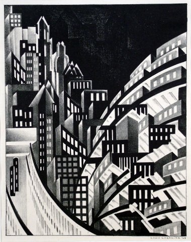
New York
Louis Lozowick (1892-1973), New York, lithograph, c. 1925, signed and dated 1923 in pencil. Reference: Flint 6. In excellent condition, the full sheet with deckle edges, printed on a cream wove BFK Rives paper (with the watermark initials BFK); 11 3/8 x 8 15/16, the sheet 15 3/4 x 11 1/4 inches. Margins: left 1 3/8, bottom 2 1/8, right 1, top 2 3/8 inches. One of approximately 15 known impressions.
A fine fresh impression of this great rarity.
Flint (1982) lists an impression in the National Museum of American Art (Smithsonian) but lists no other institutions holding this print; an impression was given to the British Museum in 1993 (and it served as the cover print for the catalog of their major exhibition The American Scene, The British Museum Press, 2008).
“New York” is a cubist/futurist vision of the city Lozowick conceptualized while in Europe during the period from 1920-24. “New York” is a composite of recollected views – the Brooklyn Bridge is at the lower left; much was recalled, according to Lozowick, from trips on the elevated line on West 109th Street made when attending the National Academy of Art during the years 1912-15; the buildings and the elevated subway cars at the right are treated in what Lozowick called a “futurist technique.”
British Museum curator Stephen Coppel, in The American Scene catalog, calls “New York” “Lozowick’s most important print,” expressing his “utopian vision of New York as the ultimate symbol of the modern American city.”
Lozowick was of course influential in developing the American School of Precisionism, even while he was in Europe in the early ’20’s, and then later when he returned to the U.S. In his essay on the Americanization of Art, written in the late ’20’s, he famously noted that the “artist who confronts his task with original vision and accomplished craftsmanship, will note with exactitude the articulation, solidity and weight of advancing and receding masses, will define with precision the space around objects and between them; he will organize line, plane and volume into a well knit design…and weave organically into every composition an all pervading rhythm and equilibrium.”
