Archive for June, 2009
Tuesday, June 30th, 2009

Francisco Goya (1746-1828), etching, lavis, burin and burnisher, 1810, Plate 20 from the Disasters of War. Harris 140 I/2 (of III/7). A working proof before letters and numbers [with signature and date lower left]. 6 1/8 x 9, the sheet 7 5/8 x 9 15/16 inches.
Provenance: Infante Don Sebastian de Borbon y Branganza; George Prevot (This is the proof referred to in Harris as Lima Private Coll. (ex Provot). Sold by Prevot in Paris, April 10, 1935, Hotel Drouot, in the sale of Prevot’s Goya collection, catalog number 49. );Private Swiss Collection
An extraordinarily fine proof impression.
One first state impression is known, and about nine other second state proofs have been accounted for; eight are in major institutions (Boston MFA, Madrid BN, New York MMA, Paris BN and BAA, Berlin KK).
In this state there was extensive etched re-working of the original design and filling in of the unworked areas in the right foreground; with the false biting burnished on the figures, with lavis which fails to print in some of the very clean wiped impressions. Although relatively clean wiped, lavis bordering can be seen quite clearly on this impression. No proof is known with the earlier 8 only, or with nos. 8 and 20.
The print quality is extraordinary, particularly when compared to that of the edition (the First Edition was printed posthumously, in 1863; six additional editions followed).

Detail
Posted in Uncategorized |
Tuesday, June 30th, 2009

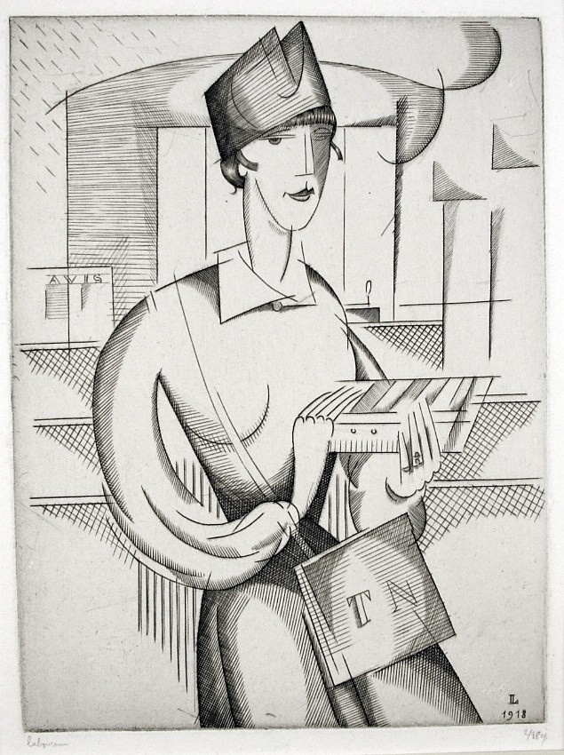
Marguerite Zorach (1887-1968), Two Female Nudes (also known as The Dancers), c. 1915-20, lineolum cut, signed in pencil lower right margin. One of a small number of proofs; there was no edition. In excellent condition, on a very thin cream Japan paper, with margins, 8 1/4 x 6 1/2, the sheet 12 x 10 1/2 inches. Archival mounting with window mat.
A fine impression of this very rarely encountered American modernist/cubist print.
Provenance: The Heald Collection, with its mat.
The Zorachs (William and Marguerite), who met in Paris, spent several summers in Provincetown (1915, 1916, 1921, 1922), and it is surely there that Marguerite created this cubist composition, which bears some resemblance to other linoleum cuts she created there, including A New England Family, and Provincetown Players (indeed the two women portrayed here may have been Provincetown Players).
The linoleum cut technique was well suited to Zorach’s approach to printmaking at the time; she could carve the image herself, and print it herself by hand.
Zorach was focused on the artmaking, not marketing or distribution of prints, so she did not edition them, number them, sign them all, or keep careful records of the number of prints produced. This has had a mixed effect on Zorach’s reputation as a printmaker – some of her prints are little known and rarely seen – but today her prints are increasingly sought after by knowledgeable collectors.
Posted in Uncategorized |
Tuesday, June 30th, 2009

Francisco Goya (1746-1828), Who Will Bell the Cat (Quien se Pondra El Cascabel at Gato?); also Animal Folly (Disparate de Bestia), etching, c. 1820, burnished aquatint and drypoint. Reference: Harris 268, Delteil 222. In excellent condition, the full sheet, on fine laid paper, 9 1/2 x 13 3/4, the sheet 12 x 17 1/4, archival window mat.
Published by L’Art with the title “Otras Leyes Por el Pueblo and below “(Autres loie pour le peuple)” [other laws for the people] with “Goya inv. et sc.” and “L’Art” to the left and “Fcois Lienard, Imp Paris” to the right. One of the four additional plates prepared for the Proverbios Series but unpublished until the late nineteenth century (1877). (There were initially 18 prints in the set, which was first published in 1864.) One working proof of Quien se Pondra is known, then some posthumous trial proofs before letters prior to the edition.
Provenance: ex Collection Frederick Garnet Rice (Lugt Supplement 1042a), his stamp verso.
A fine impression, with the aquatint contrasts clear, and the drypoint scratches vivid as well.
Harris notes that the “elephant is copied from a pen and ink drawing which represents two elephants and their keeper. There are etched traces of the second elephant in the rocks above the Moors.” In this impression these etched traces are quite clear.
The generally accepted interpretation of this print is that the elephant, representing the people, is being seduced into accepting laws which would sap its strength and put it at the mercy of the ruling class. The fable of the mice who held a meeting to discuss what to do with the cat (they decided to bell it, but then had to decide who would take on the task) was in an anthology that was almost surely known to Goya. In the composition one of the cowering Moors holds a book (laws?) while another holds out a bell harness in the direction of the massive animal.

Posted in Uncategorized |
Tuesday, June 30th, 2009

Francisco de Goya (1746-1828), Bien te se está – It serves you right, etching with aquatint with touches of burin; on laid paper, circa 1808-1814, Harris 126 I.3 (of III.7). 14.1 x 20.4 cm; the sheet 20.8 x 29.7
A working proof impression for plate 6 of Los Desastres de la Guerra , with the earlier number 26 in the lower left corner, but before the additional burin work in the two known I.4 working proofs (Paris Gil and the Cean Bermudez Album impressions).
Harris lists one impression of state I.1 (Berlin) and one of state I.2 (Boston). Of the present state I.3, six impression are known, including this one that was formerly in the collection Georges Provôt in Paris
Provenance: Infante Don Sebastian de Borbón y Braganza
Georges Provôt, Paris
his sale, Hôtel Drouot, April 10, 1935, lot 37
private collection, Switzerland
Working (lifetime) proofs of the Disasters prints are of course of the utmost rarity; no edition was made during Goya’s lifetime – the First Edition of Los Desastres de la Guerra was published posthumously, in 1863, and seven editions were made in all.
Posted in Uncategorized |
Tuesday, June 30th, 2009

Jules Pascin (1885-1930), Comparaison (Nude Bathers), 1929, drypoint and aquatint, signed in pencil and numbered (99/253). Reference: Hemin 162 (p. 133). In good condition with full margins, slight light stain, on cream wove paper, 7 1/4 x 7, the sheet 16 1/2 x 13 inches.
The plate for this print was not cut squarely, so the top margin is angled; also, at the right of the plate one can see a watery line within the platemark where the plate was not completely bitten by acid.
A very good impression of this rather idiosycratic print. The voluminous nudes, and light virtuoso drypoint lines are characteristically Pascin’s; the darkness and shading of the aquatint gives the print an ominous, disturbing feel – another side to Pascin’s character.
Although the numbering suggests an edition of 253, we believe this number (and the other number shown, 99, might well have been made up; our experience with Pascin prints is that the numbering is often quite arbitrary, bearing no relation to the actual number of impressions printed (which, we believe in this case to have been relatively small).
The plate for this print was not cut squarely, so the top plate mark is angled; also, at the right of the plate one can see a watery line within the platemark where the plate was not completely bitten by acid. These are characteristics of a trial proof; one wonders – again – whether an edition for this plate was even planned. Yet despite it’s curious flaws – it’s hardly an example of professional printing – it has its aesthetic value.
Pascin (born Julius Pincas) was born in Bulgaria, in 1885. By his mid-teens he had experienced life in a bordello, had traveled widely in Europe developing as an artist, and early in the new century ventured to Paris, where he became a fixture in the burgeoning art scene. He had a dozen works in the Armory Show in New York (1913), and soon thereafter became a citizen of the US, living and showing his works in New York. He was married to the artist Hermine David.
Posted in Jules Pascin |
Tuesday, June 30th, 2009

Edgar Chahine (1874-1947), drypoint, Le Ciacolone (Les Bavardes), Venise, 1922, signed, titled and numbered (74/100) in pencil. Reference: Tabanelli 348, third state of three, from the edition of 100. On a green laid paper with a letters watermark. With small margins, 12 1/2 x 8 1/2 (the sheet 13 1/2 x 10). In generally good condition apart from nicks and remains of old hinging right margin edge; fold at lower right; the image surface excellent, archival mounting.
A fine atmospheric impression, printed in brownish/black ink on an old green laid paper, with a veil of plate tone but carefully wiped to create areas of light (e.g., the blouse of the woman at left), and with ink left on the plate to create areas of shadow (e.g., lower left). The very heavy burr from the drypoint work gives the print a satiny glow.
Les Bavardes was created at a propitious moment in Chahine’s career – he had recently married Julia Gaumet, had left Paris and traveled through France and down to Venice. At the height of his artistic powers (and about to receive much recognition back in Paris), his Venice portraits of this time are quite different from his earlier Belle Epoque work – he portrayed women with children, little known Venetian alleys and courtyards, and, as in this example, older Venetian women talking in the streets.
Posted in Edgar Chahine |
Tuesday, June 30th, 2009
Edgar Chahine (1874-1947), drypoint, Le Ciacolone (Les Bavardes), Venise, 1922, signed, titled and numbered (74/100) in pencil. Reference: Tabanelli 348, third state of three, from the edition of 100. On a green laid paper with a letters watermark. With small margins, 12 1/2 x 8 1/2 (the sheet 13 1/2 x 10). In generally good condition apart from nicks and remains of old hinging right margin edge; fold at lower right; the image surface excellent, archival mounting.
A fine atmospheric impression, printed in brownish/black ink on an old green laid paper, with a veil of plate tone but carefully wiped to create areas of light (e.g., the blouse of the woman at left), and with ink left on the plate to create areas of shadow (e.g., lower left). The very heavy burr from the drypoint work gives the print a satiny glow.
Les Bavardes was created at a propitious moment in Chahine’s career – he had recently married Julia Gaumet, had left Paris and traveled through France and down to Venice. At the height of his artistic powers (and about to receive much recognition back in Paris), his Venice portraits of this time are quite different from his earlier Belle Epoque work – he portrayed women with children, little known Venetian alleys and courtyards, and, as in this example, older Venetian women talking in the streets.
Posted in Uncategorized |
Tuesday, June 30th, 2009

Sir David Young Cameron (1865-1945), Old St. Etienne, etching and drypoint, 1907, signed in pencil lower right. Reference: Rinder 400. In very good condition, on old cream wove paper, with small margins (remains of prior hinging verso), 16 7/8 x 9, the sheet 19 1/2 x 9 1/2 inches. Archival storage with window mat.
Provenance: estate of Elizabeth Hutton Tupson, Lady Cameron.
A fine impression, printed in a dark brown ink with a veil of plate tone.
Cameron was, of course, one of the greatest of the British Etchers, and Old St. Etienne is one of the finest of his several church-front portraits.
In 1929 Cameron’s work sold at record prices for British prints; his The Five Sisters, York Minster sold for $3200 in August 1929, perhaps a higher price than any British print even to this day. Cameron’s star fell with the Depression. Robin Garton, always an insightful observer, noted in the early 1990’s that Cameron was “an artist of quite remarkable qualities and it would be hard to find a more worthwhile artist who is more out of fashion.” Today there are stirrings of interest in artists whose reputations have withstood the fashions of recent art movements, and Cameron’s time may be – again – at hand. In any case, this is a splendid print.
Posted in Uncategorized |
Tuesday, June 30th, 2009

Fiske Boyd (1895-1975), Interior, woodcut, 1936, unsigned. Published by the American Artists Group. In very good condition, on ivory wove paper, the full sheet, 6 x 10 1/4, the sheet 13 x 18 inches. In the original mat as issued (the mat has some soiling and a tear, not affecting the print).
A very good impression.
The American Artists Group was formed in 1934, during the Great Depression, with the express purpose of providing unsigned inexpensive prints which were to be widely distributed. AAG published prints by Ganso, Spruance, Meissner, and Lankes, among many other noted artists. Although the prices of these prints was minimal, collectors were saving what money they had, and so the editions were not sold out; most printings were under 200 and many under 100. Ironically, today, these prints are considered rare collector’s items.
Boyd seems to have become more modernist over time; in the picture depicted in this woodcut one can see a vision of the sort of prints he was to make a bit later in his career. Even here, he uses the medium of the woodcut to carve out a flat, modernist composition, in a sense ahead of his time for an American artist.
Posted in Uncategorized |
Tuesday, June 30th, 2009

Fiske Boyd (1895-1975) woodcut Concept, 1951, signed in pencil [also initialed and dated in the block], from the edition of 100 published by the Society of American Etchers-Engravers and Woodcutters, NY.
A fine impression, in very good condition, with wide margins, on a heavy cream wove paper, 12 x 9 inches (the sheet 17 1/4 x 14 1/4), archival mounting.
This is a modernist view of the East River Drive (also known as Franklin Delano Roosevelt Drive), New York City. (The tall building is the UN Building, etc.) One of Boyd’s most famous images, this print is frequently chosen by museum curators to represent the post War modernist woodcut in America (and it is featured in the collection of many museums such as the Smithsonian Museum of American Art or the San Francisco Museum of Art).
Fiske Boyd printed each of his woodcuts by hand, “by hand rubbing with the back of a spoon.” He said that “Even though it is relatively labourious and takes too long the way I do it, I come back to it time and time again….the very tediousness of the labor involved makes possible – nay unavoidable – the working out of a pictorial design with a kind of deliberateness that gives a peculiar control over certain aspects of the work.”
Posted in Uncategorized |
Tuesday, June 30th, 2009

HERMAN ARMOUR WEBSTER (1878-1970), Monte Caprino, Rome, etching, c. 1925, signed in pencil lower right. In excellent condition, with full margins and deckle edges, 5 3/8 x 7, the sheet 9 1/4 x 11 1/4 inches, archival matting.
A fine strong impression, printed in black ink on cream laid paper.
Born in New York and educated at Yale, Webster discovered Paris and its artistic ferment in 1900, moved there in 1904 to study at the Académie Julian with J.-P. Laurens and the etcher Eugène Béjot, and also was inspired by the etchings of Whistler and Meryon. Webster travelled extensively in Europe, and made numerous etchings of Paris and other European cities; he became widely distinguished as a painter-etcher both in Europe and the U.S.
During the middle ages the Campidoglio, one of the Seven Hills of Rome, was simply known as “Monte Caprino” where goats grazed among the ruins. In the 16C Michelangelo redesigned the square to accommodate the position of a pre-existent palace, the Palazzo dei Conservatori. On its foot there is the imposing Piazza Venezia, one of the biggest and most central squares of the city.
Posted in Uncategorized |
Tuesday, June 30th, 2009

Henri Boutet (1851-1919), Au Theatre a Paris, drypoint, 1884, signed in pencil and inscribed 1 etat (1st state). Reference: Henri Beraldi, Les Gravures du XIX Siecle, Vol. 2, p. 176. In excellent condition, printed on wove paper with full margins, 9 1/4 x 5 1/2, the sheet 13 1/4 x 8 1/2 inches, archival matting.
With the red Boutet stamp (Lugt Supp. 1295a).
A fine rich impression, with much burr from the drypoint work, a light plate tone wiped selectively, e.g., the ribbon is whiter than the background. Boutet apparently used a tiny roulette tool to create the effects of gray shading in the spaces surrounding the model.
This is a proof impression; before the addition of letters at the bottom margin.
Boutet was one of the most talented of the Belle Epoque artists. He made a number of small drypoint portraits of women in tiny editions (20 or so), of which this example is a first state proof. These prints, carefully printed, wiped and signed, are rarely encountered today, although reproductions of Boutet’s work are quite common. He became popular as an illustrator for magazines such as the Paris-Croquis and Le Courrier Francais, and later founded publications including La Revue Artistique. He was well known at the turn of the century as “le Petit maître au corset” – the small master of the corset.
Posted in Uncategorized |
Tuesday, June 30th, 2009

Georges Braque (1882-1963), Femme Assise (Seated Woman), etching, 1934, signed in pencil lower right and numbered (12/50) lower left. Reference: Vallier 24, only state. From the edition of 50 published by Maeght, Paris, in 1953 (only a few trial proofs were printed in 1934). Printed by Visat, Paris. In very good condition apart from pale light and mat stain, on Arches wove paper, the full sheet with deckle edges, 9 1/2 x 7 1/8, the sheet 17 3/4 x 12 1/2 inches. Archival mounting with window mat.
A fine impression, with good contrast among the various cross-hatching and linear patterns.
In this classic cubist composition of a girl playing a guitar Braque displays a panoply of textures and patterns, apparently working the plate to a near breaking point in pure etching. In doing this he follows a long tradition of printmaking, from Callot and Hollar to Meryon and Whistler, and then even to his cubist colleague Picasso.
The etching is similar to a Braque painting called Femme a la Guitare (Girl with a Guitar); this is shown in the Maeght volume Peintures de Braque, 1928-35, p. 59.
Posted in Uncategorized |
Tuesday, June 30th, 2009

George Biddle (1885-1973), Goat Herder’s Wife, 1928, lithograph, signed in pencil lower right and titled and numbered (64/100) in pencil lower left margin [with the inscription “Biddle/1928” in the plate lower right] Reference: Pennigar 82, Trotter 48. Printed by George C. Miller. From the edition of 100. In excellent condition, on Rives cream wove paper, with full margins (tiny nick upper right edge); 9 1/2 x 13, the sheet 16 x 18 1/2 inches. Archival mounting (unattached mylar hinging between acid free boards, glassine cover).
A fine clear impression, in pristine condition.
After Groton, Harvard College and Harvard Law (and several breakdowns) Biddle decided that a conventional career in law was not for him; he decided on art, went to Paris, worked with Mary Cassatt and familiarized himself with modernist currents in art (as well as more traditional European art).
After serving in WWI, and the dissolution of his marriage, he became interested in working outside of the European tradition (although his travels continued to include Europe, and he spent a period working under the influence of Jules Pascin in Paris in the mid-20’s). Goat Herder’s Wife reflects the time he spent with Pascin, expecially in terms of the modernist flatness and freedom of the composition. Biddle reached a an aesthetic high point in this and several other prints he did of Mexico and Haiti in the late ’20’s; later his work was caught up in the social realism of the ’30’s.
Posted in George Biddle |
Tuesday, June 30th, 2009

George Biddle (1885-1973), The Expectant Thistles, 1928, lithograph, signed and dated in pencil lower right, titled and numbered in pencil lower left [also inscribed in the plate lower left Biddle/1928/46]. References: Pennigar 80, Trotter 46, only state, from the edition of 100. Printed by George C. Miller. On cream wove Rives paper, the full sheet with deckle edges, in pristine condition (never framed or matted), 7 x 11 1/4, the sheet 11 1/2 x 15 3/4 inches. Archival mounting (mylar unattached hinging between acid free mats, glassine cover).
A fine fresh impression; a good example of Biddle’s technique of scratching and sanding the lithographic stone in order to get detailed effects (which sometimes approximated the appearance of drypoint burr in etching).
The year 1928 was important for Biddle; he made many of his greatest images of Haiti and Mexico (where he traveled with Diego Rivera) in this year.
The composition of The Expectant Thistles reflects the experience Biddle had working with Jules Pascin, who became his friend and colleague when Biddle was in Paris from 1924-6. The composition is modernist – without rigid adherence to conventional positioning and depth, and it’s witty too; while Pascin typically populated sheets such as this with nudes, Biddle turns to donkeys, and a few tiny (dressed) people as well.
Posted in George Biddle |
Monday, June 29th, 2009

Hans Sebald Beham (1500-1550), Virgin and Child with the Pear, engraving, 1520. Initials monogram and date in the plate. References: Bartsch 18, Pauli, Hollstein 19. First state (of two). In good condition, on old laid paper with thread margins on three sides, trimmed on the platemark bottom right and bottom, and archival mounting. h: 4.5 x w: 3 in / h: 11.4 x w: 7.6 cm
A very good impression of this rarity.
Hollstein indicates that earlier impressions, such as this one, do not have a scratch above the head of the Virgin.
Beham was one of the Northern Renaissance Little Masters, so called because of their eminence in producing small-scale engravings such as the Virgin and Child with a Pear. Beham was born in Nuremberg in 1500, and may have trained under Durer, though his training is no more certain than that of his younger brother Barthel. He made his first engraving in 1518, and later became known for producing woodcuts as well.
Beham’s Madonna with the Pear has a similar composition but in reverse to Durer’s engraving of the same subject done only 9 years earlier. In both prints the Madonna rests against a tree and holds the pear away from the Child; Durer’s image is larger and includes a city background; Beham draws no clouds or buildings in the space next to the Virgin, but instead features her long curly hair blowing towards the right.
The pear as a pacifier as opposed to the “apple of discord” or temptation occurs as an attribute of the Virgin in a sculpture at the Cathedral at Chartres, completed in 1240.
Posted in Hans Sebald Beham |
Monday, June 29th, 2009

James Whistler (1830-1903), Battersea Morn (also Battersea Dawn), drypoint, 1875, Kennedy 155, signed in pencil with the butterfly and inscribed “imp”. Kennedy 155, first state (of 4), Glasgow 174, first state (of 5). On laid paper with a Coat of Arms watermark, also signed in the plate with a faint butterfly upper right, with full margins, in good condition apart from a few slight fox marks and light soiling in the margins, a tiny printer’s crease in the right edge, hinge stains and small related creases in the upper corners verso, 5 3/4 x 8 7/8 (sheet 8 x 13) inches, archival mounting.
Provenance: Ex coll. George Mathew Adams (Lugt 59, with his stamp on recto lower right and verso).
Kennedy Galleries (stock no. a 38302)
Knoedler & Co., New York (stock no. MK 17120).
A fine, rare, very early proof impression, printed in a pale sepia ink, before extensive additional line work and shading were added to give the buildings and vessels further definition. In this state the print is an iconic impressionist image. This is rather rare; this print was not published but only issued in proofs.
Katherine Lochnan has suggested that when Whistler turned to the Thames in the 1870’s for subjects for printmaking (as he had in earlier years) he was experimenting with the possibilities of printmaking, without having any publication in mind. In Battersea Dawn, according to Lochnan, Whistler “reduced his line to the thinnest, most suggestive ever employed in the history of the medium. The images were drawn with faint, hair like lines, probably using a diamond-tipped needle.” In this delicate impression, Whistler gives the industrial area of Battersea, across the Thames from Chelsea, an atmospheric, impressionistic glow.
Posted in James Whistler |
Monday, June 29th, 2009

Rembrandt van Rijn (1606-1669), Three Oriental Figures (Jacob and Laban), etching, 1642, [signed and dated in reverse in the plate].h: 5.8 x w: 4.4 in / h: 14.7 x w: 11.2 cm
References: Bartsch, Hollstein 118, second state of two. In very good condition, two tiny (oil?) dots in matrix, with thread margins all around. With a Seven Provinces watermark (characteristic of numerous lifetime impressions of Rembrandt prints). Archival mounting.
Provenance: J.B. de Graaf (Lugt 1120), with the chop mark recto bottom edge
A very fine clear impression, with the drypoint work at the right of the porch, the man’s hat at center, and the pointing hand clear, with faint traces of burr on the latter. Still with lines in the sky. This is not an uncommon print, but it is unusual to encounter the Three Oriental Figures in such a fine impression.
In the second state light drypoint work was added to the foliage at the right opposite the porch and elsewhere, but the essential composition was unchanged from the first state.
Posted in Uncategorized |
Monday, June 29th, 2009

Rudolph Ruzicka (1883-1978), [Riverside Factory], wood engraving in colors, circa 1920, signed in pencil lower right and inscribed imp. In excellent condition, on laid paper with wide margins, 7 3/4 x 5 1/4, the sheet 12 x 9 1/2 inches, archival mounting with window mat.
A fine impression, with the subtle colors fresh.
Ruzicka’s color wood engravings are rarely encountered in today’s marketplace, but are highly valued by collectors, both because of the subtlety of their design and composition, and Ruzicka’s technical mastery of the medium.
Rudolph Ruzicka was an eminent wood engraver, etcher, illustrator, book designer and inventor of typographic fonts. He came to the US from Bohemia, living first in Chicago where he took drawing lessons at Hull House and later becoming an apprentice wood engraver. From 1900 to 1902 he studied at the Chicago art institute, and in 1903 moved to New York where he worked as an engraver and furthered his artistic studies. He went on to achieve fame as a book illustrator, artist and typographer. As a wood engraver he surely was influenced by the 19th Century French master August Lepere, and in turn Ruzicka influenced generations of American artists and illustrators who worked in the difficult and exacting field of wood engraving.
$1000
Posted in Uncategorized |
Monday, June 29th, 2009

Wallerant Vaillant (1623-1677), [Venetian Woman], mezzotint, circa 1670. References: Wurzbach 68, Hollstein p. 205, in good condition, with thread margins, on old laid paper, 12 1/8 x 9 1/8 inches.
A fine rich impression.
This rare print has been the subject of much discussion among art historians. Wurzbach attributes it to Vaillant; Hollstein to another (unknown) artist. It was clearly done in the 17th Century, early in the development of the mezzotint technique.
Vaillant, a French portrait painter and etcher trained in Flanders was a collaborator of Prince Rupert, one of the earliest artists working in mezzotint, and he developed the technique further after leaving the employ of Rupert, to achieve prints more beautiful and technically satisfying than those of Rupert. The subtle technique and professionalism of Venetian Woman has led historians to attribute the print to Valliant.
Posted in Uncategorized |
Monday, June 29th, 2009

Tod Lindenmuth (1885-1956), Low Tide, color woodcut, c. 1915, signed and titled in pencil lower margin. In very good condition, with wide margins (some flattened creases in margins, small area of thinning upper left margin edge, a few prior hinges attached to margin edges, only the slightest hint of light tone); on a Japan wove paper, 14 7/8 x 14, the sheet 21 x 17 3/4 inches, archival mounting with window mat.
A fine impression of this rare Provincetown woodcut, made from three blocks in light, medium and dark blue.
Although Lindemuth himself titled this Low Tide, there appears to be some confusion about this title. In her classic volume American Prints and Printmakers Una Johnson refers to another Lindemuth color woodcut (pictured on page 15) as Low Tide. (We believe this may in fact be The Runway, as titled in another impression by Lindenmuth.)
We do not know the edition sizes of the Lindenmuth prints, but believe they are small; they are rarely encountered on the market today.
In the extensive archives on Lindenmuth in the Archives of American Art (Smithsonian Institute), his daughter, in an interview, points out the Provincetown piers and fishing runways Lindenmuth depicted in his color woodcuts. These prints were important to Lindenmuth, who regarded the color print as a “small painting.”
These woodcuts were important as well to the group of American artists (including the Zorachs, Max Weber, BJO Nordfeldt) who were influenced by European Modernism and Japonisme (quite evident in Low Tide), and who made woodcuts along with Lindenmuth in Provincetown in the 1915-1925 period; these were in many respects the beginnings of American Modernism.
Posted in Uncategorized |
Monday, June 29th, 2009

Tod Lindemuth (1885-1956), The Runway (Provincetown), color woodcut, 1917, signed in pencil lower right, titled and numbered (67/100; possibly later, see below) lower left. On medium weight Japan paper, in very good condition, with margins (slight evidence of yellowing here and there, the slightest marginal light staining), the full sheet with deckle edges, 14 3/8 x 11 1/8, the sheet 18 x 15 1/2 inches, archival mounting with window mat.
A fine, carefully printed impression of this important – and rare – American early modernist woodcut.
Although the print is annotated with a number, we believe this is probably not evidence of the number of impressions made (and this misnumbering of prints was not unusual at that time); in fact this print appears to be exceedingly rare, and probably was not made in an edition at all. When Lindemuth’s daughter was interviewed for the artist’s file for the Archives of American Art (Smithsonian Institute) she noted that this print was “one of the few color wood blocks I’m aware of, it’s of the fish hauling runways in Provincetown in 1917.”
A variant of this print (from the collection of the New York Public Library), without the background structure (the runway, in fact) is pictured in Una Johnson’s American Prints and Printmakers (page 14). There it’s called “Low Tide.” (We have another Lindemuth print which he titled “Low Tide” which bears no resemblance to either of these.)
Lindemuth, a painter, was one of a number of American artists (including the Zorachs, Max Weber, BJO Nordfeldt) who were influenced by European Modernim and Japonisme, and who made woodcuts (often in Provincetown) in the 1915-1925 period; these were in many respects the beginnings of American Modernism.
Posted in Tod Lindenmuth |
Monday, June 29th, 2009

Reginald Marsh (1898-1954), Irving Place Burlesque (#2), etching, 1928, signed in pencil lower right by Felicia Meyer Marsh, numbered (21) lower left margin, also with the initials RW lower left. Reference: Sasowsky 49, a proof impression of the 7th state (of 8). In good condition with margins, with characteristics of a Marsh proof, i.e., some inky fingerprints in margins, trimmed irregularly especially at left margin edge, printer’s creases. On an ivory laid paper, 7 x 10 3/4, the sheet 9 3/4 x 13 1/4 inches.
A very good impression, before engraving and additional work darkening composition.
Apparently Marsh experimented with burnishing and scraping this plate, particularly the group of dancers at the left. In this impression they are rather lightly drawn, and in the final state they appear to be darker. The only lines he added for the final state (that we can find) are cross-hatching lines on the column at the far right (partly hidden by a man); this is definitive evidence that this is an earlier state, but in other respects the lines and composition are the same as in the last state.
The numbering 21 on this impression is a confusing element; according to Sasowsky an impression in the final state was numbered 21 (and the two known impressions in the seventh state were numbered 13 and 14), but of course Marsh (and to a lesser degree Sasowsky) were not infallible in their numbering and records. The highest number Sasowsky cites for the print is 25.
Irving Place Burlesque #2 is a close-up depiction of the stage, the piano player, and some of the audience; aother print entitled Irving Place Burlesque (S 75) done about the same time shows only a tiny portion of the stage and focuses more on the house and the audience.
Posted in Reginald Marsh |
Monday, June 29th, 2009

Reginald Marsh (1898-1954), Switch Engines, Erie Yards, Jersey City, Stone No. 3, lithograph, 1948, signed in pencil lower right. Reference: Sasowsky 30, only state, from the edition of 253 as published by the Print Club of Cleveland. In very good condition, slight spotting verso, 9 x 13, the sheet 13 x 16 3/4 inches.
A fine fresh impression, in its original mat with the inscription on the mat of the Print Club of Cleveland, with its stamp verso, printed on a cream wove paper, the full sheet with deckle edges.
Marsh made two earlier versions of this lithograph, which he apparently decided were not adequate, before developing this version for the edition. The earlier versions were more detailed and realistic; this is more impressionist, and perhaps captures the feel of the rail yards better than the more straightforward versions.
Railroad imagery was an important recurring theme for Marsh, both in his etching and lithographic work. Sasowsky wrote that the locomotives “are phallic in form and appear in Marsh’s work almost as a leitmotif throughout his career. They are rendered with great knowledge, affection, and dignity.”
Posted in Reginald Marsh |
Monday, June 29th, 2009

Reginald Marsh (1898-1954), St. Jean de Luz, lithograph, c. 1928, signed in pencil lower right and inscribed “40 proofs” lower left [also signed in the plate lower left], printed on a chine colle. In good condition, the full sheet with full margins (slight soiling, nicks, handling folds in margins, remains of prior hinging verso). 8 1/4 x 12 5/8, the sheet 12 3/4 x 19 1/4 inches, archival matting.
A good strong impression.
Provenance: Estate of Ernest Shapiro
In this marvelous display of draftsmanship, Marsh draws a fierce storm, with a fiery sky and a group of people trying to get onto a pier just as an enormous wave breaks over it.
Marsh made a group of lithographs during a trip to France in 1928; most were scenes of Paris street and cafe life. Aesthetically St. Jean de Luz is surely the most accomplished of this group (and is also a rather unusual subject for Marsh).
Saint-Jean-de-Luz is a fishing port on the Basque coast, just south of Biarritz. The port lies on the estuary just before the river joins the ocean.
Posted in Reginald Marsh |
Monday, June 29th, 2009

Reginald Marsh (1898-1954), Loco-Erie Watering, 1929, etching, signed in pencil lower right, and numbered (16) lower left. Reference: Sasowsky 85, fourth state (of 4). On Whatman paper. In very good condition (apart from two hinging stains verso showing through top margin just into plate mark, some printers ink and soiling in margins), with margins, 7 x 9 7/8, the sheet 8 1/4 x 11 7/8 inches. Archival matting (acid free hinging and board, window mat, glassine cover).
A fine clear black impression.
Provenance: Kennedy Galleries, New York, and with their label and annotations still on mat.
Marsh (obviously) printed this personally, and this paper is specified in Sasowsky for his numbered impressions 8-18 of the definitive fourth state. He probably did not print more than about 20 impressions.
In Thomas Craven’s Treasury of American Prints (1939), Marsh is quoted as saying in response to a question about the size of his editions: “Since I do practically all my own printing, I do not limit the edition. The buyer limits the edition – he rarely buys, I rarely print. I usually print fifteen or twenty and sell one or two in the next five years – so why limit the edition?” (That was in 1939; today of course Marsh’s etchings are treasured as icons of American printmaking in the ’20’s and 30’s.)
Posted in Reginald Marsh |
Monday, June 29th, 2009

Reginald Marsh (1898-1954), Fan Dance at Jimmy Kelly’s, etching, 1936, signed and inscribed 50 proofs (only 24 known printed) [also with the initials and date in the plate lower left]. Reference: Sasowsky 161, third state (of 3). In very good condition, with wide margins, on Rives cream wove paper (with the Rives watermark). 6 x5, the sheet 9 1/2 x 7 inches. Archival mounting.
A fine, delicately printed impression.
Fandance was printed in three states; the design was essentially complete in the first state and small changes were made for the second and third states. Two proofs were made of each of the first and second states; Sasowsky indicates that although Marsh noted that an edition of 50 impressions was scheduled, only 20 impressions of the third state were printed.
The Marsh notation “50 impressions” represented wishful thinking as to the size of the edition on his part. In Thomas Craven’s Treasury of American Prints (1939), Marsh is quoted as saying in response to a question about the size of his editions: “Since I do practically all my own printing, I do not limit the edition. The buyer limits the edition – he rarely buys, I rarely print. I usually print fifteen or twenty and sell one or two in the next five years – so why limit the edition?” (That was in 1939; today of course Marsh’s etchings are treasured as icons of American printmaking in the ’20’s and 30’s.)
Posted in Reginald Marsh |
Monday, June 29th, 2009

Reginald Marsh (1898-1954), Erie Rail Road Locos Watering, etching and engraving, 1934, signed and number (# 2). Reference: Sasowsky 155, eighth state (of 8). From small group of impressions in this state (highest number located is #18, but possibly numbering was not in order; earlier states only 1 or 2 proofs. On BFK Rives cream wove paper, with their (partial) watermark. In very good condition, with margins, 8 7/8 x 11 3/4, the sheet 10 3/4 x 14 3/4 inches.
A brilliant black impression.
Marsh has captured the grime, dirt, black colors of the trains and smoke, partly through his artistry, and partly through the difficulty he had creating and printing this plate. After making two proofs the etching ground collapsed, and he had to burnish and scrape a film of foul biting; the plate still shows spots, akin to the phospherous grains which etchers from the time of Rembrandt used to create tiny dots of black on their impressions. Marsh then repeatedly re-engraved the plate, and this accounts for the astonishing blacks, and the burr (in the smoke at right center, for example). The final product was well worth the effort – it is arguably Marsh’s finest railroad engraving.
The number of prints that Marsh printed is not known precisely, but this print is quite rare, and many of the impressions are accounted for (e.g., #7 is at the Metropolitan Museum of Art, #8 at the Whitney, #12 is at the New York Public Library, etc.). This impression is #2.
On the size of Marsh’s lifetime editions, his famous quote explains the situation: “Since I do practically all my own printing, I do not limit the edition. The buyer limits the edition – he rarely buys, I rarely print.” Written on pencil at the bottom margin of this print, quite probably in Marsh’s hand, are the words: “Erie Locomotives Watering – $20.”
Posted in Uncategorized |
Monday, June 29th, 2009

Reginald Marsh (1898-1954), Tank Car Rail, 1929, etching, signed lower right and numbered 15 lower left margin [also signed and dated in the plate]. Reference: Sasowsky 86, fifth state (of 5). In very good condition, on cream laid paper with margins, 6 x 8 3/4, the sheet 8 1/8 x 11 inches, archival mounting.
A fine impression of this rarely seen image.
Marsh printed this personally, and worked on the plate extensively after creating areas of foul biting in the first state (foul biting occurs when acid gets through the etching ground and creates tiny holes in the plate, and resulting spots on the print). In his notes he writes that he “scraped, snaked and charcoaled this plate for hours.” He also added many lines in the sky and the smoke. The resulting gritty look, with tiny specks of black and lines of is perfectly appropriate for the subject matter.
Provenance: Kennedy Galleries, with their mat and label intact.
There are only about 18 impressions known of this print, and about 13 in this state. This was numbered 15 by Marsh; number 12 is in the Library of Congress, numbers 3, 5 and 6 in the New York Public Library Marsh estate collection.
In Thomas Craven’s Treasury of American Prints (1939), Marsh is quoted as saying in response to a question about the size of his editions: “Since I do practically all my own printing, I do not limit the edition. The buyer limits the edition – he rarely buys, I rarely print. I usually print fifteen or twenty and sell one or two in the next five years – so why limit the edition?” (That was in 1939; today of course Marsh’s etchings are treasured as icons of American printmaking in the ’20’s and 30’s.)
Posted in Reginald Marsh |
Monday, June 29th, 2009

Reginald Marsh (1898-1954), Star Burlesk, 1933, etching, signed in pencil lower right margin. Reference: Sasowsky 142. First state of three.
A very fine, early, clear and sharply printed proof impression of the very rare (perhaps unique) first state. (Sasowsky calls for only one impression of the first state, two of the second, and then an edition of an unknown number, probably about 20-25). In this impression some of the columns have yet to be shaded, the upper left corner is not yet fully etched, and some addititional shading has yet to be added to some of the heads in the foreground.
Star Burlesk was one of a series of such subjects undertaken by Marsh, and in the view of many observers (including this writer), is his most effective. The burlesque show took place at the Minsky’s Theatre in New York. Marsh had studied at Yale, and traveled through Europe, but found an inspiration in the life of New York. He was interested in sex, and the human body, but not just as an academician – he insisted on portraying real life rather than studio models. He discussed the burlesque work and world in these terms, “The whole thing is extremely pictorial. You get a woman in the spotlight, the gilt architecture of the place, plenty of humanity. Everything is nice and intimate.”
In very good condition, on white wove with margins (slight skinning margin corners verso), 12 x 9 (sheet 15 x 10 1/2) inches, archival mounting.
Posted in Uncategorized |
Monday, June 29th, 2009

John Sloan (1871-1951), Subway Stairs, etching, 1926, signed, titled and inscribed “working proof 1;” also with the notation “JS imp” in pencil bottom margin [with the name and date in the plate]. Reference: Morse 221, third state (of 7). There was an edition in the seventh state, 60 printed. In very good condition, on ivory laid paper with margins (the slightest toning toward the margin edges). 6 7/8 x 5, the sheet 8 1/2 x 7 1/2 inches. Archival mounting, with acid free board, window mat.
A fine early state proof impression of one of Sloan’s most alluring subjects.
In this third state proof impression the composition is essentially complete, but the heavy cross hatching has yet to be done on the girl’s legs (which was added in the fourth state, and then burnished out in the seventh state), and some work has yet to be done on the girl’s face. According to the notation this impression was printed by Sloan; the prints for the edition were done by printers Platt, White and others.
Sloan wrote of this print: “In modern times incoming trains cause updrafts in the subway entrances. Getting on an omnibus in the hoop-skirt was exciting in grandmother’s day.”
$5250
Posted in John Sloan |
Monday, June 29th, 2009

John Sloan etching Schuylkill River, 1894, signed, titled, annotated “100 proofs” [only 25 were printed], also signed by the printer “Peter Platt imp’ in pencil lower left margin. From the edition (of 25) all printed by Peter Platt. Morse 60, only state. Provenance: ex. coll. VO and MP Potamkin Collection; Kraushaar Galleries.
A fine impression, with plate tone. On a tan wove paper with a partial crest and fleur de lys watermark, with margins, in good condition, a tiny nick right edge, slightest browning toward outer margin edges, 8 1/4 x 5 1/4 (the sheet 12 1/2 x 10) inches, archival matting.
A relatively early (and rarely seen) print for Sloan (1871-1954), he was 23 when he made this etching. Here are his later comments on the print: “One of my few plates that looks like an etching from the connoisseur’s point of view. It might be that had I pursued the direction here suggested my etchings might have become quite popular. This plate was made with William Glackens beside me, absorbing his first and only lesson in etching.”
By 1894 Sloan was coming into his own as an illustrator for the Philadelphia Inquirer, and Glackens and Sloan had become devoted students of a local artist just a few years older than Sloan – Robert Henri. At this stage Sloan had become interested in Japanese prints, Fin de Siecle French posters; also, of course, there’s the hint of aWhistlerian aesthetic here.
Peter Platt was one of Sloan’s best and most favored printers. This print demonstrate why: the subtle use of plate tone (ink left on the plate during printing process) gives the impression an atmospheric quality.
$2250
Posted in John Sloan |
Monday, June 29th, 2009

John Sloan (1871-1951), “Up the Line, Miss?”, etching, 1930, signed, titled and inscribed 100 proofs [also signed in the plate]. Reference: Morse 243, fifth state (of 5). In excellent condition, with full margins (slightly irregular lower edge, typical for the older paper favored by this printer, see note below). On an old laid paper with a circles in shield watermark. 5 1/2 x 7, the sheet 9 1/2 x 12 inches. Archival mounting.
A fine impression.
Only 80 impressions of the edition were printed.
This impression is printed on an old laid paper, of the sort the printer and artist Ernst Roth collected and sometimes used for printing Sloan’s prints. Sloan remarked on this: “Roth is using some wonderful old paper he brought from Europe some years ago. This is very kind of him, as he is a first rate etcher himself.” This sheet may have been pulled from a book of old paper, accounting for the rough bottom edge.
Although this etching was made in 1930, it has the look of one of Sloan’s New York etchings, done much earlier. In fact, it is based on a 1907 drawing Sloan made, and was done when his dealer (Kraushaar) suggested he do some etchings based on his earlier New York drawings.
Sloan’s 1945 note on this etching: “A young lady of Greenwich Village who is about to treat herself to an afternoon drive on Fifth Avenue.”
Posted in John Sloan |
Monday, June 29th, 2009
John Sloan (1871-1951), “Up the Line, Miss?”, etching, 1930, signed, titled and inscribed 100 proofs [also signed in the plate]. Reference: Morse 243, fifth state (of 5). In excellent condition, with full margins (slightly irregular lower edge, typical for the older paper favored by this printer, see note below). On an old laid paper with a circles in shield watermark. 5 1/2 x 7, the sheet 9 1/2 x 12 inches. Archival mounting.
A fine impression.
Only 80 impressions of the edition were printed.
This impression is printed on an old laid paper, of the sort the printer and artist Ernst Roth collected and sometimes used for printing Sloan’s prints. Sloan remarked on this: “Roth is using some wonderful old paper he brought from Europe some years ago. This is very kind of him, as he is a first rate etcher himself.” This sheet may have been pulled from a book of old paper, accounting for the rough bottom edge.
Although this etching was made in 1930, it has the look of one of Sloan’s New York etchings, done much earlier. In fact, it is based on a 1907 drawing Sloan made, and was done when his dealer (Kraushaar) suggested he do some etchings based on his earlier New York drawings.
Sloan’s 1945 note on this etching: “A young lady of Greenwich Village who is about to treat herself to an afternoon drive on Fifth Avenue.”
$2100
Posted in John Sloan |
Monday, June 29th, 2009

John Sloan (1871-1954), Copyist at the Metropolitan Museum, etching, 1908, signed, titled, and inscribed “100 proofs,” also inscribed by the printer “Ernest Roth imp.” Reference: Morse 148, eighth state (of 8), from the JS edition (75 printed). In very good condition, on tan/ivory wove paper, with full margins, 7 1/2 x 9, the sheet 11 x 13 1/8 inches.
A fine impression printed in a brownish/black ink.
In his diary of September 1908 Sloan wrote “In the evening I stared to make a plate of a copyist at work in the Metropolitan Museum of Art, crowd around as it is a sheep picture which the lay copyist is ‘takin’ off’. Made preliminary drawing on tissue paper and grounded my plate and got the red chalk tracking sketches on the ground.”
Sloan had much difficulty with the faces of Dolly (his wife) and himself, at the left; that’s the reason for the multiple states. He noted in later years: “I’ve always had trouble with portraits of members of the family. I had the head of Dolly in and out of the plate innumerable times.”
In addition to the JS edition (in which this impression was included) there was a Weyhe edition of 115 prints, as part of a portfolio called Twelve Prints by Contemporary Artists, published in 1919.
Posted in Uncategorized |
Monday, June 29th, 2009

John Skippe (1742-1811), Joseph Sold by His Brothers, chiaroscuro woodcut after Raphael, 1783. [with these inscriptions in the plate lower right: R d’Urbino JS: Scul 1783 indicating that Raphael of Urbino is responsible for the composition and John Skippe for the print]. In good condition, mounted on a sheet of old cream laid paper, trimmed on the borderline; 8 1/4 x 11 1/4 inches; archival mounting.
A fine fresh impression of this rare chiaroscuro woodcut, printed in four blocks: light and medium olive green, dark grayish green and dark brown.
Provenance: ex Collection: Mr. and Mrs. Percy Simmons
Exhibited: Beyond Black and White, Chiaroscuro Prints, Indiana University Art Museum, and Indianapolis Museum of Art; 1989-90; number 55 in the catalogue.
Joseph Sold by His Brothers is based on the fresco designed by Raphael and executed in the Vatican by his assistant Polidoro da Caravaggio. Skippe has added three pyramids in the background, which were not in the original fresco – these may represent his own reaction to the slaver market he personally witnessed when he visited Cairo – he was appalled at the scene, and may be using this Biblical scene as an opportunity to depict it.
Skippe was a gentleman painter who made a series of chiaroscuro woodcuts, often based on paintings or drawings he had in his collection, to please himself and his friends. Because these were not distributed in large numbers commercially (Skippe was independently wealthy) they are quite scarce and rarely seen today. The Victoria and Albert Museum, and the British Museum are strong repositories of his work; in the United States small Skippe collections can be found at the Yale Center for British Art, the Cincinnati Museum of Art, and the Chicago Art Institute. Skippe prints are rarely encountered today on the print market.
Posted in Uncategorized |
Monday, June 29th, 2009

John Skippe (1742-1811), Two Standing Warriors (after Andrea Del Sarto), chiaroscuro woodcut, 1783, Reference: Le Blanc 25. [with these inscriptions in the plate upper left: Del Sarto Inv.; JS: Scul: 1783]. Printed in three blocks. The matrix in good condition, trimmed on the borderline and mounted onto a large sheet of old cream laid paper, 10 x 6 3/4 inches, the (backing) sheet 19 1/2 x 13 1/2 inches.
Provenance: Christopher Mendez (London Old Master Print Dealer), with his label appended to mat
Exhibited: Beyond Black and White, Chiaroscuro Prints, Indiana University Art Museum, and Indianapolis Museum of Art; 1989-90.
A strong, clear impression, with the colors (3 shades of green) contrasting effectively.
Skippe considered himself primarily a painter, but made a series of chiaroscuro woodcuts, often based on paintings or drawings he had in his collection, to please himself and his friends. Because these were not distributed in large numbers commercially (Skippe was independently wealthy) they are quite scarce and rarely seen today. The Victoria and Albert Museum, and the British Museum are strong repositories of his work; in the United States folios of his work can be found at the Yale Center for British Art, the Cincinnati Museum of Art, and the Chicago Art Institute, and although individual impressions can be found in other collection, they seem rarely to be found on the print market.
Posted in Uncategorized |
Monday, June 29th, 2009

Jerome Myers (1867-1940), On Rivington Street, c. 1910, colored etching, signed in pencil lower right. In very good condition, with margins, 6 1/4 x 7 3/4, the sheet 9 1/4 x 10 3/8 inches, printed on a cream wove paper, archival matting.
A fine impression of this rarely encountered print, with the colors fresh, printed in brown, red, yellow, orange, two shades of green. This print shows no signs of having been editioned.
Myers printed his color prints personally, using different plates for the coloring. Myers’s artistry, and printing skill, are apparent here – one can discern that the various plates used for the coloring were not registered perfectly. This gives the print a hand-crafted, unique quality all too absent in contemporary printmaking.
Myers was an actor and artist, a specialist in the American turn of the century immigrant experience, particularly those immigrants in the Lower East Side of Manhattan; and those immigrants are the subject matter of this work.
Active in the art life of the times, he was a prime mover behind the Armory Show of 1913, successfully working with Walt Kuhn to get the highly esteemed Arthur B. Davies to help arrange the show. Myer’s paintings are an important part of America’s aesthetic and historical heritage; they can be found, for example, in the National Gallery alongside those of Everett Shinn, John Sloan, George Bellows.
Posted in Jerome Myers |
Monday, June 29th, 2009

Jerome Myers (1867-1940), Children in Mulberry Street, c. 1910, soft ground etching and plate tone, signed in pencil lower right. In good condition (apart from weakening at platemark left), with full margins, on a cream laid paper, 8 1/8 x 10 1/2, the sheet 12 x 18 7/8 inches, archival mounting.
A fine fresh impression of this great rarity.
This is a sketch pad, using the print medium (a la Rembrandt). The figure at the upper left is apparently a drawing, or at least the same figure, as Myers used in another etching called Conversation, two women on a bench talking. The other figures are sketches as well – a girl at the upper right reading, children sleeping on the sidewalk. We have not encountered another impression of these sketches, and they were certainly not issued in any edition or great number.
Provenance: Kennedy Galleries, Inc. (still in their mat with their label)
Myers was an actor and artist, a specialist in the American turn of the century immigrant experience, particularly those immigrants in the Lower East Side of Manhattan; and those immigrants are the subject matter of this work. Active in the art life of the times, he was a prime mover behind the Armory Show of 1913, working with Walt Kuhn to get the (then) highly esteemed Arthur B. Davies to help arrange the show. Myer’s paintings are an important part of America’s aesthetic and historical heritage; they can be found, for example, in the National Gallery in Washington alongside those of Bellows and the members of the Ashcan school. Although his paintings show that he was a talented colorist, his etchings prove that he was (unlike several of his colleagues) also a master draughtsman, able to capture the spirit and atmosphere of the times with an impressionistic approach to printmaking. Children in Mulberry Street demonstrates this.
Posted in Jerome Myers |
Monday, June 29th, 2009
Jean-Emile Laboureur (1877-1943), La Receveuse, engraving, 1919-1920, signed in pencil lower left, numbered (2/38) lower right and annotated ”imp” [also with initials and the date 1918 in the plate (Godefry’s notes indicate that the plate was finished in 1919)]. Reference: Godefroy 190, Sylvain Laboureur 190, second state (of 2). In very good condition, the full sheet, printed on a cream wove paper with deckle edges, 7 7/8 x 5 7/8, the sheet 11 1/2 x 10 inches, archival mounting.
A fine impression of this Cubist portrait.
Here Laboureur uses the engraving technique which produces straight or regularly curved sharp lines, well suited to his modernist/cubist perspective.
La Receveuse (train conductor) is working on the Nantes Tramway (hence the initials on her bag), and so it is fitting that Laboureur donated the plate for this print to the Nantes Museum, where it has been exhibited; the museum also has a Laboureur gouache of the same subject.
This print has been exhibited widely; the Laboureur catalogue lists about 20 exhibits where it has been shown.
$2400
Posted in Jean-Emile Laboureur |
Monday, June 29th, 2009

Jean-Emile Laboureur (1877-1943), La Cabaretiere Obese, engraving, 1917, signed in pencil lower left and numbered 7/8 lower right, also inscribed imp. Reference: Sylvain Laboureur, Godefry 172, first state (of 2). There was a trial proof and eight impressions of the first state, made in 1917; then in 1921 an edition of 45 in the second state. In very good condition, on greenish/ivory laid paper, with an elaborate Crown with the initials MBM watermark, with margins, 7 1/2 x 6 3/4, the sheet 8 7/8 x 7 1/2, archival matting.
A fine impression, still with wiping marks and plate tone, especially on the apron of the woman.
The first state is compositionally complete, but before lines were added on the figure’s apron, some cross-hatching upper left corner, and a few other more minor additions.
La Cabaretiere Obese was shown in the famous The Cubist Print exhibit (1981), and widely exhibited in other shows. Laboureur also made a painting of this subject.
In a review in the Daily Telegraph (1929) R.R. Tatlock wrote: “Depicting a perfectly enormous lady in a wine cellar that seems only just large enough to contain her and the heap of barrels…the woman bears in her arms, like so many infants, a dangerously large number of tiny glasses and bottles.” He called this an example of Laboureur’s subtle humor.
$2750
Posted in Jean-Emile Laboureur |
Sunday, June 28th, 2009
 John Sloan (1871-1951), Connoisseurs of Prints, etching, 1905, signed in pencil bottom right (also titled in lower left margin near edge), Morse 127, from the New York City Life Series, edition of 100, on Arches cream laid paper, with wide margins (5 x 7, sheet 9 3/4 x 13 inches), in very good condition, tiny spot left margin just outside of platemark, barely visible light stain, archival window mounting.
Provenance: ex Collection Jessup Memorial Library, Bar Harbor, with the blindstamp of the University of Maine; sold at Sotheby’s New York sale, March 1988 ($4750 plus 10% commission), and then to current owner.
A very fine, black, vivid impression, with a light plate tone.
Here are Sloan’s notes: “Connoisseurs of Prints is the first of my New York life plates. It shows an exhibition of prints that were to be auctioned at the old American Art Galleries on 23rd St. Henri [Robert Henri, artist and teacher] and I talked about making a series of connoisseurs, he was so pleased with this one.”
The New York City Life set, 1905-6, consisted of 10 prints, which Sloan hoped to sell as a set (he met with little success, and eventually sold them separately). He later added three more prints which were also to be considered as part of the New York group. These prints of early 20th Century New York have ranked among Sloan’s most popular etchings, and Connoisseurs of Prints became one of the most famous of this set and of Sloan’s images generally.
Posted in John Sloan |
Sunday, June 28th, 2009

John Sloan (1871-1951), Nude on Stairs, etching, 1930, signed in pencil lower right margin, titled in pencil center, inscribed “100 proofs” lower left [also signed in the plate lower left]. Reference: Morse 241, ninth (published) state (of 9). In very good condition, the full sheet with margins (slightest toning in margins), printed in black on a cream wove paper, 9 7/8 x 8, the sheet 14 1/2 x 11 1/2 inches, archival matting.
A superb impression, printing very black and clear.
Provenance: Collection unknown collector, stamp SN in a circle verso (not located in Lugt)
At this point in his career Sloan was experimenting with the use of lines to produce sculptural effects in his prints, drawings, and paintings, and he tried these effects first in his prints. (Some of the great prints and paintings of Rembrandt and Durer had appeared at the Metropolitan Museum in New York, and Sloan – even at this mature stage of his career – became an eager student of these artists.) Of this print he noted: “The etching Nude on Stairs of 1930 is the first important use of super-glazing with linework. There are sets of lines which define the form in light and shade, more which give it sculptural texture, and then there are top-texturing lines which attack the lights and give them greater realization than the eye can see.”
$1600
Posted in John Sloan |
Sunday, June 28th, 2009

Louis Legrand (1863-1955), Le Tub, drypoint, 1909, signed in pencil lower right, also annotated Bon a Tirer bottom margin edge [also signed in the plate upper left]; published by Gustave Pellet (with his red stamp lower right margin recto (Lugt 1191). Reference: Exsteens 264. In very good condition, on Louis Legrand laid cream paper, with the Swan and the Legrand signature watermark. The full sheet, 11 x 5 3/4, the sheet 17 1/4 x 12.
A fine bon a tirer impression, with the remarque, before steelfacing of the plate and with substantial drypoint burr. Printed in a dark brown/black ink.
Legrand trained at the Ecole des Beaux-Arts in Dijon and in 1884 moved to Paris, where he worked initially as a caricaturist and political satirist. After learning etching from Felicien Rops, he produced a successful series of etchings on themes of women, and dancing, that brought him to the attention of the great publisher Gustave Pellet, who published a set of Legrand prints in 1892, and worked with him for many years thereafter. This impression captures the artist at the height of his career.
Posted in Uncategorized |
Sunday, June 28th, 2009

Lovis Corinth (1858-1925), Self Portrait, 1909, drypoint, signed in pencil lower right [also signed and dated in the plate]. Reference: Schwartz 34. In good condition, with full margins (slight but discernible light stain), 8 3/4 x 6 3/8, the sheet 16 5/8 x 10 1/2 inches, archival mounting. Published by Bruno Cassirer, Berlin. On cream laid paper, with the watermark H Antique. From the edition of 50.
A fine clear impression, with the burr from the drypoint particularly effective.
Corinth, surely influenced by Rembrandt, made a series of self-portrait prints through his career. This relatively early portrait is one of his strongest; it shows a mature, confident artist working at the height of his powers. At this stage, the end of the first decade of the Twentieth Century, Corinth was indeed a well-regarded artist, one of the leading German “impressionists.” It had been ten years since he had participated in the first Berlin Secession exhibition (that was in 1899, and the following year had a one man show with Cassirer). He was now well-known for his large romantic paintings of religious and mythological subjects – terribly fashionable at the time. This was a few years before he had his stroke (in 1911), which led to a series of darker portraits.
Posted in Uncategorized |
Sunday, June 28th, 2009

Louis Lozowick (1892-1973), White Tanks, lithograph, 1930, signed in pencil and dated “30”. In very good condition, on BFK cream wove paper (with their watermark), with full margins, 10 1/2 x 7 1/2, the sheet 16 x 11 inches. Archival mounting. An unnumbered impression apart from the small edition of only 5 impressions, published in 1972; the 1930 edition was only 10. (Lozowick had a few impressions made 1972 when he realized that the stone was intact, and that there was a demand for this print; he signed and dated these impressions, numbering 5 and reserving an additional few for himself; this impression is one of the latter.)
A fine impression of this exceedingly rare print.
Lozowick attended Kiev Art School from the age of 12 to 14, at which point he emigrated to the US. In New York he studied for three years at the National Academy of Design, then attended Ohio State, worked as a lithographer, and traveled extensively in Europe and Russia between 1919 and 1924. With this exposure to cubism and Russian modernism, combined with his talent as a draughtsman, he was able to help adapt cubism/modernism to America, creating an exciting new idiom called Precisionism.
By 1930, when White Tanks was made, Lozowick had already spent several years making superb Precisionist lithographs, proving that this printmaking method was ideal for the movement. But the public was not convinced, and he reverted in the later ’30s to more conventional, easily accessible compositions. Of course with hindsight it’s clear (and has been for about the last 30 years!) that this Precisionist work was a high point of Lozowick’s career, and of American art of the period.
Posted in Uncategorized |
Sunday, June 28th, 2009

Odilon Redon (French, 1840-1916), Tentation de St. Antoine, lithograph, signed in pencil upper left,h: 12.2 x w: 9.9 in / h: 31 x w: 25.1 cm. Troisieme Serie Plate XVIII, Antoine: Quel Est Le But de Tout, Cela?. Mellerio 151.
A fine rare signed impression from the First Edition (< 50 impressions), on chine applique, with the printed text in the lower margin of the support sheet, printed by Blanchard, with full margins, in very good condition apart from light foxing mainly in the margins of the support sheet and verso.
Provenance: Sotheby’s New York, 1984, Lot 536
Posted in Uncategorized |
Sunday, June 28th, 2009

James McBey (1883-1959), Ransdorp, etching, 1910, signed in ink bottom right margin and numbered XXXVI bottom left [also signed, titled and dated 29 Aug. 1910 in the plate]. Reference: Hardie and Carter 75, only state, edition of 41, 4 7/8 x 8 15/16, the sheet 9 1/4 x 11 1/2 inches. Printed on old laid paper, with wide margins, a deckle edge bottom and sides. In very good condition, slight soiling in margins, a touch of light tone, archival mounting.
A fine impression, with a veil of plate tone on the area of water in the foreground.
At the age of 26 McBey left his bank job (which he had had for 15 years!) and traveled to Holland, where from July to September of 1910 he created a number of etchings depicting the Dutch landscape. McBey had of course studied Rembrandt’s prints, and the influence of the Master is evident in etchings such as Ransdorp (and the subject matter is reminiscent of Rembrandt’s scenic etchings as well). During this trip McBey found a folio of old laid paper which he discovered enhanced his printmaking, thereby beginning a life-long habit of printing etchings on fine old papers.
Posted in James McBey |
Sunday, June 28th, 2009

James McBey (1883-1959), Laguna Veneta, 1926, etching, signed in ink bottom right and inscribed “Trial proof IX” bottom left margins. Reference: Hardie 227. One of 11 trial proofs before the edition of 80. In very good condition, with margins (slight mat staining upper margin well above plate line, trimmed irregularly bottom with a loss away from image). On fine laid paper with an elaborate initials (IHS?) watermark. Archival mounting. 7 x 15, the sheet 9 1/2 x 16 1/2 inches.
A fine impression, with plate tone especially toward the left in the water and sky, printed in a dark brown ink.
This is one of the 5 trial proofs used to test the different effects of printing. Here, the plate tone is used to create a brilliant lighting of the sky at the right. The skyline of Venice is shown mistily on the horizon, in the morning sun. McBey added his signature in the plate later for the edition.
McBey’s Venice plates were issued at the height of his career, at a point when his prints were commanding the highest prices in the history of the medium. Noted McBey commentator Robin Garton has written that McBey’s Venice prints are “one of the greatest achievements in twentieth century British printmaking,” and “the high point of his career, images of passion and energy, full of fascination in the subjects and the process of creating them.”
Posted in James McBey |
Sunday, June 28th, 2009

James McNeill Whistler (1830-1903), Lagoon: Noon, etching and drypoint, 1879-1880, signed with the butterfly and inscribed “imp” on the tab [also signed with the butterfly in the plate lower left]. Reference: Glasgow 209, third state (of 3), Kennedy 216, third state (of 3); Lochnan 231, 4 7/8 x 7 7/8 inches.
A fine impression with very little plate tone, and printed with extraordinary attention to the etching and drypoint details. The printed butterfly, usually only barely visible, is clearly defined in this impression (see detail below). Kennedy mades special note that an impression like this, with the clearly visible butterfly, was in the collection of John H. Wrenn.
On a commission from the Fine Arts Society, Whistler created the plates of his Venice series, including Lagoon: Noon during the fall and winter of 1879-1880. He published them in two groups, first with the Fine Arts Society, and then, after much disputation with the Society, a second group with the firm of Dowdeswell and Dowdeswell (called the “Second Venice Set”). Lagoon: Noon was published in the latter set. Whistler insisted on printing these proofs himself, and of course had extremely high standards, so he got behind in printing these impressions (and he had not yet finished the impressions from the First Set) – but of course the care he took in printing these proofs make them highly sought after today.

Posted in James Whistler |
Saturday, June 27th, 2009
 Max Weber (1881-1961), Prayer, color linocut with unique inking, signed in pencil, numbered 2 in the bottom left sheet corner. Reference:Rubenstein 32. Image size 8.94 x 2.75 inches (227 x 70 mm); sheet size 9.25 to 6.75 inches (235 x 171 mm)
A fine impression of this rare cubist work, with fresh colors, on tissue-thin cream laid Japan; apparently the full sheet, with narrow margins top and bottom (1/8 inch), wide margins left and right (2 1/4 inches). Several invisibly repaired tears in the top sheet edge, two extending into the image; otherwise in excellent condition.
Another impression of this work was reproduced on the exhibition catalog cover Max Weber: Prints and Color Variations, Daryl R. Rubenstein, National Collection of Fine Arts, Smithsonian Institution, Washington, D.C., 1980.
Posted in Uncategorized |
Saturday, June 27th, 2009

Jan Matulka (1890-1972), Three-Quarter View of Nude Bathing Seated Near Lamp, lithograph, 1925, signed and dated in pencil lower right. Reference: Flint 9. Edition: only a few impressions known. On cream laid Japan paper. In good condition, with wide margins at top and bottom, narrow margins on sides, 11 1/2 x 9 7/8, the sheet 17 x 10 3/4 inches, archival mounting.
A fine impression of this important – and rare – Matulka lithograph. This proof impression shows evidence of printing by the artist himself since there is substantial inking in the margins and outside of the image itself; also it is trimmed rather idiosyncratically – wide at the top and bottom, narrow at the sides. No edition is known.
Born in Prague, Czechoslovakia, in 1890, Jan Matulka became a leading American modernist working at the same time as Lozowick to develop the earliest American Precisionist work, and with Stuart Davis to evolve a new form of Americanized Cubism.
In 1907, he came to the Bronx, New York where he had a poverty-ridden childhood with a mother who tried to raise a family by herself. From 1908 to 1917, he studied at the National Academy of Design, and in 1917, received the first Pulitzer traveling scholarship with which he traveled and painted in the Southwest and Florida.
In 1919, he first went to Paris, where he was exposed to European modernism, (especially Cubism). Three-Quarter View reflects both the realism that was always a theme in the Matulka’s work and also a Cubist idiom that he was to work with through the years. Matulka often varied his approach from rather conventional realism to cutting edge modernism, even during the same periods.
Matulka had his first one-man exhibit in New York City in 1925. A reclusive and independent figure, he did not fashion his art or career for optimal art world recognition. Still, he has been the subject of great interest and regard over the years, especially among artists and curators, and his work is increasingly sought after among those interested in the evolution of American modernism.
Posted in Jan Matulka |
Saturday, June 27th, 2009
 Jan Matulka (1890-1972), Three Nudes in a Landscape, drypoint, 1923, not signed. Reference: Flint 5, no edition, only several proofs were made. In very good condition, some soiling verso and some inky marks including fingerprints in margins (as characteristic of an artist’s proof), printed in black ink on an ivory laid paper with a bull in a circle (?) watermark, the full sheet with margins and deckle edges, 14 1/16 x 10 13/16, the sheet 15 5/8 x 11 5/8 inches, achival mounting with non-attached mylar hinging, window mat.
A fine fresh and rich impression of a rare proof (no edition is known), with extensive burr from the drypoint work, and a substantial layering of plate tone. It is quite unusual to encounter prints by Matulka – signed or not- in today’s art market, particularly since he often seemed to produce these prints in very limited numbers, without regard to making them in editions.
Born in Prague, Czechoslovakia, in 1890, Jan Matulka came to New York City in 1907, eventually becoming a leading American modernist. From 1908 to 1917 he studied at the National Academy of Design, and in 1917, received the first Pulitzer traveling scholarship enabling him to work Southwest and Florida. In 1919, he first went to Paris, where he was exposed to European modernism (especially Cubism).
Three Nudes reflects both the realism that was always a theme in Matulka’s work and also a Cubist idiom that he was to work with through the years. Matulka often varied his approach from rather conventional realism to cutting edge modernism, even during the same periods.
Matulka had his first one-man exhibit in New York City in 1925. His reputation as an iconoclast and loner, oblivious to the workings of the art world, prevented him from achieving the fame that was his due during his lifetime, but he has gained substantial and increasing recognition, especially among artists and curators, in recent years. He continued to paint until he died, in New York City, in 1972.
Posted in Uncategorized |
Saturday, June 27th, 2009

Jan Matulka (1890-1972), Boat Scene in Central Park, etching and drypoint, 1923 [initialed in the plate JM and bearing signature by another hand lower right]. Reference: Flint 20, second state (of three), a proof impression. In very good condition, with margins (the usual ink marks in the margins as typical of proofs pulled by Matulka), on J Whatman wove paper, with the J Whatman 1923 watermark, 10 3/4 x 13 1/2, the sheet 13 3/4 x 16 1/2 inches, archival mounting.
A very fine rich and fresh impression of this night scene, with a moderate veil of platetone overall, wiped only slightly more on figures in foreground and around the lamp, and with the burr from the drypoint work strong.
The British Museum recently exhibited their impression of this rare work in their landmark show “The American Scene.” Their impression, also an unsigned proof, has the same watermark and although they identified its state as between first and second, appears to be the same state as this proof (Flint’s description calls for the addition of considerable linework to the lamp, sky, platform, fence and figures in the third state, but the differences between the first two states are not so clear).
The evening boat scene in New York’s Central Park was a subject of great interest to Matulka, who returned to it a number of times in prints and paintings.
Posted in Uncategorized |
Saturday, June 27th, 2009

James McBey (1883-1959), Early Morning, Fintray, etching and drypoint, 1911, signed in ink lower right and numbered XIX lower left [also signed, titled and dated in the plate]. Reference: Hardie and Carter 89, from the edition of 40 proofs. In very good condition, printed on cream laid paper, 5 3/8 x 8 3/4, the sheet 6 15/16 x 10 inches, archival matting.
A fine delicately printed impression, with a subtle veil of plate tone.
Provenance: Kennedy Galleries, New York, with their inventory number recto (A3688).
A view of the river Don, Aberdeenshire, with very lightly sketched trees and even more lightly sketched hills in the distance. A woman leans on the fence just to the right of the tree at the right. A boat with its bow out of the water can be seen in the marshy foreground.
Posted in Uncategorized |
Saturday, June 27th, 2009

James McNeill Whistler (1834-1903), Black Lion Wharf, etching, 1859 [signed and dated in the plate lower right]. Reference: Kennedy 42, third state (of 3). One of the 16 etchings of the Thames Set. Printed in black on thin antique cream laid paper. In very good condition, with full margins, 5 7/8 x 8 7/8, the sheet 8 7/8 x 14 inches, archival
Provenance: Ex Collection S. William Pelletier, with his stamp, initials and date of purchase (1990) verso (not in Lugt). Dr. Pelletier was renowned for his collection of old master prints including Rembrandt, Van Ostade, and Meryon, and for collecting fine examples of other artists such as Muirhead Bone and James Whistler.
Kennedy Galleries, with their stock number a66332 verso.
Frederick Keppel, with their labels attached to the mat verso.
An extraordinarily rich, atmospheric impression.
Black Lion Wharf is one of Whistler’s best known portraits of the London waterfront (and seemingly a favorite of Whistler as well, since it appears on the wall of his famed painting of his Mother in the Louvre).
The patterns and details of the buildings along the shoreline were surely influenced by Meryon’s depictions of Paris, made only a few years earlier – they presage Whistler’s focus on storefronts and facades as a compositional vehicle. Simultaneously, the sketchy lines of the figures and boats in the foreground signals his interest in impressionism, in breaking away from rigid adherence to conventional rendering of details.
Posted in Uncategorized |
Saturday, June 27th, 2009

James Whistler (1834-1903), The Mill, 1889, etching and drypoint, signed in pencil with the butterfly on the tab and inscribed “imp”, and inscribed “first state” (twice) and annotated “Wunderlich” and signed again with the butterfly verso. Reference: Kennedy 413, first state (of 5). Glasgow 457, second state (of 6; see discussion below) (cf. Margaret F. MacDonald, Grischka Petri, Meg Hausberg, and Joanna Meacock, James McNeill Whistler: The Etchings, a catalogue raisonné, University of Glasgow, 2011)
On laid paper, in very good condition, trimmed just outside of the platemark all around except for the tab by the artist, 6 1/4 x 9 3/8 inches.
A very fine impression of this great rarity, printed in black/brown ink with a slight veil of plate tone.
provenance:
H. Wunderlich & Co., New York
Louis B. Dailey, New York (Lugt 4500)
sale, Sotheby’s, New York, October 31, 2003, lot 69
literature;
Neue Lagerliste 122: James McNeill Whistler – Etchings and Lithographs, sale catalogue, C.G. Boerner/Harris Schrank Fine Prints, New York/Düsseldorf 2007, no. 39
A very fine impression.
This impression shows accents of fresh drypoint work with burr, most discernable above the head of the woman standing in the shadows at right, above her right hand, and close to her left foot; these touches and additional lines on the woman seated at the left suggest this is a second state, not a first as noted by the artist (and, according to Glasgow, the only example of this state). It is a much richer impression, with more drypoint burr, than the examples of the first state (at the National Gallery and the Freer, Washington D.C.)
The print is annotated by Whistler himself in pencil on the verso 1st state (twice) and signed again with a small butterfly. Below this, the artist wrote Wunderlich, designating this impression for Hermann Wunderlich, the founder of H. Wunderlich & Co. in New York and the artist’s first and most important dealer in the United States. Whistler is known to have chosen particularly fine impressions for Wunderlich.
The print is extremely rare in every state. Fine calls it “little known because of its rarity” (p. 179) and Glasgow lists no more than a total of 13 impression. To our knowledge this is the only impression to have reached the market in the past thirty years.
Whistler attempted in his Amsterdam etchings to use extensive etching and drypoint lines to create the atmospheric changes in tone which he achieved in the Venice group through plate tone. Doing so, he created extremely delicate plates, which could only produce a few impressions before the plate became unusable.
Critics have viewed The Mill as a paean to Rembrandt, which it surely is, but one wonders whether Whistler might have also thought of the etchings of Van Ostade, particularly those showing the shadowy indoor settings (such as The Barn), with workers or peasants merging into the darkness. Whistler’s brilliant chiaroscuro etchings (such as Doorway and Vine, or the Nocturne: Furnace of the Venice Set) come to mind also – here the light of day illuminates windmills in the horizon.
POR
Posted in James Whistler, James Whistler |
Saturday, June 27th, 2009

James McNeill Whistler (1834-1903), Bibi Lalouette, 1859, drypoint and etching, printed in dark brown ink on old laid paper with a Bouchet watermark. [Signed and dated in the plate; at this stage Whistler was not signing prints in pencil] References: Glasgow 33, second state (of 2; see discussion below), Kennedy 51, second state (of 2). In very good condition, with small margins, 8 7/8 x 6, the sheet 9 1/4 x 6 1/4 inches.
A fine early impression, with burr from the drypoint work quite visible especially in the boy’s hair (only visible in the early impressions). In the early impressions of this state a scratch is visible on the sleeve of the child; in the later impressions it is removed. It is visible in this impression. Also in later impressions of this state a scratch appeared on the blouse of the child (which some have considered a cancellation mark), which was also then removed; in this early impression this scratch has yet to appear.
Provenance: Kennedy Galleries, New York, with their stock number (a81516) verso.
Also on the verso in graphite the following words are written: London Office Collection and the initials WX (neither found in Lugt)
In the first state of this print there were two heads (upside-down) at the bottom of the plate, made when Whistler was formulating the composition. These were removed in the second state, but they (one in particular) are still visible in this impression. Also in the second state light horizontal lines to the left and right of the child were added.
Bibi’s father owned a pension where Whistler, Henri Fantin-Latour and Alphonse Legros (who called themselves the Societe des Trois) often ate during their student days. In this delightful portrait Whistler features the boy’s curly hair (reminiscent of his own).
Posted in Uncategorized |
Saturday, June 27th, 2009

James Abbott McNeill Whistler (1834-1903), Father and Son, 1895, lithograph, signed with the butterfly in pencil [also signed with the butterfly in the stone upper left]. Reference: Spink 123, Way 87. In good condition, with margins (slight browning at edges, cataloguer’s notations at margin edges), 9 1/2 x 7 inches, the sheet 12 1/2 x 8 inches. Archival matting.
A fine carefully printed lifetime impression of this very rare print.
This is the only impression we know of to appear on the market in recent history. Thomas Way, who printed Whistler’s lithographs, noted that he printed 15 impressions; we are able to account for 14 impressions in public institutions such as the Chicago Art Institute, Glasgow, Metropolitan Museum, British Museum, National Gallery in Washington, etc.
This impression is printed on ivory laid paper with the watermark Pro Patria and the letters IVDL countermark. This is Spink watermark number 232 (noting that this is a lifetime watermark).
Provenance: Birnie Philip stamp verso (Lugt 406). This is the Birnie Philip (Whistler’s sister in law) mark she used to denote the lifetime impressions in her collection.
P. & D. Colnaghi & Co., London (their stock no. verso C3315044).
The two blacksmiths pictured are George Govier and his son Samuel, shown working at their shop in the seaside town of Lyme Regis, Dorset. Whistler had problems with the printing of the several lithographs he made of these blacksmiths working; Father and Son was among the better printed examples, and he chose to include it in a show of his lithographs held at the Fine Art Society on Bond Street in 1895-6.
$8500
Posted in Uncategorized |
Saturday, June 27th, 2009

James McNeill Whistler (1834-1903), Wapping – The Pool (or, The Large Pool), etching, 1878-9, signed in pencil lower margin with the butterfly, dated 1879 and annotated “imp”, also titled and dedicated to James Waddell. References: Kennedy 174, fifth state (of 7), Glasgow 180, seventh state (of 8). On laid paper with a Strasbourg Lily and initials WR watermark. In good condition (tiny fox mark at lower center), with wide margins. 7 3/8 x 10 7/8 inches, the sheet 9 3/4 x 13 3/4 inches, archival mounting.
Provenance: H. Wunderlich and Co., New York (with their stock number a25414 verso)
A. LE MASSON (cf Lugt 1746, with his collector’s mark, in pencil, not a stamp, verso). He is known to have had an impression of Wapping which was sold at Sothebys May 16, 1878.
James Waddell (see below)
A fine impression of this extremely rare print, signed in pencil with the early large shaded butterfly (butterfly of 1879). This print was not published; the Whistler Etchings Project at Glasgow has identified a total of 13 impressions in all states.
James Waddell was the accountant appointed to oversee the reclamation of Whistler’s artworks after his 1879 bankruptcy.
The Large Pool shows the Pool of London at Wapping, the scene of several prints of the Thames done some twenty years earlier. In composition it anticipates the etchings Whistler was about to do in Venice.
According to the Glasgow catalogue Whistler apparently had a high regard for this plate, as evidenced by the care he took with selection of papers and printing of various states, and by correspondence regarding the plate; and he may have hoped it would help him avert bankruptcy. But it did not; in the end no edition of the print was made.
Posted in Uncategorized |
Saturday, June 27th, 2009

James Ensor (1860-1946), The Entry of Christ into Brussels, etching and drypoint, 1898, on a cream colored simili Japan paper, signed, dated and titled recto, countersigned and titled verso, 9 ¾ x 14 ¾, the sheet 14 x 18 1/8 inches. Reference: Elesh 118, fourth state (of 4), Taevernier 114, third state (of 3). In superb condition, with some slight rubbing margins verso only, some tiny creases verso margins with archival matting.
A very fine dark impression, with wonderfully clear detailing, printing with relief.
Provenance: Paul van der Perre Behaegel, with their collector stamp (BG in a circle) verso (not in Lugt)
Sale: CG Boerner, to current owner.
The Entry of Christ into Brussels is perhaps Ensor’s most famous image, both through the painting and the print. In addition to the astonishing – and of course successful – complexity of the composition, the Entry shows in exquisite detail Ensor’s talent as a draftsman. Here is the myriad of faces, feelings and activities found throughout his work, but no where else so concentrated in a single composition.
Christ, a smallish figure, is located at the center of the composition, riding on a donkey. All around him are the citizens of the town – some stolid, some skeletal; wearing masks, demonstrating, playing music, marching, waving, kissing, snarling, watching – many staring at him, others at us. The scene is a carnival.
The related painting is in the J. Paul Getty Museum, Malibu; the Getty has a related drawing as well. The print is not identical to the painting at the Getty; the composition is reversed, and there are additional characters, other flags waving as part of the demonstration; the print may also have a darker quality, as exemplified by the many characters (not found in the painting) viewing the scene from the crevices and rooftop of the viewing stand at the left. Although the painting is perhaps Ensor’s greatest work, Ensor, the consummate artist, would never have been satisfied merely to copy it as a print; the print has a unique quality and flavor of its own, making it one of the masterpieces of printmaking.
Posted in Uncategorized |
Saturday, June 27th, 2009

James Ensor (1860-1949), Boulevard Van Iseghem, Ostend, etching and drypoint, 1889, signed in pencil lower right [also signed and dated in the plate lower right, and annotated “Ostende” lower left]. References: Delteil 66, Taevernier 66, Elesh 66, third state (of 3). In very good condition, with margins (remains of prior hinging verso), printed in greyish/brown ink on ivory simuli-Japan paper, 5 1/2 x 4, the sheet 9 3/4 x 6 1/8 inches, archival window mounting.
A very fine impression, with exquisite detailing and clarity in the complex patterning of shades and textures in the buildings, street and sky.
The impression quality is evidence that this is an early impression. In addition Ensor’s signature conforms to that found in the early printings; it is quite likelythat this was signed about the time the print was created (Ensor had impressions made over a number of years).
This is a view of the seaside town roofs of Ostend, from Ensor’s studio. In many of his etchings and paintings of the town he filled the streets with people, but here the streets are vacant, but for two tiny carriages parked halfway up the street.
A painting of the same view (and title) is included in the major Museum of Modern Art show on Ensor; the painting is much more impressionistic than the print (it is not surprising that Ensor would chose this subject for work in various media, since it was the view from his studio, but other than having similar subject matter, the painting and the print do not appear related in any way; in addition the painting was done much earlier, perhaps c. 1880).
$3500
Posted in Uncategorized |
Saturday, June 27th, 2009

James Ensor (1860-1949), etching, 1899, signed and dated (1900) in pencil lower right, countersigned and titled verso. The title verso is: “La Reine Parysatis ecorchant un eunuque” (Queen Parysatis flaying a eunuch). References: Elesh 121, Taevernier 116; Elesh’s second state (of 2). In very good condition, remains of prior hinging verso, on an ivory/tan simile Japon paper with wide margins, 6 3/4 x 4 3/4, the sheet 11 3/8 x 9 1/4 inches, archival matting.
A fine rich atmospheric impression, printed in dark brown/black ink with aquatint or grainy areas probably achieved through the use of phosphorus or other grainy elements.
Ensor illustrates an episode from Plutarch, in which the Persian Queen Parysatis, at the left, flays the eunuch who had killed her son. Her assistant stands at the center. Flames emanate from the helmets of those on the right, and a crowd of faces, one skeletal at the bottom, witness this sadistic happening.
$4500
Posted in Uncategorized |
Saturday, June 27th, 2009

James Ensor (1860-1949), Exterminating Angel (L’Ange Exterminateur), etching with drypoint, 1889, signed and dated in pencil lower right, also titled and countersigned verso. References: Delteil 77, Croquez 77, Elesh 77, Taevernier 77; second (final) state. In very good condition, on a Japan paper with wide margins, (remains of old hinging verso showing through at extreme corners). 4 3/4 x 6 1/8, the sheet 7 3/4 x 11 1/8 inches.
A fine impression printed in a grey/black ink, with substantial plate tone.
Provenance: ex Collection Johannes Hendricus de Bois (1878-1946), with his mark recto lower left corner (Lugt 733).
Only a few impressions of a first state of this print are known; one definitively identified in 2002 by Eric Gillis and Patrick Florizoone, published in the catalogue on Ensor prints presented for sale by CG Boerner.
Gillis and Florizoone note that this print “combines a Catholic element, the destroying angel of the apocalypse with the Flemish proverb ‘to go in one’s pants from fear.’ In his catalogue of the graphic works of Ensor, Albert Croquez made the link between this work and the painting [and print] by Henri Rousseau titled La Guerre. It is not very likely that the painting influenced Ensor, but it is possible that both artists were inspired by the same source, namely the parody of Le Tsar, published in the French magazine L’Egalite on October 6, 1889.”
Posted in James Ensor |
Saturday, June 27th, 2009

Jacques Villon (1875-1963) etching, aquatint, and drypoint, Minne Playing with a Cat (Minne Jouant avec un Chat),1907, signed in pencil and numbered (12/30)(Ginestet and Pouillon 192).
A very good impression, with bright contrasts and strong burr from the drypoint, on laid Japan with margins. Ex. coll: Estate of June W. Schuster; Mrs David Steinmetz III.
In good condition, with margins (pale light and mat stain in margins, minor soiling at the bottom left margin corner), 9 3/8 x 6 5/8 (the sheet 13 x 9) inches.
This is from the Minne series, a group of prints made by Villon in 1907, portraying the young daughter of a friend in various poses. Minne’s real name was Renee, and she achieved a sort of fame four years later when Villon made his landmark cubist prints of her. In this modernist/expressionist portrait Villon explores the enigmatic character of a young girl, a subject which held much fascination for him at this early stage in his career.
Posted in Jacques Villon |
Saturday, June 27th, 2009

Jacques Villon (1875-1963), Impressions (Drawings after Nature), 1907, lithographs, the complete suite of 10 lithographs plus the cover and album case, E221 (Vautours, Vultures) is pencil signed and numbered, and with the Sagot blindstamp [each sheet is also signed in the plate]. Reference: Ginestet and Pouillon E212-221, only states. As edited and published by Sagot.
In very good condition overall, the cover with slight soiling, nicks, minor losses; the lithographs in (original) mats, in very good condition (E212 with slight creasing upper corners). The title cover with the lithographed Vultures from the set recto and the Eagle verso, and also with the address of Sagot, is about 15 x 22 inches (folded); the lithographs are each c. 9 x 6 3/4 inches; and the cover and lithographs are included in a strong blue portfolio case titled in gilt lettering “Impressions.”
Fine impressions of this now-rare early set of Villon’s delightful lithographs based on his watercolors, with the subtle colors still fresh and vital. Printed on a light laid paper.
The 10 lithographs included in this set are, starting with E221, are: Femme de Profil; Fillette; Femme a L’Ombrelle; Femmes au Bord de la Mer; Jeune Serveuse; Femme au Cafe; Soldats (soldiers); Soldat; Aigle (eagle); Vautours (vultures).

Posted in Uncategorized |
Saturday, June 27th, 2009

Jacques Callot (1592-1635), The Large Passion, 7 etchings (2 are illustrated), 1619-1624. Reference: Lieure 281-287. Five in the first state, one in the second and one in the second or third, as discussed below; an extraordinarily large proportion of the plates (6 of 7) have watermarks Lieure identifies as characteristic of the earliest impressions of this set (see below). Each in very good condition, on a brownish laid paper, with thread or small margins trimmed outside of the platemark, each approximately 4 1/2 x 8 3/4 inches.
States: Lieure 281 (Washing of Hands) second state (of 3)(the first state is extremely rare); L282 (Last Supper) first state (of 3); L283 (Condemnation) first state (of 2); L284 (Crowning of Thorns) first or second state, before completion of the background (of 4); L285 (Presentation to the People) first state (of 3); L286 (Carrying to the Cross) first state (of 3); L287 (Crucifixion) first state (of 2).
Lieure 281 has Lieure watermark 35 (countermark to the Cross of Lorrain mark)
Lieure 282, 283, 284, 285, 287 have the Cross of Lorraine watermarks (Lieure watermark 30).
A fine uniform, early set of this monumental work.
Provenance: Donald Judd Foundation
Unidentified collector (pencil signature verso on each impression, not found in Lugt)
The Large Passion is one of Callot’s larger format religious sets. Most of the portrayals are set as on a stage. For example, the Presentation to the People is set in classic architecture, with Christ isolated in the center background, and larger more darkly etched figures in the foreground. This theatrical approach would be used repeatedly by future generations of artists.
This set is complete, but Callot may have contemplated a larger grouping; he made sketches for as many as fourteen scenes for a Large Passion, most of which today are in the Collection of the Duke of Devonshire at Chatsworth; other preparatory drawings, including sketches of figures found in the Large Passion, can be found in the Louvre, the Morgan Library, and the National Gallery in Washington.
This set is currently on reserve.

Posted in Uncategorized |
Saturday, June 27th, 2009

Isabel Bishop (1902-1988), Putting on the Coat, etching, 1943, signed in pencil lower right and titled (Putting on Coat (front)) lower left margins. Reference: Teller 31. In excellent condition, printed on cream wove paper, with margins, 5 7/8 x 3 7/8, the sheet 7 5/8 x 4 5/8 inches, archival mounting with window mount.
A fine atmospheric proof impression, before the edition printed decades later and before the corners of the plate were burnished (and thus with a platemark set in strong relief), printed with a light veil of plate tone.
Provenance: Associated American Artists, with a copy of their signed certificate of authenticity attached to the mat.
This is one of a small number of proofs that Bishop personally printed in 1943. In 1981 an edition of 25 was printed; these were printed professionally and numbered I-XXV. Proof examples are highly coveted today; printed by Bishop herself, they tend to have an atmospheric character that the later impressions lack.
Bishop was of course a member of the Union Square group of New York artists, an informal circle of friends including Reginald Marsh, Armin Landeck, Raphael Soyer, and Yasuo Kuniyoshi. Virtually all her prints were figure studies. In the early years her printmaking was focused on etching; later she added aquatint to her repertoire.
Posted in Isabel Bishop |
Saturday, June 27th, 2009

Hermine David, drypoint and engraving Boxing Match, circa 1927, signed and numbered (4/10) in pencil, lower margin. Reference: Jean Adhemar, Inventaire Bibliotheque Nationale #12. In excellent condition, with full margins (some staining top margin near edge) (8 1/4 x 9 1/2, the sheet 12 3/4 x 16 1/4 inches), on BFK Rives cream wove paper, archival mounting.
A fine impression, with the burr from the drypoint giving the composition an atmospheric quality, while at the same time the drypoint is used to convey even the finest details of the many figures.
Hermine David (1886-1970) studied at the Ecole des Beaux Arts from the age of 16, and showed frequently at the Salon des Femmes Peintures from 1905. She met Jules Pascin in 1907, becoming his steady companion; they later married. David and Pascin traveled together to the US, where Hermine continued her successful career, then returned to Europe in 1920. Her flair for detailed drypoint work is evident in the Boxing Match, as is her talent at composition.
This impression captures the gay atmosphere of this event, a match – really a social event – taking place in a baroque Parisian theatre.
Posted in Hermine David |
Saturday, June 27th, 2009

Hermine David (1886-1970) La Corrida, etching and drypoint, 1929, signed and numbered (20/100) in pencil (Inventaire Bibliotheque Nationale de France #22). From Trois Plates au Nouvel Essor. On a medium weight cream wove paper, in very good condition with only the slightest trace of light stain, the matrix perfect, with wide margins, 10 x 11 3/4, the sheet 14 x 18 inches, archival acid free matting.
A fine, bright impression, with substantial burr from the drypoint and engraving work.
Hermine David was an established artist in Paris from about 1905 onward, even before she met Jules Pascin (in 1907), who she eventually married. She and Pascin exhibited in the US from about 1915-20 while they lived here, then moved back to France. Although David worked into the ’60s, her work of the ’20s and ’30s, particularly the drypoints, is perhaps most renowned today; this is the period when La Corrida was made.
Posted in Hermine David |
Saturday, June 27th, 2009

Gerald Brockhurst, L’Eventail (The Fan), etching, 1926, signed in pencil, from the edition of 76. Reference: Fletcher 22, Wright 22. In good condition, on cream laid paper with margins (a thin spot inherent in paper lower margin near edge), the matrix pristine, archival matting.
A fine impression of this small but impressive demonstration of Brockhurst’s mastery of etching.
The woman carrying the fan is of course Brockhurst’s favorite model, at least at this time, his wife Anais. She wears an embroidered coat which allows Brockhurst to display his capacity to capture complex textures with the etching needle – much as his predecessor Wenzel Hollar used women’s furs and fashions to display his legendary abilities.
The meticulous etching is contrasted – in an aethetically effective way – with the curiously messy border area below. It appears that Brockhurst was practicing using the etching needle in an area that would not affect the image, and he left it that way – surely intentionally – in the edition (including also his printed signature, written normally in the plate and thus printed backwards).
Posted in Gerald Brockhurst |
Saturday, June 27th, 2009

Gerald Leslie Brockhurst (1891-1978), Aglaia, etching, 1926, signed in pencil lower right [also signed in reverse in the plate]. Reference: Fletcher 54, ninth state (of 9), from the edition of 106. In very good condition apart from slight light toning, with wide margins, 5 x 3 1/2, the sheet 11 x 8 1/4 inches, archival window matting.
A fine delicately printed impression, printed in a blackish/grey ink, on an ivory wove paper.
Aglaia was the Greek goddess of beauty, splendour, glory, magnificence and adornment. She was the youngest and most beautiful of the Three Graces, the sisters who typically appear dancing in a circle (the others were Euphrosyne (joy and mirth) and Thalia (bringer of flowers).
Brockhurst would often add a touch of drama to the naming of his etchings and paintings, using such names as Aglaia, Xenia, Melisande, Nedajda. But in this as in many other cases, the model for the work is Brockhurst’s first wife, Anais.
Gerald Leslie Brockhurst was one of the outstanding British artists of the early 20th Century, hugely popular in the ’20’s and early ’30’s. Today he is still renowned for his poignant images of young women and girls and several portraits of contemporaries (Rushbury, McBey); to print lovers portraits such as this example show him at his best, as a master etcher and superb draftsman.
Posted in Gerald Brockhurst |
Saturday, June 27th, 2009

Franz Edmund Weirotter (1730-1771), Paysages (Landscapes), 1759, complete set of 6 (4 are illustrated on this site), [signed in the plates lower right Weirotter sc, and also signed and dated in the images upper left; plate one with the title and inscription “Dessines et engraves apre nature par Weyrotter”]. Reference: Nagler 22. In generally good condition, with full margins (stains and spotting in margins away from images, browning at edges, plate 5 with an unobtrusive printer’s crease and thin area outside of image, plate 1 with a stain bottom edge well away from image). Platemarks app. 7 x 9 1/2, images 6 1/2 x 8 3/4, sheets 10 1/4 x 16 1/2 inches. Not hinged or matted.
A fine complete set of these rarely encountered images.
Weirotter was one of the most distinguished of the German 18th Century landscape etchers. Although many of these printmakers specialized in reproducing the work of others, Wierotter tended to create original compositions for his prints. The 6 plates in this set are original Wierotter compositions, although they are remindful of the work of 17th Century Dutch artists such as Jan van Goyen, Pieter Molyn, or Jacob van Ruisdael. Hind noted of Weirotter that he was “most successful when he keeps to plates of the small dimensions, to which his delicate and clearly etched line is fitted.”
Each of these six scenes involves waterways – rushing falls, and lakes and rivers with people walking along the shores, fishing and boating, and crossing flimsy bridges.


Posted in Franz Weirotter |
Saturday, June 27th, 2009

Felix Vallotton (1865-1925), Le Bon Marché Department Store, woodcut, 1893, signed in pencil lower right margin [also with the title in the block lower left and initials lower right]. Reference: Vallotton-Georg 116 a (of d). In very good condition, printed on a yellow/cream wove paper as specified for the lifetime impressions (there were also posthumous stamp-signed editions of 25 on white Japan and 15 on white wove), 7 7/8 x 10 1/4, the sheet 9 15/16 x 12 1/16 inches, archival matting.
A fine strong impression from the lifetime edition.
Founded in 1852, Le Bon Marché (which translates roughly to “good deal”) continues in operation today as a pre-eminent Paris department store.
Vallotton made drypoints and etchings early in his career, and began making woodcuts in 1891. By the next year he had achieved some measure of fame in this medium, with the publication of an article on his breakthrough approach by Octave Uzanne in the Paris journal “L’Art et L’Idee.” By 1893 he had obviously hit his stride, and Le Bon Marché represents one of the great examples of woodblock printmaking.
Posted in Uncategorized |
Saturday, June 27th, 2009

Francisco Goya (1746-1828), The Disasters of War, etchings and aquatint.
Made in the Workshop of Laurenciano Potenciano for the Real Academia; published in 1863. On heavy, absorbent wove paper, many sheets with the watermark JGO and a palmette. Reference: Harris 121-200, First Edition 1b, with letters as corrected, 247 x 340 mm, 9 1/2 x 13 1/4 inches, images approximately 5 1/2 x 8.
An extremely fine complete set in superb condition, with the dated title page and biographical introduction on paper with the El Arte en Espana watermark; in a gilt-lettered box, the binding threads carefully removed.
The sets of the First Edition varied in quality (the edition was limited to about 500); this is one of the finest sets we have encountered. Seven editions were made in all.
The images of war and famine in Goya’s Los Desastres de la Guerra are timeless in their depictions of man’s inhumanity to man.


Posted in Uncategorized |
Saturday, June 27th, 2009

Hans Burgkmair (1459-1519), The Old White King Warning His Son Not to Trust the Flemish Party, woodcut, 1514-1516. Reference: Bartsch 80-(224) 62 [by Leonhard Beck], from the History of Emperor Maximilian I. In very good condition (with margins; some very old script in ink top and bottom margin, some slight staining, foxing), on old laid paper, 8 3/4 x 7 5/8, the sheet 10 1/2 x 8 1/2 inches.
Provenance: Karl Edward von Liphart (1808-1891, Dorpat, Bonn and Florence), with his graphite mark verso (Lugt 1651, see also Lugt 1687, 1688). Lugt notes of Liphart, a distinguished collector of old master prints, “il commence par l’oeuvre de Ridinger et par un achat considerable GG. Boerner in Leipsig en 1836.”
A very good impression.
The History of the Weisskunig (White King) is an autobiography in the style of an illustrated novel without words. Although it is the story of Emperor Maximilian I all the characters have symbolic names. The White King is the name Maximilian chose for himself, as it both stands for whiteness (purity) and is associated with the word for wisdom (Weisheit).
Hans Burgkmair, the eminent Augsburg painter and printmaker was in effect Maximilian’s official court artist. He worked with other artists, including Leonhard Beck (Germany, Augsburg, 1480 – 1542), in developing the plates for the Maximilian series. At the time of the original cataloguing this block was given to Beck; in the more recent edition of Bartsch it is given to Beck but the decision was made to continue its cataloguing under Burgkmair, to avoid confusion and keep the ordering and placement of all the blocks of the series intact.
This is one of a bound group of old master prints, including other woodcuts by Burgkmair, Hans Weiditz, Hans Schaufelein and others. Many of these prints have the mark of the eminent collector Karl Edward von Liphart (Lugt 1651) verso. We are currently doing research on the collection so it is not on the market as yet.
Posted in Hans Burgkmair |
Saturday, June 27th, 2009

Hans Sebald Beham (1500-50), Doric Columns I and II, engravings, 1543. References: Bartsch 247 and 248; Pauli 257 and 258, first state of two. With the monogram, date and extensive annotation in the plate. In very good condition, on old laid paper. Both prints engraved on one sheet, and so with margins; each 3 x 2, the sheet 3 1/2 x 5 3/8 inches; archival mounting.
Both fine early impressions, with the guidelines for the lettering still clearly printing; these prints are rarely seen and very rare as printed on a single sheet.
Provenance: Dr. Karl Herweg (a well-known collector of Northern Renaissance prints); and an unidentified collector’s mark (KB?, not found in Lugt).
Beham, like the other illustrious German Little Masters of the Northern Renaissance including his brother Barthel, Heinrich Aldegrever, Albrecht Altdorfer, Georg Pencz and others, made a number of prints which were used as decorative models or with decorative applications in mind.
In this case the columns appear to have been referred to and perhaps illustrated in the writings of Vitruvius (active c. 90-20 BC), a Roman writer on architecture, whose writings were highly influential during the Renaissance. The first printed version of his works appeared in the late 15th C., and the first illustrated edition in 1511. Beham’s engravings may have been a way to circulate the illustrations widely, and they’re an aesthetic treat regardless of their function when issued.
Posted in Uncategorized |
Saturday, June 27th, 2009

Adolphe-Marie Beaufrere (1876-1960), Les Enfants Le Gall, drypoint, 1927, signed in pencil lower right and numbered lower left margins (13/45) [also dated and monogrammed in the plate]. Reference: Laran 208, Morane 27-04, only state. In very good condition, with margins, printed on a ivory/orange laid Japan paper, 7 5/8 x 6 1/2, the sheet 10 x 8 3/4 inches, archival matting.
A fine impression, the black contrasting warmly with the ivory/orange paper.
With the Sagot blindstamp.
Beaufrere was born at Quimperle, in Brittany, and though he traveled widely he re-connected with this area throughout his life. As a teenager he decided that he wanted to become an artist and he traveled to Paris where, shortly after his arrival, he encountered the eminent Gustave Moreau, who took him on as a student. Beaufrere began printmaking in about 1904, with some woodcuts, but soon got into etching and engraving. He began showing his prints, with some success, but after his marriage in 1905, and with the urging of his new wife, moved out of Paris and back to Brittany. This move had a mixed effect on his career – contacts with other artists became fewer, but he did maintain gallery relationships, and the French countryside and it’s inhabitants – such as the woman, children and cows in Les Enfants – would provide a continuing source of inspiration.
During the Great War Beaufrere served in the infantry, and had few opportunities to make art. After the War Beaufrere experienced great success, both in France and the US. He received many awards (including Chevalier of the Legion of Honor in 1939, nominated by his friend Jean-Emile Laboureur). And throughout his life, despite various maladies including eye problems in the ’40’s and later, he continued to make prints as well as paintings and watercolors.
Posted in Uncategorized |
Saturday, June 27th, 2009

Hans Burgkmair (1459-1519), The Alliance of the Four Kings, woodcut, 1514-1516. Reference: Bartsch 80-(224) 183 [by Leonhard Beck], from the History of Emperor Maximilian I. In very good condition (with margins; some very old script in ink bottom margin, some slight staining), on old laid paper, 8 3/4 x 7 3/4, the sheet 10 1/4 x 8 3/8 inches.
Provenance: Karl Edward von Liphart (1808-1891, Dorpat, Bonn and Florence), with his graphite mark verso (Lugt 1651, see also Lugt 1687, 1688). Lugt notes of Liphart, a distinguished collector of old master prints, “il commence par l’oeuvre de Ridinger et par un achat considerable GG. Boerner in Leipsig en 1836.”
A very good impression.
The History of the Weisskunig (White King) is an autobiography in the style of an illustrated novel without words. Although it is the story of Emperor Maximilian I all the characters have symbolic names. The White King is the name Maximilian chose for himself, as it both stands for whiteness (purity) and is associated with the word for wisdom (Weisheit).
Hans Burgkmair, the eminent Augsburg painter and printmaker was in effect Maximilian’s official court artist. He worked with other artists, including Leonhard Beck (Germany, Augsburg, 1480 – 1542), in developing the plates for the Maximilian series. At the time of the original cataloguing this block was given to Beck; in the more recent edition of Bartsch it is given to Beck but the decision was made to continue its cataloguing under Burgkmair, to avoid confusion and keep the ordering and placement of all the blocks of the series intact.
This is one of a bound group of old master prints, including other woodcuts by Burgkmair, Hans Weiditz, Hans Schaufelein and others. Many of these prints have the mark of the eminent collector Karl Edward von Liphart (Lugt 1651) verso. We are currently doing research on the collection so it is not on the market as yet.
Posted in Hans Burgkmair |
Friday, June 26th, 2009

Felix Vallotton (1865-1925) woodcut, La Modiste, signed in pencil lower right margin, 1894. Reference: Maxime Vallotton and Charles Georg 138a (of a-d). On a greenish tan wove paper, in good condition (apart from several repaired tears and nicks at margin edges and upper corners, a tiny pinhole lower left image), archival mounting, wide margins, 7 1/4 x 9, the sheet 11 3/8 x 13 1/4 inches.
A fine impression of this Fin de Siecle icon. From the signed edition of about 60; there were also some (35) posthumous impressions made, then the plate was destroyed.
Vallotton was of course known as a foremost Nabi painter, and a social critic as well. But perhaps his most notable contribution was through his woodcuts, all of which were done in the period of about 7 years, from age 26 to 33 (1891-98). In La Modiste, he satirizes the middle class shopping, while showing the design line and shapes, with their limited planar quality, that anticipate much of modernism including the Art Nouveau movement. Yet shortly after this period Vallotton married into a rich art dealer’s family – and he gave up the critical printmaking of his “youth.”
Posted in Uncategorized |
Friday, June 26th, 2009

Felix Vallotton (1865-1925), L’Assassinat, woodcut, 1893, signed in pencil lower right [also titled lower left and initials lower right in the block]. Reference: Vallotton/Georg 113b; a signed impression from the edition of 75 (most but not all numbered). On orange wove paper, in very good condition, with wide margins as published, 5 3/4 x 9 3/4, the sheet 10 x 12 3/4 inches, archival mounting.
A fine impression of this powerful work.
This is an impression from the lifetime edition; there were two subsequent posthumous editions, one of 25 on white Japan, another of 10 on white wove, each identifiable by the stamped initials as well as the paper and blindstamps in the paper; after these editions the woodblock was canceled.
Vallotton (1865-1925) made drypoints and etchings early in his career, and began making woodcuts in 1891. By the next year he had achieved some measure of fame in this medium with the publication of an article on his breakthrough approach by Octave Uzanne in the Paris journal “L’Art et L’Idee.” By 1893 he had obviously hit his stride, and L’Assassinat, made in that year, represents one of the great examples of Vallotton’s woodblock printmaking.
In an interesting variant on most of his prints, he printed this on an orange/yellow paper; during this period of course many artists experimented with paper color and type, and this appears to be a particularly appropriate paper color for this medium (and perhaps, for this subject matter).
Posted in Uncategorized |
Friday, June 26th, 2009

Jean-Emile Laboureur (1877-1943), engraving, 1925, signed in pencil lower left, numbered 53/65 lower right and annotated imp. Reference: Laboueur 300, third state (of 3), from the total of about 69 lifetime proofs (there was also a posthumous edition). In very good condition, minor handling folds at margin edges; with wide/full margins, on a cream wove paper, archival mounting with window mat, 7 1/4 x 7 5/8, the sheet 9 3/4 x 12 3/4 inches.
A fine fresh impression.
Laboureur created Pecheurs au Carrelet in engraving, a technique which provided sharp and exact lines complimenting his personal interpretation of cubism; as is apparent, he had perfected the technique by the time he made Pecheurs.
The fishers (pecheurs) pictured are using a square net (a carrelet).
$1750
Posted in Jean-Emile Laboureur |
Friday, June 26th, 2009

Jean-Emile Laboureur, engraving La Boutique du Cremier, 1937, signed and numbered 5/110, from the edition of 110 in this state (only a few proofs were made in a first state). Reference: Godefry, Sylvain Laboureur 526, second state of two. With the blindstamp of the Société des Peintres-Graveurs Français (Lugt 1195a).
In very fine condition, with full margins, 6 1/4 x 5 1/4, the sheet 10 1/2 x 7 1/2 inches, archival mounting.
A fine impression of this late 1930’s cubist/modernist composition.
Jean-Emile Laboureur was born in Nantes in 1877. He traveled to Paris in 1895 intending to study law at the Sorbonne, but found himself drawn to the nearby famed Academie Julian, and although he never officially matriculated there, he became immersed in the Parisian art scene. Laboureur then traveled widely, staying for periods in the US and London, and studying classic art and printmaking in Italy and Germany. Although he had moved back to Paris by 1910, a time when analytical cubism was emerging in the work of Picasso and Braque, he continued working in an abstract, modernist mode, waiting until about 1913 or shortly thereafter to invent a cubist idiom all his own.
Cubism remained an important theme for Laboureur, a theme he varied, sometimes using it as a strong design or compositional component, sometimes only as a subtle background element. His experiments with engraving, started about 1915, began perhaps because of the difficulty of carrying complicated etching materials while working as an interpreter in the British Army, but were also based on his familiarity with the old masters, who typically worked in engraving. Few modern artists use engraving, for although it doesn’t require much equipment, it is far more difficult and time consuming than etching. But engraving became his method, and the clear, clean engraving line seemed to complement Laboureur’s cubism.
By 1937, when he made La Boutique du Cremier, Laboureur was working securely and successfully within his unique modernist idiom, as demonstrated in this delightful composition. The Société des Peintres-Graveurs Français chose this print to include (de hors texte) with the catalogue of their 1938 Exposition.
$750
Posted in Jean-Emile Laboureur |
Friday, June 26th, 2009

Jean-Emile Laboureur (1877-1943), Le Policeman, Londres, 1913, etching on zinc. Signed lower left in pencil [also with the signature and date in the plate]. Reference: Godefroy, Sylvain Laboureur 119, only state, a proof impression apart from the edition of only 14 lifetime impressions (Laboureur calls for one trial impression). In good condition, with the deckle edges, on ivory laid paper with the watermark A Parbeauf. 7 15/16 x 10 1/4, the sheet 9 x 12 3/8 inches, archival matting with non-attached mylar hinging.
A very good impression of this rare print, printed with a light veil of plate tone
Le Policeman represents a critical turning point in Laboureur’s work: the moment when he full integrated cubism within his own unique style. Years after creating this masterpiece the critic Michel Cournot wrote in Le Monde: “Cette scene de la rue fait date dans l’histoire de la gravure francaise. Parce que d’un coup, sans crier gare, Laboureur vient de trouver sa maniere, d’inventer son style bien a lui.”
The importance of this print was underlined in 1988 with the publication of the definitive catalogue raisonne of the prints by Sylvain Laboureur. A small posthumous edition of this print was printed, numbered 15-25 of 25, each with a special “cachet du crab,” dated, and identified by the catalogue’s author; the plate was then cancelled.
$4000
Posted in Jean-Emile Laboureur |
Friday, June 26th, 2009

Jean-Emile Laboureur (1877-1943), La Blanchisseuse, 1922, engraving, signed in pencil and annotated “d’etat”. Sylvain Laboureur 229, second state of three, before the edition of 72. In good condition, with full margins (slight soiling at right margin edge), on a wove Van Gelder Zonen paper, with their watermark, 9 3/4 x 7 1/4, the sheet 14 x 11 1/2 inches, archival mounting.
A fine impression of this early state. In the third state (the state pictured in the catalogue raisonne) cross hatching and additional lines were added in various places, but of course the structure of the composition is quite intact in this fine and rare earlier state. There were seven numbered proofs of the second state plus a trial proof; this is the trial proof.
At this stage of his career Laboureur had developed the unique and individualistic interpretation of cubism that was to be so influential for several generations of European and then American artists, and of course he had also mastered the engraving technique – a difficult and time consuming printmaking method which complements his cubist idiom perfectly in La Blanchisseuse.
$2500
Posted in Uncategorized |
Friday, June 26th, 2009

Jean-Emile Laboureur (1877-1943), Le Chapeau de Velours, etching, 1914, signed in pencil lower left and numbered (17/30) lower right [also signed and dated in the plate upper right]. Reference: Godefroy, Sylvain Laboureur 128, only state. In very good condition, with margins (small thin areas verso toward corners), 8 x 6 1/4, the sheet 9 3/4 x 8 3/8 inches. Archival matting.
A fine impression, printed with plate tone on an ivory wove paper.
Le Chapeau is a markedly modernist print, done as Laboureur was immersed in developing the unique approach to cubism that represented a break from the more conventional aesthetic of his past.
$1750
Posted in Jean-Emile Laboureur |
Friday, June 26th, 2009

Jean-Emile Laboureur, Lassitude, 1912, woodcut, signed and numbered (24/35) in pencil. Reference: Sylvain Laboureur 682, third state (of 3). From the edition of about 35, published by Frequet, in very good condition, with wide margins, deckle edges right and bottom, a pinhole left and right margins, 9 1/2 x 10 1/8, the sheet 12 3/4 x 14 3/4 inches.
A fine impression of one of Laboureur’s most famous images; the colors fresh.
Although Laboureur’s own notes indicated that there were three states of this print (a few proofs inearly states) his later notes for an exhibition of his work (in 1917, at Galerie Jove in Paris) indicated that there was only one state.
For the catalogue of the Laboureur Centenary Tribute exhibit in 1977 (at the French Institute/Alliance Francaise; the Chrysler Museum and The Minneapolis Institute of Arts) Robert Allen wrote, of Laboureur’s woodcuts: The most extraordinary of these is Lassitude, in which the head, outlined in black and colored in pink, gray, and yellow, is a bold, close-up portrait of a lady clearly under the influence of opium. Her dreamy condition is emphasized by the weird out-of-focus treatment of her eyes, the flat, gray sockets of which are hatched in parallel blacks and seem to be superimposed, like tinted glasses, an inch or two beyond the actual plane of her face.
$7500
Posted in Jean-Emile Laboureur |
Friday, June 26th, 2009

Reginald Marsh (1898-1954), Girl Standing – Repeated, engraving, 1943, signed in pencil lower right and inscribed: “& Hoppe”. Reference: Sasowsky 224, only state, no edition or printing numbers known. In very good condition, with wide margins (remains of prior hinging at upper corners verso, repaired tear upper left edge well away from image), printed on wove paper, 6 1/2 x 4 3/16, the sheet 9 5/8 x 6 inches, archival matting.
A fine impression of this great rarity, printed with plate tone.
Provenance: Estate of Ernest Shapiro
This unusual print is apparently the result of a session with the engraver William Hoppe (mentioned in the inscription), as Marsh was fine tuning his engraving skills. Marsh had learned engraving in the early ’30’s, and later took lessons from the eminent William Stanley Hayter. But he also learned from a man named Hoppe, as described by Edward Laning:
“I remember going to his (Marsh’s) studio one day and being introduced by him to a stranger. They were poring over bits of calligraphy – and dollar bills! Reg had found the man on Fourteenth Street, selling examples of penmanship (for a quarter he would write the purchaser’s name in fine italic script on a card). Reg had watched for a while and then said to him “Where did you learn to use your pen like that?” The man replied “I used to be an engraver at the mint in Washington.” Reg invited him to come up to his studio and immediately began to pay him for lessons in engraving.”
Examples of Hoppe’s calligraphy fill out bust of the girl at the right, and float in the area between the two figures, including a tiny leg, flowers, initials. Other examples of various calligraphic effects run down the right border. Between the legs of the figure at the right is an example of writing in fine italic script, which has printed in reverse – it spells “Smith.” It appears that Marsh engraved the figure at the left and most of the figure on the right, leaving some open spaces for these curiously modernist calligraphic effects.
Girl Standing, Repeated, is a rare print; we know of no other impressions to appear on the market, and Sasowsky does not list any in institutional collections.
Posted in Reginald Marsh |
Friday, June 26th, 2009

Reginald Marsh (1898-1954), East Tenth Street Jungle, 1934, etching, signed and annotated “Second Proof, First State”, in pencil [also initialed and dated in the plate]. Reference: Sasowsky 154, first state of 4. In very good condition, with margins, mat stain in margins outside of platemark, remains of glue from prior hinging upper margin corners recto, some pencil notations lower margin. Size: 8 x 12, the sheet 10 x 13 3/4 inches, archival matting.
A fine, delicately printed trial proof impression.
This is one of the two first state impressions, with the composition completed but before shading in the wall at left, the addition of the smoke upper right, some strengthening of the foreground. There were another 3 trial proofs; then a small printing of up to 22 impressions (by Marsh).
There is a painting of similar design at Yale; and two related drawings at the Fogg at Harvard.
This Breugellian scene captures men in various states of struggle as they make their way through the Great Depression.
In Thomas Craven’s Treasury of American Prints (1939), Marsh is quoted as saying in response to a question about the size of his editions: “Since I do practically all my own printing, I do not limit the edition. The buyer limits the edition – he rarely buys, I rarely print. I usually print fifteen or twenty and sell one or two in the next five years – so why limit the edition?” (That was in 1939; today of course Marsh’s etchings are treasured as icons of American printmaking in the ’20’s and 30’s.) East 10th Street Jungle is a rare proof before the “edition.”
Posted in Reginald Marsh |
Friday, June 26th, 2009

Reginald Marsh (1898-1954), Coney Island Beach #1, etching and engraving, 1939, signed in pencil lower right, also titled lower center margin [also with initials and date in the plate lower right]. Reference: Sasowsky 191, second state (of 2), from the total lifetime printing of about 17 (there were also the posthumous Jones and Whitney printings). In very good condition, slight toning in outer margins, printed on a cream laid Whitman paper, with margins (small loss lower right, slightly irregularly trimmed as typical of the proofs printed by Marsh), 9 5/8 x 11 3/4, the sheet 11 x 14 3/8 inches; silk window mat.
A fine early impression, with substantial burr evident from the touches of engraving.
Marsh made several visits to Europe, studying the Renaissance and Baroque artists. Coney Island Beach is remindful of many of the drawings and paintings he may have encountered there (including of course Michaelangelo’s Sistine Chapel, e.g., the Last Judgment at the Vatican).
In this complex, monumental composition there is little well-defined horizon or conventional spacing. Near the top a woman is being tossed about by seven or eight men. Others seem to be piled on top of each other, in various poses. Several figures appear to be nude (such as the woman sitting lower right), and obviously Marsh saw this as a vehicle for demonstrating his ability to draw the human figure (there is a preliminary drawing of Coney Island Beach #1 in the Benton Collection).
Posted in Uncategorized |
Friday, June 26th, 2009

Reginald Marsh (1898-1954), Bowery, etching and drypoint, 1928, signed and initialled in pencil lower right by the artist’s wife Felicia Marsh, and numbered 10. Reference: Sasowsky 54, fifth state (of 7). A working proof impression, printed in black on a hand made wove paper, the full sheet with deckle edges, in generally good condition (folds in margins, slight spotting in margins), 6 3/8 x 5 7/8, the sheet 10 x 7 1/2 inches, archival matting.
A fine working proof impression of this rare etching, with plate tone.
This impression is listed in Sasowsky as the fifth state proof numbered 10 and signed by FM. The number of impressions made of the seventh and final state is not known but was probably under a dozen; about 4 proofs were made of the fifth state, and about 6-8 proofs of the other states. A number of proofs can be accounted for in museums, and an additional group of proofs were held in the Marsh Estate (and signed by FM) and are now in the New York Public Library, and thus this print is rarely encountered on the print market.
This is not strictly a Depression era print since it was made in 1928, before the Great Depression. But New York’s Bowery (although an elegant street a century earlier) was an impoverished area, known as New York’s Skid Row, long before the onset of the Great Depression.
Posted in Uncategorized |
Friday, June 26th, 2009

Pierre Gatier (1878-1948), La Toilette (also known as Le Rimmel or L’elegante a sa Toilette), 1911, etching and aquatint, signed and inscribed “Recherche de couleurs”. [also signed and dated in the plate]. Reference: Felix Gatier 81, from the series L’Elegantes de Montmarte, 1911″ (4 plates), as edited by George Petit, and published in a suite of 100. In very good condition, on a heavy cream wove paper, the full sheet with deckle edges, 8 5/8 x 12 1/2, the sheet 13 7/8 x 19 5/8 inches.
A fine fresh impression of this colorful Fin de Siecle aquatint, printed in three colors.
In Le Rimmel (eyeliner) Gatier captures the spirit of the Belle Epoque, and demonstrates his facility with aquatint, and the method of using three color plates which apparently fascinated him -he wrote a treatise on the method, which is re-printed in the recently published catalogue raisonne of his prints.
Le Rimmel is the second plate of a series of four, showing a women of Montmarte waking, dressing (Le Rimmel), shopping, and then going out on the town. This is – in our view – the most interesting depiction in the series.
Posted in Pierre Gatier |
Friday, June 26th, 2009

Emil Orlik (1870-1932), Die Loge im Gaite Montparnasse (Paris), drypoint, etching and soft ground, 1911, signed and numbered in pencil lower right, for the portfolio Zuschauer und Zuhorer (Listening and Watching), in very good condition, on an orange chine colle paper, 5 x 7 1/2, the (backing) sheet 8 3/4 x 11 5/8.
A fine impression. Orlik captures the intense interest of each of these nine spectators, sitting and standing in the Loge at the Gaity in Montparnasse.
Orlik visited Paris often, getting to know artists including Vallotton, Toulouse-Lautrec, Pissarro and Renoir. And of course one of his great interests was the theatre where, like Renoir and Lautrec, he was fascinated both by the show and the audience watching it.
The definitive source of information on Orlik, with pictures of his prints (some for sale) and an extensive biography, is of course the wonderful website produced by the late Allan Wolman and Anne Schneider (orlikprints dot com).
Posted in Emil Orlik |
Friday, June 26th, 2009
 Martin Lewis (1881-1962, Stoops in Snow, 1930, drypoint and sand ground. McCarron 89. Edition 115 (including 8 trial proofs); second state of two. Signed in pencil. Signed in the plate, lower left.
Image size 8 7/8 x 14 3/4 inches (225 x 375 mm); sheet size 13 3/8 x 18 3/8 inches (340 x 467 mm).
A superb impression, on cream laid paper, with full margins (1 3/4 inches all sides). Slight toning to the center left and center right sheet edges verso, where previously taped; otherwise in excellent condition.
The composition was completed in the first state; in the second minor changes were made (i.e., lines representing snow were added at upper left to garbage cans, woman’s coat, and to the stonework at right and in foreground; shading added on umbrella; signature added at lower left).
Lewis initially called this Stoops in Snow – West Forties, then shortened it.
Posted in Uncategorized |
Friday, June 26th, 2009

Martin Lewis (1881-1962), Winter on White Street, 1934, drypoint and sand ground, McCarron 110. Edition 41. Signed in pencil. First state (?) of three.
Image size 10 3/4 x 6 3/4 inches (273 x 171 mm), sheet size 14 15/16 x 10 1/8 inches (379 x 257 mm).
A splendid impression, on cream wove paper; with full margins (1 5/8 to 2 1/4 inches), in excellent condition.
This print was completed compositionally in the first state; in each of the next two Lewis added some branches to the tree. Our impression corresponds to that illustrated by McCarron, which is a first state, and so we believe ours is also; however, the state differences are minimal, consisting of additions of tree branches – indeed, it appears to be difficult to discern differences as described in the catalog, and Lewis himself only recorded two states.
The location shown is White Street in Danbury Connecticut, just east of the Benjamin Feed Store.
Posted in Uncategorized |
Friday, June 26th, 2009

Charles Meryon (1821-1868) etching with engraving La Galerie Notre Dame, 1853. Schneiderman 29, Delteil 26. Schneiderman’s third state of six. In good condition, with wide margins, the matrix in perfect condition, on a fine old green laid verdatre paper, 11 1/8 x 6 15/16, the sheet 15 x 10 inches. [with the signature, date, address in the plate lower margin]
A fine impression of this important Meryon work, printed in dark brown/black ink.
In this early state Meryon has yet to strengthen the top border line, but has added the inscriptions in cursive below the bottom borderline. In the next state the borderline was strengthend, and in the fifth state he added 7 crows within the area between the columns above the bell tower in the middle distance, and strengthened the tiny bell tower itself.
This view is taken within the inside of the Notre Dame gallery; tiny segments of Paris can be seen in the distance. The towers of Notre Dame were of course a focus of fascination for Meryon (they sometimes appear in his prints in views where they should not be!); here Meryon gets close up to his prey.
Meryon printed impressions in this state personally. He wiped the plate selectively, leaving little ink on the central pillar, and leaving the areas to the right of the composition relatively dark.
The crows in the foreground were probably in tribute to Poe’s the Raven, which was published at the time Meryon made La Galerie; Meryon was a Poe fan, and included crows in a few other prints made at that time (e.g., Le Stryge, Le Pont au Change).

Detail
Posted in Uncategorized |
Friday, June 26th, 2009

Erich Heckel (1883-1970), Antwerp, drypoint, 1914, signed and dated in pencil lower right margin. Reference: Dube 123. In excellent condition, the full sheet on a cream/ivory wove paper, 12 1/2 x 7 3/4, the sheet 18 1/4 x 13 1/4 inches, archival matting.
A fine fresh impression, printed in black ink on a cream/ivory paper with substantial plate tone and strong burr from the drypoint work.
Erich Heckel was born in Saxony in 1883. He studied architecture at the Technical College in Dresden where he met Kirchner and was a founding member of Die Brücke in 1905. Heckel moved to Berlin in 1911 with other members of the group, and was a founding member of the Berlin Sezession. Heckel’s early intaglio prints were etchings, but after about 1909 they are almost entirely drypoints.
The area depicted here appears to be Antwerp’s ‘Groenplaats’ (or Green Square), dominated by Our Lady’s Cathedral in the background.
Posted in Erich Heckel |
Friday, June 26th, 2009

Emil Ganso (1895-1941), Halberstadt III, 1929, etching, aquatint, soft-ground etching, roulette, signed in pencil lower right,and numbered 13/35 lower left; also titled lower center. Reference: Smith I 59, second state (of 2), from the edition of 35. In very good condition, with some printer’s fingerprints in the margin edges, on a sturdy ivory wove paper with margins, 9 13/16 x 11 15/16, the sheet 11 x 15 inches, matted.
A fine atmospheric impression.
Provenance: Weyhe Gallery, still in their original worn mat, with their cataloguing annotations. Weyhe, one of the oldest and most distinguished Madison Avenue New York dealers, was Ganso’s dealer.
Halberstadt III is a tour de force of etching techniques. Ganso uses 3 levels of aquatint tone, as well as soft ground etching (creating lines through a thin sheet of paper over a soft ground, then picking up the paper to reveal broad lines which are then subjected to acid) and conventional etching; he also uses a roulette tool in just a few places, e.g., for shading of the girl at the right getting water from the well.
In 1929, on the eve of the Great Depression, Ganso made an extended trip to Europe to see his family, with the encouragement of his dealer Erhard Weyhe and Frank Crowninshield of Vanity Fair. The Halberstadt etchings date from this trip, as do a number of other etchings, mostly landscapes.
Posted in Emil Ganso |
Friday, June 26th, 2009

Emil Ganso (1895-1941), Central Park Bridge, hard and soft ground etching and aquatint, roulette, 1927, signed in pencil lower right [also initialed in the plate lower left]. Reference: Smith I27B, the second state (of 2). In excellent condition, the full sheet with deckle edges and full margins, no indication of framing, printed on an ivory wove Arches paper, with the Arches watermark. 7 15/16 x 9 15/16, the sheet 12 3/4 x 18 inches, archival storage (between acid free boards, non attached mylar hinging, glassine cover).
A fine atmospheric impression, with a delicate veil of plate tone overall.
Provenance: Weyhe Gallery, with their catalogue notation lower left.
Smith lists two states of this print, one before the initials lower left, one after. He does not indicate an edition.
Ganso depicts Central Park in New York in a subdued winter light; the trees are bare and snow covers the hills and paths as well as the lake and bridge.
Posted in Uncategorized |
Friday, June 26th, 2009

Edward Landon (1911-1984), January Day, serigraph, 1979, signed, titled and annotated “Edition 20”. Reference: Ryan 106, only state, from the edition of 20. In excellent condition, printed on a cream wove paper, the full sheet, 13 1/2 x 9 1/2, the sheet 16 x 12 1/2 inches, never framed or matted.
A fine fresh impression.
Landon was a pioneer in the creation of abstract imagery using the medium of the serigraph. This aesthetically elegant construction demonstrates the validity of critic James Wechsler’s observation that as Landon matured as an artist he “honed in on what was most important, his compositions became less complicated.”
Posted in Uncategorized |
Friday, June 26th, 2009

Edmund Blampied (1886-1966), Loading Vraic St. Malo, drypoint, c. 1926, signed in pencil lower right margin and numbered 50/100 lower left. Reference: Appleby 122. In very good condition, with margins, on an ivory laid paper; 6 7/8 x 10, the sheet 10 x 15 1/2 inches, archival mounting.
A fine impression, with substantial burr from the drypoint work.
Provenance: Collection: Albert M. Bender; San Francisco Museum of Modern Art; sold at Christie’s New York to benefit the SFMMA.
The medieval city of St. Malo is a ferry’s trip from Jersey, and we can see the walled city with the spire of the church in the finely detailed background in Blampied’s etching. Of course the featured activity is loading vraic, the Norman name used in the Channel Islands for the seaweed traditionally used as fertilizer.
Posted in Edmund Blampied |
Friday, June 26th, 2009
 Charles Meryon (1821-1868) etching with engraving La Galerie Notre Dame, 1853. Schneiderman 29, Delteil 26. Schneiderman’s fourth state of six, Delteil’s third state of 5. In good condition, with very wide (full) margins (areas of staining in right margin but not near image), the matrix in perfect condition, on a cream laid paper, 11 1/8 x 6 15/16, the sheet 19 1/2 x 12 1/4 inches. [with the signature, date, address in the plate lower margin]
A very good impression of this important Meryon work, printed in brown ink.
In this early state Meryon has yet to add 7 crows within the area between the columns above the bell tower in the middle distance, and has yet to strengthen the tiny bell tower itself.
This view is taken within the inside of the Notre Dame gallery; tiny segments of Paris can be seen in the distance. The towers of Notre Dame were of course a focus of fascination for Meryon (they sometimes appear in his prints in views where they should not be!); here Meryon gets close up to his prey.
Meryon printed impressions in this state personally, paying close attention in many impressions (such as ours) to the careful wiping of the plate to produce areas of white (where the plate was wiped well before printing) but leaving some ink on the plate in other areas to create areas of plate tone. The central column and base, and the sky are wiped to create areas of bright light; ink is left, in differing layers of intensity, on other areas to create depth and shadow.
The crows in the foreground were probably in tribute to Poe’s the Raven, which was published at the time Meryon made La Galerie; Meryon was a Poe fan, and included crows in a few other prints made at that time (Le Stryge, Le Pont au Change).
$3000
Posted in Uncategorized |
Friday, June 26th, 2009

Charles Dufresne (1876-1938), Une Escale au Brasil (A Stopover in Brazil), etching and drypoint, c. 1920, signed in pencil lower right margin and inscribed “epreuve de artist” lower left. Reference: Thomas Dufresne 35. Edition of only 25. In very good condition, with full margins on a cream wove paper, with the watermark Van Gelder Zonen and also Alfred Porcabeuf (?), 9 1/8 x 12, the sheet 12 1/2 x 18 inches, archival matting.
A fine impression of this artist’s proof, printed in black ink.
Dufresne used techniques beyond etching and drypoint here, perhaps softground etching and a piercing tool too for dotting effects.
Une Escale was first exhibited at the Paris Salon de la Societe Nationale des Beaux Arts in 1921, where it caused much comment regarding both its marvelous composition, and its subject matter – it led to much speculation about the artist (e.g., what’s he doing in Brazil? What is the meaning of the composition – the well-dressed fop at the table (presumably the artist); the sailor and largish waitress, and the nude women lounging or standing about? Dufresne’s stunning composition in Une Escale shows the influence of cubism and the Parisian School – after all he was born in France and studied at the Ecole des Beaux Arts – but it also shows the influence of the years he spent in Africa, and his origins as part of a seafaring family. In 1910 won the Prix de l’Afrique du Nord and then spent two years in Algeria, which stirred his interest in exoticism and lyricism.
Posted in Charles Dufresne |
Friday, June 26th, 2009

Arthur B. Davies (1862-1928), Against Green (also Three Figure Composition, Figures Against Green), soft ground etching and aquatint, 1918, signed in pencil lower right; also titled lower margin “Figures Against Green.” Reference: Czestochowski 58, fifth state (of 6). From an edition of unknown size, but according to Czestochowski “unknown but small.” In generally good condition, the matrix in very good condition, oil and slight light staining in margins and verso, remains of prior hinging, archival matting. Printed on an ivory laid paper, with margins, 7 13/16 x 11 7/8, the sheet 10 x 14 3/8 inches.
A fine strong impression, with good contrast among the varying shades of aquatint.
At this stage of his printmaking career Davies had for the most part abandoned the cubist idiom he had experimented with after his involvement in the Armory Show of 1913, and reverted to the expressive symbolism and mysticism characteristic of much of his earlier work. Of this work artist Marsden Hartley wrote: “Often you have the sensation of looking through a Renaissance window upon a Greek world – a world of Platonic verities in calm relation….Arthur B. Davies is a lyric poet…He is mystic only in the sense that perhaps all lyrical poetry is mystic, since it strives for union with the universal soul in things.”
When Davies produced Against Green he was probably the best known American artist, a towering figure who was the critical influence in bringing the Armory Show of 1913 to the United States. Today his prints, generally issued in small numbers and not editioned, can be found in all important museum print rooms in the United States, but are rarely encountered in the art market.
$750
Posted in Arthur B. Davies |
Friday, June 26th, 2009
 Adriaen Van Ostade (1610-1685), Bust of a Laughing Peasant, c. 1647. References: Bartsch 1, Godefry 1. Second state (of 4), before the monogram inscription to the right of the man’s chin and the borderline were added. In very good condition (remains of prior hinging verso), trimmed with a filet of paper outside of the platemark, 1 5/16 x 1 5/32 inches, archival window mat.
A fine strong impression.
Godefry indicates that impressions from this state were included in the later Picart edition, but there is evidence that impressions of this state were also taken before the Picart edition; this impression (highly magnified in the above illustration) appears sufficiently fine to suggest that it is a lifetime impression.
Impressions of the first state of this print are quite rare; in fact the distinguished S.W. Pelletier collection’s earliest impression was of the second state (he also had a third state).
Godefry dates this to 1636, but subsequent authorities have concluded that this work is far too mature to date that early, and suggest a later date (Schnackenburg 1647-52; Slatkes 1650-52).
Although tiny, the etching is very detailed and expressive; this is apparently an older man, and its companion print (Bartsch 2), an older woman, are sometimes seen in copies printed in pendant fashion facing one another, consistent with a northern tradition showing pairs of heads in relationship to each other. Copies of these etchings were used in a 1716 Haarlem songbook in which the two peasants talked about old age, and eventually focused on the frailty of the human condition.
Posted in Uncategorized |
Thursday, June 25th, 2009

Edward Landon (1911-1984), On the Beach (By the Sea), serigraph, 1962, signed, titled and numbered 11/23. Reference: Mary Ryan 145, from the edition of 23, only state. In excellent condition, apparently never matted or framed, on a medium/heavy ivory wove paper, with margins, 11 1/4 x 20 1/2, the sheet 13 1/4 x 24 inches.
A fine fresh impression.
Landon was a pioneer in the creation of abstract imagery using the medium of the serigraph. Landon studied natural phenomena patiently and persistently through his career, so that his nature studies, however abstract, have a close relationship to reality. In On the Beach the black shapes of sea creatures and vegetation are superimposed upon a setting of sand, sea and sky.
Posted in Uncategorized |
Thursday, June 25th, 2009

Edward Landon (1911-1984), Albatross, serigraph, c. 1955, signed in pencil lower right, titled and numbered lower left. Reference: Ryan 6, from the edition of 25. In adequate condition, with creases in the margins and one tear in the margin left (not reaching image), the matrix flawless, no evidence of lightstain or prior hinging. The full sheet, 18 x 14 3/4, the sheet 21 x 17 1/2 inches, archival matting.
A fine fresh impression.
Landon was of course a pioneer in the creation of abstract imagery using the medium of the serigraph. This image is reminiscent of the Viking shapes Landon was taken with in the ’50’s and thereafter, and also has some resemblance to the sea and ship imagery that was a lifelong fascination for him. Indeed, a legendary Swedish four masted schooner (Landon was of Swedish ancestry) named the Albatross was built in 1942, and had circled the globe doing oceanographic research in the late ’40’s; in a collision in 1949 her original masthead – an albatross – was lost, but the ship sailed for some years thereafter. It seems quite certain that Landon’s imagery refers to this ship.
Posted in Uncategorized |
Thursday, June 25th, 2009

Emil Orlik (1870-1932), Mother with Smiling Child (Mutter Mit Lachelndem Kind), etching with roulette, 1896, signed and dated in pencil lower right [also signed in the plate lower right]. In very good condition, the full sheet with wide margins, 3 3/4 x 4 7/8, the sheet 5 1/4, the sheet 7 1/8 x 9 3/8 inches, archival window mat.
A fine atmospheric impression of this very early, rare image. Printed on a thin ivory laid paper with deckle edges.
At this point in his career Orlik was mastering printmaking, breaking away from his conservative teachers, and moving toward a more modernist approach as represented by the Munich Naturalistic movement.
For further information on Orlik, including pictures of his prints (some for sale) and an extensive biography, please refer to the definitive website on Orlik produced by Allan Wolman and Anne Schneider (orlikprints dot com).
Posted in Uncategorized |
Thursday, June 25th, 2009

Emil Orlik (1870-1932), Bei Enoshima, etching, 1901, signed in pencil lower right. In very good condition (slight toning); with full margins, 3 3/4 x 5 1/4, the sheet 7 1/8 x 9 3/8 inches, archival matting.
A fine impression, one of Orlik’s finest images of rural Japan.
This impression is on laid paper, carefully printed with dotted effects in the sky and the foreground (possibly made with the use of sulphur placed on the plate, to get a dotted, gritty effect). There is evidence of soft-ground etching in the lower left, and drypoint in the finely drawn lines in the sky. The composition is spare, exemplifying the approach toward such works characteristic of much Japanese art.
Posted in Uncategorized |
Thursday, June 25th, 2009

Edward Hopper, Night Shadows, etching, signed in pencil. Reference: Zigrosser 22, Levin 82. From the portfolio Six American Etchings, published by The New Republic, New York, 1924. Printed on a cream wove paper with full margins and deckle edges. Edition of approximately 500, 7 x 8 1/4, the sheet 10 15/16 x 14 1/4 inches, in very good condition (a tiny nick lower left corner which shows evidence of some attempt at repair, also evidence of pencil markings now erased lower margin near edge), archival matting.
A fine rich impression of this iconic image.
Posted in Uncategorized |
Thursday, June 25th, 2009

Daniel Hopfer (1470-1536), Three German Soldiers, circa 1505, etching. Reference: Hollstein 73; second state of three; a 17th Century impression, with the artist’s initials in the plate, Funck number lower left. In very good condition, with (small) margins, 8 x 11 1/4 inches, 20 x 28.5 cm.
A very good, strong impression of this rarity, with some iron spots near the borders left and right.
Provenance: ex. Collection: Quiring (Lugt 1041b); WE Drugulin (L 2612); AT Gerstaechker (L1077), and Dr. Karl Herweg (not in Lugt).
Daniel Hopfer became a citizen of Augsberg in 1493, which was fitting since he was an etcher of armor, and Augsberg, the main residence of the Emperor Maximilian, was a center of armor manufacturing. But Hopfer is known to the print world as the first, or certainly one of the first, to practice etching as we know it. He seems to have focussed on heavily ornamented Northern Renaissance forms and figures, such as the soldiers in this etching. Lifetime impressions of Hopfer prints are of course extremely rare, nearly unavailable, and this excellent impression – also quite rare – was taken by the publisher Funck in the 17th Century. Hopfer made his prints on iron, and the corrosion of the plate is evident in a few spotted/grayish areas, where ink remained on the plate even after wiping during the printing process.
Posted in Uncategorized |
Thursday, June 25th, 2009
 Charles Meryon (1821-1868), Tourelle, Rue de la Tixeranderie (Turret, Rue de la Tixeranderie), 1852, etching. Reference: Schneiderman 24, Delteil Wright 29. In very good condition, with full margins (9 3/4 x 5 1/4, the sheet 19 1/4 x 12 3/4 inches). Printed in dark brown ink, on a cream laid paper. With the watermark C&W COMP. Schneiderman’s second state of five.
A fine impression, carefully printed by Meryon personally. A very subtle veil of plate tone has been left on the lower sections of the buildings, but the upper sections and the sky are wiped fairly clean.
Only three impressions of the first state are known. In this, the second state, still quite rare, Meryon added his initials (upper right), but did not make major changes; in later states he added some shadow lines, and then for the fourth state (published)edition of 30 made in 1861 added a title inscription (these impressions were printed by Delatre).
The house pictured stood at the corner of the rue de Coq, which was demolished in 1851. One of the figures below points to the turret; this neighborhood was mentioned by Victor Hugo as one of the most interesting in Paris, and one of Meryon’s aims in making such prints was to capture the architecture and spirit of a Paris that was soon to be lost.
Posted in Uncategorized |
Thursday, June 25th, 2009

Charles Meryon (1821-1868), Rue des Chantres, Paris, etching, 1862. Before letters. Reference: Delteil 17, Schneiderman 85. Fourth state (of 6). In very good condition, printed on a grey/ivory laid paper, with margins, 11 3/4 x 5 7/8, the sheet 13 1/8 x 7 5/8 inches.
A fine impression of this print, rare in this state before letters and before the edition.
The first four states of Rue des Chantres were printed by Meryon, in very small numbers; then in the fifth state an edition of 100 impressions was printed by Delatre, with the title, address, date in the margin below.
In this fourth state the bells and cartouche with the initials JB are added at the top; a dolphin is added to spire of Notre Dame, and some other small changes were added. In this impression the figure of the tiny dolphin is quite distinct, although Schneiderman notes that this figure is not very distinct. This suggests that this impression is an early one; in the later states this tiny dolphin wears away and is replaced by a weathercock.
This narrow street is filled with people: some soldiers possibly brawling with two policeman in their midst; a woman carrying bread, with a child; a howling dog. As in so many of Meryon’s prints, a spire of Notre Dame rises in the distance.
This is a composite view, based on separate drawings of the street which Meryon later aligned for the etching.
$2500
Posted in Uncategorized |
Thursday, June 25th, 2009
 Charles Meryon (1821-1868), Bain-Froid Chevrier (Chevrier’s Cold Bath Establishment, or The School Baths, Paris), 1864. References: Delteil 44 (fourth state of six); Schneiderman 93 (fourth state of five). In very good condition, on cream laid Hudelist paper (with the lettered Hudelist watermark often found on Meryon proof impressions), with wide margins (5 1/4 x 5 5/8, the sheet 11 1/2 x 12 inches), archival mounting.
With a red inked monogram lower right margin, possibly that of Phillip Burty (cf. Lugt 2071), an eminent collector of Meryon prints and author of an early Meryon catalogue.
A very fine proof impression, rare in this early lifetime state. Of the 12 impressions printed in this state, 6 are recorded in museum collections.
In this state the words “Bain Froid Chevrier” were added to the tiny billboard. After printing the 12 impressions in this state Meryon added lettering below, an extensive verse, his monogram upper center and a few drypoint lines for the later final state which was published in a number of lifetime and also posthumous impressions.
The Ban-Froid Chevrier was one of the floating cold water baths and swimming schools for both sexes which were a feature of the Seine during the summer months. It was located at the western end of the Ile de la Cite, behind the statue of Henry IV (which is visible in the etching). At the left is Pont Neuf.
In a letter to Jean Lesecq who commissioned this print Meryon wrote that he spent 45 days making this print; he notes: “I first made a drawing of the scene as it is in reality, but finding that the Pont Neuf was too much in profile, I made a second sketch in order to make a more compact composition.”
Posted in Charles Meryon |
Thursday, June 25th, 2009

Adriaen Van Ostade (1610-1685) etching The Anglers, circa 1647, Godefry 26, Bartsch 26. Very good condition, with small (1/2 inch) margins, on cream laid paper, archival mounting. 4 1/2 x 6 5/8 inches.
A fine, rich impression of the sixth state of seven.
This state appears identical to Godefry’s fifth state, but the borderline appears a bit stronger than that pictured in Godefry, so we’ve taken a conservative position and assigned it as sixth state. But the horizontal lines in the sky upper right are printing quite well as in the earlier states, and the inking is quite rich and black, with details fine. Godefroy notes that 5th state impressions of The Anglers were included in the Picart edition.
Adriaen Van Ostade (1610-1685) specialized in scenes of individuals indoors, but in the few etchings he made of the outdoors he displayed mastery. In The Anglers on a Bridge, perhaps influenced by his contemporaries Rembrandt, and the landscape specialist Ruysdael, Van Ostade focuses on the landscape, the bridge and the water, not the two tiny figures on the bridge.
Posted in Adriaen van Ostade |
Thursday, June 25th, 2009

Adriaen Van Ostade (1610-1685), Village Romance, etching and drypoint, circa 1667. Godefry 11, Hollstein 11. Godefry’s 9th state (of 12). In good condition, remains of prior hinging verso, with margins, 6 1/2 x 5, the sheet 7 1/8 x 5 3/4 inches. On old laid paper with a Foolscap with 7 points watermark. This is Godefry’s watermark 21-22, characteristic of lifetime impressions c. 1680.
Provenance: Arthur FriederickTheodor Bohnenberger, Stuttgart (stamp verso, Lugt 68, Suppl.); Heinrich Buttstaedt, Gotha and Berlin (ink signature verso, Lugt 320); Martin Carlson, Stockholm; George Bjorklund, Stockholm; Dr. S. William Pelletier (acquired from Bjorklund August 18, 1966, with stamp, date and initials verso).
A fine impression in black ink on cream laid paper. In this state there are stong vertical stokes on the man’s hat. Godefry describes the 9th state impressions of this print as “rare.”
This impression of Village Romance is illustrated and discussed in the landmark volume on Van Ostade’s prints “Adriaen Van Ostade, Etchings of Peasant Life in Holland’s Golden Age,” by Pelletier, Slatkes and Stone-Ferrier, pages 71-3.
Van Ostade made the Village Romance at a relatively late stage in his career, after he had demonstrated his ability to create both large scale scenes (such as Dance in the Inn) and smaller more intimate plates. This is one of his most successful plates of the latter type (though it is not particularly small); the drawing is supple, the expressions of the young woman, and the much older man (whose hand is firmly planted on her breast, apparently with her consent), are both quite telling. The composition is intriguing, the framing of the images (with the window device, and the vine upper right) superb.
Posted in Uncategorized |
Thursday, June 25th, 2009

Adolphe-Marie Beaufrere (1876-1960), Aux Approches de Madrid (also Aux Abords de la Ville), drypoint, 1927, signed and numbered (14/55), from the edition of 55, with the blindstamp of Sagot, publisher (Lugt 2254). Reference: Morane 27-19. In good condition, on very thin cream Japan paper, 6 1/2 x 9, the sheet 8 3/8 x 11 1/4 inches, archival matting.
A fine impression, with the drypoint burr extremely rich and effective (due in part to the use of a Japan paper, which tends to diffuse the ink surrounding the drypoint lines).
Beaufrere was born at Quimperle, in Brittany, and though he traveled widely he re-connected with this area throughout his life. As a teenager he decided that he wanted to become an artist and he traveled to Paris where, shortly after his arrival, he encountered the eminent Gustave Moreau, who took him on as a student. Moreau encouraged him to study old master prints, especially the prints of Rembrandt and Durer, which were available in the Cabinet des Estampes in Paris – this was to be critical in his development.
Beaufrere began printmaking in about 1904, with some woodcuts, but soon got into etching and engraving. Curiously, one of his colleague/teachers at the time was the Canadian etcher Donald Shaw MacLaughlan. He began showing his prints, with some success, but after his marriage in 1905, and with the urging of his new wife, moved out of Paris and back to Brittany. This move had a mixed effect on his career – contacts with other artists became fewer, but he did maintain gallery relationships, and the French countryside and it’s inhabitants would provide a continuing source of inspiration.
During the Great War Beaufrere served in the infantry, and had few opportunities to make art. But he did study a volume of Rembrandt’s prints, and wrote later that Rembrandt was his master, that there could be no better teacher of etching. Rembrandt’s continuing influence is evident in works such as Aux Approches de Madrid, particularly the use of drypoint against Japan paper, and the composition is remindful of a number of Rembrandt works such as Three Gabled Cottages (Bartsch 217).
After the War Beaufrere experienced great success, both in France and the US. He traveled a bit, in France (and here, in Spain), and received many awards (including Chevalier of the Legion of Honor in 1939, nominated by his friend Jean-Emile Laboureur). And throughout his life, despite various maladies including eye problems in the ’40’s and later, he continued to make prints as well as paintings and watercolors.
Posted in Adolph Beaufrere |
Thursday, June 25th, 2009
")
")
Jacques Villon (1875-1963), two drypoints, 1905, (Ginestet and Pouillion E156) each signed in pencil: an impression of the final state (third state of three) printed in bistre, with lettering (Adresse Sagot); and an impression of the second state (of 3), before lettering, printed in sanguine.
Both in very good condition: impression in bistre on cream wove with wide margins; impression in sanguine with wide margins, on laid paper, with very pale time staining in upper right sheet edge, minor surface soiling. Image: 9 1/2 x 8 1/2 inches (sheets: 12 1/2 x 10, 14 x 10), archival mounting.
Both fine fresh atmospheric impressions of this rarely seen image, with substantial burr from the drypoint work.
During the period 1904-6 Villon spent much time on printmaking, often focusing on portraits of women, and also made drawings for weeklies, re-using the drawings for prints. In this instance, he created an independent work of art which was ultimately used to illustrate an address card for the publisher Sagot.
Posted in Jacques Villon |
Thursday, June 25th, 2009

Jacques Callot (1592-1635), Le Combat a La Barriere (The Combat at the Barrier), 1627, etchings, the complete set of 10, including the title plate and the nine etchings. Reference: Lieure 575-584. In very good condition, on old laid papers with thread margins (occasionally trimmed on the platemark); two with center folds, occasional stains or soiling), the title 6 x 4 3/8, the plates approximately 6 1/8 -6 3/16 x 8 11/16 – 9 9/16 inches.
A fine, uniform early set, before the posthumous Fagnani printing, in only states except: L. 575 in state 2 (of 3) [Lieure notes that state one is extremely rare]; L. 578 first state (of 2); L 583 first or second state (of 2) [and with the early Lieure 29 watermark].
Watermarks: L. 577, 579, 580, 583 with the Interlaced C watermark (Lieure watermark 29); L. 582 with the 4 Lorrain watermark (Lieure watermark 35).
In Plate 578, the Entree of MM De Vroncourt, there are in the distance two small boats. This confirms that this plate is a first state; in the second state (Fagnani) impressions these have been effaced. On Plate 583 Lieure describes in vague terms a very rare first state with some problematic lines in the curtain at the right, corrected later. Our impression has some weak lines, as have several other very early impressions we have examined; it also has an early watermark; it is quite probable that ours is a first state or that no such first state as described by Lieure exists.
The 10 prints in the Combat series were created to commemorate a tournament sponsored by Duke Charles IV of Lorraine, in his palace at Nancy, in honor of his beautiful cousin the Duchess of Chevreuse who was in exile at Lorraine after the discovery of her role in the plot against Richelieu. The Duke and his cousin the Prince of Phalbourg fought for her favor in an evening joust – the fight itself is shown in the culminating plate.
The series shows Callot at his best in a range of motifs, showing crowds and individuals, astonishing details and marvelous compositions, reality and invention, all etched splendidly.
Callot’s illustrations eventually were included in a book on the event written by the blind court poet Henry Humbert. Various floats, chariots and individuals are shown entering the arena. Humbert writes of the entry of Vroncourt, Tyllon and Marimont: “They were raised up on a dolphin, armed with silver armor…Before their machine was seen Arion carried by another dolphin in the middle of the waves of the sea, who fondly touching his lute, blended his harmonies with the accidents of his voice.” The entry of the Duke (the star) is described thus: “Vulcan with the nude Cyclops appeared next in a grotto, at the rear of which was a blazing furnace, where these dark artisans forged the arms of the sun..” (Callot had in fact designed the chariot of the forge of Vulcan.)

Posted in Jacques Callot |
Thursday, June 25th, 2009

Jacques Callot (1592-1635), Parterre du Palais de Nancy (Gardens of the Palace at Nancy), etching, Lieure 566, first state (of two) before the address of Silvestre). On old laid paper, with the countermark of the Cross of Lorraine (watermark Lieure 35). In very good condition, with small margins (minor vertical fold visible verso, very slight creasing, some brown spots). 10 1/4 x 15 1/4 inches, 258 x 382 mm., archival mounting.
Provenance: Furstl Furstenberg Kupferstic Kabinett; Christie’s London, 12/6/85, lot 227.
A fine rich impression, with the exquisite detail of the distant landscape and the (nearly microscopic) deer hunt printing very clearly.
Callot’s depiction of the magnificent garden at Nancy is in some part imaginary: the garden at the left replaced a palace wall; the scale of the people is reduced to enlarge the garden, and Callot rearranged the walls to make the composition more spectacular.
The print was dedicated to the Dutchess of Lorraine, who can be seen in the lower center with the parasol, surrounded by a flock of courtiers. Above the scene is the Lorraine Coat of Arms surrounded by banners, which gives the title and the dedication. It’s springtime, and the scene and the gardeners suggest beginnings – it was dated October 15, 1625, at the beginning of the Nicole’s (the Dutchess) reign.
Callot includes in Le Parterre many famous images found in other prints, including a woman carrying a pan on her head (from Varie Figure), and a man carrying a weapon (from Combat a la Barriere). People can be found relaxing, fighting, playing ball and croquet, bowling, riding, boating, hunting, fishing, parading and preening.
Posted in Uncategorized |
Thursday, June 25th, 2009

Jacques Villon (1875-1963), La Parisienne (tournee a gauche, petite planche), 1904, etching and aquatint in color (black, brown, red), signed and dated (’04) in pencil. Reference: Ginestet and Pouillon E093, fifth state (of five). In very good condition, with margins, 9 1/2 x 6 1/2, the sheet 13 1/4 x 9 1/2 inches.
A fine delicately printed impression.
Provenance: Louis Carre (1897-1977), Villon’s dealer in both New York and Paris, who organized the first comprehensive exhibit of Villon’s graphic work, in Paris in 1954, and who kept many of the finest working proofs of Villon’s early prints, such as this one, which passed through his estate. The Carre stock number 11320 is written verso.
At this stage in his career Villon was experimenting with colored etching, in a Belle Epoque/Modernist mode; this is much before his later cubist efforts.
Marcel Duchamp (Villon’s brother) has stated that Yvonne Duchamp was the model for this print, as shown by a note on the Museum of Modern Art impression of the print. Our impression is comparable to the MOMA impression – in both the chair is printed in orange (in the NY Public Library impression it’s salmon).
Posted in Jacques Villon |
Thursday, June 25th, 2009

Jacques Villon (1875-1963), La Parisienne, (tournee a gauche, petite planche), 1904, etching, roulette and aquatint, signed in pencil [also signed in plate]. Reference: Ginestet and Pouillon E093. Second state (of 5). In very good condition. On cream wove paper, with margins, 9 3/8 x 6 1/2, the sheet 15 x 11, archival mounting.
A fine proof impression, with the fine roulette effects very evident, the aquatint layering clear and effective, and careful shading through the use of plate tone.
Marcel Duchamp (Villon’s brother) has stated (in a note on the Museum of Modern Art impression of this print) that Yvonne Duchamp was the model for this print.
Posted in Jacques Villon |
Thursday, June 25th, 2009

Jacques Villon (1875-1963), La Couseuse (The Seamstress), 1905, signed in pencil lower right margin. Reference: Ginestet and Pouillon 147, Auberty and Perussaux 96. On a heavy cream laid paper with a partial initials watermark. In good condition apart from slight time stain; soft fold along a laid paper line, a few marks in margins. Archival mounting. With margins, 6 3/8 x 6 3/8, the sheet 8 1/2 x 11 1/4 inches.
A fine, black atmospheric impression, with the drypoint burr fresh and satiny.
This is an exceedingly rare impression. When Ginestet and Poullon did their recent catalogue raisonne of Villon’s prints they were unable to locate an impression, and so made a photo of the impression shown in the very early Auberty and Perussaux catalogue. This impression is before any burnishing of the plate (if indeed it was burnished), so the platemarks are quite prominent. It was never editioned and exists in at most a few impressions.
In this relatively early period in Villon’s career as a printmaker, he made a number of color aquatints, and also began a series of very personal drypoints of his (and his sister Suzanne and his brother Marcel Duchamp’s) family as well as those of children (including the famed Minne series). This extraordinarily successful portrait appears to be within the latter tradition.
Posted in Jacques Villon |
Thursday, June 25th, 2009

Hans Sebald Beham (1500-1550), Virgin and Child with the Parrot, engraving, 1549, [with the initials monogram and date in the plate upper left, and the title S. Maria upper right ]. References: Bartsch 19, Pauli, Hollstein 12. First state (of three). In generally good condition, on old laid paper, soiling verso, slight staining recto, trimmed on or just into the platemark but generally within the borderline top and sides, 3 1/16 x 2 1/4 inches, archival mounting.
A very good impression of this rarity.
The first state is before the 3rd hatching in the shadow near the foot of the Virgin. In the second state this 3rd diagonal hatching is added; in the third state cross hatching in the shadow of the Virgin’s gown above the girdle is added, and the tree branch in the upper right corner is extended.
Beham was one of the Northern Renaissance Little Masters, so called because of their eminence in producing small-scale engravings such as the Virgin and Child with a Pear. Beham was born in Nuremberg in 1500, and may have trained under Durer, though his training is no more certain than that of his younger brother Barthel. He made his first engraving in 1518, and later became known for producing woodcuts as well.
The parrot perched on the Virgin’s right hand may be a suggestion of the state of Paradise. The pear in her left hand (also featured in the Virgin with the Pear of Durer, Beham and others) has been considered as a pacifier as opposed to the “apple of discord” or temptation.
Posted in Uncategorized |
Thursday, June 25th, 2009

Hans Sebald Beham (1500-1550), Four Evangelists, engravings (4), 1541 [initialed, titled and numbered in the plates]. References: Bartsch 55-58, Pauli, Hollstein 57-60, early states (see state descriptions below). In very good condition (tiny loss upper left – John; slight stain – Luke; tiny nick upper left – Mark). With small margins, 1 3/4 x 1 1/4 inches. Archival mounting.
Provenance: D.G. de Arozarena (Lugt 109), another unidentified mark, both verso.
Fine rich early impressions, very rare in these early states.
Luke is the first state of five, with 1 hatching on the shoulder of the bull but before the diagonal hatching on the bull’s neck in the second state, and the additional work of the later states.
John is the first (or possibly second) state of five, with two hatchings in the deepest shadow on the coat to the right of the eagle’s head, but perhaps with a third diagonal characteristic of the second state (but before the fourth diagonal of the third state).
Matthew is the first state of five, with the buttons on the book visible only with a magnifying glass, before the buttons were made clearly visible, and before the third diagonal hatching to the right of the writing materials added in the third state.
Mark is the first state of four, before the third hatching in the shadowed part of the right wing above the book.
Sebald Beham was born in Nuremberg in 1500. In 1525 he and his brother Barthold, together with Georg Pencz, were thrown out of Nuremberg following an investigation into their agnosticism, but they returned the next year. Sebald continued to get into trouble: he was expelled again for publishing an essay on the proportions of the horse which was taken from Durer’s unpublished Art of Measurement.


Posted in Uncategorized |
Wednesday, June 24th, 2009

John Sloan (1871-1951), McSorley’s Back Room, etching, 1916, signed bottom right margin, titled and inscribed “100 proofs.” [also signed and dated in the plate lower left, and titled in the plate in the margin below the borderline] Also signed bottom left margin by the printer Charles White. Reference: Morse 181, third state (of 3). From the edition of 100, of which 90 impressions were printed. In excellent condition, on a cream wove paper with full margins and deckle edges, 5 x 6 7/8, the sheet 8 1/2 x 11 inches, archival mounting.
A fine impression, printed in black ink.
In 1945 Sloan wrote of this print made about 30 years earlier: “Old John McSorley and two friends in the back room of the now famous McSorley’s… Nothing but ale was ever served there…A very remarkable saloon…No woman ever touched foot in there and no hard liquor was ever served.” McSorley’s still exists in New York City (and it has admitted women for many years).
Posted in Uncategorized |
Wednesday, June 24th, 2009
 John Sloan (1871-1951), Hell Hole, 1917, etching and aquatint, signed bottom right, titled bottom center, and inscribed “100 proofs”. Reference: Morse 186, second state (of 2). From the edition of 100, printing of 110. In good condition, slight toning; with wide margins (trimmed irregularly at right and left, soft folds in margins, with the printer Peter Platt’s drying holes and associated paper losses, reinforced tears and nicks at margin edges). On a cream wove paper, 8 x 10, the sheet 11 1/2 x 14 3/4 inches, window matted.
A fine impression of this Sloan masterpiece.
This impression was printed by Peter Platt, one of Sloan’s favorite and most effective printers. Platt impressions of The Hell Hole are richer and clearer than many of the other impressions of this print (he printed a bit less than half of the edition). Platt tacked the print to a board after printing, and so on impressions that have not been trimmed one typically finds his drying tack holes near the edges of his impressions.
Sloan wrote of this etching: “The back room of Wallace’s at Sixth Avenue and West Fourth Street was a gathering place for artists, writers, and bohemians of Greenwich Village. The character in the upper right hand corner of the plate is Eugene O’Neill. Strongly etched lines are reinforced by aquatint tones.”
Posted in John Sloan |
Wednesday, June 24th, 2009
 John Sloan (1871-1951), Easter Eve, Washington Square, etching and aquatint, 1926, signed in pencil lower right, titled, inscribed “100 proofs”; also signed by the printer Charles White and inscribed “imp.” Reference: Morse 222, third state (of 3). 60 proofs were taken of the third state. In very good condition, with wide margins, printed on a thin hand made laid paper (with some tiny paper imperfections), 10 x 8 1/8, the sheet 15 x 10 15/16 inches, archival mounting.
A fine atmospheric impression, delicately printed with an overall veil of plate tone, without the relatively harsh selective wiping found on some impressions. In this impression the overall effect is rather dark (as befits a depiction of a rainy evening); variations in light are created by the different aquatint layering.
Easter Eve is a complex composition, with several layers of aquatint which Sloan used to soften what was, for him, an initially overly harsh rendering. In his own words: “I hardly ever use a zinc plate. They are so soft that you can’t work on them long before they get worn down in deep hollows….The Easter Eve was started as a pure etching and the lines were bitten down too deeply and coarsely so I went on and made an aquatint out of it.”
The scene is Washington Square, April, 1926. Sloan’s description: “An aquatint record of an April shower, happy girls and spring flowers.”

Detail
Posted in Uncategorized |
Wednesday, June 24th, 2009


James Whistler (1834-1903), Little Arthur, etching, 1857-8, 2 impressions. Reference: Kennedy 9, 3rd state and 5th state (of 5), Glasgow 8, third state, and fourth (of 4). Both impressions in very good condition, with margins. State 3: 3 1/4 x 2 13/16, the sheet 8 1/4 x 6 5/8; State 5: 2 1/4 x 2, the sheet 4 1/2 x 4 1/4 inches. Both on laid paper.
Provenance: ex Collection Melvin Zapata
State 3: Marcel Louis Guerin (with his stamp lower left recto, Lugt 1872b)
P and D Colnaghi and Company, London (with their stock number in pencil verso c22731 over MSX).
State 5: with stock numbers B19622 and NR 29770 in pencil verso.
Fine impresssions of both prints; state 5 in dark brown, state 3 in black.
Arthur is the youngest child of Seymour Haden, Whistler’s brother in law. It is one of the etchings of Haden’s family done at the outset of Whistler’s etching career, and the beginning of a period of collaboration between Haden and Whistler. These prints are rare in early states, intended for circulation only within the family – there are only 2 impressions known of the first, 2 of the second state, and about 10 of the third state.
It appears that the print entered the French State in the third state,with the addition of the ‘Imp. Delâtre. Rue St. Jacques. 171’ at lower left, and was included in editions of the French Set printed by Delatre. The plate was reduced and altered after Whistler and Haden undertook printing of impressions for the French Set.
$14,000 the pair
Posted in Uncategorized |
Wednesday, June 24th, 2009

James Abbott McNeill Whistler (1834-1903), Alderney Street, etching, c. 1880-1, signed in pencil with the butterfly on the tab and inscribed “imp” [also with the butterfly in the plate], Kennedy 238, first state (of 2), Glasgow 246, first or third state (of 3) (cf. Margaret F. MacDonald, Grischka Petri, Meg Hausberg, and Joanna Meacock, James McNeill Whistler: The Etchings, a catalogue raisonné, University of Glasgow, 2011) on laid paper, in very good condition, trimmed on the plate mark by the artist except for the tab, 7 x 4 1/4 inches.
Provenance: P & D Colnaghi, with their stock number verso (C5462). We believe this is the impression sold in the Colnaghi Whistler sale (at 14, Old Bond Street, London) November-December, 1971.
Also with the initials AR verso (not in Lugt), and titled in pencil with the additional words: “The rare original.” This has been identified as the writing of Harold James Lean Wright (1885-1961), who was an art historian and print dealer with P. and D. Colnaghi & Co.
The Glasgow Whistler Project identified three impressions of the first state and five impressions of the third state, each printed by Whistler. The second state of Alderney Street was published in the Gazette des Beaux-Arts in April 1881 in a second state, in which the words “Gazette des Beaux-Arts” was printed in the lower edge at left, and “Imp. Cadart.” printed at the right. It was used to illustrate an article on Whistler’s Nocturnes and Etchings by his old friend Theodore Duret. After this the print was removed, and Whistler printed a few more impressions.
A fine impression, printed in brownish ink with a subtle veil of plate tone which is intensified toward the bottom of the composition.
On his return from Venice Whistler lived for a few months on Alderney Street.
on reserve
Posted in Uncategorized |
Wednesday, June 24th, 2009
James McNeill Whistler (1834-1903), Little Doorway, Lyme Regis; lithograph, 1895. Reference: Spink, Stratis and Tedeschi 119, only state, in good condition with margins (expert japan backing at thin spots verso corners), on a smooth cream wove proofing paper, image 11 x 7 1/4, the sheet 12 5/8 x 10 inches, archival matting.
Provenance: ex Collection Louis B. Dailey, with his stamp verso and also on the mat; and Kennedy Galleries, with a copy of their address and label attached to the mat (with their early address, 693 5th Avenue, New York). The Kennedy label notes: “Only 15 proofs Way, No. 83.” This refers to the fact that according to Way only 15 lifetime impressions were printed, and presumably this is one of that group (another 30 impressions were taken by Goulding in 1904, shortly after Whistler’s death).
A fine delicately printed impression; not as black and uniform in appearance as the posthumous impressions; also, the image is not centered on the sheet as is typical of the posthumous impressions. These characteristics, along with the Kennedy label, strongly indicate that this impression is lifetime, and although the evidence is not absolutely dispositive, it is our opinion that it is lifetime.
Whistler and his ailing wife Beatrix traveled to Lyme Regis, Dorset in late summer, 1895, hoping that the sea air would improve her health. He made seven drawings on special lithographic transfer paper while there; six were of a smithy on Broad street, the seventh was The Little Doorway. The dampness of the air in Lyme Regis affected the transfer paper, making printing difficult, and in a letter the printer Way explained to Whistler that it had been a “sort of guesswork on our part as to how far you would like the strengthening to go.” In the end Whistler apparently liked the Little Doorway and included it in the exhibition of his lithographs at the Fine Art Society a few months later.
Posted in Uncategorized |
Wednesday, June 24th, 2009
Theodore Roussel (1847-1926), The Sign of the White Horse, Parson’s Green, etching, 1906, signed in pencil on the tab and inscribed “imp.” [also signed in the plate lower right] Reference: Hausberg 68, 14th state (of 14), from the total printing of about 60 impressions, about 30 in this state. In very good condition, on a laid paper, trimmed by the artist on the platemark with the tab, 4 7/8 x 3 1/4 inches, archival mounting.
A fine impression with exquisite detailing, printed in black ink with strong plate tone.
Roussel apparently perfected this plate through a series of 14 states, making small changes each time and generally printing two or three proofs before arriving at this definitive last state, in which he added diagonal shading to the right awning, and his signature to the plate. In accord with the custom of his mentor James Whistler he trimmed the print on the platemark except for the small tab at the bottom where he signed his name and wrote the letters imp, standing for the Latin impressit (indicating that he printed the impression personally).
Meg Hausberg, who wrote the catalogue raisonne for Roussel (and painstakingly documented each of the 14 states of The Sign!) wrote this note on The Sign: “The pub The White Horse was less than one hundred yards from Roussel’s home, Belfield House, on Parson’s Green in Fulham. Like Belfield House, which is now part of Lady Margaret School, the pub is still standing today. This is one of three etchings Roussel made depicting the local scene at Parson’s Green. In them, he exhibited an interest in the everyday life of the neighborhood similar to that portrayed in his earlier etchings of Chelsea Embankment and its environs.”
Posted in Theodore Roussel |
Wednesday, June 24th, 2009

Erich Heckel (1883-1970), Young Man (Ein Junger), woodcut, 1917, signed in pencil and dated lower right margin. Reference: Dube 300, second state (of 2). On heavy Japan wove paper, in good condition with full margins (some unobtrusive creases generally confined to margins), 14 1/8 x 11 1/4, the sheet 20 1/4 x 16 7/8 inches, archival window matting.
A fine strong impression printed in black ink.
Dube dates this to 1915; Heckel has written the date 17 on this impression.
Heckel was categorized as unfit for active service during World War I, but he did volunteer for ambulance duty. While stationed in Ostend he was able to make a number of paintings, woodcuts, and drawings of colleagues or their wounded patients, some landscapes and seascapes, but never battle scenes. This moving portrait is probably of a colleague.
In 1937 Heckel’s work was labeled as degenerate, and 729 of his works were expelled from German museums; in January 1944 his Berlin studio, containing all his blocks and plates, was destroyed.
Posted in Uncategorized |
Wednesday, June 24th, 2009

Francisco Goya (1746-1828), Tristes Presentimientos de lo que ha de Acontecer (Sad Forebodings of What is Going To Happen), etching, burin, drypoint, and burnisher, c. 1810. Plate 1 of the Disasters of War, First Edition (1863). Reference: Harris 121, Delteil 120. In very good condition, with wide margins (stains on bottom margin edge, slight stains on edges top and right but not near and not affecting image in any way), on heavy absorbent wove paper, the full sheet, 7 x 8 5/8, the sheet 9 1/8 x 12 15/16 inches, archival matting.
A fine clear early impression of this dramatic image, the frontispiece for the series. Goya apparently made this print without completely removing an earlier design, so the many shapes and images appearing through the shadowy surface do indeed suggest “forebodings.” It is clear that although the order of the plates of the Disaster were changed over the course of its evolution, this plate was always intended as the frontispiece, and of course its title, given by Goya, indicates this.
Made in the workshop of Laurenciano Potenciano for the Real Academia and completed in March 1863. There were 7 editions of the Disasters in all (6 after this, the First Edition), and of course most impressions extant are from the later editions.
Posted in Uncategorized |
Wednesday, June 24th, 2009

Hendrick Goltzius (1558-1617), engraving, 1593 [with extensive inscription in the plate]. Reference: Bartsch 161, Hollstein 177, second state (of two). In very good condition (old hinges verso, horizontal centerfold visible verso), trimmed outside of the borderline, 10 7/16 x 7 5/16 inches, archival mounting.
A very good, balanced impression, with exquisite detailing.
This portrait of Bol was taken in the last year of his life, when he was 58. According to the inscription it is dedicated to Bol’s stepson Frans Bol. The skull with the upside-down torches indicatesthat this engraving was made by Goltzius after Bol died, and thus is based on a drawing.
$3500
Posted in Hendrik Goltzius |
Wednesday, June 24th, 2009

Hendrick Goltzius (1558-1617), The Banquet at the House of Tarquinius, or The Banquet of Turquinius Collatinus, engraving, c. 1578. References: Bartsch 104, Hirschmann 171, Strauss 17, only state. First of the series (of 4) The History of Lucretia. In very good condition (tiny printer’s creases at bottom edge away from image), with thread margins on old laid paper with part of a Gothic P watermark, 8 1/8 x 9 1/8 inches, archival mounting.
A fine impression of this brilliant, complex masterpiece.
Art historian Carl Van Mander particularly admired this engraving, especially because Goltzius -contrary to custom – clothed his figures in modern (16th C) Netherlandish costume.
During the siege of the city of Ardea by the Roman king Lucius Tarquinius Superbus two of his sons and his nephew Collatinus, with some downtime to spare, returned to Rome with the idea of paying a surprise visit to their wives. They found the wives at a banquet but Lucretia, the wife of Collatinus was at home; later one of the men (Sextus) raped her.
$2200
Posted in Uncategorized |
Wednesday, June 24th, 2009
 Etienne Delaune (1519-1583),Varied Subjects, engravings, circa 1560, the set of 12. Reference: Robert-Dumesnil 237-248, only states. The set includes 12 individual impressions on 12 sheets, each plate trimmed to the borderline and pressed on a backing sheet (engraved on 6 plates originally), 4 circular, 8 ovals, approximately 1 1/4 – 1 1/2 inches across.
Provenance:
ex Collection: Dr. Karl Herweg (Lugt 3974, with his stamp verso on each print). Dr. Herweg was advised on his acquisitions by Dr. Eduard Trautschold of C.G. Boerner, Dusseldorf. The prints remain in Herweg’s matting. They were purchased at Herweg’s sale at Sotheby’s London, 2003.
Fine clear impressions of these great rarities.
Impressions include (Robert-Dumesnil numbers)
237 – Roman soldiers before a prince seated on a throne
238 – Cincinnatus with Romans
239 – Women and a soldier hurry to help a young girl who has fainted in their arms.
240 – A man in a turban fights “un basilic”
241 – La jeune Atys
242 – An angry prince raises a young man in the air to throw him in the water
243 – Diane and nymphs
244 – Warrier climbs a rock full of beasts, perhaps Aeneas finding the road to Hell
245 – 2 women in a temple consecrated to Diana of the Hunt
246 – La Continence de Scipio
247 – A princess offers a sacrifice in presence of Neptune
248 – A queen totally nude falls before soldiers who came to murder an old man in his bed (!)
Delaune, trained as a goldsmith, was the pre-eminent master of the 16th Century French Renaissance school of ornamental and architectural engraving. His earliest work was done in metal as an employee of the mint; in his middle and later years he focused more on small format printmaking, especially on mythological or Old Testament subjects done in series, such as this one.
Here are enlarged illustrations of the last two prints listed above, i.e., 248 – A queen totally nude falls before soldiers who came to murder an old man in his bed, and 247, A princess offers a sacrifice in the presence of Neptune:


Posted in Uncategorized |
Wednesday, June 24th, 2009

Ernst Ludwig Kirchner (1880-1938), Greenhouse in Jena, 1914, signed and dated (as 1914), and annotated “eigendruck” (handprinted); also at bottom margin signed “Botanischer Garten Jena 14, corrected to 15). Reference: Dube 291 (there dated 1916). In good condition apart from toning from mat in margins outside of the image, minor handling folds in margins, printed in black ink on a heavy ivory wove paper, with wide margins trimmed irregularly as typifies proof impressions, 15 1/4 x 11 3/4, the sheet 22 1/4 x 16 inches, archival matting.
A fine rich impression of this rare woodcut.
Provenance: Estate of the Artist (with the estate stamp verso).
This impression was printed personally by Kirschner, who rarely allowed others to print his work (and this helps account for the great rarity of his work).
The dating of Greenhouse in Jena is not entirely clear; the Dubes indicate 1916 but Kirschner (who was notoriously inaccurate at dating his work) dates it earlier. But in any case it was done shortly after he created his famous paintings of Berlin street scenes in the years 1913-14.
Jena is a city in central Germany; its Botanical Garden was created in 1580, and is one of the oldest in Europe. Kirschner’s view of the Garden is that of an overwhelming presence, a riot of threatening shapes and patterns dwarfing the man at its center. The astonishing imagery may well relate to the difficulties Kirchner experienced during this period – he was called to the army in early 1915 but after a breakdown was given a leave of absence later that year and spent time in asylums in Konigstein and Berlin; his recovery took a long while and perhaps was never quite complete.
Posted in Uncategorized |
Wednesday, June 24th, 2009

Emil Nolde (1876-1956), etching and aquatint, 1911, signed in pencil lower right (titled lower margin edge). Reference: Schiefler and Mosel 168, fifth state (of 5). Printer: Sabo. In excellent condiion, the full sheet with wide margins, 11 3/4 x 9 3/4, the sheet 23 1/2 x 18 1/2 inches. Archival storage, between acid free board, unattached mylar hinging.
A superb impression, with the composition, figures and light quite vivid and clear, yet still atmospheric.
The essential design of this print was complete in the first state; in the subsequent states Nolde experimented with the shading and effects of aquatint. Here the figures are quite bright, with the light focused on them and contrasting strongly with the dark background at the top.
As was typical for Nolde in this early phase of his printmaking career, he here uses various techniques – including aquatint, spreading acid on the plate, and biting the plate with acid at different points in the printmaking process – to create tonal and speckling effects which contribute to the atmospheric and mystical quality of the final composition.
The themes of this print were never far from Nolde’s reality in the early 1900’s. His wife became a semi-invalid soon after their marriage in 1902, and Nolde himself recovered from a severe illness in 1909.
Posted in Uncategorized |
Wednesday, June 24th, 2009

Emil Nolde (1867-1956), Doppelbildness (Double Portrait), woodcut, 1937, signed in pencil and numbered 97. From the edition of 150 impressions, published by Schweizerische Graphische Gesellschaft. Reference: Schiefler and Mosel 193II (second state of 2). In excellent condition, printed in black on a heavy ivory wove paper with full margins, 12 3/8 x 9, the sheet 16 1/4 x 11 5/8 inches, archival matting.
A fine fresh and unusually strong impression of this iconic image.
This composition was essentially complete in the first state, but the hair of the man and woman were undifferentiated; in the second state Nolde cut a contour line between the two to clarify their separation, and also corrected some errant spotting in the face of the man.
Although Nolde made most of his woodcuts earlier in his career, he created this important image in a later period, just before his work was denounced by the Nazis as “entartete Kunst” – degenerate art.
Posted in Uncategorized |
Wednesday, June 24th, 2009

Conrad Felixmuller (1897-1977), Frau am Morgen (Woman in the Morning) or Hemd Anziehend (Putting on a Blouse), 1920, etching and aquatint on a cream wove paper, signed in pencil lower right and numbered lower left (9/50),11 3/4 x 7 3/4, the sheet 19 1/2 x 12 3/4 inches. Reference: Sohn 238, Plate 8 from the series Frau. Only 12 impressions were printed in the edition. In excellent condition, the matrix perfect, with wide margins (rippling, soft folds at bottom and top margin edges far from image), archival window matting.
A fine fresh impression of this great rarity (Sohn notes that this is one of only 12 impressions that were distributed, although more were apparently planned, thus accounting for the discrepancy between the edition size and the numbering).
Felixmuller was the leader of the Dresden Secessionist movement.
Posted in Uncategorized |
Wednesday, June 24th, 2009
 Martin Lewis, “Arc Welders”
1937, Drypoint and sand ground.
McCarron 124. Recorded impressions: 33 (including 5 trial proofs). Signed in pencil. With the stamp Lucile Deming Lewis Collection in the bottom left corner, verso.
Image size 10 x 7 15/16 inches (254 x 202 mm); sheet size 14 3/8 x 10 5/8 inches (365 x 270 mm).
A superb, rich impression of this rarely encountered print (due to the small number of impressions printed), on cream wove paper, with full margins (1 3/8 to 2 3/8 inches); original hinge remains on the left sheet edge, recto, well away from the image, in excellent condition.
McCarron points out that Lewis’s “use of the almost cubist device of overlapping, transparent planes of light, produced by the arc welder’s torch, is unique in his oeuvre.”
Collections: BPL, CU, DIA, FU, YU.
Posted in Uncategorized |
Wednesday, June 24th, 2009
Lyonel Feininger, “Kreuzende Segelschiffe 2 (Cruising Sailing Ships 2)”
1919, Woodcut.
Prasse W175. Edition 275 unsigned for portfolio Die tunlte Jahresgabe des Kreises graphischer Kunstler und Sammier, 1925; 25 signed de luxe edition nos. I-XXV, on Japanese Milo paper; 150 signed edition nos. 1-150, on Zanders cream laid paper; 100 unsigned nos. 151-250. Signed and titled in pencil.Image size 6 x 8 7/8 inches (171 x 225 mm); sheet size 9 1/2 x 11 7/8 inches (241 x 302 mm).A superb, black, proof impression, apart from the published editions, on tissue-thin cream laid Japan, with full margins ( 7/8 to 1 5/8 inches), in excellent condition.
Feininger estate stamp in the bottom right sheet corner.
This print was also titled by the artist Segler, Segel-Schiffe, Kreuzende Schiffe (and that’s the title he used in this impression), and Ships.
Prasse notes that there were proofs made on carbon copy paper and Kozo and other Japanese laid paper (the latter two types were Feininger’s favorite papers).Collections: Altenburg, Braunschweig; Bremen; Cincinnati CIAM (proof); Cleveland CMA (proof); Darmstadt BA (proof); Dresden (185/250); Essen; Kaiserslautern (11/150); Karlsruhe (XIV/XXV0); Leipzig MdbK (24/150); Philadelphia PMA; Tel Aviv; Trenton (proof); Washington NGA; Zwickau.$11,000
Posted in Uncategorized |
Wednesday, June 24th, 2009
Lyonel Feininger, “Verfallenes Dorf (Desolated Village with Sunburst)”
1918, Woodcut
Prasse W31. Edition proofs only; Signed in pencil. Annotated 1820 b in the artist’s hand in pencil, bottom center sheet edge.
Image size 4 1/2 x 4 1/8 inches (114 x 105 mm); sheet size 6 1/16 x 5 inches (154 x 127 mm).
A fine, black impression, on tissue thin red Japan, with full margins (3/8 to 1 1/2 inches), in excellent condition.
Prasse, who devotes an entire red page in the catalogue to this rare print, notes that this was created in proofs only, “chiefly on tissue paper, one on Japanese laid paper [perhaps this impression]: on one, on white tissue paper, the artist has penciled “1820 a/Probedruck”; on others “1820b [as in this impression]”.
Posted in Uncategorized |
Wednesday, June 24th, 2009
 Louis Marcoussis (1883-1941), Un Reve, etching, 1930, signed in pencil lower right and inscribed “2nd etat 1/2” lower left. Plate 1 of the portfolio Aurelia. Reference: Milet 55II, second state (of 4), before the edition (of 153 in the fourth state). In good condition, on a wove paper with full margins (a small area of discoloration below the border lower left, remains of prior glue right margin edge), 7 1/4 x 5 3/8, the sheet 15 5/8 x 9 3/8 inches, archival matting.
A fine impression of a rare proof, before the edition. This is one of the two proofs of the second state. After this state the plate was reduced in a third state (from 183 to 174 mm), and then steel faced for the edition.
Provenance: Libreria Prandi Reggio (blindstamp lower right corner)
Jean Cassou and Pierre Courthion asked Marcoussis to illustrate Aurelia, a novel by Gerard de Merval. This was the first album of their collection “Le Blanc et Le Noir,” edition chez Fourcade. Marcoussis was familiar with this novel, in which imagination and reality intermingle. In it de Merval wrote: “La Reve est une seconde vie.” (The Dream is a parallel life.) Marcoussis wrote of the print: “Il ressemblait a l’Ange de la Melancholie d’Albrecht Durer.” (It recalls the angel in Durer’s Melancholia.)
Posted in Louis Marcoussis |
Wednesday, June 24th, 2009
 Marguerite Zorach (1887-1968), A New England Family (The Father), linoleum cut, c. 1917, signed in pencil lower right margin. One of a small number of proofs; there was no edition. In excellent condition, on a very thin cream Japan paper, with margins, 12 7/8 x 8 3/4, the sheet 15 3/4 x 10 5/8 inches. Archival matting. .
A fine impression of this very rarely encountered American modernist/cubist print.
The Zorachs (William and Marguerite), who met in Paris, spent several summers in Provincetown (1915, 1916, 1921, 1922), with artist friends such as Max Weber and Marsden Hartley, and the summers of 1917 and 1918 at Echo Farm, New Hampshire, which probably provided the subject matter for A New England Family. Marguerite was used to farming during the summer, dating back to her early days in California, and at various times the Zorachs worked on farms that had sheep, horses, geese and, as pictured here, cows.
Given the disparity in size of the father and mother in A New England Family, and the children playing at the bottom right, it’s probable that the composition does not depict the Zorach family. The couple had a first child, a son, in 1915 (Tessim) and a daughter in 1917 (Dahlov), so conceivably one of them is pictured here with the huge Bunyanesque father figure, dressed in lumberman’s attire, carrying a child in his left hand and holding the much smaller woman’s hand in his right hand (lower left). The flat, cubist/modernist aesthetic reflects Marguerite’s exposure to emerging currents of modern art both in Europe and back in the US.
The linoleum cut technique was well suited to Zorach’s approach to printmaking at the time; she could carve the image herself, and print it herself by hand, often after returning to their Greenich Village apartment after a summer of art making. Zorach was focused on the artmaking, not marketing or distribution of prints, so she did not edition them, number them, sign them all, or keep careful records of the number of prints produced. Most of her prints, such as A New England Family, are little known and exceedingly rare, but are gaining an increasing appreciation among knowledgeable collectors.
Posted in Marguerite Zorach |
Wednesday, June 24th, 2009
Mary Cassatt (1844-1926), Lydia Looking Toward the Right, Trees Beyond, etching, c. 1881. Breeskin 52, only state. In generally good condition, with full margins, on Van Gelder paper. 7 3/4 x 4 5/8, the sheet 14 1/2 x 11 inches.
Provenance: Robert Hartshorne, NY, with his stamp verso (Lugt 2215b).
A fine impression of this great rarity.
Lydia was Mary Cassatt’s sister.
Posted in Mary Cassatt |
Wednesday, June 24th, 2009
Mary Cassatt (1844-1926), Lydia Looking Toward the Right, Trees Beyond, etching, c. 1881. Breeskin 52, only state. In generally good condition, with full margins, on Van Gelder paper. 7 3/4 x 4 5/8, the sheet 14 1/2 x 11 inches.
Provenance: Robert Hartshorne, NY, with his stamp verso (Lugt 2215b).
A fine impression of this great rarity.
Lydia was Mary Cassatt’s sister.
Posted in Uncategorized |
Wednesday, June 24th, 2009

Mary Cassatt
(1844 Allegheny City, PA. – Château de Beaufresne, Mesnil-Theribus 1926)
Tea ca. 1890
etching on laid paper
7 1/8 x 6 1/8 inches (181 x 156 mm); sheet 13 7/8 x 8 3/8 inches (352 x 213 mm)
watermark: coat of arms
provenance
Robert Hartshorne, New York (Lugt 2215b)
thence by descent
Breeskin 133 fifth (final) state
A superb impression of the final state which was printed in an edition of 25. The drypoint effects in this impression are unusually rich; this must therefore clearly been one of the earliest pulls within the edition.
This is one of twelve drypoints (Breeskin 127-138) that were shown in Durand-Ruel’s Cassatt exhibition in 1893.
Posted in Uncategorized |
Wednesday, June 24th, 2009

Francisco Goya (1746-1828), Capean Otro Encerrado (They Play Another With the Cape in an Enclosure), etching, burnished aquatint, drypoint and burin, 1814-16, Plate 4 of the Tauromaquia [with the number 4 upper right]. Reference: Harris 207, Delteil 227, First Edition (of 7). In very good condition apart from printer’s creases upper left and lower left, the full sheet with wide margins, 9 5/8 x 14, the sheet 12 1/2 x 17 1/4, archival window mounting.
A fine impression printed on the fine laid paper used for the First Edition impressions as indicated by Harris. The medium grain aquatint, in one tone, burnished on the left and in the middle around the figures contrasts well with the highlights of the figures. The scratch in the plate in an arc from the seated figure at the right to the bottom foreground occurred before the First Edition and is quite visible in fine impressions such as this example.
This edition is the only one in which the full qualities of the plates can be appreciated. The impressions are extremely fine and are all clean-wiped. (Only the First Edition impressions are lifetime; the six subsequent editions were posthumous).
This is the second of the Tauromaquia series in which Goya shows the Moors fighting. In the earlier print he noted that “The Moors settled in Spain, giving up the Koran, adopted this art of hunting.” Here, they “play” with a bull in an enclosure. Robert Hughes has noted that it’s historically untrue that the Moors were particularly interested in bullfighting, but suggests that Goya adopted this idea in order to portray bullfighters wearing the Mameluke uniforms he had seen Napoleon’s mercenaries wearing in Madrid – so these Moors were depicted as bullfighters because they were so colorful. Also, Hughes points out that the bulls in these aquatints were quite small, perhaps 400 pounds smaller than today’s huge bulls, which are specially bred for the ring.
Posted in Uncategorized |
Wednesday, June 24th, 2009

Gerald Brockhurst (1890-1978), etching, 1924, signed in pencil lower right [also signed, in reverse, in the plate]. Reference: Fletcher 47, second state (of 2). In excellent condition, printed in black on cream wove paper, with wide margins, 5 7/8 x 4 3/8, the sheet 9 1/2 x 8 3/4 inches, archival windowmat mounting.
A fine impression with exquisite detailing.
At this point in his career Brockhurst focused his portraiture on women; Najeda is a fine example of this work.
Brockhurst created shading through a system of elaborate cross-hatching; he also evidently used an exceedingly subtle stipple or dot-printing technique, which involved punching the copper plate with a needle point, creating tiny indentations in the plate which would hold ink. In Najeda this dotted work is evident on Najeda’s arms, neck and face.
Posted in Uncategorized |
Wednesday, June 24th, 2009

Gerald Leslie Brockhurst (1891-1978), etching, 1944, signed and dated bottom right. Reference: Fletcher 81, third state (of 3). In good condition apart from remains of old hinges on margin edges, slight handling folds, unobtrusive scuff and pressure mark, no light staining apparent. Printed on a wove paper with the watermark SASPINA and Coat of Arms. Total edition of 75. 10 x 8, the sheet 12 1/4 x 9 1/2, archival mounting.
A fine impression, and superb example of Brockhurst’s exquisite etching technique.
Mrs. Paul Mellon was a founder of the Pantheon Press; her husband was a founder of the Washington’s National Gallery of Art
Brockhurst was one of the outstanding British artists of the early 20th Century, hugely popular in the ’20’s and early ’30’s. Today he is still renowned for his poignant images of young women and girls (including the famed Adolescence) and several portraits of contemporaries (Rushbury, McBey); to print lovers portraits such as this example show him at his best: a master etcher, and superb draftsman.
Posted in Uncategorized |
Wednesday, June 24th, 2009

Gerald Leslie Brockhurst (1891-1978), La Tresse (Anais), etching, 1926, signed in pencil lower right [also signed and dated in reverse in the plate lower left]. Reference: Fletcher 56, seventh state (of 7). In very good condition apart from slight light toning, with wide margins, 8 3/8 x 6 3/4, the sheet 11 x 8 3/4 inches, archival window mat.
A fine impression, with a light veil of plate tone overall; printed on greyish/black ink on an ivory wove paper.
La Tresse refers to the long braid of hair held by Anais, Brockhurst’s first wife.
Gerald Leslie Brockhurst was one of the outstanding British artists of the early 20th Century, hugely popular in the ’20’s and early ’30’s. Today he is still renowned for his poignant images of young women and girls and several portraits of contemporaries (Rushbury, McBey); to print lovers portraits such as this example show him at his best: a master etcher, and superb draftsman.
Posted in Uncategorized |
Wednesday, June 24th, 2009

Felix Buhot (1847-1898) Les Grandes Chaumieres, 1881, etching and drypoint, Bourcard/Goodfriend 150 (their fifth, and definitive, state of five, the plate was then cancelled), with Buhot’s red owl stamp (Lugt 977). Good condition, with margins (several nicks or tiny tears at outer margin edges, some spots in margins), plate mark reinforced verso, conservation matted, 5 1/2 x 10 7/8 (full sheet 7 1/2 x 12 1/4) inches.
A fine, atmospheric impression, with substantial burr from the drypoint work.
In this unique proof impression Buhot – one of the most inventive of printmakers – treated the paper with kerosene, gasoline or turpentine before printing (papier essencee), creating a striking “orange” quality which has the magical effect of bathing this farm scene in the subdued light of a sunset.
Posted in Uncategorized |
Wednesday, June 24th, 2009

Clement Haupers (1900-1982), Induction, aquatint and etching, 1945, signed, titled, dated and inscribed “ed 75”. In excellent condition, printed in black on a heavy ivory wove paper with full margins and deckle edges all around, presumably printed in an edition of 75, 10 5/8 x 6 3/4, the sheet 14 3/4 x 11 inches, archival matting.
A fine fresh impression, with the various aquatint tonalities contrasting vividly.
This World War II scene portrays a doctor giving an inductee a physical exam, presumably checking on reflexes, as two other nude inductees are seen in the rear.
Haupers studied in Paris with the Cubist painter André Llote, who influenced his style and perspective. Upon completing his studies in France, Haupers returned to Minnesota where he became an influential teacher at the St. Paul School of Art. He rose to prominence in 1935 as the state and regional director of the New Deal’s Federal Art Project in Minnesota, which hired unemployed artists to decorate public buildings and parks. In 1981 Clement Bernard Haupers was the first recipient of the “Minnesotan of the Year” award. He was born and died in the same house in St. Paul.
Posted in Clement Haupers |
Tuesday, June 23rd, 2009

Edmund Blampied (1886-1966), Ostend Horse, drypoint, 1926, signed in pencil lower margin [also signed and dated in the plate lower left], from the edition of 100, printed on ivory laid paper with full margins with deckle edges, 7 x 9, the sheet 9 1/4 x 12 1/2 inches, still in the original SFA Museum mat with extensive annotations.
Provenance: Kennedy Galleries (with their stock number A49359)
Ex Collection: Albert M. Bender
Ex Collection: San Francisco Museum of Art
Christie’s New York
A fine fresh impression, with rich burr from the drypoint work and a subtle layering of plate tone.
One reason for Blampied’s continuing eminence as a printmaker is his ability to draw fresh imagery upon the copper plate using the drypoint needle. Describing his technique he noted: “In very few cases do I touch a plate after the first proof, so the majority have but one state. If I am dissatisfied with either the composition or details, I prefer to start afresh upon another plate rather than make radical alterations.” Ostend Horse exemplifies the best of Blampied’s prints – the composition works, the drawing is vivid and alive, and the printmaking technique is superb.
Posted in Edmund Blampied |
Tuesday, June 23rd, 2009

Edgar Chahine (1874-1947), Ada, 1901, drypoint, signed in pencil lower left also initials, dated and titled in the plate] Reference: Tabanelli 65, second state (of 2). In very good condition, with full margins, on cream wove paper, 7 1/4 x 13, the sheet 14 x 22 inches. Archival mounting with window mat.
A very fine impression of this important Fin de Siecle Belle Epoque masterpiece, surely Chahine’s greatest portrait. With a rich drypoint burr on Ada’s fur and hat, and a subtle layer of plate tone over her dress and divan; her face and parts of the hat have been wiped carefully to heighten her appearance.
Chahine, unlike his contemporary portrait specialists such as Zorn or Helleu, addressed social issues and people of varying social classes in his etchings. It is perhaps his greater depth, and his ability to portray a wide range of subject matter, that enables him to convey the intelligence and insight of Ada, as well as her beauty, in the apparent context of a traditional Belle Epoque drypoint.
Posted in Edgar Chahine |
Tuesday, June 23rd, 2009

Arthur B. Davies (1862-1928), Amber Garden (Hand Raised, Autumn Mist), soft ground etching and aquatint, 1919, signed in pencil lower right margin. Reference: Czestochowski 73, third state (of 4), from an edition of unspecified size but according to Czestochowski “total printing unknown but small.” In very good condition, the matrix pristine, some folds and creasing in the (wide) margins, printed on a cream wove paper with the watermark SPECIAL MBM, 11 3/4 x 7 13/16, the sheet 14 3/4 x 11 5/8 inches; archival mounting with acid free window mat.
A fine strong impression with the several layers of aquatint contrasting effectively.
At this stage of his printmaking career Davies had for the most part abandoned the cubist idiom he had experimented with after his involvement in the Armory Show of 1913, and reverted to the expressive symbolism and mysticism characteristic of much of his earlier work. Of this work artist Marsden Hartley wrote: “Often you have the sensation of looking through a Renaissance window upon a Greek world – a world of Platonic verities in calm relation….Arthur B. Davies is a lyric poet…He is mystic only in the sense that perhaps all lyrical poetry is mystic, since it strives for union with the universal soul in things.”
Posted in Arthur B. Davies |
Tuesday, June 23rd, 2009
 Albrecht Durer (1471-1528), Nemesis, engraving, 1502.
References: Bartsch 77, Meder 72 IIa (of f). In excellent condition. Watermark: High Crown (Meder watermark 20). 330 x 230 mm.
Very fine, with the exquisite detailing characteristic of only the earliest of the Meder IIa impressions.
Provenance:
private collection, Germany
Christie’s London June 24, 1986, lot 21
private collection USA
Panofsky identified the literary source for Nemesis as “a Latin poem of Politian which synthesizes the classical goddess of retribution with fickle Fortune: clad in a white mantle, she hovers in the void, tearing the air with strident wings, driven hither and thither by the gales, and always wielding the goblet and the bridle – symbols of favor and castigation – with a contemptuous smile.” The landscape has been identified as the Tyrolese town of Chiuso.
On reserve.
Posted in Uncategorized |
Tuesday, June 23rd, 2009

Albrecht Durer (1471-1528), Madonna with the Pear, engraving, 1511, Bartsch 41, Meder 33, Holstein 33. A Meder a impression. With an Anchor in a Circle watermark (Meder watermark 171). In very good condition, with thread margins, 6 1/4 x 4 1/4 inches, archival mounting.
Provenance: estate of Dr. and Mrs David Alterman.
A superb, brilliant black impression printing especially strongly toward the tree trunk, as characteristic of the earliest impressions. The Anchor in Circle watermark 171 is specified by Meder as found in fine impressions of Madonna and Pear (and also Christ on the Cross); Briquet dates paper with this watermark to 1506-1516.
Fine lifetime impressions of Durer (1471-1528) engravings are of the utmost rarity today outside of great museum collections. Commentators have differed as to whether the Madonna with the Pear is the most beautiful of the Durer Madonnas (and this observer feels that it is), but there is no doubt that it is a tour de force demonstration of Durer’s mastery. The composition is classic, but the portrait is far from a quiet repose – there is a tension between the Virgin and the Child (whose hand is raised as if to make a benediction); some commentators have suggested that the pear is here being used as a pacifier (as opposed the “apple of discord” or temptation).
In the best early impressions, such as ours, the tree is engraved and printed strongly – there even remains some burr from the burin work which was ordinarily burnished clean. So the tree takes on an animated dimension of its own – it creates a dramatic pull towards the right and the sky.
Posted in Uncategorized |
Tuesday, June 23rd, 2009

Christopher Richard Wynne Nevinson (1889-1946), From Waterloo Bridge, drypoint, aquatint, plate tone, 1925, signed in pencil lower right, from the edition of 40. In very good condition (very slight tone); on cream wove with margins, 11 x 6 15/16, the sheet 14 3/8 x 9 1/2 inches, archival matting.
A fine atmospheric impression.
Nevinson apparently achieved the brilliant effect of moonlight on the Thames through the use of aquatint and careful wiping of the plate, as well as drypoint.
Traditionally it’s thought that Nevinson became disillusioned with modernist movements after the War, and renounced the futurism and cubism which illuminated his pre-War work. But his evolution is far more complex than that. In From Waterloo Bridge there is the immediate sense that Nevinson is reverting to the pictorial framework set out by Whistler, and also appears to be revisiting an enduring Whistlerian theme: the night subjects, especially the lithotints of the Thames. But he does that and more: his dynamic patterning of the glow of the moonlight on the water, and the brilliance of his overall composition could only have achieved after his working through earlier stages of cubism, abstraction, and futurism.
Posted in Uncategorized |
Tuesday, June 23rd, 2009
 Cornelis Bega (1631/2-64), The Inn, etching, c. 1660-64. Reference: Hollstein 35. First state of three. With the Foolscap watermark. In good condition, with some (flattened) printing creases, a few unobtrusive (printer’s oil?) stains, archival mounting. With margins, 8 3/4 x 6 3/4, the sheet 9 5/8 x 7 1/2 inches.
A fine impression of this very early state, before the address was added (“J Covene et C. Mortier excudit” was added in the second state).
Hollstein notes several other first state impressions with the Foolscap watermark.
Provenance: ex. Collection: Dr. Karl Herweg, and with his stamp (not in Lugt) verso. The Herweg collection was distinguished for its collection of Van Ostade and Bega prints.
Cornelis Bega was born in Haarlem, the son of Pieter Bega, a wood carver and silversmith, and Maria Cornelisdr, daughter of the Mannerist painter Cornelis van Haarlem. He is known as a pupil of Adriaen Van Ostade, and of course his work bears a resemblance to Van Ostade’s. He was admitted to the Haarlem artists’ guild in 1654.
Bega’s few later etchings are his most complex, and – as is especially evident in The Inn – they have a dark, cold sense to them – not the warm hominess of some of the other 17th Century etchings of Van Ostade, Van Vliet or Dusart. Here, the two men talk with the girl in an accusatory or threatening manner, and she appears contrite. The scene is dark, two other men talk in the background. Food and a jug are on an overturned half barrel at the right, shoes and hat and a broom on the ground at the left. The composition is triangular, tight and structured, and the lighting focuses on it effectively.
Posted in Uncategorized |
Tuesday, June 23rd, 2009

Cornelis Bega (1631/2-1664), The Mother Seated in an Inn, etching, circa 1660-64. Reference: Hollstein 31, first state of two. In good condition, trimmed outside of the plate mark top and sides, on the plate mark bottom; 6 1/4 x 4 7/8 inches, archival mounting.
Cornelis Bega was born in Haarlem, the son of Pieter Bega, a wood carver and silversmith, and Maria Cornelis, daughter of the Mannerist painter Cornelis van Haarlem. He is known as a pupil of Adriaen Van Ostade, and of course his work bears a resemblance to Van Ostade’s. He was admitted to the Haarlem artists’ guild in 1654.
A fine early impression, berfore the additional work on the head and hair of the child, and before the removal of the spots on the left leg of the seated man.
Provenance: ex Collection: Thomas Graff (Lugt 1092) with his mark verso; ex. Collection: Dr. Karl Herweg, and with his stamp (Lugt 3974) verso. The Herweg collection was distinguished for its collection of Van Ostade and Bega prints.
In this state the head of the child is unfinished, as is much of the bottom of the print. In a later state additional work was done (on the head of the child, for example), but the print was left substantially unfinished, in outline in the bottom of the composition. This may have been what Bega desired (and of course, as the Unfinished Print exhibit at the Frick Museum in New York recently documented, many great artists through the ages including Rembrandt, whose prints Bega surely knew, sometimes left their prints “unfinished” when they were satisfied with what they had done). Alternatively, Bega may simply have turned to other work (or this may have been his last). But the outline of the bottom of the composition is clearly delineated in this impression.
Posted in Cornelis Bega |
Tuesday, June 23rd, 2009

Cornelis Bega (1631/32-64), Man Caressing the Young Hostess, ca. 1660-64, etching. Reference: Hollstein, Bartsch 34, first state of two, with the name of the artist showing in the lower left corner through the crosshatching. Printed on old laid paper with a dark brown ink, a partial crest watermark. In very good condition, borders inked in, trimmed on or outside of the platemark, 8 3/4 x 6 7/8.
A fine delicately printed early impression of this 17th Century Dutch masterpiece.
Provenance: ex Collection Dr. Karl Herweg, with his stamp verso (not in Lugt), and Coenrad Willem Antoine Buma (Lugt 494a, his initials in pencil verso). Dr. Herweg was a noted collector of 17th Century Dutch prints, especially those of Van Ostade and Bega; Buma was also noted for his collection of 17th C. Dutch prints.
Dr. Herweg purchased most of his old master print from CG Boerner in Dusseldorf, where he was advised by legendary connoisseur and scholar-dealer Eduard Trautscholdt whose real passion was the etchings of the Haarlem genre painter-etchers: Cornelis Bega, Adriaen van Ostade, and the latter’s pupil Cornelis Dusart. Working with Trautscholdt, Dr. Herweg collected meticulously and with great discernment, selecting the best impressions of diverse states, often buying a further impression of a print already acquired.
In this late stage of Bega’s career he typically grouped his figures tightly in a pyramidal cluster. Here the setting is rather austere, with various elements extending the middle grouping. The light comes from an undisclosed source, although some light may be coming from the lamp (above the cabinet) which serves as the apex of the composition.
The depiction of sex, drinking, smoking and gambling is both direct and symbolic. Obviously the two men are leering at and embracing the young barmaid – the one at the right is holding her hand; the one at the left is rocking toward her, and it’s not clear where his right hand is going. Cards are on the floor; the ace of spades could symbolize death, but the other cards have no special meaning. The pipe was typically shared in 17th C. Holland, and perhaps the bottle was too. The hat on the floor (which is superfluous since both men have hats) denoted irresponsibility; and the open cabinet with its wrinkled linens, and the empty shoes may refer to the sexual favor which is being arranged. But no great moralizing seems to be operative; the margin below the picture was not used for any message, at least among the known impressions.
(Note: for an interesting and detailed discussion of the iconography of this print see the catalogue Dutch Prints of Daily Life by Linda A. Stone-Ferrier, published by the Spencer Museum of Art, University of Kansas.)
Posted in Uncategorized |
Tuesday, June 23rd, 2009

George Biddle (1885-1973), Hombre! Que Sin Vergeunza!, 1928, lithograph, signed and dated in pencil lower right, titled and numbered lower left [also signed in plate lower left “Biddle/1928/44]. References: Pennigar 78, Trotter 44. Edition 100. In excellent condition (never framed, without light or time staining), with wide margins, the full sheet, 9 3/4 x 13 3/4, the sheet 15 1/2 x 20 1/2 inches. Printed by George C. Miller. On cream wove paper with the FRANCE watermark. Archival mounting (mylar unattached mounting between acid-free board).
A fine, fresh impression, in pristine condition.
According to Pennigar the title translates roughly to “Buddy! Aren’t you ashamed of yourself!” The title refers to the composition: the well-groomed man with his foot up in the carriage passes a group of naked little boys. In 1928 Biddle was immersed in issues of social class and equality (as he was for much of his life); he visited Mexico with Diego Rivera in this year, and made a number of lithographs with Mexican and Haitian subjects.
The composition of Hombre! reflects the experience Biddle had working with Jules Pascin, who became his friend and colleague when Biddle was in Paris from 1924-6. The composition is modernist – it’s flat, without rigid adherence to conventional positioning and depth, and it’s witty too.
Posted in George Biddle |
Tuesday, June 23rd, 2009

George Biddle (1885-1973), Banana Grove, lithograph, 1928. Signed, titled and numbered in pencil [also annotated in the plate “Biddle/1928, lower right “47). References: Pennigar 81, Trotter 47. In excellent condition, the full sheet, on cream wove BFK RIVES paper, with their (partial) watermark. 12 1/2 x 9, the sheet 20 x 16, archival mounting (non attached mylar hinging between acid free board, glassine cover).
A fine fresh rich impression in pristine condition.
After Groton, Harvard College and Harvard Law (and several breakdowns) Biddle decided that a conventional career in law was not for him; he decided on art, went to Paris, worked with Mary Cassatt and familiarized himself with modernist currents in art (as well as more traditional European art).
After his service in WWI, and the dissolution of his marriage, he became interested in working outside of the European tradition (although his travels continued to include Europe, and he spent a period working under the influence of Jules Pascin in Paris in the mid-20’s). Banana Grove reflects the time he spent with Pascin, in terms of the freedom of the composition, and the suspension of the figures on a flat surface. It was made in 1928, the year Biddle traveled to Haiti with Diego Rivera.
Posted in George Biddle |
Tuesday, June 23rd, 2009

George Biddle (1885-1973), Cows and Sugar Cane, 1928, lithograph, signed in pencil bottom right margin, titled and numbered bottom left margin [also signed and dated in the plate bottom left]. Reference: Pennigar 79, Trotter 45. From the edition of 55, on BFK RIVES wove paper (with their partial watermark), printed by George C. Miller. In excellent condition, the full sheet with wide margins (remains of old hinging margin corners verso), 11 9/16 x 7 3/4, the sheet 15 1/2 x 11 1/2 inches. Archival mounting (mylar corners on acid free board, glassine cover).
A fine black impression.
After Groton, Harvard College and Harvard Law (and several breakdowns) Biddle decided that a conventional career in law was not for him; he decided on art, went to Paris, worked with Mary Cassatt and familiarized himself with modernist currents in art (as well as more traditional European art).
After serving in WWI, and the dissolution of his marriage, he became interested in working outside of the European tradition (although his travels continued to include Europe, and he spent a period working under the influence of Jules Pascin in Paris in the mid-20’s).
Cows and Sugar Cane, like many of the Mexican and Haitian prints of the late ’20’s, seems to reflect Pascin’s influence, particularly in the modernistic flattening of the perspective and free placement of the animals, and also in the exacting lithographic lines more characteristic of drypoint (a favorite medium for Pascin) than lithography. Indeed, the black areas of the print have the character of drypoint burr.
Posted in George Biddle |
Tuesday, June 23rd, 2009
 John Marin (1870-1953), Meaux Cathedral, etching, 1907, signed in pencil lower right (also titled and numbered 25/26) [also signed and dated in the plate lower right]. Reference: Zigrosser 75, second state (of 2). From the edition of about 25 impressions. In good condition, a tiny rubbed area near plate mark left, with wide margins, on an ivory wove paper, 9 x 6 5/8, the sheet 14 3/4 x 6 5/8 inches, archival matting with window mat.
A fine atmospheric impression, with substantial plate tone, carefully wiped to highlight the glass windows of the church and the courtyard in the foreground; the building at the right, for example, has been covered with a delicate veil of plate tone.
The composition was essentially complete in the first state; in the second state Marin added some work on the chimney and building on the right.
The success of this composition apparently led the Gazette des Beaux Arts to commission Marin to create another print of the same subject for a large unsigned edition pulled from a steel faced plate; the Gazette print (Zigrosser 76) is an entirely new version, not to be confused with the small edition of fine hand pulled, carefully wiped, and pencil signed impressions as represented by our print.
Posted in Uncategorized |
Tuesday, June 23rd, 2009

Jerome Myers (1867-1940), Morning on the East Side, c. 1910, colored etching, signed in pencil lower right and annotated “imp.”; numbered and titled (twice) lower left. In very good condition, with full margins, 7 5/8 x 6 3/8, the sheet 11 1/2 x 8 7/8 inches, printed on a cream wove paper, archival matting.
A fine impression of this rarely encountered print, with the colors fresh, printed in brown, yellow, pink, blue.
This print is numbered 100/14, suggesting there was an edition of 100. Since we have not encountered another impression of this print, we doubt that this print was editioned at all, and suggest that – as was often the case – the numbering on this print is an expression of hoped for sales rather than an actual edition.
This print was printed by Myers personally (hence the imp annotation, Latin for impressit), using different plates for the coloring. Myers’s artistry, and printing skill, are apparent here – one can discern that the various plates used for the coloring were not registered perfectly. This gives the print a hand-crafted, unique quality all too absent in contemporary printmaking.
Myers was an actor and artist, a specialist in the American turn of the century immigrant experience, particularly those immigrants in the Lower East Side of Manhattan; and those immigrants are the subject matter of this work.
Active in the art life of the times, he was a prime mover behind the Armory Show of 1913, working with Walt Kuhn to get the (then) highly esteemed Arthur B. Davies to help arrange the show. Myer’s paintings are an important part of America’s aesthetic and historical heritage; they can be found, for example, in the National Gallery in Washington alongside those of Bellows and the members of the Ashcan school. Although his paintings show that he was a talented colorist, his etchings prove that he was (unlike several of his colleagues) also a master draughtsman, able to capture the spirit and atmosphere of the times with an impressionistic approach to printmaking.
Posted in Jerome Myers |
Tuesday, June 23rd, 2009

Jerome Myers (1867-1940), At the Show, etching and drypoint, c. 1920, signed in pencil lower right. In good condition, with margins (paper losses upper corners), faint ink marks and fingerprints in margins and matrix. 5 3/4 x 8 3/4, the sheet 8 1/2 x 11 1/2 inches, archival matting.
A fine strong impression, printed on a tan wove paper, with the burr from the drypoint work printing effectively, and a light veil of plate tone, wiped selectively to frame the faces of the viewers.
This proof, surely printed by the artist, is probably quite rare since we know of no edition or other impressions that have appeared on the market.
Myers was an actor and artist, a specialist in the American turn of the century immigrant experience, particularly those immigrants in the Lower East Side of Manhattan. Active in the art life of the times, he was a prime mover behind the Armory Show of 1913, working with Walt Kuhn to get the (then) highly esteemed Arthur B. Davies to help arrange the show. Myer’s paintings are an important part of America’s aesthetic and historical heritage; they can be found, for example, in the National Gallery in Washington alongside those of Bellows and the other members of the Ashcan school. Although his paintings show that he was a talented colorist, his etchings prove that he was (unlike several of his colleagues) also a master draughtsman, able to capture the spirit and atmosphere of the times.
Posted in Jerome Myers |
Monday, June 22nd, 2009

George Bellows ((1882-1925), Preliminaries (or, Preliminaries to the Big Bout), 1916, lithograph, signed, titled (in full: “Preliminaries to the Big Bout), and numbered (No. 26) in pencil, bottom margin. Reference: Mason 24, edition 67. In very good condition, with margins (some very slight thinning toward margin edges verso), the matrix pristine. 15 3/4 x 19 1/2, the sheet 19 3/4 x 23 1/4 inches. On a very thin Japan paper, archival mounting.
Provenance: The Greentree Foundation (Whitney Estate)
A superb, glowing impression.
Preliminaries has always been considered one of the Bellows Boxing Series prints, but it is of course quite different from the others: the fighting action is in the background, but the real action is the fashionable tuxedo and gown clad group in the foreground making their way into their box. The composition is sophisticated; and the atmosphere is palpable.
Bellows noted of this print: “Society attends a big fight at Madison Square Garden, New York.” Preliminaries is the only one of the Bellows fight lithographs in which women are present. At the center of the composition a woman (Emma Bellows?) turns toward us. Emma commented in her catalogue of the Bellows lithographs: “For the first time in New York prize-fight history, many fashionable women appeared in the audience.”
There is no major painting associated with Preliminaries, but there is a large related drawing in crayon and India ink at the Wiggin Collection in the Boston Public Library).
Posted in Uncategorized |
Monday, June 22nd, 2009
 George Bellows (1882-1925), Lady with a Fan (or, Emma in a Chair), 1921, lithograph, signed in pencil lower right and also signed and annotated “imp” by the printer Bolton Brown, lower left. Reference: Mason 111. From the edition of 63. In very good condition, on Chine laid paper with wide margins (slight rippling at corners from printing, remains of prior hinging corners), 11 1/2 x 8 1/2, the sheet 14 1/8 x 10 5/8 inches, archival mounting (mylar hinging, between acid-free boards, glassine cover).
A fine clear black impression.
This is a study of Emma Bellows, George’s wife. At this time she was 37, the mother of two daughters. Emma Story and George Bellows met in 1905, in Montclair New Jersey. The setting for this portrait, done 16 years later, is probably their home at 146 East 19th Street, New York City.
This study is not a sedate formal portrait with all the details tightly drawn; rather, it’s a spirited rendering capturing the feeling of the moment – far more successful, in this observer’s view, than many of the more “finished” portraits.
Posted in Uncategorized |
Monday, June 22nd, 2009

Felix Vallotton woodcut Manifestation, signed in crayon lower right, and numbered 50. Reference: Vallotton and Georg 110, state a (of d). From the edition of 100 printed in the first printing of L’Estampe Originale, January-March 1893 (which also contained prints by Bonnard, Denis, Ibels, Maurin, Ranson, Roussel, Toulous-Lautrec and Vuillard). On brown wove paper. In good condition, with small margins (some nicks at edges well repaired), the block is 8 x 12 5/8, the sheet 9 1/8 x 13 1/4 inches, archival mounting.
A very good impression.
Vallotton (1865-1925) made drypoints and etchings early in his career, and began making woodcuts in 1891. By the next year he had achieved some measure of fame in this medium, with the publication of an article on his breakthrough approach by Octave Uzanne in the Paris journal “L’Art et L’Idee.” By 1893 he had obviously hit his stride, and Manifestation represents one of the great examples of woodblock printmaking.
Posted in Uncategorized |
Monday, June 22nd, 2009

Honore Daumier (1808-1879), Rue Transnonain, lithograph, 1834, Reference: Delteil 135, Daumier Register 135, only state. With full margins, 13 x 18 1/8, the sheet 14 3/8 x 21 inches. On wove paper, in very good condition apart from several nicks and two (repaired) tears bottom margin edge, a soft fold lower left margin corner, another fold (flattened) visible verso only. [With initials, addresses, title in the plate]
Provenance:
ex Collection: Ruth Benedict (Ms. Benedict served as a guest curator at the National Gallery, Washington, DC, and was honored by the Gallery with the show A Discerning Eye: Prints and Drawings Given by Ruth B. Benedict)
ex Collection: James H. Lockhart (with mark verso, after Lugt)
ex Collection: Dieter and Lilian Noack (with mark verso, after Lugt)
A brilliant impression of this great rarity, among the most treasured of Daumier prints and indeed, of fine prints generally.
Rue Transnonain was created in response to the massacre of 19 people – including women and children – by the French National Guard in response to the strike of silk weavers in Lyon, on April 14, 1834.
Daumier created this large scale lithograph for inclusion in the L’Association Mensuelle, a publication for subscribers whose purposes was to collect funds to further freedom of the press, and pay for lawsuits brought against Charivari. Association lithographs were larger scale than the usual Charivari publications, and their distribution was to a very small group – the subscribers of this special publication. When the printseller Aubert showed the lithograph in his shop window the authorities were so incensed that all impressions were ordered found and confiscated (as well as the lithographic stone). Outstanding impressions were hidden (usually after extensive folding!).
ON RESERVE
Posted in Uncategorized |
Monday, June 22nd, 2009
 Honore Daumier (1808-1879), TRS HAUTS ET TRS PUISSANS MOUTARDS ET MOUTARDES LGITIMES, lithograph, 1834. References: Daumier Register 132, Delteil 132. Only state. Published by L’Association Mensuelle. [With extensive annotation including Daumier’s initials in the plate; see below] With margins, 13 5/8 x 19 1/2, the sheet 14 1/8 x 21 inches. Now restored,with numerous (flattened) folds, repaired tears and nicksin the margins mostly where previously folded, evidence of prior foxing verso (now de-acidified); archival mounting with window mat.
A very good impression of this extremely rare, early, andpolitically important lithograph.
This lithograph was published as part of the special L’Association Mensuelle series, to provide fundsto pay for legalexpenses incurred by the journal Caricaturein its battles with the French government. Many of Daumier’s most famous and rarest lithographs were published within this series. The prints are larger than those in the journals, and are apt to have been folded (as is this one) since they were large, and typically hidden by the recipients.
Tre Haut et Tre Puissans is thought to depict the children of Louis-Phillipe, although the commentator Provost felt it illustrated the future leaders of Austria, France and Greece as well as the young Queen Victoria. The indispensable Daumier Register gives us a substantial amount of background on this print, and also provides thistranslation of the text at the bottom of the print:
TRS HAUTS ET TRS PUISSANS MOUTARDS ET MOUTARDES LGITIMES.
Peuples, battez vous, dchirez vous, gorgez vous, pour ces Augustes personnages, vous leur appartenez imbcilles.
Translation:
Peoples, defend yourselves, tear yourselves to pieces, sacrifice yourselves for these royals, you belong to them, imbeciles.
$3000
Posted in Uncategorized |
Monday, June 22nd, 2009
 Cyril Power (1872-1951) color linoleum cut, Monseignor St. Thomas, circa 1931, signed and titled in pencil at the lower right, apart from the edition of 60. Reference: Redfern 24. In very good condition, on buff oriental laid tissue, conservation matted, with margins, 13 7/8 x 11 1/8, the sheet 15 x 12 5/8 inches.
A fine impression, with the colors fresh and vivid. Printed in four colors (yellow, red, blue and dark blue).
The prints of the Grosvenor School artists were created by applying colors with successive blocks. The margins show the colors of each of these blocks (see illustration of the margin).
The subject matter of this print relates to TS Eliot’s play “Murder in the Cathedral”; it depicts the murder itself.
Power, an architect, painter, etcher and color linocut artist, was to achieve fame as the most important of the Grosvenor School artists. These artists, including Sybil Andrews, who worked closely with Power, were essentially applying the technique of the color linocut to the Futurist idiom – a movement brought to Britain via Italy by linocut adherent Claude Flight. Power was teaching architecture at the school in the 1920’s when the linocut movement hit. In 1912 he had published a three volume History of English Mediaeval Architecture illustrated with his own drawings.
Posted in Cyril Power |
Monday, June 22nd, 2009

Lovis Corinth, , drypoint, 1920, signed, titled, dated in pencil lower margin. Reference: Schwarz 394, second state of two, edition of 30, on Japan paper, with margins, 13 1/2 x 10 3/8 (the sheet 19 x 12 7/8 inches). Published by Wohlgemuth and Libner, Berlin. In generally good condition apart from printer’s creases at bottom and top margins, a thin spot at top margin, archival mounting.
A superb, richly printed and inked impression.
By the late 1890’s Corinth (1858-1925) had achieved major stature in Germany as a modernist artist; he took part in the first Berlin Secession exhibit in 1899, and in 1901 had a one man show with the eminent dealer Cassirer. In the first decade of the 20th Century he was known as the foremost German “Impressionist” after Lieberman. After a stroke in 1911 he became more “Expressionist” in his manner of painting and printmaking. The work of his last 6 years (during which he made The Three Graces) was a climactic period for him, earning the brilliant portraits and landscapes of this period branding as “degenerate” by the Nazis.
The Three Graces were mythological goddesses – Euphrosyne, Aglaia and Thalia – presiding over dining, dance, and entertainment.
Posted in Uncategorized |
Sunday, June 21st, 2009

Childe Hassam (1859-1935), The Writing Desk, 1915, etching, signed in pencil with the monogram and annotated “imp” (indicating that Hassam pulled this impression himself) [also initialed, dated and the words “Cos Cob” in the plate upper right]. Reference: Cortissoz and Clayton 56, only state, edition size not specified. In very good condition, on an ivory wove paper, the full sheet with deckle edges (the usual drying holes at the edges all around with associated small tears and losses), 10 x 7, the sheet 12 1/2 x 9 1/2 inches, archival mounting (acid free window mat with mylar unattached mounting corners).
Ex. collection: Sylvan Cole, New York. Cole was the director of Associated American Artists, and founder of the IFPDA (International Fine Print Dealers Association).
A fine, light filled delicately printed impression.
This is a portrait of Mrs. Hassam at Holley House, Cos Cob Connecticut.
Hassam worked as a wood engraver early in his career, before his critical second trip to Europe in 1885. But it was well after establishing himself as America’s pre-eminent Impressionist painter that he turned to etching, in 1915 at the age of 56. This was the year he created The Writing Desk.
This impression of The Writing Desk has a light airy quality. The movement provided by the flowery surroundings and fine strokes of etching provides a fascinating counterpoint to Mrs. Hassam’s thoughtfull, contemplative mood.
Posted in Uncategorized |
Sunday, June 21st, 2009
")
Camille Pissarro (1830-1903), Rue du Gros Horloge a Rouen, etching and aquatint, 1883-4, signed and inscribed “3 etat” and numbered “no. 7”. Reference: Delteil 54. Third state of three. From the “edition” of 12 in this state; there were also 2 proofs taken of the first state, and five of the second. (There were also 15 posthumous impressions taken, but of course they are not aesthetically comparable to the lifetime impressions.) In very good condition, with wide margins, 7 1/2 x 5 11/16, the sheet 11 13/16 x 9 7/16 inches. On laid paper, with the watermark Glaslan.
A fine impression of this great rarity.
Pissarro was perhaps the most active printmaker of the Impressionists; printmaking was an essential component of his career, and he was deeply involved in the process of creating and printing his prints. By mid-career Pissarro had made many etchings, using fairly conventional techniques (although of course aesthetically his work was hardly conventional), but it was Degas who introduced Pissarro to a range of unusual ways of working with the etching plate – especially the use of aquatint. At this point Pissarro was about 50. He worked closely with Degas for several years; they both enjoyed working carefully and painstakingly to refine an image or composition, and often incorporating accidents or unanticipated results in the print.
Rue du Gros Horloge was made about 5 years after Pissarro first began working on the refinements of printmaking with Degas. Among other innovations, they developed a variant of the aquatint technique called “maniere grise”, in which they scraped the plate with an emery point; that technique appears to have been used in this print. As noted, Pissarro and Degas both loved to re-work their plates through a number of states, carefully giving the plates different shadings and nuances, e.g., there are at least two layers of aquatint in this impression, as well as some carefully wiped plate tone. Of course this meant that the plates could withstand only very limited printings, and today these prints are of the utmost rarity.
Pissarro did not like professional printing of his etchings, and so he printed his plates himself (also Degas apparently printed many Pissarro proofs). The concept was not to produce a large edition of prints similar in appearance (only about 5 of Pissarro’s prints were in fact editioned during his lifetime); printmaking for Pissarro was a way of experimenting, achieving variations in light, mood, sensibility, with each proof. He did not intend to earn much money through printmaking (and he never did).
In 1883 Pissarro was painting at Rouen, and returned to Paris with a number of sketches and full of recollections, which he used in developing the Rouen prints, which were probably completed in early 1884; Pissarro did not yet have a printing press of his own, so he used printing facilities in Paris. These are among his most engaging prints, and Rue du Gros Horloge is among the most successful of this group.
Posted in Uncategorized |
Sunday, June 21st, 2009
 Camille Pissarro (1830-1903), Rue Damiette, a Rouen; etching, drypoint and aquatint, 1884, signed bottom right [also dated and titled in the plate lower right]. Reference: Delteil 52, second state (of 2). Delteil notes that 9 proofs were pulled before steelfacing, and another 8 or 9 after (among the lifetime impressions); the earlier group was numbered according to Delteil, and so this impression may have been in the second group. In very good condition with full margins, slightest rubbing in margin to left of signature (visible only in a raking light, not near image); thin areas in margins verso inherent in handmade paper. On a hand made laid paper, without watermark, 7 7/8 x 5 7/8, the sheet 13 3/4 x 10 1/4 inches, archival mounting with silk window mat.
A fine atmospheric impression of one of the most successful of the Rouen cityscapes, in which Pissarro employs the “manier grise” aquatint technique (discussed below) effectively. A great rarity, we know of only one lifetime signed impression to come on the market in the past 15 years.
Pissarro was perhaps the most active printmaker of the Impressionists; printmaking was an essential component of his career, and he was deeply involved in the process of creating and printing his prints. By mid-career Pissarro had made many etchings, using fairly conventional techniques (although of course aesthetically his work was hardly conventional), but it was Degas who introduced Pissarro to a range of unusual ways of working with the etching plate – especially the use of aquatint. At this point Pissarro was about 50. He worked closely with Degas for several years; they both enjoyed working carefully and painstakingly to refine an image or composition, and often incorporating accidents or unanticipated results in the print.
Rue Damiette a Rouen was made about 5 years after Pissarro first began working on the refinements of printmaking with Degas. Among other innovations, they developed a variant of the aquatint technique called “maniere grise”, in which they scraped the plate with an emery point; that technique appears to have been used extensively in this print. As noted, Pissarro and Degas both loved to re-work their plates through a number of states, carefully giving the plates different shadings and nuances, e.g., there are at least two layers of aquatint in this impression, as well as some carefully wiped plate tone. Of course this meant that the plates could withstand only very limited printings, and today these prints are of the utmost rarity.
Pissarro did not like professional printing of his etchings, and so he printed his plates himself (also Degas apparently printed many Pissarro proofs). The concept was not to produce a large edition of prints similar in appearance (only about 5 of Pissarro’s prints were in fact editioned during his lifetime); printmaking for Pissarro was a way of experimenting, achieving variations in light, mood, sensibility, with each proof. He did not intend to earn much money through printmaking (and he never did). In 1883 Pissarro was painting at Rouen, and returned to Paris with a number of sketches and full of recollections, which he used in developing the Rouen prints, which were probably completed in early 1884; Pissarro did not yet have a printing press of his own, so he used printing facilities in Paris. These are among his most engaging prints, and Rue Damiette a Rouen is among the most successful of this group.
Posted in Uncategorized |
Sunday, June 21st, 2009
")
Camille Pissarro (1830-1903), Paysage a Osny, 1887, etching and drypoint, signed in pencil and numbered “20”. Reference: Delteil 70, first state of two. In very good condition, on heavy cream laid paper, the full sheet with very wide margins, 4 1/2 x 6 1/8, the sheet 16 3/4 x 23 1/16 inches. As published by L’Etampe Original, and with its blindstamp (Lugt 819) lower left margin. From the edition of 100.
A fine impression, with excellent contrasts, and the drypoint burr effective.
Paysage a Osny was published in its original edition in the first state; additional proofs were taken in a second state, and then in a posthumous edition. The second state posthumous prints are not comparable to our impression: they’ve lost their richness, many of the delicate drypoint lines have worn out; the print has a grey quality.
By the late 1880’s Pissarro had been making prints for many years, and printmaking was a critical part of his work (among the Impressionists Pissarro and Degas were exceptional in their involvement with printmaking). After an early period of learning about the rudiments of printmaking, and then an extended time of experimentation, working closely with Degas, he continued printmaking as a mature artist; Paysage a Osny was done in this latter phase of his career. But his work was always aesthetically ahead of his time. He noted in a letter to his son Lucien in 1891: “As for the collectors, I’ll tell you what they really admire – Charles Jacque, Buhot, Bracquemond, or Legros when he’s in his Rembrandt mood, and the same goes for Seymour Haden. But not printmaking dealing with sensations. And that’s what I’m trying to do with my feelings.”
His comments about printmakers in a “Rembrandt mood” notwithstanding, Pissarro was (of course) an admirer of Rembrandt, and Paysage a Osny bears a curious resemblance to one of Rembrandt’s most famous prints, The Three Trees, with the trees on a dark hill at the right of the composition, and a rather complex set of hills and patterns (although, in both prints, the composition seems at first innocent glance rather straightforward).
Posted in Uncategorized |
Sunday, June 21st, 2009

Camille Pissarro (1831-1903), etching, 1889, signed, titled and inscribed “No. 6 Epreuve de Artiste.” Reference: Delteil 89, third state (of 3). On tan laid paper. In good condition (slight time staining and spotting), with margins and archival mounting.
A fine impression of this charming composition, a great rarity.
Only 7 or 8 impressions of this state of the print were made (and only 10 or 11 in all, each personally printed by Pissarro), each signed, numbered and annotated. (Another 12 impressions were taken posthumously, but of course they lack the character, atmosphere and quality of the lifetime impressions; these were stamped and numbered.)
Few changes were made in Enfants Causant from state to state. In the third state Pissarro added a small tree trunk in the background, and extended the hair of the girl standing at the right down over her shoulders.
Pissarro did not like professional printing of his etchings, and so he printed most of his plates himself (Degas apparently printed many Pissarro proofs). The concept was not to produce a large edition of prints similar in appearance (only about 5 of Pissarro’s prints were in fact editioned during his lifetime); printmaking for Pissarro was a way of experimenting, achieving variations in light, mood, sensibility, with each proof. He did not intend to earn much money through printmaking (and he never did).
Posted in Camille Pissarro |
Sunday, June 21st, 2009

Jacques Callot (1592-1635), The New Testament (Le Nouveau Testament), etchings, 1635; complete set of 11 including the frontispiece. Reference: Lieure 1418-1427, the frontispiece by Bosse Meaume 37 (only state). Five of the plates are trimmed of the (blank) lower margin, and therefore of uncertain state. The remaining five plates are all first states; Lieure 1418 the very rare first state of 5, and 1419, 1420, 1423, and 1426 each first states of 2. About 2 3/4 x 3 1/4 inches. In generally very good condition, trimmed on or near the platemarks, a few stains and nicks, each archivally matted, and held in a fine custom made marble covered box.
Provenance:
GFK Parthey (Lugt 1189)
H. Haendcke (Lugt 1228a)
A very fine set of these exceedingly detailed and finely wrought compositions.
This is the last set Callot did. He surely contemplated a larger series; at his death Abraham Bosse engraved a frontispiece for ten completed etchings of the set. Additional pictures and details are of course available on request.
The titles (starting with Lieure 1418) include: Jesus Among the Doctors, Jesus Preaching on the Shore; Jesus with the Pharisees; The Sermon on the Mount; Jesus and the Adulteress; Jesus Stoned; Resurrection of Lazarus; Entry into Jerusalem; Le Dernier de Cesar; The Conversion of St. Paul.


Posted in Uncategorized |
Sunday, June 21st, 2009

Jacques Callot (1592-1635), Mysteries of the Passion (Variae Tum Passionis Christi, Tum Vitiae Beatae Mariae Virginis), complete set of 20 etchings plus the frontispiece by Abraham Bosse (Reference Meaume 31). c. 1631. Reference: Lieure 679-698, second state (of 2). In very good condition, archival mounting.
A fine set of these small etchings, printed on 5 plates/sheets of laid paper, with margins, 3 of the plates with partial Crown watermarks (possibly Lieure 45).
The set of 20 etchings includes 7 in circular format, with a diameter of 1 1/4 inches; 7 larger ovals with a length of 1 7/8 inches, and 6 smaller ovals with a length of 1 1/2 inches. These are on 5 plates, with margins outside of the etchings of about 5/8 inches. The frontispiece is 3 1/2 x 3, the sheet 4 1/2 x 4 3/4 inches.
The 20 etchings of the series include:
Plate with 6 Scenes (Lieure 685-690): Ovals: Adoration of the Shepherds, Visitation, Adoration of the Magi; Circles: Descent into Limbo, Descent of the Holy Spirit, Entombment
2 Plate with 4 Scenes Each (Lieure 691-698): Ovals: Annunciation, Christ Among Teachers, Circumcision, Presentation; Circles: Resurrection, Crucifixion, Descent from the Cross, Transfiguration
2 Plates with 3 Oval Scenes Each (Lieure 679-684): Carrying of the Cross, Presentation to the People, Crowning with Thorns, Flagellation, Christ Before Pilate, Christ Delivered to the Jews.
These tiny etchings were originally made on 3 plates; later Israel Henriet cut two of the plates in half, issuing the set with the additional frontispiece made by Bosse, adding his “excudit” and Callot’s name to each plate.
The etchings were designed to be cut out and mounted as medallions to be worn around the neck as protection against the Black Plague, which was ravaging the Lorraine area in 1631. The details are so small that they are best seen under a magnifying glass (or perhaps by vulnerable microbes). As in all the best Callot prints, the compositions would appear to “work” even in formats many times their size.
Six of the 20 plates are illustrated; additional illustrations are of course available on request.
Posted in Jacques Callot |
Sunday, June 21st, 2009
 Pieter Bruegel the Elder (1525-1569), engraving. Reference: Bastelaer, Hollstein 146. Lebeer 54, Orenstein 115. c. 1563. First state of two (see discussion below). Engraved by P. Van der Heyden. On paper with a Double Headed Eagle watermark. With thread margins below, trimmed to the subject but outside of the borderlines at the sides, trimmed irregularly at the top within the platemark particularly toward the upper right, some minute worm holes repaired, very light paper discoloration, other minor defects, 9 3/8 x 12 1/8 inches.
A fine clear impression of this well-known print, rarely found, especially in an early impression.
This is LeBeer’s, Hollstein’s, and Lari’s first state, and Bastelaer’s A state (of D), with the monogram of Pieter van der Heyden in the center and the signature P. Bruegel Inuet in the lower right corner, and between the two the address of the publisher Aux quatre Vents. Nadine Orenstein of the Metropolitan Museum recently discovered an impression in the Albertina in Vienna which had some slight variations in the writing at the bottom; assuming that impression was a first state, this print, traditionally the first state, would be a second state (of four; Orenstein also determined that Bastelaer’s State B does not exist!).
This is a difficult composition; one can stare at it for long periods without figuring out precisely who’s attacking whom. Although titled the battle of the moneybags and strongboxes, the battle is more complex than that – there are strongboxes and money bags to be sure, but also barrels of coins, piggy banks, and warriors emerging from all these structures attacking each other. The battle is of course about money, and the inscriptions, in Latin and Flemish, discuss the issues. To quote a few lines: “It’s all about the gold and goods, this fighting and quarreling. Even if somebody tells you otherwise, don’t believe it.”
$12,500
Posted in Uncategorized |
Sunday, June 21st, 2009

Andre Derain (1880-1954), Couple au Bord du Torrent, drypoint, c. 1912-14, signed in pencil lower right margin and numbered 36 lower left. Reference: Adhemar 41, from an edition estimated at 50, in very good condition, the full sheet, printed on an ivory wove paper, 4 5/8 x 4 1/4, the sheet 12 3/4 x 9 3/4 inches, archival mounting with window mat.
A fine impression printed with plate tone.
It appears that this plate was owned by Derain’s eminent dealer Daniel Henry Kahnweiler, and was editioned and exhibited by Kahnweiler’s partner Simon at the Galerie Flechtheim in Dusseldorf in 1920.
Couple au Bord du Torrent was most likely created after Derain’s proto-cubist period (after 1907). but before his period of creating fully formed classical nudes during the 1920’s. It may be related to the several paintings he did during this wartime period, which showed rather mannerist nudes based on archaic or classical models such those on Grecian urns with a rather sparse somewhat artificial background.
Jane Lee, in her article The Prints of Andre Derain (The Print Quarterly, March, 1990, p. 45) dates Couple au Bord du Torrent as made during the War, a time when Derain was experimenting with various idioms in his work with nudes.
$1400
Posted in Uncategorized |
Sunday, June 21st, 2009
 Andre Derain (1880-1954), Baigneuse Nue aux Arbres (Nude Bather amidst Trees), etching and drypoint, c. 1909, signed in pencil and numbered 27/100. Reference: Adhemar 50. In very good condition, on ARCHES cream laid paper, with their watermark, with full margins, 7 x 3 3/4, the sheet 22 1/4 x 17 1/2 inches, archivally matted.
A fine impression, with a subtle layering of plate tone.
Derain clearly based the face in this print on the famous African Fang mask which he owned (and which influenced others who saw it in his apartment such as Picasso, e.g., in his Demoiselles d’Avignon). It is also related to a sculpture he owned, a late medieval Virgin and Child. In fact, as is argued by Jane Lee in her landmark article on Derain’s Prints (Print Quarterly, March, 1990), Derain was surely affected by late 16th Century Italian woodcuts in casting the “pose of the model, the curves of the trailing drapery repeating those oof her arm and hand.”
The landscape – the rolling hills – is probably based on the area of France between Collioure and Ceret, which was later to become known, according to Apollinaire’s phrase, as the “Mecca of Cubism.” Derain used a similar landscape in his print Paysage (Le Morin) and also in several paintings made at this time.
Andre Derain was born in Chatou, near Paris in 1880. He worked with Henri Matisse in 1905 at Collioure, and participated in the 1905 Salon d’Automne with Matisse, Vlaminck, and Braque, the exhibition in which this group was labeled as Fauves, or Wild Beasts. Derain moved to the Montmartre section of Paris in 1907 where he met Picasso. He had his first one-person exhibition in Paris in 1916, and received many honors and exhibitions until his death in 1954.
Posted in Andre Derain |
Sunday, June 21st, 2009
 Anders Zorn (1860-1920), Gopsmor Cottage, 1917, etching, signed in pencil lower right [also signed and dated in the plate]. Reference: Asplund 275, Hjert and Hjert 210. In very good condition, with full margins, 11 3/8 x 7 1/8, the sheet 16 1/2 x 11 1/4 inches, printed in black ink on a laid cream Van Gelder Zonen paper (with their watermark). Archival storage (non-attached mylar hinging between acid free boards).
A fine fresh impression.
Gopsmor Cottage demonstrates Zorn’s facility at creating movement in etching, within the context of his impressionist approach.
This is a barn dance, at night; we are in the middle of things, vigourous dancing all around. The beams at the top of the barn – done in Zorn’s strong etching strokes – are remindful of Piranesi’s imaginary structures, the Carceri. A couple facing each other dances at the left, a girl at the right, and other swirling figures can be made out in the distant light.
$2250
Posted in Uncategorized |
Sunday, June 21st, 2009

Hans Burgkmair (1459-1519), King Philip Received at Castile and Sworn to Loyalty, woodcut, 1514-1516. Reference: Bartsch 80-(224) 218 [by Leonhard Beck], from the History of Emperor Maximilian I. In very good condition (with margins; some very old script in ink bottom margin, some slight staining), on old laid paper, 8 5/8 x 7 5/8, the sheet 10 1/4 x 8 1/2 inches.
Provenance: Karl Edward von Liphart (1808-1891, Dorpat, Bonn and Florence), with his graphite mark verso (Lugt 1651, see also Lugt 1687, 1688). Lugt notes of Liphart, a distinguished collector of old master prints, “il commence par l’oeuvre de Ridinger et par un achat considerable GG. Boerner in Leipsig en 1836.”
A very good impression.
The History of the Weisskunig (White King) is an autobiography in the style of an illustrated novel without words. Although it is the story of Emperor Maximilian I all the characters have symbolic names. The White King is the name Maximilian chose for himself, as it both stands for whiteness (purity) and is associated with the word for wisdom (Weisheit).
Hans Burgkmair, the eminent Augsburg painter and printmaker was in effect Maximilian’s official court artist. He worked with other artists, including Leonhard Beck, in developing the plates for the Maximilian series. At the time of the original cataloguing this block was given to Beck; in the more recent edition of Bartsch it is given to Beck but the decision was made to continue its cataloguing under Burgkmair, to avoid confusion and keep the ordering and placement of all the blocks of the series intact.
This is one of a bound group of old master prints, including other woodcuts by Burgkmair, Hans Weiditz, Hans Schaufelein and others. Many of these prints have the mark of the eminent collector Karl Edward von Liphart (Lugt 1651) verso. We are currently doing research on the collection so it is not on the market as yet.
Posted in Hans Burgkmair |
Sunday, June 21st, 2009

Anders Zorn (1860-1920), Henry Marquand, etching, 1893, signed in pencil lower right [also with initials and date in the plate]. References: Delteil 81, Asplund 81, Hjert/Hjert 58, only state. From the edition of about 35. In very good condition, with margins (a small hole in right margin away from platemark, slight toning), on a thin fine laid paper with the watermark M, 11 x 7 3/4, the sheet 12 5/8 x 9 1/8 inches, archival mounting.
A fine strong impression printed in black ink.
Henry G. Marquand (1819-1902) was an eminent American businessman and philanthropist. He began his career in the family jewelry business, then went on to invest in real estate, banking, and railroads. In the early 1880’s he withdrew from business and focused on the arts, eventually becoming the second president of the Metropolitan Museum in New York, and donating items across a wide range of categories (some of which, e.g., porcelains and paintings, are shown alongside of this portrait of him).
Zorn’s lithograph of Marquand was recently on exhibit at the Met as part of its Age of Rembrandt exhibit.
Zorn specialized in portraits of the famous and rich, and his depiction of Marquand is surely one of his most dramatic and effective. He apparently created the etching on his first visit to the US, in 1893.
$2250
Posted in Uncategorized |
Saturday, June 20th, 2009

John Marin (1870-1953) etching St. Pauls Against the El, 1930, signed in pencil, from the edition of only about 20 (Zigrosser 146). [also signed and dated in the plate] . In very good condition, with margins (tiny skinned spots upper corners, a fox mark upper margin verso, archival mounting, 9 5/8 x 6 7/8 inches.
A fine, fresh impression with considerable plate tone, giving an unusual atmospheric quality to this cubist/modernist image. Published by Alfred Stieglitz.
St. Paul’s church and the surrounding downtown structures were favorite Marin etching subjects: he made several Whistlerian-style etchings of St. Paul’s around 1914, and returned to the subject in the mid-Twenties, but now in a modernist idiom. St. Paul’s Against the El represents an ambitious culmination of these efforts, and is surely one of his most successful modernist etchings.
Posted in Uncategorized |
Saturday, June 20th, 2009

Mary Cassatt (1844-1926), Baby and Nurse Reclining, drypoint, c. 1886, signed in pencil with initials lower right. Reference: Breeskin 91, only state. On Britannia Lifeline paper, in very good condition, with irregular margins, a few tiny foxmarks, some nicks and small tears left margin edge, remains of prior hinging right edge verso, 7 3/4 x 5 7/8 inches, the sheet 13 x 8 inches.
Provenance: Robert Hartshorne, New York (Lugt 2215b).
A fine atmospheric impression, printed with a substantial layering of plate tone.
Impressions of Baby and Nurse Reclining are rare; indeed we know of no other impressions to appear on the art market over the past 25 years.
Mary Cassatt regarded printmaking as a developmental activity, a way to grow as an artist, much in line with her colleague Edgar Degas. On the medium of drypoint, she said: “That is what teaches one to draw.” Prints such as Baby and Nurse Reclining – made a few years before the color aquatints that have become so popular – were not editioned but created in only a few impressions, and printed personally by Cassatt.
Posted in Uncategorized |
Saturday, June 20th, 2009

Adolphe Beaufrere (1876-1960), Femmes au Tub (Women Bathing), c. 1902, colored woodcut, signed in pencil, also with the artist’s red monogram stamp. Reference: Morane B-1; Musee des Beaux Arts de Renne 1. On brown Japon paper. Printed in dark brown, orange, tan and light blue. 13 1/2 x 8 7/8 inches. Trimmed just outside of the borderline. Soft creases upper left and associated slight rubbing, 2 soft folds upper right corner, soft creases lower left, soft fold near left border, a few rubbed or lightly printed areas in image.
Provenance: acquired directly from Jean-Noel Beaufrere, the artist’s son.
A fine impression of this great rarity, Beaufrere’s first woodcut and arguably his greatest work in printmaking.
We know of no other impressions of Femmes au Tub appearing on the market in recent history; the impression in the Musee des Beaux Arts de Rennes is presumably the impression appearing in Morane’s catalog raisonne (it appears to have condition problems, including scattered ink markings and creases, far exceeding those of the present impression). Morane does not call for any proposed edition. One surmises that Beaufrere had problems printing this print which prevented him from making more than a few proofs, but aesthetically it was a great success.
Beaufrere was born at Quimperle, in Brittany, and though he traveled widely he re-connected with this area throughout his life. As a teenager he decided that he wanted to become an artist and he traveled to Paris where, shortly after his arrival, he encountered the eminent Gustave Moreau, who took him on as a student. Moreau encouraged him to study old master prints, especially the prints of Rembrandt and Durer, which were available in the Cabinet des Estampes in Paris – this was to be critical in his development. He was also influenced by the stirrings of modernism in Paris at the time, as well as the Japanese woodcut tradition and the French frenzy with Japonisme, of course evident in Femmes au Tub.
Beaufrere began printmaking near the end of his formal training, and Morane indicates that Femmes was made at this time, in 1902; he made a number of other woodcuts, but soon focused more on etching and engraving, as well as painting (curiously, one of his printmaking teachers at that time was the Canadian etcher Donald Shaw MacLaughlan). He began showing his prints, with some success, but after his marriage in 1905 his new wife convinced him to move out of Paris and back to Brittany, a move having a mixed effect on his career – contacts with other artists became fewer, but he did maintain gallery relationships, and the French countryside and it’s inhabitants would provide a continuing source of inspiration.
Posted in Adolph Beaufrere |
Saturday, June 20th, 2009
Camille Pissarro (1830-1903), Paysanne au Puits (Peasant Woman at the Well), etching and aquatint, 1891, signed, titled and numbered (3 etat no 2). Reference: Delteil 101, third state (of 3). In excellent condition, on an ivory laid paper, no watermark discernible, with margins (remains of prior hinging verso). 9 1/4 x 7 5/8, the sheet 12 1/4 x 9 7/8 inches, archival mounting with non-attached mylar hinges, window mat.
A superb, atmospheric impression of this great rarity, printed with a veil of plate tone overall.
The composition of Paysanne au Puits was essentially complete in the first state of the print (known in one impression); in the second Pissarro scratched the plate (seemingly burnishing areas of aquatint) to clarify and lighten areas of the womans dress and face, and further lightening was done for the third state. In this impression Pissarro left substantial overall platetone which tends to mitigate in part the lightening effects of the work done in the third state; the mood created is thus relatively dark, and the prints profound aesthetic effects are achieved through the etching and plate work rather than selective plate wiping.
Pissarro personally printed only 9 impressions of Paysanne au Puits, and these are the only lifetime impressions. There was one of the first state, 3 of the second, and 5 of the third. This impression is numbered 2 (of the 3 state). The impression numbered 4 is in the Musee du Luxembourg; the impression numbered 1 is at the Ashmolean at Oxford.
Pissarro was perhaps the most active printmaker of the Impressionists; printmaking was an essential component of his career, and he was deeply involved in the process of creating and printing his prints. By mid-career Pissarro had made many etchings, using fairly conventional techniques (although of course aesthetically his work was hardly conventional), but it was Degas who introduced Pissarro to a range of unusual ways of working with the etching plate especially the use of aquatint. At this point Pissarro was about 50. He worked closely with Degas for several years; they both enjoyed making prints in many successive states, working to refine an image or composition, and often incorporating accidents or unanticipated results in the print.
By the early 1890s Pissarro was having some eye problems which prevented his working out of doors. He re-focused on printmaking, eventually (in 1891, the year Paysanne au Puits was made) buying a press so he could print them himself conveniently. Pissarro apparently saw printmaking as a way of evolving an image, experimenting with variations on a theme. He was not concerned with making exactly repeatable impressions, or making a lot of impressions; for him printmaking was an adventure.
Today the vast majority of Pissarro prints on the market are posthumous impressions (there were 50 posthumous impressions of Paysanne au Puits), and it is unfortunate that many know his work only through these inferior impressions; it is only through his lifetime impressions that one can appreciate Pissarro as one of the great masters of printmaking.
Posted in Camille Pissarro |
Saturday, June 20th, 2009

Bernard Kretzschmar (1889-1972), Auction, etching, drypoint, and burnished aquatint, 1921, signed and dated (’20) in pencil lower right [also initialed in the plate lower left] Reference: Diether Schmidt 80. In very good condition, the full sheet with wide margins, 13 1/2 x 15 1/2, the sheet 18 x 22 inches, archival window mat.
Published by the Marées-Gesellschaft, with their blindstamp lower right.
A fine impression. This impression may be a second state, after burnishing of the plate. Burnishing marks are evident especially in the lower section, the lower left corner, the area surrounding the head of the auctioneer, the face of the man at the desk recording the auction, and elsewhere.
Kretzschmar is one of the great, but underappreciated German Expressionists. Originally a decorative painter, he saved enough money to enroll at the Kunstgewerbeschule, then the Kunstacademie (art school) in Dresden. In 1920, at the age of 31, he destroyed all his work and started anew, focusing on the life of the townspeople of Dresden and surrounding towns.
In Auction, done in this period, he does not portray the auction attendees or staff lovingly, but rather as a somewhat grubby lot, staring at what appears to be a woman’s undergarment (or some such thing) being brought up for sale
Posted in Bernard Kretzschmar |
Saturday, June 20th, 2009

Albrecht Durer (1471-1528), The Holy Kinship with Lute Playing Angels, woodcut, 1511. References: Bartsch 97, Meder, Hollstein 216. In generally good condition, trimmed to the border, a horizontal fold, small made up repair lower center, other slight repaired breaks near left margin, scattered thin areas verso, 208 x 210 mm, 8 1/8 x 8 1/4 inches, archival mounting.
A fine strong Meder A/B (of D) impression, with clear black detailing and considerable gauffrage. Before the break and displacement of the numeral 1 of the date (which Meder notes is characteristic of the B impressions) but without any discernible watermark (B impressions characteristically have no watermark).
Provenance: unidentified collector’s mark (brown cross on circle stamp) verso (not in Lugt).
The Holy Kinship depicts the complex relationships of the family of Saint Anne, the mother of Mary and wife of Joachim. Joseph, Mary and Saint Anne’s three husbands (in the late medieval period she was thought to have had three) are pictured, as well as Anne’s two other daughters. Saint Anne is typically shown as here, holding a book.
Posted in Uncategorized |
Saturday, June 20th, 2009

Albrecht Durer (1471-1528), Christ Among the Doctors, from the Life of the Virgin, woodcut, c. 1503. References: Bartsch 91, Hollstein 203. Watermark: High Crown (Meder watermark number 20). A proof before the 1511 Latin Text. In good condition overall apart from thin spots on verso, 2 pinholes bottom right, loss (repaired) upper left corner, small abrasion above head of man lower right, trimmed to the platemark, archival mounting.
A brilliant Meder a impression.
Provenance: ex Collection G. Von Rath (Lugt 2772).
Meder a impressions of Christ Among the Doctors are characterized by clear strong printing, a gap in the upper left border line, and a 75 mm. break bottom center under the feet of the standing figure. The High Crown watermark (as here) or the Bull’s Head watermark are found in these early impressions.
The scene is based on Luke 2:42-50. Christ, only 12, had stayed in the Temple in Jerusalem after his parents had left “sitting in the midst of the doctors, both hearing them, and asking them questions. And all that heard him were astonished at his understanding and answers.” But after awhile, his parents came back to find him.
Here, Mary has just entered the temple (at the left, followed by Joseph), not yet realizing that her search for the young Jesus – who is seated on the stage in back possibly reading from the scroll – has ended. Durer creates a fascinating composition, with the immediate discussion between Christ and the doctors taking place in the far background, contrasting with the large figures in the foreground who seem to be expressing astonishment among themselves at the talent of the young scholar.
Posted in Uncategorized |
Saturday, June 20th, 2009

Albrecht Durer (1471-1528), Sudarium Held by Two Angels, engraving, 1513 [with the monogram and date on the tablet]. References: Bartsch 25, Meder, Hollstein 26. In excellent condition, 4 x 5 1/2 inches.
A superb, very early impression, with small margins.
PROVENANCE:
F.B. 1602 (Lugt 365, 369, identified in the Fisher sale catalogue as Borduge 23-27 May, 1892, lot 197)
Dr. W. Krieg (Lugt 799b)
Pierre Mariette (tracing of signature verso)
R. Fisher (L. 2204)
Dr. and Mrs. Edgar F. Paltzer-Boker (stamp verso, not in Lugt)
Dr. Edward H. Paltzer and Gabriele Paltzer-Lang (stamp verso, not in Lugt) .
This engraving is derived from the legend of St. Veronica. The earliest version, recorded in the 6th C., speaks of the cloth merely as a commemorative image of Christ commissioned by the saint. By 1300, in the influential Bible of Roger d’Argenteuil, the saint, taking pity on Jesus on his way to Calvary, hands him the kerchief to wipe his face, and miraculously his features are imprinted upon it.
Posted in Uncategorized |
Saturday, June 20th, 2009

Wenzel Hollar (1607-77), View of London from Whitehall Stairs, etching, c. 1647. Reference: Pennington 912, only state. In very good condition, with small margins, soft folds upper right corner, printed on an old laid paper with a Fleur de Lis and Crown watermark. 3 3/4 x 7 inches, archival matting.
A fine impression with superb detailing (e.g., the letters ‘Thames flu’ can be clearly read in the river, but some magnification is useful for reading this and other details).
Provenance: ex Collection, Francis Leventritt (Leventritt’s advisor regarding Old Master prints was the eminent art critic Leo Steinberg)
Pennington’s description of this image is worth some repeating: “A view of the muddy shore of the Thames, lettered ‘Thames flu’, at low water across to Lambeth Place…Across the mud a plank walk – Whitehall Stairs – slopes down to low water level to end in a post to which a dozen ferry boats are made fast…Whitehall Stairs was a public landing place as opposed to the Privy Stairs a little farther up river. They led to a narrow passage,with the quarters for the royal pages and the royal cooks on the left, which led into an open space behind the Banqueting House. Whtehall Court now stands on the site.”
Posted in Uncategorized |
Saturday, June 20th, 2009

Marc Chagall (1887-1985), La Tour Eiffel (The Eiffel Tower), etching, 1943, signed in pencil lower right and annotated “epreuve d’artist” lower left. Reference: Kornfeld 85c. From the edition of 14, each an artist’s proof, printed in 1957 (there was an earlier edition of 50 in 1943, as included in the portfolio of original works by artists including Breton, Calder, Ernst, Tanguy, Motherwell). In very good condition, on laid paper with the FRANCE-PAPIER watermark, with full margins, 11 x 8, the sheet 19 1/4 x 13 inches; archival window matting.
A fine strong impression of this moving image.
Paris, and the Eiffel Tower, were of course critical to Chagall’s career. He moved to Paris from Russia in 1910, and lived and worked there intermittently during the course of his life, becoming a French citizen in 1937. But with the Nazi occupation of France during World War II, and the deportation of Jews and the Holocaust, the Chagalls fled Paris, first hiding in Marseille, and then escaping from France through Spain and Portugal, settling in the United States in 1941.
Chagall created many images of the Eiffel Tower during his career; in fact observers have frequently suggested that the Tower represented freedom or being up in the sky, in his paintings. But in this representation, created in 1943 in the midst of the War, Chagall depicts the tower as a woman, shedding a tear.
Posted in Uncategorized |
Saturday, June 20th, 2009

Rembrandt Harmenz Van Rijn (1606-1669), Death Appearing to a Wedded Couple from an Open Grave, etching and touches of drypoint, 1639 [signed and dated, Rembrandt f. 1639 in the plate]. References: Bartsch, Hollstein 109, Hind 165. Only state. Watermark: part of a Strasbourg Lily with Pendant PR (Ash and Fletcher E.a). In generally adequate condition, trimmed on or just inside of the platemark, various soft folds (one vertical, bottom diagonal), tip of upper right corner missing, some tiny nicks at edges. 4 3/8 x 3 1/16 inches, archival mounting with non-attached mylar hinging.
A fair/good impression lifetime impression of this very lightly and delicately printed print. A rarely encountered Rembrandt print (rated RR, “rare”, by Nowell-Usticke)
Provenance: H. Marx (with stamp verso) (Lugt 2816a); also with the initials VC written in brown ink bottom right recto.
The plate of this print is not known, and (therefore) posthumous impressions printed by the succession of engravers who possessed Rembrandt prints are not recorded.
Posted in Uncategorized |
Saturday, June 20th, 2009
 Rembrandt Harmenz. Van Rijn (1606-1669), A Canal with a Large Boat and Bridge, etching and drypoint, 1650. References: Bartsch, Hollstein 236, Hind 239. Second state (of two). On old laid paper with thread margins or trimmed to the platemark, short tear (5mm) at left edge, tip of lower right corner missing, an inscription in brown ink verso showing through lower left, otherwise in good condition. 3 1/4 x 4 1/4 inches; 83 x 108 mm.
A very fine early impression, with substantial burr from the drypoint work, especially in the tree at the right but also in the boat, shoreline and ground toward the left.
Provenance: Collection of Otto Schaefer, sold in his sale of Rembrandt prints at Sothebys New York May 13 1993, lot 71. The sale of Dr. Schaefer’s collection was a landmark event in the history of great collections of Rembrandt prints coming onto the market, perhaps never to be equaled again as such high quality prints become increasingly unobtainable.
Nowell-Eusticke notes that this is “A scarce little landscape”; rating it “R+” (“R” is “scarce or very uncommon”). Impressions with much burr such as this one are quite early, since the burr is known to wear off after a few dozen impressions are made.
Rembrandt appears to have made only the basic structure of the print, with some details (such as a series of compartments in the boat) in etching; then he worked the plate with the drypoint needle to give this appealing composition rich complexity and atmosphere – its shadows, the rich foliage in the tree, the cross hatching in the field, the dark and light patches of grass along the river bed.
Posted in Uncategorized |
Saturday, June 20th, 2009

Simone Cantarini (1612-1648), St. Anthony of Padua Adoring the Christ Child, c. 1640, etching. References: Bartsch 25, Bellini 26, first state (of 3). In good condition with thread margins apart from small stain middle left and backed to a tissue, (possible) repaired tear bottom right corner, on laid paper with an unidentifiable watermark, 10 1/4 x 7 inches, archival mounting (acid free hinging and backing mat, window mat).
A fine clear and strong early impression.
Provenance: ex Collection Emiliano Sorini, with stamp verso (not in Lugt).
In our early lifetime impression the bottom margin is still blank; in the second state the name of the artist is added (Simone Cantarini Fe originale); in the third state the name of the publisher is added (Gio Giacomo Rossi formis Romae alle Pace).
Simone Cantarini was strongly influenced by Guido Reni, whose large painting of the Madonna and Child was installed in a church in Cantarini’s home town when Cantarini was a teenager. A few years later in about 1635 Cantarini traveled to Bologna where he became part of the Reni’s studio, working closely for a few years with Reni. But Cantarini was bad tempered, and resented Reni’s attempts to exploit him to make etchings after Reni paintings; in addition, he hated having his work passed off as Reni’s. After a violent break with Reni in 1637 he went out on his own.
Cantarini died at the early age of 36, after having made some 37 etchings. Unlike other artists of the time better known for their paintings than their graphic work, Cantarini is known today as a masterful etcher; he has received great praise from art critics of the period for his bold, free-spirited touch.
$1400
Posted in Uncategorized |
Saturday, June 20th, 2009

Rembrandt Harmensz Van Rijn (1606-1669), The Circumcision in the Stable, etching, 1654. References: Bartsch, Hollstein 47, White and Boon 47 I (of II), Hind 74. First state (of 3) (see discussion below), [signed and dated twice in the plate] On laid paper with the Foolscap with seven pointed collar watermark (cf. Ash and Fletcher Foolscap with Seven-Pointed Collar C.b., page 117); Hinterding C-b. 3 3/4 x 5 3/4 inches.
Provenance:
Georg Rath (Lugt 1206)
Weber (Lugt 1383)
G. Bjorklund (Lugt 1138c)
A fine, strong sharp and clear impression.
Cataloguers White and Boon, Hind and Nowell Eusticke refer to square corners (as found in this impression) as characterizing the early first state impressions. But in the recent (2000) volume Rembrandt the Printmaker Hinterding et al identify a new first state (cf. catalogue number 74) in which dots appear above the child, to be burnished in the next state, and the man at the right turning has yet to have his rounded shoulder straightened. And in their (Amsterdam) impression this new first state also has rounded corners. In the present impression the dots above the child have been mostly burnished, the shoulder appears to be straightened, there is evidence of burnishing next to the “turning man,” and the corners are square. (The rounded corners issue is not referred to in the Hinterding volume.) So given the latest research, this impression would be a second state after the newly discovered first. It has yet to be shown how this new first state can have rounded corners, which become square in the second state, then rounded again in the last state.
Hinterding identifies several impressions of B 47 with this or a similar Foolscap with Seven-Pointed Collar watermarks: at the Boston Museum of Fine Arts, and at the Former Ritman Collection, London; also two coming from the Clement de Jonghe stock, one now at the Morgan Museum, the other in the Rijksprentenkabinet, Amsterdam. He indicates that the impressions in the de Jonghe stock are “good, crisp and full of contrast, but will not have been printed before 1658.”
In White and Boon’s final (second) state the blank spaces in the upper middle and the upper far left were filled in; Hinterding et al note that that is probably a posthumous state, and that all the watermarks found in the White and Boon second state impressions have been posthumous.
The iconography for this print is a bit unusual, for generally the circumcision of Christ was depicted in a Temple, and indeed Rembrandt showed the circumcision in a Temple in an earlier etching, and in a drawing and a (now lost) painting. But theologians have pointed out that it was forbidden for a newborn’s mother to enter a Temple for 40 days after giving birth.
The strong shadowing lines at the right recall the dramatic lines of Rembrandt’s drypoint the Three Crosses, done the prior year.
Posted in Uncategorized |
Saturday, June 20th, 2009

Sir Francis Seymour Haden (1818-1910), Kensington Gardens (The Small Plate), drypoint, 1859, signed in pencil lower right. References: Harrington 12, Schneiderman 15, third/fourth state (of 10). In very good condition, on a thin Japan paper, with margins, 6 1/4 x 4 1/2, the sheet 8 1/4 x 5 3/4 inches, archival mounting (window mat, unattached mylar hinging).
A very fine impression, carefully wiped above the chimneys in the background, with blacks of the trees and shadows in the foreground contrasting effectively with the greys of the mansion to create a marvelous sense of depth.
We believe this is the third state, before the inscription by Whistler (the name Seymour Haden at the bottom) is completely removed, but it may be the fourth state or an intermediate state between the two – the name Kensington appears twice, once at the left and again is visible at the right.
At this time Whistler, Haden’s brother in law, was learning printmaking and working closely with Haden. Haden was a surgeon, but had a long and distinguished career as one of the leading British etchers.
Posted in Seymour Haden |
Saturday, June 20th, 2009

Seymour Haden (1818-1910), Combe Bottom, etching and drypoint, 1860, signed in pencil lower right margin [also signed in the plate lower left and annotated “Shere”]. Reference: Schneiderman 32, tenth state (of 16). In very good condition, printed in black ink on ivory laid paper, with margins, 4 1/2 x 5 15/16, the sheet 6 x 8 inches, window mat.
Provenance: Collection of Mr. and Mrs. Edward Crossett, with their stamp verso (not yet in Lugt). A substantial part of Crossett’s distinguished and large print collection is now part of the Mead Museum collection at Amherst College.
A fine fresh impression. In this state Haden has added the wonderful light touch of long shadows to the left of the rabbits.
Combe Bottom is in Shere, Surrey; this is still a scenic area of great recreational and scientific interest.
Sir Seymour Haden was a surgeon who became one of the leading printmakers of the 19th Century. Combe Bottom was created during his best creative period, shortly after he began working with his brother-in-law James Whistler.
The New York Times notes, in an article on a 1911 sale of Haden prints, that Combe Bottom sold for $220.
$750
Posted in Uncategorized |
Saturday, June 20th, 2009
 Sir Francis Seymour Haden (1818-1910), A Sunset in Ireland, 1863, drypoint, signed in pencil lower right margin [also signed in the plate lower left]. Reference: Schneiderman 47, Harrington 51. Schneiderman state xiii/xiv; Harrington ii/ii. On laid paper, in very good condition (very slight light or mat stain visible well outside of platemark), with wide margins, 5 1/4 x 8 1/2, the sheet 9 x 12 1/2 inches, archival mounting with window mat.
A superb impression of this famed image, with extensive burr, in black ink.
A Sunset in Ireland is surely Haden’s greatest masterpiece, and in this impression it’s clear why: the composition works superbly, and the drypoint burr achieves an astonishing velvet, atmospheric, quality. In this state, before some added drypoint at the left bank and before the cancellation of the plate, we see the definitive structure and composition of the print.
Haden depicts a scene of tranquillity and calm in the estate of Viscount Hawarden, in Tipperary. Dr. Haden was a fisherman as well as a surgeon and artist, and so this was surely a river scene (the river is the Dundrum or Malteen) with special meaning to him.
Posted in Uncategorized |
Saturday, June 20th, 2009


Stefano Della Bella (1610-1664), Il Mondo Festeggiante (The Celebrating World), the set of 3 etchings, 1661. Reference: DeVesme 70-72, only state. On heavy laid paper, with thread margins, in very good condition (one with reinforcements verso; some misprinting at top/center of another); one with a star and countermark letter R watermark, approximate size 11 3/4 x 17 1/8 inches, archival matting.
Superb impressions of these large rarities; with the guidelines for the lettering at the bottom margins still printing.
These illustrations record the festival staged in 1661 in honor of the marriage of Cosimo de Medici and Marguerite-Louise d’Orleans. The festival takes place in the Pitti Palace amphitheater, in Florence. Two of the illustrations are remarkably complex, the third appears to be a bird’s eye view of marching formations and choreography.
In one scene Atlas, a huge giant constructed for the occasion holds a huge globe, from which 4 women singers will emerge; hundreds of marchers, many on horseback, surround this spectacle. Prince Cosimo rides past below, left of center. In the next composition Atlas – thanks to a spectacular engineering feat -ihas transformed into a mountain at the center, standing between chariots representing the sun and the moon. Four groups of cavaliers surround him, costumed to symbolize Europe, Asia, Africa, and America. Huge pyramidal wax torch structures on the periphery light up the scene.
Posted in Uncategorized |
Saturday, June 20th, 2009

Suzanne Valadon (1865-1938), Catherine Prepare le Tub et Lois Nue se Coiiffre, 1895, drypoint and etching with plate tone, signed in pencil lower right [also signed and dated in the plate, in reverse]. Reference: Petrides E 7. From an edition of unstated size, probably printed well after its creation. In very good condition with full margins (some spots of mat stain (?) in the margin outside of the platemark, stains from prior hinging margin edges), printed on BFK Rives cream wove paper, the full sheet, 8 7/8 x 8 7/8, the sheet 18 3/8 x 14 1/2 inches, archival mounting (2750).
A fine fresh atmospheric impression, printed with plate tone and a smattering of acid or phosphorous.
Shortly before this early drypoint was made, in 1893, Valadon, at the suggestion of Toulouse Lautrec succeeded in meeting and impressing Degas. It is said that Degas took one look at her drawings of little Maurice (her son, later to become well-known as the artist Maurice Utrillo) and said, “you are one of us!” He then bought 17 of these drawings and hung them among his Cézannes, Gauguins and Van Goghs.
$2750
Posted in Uncategorized |
Saturday, June 20th, 2009

Walt Kuhn (1877-1949), [Reclining Nude], c. 1920, etching, signed in pencil lower margin. In pristine condition, soft fold upper right, with no sign of prior framing or exposure, the full sheet on yellow/cream laid paper, 6 x 7 3/4, the sheet 9 3/8 x 11 3/4 inches, archival mounting.
A fine impression.
Walt Kuhn was born in Brooklyn, and after a period of study art in Europe, he returned to the US to work as a cartoonist; illustrator, and developing artist. Aware of the great surge of modernist artistic activity in Europe, he joined with others to encourage Arthur B. Davies to get behind the idea of bringing a great European modernist art show to the US, and traveled with Davies to Europe to select art for the occasion (which became the 1913 Armory Show).
Reclining Nude was probably done c. 1920 when Kuhn, Davies, and a few others in the US were experimenting with modernism as they developed their printmaking skills. Kuhn successfully continued printmaking and painting in a modernist mode for the next 30 or so years.
Posted in Walt Kuhn |
Saturday, June 20th, 2009

Walt Kuhn (1877-1949), [Nude on Chaise], c. 1920, etching, signed in pencil lower margin. In very good condition, no sign of prior framing, with margins (slight discoloration in margins), the full sheet on yellow/cream laid paper, 6 x 7 3/4, the sheet 9 3/8 x 11 1/4 inches, archival mounting.
A fine impression, printed with a light veil of plate tone.
Walt Kuhn was born in Brooklyn, and after a period of study art in Europe, he returned to the US to work as a cartoonist, illustrator, and developing artist. Aware of the great surge of modernist artistic activity in Europe, he joined with others to encourage Arthur B. Davies to get behind the idea of bringing a great European modernist art show to the US, and traveled with Davies to Europe to select art for the occasion (which became the 1913 Armory Show). [Nude on Chaise] was probably done c. 1920 when Kuhn, Davies, and a few others in the US were experimenting with modernism as they developed their printmaking skills. A debt to Matisse is evident. Kuhn successfully continued printmaking and painting in a modernist mode for the next 30 or so years.
Posted in Walt Kuhn |
Saturday, June 20th, 2009

Walt Kuhn (1877-1949), Negligee, c. 1920, etching, signed and titled in pencil lower margin. In good condition, on cream wove paper, printed with a light veil of plate tone, with wide margins, 6 x 8, the sheet 8 1/2 x 11 1/4 inches, archival mounting.
A fine impression of this great rarity; it is listed as number 39 in the Kennedy Galleries Walt Kuhn Checklist, made for an exhibit of his prints in 1967; it is cited as a print where no more than 6 impressions are known to exist.
Walt Kuhn was born in Brooklyn, and after a period of study art in Europe, he returned to the US to work as a cartoonist; illustrator, and developing artist. Aware of the great surge of modernist artistic activity in Europe, he joined with others to encourage Arthur B. Davies to get behind the idea of bringing a great European modernist art show to the US, and traveled with Davies to Europe to select art for the occasion (which became the 1913 Armory Show).
Negligee was probably done c. 1920 when Kuhn, Davies, and a few others in the US were experimenting with modernism as they developed their printmaking skills. Kuhn successfully continued printmaking and painting in a modernist mode for the next 30 or so years.
Posted in Walt Kuhn |
Saturday, June 20th, 2009
 Theophile Steinlen (1859-1923), Interior of Tramway, lithograph, 1896, signed lower right in red pencil. Reference: Crauzat 173. In good condition, on Chine Volant with wide (full) margins, 10 5/8 x 13 5/8, the sheet 16 1/2 x 20. A proof impression apart from the edition of 50.
A fine proof impression of this well known masterpiece.
Theophile Alexandre Steinlen began his career as an illustrator for Paris journals (Le Chat Noir, Gil Blas), and was naturally attracted to printmaking presumably because he was such an excellent draughtsman. His lithographic work, such as Interior of Tramway, was of course informed by the marvelous draughtsmanship of his fellow-countryman and predecessor Honore Daumier. Indeed, Daumier made several at least superficially similar images of people on trains, and this theme has of course been repeated by others including Hopper, Marsh, and Bishop in the US.
Although he is famed for his fin de siecle posters (and for his cats!), Steinlen’s work throughout his career was marked by strong social consciousness. From early on, he created images of French life – prostitutes and pimps, construction workers and miners, ragpickers and soldiers, workers, city people. Here we find group of Parisiens, some rather well dressed in fact, bundled up against the cold and although sitting close to each other, each in a world of their own.
Posted in Théophile Steinlen |
Saturday, June 20th, 2009

Theodore Roussel (1847-1926), Profile of a Woman, drypoint, c. 1900-1905, signed in pcncil on the tab and annotated “imp” [also signed in the plate lower left]. Reference: Hausberg 60, only state, from the edition of about 30 impressions. In very good condition, trimmed somewhat irregularly by the artist along the platemark except for the tab, 6 5/16 x 4 5/8 inches.
A fine impression with exquisite detailing, printed with considerable plate tone in the background and wiped carefully about the head and shoulders.
Hausberg notes that this print was printed two ways, either wiped fairly clean, or, as in this impression, with a dark covering of plate tone left in the background.
In accord with the custom of his mentor James Whistler, Roussel trimmed the print on the platemark except for the small tab at the bottom where he signed his name and wrote the letters imp, standing for the Latin impressit (indicating that he printed the impression personally).
The model for this print is Hettie Pettigrew (1867-1953). Ms. Pettigrew, a model for Whistler as well as Roussel, was also Roussel’s student, and had, according to Hausberg, a personal relationship with Roussel as well as a professional one.
Posted in Uncategorized |
Saturday, June 20th, 2009

William Zorach (1887-1966), Sailing (Provincetown), 1916, linocut, signed and titled (as Provincetown). In generally good condition, on tan Japan paper, with margins (staining and thin spots from prior hinging at top margin edge, away from image). 10 11/16 x 8 9/16, the sheet 12 1/5 x 10 1/8 inches, archival mounting (non-attached mylar hinging, acid free window mat).
A fine proof impression of this rarity, hand rubbed by the artist in an oily black ink.
In his landmark article “The Prints of William Zorach” (Print Quarterly, Vol. XIX, December, 2002) Efram Burke accounts for only 6 impressions (all in black and white) of Sailing (Provincetown) in public institutions: Brooklyn Museum, NY Public Library, Boston MFA, Ackland Art Museum (UNC at Chapel Hill), Philadelphia MFA, and the Smithsonian American Art Museum.
Burke notes that the sails of the boat (holding a family which could be Zorach’s) are left mostly transparent, enabling the viewer to see more of the coastline. Provincetown landmarks are visible, including the uniform wharves of the city along the water, and at the center, the tower known as the Pilgrim Monument.
William Zorach was a pioneering American modernist. Born in Lithuania, his parents migrated to Cleveland when he was four. After working as an apprentice commercial lithographer he studied art in Cleveland and New York, then in Paris from 1909 to 1911. He eventually became best known as a modernist American sculptor, but before that he and his wife Marguerite spent a number of summers in New England, including four in Provincetown where they made prints inspired by the New England countryside and coast.
Posted in Uncategorized |
Saturday, June 20th, 2009
 Wassily Kandinsky (1866-1964), Klein Welten (Small Worlds) IX, drypoint, 1922, signed lower right in pencil [also monogrammed in the plate]. Reference: Roethel 172, only state. From the edition of 200; from the portfolio Klein Welten. In good condition, tiny loss upper right margin corner, old glue verso upper margin corners. On a heavy wove paper, with full margins, 9 3/8 x 7 3/4, the sheet 11 3/4 x 10 1/2 inches. Archival mounting.
A fine clear impression.
Kandinsky joined the Bauhaus in 1922, the same year he published the Klein Welten portfolio, which was a survey of his progression from abstraction after nature, which he began shortly after the turn of the century, to more structured and constructivist abstraction. Klein Welten IX is a superb example of Kandinsky’s abstract constructivism, using the print medium. Planes intersect, rectangles and complex triangles move through space and through each other, things fall apart and cohere, and in the end the overall composition “works.”
Posted in Uncategorized |
Saturday, June 20th, 2009

Wassily Kandinsky (1866-1944), Etching 1916 Number II, drypoint, signed in pencil lower right, titled, numbered (No. 9) and dated lower left [also with initials and date in the plate lower right]. Reference: Roethel 154, only state, edition of 10. In excellent condition (the barest handling fold at sheet edge), printed on a heavy ivory wove paper, the full sheet with full margins, 4 7/8 x 3 1/4, the sheet 17 1/2 x 13 inches, archival mount with window mat.
A fine fresh impression of this great rarity, printed in a dark brown ink.
Kandinsky created this drypoint (erroneously named Etching 1916) in early 1916 while staying with Gabriel Munter in Stockholm during the winter of 1915-16. This is from the second series of drypoints he made; the first was in the year 1913-14.
The tiny size of this edition (10) makes this print a great rarity within the Kandinsky’s printed oeuvre (for comparison, his Kleine Welten series, issued later, in 1922, was published in an edition of 230).
Kandinsky had already moved decisively toward an abstract idiom all his own, and had established his reputation internationally by the time he created this drypoint. Before this his involvement with printmaking was mostly in woodcuts; much of this work had clearly identifiable imagery. But by 1911 he had (with Franz Marc) founded the Blaue Reiter group, and had written (although not published) his famed On the Spiritual in Art, a treatise which helps explain the meaning and force of the shapes and lines found in this fascinating and complex drypoint.
POR
Posted in Wassily Kandinsky |
Saturday, June 20th, 2009

John Sloan (1871-1954) Barbershop, 1915, etching and aquatint, signed, titled and inscribed “100 proofs” in pencil; also signed and inscribed “imp” by the printer Peter Platt [also signed and dated in the plate]. Reference: Morse 173, third state of three. On cream wove paper, in very good condition (with the drying holes in outer margins top and bottom that characterize the impressions printed by Platt), with wide margins, traces of pale time stain, 9 7/8 x 12, the sheet 12 3/4 x 17 3/4 inches, archival mounting. From the total printing of only 35.
A fine impression, in a dark brownish/black ink.
Although Sloan routinely wrote an edition size of 100 on his prints, many were printed in small numbers; the total printing of Barbershop was only 35.
Peter Platt was one of the most eminent of the printers who printed for Sloan, and one of Sloan’s favorite printers. After printing a proof he tacked it up to dry, and did not later trim the print so that the holes would not be evident; hence the tacking holes which characterize the Platt proofs. Cream wove paper was a favored Platt paper.
This is not only one of Sloan’s most successful compositions, it is also one of his most ambitious efforts in printmaking. In later years Sloan wrote these technical notes about this print: “Done on a zinc plate, which is not susceptible to delicate biting. The linework was etched first, then the plate coated with powdered resin and prepared for aquatint in the usual manner. The lightest areas were blocked out first with stopping-out varnish, then the medium darks while the darkest darks were exposed the longest to the acid bath. I don’t remember making any previous experiment with aquatint.”
Sloan’s success in capturing this scene – and an era as well – is obvious. Less obvious are little touches throughout the composition, e.g., the sign upper left (“Turpitude the Great Hair Raiser”), the typical barbershop calendar at the left, the issues of The Masses on the table at right (though the waiting customer is reading Puck).
Posted in Uncategorized |
Saturday, June 20th, 2009

James Ensor (1860-1949), La Mare aux Peupliers (The Pond at the Poplars), drypoint and etching, 1889, signed, titled and dated lower margin, also countersigned verso [also signed and dated Ensor 1889 in the plate]. References: Delteil 74, Elesh 74, first state (of two). In very good condition, with full margins, on Simili Japon paper, 6 1/4 x 9 3/8, the sheet 13 7/8 x 18 3/4 inches, archival matting.
A fine delicately printed impression of the rare first state, before the additional darkening lines to the bank at the right, before additional such lines throughout the foreground and in the background foliage.
The print is rarely seen on the market, particularly in a fine example in the first state.
In a tradition reminiscent of Breughel Ensor created landscapes with only a few or no figures (there is a man lurking in the reeds in the lower left of this example) while over-populating other works with various sorts of people, insects and other creatures. Perhaps the serenity of the scenes from nature were a useful antidote to the busy highly populated works, for both artists. La Mare aux Peupliers is one of Ensor’s larger, more ambitious (though no less serene) landscapes; it is impressionist in mood.
$8750
Posted in Uncategorized |
Saturday, June 20th, 2009

James McBey (1883-1959), The Ebb Tide, or, Brightling Sea, etching, 1922-3, signed in ink bottom right margin and numbered in ink bottom left margin (IV/L) [also signed, dated and titled in the plate]. Reference: Hardie and Carter 216. From the British Edition (as numbered in Roman Numerals from I to L); the total edition was 76. In very good condition (some glue on verso, small loss lower margin edge far from image, on old laid paper with a Four Balls watermark, with margins, 8 3/8 x 13 3/4, the sheet 10 1/2 x 16 1/2 inches. Archivally matted, with acid free window mat, non-attached mylar hinging.
Provenance: The Montclair (New Jersey) Museum, with their catalogue numbering verso.
A fine impression, printed on a tan paper in black ink, with a light veil of plate tone overall, slightly accentuated in the watery area towards the bottom.
The print portrays daybreak on Brightlingsea Creek. In the morning mist the Thames barges appear on the left, and the oyster boats moving toward the sea at the right.
Although this is a Thames print, it presages in mood and composition the Venice prints McBey created a few years later.
Hardie wrote that “there is a brilliant outflash, a lighthouse radiance about The Ebb Tide. The Ebb Tide, a peaceful rendering of light and air and boats on an oily sea, possesses as its secret what the early Christian described to the Roman magistrate as the secret of his faith – it has the “mysterium simplicitatis”. It has, at any rate, the appearance of it and yet to those of us who are interested in technical matters, it is intriguing to note how cunningly all the lines across the boats and their sails radiate from where the unseen sun is rising in the mist. And I gladly follow Mr. Malcolm Salaman, who, speaking of The Ebb Tide in “Fine Prints of the Year”, puts it to the test of those four qualities which Sir Charles Holmes says all fine pictures must possess: “Unity, Vitality, Infinity, Repose – is any of these lacking?”
Posted in James McBey |
Saturday, June 20th, 2009
 Reginald Marsh (1898-1954), Second Avenue El, etching, 1930, signed in pencil lower right margin and numbered (13) lower left. Reference: Sasowsky 93, Fourth state (of 4). From a total printed of about 19. In generally good condition apart from some ink marks in the margins (typical for proofs printed by Marsh himself), hinged with tape at upper corners, on a cream laid paper with slightly irregularly cut margins, 6 7/8 x 8 7/8, the sheet 8 5/8 x 10 3/4 inches.
A fine rich impression printed in black ink. This impression was printed by Marsh; it is among those Sasowsky notes as being numbered by Marsh, and of course the ink spots in the margins, as well as the slightly irregularly cut margins, also attest to a Marsh printing.
This is one of the Marsh prints that was chosen to be printed posthumously by the Whitney Museum in 1969 in an edition of 100 as a fund-raising venture. Of course the posthumous impressions are mere shadowy reminders of rich lifetime impressions such as this example.
The Second Avenue El refers to an elevated train going along Second Avenue in New York City, which was taken down in 1942 to make way for a Second Avenue Subway, which has been in the planning stages for nearly 80 years
The two riders portrayed are bundled up; this etching was made in late winter of 1930. The Great Depression began its long course (with the stock market crash of ’29) only several months before (one wonders whether these riders – as well as Marsh – might now be contemplating its consequences).
Posted in Uncategorized |
Saturday, June 20th, 2009

Pablo Picasso (Spanish 1881 – 1973), Femme Nue a la Jambe Pliee, etching, 1931, signed in pencil; from the Suite Vollard (Bloch 141, Geiser 208), from the edition of 300. Printed by Lacouriere, Paris; published by Vollard, Paris, with the Picasso watermark. In excellent condition, with full margins, 12 3/8 x 8 3/4, the sheet 17 7/8 x 13 1/2 inches.
A fine, clear impression.
Although the nude is of course featured, a close inspection reveals another face, just to her right (see detailed photos). Femme Nue is one of the earliest of the Suite Vollard etchings, done in a pure etching line, and having classical elements, but also perhaps some cubist aspects as well. Of course we don’t know precisely what Picasso was thinking when making these early Vollard etchings, but it’s been generally thought that they represented a sort of pictorial diary, his musings about women, models, and their relationship to the artist (himself), at the beginning of the decade of the ’30’s.
Posted in Uncategorized |
Saturday, June 20th, 2009

Pablo Picasso (1881-1973), Sculpteurs, Model et Sculpture, etching, signed in pencil, 1933, from the Suite Vollard (Bloch 149, Baer 300), total edition of 310. In excellent condition, archival matting. With wide margins, 7 1/2 x 10 3/8, the sheet 13 3/8 x 17 5/8 inches.
A fine, delicately printed, clear impression, on laid paper with the Vollard watermark.
About half of the 100 prints in the Vollard Suite series – 46- are focused on the artist and his studio. Perhaps the most fascinating are those in which Picasso uses a spare, neo-classical idiom to portray models and the artist, together with the modernist sculpture that the artist has created – as in this etching.
Posted in Uncategorized |
Saturday, June 20th, 2009

Pablo Picasso, Model Contemplating Sculpture, etching, signed in pencil, 1933, a fine impression, published by Vollard, from the Vollard Suite, edition of 310, Bloch 175, Geiser 328, printed by Lacouriere, with the Picasso watermark. In pristine condition, with small margins, 11 7/8 x 14 1/2 inches.
A fine, delicately printed, clear impression of this fascinating composition. The model at left (looking rather sculpted herself) contemplates a sculpted group – a horse with attending figures – as well as the sculpteur. Small faces below the sculpture view the scene, or perhaps the viewer. This is one of the more complex compositions among the artist and model group of the Vollard Suite etchings, generally as here drawn in a neoclassic idiom.
Posted in Pablo Picasso |
Saturday, June 20th, 2009
Posted in Uncategorized |
Saturday, June 20th, 2009

Max Pechstein (1881-1955), Russian Ballet, etching and aquatint, 1912, signed and dated lower right, numbered (24) lower left in pencil. Reference: Krüger, R 71. From the first edition, of 100, to be published by Jahresmappe der Brücke (#7) in 1912 (see note below). In very good condition (slightest traces of soiling in margins), with full margins, 11 3/4 x 9 7/8, the sheet 17 5/8 x 13 1/4, archival mounting.
A fine fresh impression, printed in black ink with aquatint layering on ivory wove paper. In addition to etching and aquatint Pechstein used burnishing and scraping to achieve various tonal effects.
This print, from the original intended edition of 100, is rarely encountered. Although the intended edition of 100 impressions is thought to have been printed, this Brücke portfolio was never distributed because of Pechstein’s expulsion from Brücke in the summer of 1912 (after he had broken with the Brücke policy of exhibiting only with the group by exhibiting his work individually at the Berlin Secession). This portfolio was to have been devoted to Pechstein’s work.
The only apparent dancers in this Russian ballet are two figures in the background; the other characters appear to be otherwise engaged.
Posted in Uncategorized |
Saturday, June 20th, 2009

Max Beckmann (1884-1950), The Merry Ones (Die Vergnugten; Red Light District), drypoint, 1912, signed and numbered in pencil (25/30). Reference: Hofmaier 53 BB. Published by I.B. Neumann, Berlin. In very good condition, on Strathore Japan paper (with the Strathmore Japan watermark), with margins, 4 5/8 x 7, the sheet 9 3/4 x 12 3/8 inches, archival mounting (non attached mylar hinging between acid free mat board, window mat).
A fine clear impression of this rarely encounterd early drypoint, with substantial burr from the drypoint work.
There were three trial proofs, then an edition of 10 proofs on Japan and 30 on imitation Japan numbered and signed.
Die Vergnugten is one of Beckmann’s first drypoints; before 1912 Beckmann’s prints were all lithographs, but in that year he began making drypoints and virtually abandoned lithography until 1919. This is one of the very few prints made before World War I, presaging the “Faces” series of the post-War period. The subject matter for these prints is street life, a departure from his previous focus on Biblical themes.
$4750
Posted in Uncategorized |
Saturday, June 20th, 2009

Max Beckmann (1884-1950), Kinder am Fenster (Children at the Window), drypoint, 1922, signed and numbered (18/35) in pencil. Reference: Hofmaier 237, second state (of 2).
In excellent condition, on a cream wove paper, the full sheet with deckle edges, 12 1/2 x 8 3/4, the sheet 20 5/8 x 14 7/8 inches, archival matting.
A fine fresh impression of this relatively rare print, made in an edition of only 35. The effect of the drypoint burr is striking.
This penetrating portrait of two boys talking with each other in front of a window is seemingly fraught with meaning, yet it remains mysterious to this viewer. The boy at the right, kneeling on a chair, appears to hold the “cross” of the window; his comrade has his hands in his pockets. The buildings outside may be churches, or perhaps not, but neither boy is looking outside. What is clear is Beckmann’s classic composition: two figures focused and framed – at a slight angle – within the curtained window.
Posted in Uncategorized |
Saturday, June 20th, 2009
 Max Beckmann (1884-1950), Landscape with Balloon (Landschaft mit Ballon), drypoint, 1918, signed in pencil lower right. Reference: Hofmaier 134, second state (of 2), from the total edition of 100, printed on cream laid paper. From the portfolio Gesichter (Faces) published by the Marees Gesellschaft, with their watermark lower right. In excellent condition, the full sheet with deckle edges, 9 1/4 x 11 1/2, the sheet 11 3/4 x 14 1/2 inches, archival matting.
A fine fresh impression, printed in black ink on cream laid paper.
The Gesichter portfolio was a collection of mostly unrelated prints which Beckmann made over the course of WWI, from 1914 to 1918, published in 1919.
The composition was basically complete in the first state; in the second state Beckmann added the flagpoles in the windows, and the sun (or moon) in the sky.
This scene is of the Darmstadter Landstrasse in the suburbs of Frankfort. Balloons were not infrequently seen at this time, and were of special significance to Beckmann; one appeared in a painting he made in 1908, and in a painting in reverse of this composition (now in the Museum Ludwig, Cologne) dated 1917.
Posted in Uncategorized |
Saturday, June 20th, 2009

Max Beckmann, Spring (Fruling) (also known as Street in Frankfort), etching and drypoint, 1918, signed lower right. Reference: Hofmaier 133IIb, from the edition of 60 on laid paper; another 40 were on Japan. Plate 13 of Gesichter (Faces), as published byR. Piper, Marees-Gesellschaft, and with their stamp bottom right hand corner. In very good condition, on an ivory laid paper, the full sheet, 11 3/4 x 7 3/4, the sheet 14 1/2 x 11 3/4 inches. Printed by Franz Hanfstaengel, Munich, archival window matting.
A fine fresh impression. This is an impression of the second state (of two); only one proof of the first state is known.
The portfolio Gesichter was a selection of prints done by Beckmann on a variety of subjects over the period of the War, 1914-18; the prints were not made with the portfolio or other compilation in view. But they all do seem to be autobiographical. Beckmann had volunteered as a medical orderly during the War, but after a nervous breakdown in 1915 was given leave.
Here, Beckmann and his wife lean out of their Frankfort apartment window to welcome Spring; the ending of the War may infuse the spirit of the print, but of course that is pure conjecture.
Posted in Max Beckmann |
Saturday, June 20th, 2009

Jan Matulka (1890-1972), Four Nudes in a Landscape, drypoint, c. 1923, signed in pencil lower right margin [also with initials in the plate lower left]. Reference: Flint 4, only state. Edition: no edition, only several proofs were made. In very good condition, with margins, 10 11/16 x 13 15/16, the sheet 12 1/2 x 17 inches. On laid Strathmore Japan paper, with their watermark, deckle edges top and bottom, archival mount with window mat.
A fine fresh impression, a rare proof (no edition is known), with extensive burr from the drypoint work, and a substantial layering of plate tone.
Born in Prague, Czechoslovakia, in 1890, Jan Matulka became a leading American modernist working at the same time as Lozowick to develop the earliest American Precisionist work, and with Stuart Davis to evolve a new form of Americanized Cubism.
In 1907, he came to the Bronx, New York where he had a poverty-ridden childhood with a mother who tried to raise a family by herself. From 1908 to 1917, he studied at the National Academy of Design, and in 1917, received the first Pulitzer traveling scholarship with which he traveled and painted in the Southwest and Florida.
In 1919, he first went to Paris, where he was exposed to European modernism, (especially Cubism). Four Nudes reflects both the realism that was always a theme in Matulka’s work and also a Cubist idiom that he was to work with through the years. Matulka often varied his approach from rather conventional realism to cutting edge modernism, even during the same periods.
Matulka had his first one-man exhibit in New York City in 1925. His reputation as an iconoclast and loner, oblivious to the workings of the art world, prevented him from achieving the fame that was his due during his lifetime, but he has substantial and increasing recognition, especially among artists and curators, in recent years. He continued to paint until he died, in New York City, in 1972.
Posted in Jan Matulka |
Saturday, June 20th, 2009
 Jacques Villon (1875-1963), Monsieur D. Lisant (Portrait of the Artist’s Father, Reading), drypoint, 1913, signed in pencil lower right and inscribed “ep. d’artiste” lower left margins [initaled in the plate lower left JV]. Ginestet and Poullion E284. An artist’s proof; the edition size was 32. On Rives laid paper, with the watermark Eug. Delatre. In excellent condition, the full sheet with deckle edges, 19 1/2 x 14 3/8, the sheet 21 5/8 x 14 7/8 inches.
A fine proof impression, with rich burr. (the edition was 32).
The rich burr in this impression is blacker and more velvety than the numbered impressions from the edition we have seen; this is an earlier impression. The burr is comparable to the trial proof impression at the Philadelphia Museum of Art; that impression is, however, less cleanly wiped.
Monsieur D. Lisant represents a culmination of Villon’s efforts in cubist portraiture, and it was the last of the great cubist prints of 1913. The composition is abstract, but not entirely so (e.g., the details of the face are clearly legible, the hands and book at the lower right somewhat less so). The brilliant crystalline structure of converging planes gives the composition a striking sense of movement.
Villon began his career as a printmaker, and this perhaps explains his lifelong focus on printmaking. Monsieur D. Lisant demonstrates how printmaking – especially drypoint – was an ideal medium for Villon’s cubist prints. Planes, angles, regularized shading, screening, all work spendidly. Even a century after the invention of cubism Monsieur D. Lisant continues to strike the viewer as a bit shocking, and invites one to look long and hard at what the future might bring.
Posted in Uncategorized |
Saturday, June 20th, 2009
Jacques Villon (1875-1963), Monsieur D. Lisant (Portrait of the Artist’s Father, Reading), drypoint, 1913, signed in pencil lower right and inscribed “ep. d’artiste” lower left margins [initaled in the plate lower left JV]. Ginestet and Poullion E284. An artist’s proof; the edition size was 32. On Rives laid paper, with the watermark Eug. Delatre. In excellent condition, the full sheet with deckle edges, 19 1/2 x 14 3/8, the sheet 21 5/8 x 14 7/8 inches.
A fine proof impression, with rich burr. (the edition was 32).
Provenance: Collection of Francey and Dr. Martin L. Gecht. (Shown at the Exhibit “Graphic Modernism: Selections from The Collection of Francey and Dr. Martin L. Gecht at the Art Institute of Chicago, Nov. 15 2003-Jan. 11, 2004)
The rich burr in this impression is blacker and more velvety than the numbered impressions from the edition we have seen; this is an earlier impression. The burr is comparable to the trial proof impression at the Philadelphia Museum of Art; that impression is, however, less cleanly wiped.
Monsieur D. Lisant represents a culmination of Villon’s efforts in cubist portraiture, and it was the last of the great cubist prints of 1913. The composition is abstract, but not entirely so (e.g., the details of the face are clearly legible, the hands and book at the lower right somewhat less so). The brilliant crystalline structure of converging planes gives the composition a striking sense of movement.
Villon began his career as a printmaker, and this perhaps explains his lifelong focus on printmaking. Monsieur D. Lisant demonstrates how printmaking – especially drypoint – was an ideal medium for Villon’s cubist prints. Planes, angles, regularized shading, screening, all work spendidly. Even a century after the invention of cubism Monsieur D. Lisant continues to strike the viewer as a bit shocking, and invites one to look long and hard at what the future might bring.
Posted in Uncategorized |
Saturday, June 20th, 2009

Francisco Goya (1746-1828), Dos a Uno, Meten La Paja en el Culo (If Two to One Stuff Your Arse with Straw), also titled Disparate Conocido (The Well-Known Folly), etching and burnished aquatint, c. 1816. Reference: Tomas Harris 266. A proof before letters, before the First Edition impressions made by Francois Lienard for L’Art, published in 1877. On a fine laid Japan paper, in very good condition, with margins, 9 3/4 x 13 1/2, the sheet 10 15/16 by 15 inches. Archival mounting (with mylar non-attached hinging, window mat.
Provenance: ex Collection: Tomas Harris, with his ink stamp lower margin right verso (visible recto, not in Lugt). (Harris was, of course, the well known collector, Goya scholar and author of, among other things, the definitive Goya catalogue raisonne.)
This is before First Edition impressions, in which the letters were added (they had the title “Que Guerrero”, and below “Quel Guerrier!”, with “Goya inv. et sc.” and “L’Art” to the left and “F. Lienard Imp. Paris” to the right).
A fine impression of this great rarity, printed in a dark brownish/black ink.
Only one contemporary proof is known, in Madrid. This is one of the trial proofs made before 1877, on very thin Japan, more lightly inked than the first edition (1877) impressions and, according to Tomas Harris, almost identical to the working proof. The edition impressions are generally well printed but lack the fine clarity and aquatint contrasts of this proof.
The man at the left is running from the two scarecrow figures, and holds his hand in mock terror as if intended to amuse the crowd of dark figures behind him.
Posted in Uncategorized |
Saturday, June 20th, 2009

John Sloan (1871-1951), Memory, etching, 1906, signed, titled, dated and annotated in pencil by Sloan. Reference: Morse 136, sixth state (of 6). From the edition of 100 (110 were printed). In generally good condition apart from slight light stain, the usual drying holes around edges as characteristic of a Peter Platt printing, repaired tear near bottom right margin. The full sheet with wide margins, 7 1/4 x 8 3/4, the sheet 11 5/8 x 16 1/4 inches. Archival mounting.
A fine impression.
This impression is titled (by Sloan) Memory of 1905; Sloan has also written the initials of the three figures (other than himself, at the right): from left: the artist Robert Henri (RH); Henri’s wife Linda (LH), and Sloan’s wife Dolly (DS). Well below the platemark are the words 100 proofs.
Peter Platt was one of Sloan’s favorite printers, and Platt impressions are most desirable.
Sloan wrote of this etching: “an intimate print which has become one of the most popular of my etchings.” Further: “Henri was always amazed that I had remembered her [Linda’s] gesture: her hand rolling her fingers as she read aloud.”
Memory was made by Sloan in 1906, recording the group a year earlier (this accounts for the difference in Morse’s date, and the title (Memory of 1905) shown on this impression). Sloan wrote: “Started sketch for etching – memory of the last year at Henri’s, when about the old table from the Charcoal Club and 806 Walnut Street, would gather Mrs. Henri (just died from us), Henri, Dolly (my wife) and myself. Mrs. Henri reading aloud.”
We maintain a large inventory of Sloan prints, and always welcome inquiries about these and other fine prints.
$4500
Posted in Uncategorized |
Saturday, June 20th, 2009

Jean-Emile Laboureur (1877-1943), La Lecture Interrompue (also La Liseuse), 1912, woodcut, signed and annotated “ep. d’artiste du 3 etat”. Reference: Sylvain Laboureur 674. In excellent condition (tiny fleck upper right, paper imperfection), on hand made cream wove paper, the full sheet with deckle edges, 9 7/8 x 6 7/8, the sheet 15 x 11 inches, archival mounting.
A fine impression of one of Laboureur’s great images; a rarity – only 11 lifetime impressions were printed.
Jean-Emile Laboureur traveled to Paris in 1895 intending to study law at the Sorbonne, but found himself drawn to the nearby famed Academie Julian, and although he never officially matriculated there, he became immersed in the Parisian art scene. The great wood engraver Auguste Lepere taught him woodcutting, which initiated Laboureur in an involvement in printmaking that would extend through his career. In 1886 he met Toulouse Lautrec, who influenced Laboureur’s emerging aesthetic style, as did the work of Odilon Redon, Bonnard, and perhaps most notably Felix Vallotton, who became a close colleague, and whose woodcut work often bears a close relationship to Laboureur’s. La Lecture Interrompue demonstrates the close relationship between the two artists, and is among those major achievements which created an aesthetic tradition in woodcutting that has been followed – although rarely as effectively as by these originators – by modernist artists for over a century.
We maintain an inventory of well over 100 Laboureur prints, and always welcome inquiries regarding Laboureur.
$3250
Posted in Jean-Emile Laboureur |
Saturday, June 20th, 2009

Reginald Marsh (1898-1954), Opera Box, 1936, engraving, signed, numbered and annotated in pencil (State II 4/5, “to Dolsy and Eddie”); one of only 11 proofs. Reference: Sasowsky 162, second state of three. In very good condition, with wide margins (not shown in the illustration, and also somewhat uneven, as trimmed by the artist), 7 x 5, the sheet 9 3/4 x 7 1/4 inches, archival mounting.
A superb black impression of this very rare print.
Only five impressions were made of this print in this state (one of the first state, and five of the third; eleven altogether). The design was basically complete in the first state, some shadows behind the men’s heads added in the second state, and only minor additions made for the third state.
Marsh may have intended a larger edition (of 40 according to his notebook), but as with virtually all of his prints, the actual number printed – by Marsh personally – was far smaller than the intended edition. This impression was printed by Marsh after the impression now in the New York Public Library, which is the repository of his wife’s collection.
Opera Box was made at the height of the Great Depression; one suspects that Marsh – Yale graduate though he was – was making a statement about the distribution of suffering at the time. And of course the serious artist comes through too; Marsh had studied not only The Eight – the Americans Henri, Sloan, Glackens et al – but also had great reverence for, and familiarity with the work of the European masters of the Renaissance and Baroque, as well as printmakers such as Daumier and Hogarth. The incisiveness of these portraits is accentuated by the incisiveness of the method he employs in this print – engraving – a difficult technique, but one which works perfectly to model this group portrait.
Posted in Reginald Marsh |
Saturday, June 20th, 2009

Reginald Marsh (1898-1954), Irving Place Burlesk, etching, 1929, signed in pencil lower right and numbered (18) lower left. Reference: Sasowsky 75, third state (of 3). In very good condition, with margins (trimmed by Marsh in his usual fashion, i.e., slightly unevenly), on an ivory laid paper; 7 1/8 x 9 3/4, the sheet 8 5/8 x 10 3/4 inches. Archival mounting with window mat, unattached mylar hinging.
A suberb impression, printed by the artist in black ink on an ivory paper.
In contrast to many of his famed burlesque prints Marsh here focuses almost entirely on the audience – men smiling and frowning, smoking cigars and pipes, talking or concentrating – and on the theatre itself – the elaborate stage boxes and curtains. These features are etched in strong black ink; the etching of the dancer at the far left is as light, and as ephemeral, as her outfit.
This impression was printed personally by Marsh. In Thomas Craven’s Treasury of American Prints (1939), Marsh is quoted as saying in response to a question about the size of his editions: “Since I do practically all my own printing, I do not limit the edition. The buyer limits the edition – he rarely buys, I rarely print. I usually print fifteen or twenty and sell one or two in the next five years – so why limit the edition?” (That was in 1939; today of course Marsh’s etchings are treasured as icons of American printmaking in the ’20’s and 30’s.)
Posted in Reginald Marsh |
Saturday, June 20th, 2009

Reginald Marsh (1898-1954), Flying Concellos, etching, 1936, signed in pencil lower right and annotated “40 Proofs” lower left. Reference: Sasowsky 163, fourth state (of 4). In excellent condition, on a RIVES wove paper, the full sheet with deckle edges, with full margins (tiny hinges upper corners from prior hinging), 8 x 10, the sheet 11 3/8 x 15 3/4 inches, archival matting.
A fine impression.
Flying Concellos was printed in a 11 or so proofs, then 15 impressions by Marsh in July of 1936 and another 10 in October ’36 by Charles White. Since this impression is in such fine condition we surmise that this is one of the White impressions. The annotation “40 proofs” by Marsh is typical for him, suggesting his hope rather than the reality – Sasowsky indicates that only 25 impressions were printed of the final state.
Arthur Concello’s act made circus history when his wife Antoinette joined him in performing the triple somersault in the late ’30’s at Madison Square Garden, New York, the two performers both attaining the triple to display the highest peak of team flying ever witnessed at that time.
Marsh brings us up to eye level with the other performers in this daring composition.
Posted in Reginald Marsh |
Saturday, June 20th, 2009
Reginald Marsh (1898-1954), Tattoo-Shave-Haircut, etching, 1932. Signed, titled (Tattoo-Haircut-Shave), dedicated (for Arnold Newman), and annotated (Fourth State. First of Two Prints). Reference: Sasowsky 140. On cream wove paper. In very good condition, with small margins (as trimmed, slightly irregularly, by the artist) (slight foxing in margins), remains of prior hinging verso; 9 7/8 x 9 3/4, the sheet 10 15/16 x 10 5/8 inches; archival matting.
A very fine rich black impression.
Provenance: Estate of Arnold Newman. Arnold Newman (1918-2006) was one of the great 20th Century masters of photography, and a friend of many leading artists; it is appears that Marsh took special care in printing this impression for Newman.
Sasowsky calls for 10 states of Tattoo-Shave, based largely on Marsh’s notes. But the states are not clearly delineated (e.g., his States 3 and 4, one proof each, are characterized by Marsh as Engraving added; no information is given for State 5). The design for the print was complete in the first state, and subsequent state changes were not, apparently, major.
This impression does not appear to differ in etching lines from the final state impression shown in Sasowsky. Its inscription (as a Fourth State, by Marsh), as well as its rich inking and quality, attest to its being a proof before the edition (of about 34 impressions), but the state of this print (and, presumably of many of the other several proof impressions) cannot at this time be stated with confidence.
Marsh printed this impression personally (we recall his famous answer to a question about the size of his editions: Since I do practically all my own printing, I do not limit the edition. The buyer limits the edition he rarely buys, I rarely print).
Tattoo-Shave-Haircut depicts a scene in the Bowery, a section of New Yorks Lower East Side, during the Great Depression. The building and train structures in the top half of the print recall Piranesis Carceri the imaginary prisons; the bottom half portrays some of the denizons of the neighborhood. The print famously captured the spirit of the city, and the country, during this difficult period.
Posted in Reginald Marsh |
Friday, June 19th, 2009

Rembrandt Harmensz. Van Rijn (1606-1669), The Artist’s Mother Seated at a Table Looking Right: Three-Quarters-Length, etching, c. 1631 [signed in the plate left]. References: Bartsch, Hollstein 343, Hind 52. White Boon II (of III), before the plate was cut down to an oval. In very good condition, with thread margins; faint stain upper edge, minor thin spot lower left corner reverse, 150 x 133 mm; 5 15/16 x 5 1/4 inches, archival matting.
A fine early example, with the exquisite detailing of the face and hands especially distinct, and the extensive etching and cross-hatching lines on her fur-trimmed coat, headscarf and chair black and clear.
Provenance: Kupferstichkabinett det Staatliche Museen, Berlin (L. 1633), with sale stamp (L. 2482)
ex Collection: Adam Gottlieb Thiermann, Berlin (Lugt 2434)
The first state of this print is known in only one impression, in Amsterdam. In the second state Rembrandt added lines strengthening the shadows to the left and under the chair.
Erik Hinterding (Rembrandt The Printmaker) has illuminated the stages Rembrandt traversed in creating this print. He must have started with the head, creating the details from life directly onto the plate; then added the rest of the figure later. It is apparent that the scarf, for example, is more deeply bitten than the face, and appears darker. After completing the scarf, coat, skirt and chair he bit the plate in acid; later he added the table at the right. One can see that the table was added later because the figure of the skirt is still evident on the face of the table, but of course the table would hide the skirt if it were made at the same time. Rembrandt must have felt that the first state of the print was a bit unbalanced, however, with the dark table forcing the eye to the bottom right. So he added some lines darkening the shadows below and to the left of the chair; he did these in burin so he would not need to re-etch the plate. All this elaborate layering and detail is quite clear in an examination of this splendid impression.
Posted in Rembrandt van Rijn |
Friday, June 19th, 2009
Rembrandt Harmensz. Van Rijn (1606-1669), The Artist’s Mother Seated at a Table Looking Right: Three-Quarters-Length, etching, c. 1631 [signed in the plate left]. References: Bartsch, Hollstein 343, Hind 52. White Boon II (of III), before the plate was cut down to an oval. In very good condition, with thread margins; faint stain upper edge, minor thin spot lower left corner reverse, 150 x 133 mm; 5 15/16 x 5 1/4 inches, archival matting.
A fine early example, with the exquisite detailing of the face and hands especially distinct, and the extensive etching and cross-hatching lines on her fur-trimmed coat, headscarf and chair black and clear.
Provenance: Kupferstichkabinett det Staatliche Museen, Berlin (L. 1633), with sale stamp (L. 2482)
ex Collection: Adam Gottlieb Thiermann, Berlin (Lugt 2434)
The first state of this print is known in only one impression, in Amsterdam. In the second state Rembrandt added lines strengthening the shadows to the left and under the chair.
Erik Hinterding (Rembrandt The Printmaker) has illuminated the stages Rembrandt traversed in creating this print. He must have started with the head, creating the details from life directly onto the plate; then added the rest of the figure later. It is apparent that the scarf, for example, is more deeply bitten than the face, and appears darker. After completing the scarf, coat, skirt and chair he bit the plate in acid; later he added the table at the right. One can see that the table was added later because the figure of the skirt is still evident on the face of the table, but of course the table would hide the skirt if it were made at the same time. Rembrandt must have felt that the first state of the print was a bit unbalanced, however, with the dark table forcing the eye to the bottom right. So he added some lines darkening the shadows below and to the left of the chair; he did these in burin so he would not need to re-etch the plate. All this elaborate layering and detail is quite clear in an examination of this splendid impression.
Posted in Uncategorized |
Friday, June 19th, 2009

Rembrandt Harmenz. Van Rijn (1606-1669), Christ Driving the Money Changers from the Temple, etching and drypoint, 1635 [signed and dated in the plate]. References: Bartsch 69, White/Boon first state (of 2); Nowell-Usticke first state (of 7). In excellent condition, trimmed outside of the borderline inside the platemark all around, 5 7/16 x 6 3/4 inches, archival mounting.
A superb black impression, with exquisite detailing. Although common in worn, clotted late impressions, lifetime impressions of this quality (as attested to by the distinguished provenance shown below) are of the utmost rarity.
Printed on old laid paper with a Strasbourg Bend variant A.c. watermark; this watermark is also found in the fine impression of the same print in the Museum of Fine Arts Boston collection (#151, the show Rembrandt’s Journey, MFA, Boston).
Provenance:
Johann Andreas Boerner, Nuremberg (Lugt 269) with an inscribed date of 1815
Wilhelm Edouard Drugulin, Leipsiz (Lugt 2612)
Dr. August Strater, Aachen (Lugt 787)
P. von Baldinger-Seidenberg, Stuttgart (Lugt 212)
Frederick Keppel and Co., New York
The etching shows the state of pandemonium in the Temple as Christ, in a scene described by all four evangelists, drives out the moneychangers, wielding a “scourge of small cords” (John 2: 15). In the Temple Christ had found “money changers sitting” as well as those who sold “oxen and sheep and doves”; in the print we can see a man being dragged across the floor by an ox at the right, another diving after a dove (lower right). As his bench falls over a man grasping a bag of money looks up at Christ; at the end of the table change falls to the floor. At the left men finish up their trading, one carries a basket of doves on his head as he and others rush out. In the background, in peaceful contrast to the foreground riot, a religious service – perhaps a Bar Mitzvah (a small boy prays before a group of men) – continues unabated.
Rembrandt borrowed the figure of Christ from Durer’s engraving of the same subject (in the Small Passion); it is a close reverse copy. In the engraving light emanates from a candle; in Rembrandt’s etching the light comes from Christ’s raised hand.

Posted in Uncategorized |
Friday, June 19th, 2009

Camille Pissarro (1830-1903), Sente des Pouilleux, a Pontoise (Path at Pontoise), grande planche, drypoint and aquatint, 1880, signed in pencil and inscribed “Ep d’essai no. 1” in pencil lower margin. Reference: Delteil 32, second state (of 2). In good condition, with margins (some creases, soft folds mostly in margins, a tiny repaired tear left margin edge not near image). Printed on heavy tan wove paper. 10 1/2 x 8 5/8, the sheet 14 1/4 x 10 1/8 inches, archival matting.
A fine atmospheric impression, printed in a brownish/black ink with a very light veil of aquatint (see discussion below). This impression was inked and wiped so as to convey a mood of impending darkness; another impression illustrated in Delteil is lighter.
Only a few proofs of this state were made; Pissarro’s inscription on this one suggests that this was the first proof made of the state, but of course Pissarro’s state descriptions are often incorrect. We do know that no lifetime edition was made (an inferior posthumous edition of 30 was made).
In the first state of this print a woman stood just to our right of the large tree; in the second state she was burnished out (some of her remains are still visible) and two figures in furtive conversation were added. Perhaps more important, the entire plate was extensively re-worked so that a lightly sketched first draft was transformed into an imposing, strong composition; a quite different print.
At this time Pissarro was working closely with Degas, who had just introduced him to a range of inventive printmaking techniques. Here, Pissarro demonstrates his facility with aquatint as well as drypoint. The drypoint lines appear to be set against a very fine-grained aquatint layer (or perhaps “grey manner” aquatint, a process Degas and Pissarro invented utilizing scraping of the plate).
Pissarro did not like professional printing of his etchings, and so he printed his plates himself (also Degas apparently printed many Pissarro proofs). The concept was not to produce a large edition of prints each similar in appearance (only about 5 of Pissarro’s prints were in fact editioned during his lifetime); printmaking for Pissarro was a way of experimenting, achieving variations in light, mood, sensibility, with each proof. He did not intend to earn much money through printmaking (and he never did). But of course one implication of this approach is that Pissarro prints (the lifetime impressions such as this) are exceedingly rare.
Posted in Uncategorized |
Friday, June 19th, 2009

Abraham Bloemart (1564-1651), The Five Senses, the set of 5 engravings (4 illustrated), circa 1645, engraved by his son Frederick Bloemart (1610-1669) (after paintings); References: Hollstein 244-248; LeBlanc 211-215. Second state of two, with the titles, names of the artist and engraver, and the numbers. On old laid paper, with the Foolscap with Seven Pointed Hat watermark. In good condition, generally trimmed slightly outside of the platemark (plate 5 trimmed on or just within the platemark in places and with a small repaired spot bottom right near the border). Each plate about 4 1/4 x 6 3/8 inches.
Provenance: Christopher Mendez (58 Jermyn Street, London, noted as incorporating Craddock and Barnard), with his label still attached to the mat.
A fine delicately printed set.
This set portrays the five senses in rather somber fashion, e.g., touch is suggested by an attack of bears, taste by breastfeeding and a child drinking, sound by a young man playing the flute for a girl, sight by an owl on a perch. Smell is portrayed curiously: an older women lectures a young girl; we can identify a garlic clove on the ground.
The Foolscap with Seven Pointed Collar (with the numeral 4 and 3 balls) watermark appears to be the same as Ash and Fletcher’s watermark number 20 (cf. Ash and Fletcher, Watermarks in Rembrandt Prints, 1998). Ash and Fletcher trace this watermark to many of the great lifetime impressions of Rembrant’s middle and later years, leading to the strong suggestion that these prints were done near the middle of the 17th Century. Frederick Bloemart life and career span closely parallels that of Rembrandt.
Abraham Bloemaert worked in Utrecht and taught many of the leading artists of that city during the course of his long career. There is a drawing of Visus (Sight) by Bloemart in Amsterdam, and one of Tactus (Touch) in London.


Posted in Uncategorized |
Friday, June 19th, 2009
")
Pierrot, 1889, etching, printed in brown on fine laid paper; trimmed to the platemark by the artist, signed with the butterfly and inscribed
imp on the tab; Kennedy 407, fourth state (of five); Glasgow 450, sixth state (of eight) (cf. Margaret F. MacDonald, Grischka Petri, Meg Hausberg, and Joanna Meacock, James McNeill Whistler: The Etchings, a catalogue raisonné, University of Glasgow, 2011); Lochnan 408, 9 x 6 1/4 inches.
Provenance:
Royal Library, Windsor Castle
P. & D. Colnaghi & Co., London (their stock no. verso C.21356)
A very fine, evenly balanced impression, printing with subtle plate tone. This state is before the left to right diagonal lines were added to the lower beam above the right window, in addition to a few other minor changes.
The Colnaghi label (appended to the mat) is annotated in pen and ink as follows: “From the Royal Library, Windsor Castle. Proof given by the artist to Queen Victoria + specially marked on the back by him o.o.” The mark refers to two pencil circles on the verso of the sheet, a sign that has often been interpreted as Whistler’s method of marking a choice impression. However, as Ruth Fine has pointed out, “no document has been located which verifies this. .. If these annotations were a Whistlerian designation of quality, they were probably one more aspect of the artist’spublic relations campaign, allowing certain buyers to think they were getting something extraordinary.”
Whistler had a high opinion of his own work, and to make certain that it found a proper home, he sent particularly fine proofs to the Royal Librarian at Windsor Castle, Richard H. Holmes, who in turn purchased them for Queen Victoria. This collection was sold in 1906.
Apparently Whistler regarded Pierrot as his favorite among the Amsterdam plates. In a letter to Whistler Howard Mansfield, the famed collector, wrote: “The impression you showed me of “Pierrot” is so fine – finer decidedly than the one I have – that I feel that I must have it. The fact that it is your favorite among the Amsterdam plates makes me wish to possess it in its greatest beauty.”
The scene shows dyers on the Oudezijds Achterburgwal in Amsterdam and was, according to Mansfield, Whistler’s favorite among
the Amsterdam plates. The clearly defined face of the single sitter is derived from the early realism of Tbe Lime-
Burner. As in the other Amsterdam views, the dark, tonal areas are no longer created by selective wiping but rather by dense networks of overlapping lines.
POR
Posted in Uncategorized |
Friday, June 12th, 2009

Reginald Marsh (1898-1954), Irving Place Burlesque, lithograph, 1928, signed in pencil lower right and inscribed 25 proofs lower left margin [also signed and dated in the plate upper left]. Reference: Sasowsky 15, only state. Chine colle on a thick cream wove paper, the matrix in adequate condition but the backing sheet with multiple (repaired) tears, some going just up to the image. Although these tears do not materially interfere with the matrix this print should not be considered by anyone at all fussy about condition. 10 x 11 5/8, the sheet 11 7/8 x 13 1/4 inches, archival matting.
Provenance: Estate of Fred Shapiro
A good impression.
Marsh made a number of prints of the Irving Place Burlesque, including at least three etchings, as well as drawings and paintings of this subject; this is his only lithograph of this subject.
This print was illustrated in Vanity Fair (December, 1928), p. 90.
Posted in Reginald Marsh |
Monday, June 8th, 2009

John Skippe (1742-1811), Annunciation, chiaroscuro woodcut, c. 1783. In good condition, trimmed just at or within the printed borderline, affixed to a laid folio sheet, on laid paper, 9 1/2 x 8 inches.
A fine impression, printed in three blocks (olive, ochre, yellow).
Dedicated (in Latin, in the block) to John Collins, presumably a friend of the artist.
Provenance: ex Collection Mr. and Mrs. Percy Simmons.
Skippe was a “gentleman antiquarian” who traveled widely, collecting drawings which he later used as the basis for his chiaroscuro woodcuts. His intent was to replicate the Italian manner of Ugo da Carpi, and perhaps even encourage a re-birth of chiaroscuro woodcut printing. His prints were a great success, but the re-birth of the medium was not forthcoming. Skippe was not focused on the commercial possibilities of the medium, sharing his prints only with appreciative connoisseurs and colleagues. He created a number of folios of prints; the number is unknown but they are rare, and were of varying sizes. In the United States there are two folios at the Yale Center for British Art (one of 31 prints, the other containing 20); another folio of 42 is at the Cincinnati Museum of Art, and finally a folio of 28 is at the University of Chicago.
Posted in Uncategorized |
Monday, June 1st, 2009

Hans Sebald Beham (1500-1550), The Little Buffoon, engraving, 1542 [with initials, verse and date in the plate]. References: Bartsch 230, Hollstein 234, Pauli 234, second state (of 2). In good condition, areas of thinning verso, with a thread margin all around, 1 7/8 x 3 1/8 inches.
Provenance: Dr. Karl Herweg (not in Lugt, stamp on verso)
A fair later impression of this popular (and hence hard to find) image, for those focusing on the subject matter rather than print quality.
Beham was one of the Northern Renaissance Little Masters, so called because of their eminence in producing small-scale engravings such as Ornament with Two Genii Riding on Two Chimeras. Beham was born in Nuremberg in 1500, and may have trained under Durer, though his training is no more certain than that of his younger brother Barthel. He made his first engraving in 1518, and later became known for producing woodcuts, as well as engravings.
The verse reads: ON DIR HAB ICH GERISEN DAS ICH MICH HAB BESCHISEN (I have written on you that I have beshit myself). The figure identifies himself as a fool by the donkey ears and bells on his helmet, and the bauble/noisemaker he carries; he’s entangled in the banderole, and in two places he’s broken through it. This well-known composition has been the subject of many interpretations through the years but one thing is certain: fools such as this continue to be with us today.
Posted in Uncategorized |


